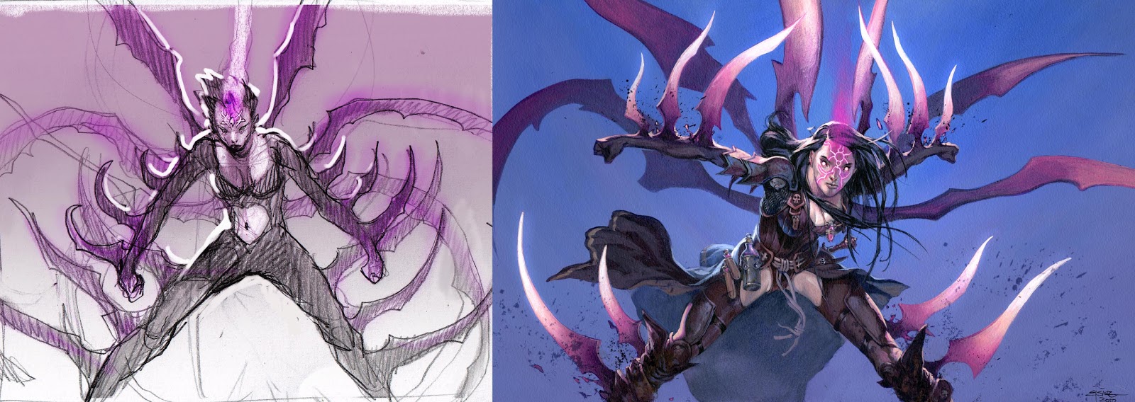
This is a magic card illustration from a while back. The description asked for a girl being enchanted with dangerous giant blade-like spikes bursting out of her body.
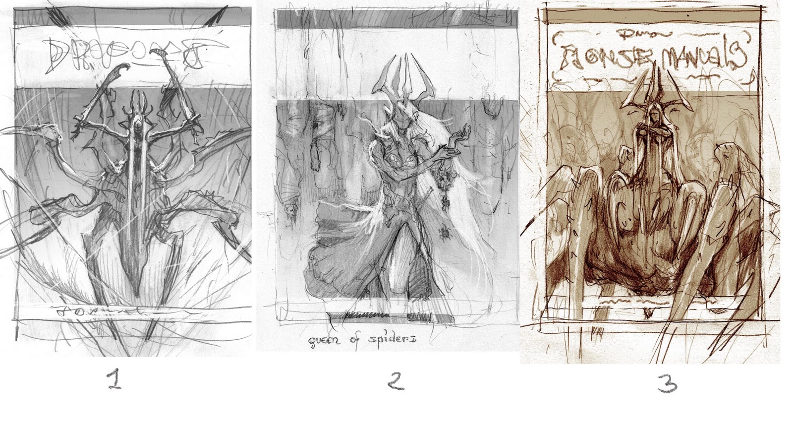
When I first start of sketching a card illustration I do plenty of loose thumbs. Some are abandoned half done or as soon as I realize it is going nowhere. The goal is to get the idea for a pose or angle for the image right. And the way I do that, is often very fast and very aggressive. I stab lines into the paper, constantly sharpening my pencil, as if it was a sword meant for battle. I am convincing myself that the fast paced scribble resampling panik, is my secret way of keeping the drawing dynamic…in truth I would rather slow down and trade some dynamic for control.
When I do hit something that my stomach tells me is right. I scan it and add some values or a single color and send it off for approval. Like the sketch you see here.
When it is approved I am ready to go. What happens now is guilt, loathing and an evil voice in my head saying “ You think this is good? you can do better, you should have done better” This is when I start redrawing the thumb. In this case I tried to get the pose more strained and more like an “end-position” of a movement. In the thumb she looks too relaxed and almost flexing. The new attempt has swing and twist in the torso and the arms and especially the gesture of the clenched wrists, clearly visible in the silhouette, works so much better. I spent the most of the afternoon adding equipment to her costume. Realizing now how dumb it is, that her inner thighs are exposed to wind and weather and raunchy gazes but her armpits are protected by thick ring mail. I can only say; some of us know how moist the thighs can get in a tight leather outfit. I gave her a little necklace with a small flask containing some pink liquid. Perhaps it is the potion she uses for extending the blades. There is no way you could see that flask in the final card art, but I like to think of small details like that. And also, since the armpit mail is such a stupid thing, at least the flask is a small token of storytelling.
Most of the time I aim for the dynamics to be in the thumb and for it to stay there through all of the process of sketching and painting towards final. But when you see a way to improve you initial drawing it would be traitorous to ignore that even if the client already approved the sketch or even if you are already in the beginning of the painting. I have no count of how many times I started all over because of a wild hunch or a glimpse of something better.
Soft Legs and Iron Armpits
Wednesday, October 24th, 2012
By Jesper Ejsing



i like this post 🙂
amazing improvement in just a slight change
I am becoming more and more aware of how importing it is to thumbnail and plan things out. At the same time, I've noticed that the best illustrators are very loose with their thumbnails. I've seen a great boost in the quality of my own work since I've started thumbnailing.
Great post, Jesper. Do you find that composition before the final drawing and rendering is the most important part in illustrating?
Question! I would love to be a freelancer. I have only had a couple of experiences with clients. I have a question about revisions when working with a client.
I know most revisions should be done during the thumbnail stage until the client is happy with the sketch. But have you ever been a situation where you are close to the finish of the final painting and a client wants a significant change to the painting? (For example, a different pose) What would happen in this scenario? Would you charge the client based on some clause in the original contract? How many revisions do you allow?
Thanks for the post!