-By Dan dos Santos
On Saturday, we found out who received this year’s Spectrum medals. Like many of you, I always fantasize that “this year will be the year.” But of course, reality always comes crashing down and I am quickly reminded that there are a ton of more deserving artists out there. In fact, not only have I never won a medal, but the piece which I am most excited about, and which I think may stand the best chance of winning, usually never even gets in. I confess, I refreshed Spectrum’s homepage a LOT that day, still hoping that “this year will be the year”.
I don’t know if some cosmic force shifted my way, or perhaps those late-night virgin sacrifices really did work… but somehow, I managed to win a Silver Medal this year… and I could not be happier!
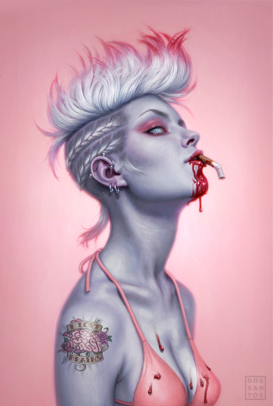
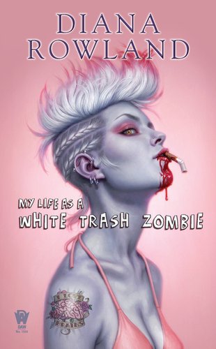
The piece that won was for a book called “My Life as a White Trash Zombie”, by Diana Rowland.

DAW books, for whom I’ve been doing a lot of covers for this past year, contacted me about this job. Unfortunately, my schedule was booked totally solid (mostly with their titles), so I had to decline. Fortunately, the Art Director being wiser than I, decided to try again anyways and called to see if I would change my mind. When the words “Zombie Romance” came out of her mouth, I knew I had to take it.
Because the deadline was so tight, I had to come up with a particularly simple piece. I also would likely only have time to come up with a single sketch, two at the most. I explained this to the AD, and she agreed.
 The AD was very particular that I make the heroine an obvious zombie, but still attractive. Apparently, someone had tried something similar not too long prior, and sales were disastrous. Making the cover more sexy than scary was essential. I sat down, and quickly drew my way through every trailer park and pink flamingo cliche I could think of. Nothing worked. But something about the pink stuck with me. I sometimes sketch in color (one of the great benefits of sketching digitally), and the moment I saw the way the dead grey skin would play off the bright feminine pink, I knew I had my cover.
To me, everything about the sketch seemed so perfect for the story… just the right combo of sexy, quirky and trashy. Yet, I was utterly convinced that they would NOT approve it. A pink book in the Fantasy section?! A cigarette in her mouth?! There was no way in hell the Sales Team was going to let me get away with this! I sent the sketch along with a short email that said: “Please, please, PLEEEAASE let me do this cover.”
Their response… “We love it!”
As is usually the case with really simple design, I ended up spending way longer than expected on it. Because there is so little to look at, you have to make sure that what is there, is stellar. Knowing that I was going to paint every little eyelash, I shot a bunch of reference. I composed it all in photoshop, mixing several different photos of 2 different models. From there I re-established my drawing, and transfered it to my board.
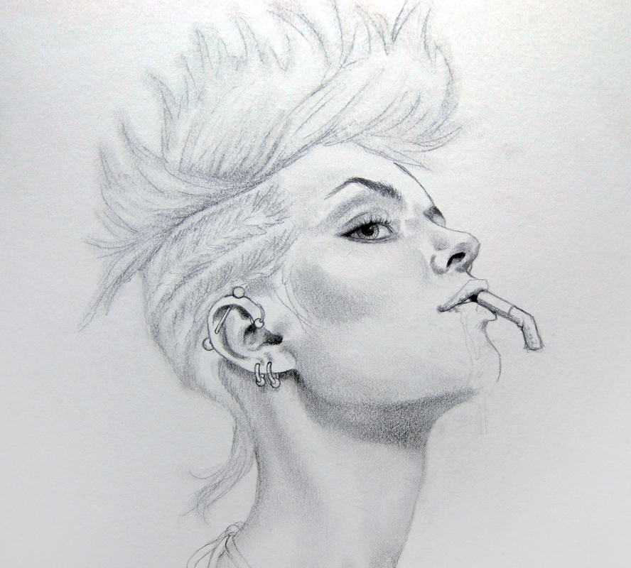
It may seem silly to spend time drawing in subtleties like the eyebrows, since they are going to get painted over anyways. But, it actually speeds up the process a lot. That pencil ends up showing through in the end, and gives me a very fine level of detail that is a bit harder to achieve in paint. To ensure that they showed through all the paint, I drew those elements much darker than the rest. The AD had questioned the amount of blood on her chin, so I kept that part of the drawing super light in case I needed to revise it.
Applying a color transparently over a white surface results in a much brighter color than mixing it with white (which tends to make most colors chalky). Since I wanted a sickeningly sweet pink background, I started with a vibrant wash of oils. This also let me see the color relationships almost immediately so that every decision afterwards would be easier to judge. You can already see how much work that pencil is doing for me at this stage.

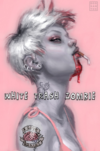
All that’s left is to just do it. In the image below, the painting is near completion. I typically paint the flesh tones beneath the hair, and then paint the hair on top of it once they are dry. This makes it easy to wipe out brushstrokes if I mess up some of the overlapping strands. Here, I am one coat away from finished, so a few elements as still missing, like the tuft of hair near her ear, as well as the nose stud. I also decided to make the eye a milky blue to add to the zombie theme.

That’s about it! I sent it off to the AD, who happily approved of it with the exception of a few changes. She wanted to have no blood on her chest, and also asked that I make the eye look human again, feeling that the dead looking eye made her less attractive. Both totally valid decisions. The completed image with type treatment is below. The book, which is getting some great reviews already, is due out in July.

congratulations on winning the medal, well deserved and about time!
Seeing the process of this one is very inspirational, thanks for sharing
Iris/eyeris
Awesome work! And congrats for the medal!
Thanks for sharing the process 🙂
Congratulations! Great work and thanks for sharing the process!
OMG…. so beautiful and so trashy! Dan you never cease to amaze. Your concept is great and your painting is so damned clean!!! A medal ultimately deserved! 😀 I can't wait to pre-order that book. It would be great if there were some special Spectrum copies where the lot of you (IMC and more) could sign it! Wouldn't that be amazing. I look forward to seeing what you do next.
p.s. the red tips, the ghostly glare and pink eyeshadow with purple skin make this baby POP!
Great work.
Congrats on the medal, Dan! It's a fantastic painting, and it's really nice to see some of the progress shots and read a bit about your decision making. Thanks for sharing!
Congrats on the medal, Dan, and the painting is fantastic: simple and clean, but all the better for it. It perfectly fits the idea of a trashy tell-all book cover.
Congratulations on the medal, and it's a great painting. Thanks for sharing!
Your first medal?
I honestly thought you already have no more space at home, because of ALL the medals you have won – your work is just gorgeous!
So, CONGRATULATIONS!
and btw. WELL DESERVED
Rita
I love the “sickeningly sweet pink background”, it really makes the whole image stand out against a lot of other zombie work. I'd love to see the painting 'in the flesh'. If you've still got it, pleeeease bring it to IMC.
This is a great post, really interesting, with all the artwork. Thanks Dan!
(And congratulations on the Spectrum award, I can't believe you didn't already have one!)
Congratulations Dan and thanks for sharing the process on your superb award-winning piece!
Congrats on the medal. Seems like you should have won a ton of these so far.
Congrats on that medal, and thanks so much for showing us the piece! it is truly gorgeous.
How did you get rid of the blood? digitally or went back in with the brushes and paint?
I'm surprised this is your first win, also, Dan. Congratulations, it's well deserved! 🙂 This is a stunning piece.
nice work! congrats on your winnings
Huge congrats Dan! She is a beauty. Love the tattoo! I admire your technique and your attention to details.
As I recall Dan is very chintzy with the bribe money that's why no medals. Really great piece Dan and congrats on a well deserved award.
I've been in love with this art since I saw the very first sketch. When my editor finally emailed me the finished version I (literally) jumped up and down in delight. I am the LUCKIEST author in the entire world! Dan has completely captured the feel of my book, and I'm utterly thrilled that the Spectrum judges saw fit to recognize his genius!–Diana
I cannot imagine a better cover for this book. This is truly a gorgeous piece of art. I am still stunned looking at it. Dan Dos Santos is exceptionally gifted. And i can't freaking wait for the book, either!!
I'm happy for you and Diana. Great job. I hope one day you'll get to do a cover for me. lol. Ya never know.
Dawn
http://www.dawnchartier.com
Hey Dan – Congrats! That's one kick ass piece!
John
Well deserved rewards!
Congrats Dan! long awaited and well deserved!!
Wow, congrats! Those poor virgins…
That is a beautiful original painting and finished book cover! congrats on the Spectrum award also!
Personally, I prefer the milky blue eyes – they're the finishing touch to making her look like a zombie – and although I'm not a lover of blood, I prefer the blood on her chest also.
And I like the cotton Candy Background! Especially the way it goes from light (centre_ to dark (outer edge).
Great work and congratulations Dan!
I heart this piece so much. Congrats on the well-earned win.
Also, perhaps I should feel trashy about this, but I really really want the “I love brains” tattoo. 🙂
@Amy:
I believe the author plans to make temporary tattoos of the design.
Seek her out at SDCC if you want one!
Congrats! What a lovely piece of work!
Congratulations, Dan!!!
I apologize if this is a totally gauche thing to ask–but my little brother sent me this link positive that I was the model–and I see why he thinks so. Since you noted that you worked from shots of two models, I was curious if you may have been using Model Mayhem or the like? I'm just curious, and would be spectacularly proud if part of that's me!
@Dayna:
Nope, not you. But you would have been perfect!
If I had known you were so close, I likely would've hired you.
I took a look at your portfolio, and I can see why you might think that. You even have a pic with a similar pose!
Rest assured, I would never use an image from your portfolio without permission. I'd be infringing on the photographers copyrights, and that would be BAD for my client. To avoid legal issues, it's always safest to shoot your own ref.
I used two models. One of whom I use very often, a girl named Monika (who I mentioned in a previous post); the other is a local tattoo artist who also looks a LOT like the picture, except with dark hair.
If you're interested, you can see them here:
http://img.photobucket.com/albums/v704/DSillustration/wtz_ref.jpg
Hi Dan!
A great piece and thank you for showing us the process.
Did you ever see Frank Quitelys “Bite Club” Cover?
http://weblogs.variety.com/bags_and_boards/quitely.jpg
Your cover somehow reminds me of it.
best wishes
They're both lovely. Thanks for responding, Dan.
-Dayna
Looks awesome, congrats on the award! it shows just how long the production process is for a book, being that the Spectrum deadline is in January and this book won't even release until July.
Did you just make the corrections digitally or did you revamp the painting?
I love the shadowing and glow. You do amazing work!!!
Disgusting!! ooOOOh
rosenalva@gmail.com
Congratulations on winning! Your hard work really paid off – it was for your cover alone that I bought this book. I had zero interest in the storyline…zombie romance? I love zombies, but romance…No thanks! But the cover really sold me. And wouldn't you know it, I ended up liking the book too. It was really cool getting to see the original artwork vs. the published version. I love the original best – the milky eye colour is perfect!
대전출장마사지로 쉽고 간편하게 집에서 경험해볼 수 있습니다.