First step here :
http://muddycolors.blogspot.fr/2012/06/daisy-first-step-sketch.html
I’m not a specialist of grayscale. I don’t use it very often. I came from traditional painting and this technique is not very « natural » for me. But let’s try, I will try to avoid the « washed » effect.
I put the sketch on a « multiply » type layer and I start to work under it. I choose my basic tones and my ambient light, it will be green. Of course, the saturation is not very good.
For the painting-like effect, I don’t use airbrush but different Ditlev brushes (once again). You can download the pack here: http://cghub.com/scripts/view/85/
I have to paint over the sketch now. I don’t want to change the contrast and the luminosity too much so I create only « overlay », « linear burn », « linear dodge » and « difference » layers.<
The amount of layers is quite ridiculous but I add the tones one by one. I often decrease the opacity of the layers to 0-10%.
The choice of colors is logical … Green and orange. I think you know the complementary tones.

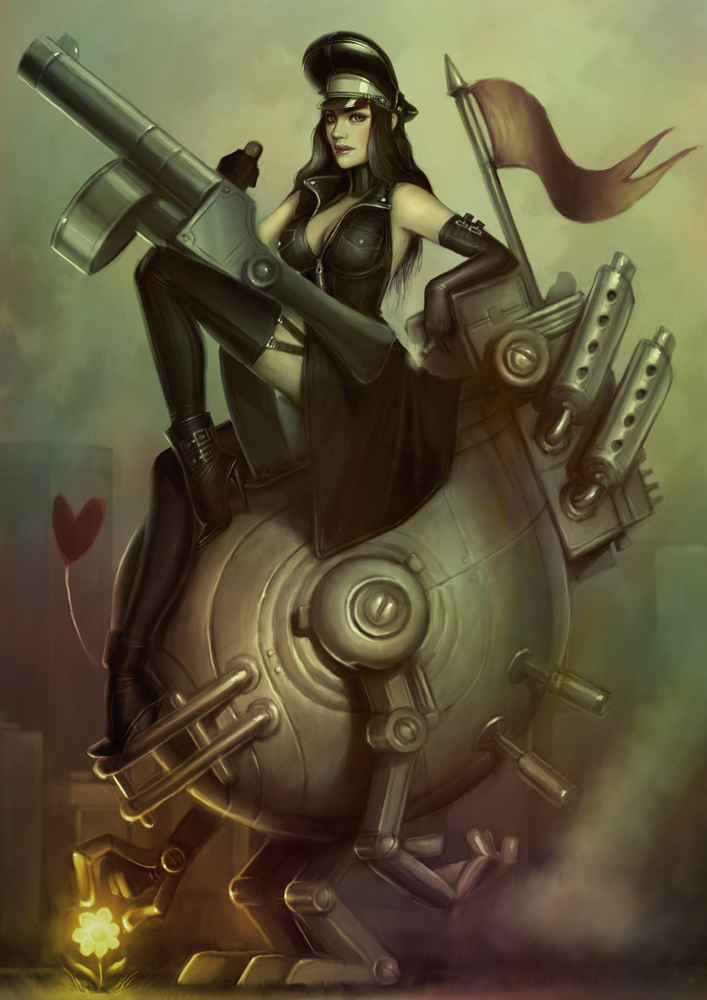
Here’s the result. It’s not perfect but I’m on the good way.
I merge all the layers.
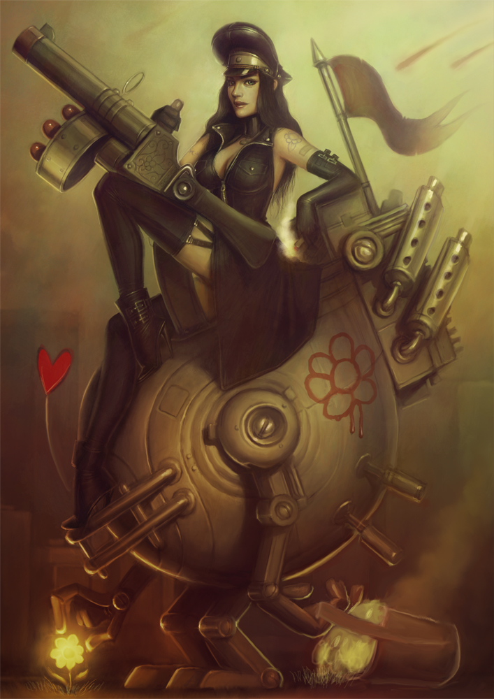
I add the bag full of daisies. It changes a bit the meaning of the picture but my composition is better now. The « hole » on the bottom-right now longer exists.
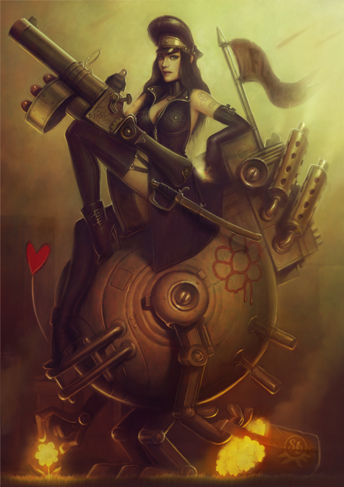
I add details and I change the contrast and the saturation a little bit.
I can’t if tell I’m totally satisfied by this technique. My palette is very close of the one I used for an old picture, « Sashimi’s revenge » but the result is not as good. By the way, I spent 80 hours on that pin up and « The daisy » was done in only 8 hours. I think I can work faster with a bit of training but I’m not sure I will use grayscale again. I go back into the one’s old ways now.


Wow, it's a girl and robot and heart and nothing. But it's fast, so it's ok.
I really like that little bit of a “washed” look as you call it Serge. Now I don't think it would work in everything but it gives this a mood it might not otherwise have, a little different than Sashimi's Revenge. Sort of gritty.
Hey Serge, what exactly is the benefit of painting in grayscale first?
Be honest. Is this for League of Legends?
It's faster 🙂
Because it's easier to find the good contrast when you work in balck and white 🙂
I see…Thanks! I am tempted to try that the next time. Although, I'm pretty sure it's going to take me longer than normal.
Hi Serge.
Working in shades of grey is very much a traditional method, also called Grisaille: http://en.wikipedia.org/wiki/Grisaille
Doing a cover with this method myself right now.
Am very glad you have chosen to test this method, as it gives this specific image a different look than most of your other works. The addition of the bucket / daisies is superb. The bot seemed to want to topple backwards before, but now is rock steady and the edge lighting this adds is great. Superb work!
nice artwork 🙂
Your painting is great Serge. However, in my experience glazing over a grisaille doesn't work as well digitally as it does with paint.
Great Work!!