By: Jesper Ejsing
I was asked a couple of weeks ago if I did something special to keep the dynamics from the sketch and drag it through all to the final. And I can only answer this: “If the thumb works and has the power and dynamic movement I am looking for, I do all I can to change as little as possible”.
People often say they have problems with the final being more “dead” than the sketch. And true, sketches has that quality to them, that they are unfinished and we tend to fill out the rest and the unfinished with the picture we want to see, thereby fixing all what is unclear. So the trouble is if you in the sketching process “fix” too much. That is, if you stray too far from what was working in the thumb.
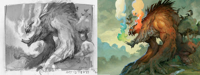
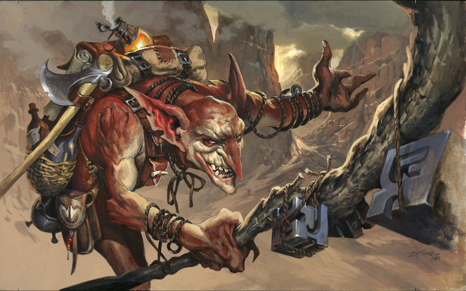
To avoid that, I give the thumb all I got. This is where the big battle is fought. I do not go on to the sketching until I am 100 percent that the thumb-sketch is the best I can do. And from there on I fix only little things. I try to stay within the silhouette of the figure, so that if I move an arm or add stuff it is not something that ruins the graphic of the thumb-stage. Take a look at the beast with the colorful breath, that I did for Magic the Gathering. I changed one thing: the tail coming out underneath its mouth. I thought it was ruining the impact of the front of the creature, so I took it away. Apart from that the thumb was just transferred to the board and painted. The birds were rendered a little better and I did try to make a good job on his hands. But for most part I just kept what was in the thumb-sketch and didn’t “fix” too much.
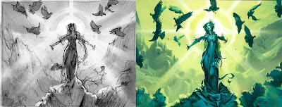
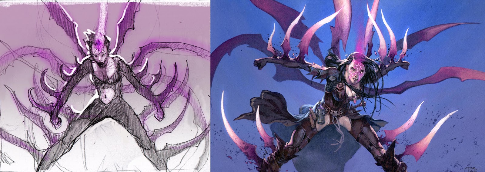
In The girl with the sunrise and the birds, my sketching differs in only three ways from the thumb. I twisted her body some more to gain amore female sexy pose, and to take her a little out of the symmetrical position. Still I am not sure that even counts as a change it is more like it is just a better drawn version than the thumb. In my thumb I was going to give her a long pony tail, but realized that when you looked at it from a silhouette point of view it seems like she has three arms. So I changed that into long hair kind of transparent to not mess up the curvy silhouette. Lastly I removed the bird coming out right behind her. It also just ruined the reading of the silhouette. I still regret not having any bird overlapping some part of her, to create a little depth, but it was sacrificed on the alter of clarity. ( I have shed a lot of blood on that particular slap of stone )
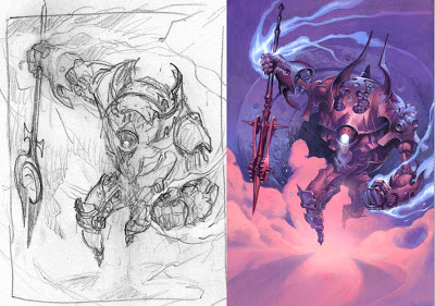
Lastly: the Spear wielding robot construct. I did not change anything but the spear head. For some reason I just wanted a more mechanical tip to the lance or spear. So I ended up doing this strange wheel-drivin thing, that when you look closer at it, has no real function: Nothing is able to turn or move and it only shows how little I actually know of mechanics. But it fits better with the theme, and it didn´t mess up the silhouette. I am particularly happy about his shoe tips in the final. I came up with this idea that it would be interesting to have this big hulk of a heavy mechanical guy running on the smallest of tip toes, like he had high heels or something: the idea came up because I couldn´t clearly see what the hell was going on in my thumb. But the point is: I didn´t break the silhouette.
One more thing that is not too apparent in these three examples is that I tend to use little photo reference. When I try to shoot pictures I often end up finding out that the pose of my initial thumb-sketch is just not human possible or it is at least enormously uncomfortable. So if I use photos at all, it is mostly for details such as the inside of a crocodiles mouth, the cleavage of a girl, hands in different positions, hair styles, birds in flight and so on. Details that will lend my impossible sketch believability. Never the whole photo or ref. For me, the surest way to kill a nice dynamic sketch is to photograph the hell out of it. ( or it might be that I am just not a very patience photographer )
This is an awesome post. Very informative, thank you!
Thanks for sharing this! The idea of keeping true to the same silhouette of the figure(s) in the sketch is an idea I hadn't really thought of before.
Ps. Blogger's 'Add Image' feature can be a little fickle at times when making new posts. If any viewers can't seem to get the thumbnails to open up to a larger view, try viewing the images in a new tab (in Firefox, right-click and chose 'view image'), then, in the address, find 's400' and replace it with 's0'.
There are bigger images than these to see. -and like all of Jesper's art, very much worth looking at a larger size. 😉
Yeah I'd like to see the larger images but it is not happening with my Safari browser ;(
Thanks for sharing! it's always great to see how other artists work. And absolutely beautiful work by the way. Especially loved seeing them in person at Illuxcon.
-cheers
Great post, the extra step of solving problems in the thumb beyond abstraction definitely pays off. Also really demonstrates just how key the silhouette is to the dynamism of the final image. Thanks for sharing!
Excellent post, all good stuff to keep in mind!
Jeff
I had an instructor at University tell me once “Your illustration is only as good as your reference.” After over 17 years of illustrating for pay and pleasure, I can say this is the worse advice I was ever given. I've learned since then that relying too much on photography kills the action, emotion, and soul of a good thumbnail / illustration.
Thanks for a great post!
And I can also say, I wasn't very good in my english composition classes… 🙂
Couldn't agree with you more about using photo reference, great post!
Love them! Is there a larger view of the top one?
Awesome sharing!!
Coming back to this because I have stumbled along my path. Your advice is timeless Jesper.