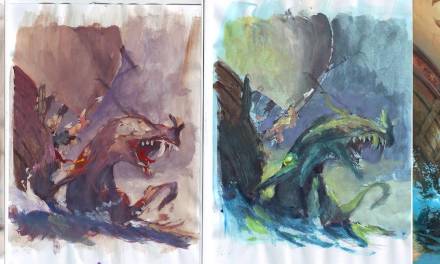
This spring, when I was teaching with Petar and Justin in Stockholm, I painted a dragon head. The figure was chosen to show the wide range of tricks and tools I use when illustrating.

Sketch:
In the sketching step I went for the clearest image I could: A profile/silhouette against a flat background. No nonsense and nothing to fuss up the reading. That is very graphically speaking because I did not do that completely, but that was the idea. A figure seen directly from the side is really boring and not very dramatic, so I lowered the angle bit so that we see the head from below thus looking up into the mouth. Also I turned the head of the dragon towards us giving the head structure a depth and a foreshortening that makes the image interesting. We are looking into the face rather than at it, if you know what I mean?
All the horns form arrow like lines into the face and the circle shapes in the scales and neck helps to emphasise shape and to further frame the face.
Inking and grey tones:
Next step for me is to draw the sketch more precise on a board and inking it. If I do not ink it I am afraid the pencil will be covered up to fast since I tend to work very opaque right from the beginning. I use the grey tones to add the value and create a guideline for light. I use black acrylics. I try to fill in all the darkest areas with total black, knowing that it will be toned later on.
In this case I was using an old board that had some scratches so I had to repair it with gesso and some other strange medium I found at a friends table right next to me.
Colour rough:
I used a copy of the grey tone step for a colour test. I kind of new I was going to do a red dragon, and I kind of wanted to make a warmish rim light. that almost filled in the rest of the decisions. if the light from the side woul be warm I almost always use a cold colour for the parts in shadow. By choosing this temperature difference you get the most contrast and the best 3dimentionality, I think.
So the main colour would be Magenta and pink. The background should be in the same family as the figure to make the rim light stand out the most, so, once again, I smeared it with purple and some cobalt blue into it at the top. Well…all these colour match very well. For the eye I chose a sickly cold yellow to make it stand out the most. that particular colour has no place in here and acts as a splash and a very uneasy element. kind of what I needed. It could have been turquoise or orange, but I didn’t want to add any “new” colour and I already used yellow for the rim light.
Final:
I had only about 3 to 4 hours to paint the figure and I never reached the same level of contrast and kick that the rough has. I think I could have managed that with a couple of hours more.
what I tried to do was show how to make texture by simply letting the brush dance randomly over the face of the dragon and afterwards picking up on elements that could be dents or scales or scratches. also I tried to use many different colours within the red skin to make it seem alive instead of just red. I achieved that by dotting grey and purple and warm red into it.
One more thing I did very deliberate was to use different size of brushes. A flat size 16 for the blocking in colours, a round 12 for most of the rest of the painting, and a round size 2 for details like the eye and the highlights in the gum. the different size of strokes adds to the focus, since I used only the small brush in the most important areas and went more and more rough the further away from the eye and teeth.
This is a very fast image, but all the same thoughts apply to an image of more details and with multiple figures.
Thank you, Jesper. THANK YOU.
It's so stimulating (to me, at least) to see such a process clearly explained!
as someone who works with very loose sketches, it's neat to see that you pull details out of random occurrences in the same way.
also I think I'd be a pissed red dragon too if my horns were twisted together…
thank you for your contribution!
This was a great insight for me to read your thought process as well as the images. It really underlines the fact that to make great art there is a lot more to it then just painting a dragon. It would be wonderful to see all the contributing artist here at Muddy Colors do a post like this.
Its amazing that you managed such brilliant detail in such a short amount of time. I see what you're saying about lacking the punch from the original rough but honestly had I not read that, I wouldn't even have noticed. After looking at the final my question is how do you determine what to detail in such a short amount of time. If this was digital I would understand, but since this is physical paint I am amazed! What size was the piece?
Great work and instruction!!Thank you!
A photo I took of Jesper while he was painting this picture is here (some guy is in the shot, too):
http://muddycolors.blogspot.se/2012/04/guest.html
Of course, that's Justin Gerard… looking at what I just wrote, I remembered that sometimes jokes don't translate so well online. I was just teasing Justin, who is a great guy. Sorry!
I really enjoyed reading your art process and seeing the step-by-step photos side by side. Very insightful. 🙂
Impressive technique with this Dragon head.
Thanks for the step by step.
Nicely done. What were the final dimensions (and medium) of the piece?