What comes to mind when someone says the word “fantasy?” I’m sure the word dragon is in the top of the list, along with elf and dwarf. Most kids that grew up with an interest in fantasy and art probably sat around drawing dragons destroying towns and eating people. I actually drew tanks and people with large bellybuttons as a kid, so I don’t know what happened.
I’ve always loved dragons, but they were never the easiest thing for me to paint. After many horrible attempts during the beginning of my career, I took a long hiatus from painting dragons. Recently I received several commissions to paint dragons, so I guess it was time to get back on the horse…or dragon.
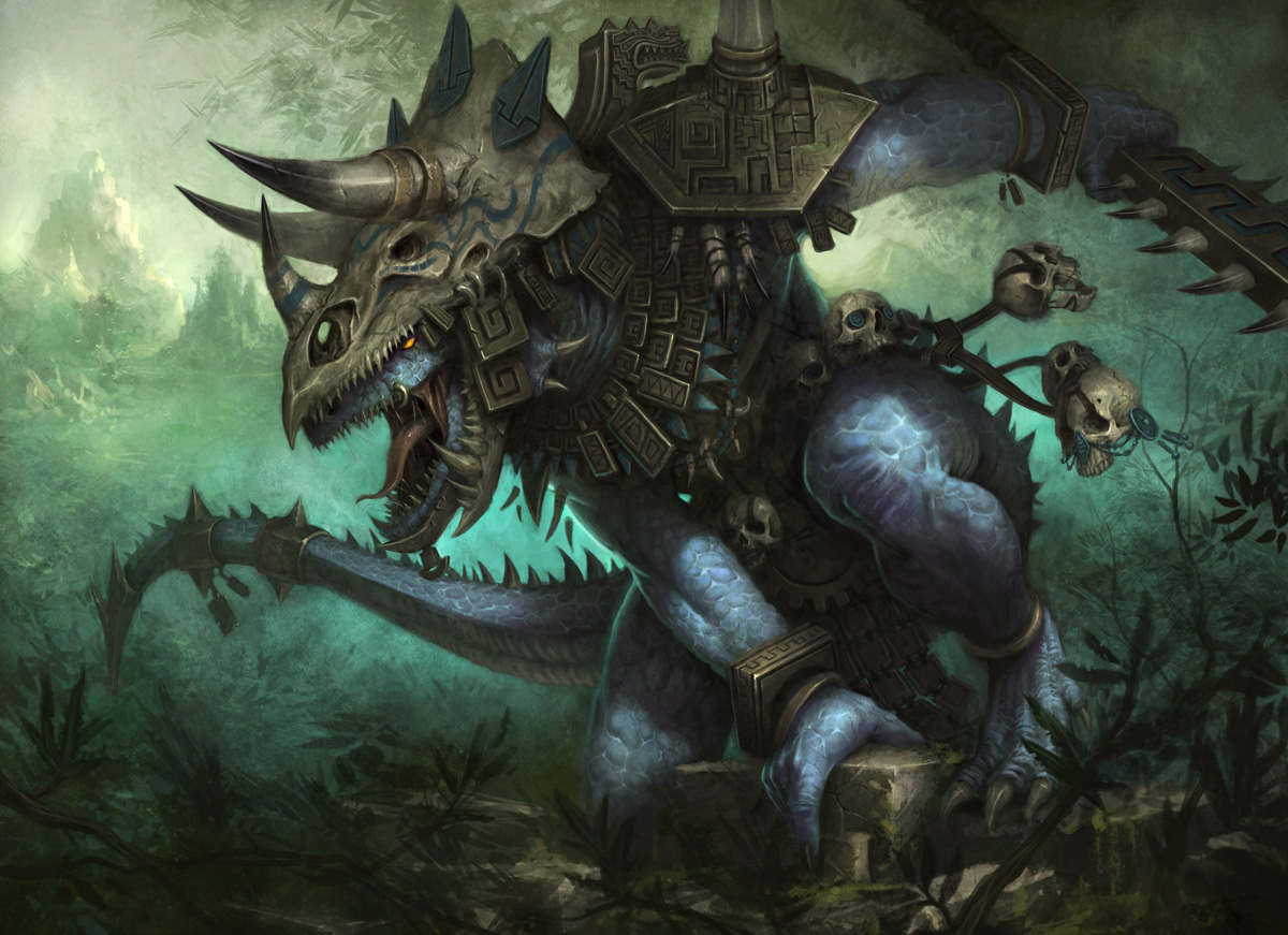
Hold on! I know this isn’t a dragon, so don’t ask for your money back just yet. While this isn’t a dragon, reptiles do share a lot of things in common with dragons. After painting this for Games Workshop, I picked up a lot of tips and tricks that I still use to this day when painting dragons. Scales were always a big problem for me when it came to dragons. I typically don’t like to use patterns or scale brushes, so I usually paint everything by hand. Since this painting was created for the Warhammer universe, I used Karl Kopinski’s amazing Blood Bowl Lizardman (blood_bowl) as reference. He could probably pass for a dragon if he had wings…ok maybe I’m stretching it a bit. Anyway, my point is, when you’re painting something that doesn’t exist in reality, look to things in nature that are similar, like reptiles.
Now on to some actual dragons! It is interesting that all of my recent dragon commissions have been for card games, four different ones to be precise. What you have to remember when creating an illustration for a card game is that the print size will be extremely small. Typically the print size is around 2 inches wide. Strong silhouettes, value structure, and composition are very important if you want your image to read.
Wizards of the Coast asked me to paint a dragon for their card game Magic: The Gathering. WotC also gave me my very first dragon commissions back in the day when I was working on Dungeons & Dragons, but I won’t mention those. They were horrible paintings and I strongly advise you against looking them up. Oh the horror! When I received the commission I was both terrified and excited. It was a chance for me to redeem myself, but at the same time, I remember how much trouble I had when I was working on Dungeons & Dragons.
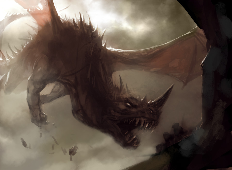
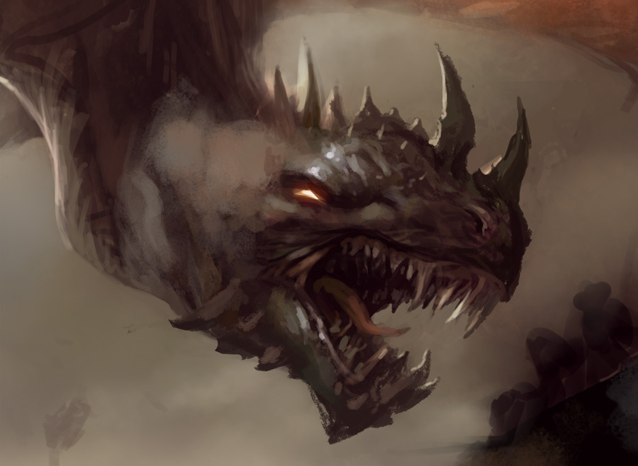
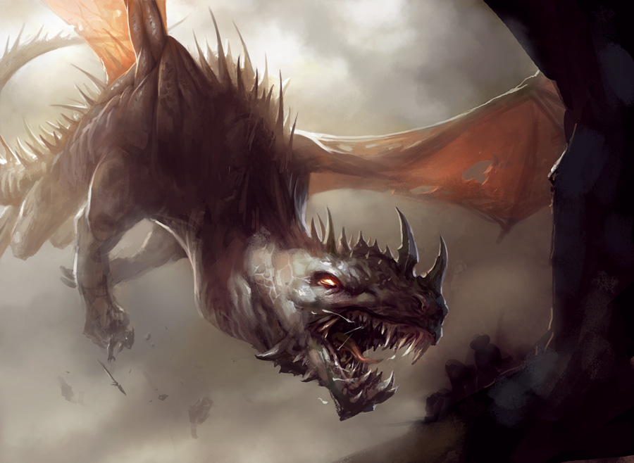
The description asked for a Jund dragon that was swooping down, attacking a group of goblins on the edge of a cliff. Jund dragons tend to have shorter snouts and lots of spiky bits, so I had a little bit of an idea of what I wanted the dragon to look like.
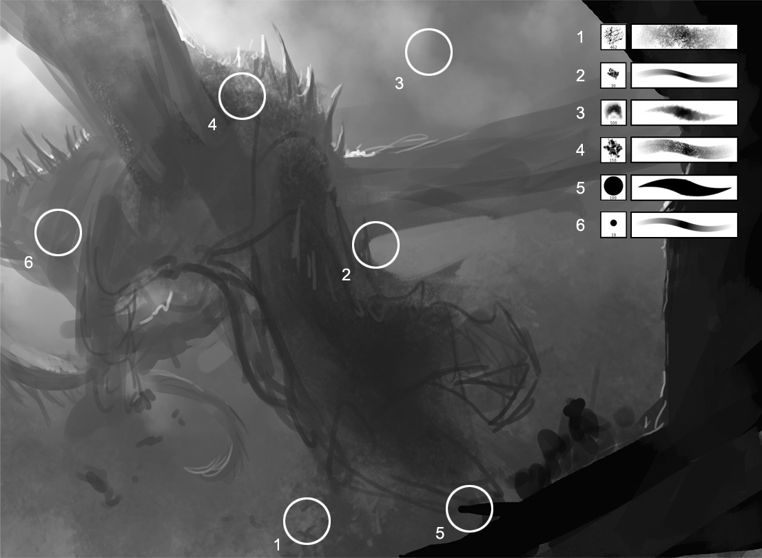
Brushes. The number one question that everyone asks and probably the number one question most artists hate. I can understand the curiosity of wanting to know which brushes an artist uses, but people need to realize that the brush doesn’t matter. Custom and fancy brushes are there to improve your efficiency, not to make you a better artist. If you want to learn to paint digitally, start by using only the round brush. Most of the time I use very simple brushes. There are some occasions when I want to use a custom brush to speed things up, like the chain brush or cloud brush, or when I want to add some quick textures.
I figured I would start off by showing which brushes I used to paint this illustration. For the most part, I only used 6 brushes. Out of those 6, I only used 2 for the majority of the painting. The other 4 are only used in very small sections, and often times only during the sketch phase.
The round brush (6) and the chalk brush (4) are the two brushes I use the most when painting. They are extremely versatile and carry the majority of the workload. Recently I retired the round brush in exchange for a round bristle brush. These brushes can give you a wide range of edges as well as texture.

Like I mentioned before, composition and silhouette is very important when creating an illustration with a very small print size. There aren’t very many elements in this painting, so I knew I could focus on creating a strong silhouette for the dragon.
Typically I create circular compositions so that the viewer’s eye keeps looking around the image. The focal point, of course, is the dragon. After you see the dragon you move down and see the goblins. The cliff wall then carries your eye up and around, looping you back to the dragon’s wing. The wing and s curve of the body brings you back to the head in a never-ending loop of dragon feeding madness.
The goblins are a second read, even though they are very small. If they are close to the head, not only will it give the illustration some tension and storytelling, but it will make it easier to notice them. I also made sure to place them against a lighter background so that you can see them more easily.
Typically when I start an illustration I work in black and white because it is easier and faster for me to knock out and submit to an art director, especially if you are working on 8 different paintings at one time. Sometimes I start with color, but usually I only start with color when I’m working on concept art, not illustrations, although there are some exceptions.
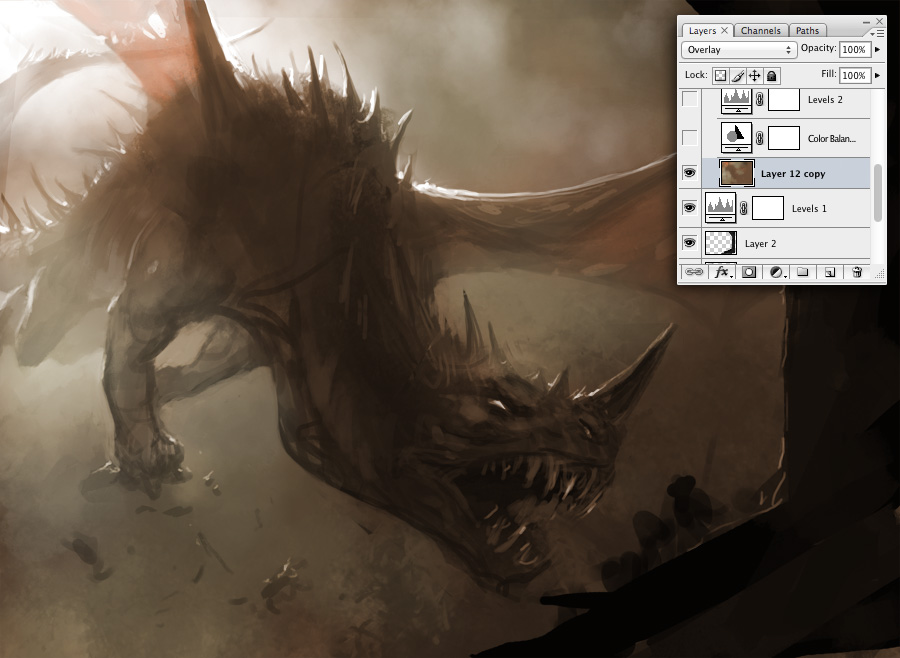
I say this a lot, but adding color to a black and white sketch isn’t a quick and easy process. Most people look for a magic button that will add color for you. Working digitally means the computer does everything for you right? Nope. Adding color through different layers modes is just the beginning, not the end; it is how I add the base colors, not the final colors. Not only do I use several different layer modes to build up color, but I also use adjustment layers. After I have the base color scheme established, I paint on top of everything with opaque color.
Once my sketch was approved, I added the base colors on an overlay layer. I wanted to have the dragon backlit, that way you could see the sun shining through his wings. It would give me a good opportunity to show some transparency through the wings and add a bit of color. I was also playing off the idea of planes attacking with the sun behind them so that their enemies couldn’t see them.
You can also see that I have a color balance adjustment layer above the overlay layer and then a levels adjustment layer on top of that. I have them turned off so that you can see what the base colors on the overlay layer look like without any other adjustments.
You will notice in this step I lightened up the background near the bottom of the painting. I felt it was getting too dark on the bottom and causing the goblins and dragon head to become lost. Those two areas are very important, so I wanted them to stand out more against a lighter background.
At this point I am mainly painting opaquely with color. I will use color balance from time to time, but I am no longer adding color through the use of layer modes. The clouds I added at the bottom were painted opaquely with the cloud brush.
I also tend to use soft light layers in order to push the atmospheric perspective. Creating depth through atmospheric perspective is very important for me because it adds that layer of realism. There are times when I exaggerate the atmospheric perspective. You will notice that the rear of the dragon’s body is being affected by atmospheric perspective. In real life you probably wouldn’t notice any change, but exaggerating the atmospheric perspective helps add depth and believability.
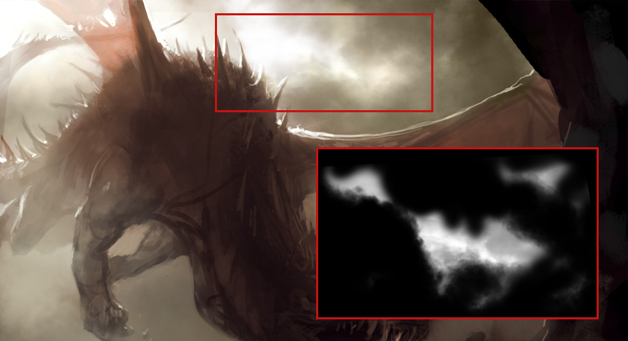
Typically I never use any photo source in my paintings, but there are rare occasions when I use tiny parts for the clouds in order to save time. In this case, I used a piece for a very small section of the sky. You will notice that I erased almost all of the photo source because I only wanted a specific section.
When I use photo source like this, I usually set the layer mode to overlay and drop the opacity down to taste. Typically the opacity is dropped down to around 30%.
In the next step you will see that I already painted opaquely on top of my clouds, changing them quite a bit. When using photo source like this, I never paste it and leave it alone. I always go back and paint opaquely on top of it in order to change things and make it my own.
Once you have the base colors established, it is usually just a matter of refining the painting.
In this stage I am still changing the clouds. I painted opaquely on top of the photo source and I also lightened up more areas of the clouds. Again, I felt like the background was getting too dark and I wanted there to be a clear separation between the clouds, the dragon, the cliff, and the goblins.
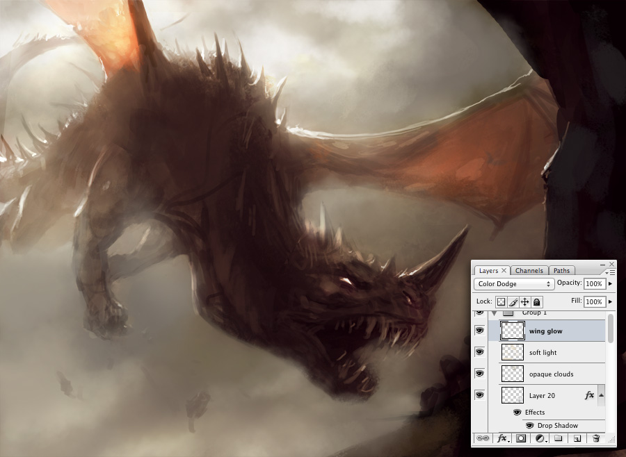
I really wanted the glow of the sun through his wings to sing, so I added a color dodge layer in order to really pump up the glow and saturation. When I use a color dodge layer, I always paint with the airbrush (0% hardness) and I choose a 50% grey. The reason I choose a 50% grey is because if you choose a lighter grey, it will blow out your image very quickly.
I am also still playing around with soft light layers in order to add atmospheric perspective. You will see that I brought more color back into the dragon’s body.
During the painting process, you inevitably end up painting over some areas of your original sketch. Once I have my background fairly well established, I can go back and repaint the areas that should go on top of the background, like the dragon’s spines. You could also keep your elements on different layers so that you don’t have to worry about painting over your figures, but I always end up forgetting to keep things separate, or I end up painting on the wrong layer.
I didn’t really like the dragon’s head, so I started changing it. The single large horn on the front of his head felt really weird and awkward, so I went with several smaller ones instead. I also moved his eye down just to give him some more character and personality.
One of the things I have been working on lately is my lighting. Most of my older paintings are fairly flat or boring in terms of lighting, so I knew I wanted to do something interesting for this painting. Up to this point the dragon’s head has been completely dark and all you could make out was his silhouette.
I thought it might be really cool if I had just part of his head and neck in the light and the rest of his body in shadow, as if he was flying under and overhang and all that was exposed to the light was his head. Imagine the horror of standing on this cliff and then, all of a sudden, you see this giant dragon head emerge from the darkness.
Most of the time I build up values from dark to light. You can see I am starting to add lighter values for the dragon’s head, but I am not going all the way to the end of the value scale. I slowly make my way through the value scale in order to build up different values and textures, saving the final highlights for last.
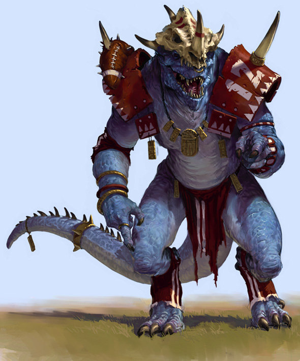
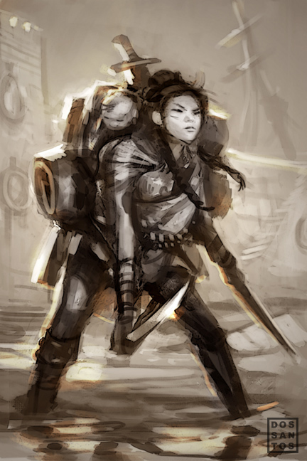
I am starting to add lighter values to the head and I am also hinting at the scales and texture. Sometimes you don’t need to refine every little inch, but rather you can imply something and the viewer will automatically fill in the blanks for you. Remember the Temple Guard I posted at the beginning? You probably thought I was just posting random stuff, but you will notice that I am starting to use the same type of texture for the scales. I told you it would come in handy!
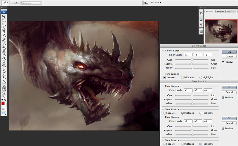
Again I am playing around with the color balance. I selected the dragon’s head and neck with the marquee tool and then added a color balance adjustment layer. I took a screenshot of each color balance window so that you can see my settings for the shadows, midtones, and highlights. Typically I like to add cool colors to the highlights and warm colors to the shadows.
Final Details
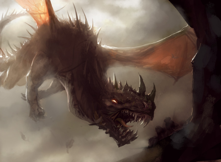
The painting is almost finished, so at this point I am just going back and refining things and making a few changes. The dragon’s arm that attaches to the wings was looking a little small and frail before, so I beefed it up. I am also going in and adding more scale texture to the rest of the body but I’m not going too crazy with it. The body texture is all painted by hand. Sometimes using texture overlays can look fake and many times it won’t match the perspective of your drawing, so you end up having to spend time making it look right.
Again I am changing the clouds in the background. There is now almost nothing left of the photo source I started with back at the beginning of the process. Sometimes it is nice to start with a base in order to make your task less daunting, even if you know you will completely change it later on.
All I need to do now is paint the goblins. The goblins are going to be incredibly small at print size, so I don’t need to go into too much detail when painting them. Instead I rely more on silhouette and a few areas of high contrast to pop them out.
I also wanted to add a few goblins being thrown or squished by the dragon, just to add more movement, interest, and storytelling.
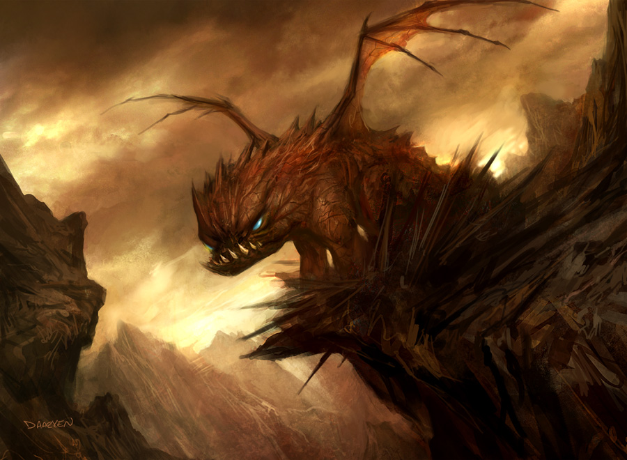
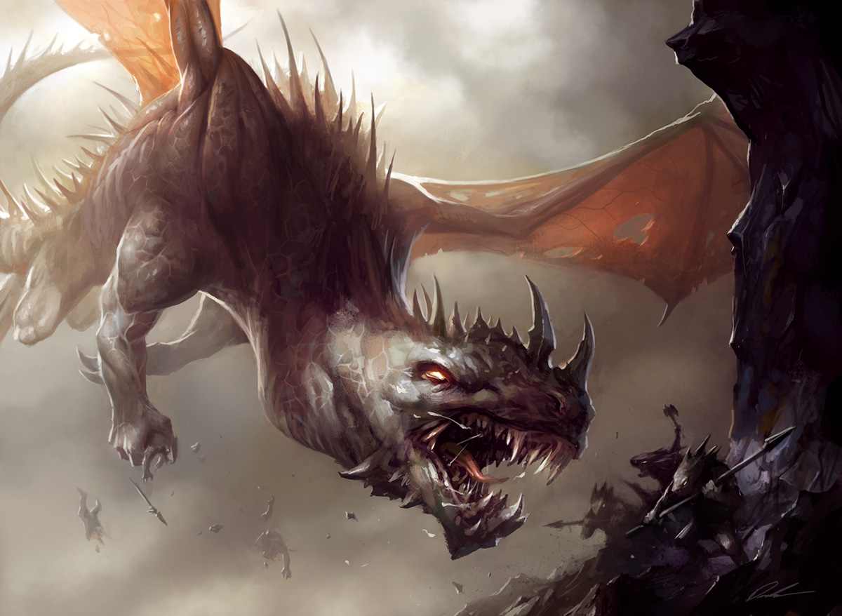 |
| Preyseizer Dragon – Magic: The Gathering Planechase 2012 © Wizards of the Coast |
I hope you enjoyed seeing the process of my painting, ‘Preyseizer Dragon’.
And now, one last dragon painting!
A post about dragons wouldn’t be complete without ending with Hellkite Hatchling. The Art Director wanted a baby dragon that didn’t have fully developed wings. I must say, my Pekingese dog with a severe underbite influenced this illustration.
 |
| Hellkite Hatchling – Magic: The Gathering Conflux © Wizards of the Coast |
If you want to see more of my dragon paintings, I have an art book coming out next month!
The book is $34.99, 200 pages, hardcover, and will go on sale in October for UK residents, and in November for US residents. The book will also be available worldwide and can be ordered from 3DTotal’s site or any site like Amazon or Barnes & Noble.
On the 24th of this month, 3DTotal will begin accepting preorders through their site. If you preorder through 3DTotal, you will receive 3 signed 8.5×11 prints with your book.
Thanks,
-Mike ‘Daarken’ Lim
http://daarken.com/

An interesting read, thank you for sharing! =]
Thank you, Dan, for posting this!I dont know if the artists themselves read the comments on these but if they do I'd like to tell Daarken a couple of words:
A great article! You have always shared not only your working process and tips with us but also all the odds you encounter during painting and in an illustrator's career in general.I have always respected you a lot for that and felt you kind of close, not just a master and a guy to look up to, but also someone who shares our problems, who found solutions and is ready to talk about them- I guess we all do, after diving into your style of writing, your topics etc.Your tutorials and clips have been rly helpful for me and I appreciate what you r doing for the future generation of artists.I'd love to hear more of you here on Muddy and maybe see you become a member of the comunity, this would truely be glorious 🙂 Also cant wait for that book of yours, what is it called?
Nice to see a post from you here!
I'd already pre-ordered your book elsewhere, but now that you've shared what we'll get if we pre-order from 3DTotal, I may have to change whom I've pre-ordered from.
I can't really speak for everyone, but I get a little annoyed when I read or hear what sounds like an artist jumping to a conclusion that folks only want their brushes so they can 'paint as good as them.” Maybe there are plenty which do that which I'm really not aware of and I totally agree with you. A certain brush doesn't make anyone a better artist.
In contrast to that, when I ask an artist to share one of his brushes, I do it because I see a certain texture in a brush I really like and can't for the life of me figure out how he's (she's) made it. I just want to dissect it to know how the brush is put together so I can make my own. I personally never like using another artists brush in my work because it gives me the feeling that the ownership of my art wouldn't be completely mine. However, if the brush is really, really good (I mean REALLY good) -read: good at being a brush, not for making me a better artist- then I have no qualms about adding it to my brush library. I have held on to several ingeniously constructed brushes over the years which really only amount to about 5% of my total brush library.
I'll also add that the brushes I use for the majority of my paintings are the ones I have personally created for my own needs -not the brushes I find others using.
I appreciate you sharing your workflow between starting in black and white and then adding color later as sort of an underpainting -over which you further paint. I've done some paintings the same way, but have never really enjoyed the results of the artwork simply looking like a tinted black and white painting. Working in grayscale really helps me focus on values, form, contrast, and composition, but laying in color later on has usually left my artwork feeling a little dead. The fact that you treat it as an underpainting 'clicks' in my mind. I've never thought of it in that way before and really appreciate it.
Thanks for the time you took to put together this post!
There are always people out there that want brushes simply because they are interested, like you pointed out, but I think people probably e-mail me or message me at least once a day asking me what brushes I use because they want to produce art like mine, or they tell me their art suffers because of the brushes they use. Whenever I watch livestreams from other artists, people in the audience usually ask the artist about his brushes 5-10 times. Many artists won't even answer questions about brushes anymore because they are tired of people asking. I've heard a few artists say “I'm not going to answer that anymore.” I always tell people which brushes I use no matter how many times people ask and I give them out, but I also want people to realize that brushes won't make you a good artist.
I appreciate your feedback and I'm glad you like the tutorial. Thanks!
Thanks! I really appreciate it. It means a lot to me when I hear that other people enjoy my tutorials. My book is called Elysium The Art of Daarken. Thanks again!
Thanks!
I honestly had no idea folks were doing that. 🙂
This reminded me of your post on enlighten.com about 'Creative Painting -Using only one Brush.'
I thought that was a great post to show that the brush only plays second fiddle to the actual knowledge of how to paint. Using what might be considered an unconventional brush to create something else is a refreshing idea. It reinforced the fact that it's the skill and dedication behind learning to paint which really counts.
-Theoretically, I could take the silhouette of a cat, make it into a brush, and proceed to produce a piece of artwork. The result would depend more on my years of practice and study rather than what the brush looks like. That sounds like such a fun idea, I may just have to try it!
Thanks for sharing here Mike. My students really appreciate and info they can get from digital artists since I do so little of it myself. Your response about brushes is so appropriate with any medium. A lot of the joy of making for me comes from discovery. Without that it just becomes a job.
Thanks a lot for sharing your progress, it's so interesting to see how other people work!
I'm looking forward to the release of your artbook, can't wait to buy it – I absolutely love the art you create.
Totally agree!! Thx Mike, and from Russia with love 😉
Thanks for the post. Ive really enjoyed your tutorials on your website. It's really cool to have artists giving so much to the community. It's really inspiring.
I stopped asking questions about brushes once I left the digital realm to understand traditional techniques better. experimentation, like Bill said, is really what it is about for me as well. I have him to thank for that nudge. I'm hoping to bring some of that back in to digital again. I struggle with edge quality more than anything right now in my digital work. I love the chalk brush but I can't seem to make it work right. practice practice practice 🙂
Thanks again! it has been a real pleasure watching you grow.
@daarken: I was alway thinking a way to get your signature for quite sometime but it is complicated in vn.
So this is a great news for me. I just want to comfirm are you really sign it? or it's pre-sign an print? 🙂
Thank you.
Yup, they are really signed with a gold paint pen. I just signed them a couple of days ago and sent them back to my publisher in the UK.
Thanks, I appreciate it!
Thank you!
Yeah, edges are always tough. I find that using a smaller size with something like the chalk brush can help get those harder edges.
Awesome!
Thank for your early reply.
I deffernately get one.
It is very essential for you to select our Ferragamo Handbag and boots because it can make you tasteful. will make the design and style and a little cute, make you younger mature. Do you know how to choose Ferragamo Outlet handbags.
http://www.ferragamobagsale.com
Hello,
Thanks for sharing such a fine post.i'm enjoying very much about the knowledge of body art painting. In this pics the deadly dragon looking such a cute i think this paining use the liquid latex on this art.It's the liquid whoom use on body painting it's completely harmless. thank's
Liquid Latex