 |
|
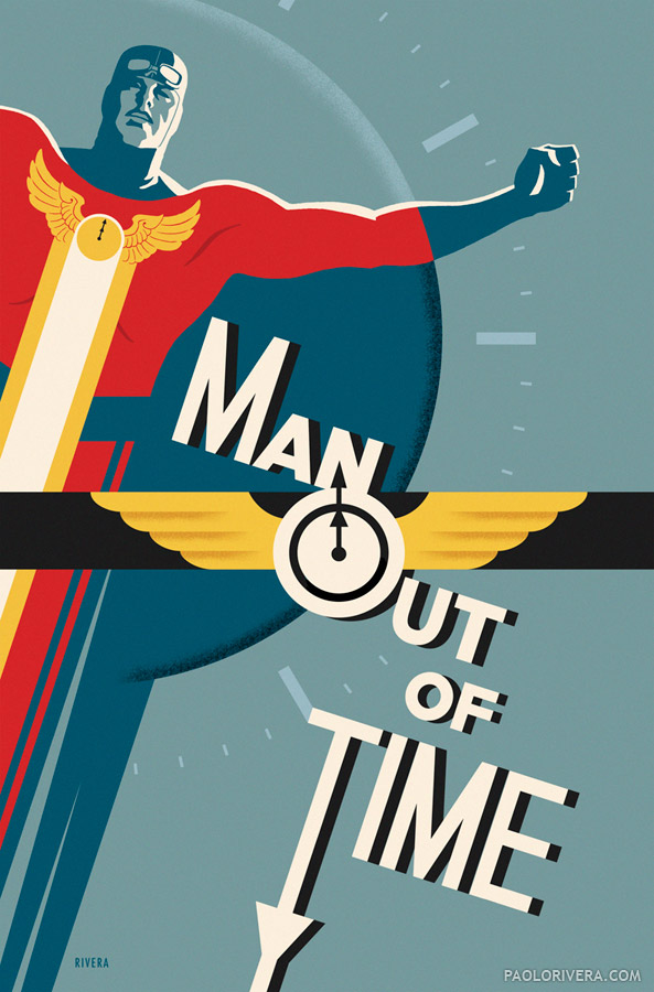
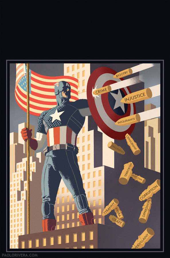
Captain Midnight #1 Variant Cover. 2013.
Photoshop, ~7 × 10.5″ @400 ppi. |
While Photoshop has always been an integral part of my workflow, I have nonetheless rendered all my finished pieces with the classics: pencil, ink, and paint. I am often asked why I don’t do everything digitally — the easy answer is that more than half of my income is from original art sales. (That’s usually all people need to hear.) The more nuanced reply is that I prefer the resistance, texture, and trials of real materials, not to mention the final look.
But in the past year, as I’ve taken on my first non-Marvel clients (I was more or less exclusive for 10 years), I’ve gotten the chance to experiment stylistically, even incorporating graphic design and lettering elements, a whole new challenge for me. The first 3 images were created for Dark Horse Comics, featuring their characters Captain Midnight, Ghost, and X.
 |
|
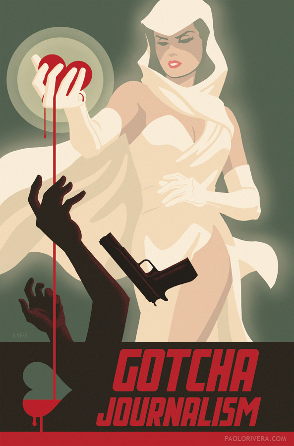
Ghost #1 Variant Cover. 2013.
Photoshop, ~7 × 10.5″ @400 ppi.
|
The bulk of the work was done in Photoshop, but the more complicated shapes, like design elements and lettering, were constructed in Illustrator and imported as vector paths. I had recently come across a collection of Swedish posters (via 50 Watts) and wanted to try my own contemporary take on them. Aside from general color schemes and airbrush effects, I was particularly interested in the hand-lettering, and even lifted some of the letterforms.
 |
|
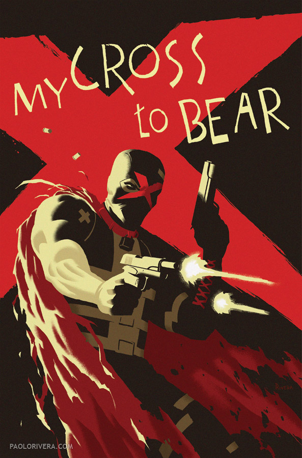
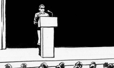
X #1 Variant Cover. 2013.
Photoshop, ~7 × 10.5″ @400 ppi. |
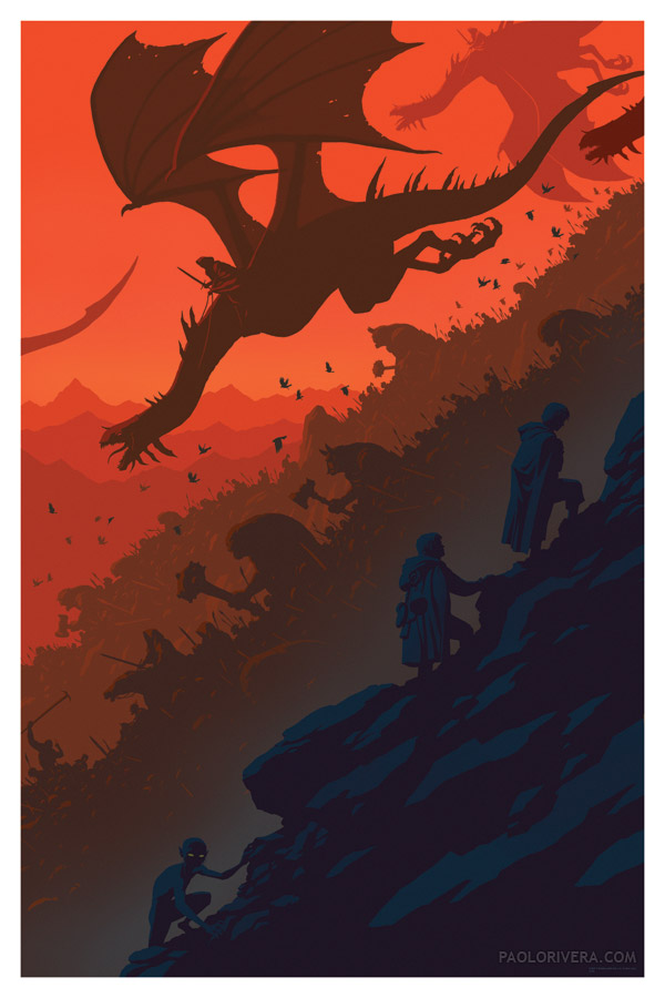
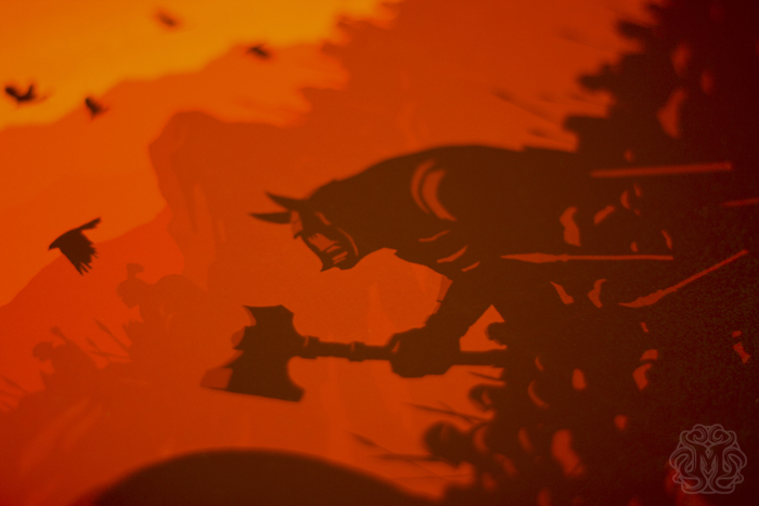
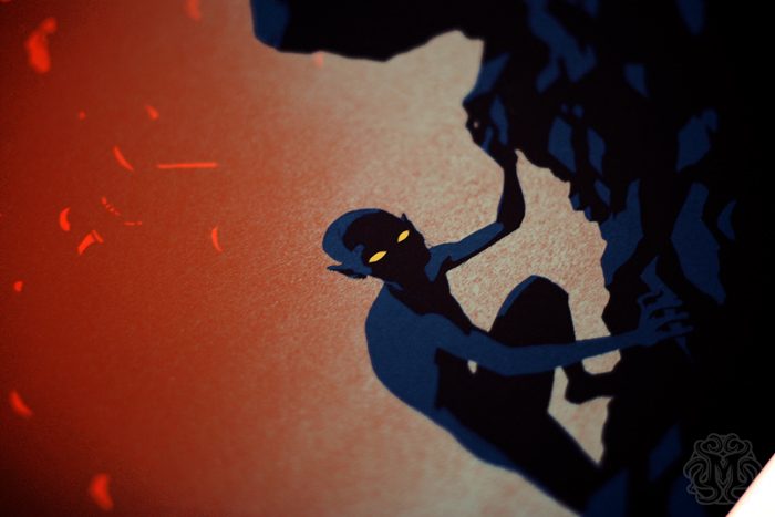
My first all-digital piece was for Mondo, an Austin-based gallery that specializes in screen printed movie posters. So even though the image was created bit by digital bit, they turned the file into a gigantic, limited-edition art print. The photos below are of the actual posters, courtesy of Mondo. (For those interested in buying a print, I will put them on sale in a month or 2 through my blog.) I’m currently working on my second poster for them, this time for one of my favorite movies of all time. I can’t reveal the subject yet, but I can say that it won’t be all-digital. I missed my inking brush.
 |
|
Precious Cargo (Lord of the Rings). 2012.
Photoshop, 24 × 36″ @400ppi. |



Congratulations on double Spectrum nominations, Paolo! These are all great, but I love that Ghost #1 cover…
HOLY SMOKIN' PAINTBRUSHES, Paolo…..I LOVE THESE. So direct, so lovingly simplified. I'm with David….that Ghost poster is fantastic. And the X cover…..and LoTR…..aww, hell…they're all great.
–“The more nuanced reply is that I prefer the resistance, texture, and trials of real materials, not to mention the final look.”
Man, I hear ya. You're exactly right, and that reality will always stay intriguing and compelling.
But….what's Brasgalla talking about…..with Spectrum? Can you brag?
Greg
Wowww! I'm definitely buying that LotR print! It's just stunning!!
I love the others too, especially the Ghost one. I also really like what you did with the lettering and the composition in Captain Midnight!
Thanks, Dave and John!
And thank you, Gregory! The Spectrum news is that I got 2 nods amongst the recently released nominations. Here's crossing my drawing fingers. The competition is stiff (and even includes a colleague).
Wow! I think that “precious cargo” is superb. Awesome work.
Thanks!
The “Captain Midnight #1 Variant Cover” is perfect.
Beautiful.
Thanks, Phesten!
Great work Paolo. For the Precious Cargo poster did you work at full size for the original image (ie 24×36″400ppi, 14400x9600px). My steam powered Mac dies when I work on posters.
Cheers
Craig
Thanks, Craig! Yep, that's precisely the file size (I usually try to list dimensions whether it's traditional or digital work). But yeah, things can get pretty slow sometimes. The nice thing about these posters is they were mostly flat shapes, which cuts down on processing.