
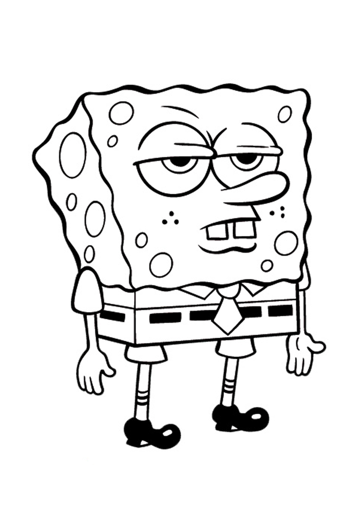
Step 1 : Here’s the coloring for kids we use for the exercice. I don’t own any right on this picture.
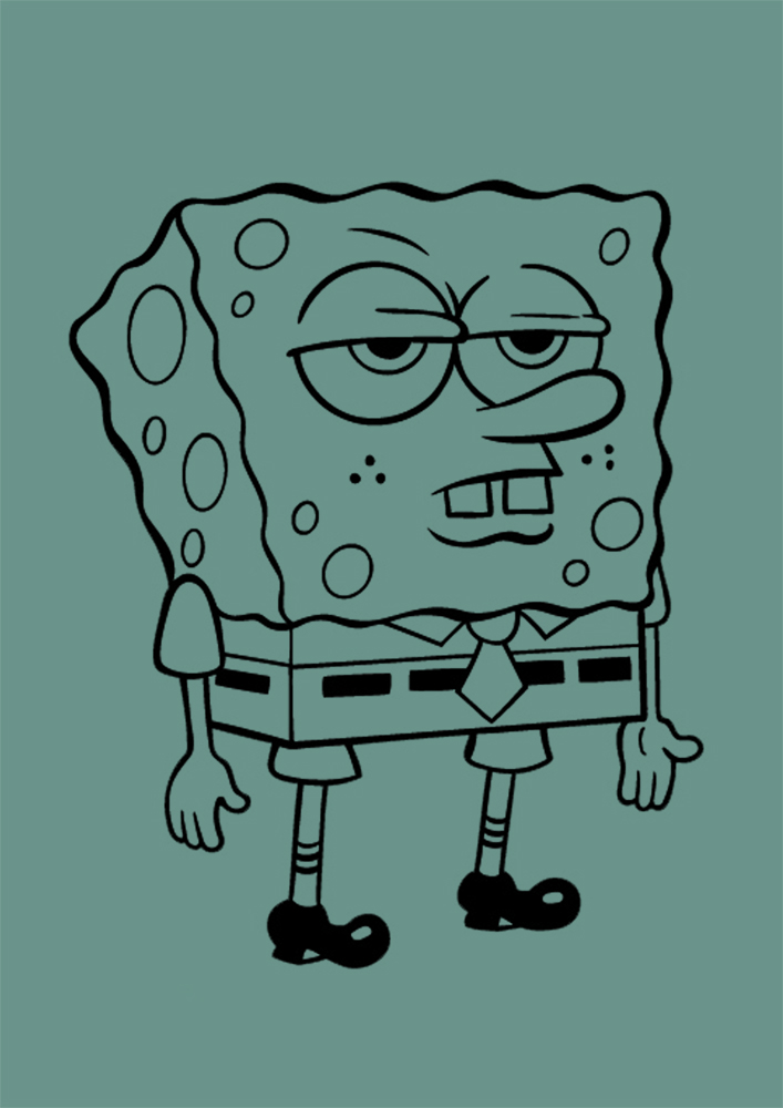
Step 2 : I choosed my ambient light. The sketch is on a multiply layer on the top.
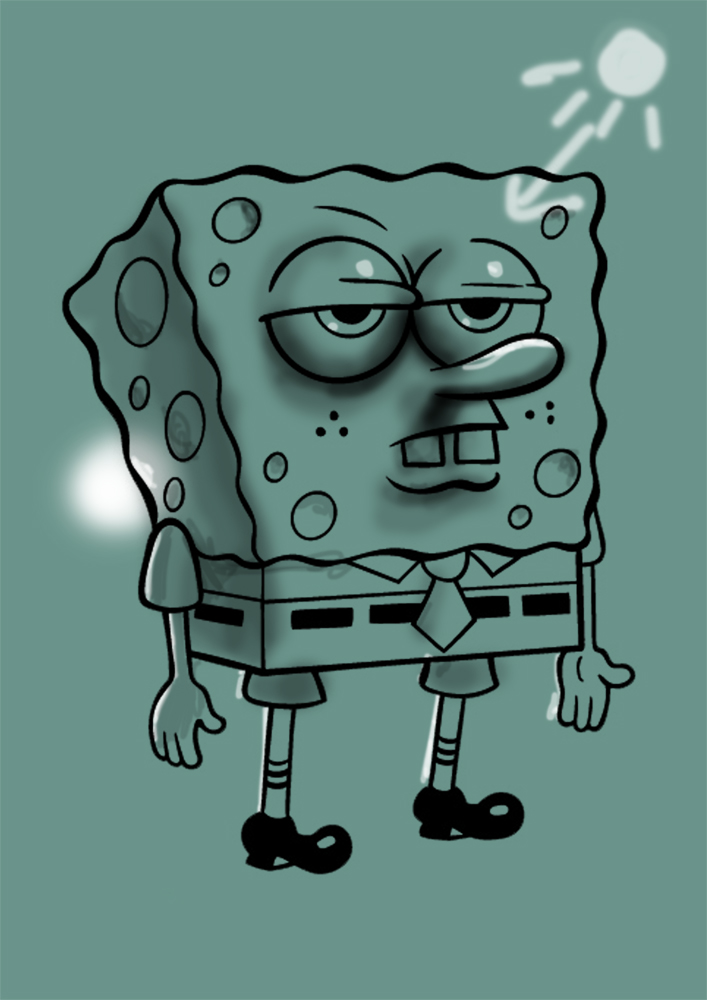
Step 3 : I choosed the direct lights.
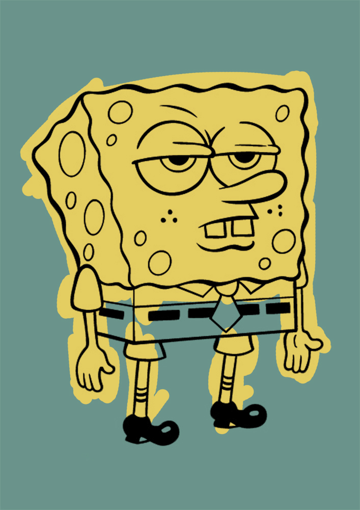
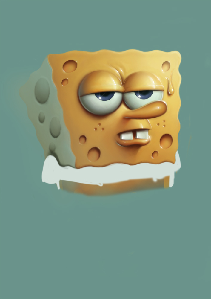
Step 4 : I did a solid swath of yellow. I choosed this yellow accordingly with the background color.
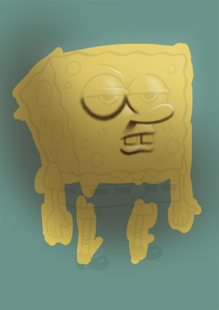
Step 5 : With the soft round brush and a very low opacity, I painted the darkest parts and the shadows. I decreased the opacity of the layer of the sketch.
Step 6 : I tried to find my middle tones. I added a little bit of red.
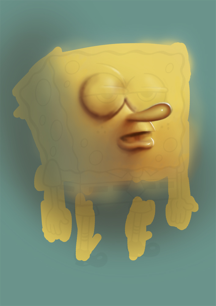
Step 7 : I started the eyes and the teeth on another layer. I don’t use white but a very bright blue/green. I used the background color on the side of SpongeBob.
Step 8 : I did the eyes and the pupils and I tried to fix the contrast and the colors.

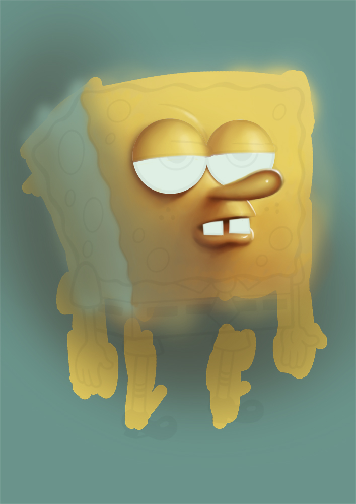
Step 9 : I used the eraser to define the edges. On another layer, I painted a hole and I duplicated it several times, changing the size each time.
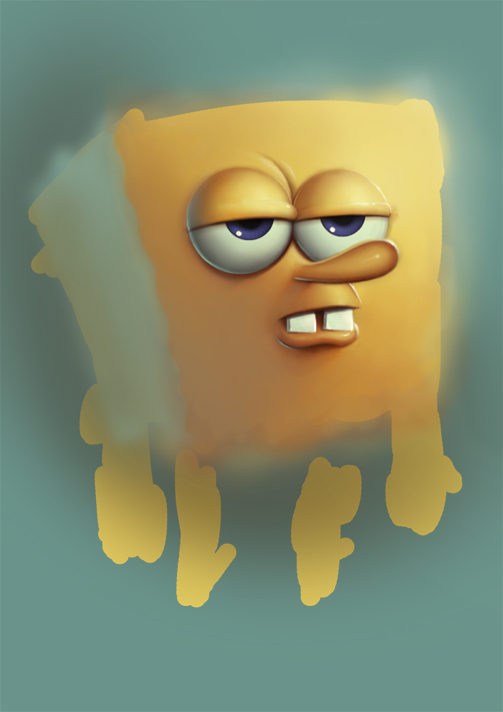
Step 10 : I made him a little bit more reflective. I started the shirt.

Step 11 : The hands and the shorts.
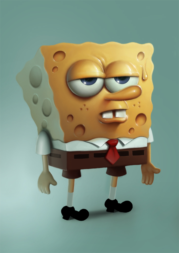
Step 12 : I did the shoes first step. I added the retro light and a bit of shadow on the floor.
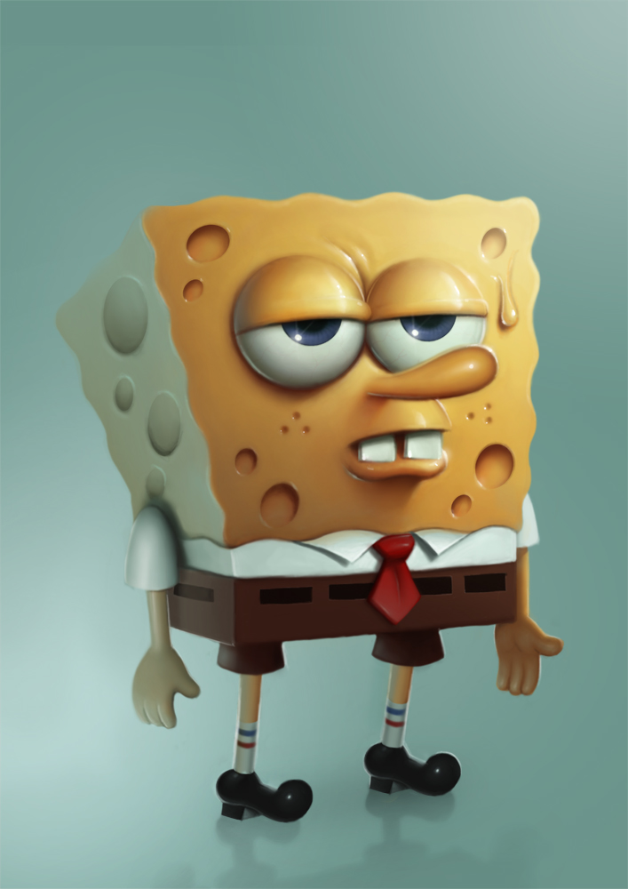
Step 13 : I painted the reflection on the floor. SpongeBob is finished.
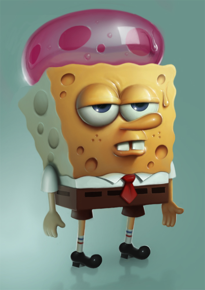
Step 14 : Jellyfish first step. I created a lot of layers for the transparency and the reflections.
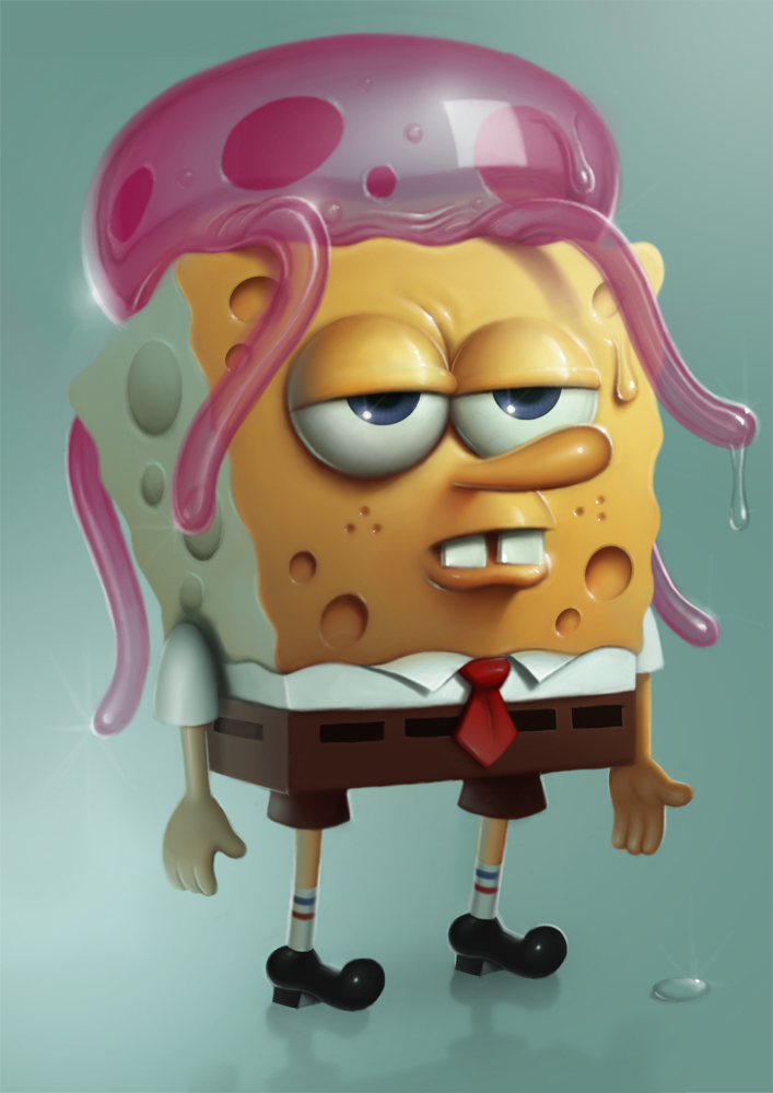
Step 15 : Last step : I added the tentacles.


You make it looks easy! Great image and really nice to see the process like this. Thanks
Merci Mr serge !
Ah, I love the way this came out. The only nitpick I have is that he looks a little more like a block of wet cheese than a sponge?
True … But don't forget I'm french 😀
Step 4: “I choosed this yellow accordingly with the background color” How? what do you mean?
Same saturation 🙂
Step 5: ta une ombre qui prolonge le nez mais vu la source de lumière, elle ne devrai pas couvrir le nez?
Pour ta “middle tone” tu fais quoi précisément ?
Est ce que la zone d ombre de tout les éléments présent on la meme quantité de noir?( par exemple tt tes ombre son a 20% de lumière). 🙂
Toujours aussi éxélent. Merci de partager votre savoir ! Vous mélangez combien de couleur maximum dans vos dégradés ? utilisez vous le noir et le blanc ?
Thank you for this process write-up!
What kind of layer types are you using (normal, multiply, overlay, etc.) for shadows/mid-tones/lighting and adding reflections?
I am always in awe of your clean shapes and smooth renderings. Nice to see a glimpse of the process work. Thanks!
Never too old!*Says the guy who draws cartoons all day*
Lucky you 🙂
How was your trip back home ?
No, only normal layers 🙂
Thanks 🙂
J'ai pas de maximum 🙂 3 ou 4 suffisent généralement 🙂
Le nez est dans l'ombre, sans doute moins que nécessaire, certes 🙂
Je n'utilise pas de noir dans les ombres,seulement du marron. Je t'avouerais que je ne fais guère attention aux pourcentages 🙂
De rien 🙂
Thanks a lot, Dean 🙂
Ton jaune de départ n est pas ta middle tone alors? Et le fait d utiliser un peu de rouge sur ton ambiant occlu c est au feeling ou Une sorte de règle . Sinon merci pour les réponse et le tuto :). ( perso je te demanderai bien de jeter un œil sur certain de mes painting si un jour tu as le temps)
Great stuff! (As usual.) Getting some insight into your process is very instructive: thanks for sharing.
Damn you made that look so easy: I might have a play in PS when I get a chance. 🙂
Tres bien et glace a la fraise!
(Sorry, just showing off my french skills… :P)
You're welcome 🙂
Yes, PS is an incredible and easy tool !
Impressionnant ! 😀
Oh Ok! so you picked your base background colour, adjusted the saturation to what you wanted(ie -52), then you picked a yellow on a new layer and then set the saturation to the same ,-52?
On step 12, do you add the lightning with 3d or is it painted? 🙂
sweet dude,no offense but your english is quite funny :D,well you are french so its understandable,i was wondering if you could show us your students versions, and of course an excellent work as always
Painted, I don't use 3D 🙂
Yep, sorry for my english … I will get all my students's pictures soon 🙂
you should consider doing a video process of this. i think many would benifit from seeing how it was done rather then being told. amazing work however im a big fan of your stuff! your style of shading is amazing and it blows my mind every time i look at your gallery on DA.
also sorry for the second reply, but to add to my previous message if you ever do a video process people can view over and over again. (not like live stream) you should explain why your using the brush your using what colors your using when you use them and why. so on and so forth….
just imagine we are all 5 year olds that dont know any better. not to say were all that intelligent but i think it would make for the best learning experience.
I did one on Livestream but you can see it again and again 🙂
http://www.livestream.com/sergebirault/video?clipId=pla_058a44c7-6d3a-46b9-a426-443d00b0d66b&utm_source=lslibrary&utm_medium=ui-thumb
Well, I don't use any tool for that but yes 🙂
Oui, au feeling, ça marche mieux 🙂
Ok cool…How do you get the same saturation without the saturation tool(In PhotoShop)? Sorry I'm self taught on art tech so maybe I'm asking a stupid question.
Serge – Thank you so much for this! Between your step-by-steps and Matt Kohr's videos, I'm finally making some progress – http://heliotropicsquirrel.deviantart.com/art/Spongebob-Painting-001-369829695?q=gallery%3Aheliotropicsquirrel&qo=0.
I love your work!
This is how all likes this chracter and now here is good news for the lovers of SpongeBob that his new upcoming film The SpongeBob Movie Sponge Out of Water is now going to released on this this 6 February and you can also enjoy this by Watch Online Free The SpongeBob Movie Sponge Out of Water .
Hermano un gran trabajo, nos inspiras
Gracias por el proceso … Buen trabajo
Hi Serge, it's me Vini, from Rio de Janeiro. We meet at in your workshop. Great! When you do the next workshop in Rio?
I was the man with leather and motorcycle helmet!
You're never too old for sponge Bob… Great demo.