In photography, lenses are typically separated into three groups: Wide, Normal, and Long. Each group has unique characteristics which might make it ideal for certain situations and problematic in others. More directly, each group has a *feel* to it which has a tremendous influence over the feel of the image produced. Choosing the right type of lens for the project is among the first steps in creating a great image. These concepts are equally important in narrative painting.
I want to make clear that this is not about shooting reference. This is about using some photographic concepts to help guide the composing and concepting of our drawings and paintings. Asking what lens best suits your intention can help jumpstart development on thumbnails, improve sketches, and hopefully avoid a tonal mismatch between intention and result.
In my photographic experience I’ve spent most of my life using zoom lenses and, if you are a typical modern camera owner, you have likely done the same. Generally zooms will cover two if not all three groups giving the user convenience and flexibility. Paradoxically though, that tends to make us lazier in our decision making and possibly water down the results. I never fully understood this until recently when I began taking an interest in non-zooming prime lenses and, perhaps not coincidentally, enjoying photography as more than just a method of recording light and anatomical information for later use. Choosing a fixed lens compels you to actually think about what kind of shots you want and how to achieve them. As tends to happen in exploring a new medium, this has caused me to re-examine these ideas as they relate to all images.
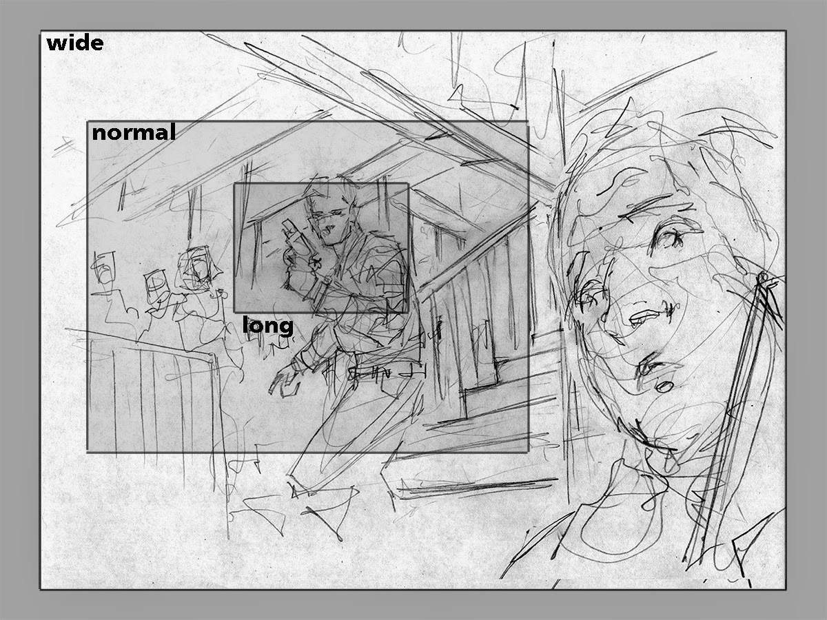 |
| How the scene might change with different lenses if we keep the audience locked to the same point of view is no different than cropping |
The difference between the three groups is how broad or narrow an angle of view we see when looking through the lens. A wide lens will give an expansive view, a normal is roughly similar to how we actually see without excess peripheral vision, and a long lens will show only a portion of our normal view. Cropping a photo kind of simulates having used a longer lens because the perspective and relative scale in the picture remains the same. This touches one of the key principles to understand though: zooming a lens in, choosing a longer lens, or cropping all achieve the same basic result because they maintain a consistent point of view as represented in the above image. On the other hand, we could physically move closer to or further from our scene and the result will be a change of perspective and relative scale in the picture. As seen below, a subject framed in your lens (in this case the foreground figure), assuming that you keep that subject framed the same size between all three lens types, will look dramatically different in relation to the environment depending on the lens type.
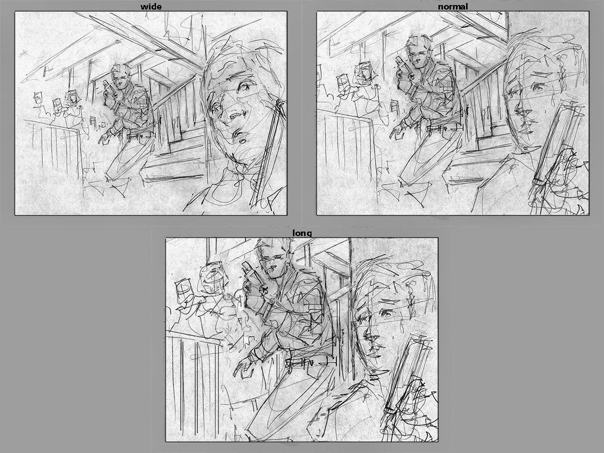 |
| Maintaining the same narrative scene, the feel changes dramatically as we shift lenses because our viewpoint must move. With a zoom, you might just take the shot in front of you. With a premeditated choice of focal length, you have to position yourself in order to properly frame all of the wanted information. As we switch to normal and then to long lenses, we as the viewer get further and further away to fit everything into the frame |
So that is all well and good for shooting photos, but what does any of this have to do with paintings? Quite simply, the wider a “lens”, the closer we as an audience will feel to what is happening in the scene. In addition, the wider a lens the faster space will appear to recede which will result in an exaggerated depth and potentially more active and dynamic images. Therefore, making the conscious choice can mean the difference between feeling like we’re a foot soldier in the thick of a battle or like we’re the general overlooking the battle from a safe distance. On the subject of action scenes, one of the frequent comments that I give when reviewing portfolios from students is that we need to get closer to the action. I give myself the same crit very often when sketching. Does it look exciting enough? Get closer! But because of the reasons given above, getting closer does not just mean cropping tighter. That will enlarge the action but it will still feel as though we are slightly removed. You have to actually get physically closer to exaggerate depth and crank up the energy in your composition. Getting closer means using a wider lens to maintain the full scope of the scene.
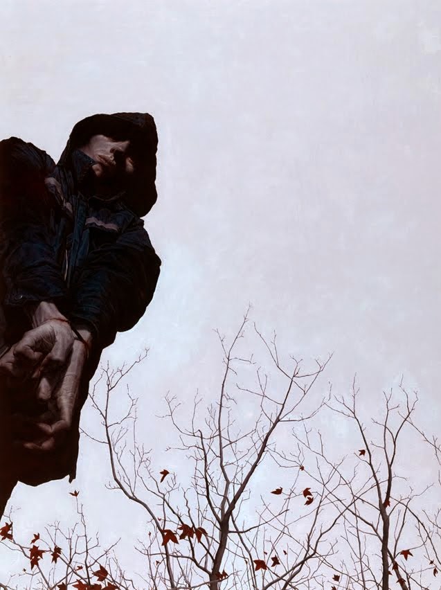 |
| Jeremy Geddes using a subtle but effective wide angle view to push the drama and emphasize the bound hands |
Personally, I believe that using a wide lens well is the most challenging of the three categories. Done well, it can give intense intimacy and put the viewer in the scene. Uncomfortably so. The wider you go, the crazier things get. This likely either means invading the personal space of your subject (and distorting the subject in the process) or placing the subject in the middle ground with foreground objects exaggerated in size and giving the viewer context of the space which they occupy. If you are doing an action scene or want to ratchet up the drama between characters, this is the take-no-prisoners way to do it. In wide angles, our vanishing points are closer together relative to the field of view so architecture will have exaggerated swooping angles that recede quickly and foreground figures will distort.
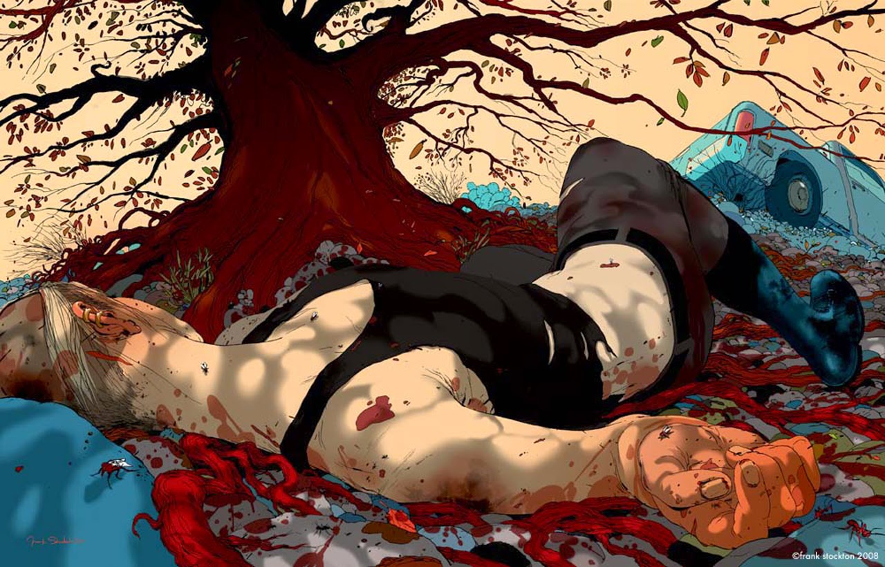 |
| Frank Stockton using wide angles like a boss |
Some artists tend to do very wide angle pictures which do not have the intention of thrusting the viewer into the middle of a kinetic scene, but rather to get an epic panoramic view. In terms of lenses, this can feel a bit ambiguous between wide and normal. The important distinction will lie in how much depth can be depicted, and how close we feel may rest heavily on use of foreground objects.
 |
| Syd Mead maintains a sense of connection to the panorama before us with the use of the flowers in the foreground to lead us in as well as the relative scale of near and far figures |
 |
| Michael Whelan presents a breathtaking view with a more distant feel due to our separation from from the nearest foreground element. Because natural landscapes are difficult to read for scale clues to understand how fast the space is receding, we are given help in the form of the tiny far off figure which enhances the drama and scope by relative comparison |
Conversely, maybe the scene is one that calls for a more orderly, stately, or designed point of view. In this case we can step way back and then crop in, which is to say switch to a longer lens. This look tends to flatten space for a more structured and compressed feel.
 |
| Donato, a master of arranging figures and objects to create pattern, shows how a long lens can compress space for the purpose of strong design and yet still deliver an active scene |
This option is often heavily about design. The results feel more planned and less kinetic. Because we are further from our subject, they will be relatively similar in scale to what is surrounding them. The space of the picture will have a compressed quality to it which can be used for more geometric and analytical perspective and compositional tricks. The viewer will feel safer in dangerous scenes as they do not share the space with the subject. Vanishing points will be very very far off the edges of the picture for minimal architectural distortion. This is also generally what works best for close up portraits because the subject will not distort and background elements can be more easily controlled and arranged to frame the subject.
 |
| Sam Weber uses a long lens view to give this scene a very graphic punch. Despite the minimalist environment, we understand the space through the scale comparisons of birds, figure, and tree combined with the lack of distortion in any of these elements. They sit stacked on top of each other in such a way as to flatten out the space and make everything feel beyond our reach |
And in the middle we have relatable scenes observed from a comfortable but still inclusive distance. Our normal lens represents where we might place ourselves as casual onlookers. This choice is our human default position which, like all compromises, you’ll find is often the balance needed for your picture with nudges towards a wider or longer feel.
 |
| Karla Ortiz places us perfectly in the scene. The feeling is intimate and yet completely natural, giving the moment tangibility and just the right level of tension |
This general purpose option is the standard for most natural view situations. You will feel close to your subject without invading their space or going full tilt on the energy level. Alternately, you might use this approach if you want the viewer to feel somewhat neutral in the scene: present but not a participant.
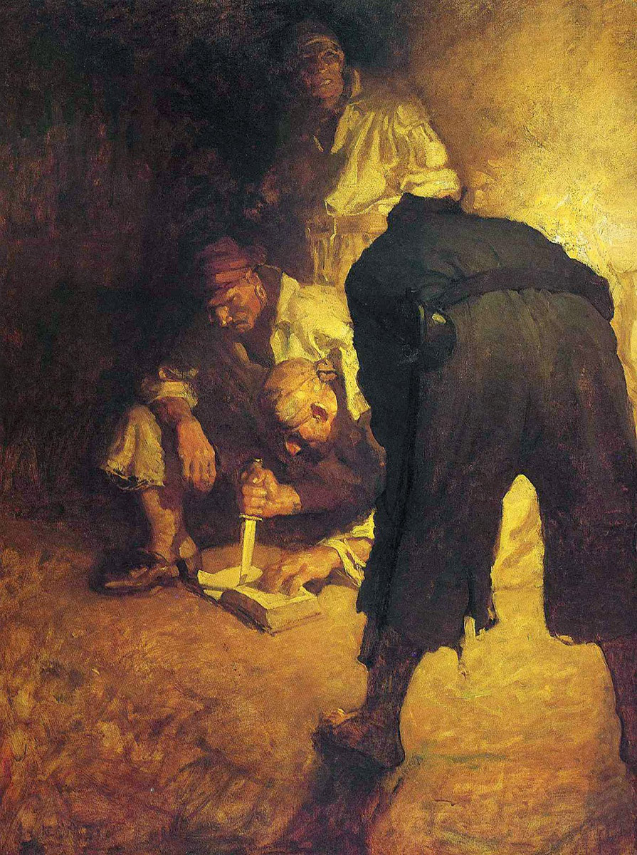 |
| NC Wyeth delivers a voyeuristic scene through the use of a Normal lens field of view. We feel as though we are in the room and yet outside the situation. Three steps closer and we would be looking over the pirates shoulder with a wider view and it would dramatically change the narrative. |
When I begin planning a new painting, I keep these principles in mind and ask myself: “How close or far do I want for the viewer to feel to the scene? Can I push that feeling even further? Is the tone immersive, natural, or compressed?” It is a good check before deciding if my sketch is ready to move forward.
So, how close or far do you want for your viewer to feel to the scene? Can you push that feeling even further?

Wonderful post! This is very informative and helpful with great examples of your discussion points. Thank you for sharing this!
Great post Dave and great seeing you. Thanks again for the incredible cover.
Dave, this post has really helped solidify my understanding of this concept. Thank you much!
Thanks guys!
http://www.oyunoynaaraba.com/oyunlar1
This is very insightful! I recently returned from a sightseeing trip in England and Wales, I took only a 50 mm prime with me. It definitely forced me to make decisions about my shots that I wouldn't have been thinking about with a zoom lens. I've never thought too much about how those factors should play into my illustrations, though.
Jameson Gardner
I love that whelan piece, its beautiful!
Thank you David! It was very helpful!
Jameson, totally! I did the same about on a trip to Europe with only a 40mm and it really opened my mind up on composing shots. Canon had just recently released the 40mm pancake and I thought I'd be more inclined to take photos if I had something so light and portable since my biggest hurdle at that time was feeling awkward just taking the camera out of the camera bag. I'm sure I agonized over what shots I might miss when leaving the zooms at home, but I didn't regret the choice for one minute during that whole trip. A great experience of restrictions pushing me to make more creative choices
Awesome post Dave!