by Greg Ruth
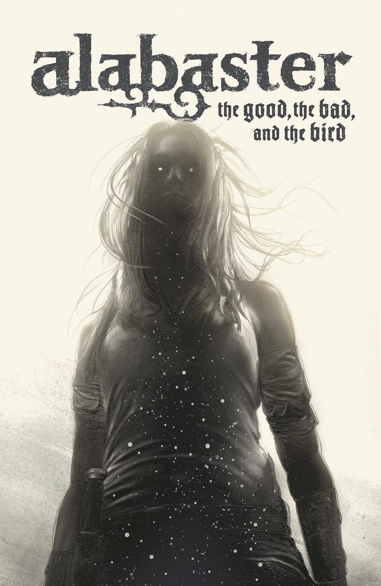
So this is my second series of covers for Caitlin Kiernan’s remarkably fun, dark and horrorific series, ALABASTER for Dark Horse Comics and Books. This new series of five follows on the heels of six previous pieces and carries the growing burden of needing to continually desiring to one-up myself on these. I’ve done a ton of book covers so far my career, and in many ways these are among the most fun to tackle and the most challenging. The story material is classic southern gothic horror set in contemporary times starring Dancy Flamarion, a white haired albino lesbian heroine who hunts down monsters with a big kitchen knife with the aid of a talking crow and a demonic seraphim. So clearly something right up my particular dark alley. These were a touch unusual for comics covers in that I executed the entire series more than a year a go. This kind of time lag between art to print is normal for the book world, but not for the comics arena. It means they have to pay out for all five covers without the prospect of recouping costs through sales the way most other projects do. But Dark Horse was committed to the series, to Cait and while it did roll on a bit longer due to a switching of the interior artist, we now finally have these things rolling on out.
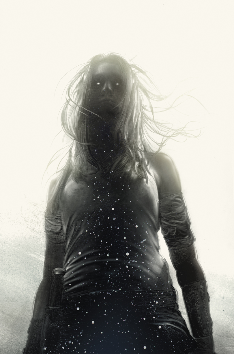
When we kick off the new series, Dancy is dead and in the underworld, black with stars and lost in the weird whiteness of the place. So this first cover was an obvious notion. I had recently become really enamored with using graphite pencils, particularly the holy trinity of the Blackwing Palomino, the 602 and the Pearl along with the Staedtler allXwrite.
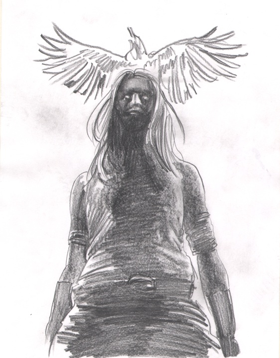 So as always we start with a sketch. I usually just whip up something quick on a piece of printer paper and scan it and send along with the necessary apologies for the craftsmanship and explanations of what it should, but may not indicate. This is really the stage by which I get to try out notional ideas and then discard them. The bird here was the first casualty of this process and for good reason- the title bar. When you’re working on covers- especially and more easily comics covers as they tend towards a similar familiar layout (bullet and logo at top left, cover across from top, upc code at bottom left, etc…), you need to keep in mind where the title treatment is going and where the author illo credits will reside. I cannot encourage this thinking enough- it makes for a better piece if you bring them into the overall composition, and it saves your AD a lot of headaches in making you move things or have to shoehorn them in themselves. My method tends to be creating a layer template with all this and drop it in over top on and off to make sure I’m playing inside the fence line. It may seem like a giant pain in the butt at first but boy howdy does it save your ass later. Trust me on this.
 What I love about this wee family of pencils are the various aspects, qualities and darknesses of them- GREAT for this kind of work. SO much range in tone really helps to build up the image in a similar fashion one would do with paint, though inverted. THe Palomino let’s me get SUPER dark when I want, and the Staedtler allows for the most gossamer of wispy lines when the opposite is desired. I did however make the mistake of undersketching the final drawing with a light blue colored pencil both to hopefully give the original a kind of ghostly glow and that would disappear when it came to print- both were wrong and I will never do it again. Looks terrible and the waxy surface of the colored pencil made it hard to recapture some of the blacks the Blackwing is famous for. Not every experiment works out, but all failures are remembered.
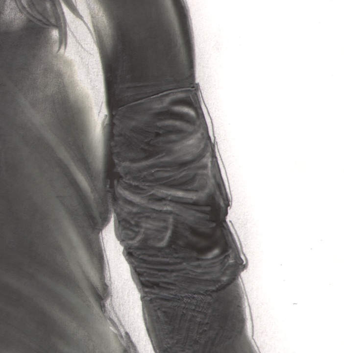 Since the paper I like to draw on, a really loose Strathmore cotton rag that catches the graphite really well, is fairly thick and soft, heavy pressure can create these little valleys and dips in the piece. At first I thought this was a deficit of the paper but I came to realize it could be kind of great if utilized in the right way. So… experimenting with this new approach I applied this to the piece and scanned the final drawing in in a way hoping the scanner’s light would catch these tiny ridges- and happily they did.
 So now that we were all digitized and ready to roll, it was time to tweak the lights and darks add details I may have missed, etc… I knew going in I wanted to apply a few things going in: Dancy is described in this issue as all black and covered in stars. That was the most obvious and anticipated application- black paint scattered across a sheet of paper, inverted and dropped in over the scanned art aster the values had been fully established. Other details like the eyes, whisps of hair in front of her face, and some small hints towards color were next to wrap up the final. Even when you’ve got a fully black and white image like this, it will get printed in color, so it never hurts to exploit the deeper levels of tone by warming or cooling the overall piece and making those adjustments. All of these digital details were done in RGB in photoshop, then transferred and readjusted to CMYK in anticipation of it going to print. You want to do this yourself and not leave it to the folks in the bullpen to sort out- they don’t know what your intended color levels are, and the benefit of sending files to your publisher digitally is being able to secure correct color values that can get lost in re-photographing, not to have those values undermined by what you will notice as a serious change in this conversion. I find RGB great to work in, natural and perfect for this stage of things- but print is always done in CMYK, so make sure to change it yourself, and to tweak the values and tones to your liking. You’ll be glad you did later.
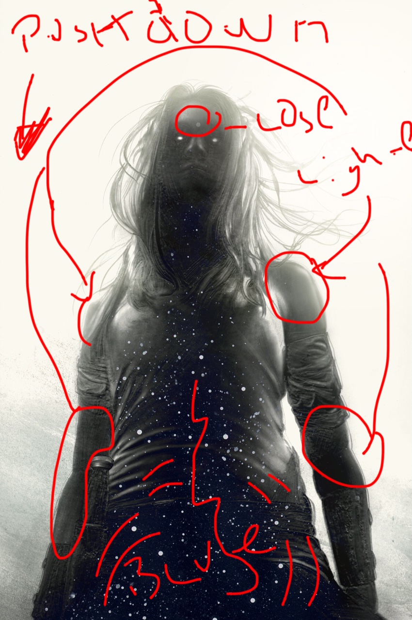
In this I had a few things that needed fixing, incidental third eye problems, some other details tweaks and changes… I got those while on the road someplace but happily via my handy dandy ipad sketch program was able to make notes on the jpeg and email it to myself so it would be waiting for me int he studio when I got back after the holidays.
SIDEBAR PONTIFICATOR:
*My general use for photoshop is as a glorified paste-up machine and my guiding rule number one is to avoid anything that can’t be done in a darkroom. if you want to apply an effect, take advantage of some new way of blending or ghosting an image- it’s a great program for exploring and sketching out the idea. not so much for the final though. ALWAYS better to execute that practically- you’ll like the results and the viewer will notice the difference even if he/she can’t immediately identify it. Photoshop can be the siren that sings you to shipwreck on the shoals of mediocre work that looks like everyone else’s- so I’d just avoid the fancy filters and parlor tricks entirely. If you’re piece isn;t working with out the bells and whistles, it isn’t working. Wall paper fancy digital tricks over it won;t hide that fact and in reality points to it more firmly. Kind of like when a kid thinks covering his eyes makes him invisible: regretfully, it does not.
So cover one is down and we’re off to the next few. As I mentioned, this project was unusual in how early I was getting a chance to tackle these covers- in comics the publishers like to push things right up to the limits so as to help defray buy in costs of a book with quick returns when that book hits the stands a few weeks. That ER vs. Surgical Ward esthetic can be harrowing and fun as it affords little time to do anything but fire all thrusters hard and fast and move on. But I have come to appreciate having longer amounts of time not to necessarily execute the piece itself, but to leave it alone, come back to it with fresh eyes later, and so on. While my previous series of covers of the Alabaster all utilized the sumi ink and brush, I did want to tackle this series with my newfound love of graphite. If it didn’t shake out, I had time to reorient and work back with more familiar tools. But these pieces have always been for me a chance to explore and push the comfort zones. In this regard especially I’m glad I had the time to do it, find the right path forward and execute the work accordingly.
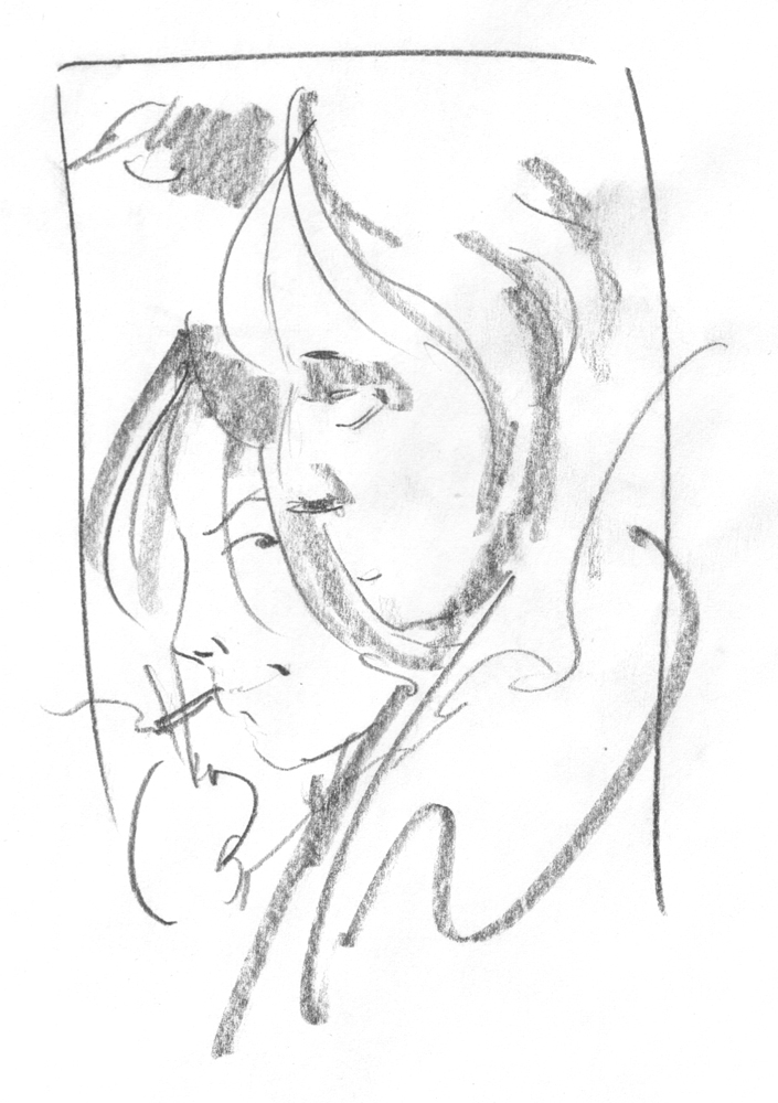
And so, with the first cover out and ready, it was time to move on. And of course reinvent it all over again. We were going to be showing another character on the cover here, but Dancy always has to be there as well. And the bird. But Dancy’s dead and in hell and making a cover work with three characters that doesn’t look like a Marvel Mashup splash page can be tough. My first thought was to show these two together- one alive and another as a statue in a southern graveyard. The bird would light upon wherever. My first swipe at it was this closeup Mag-7 style look, which I swiftly discarded for a thousand reasons- largely compositional ones. And frankly it seemed essential to show the boneyard and give us a sense of place here given the lack of all this in the previous cover. When you have a series like this, it’s important to consider the music of how they will all of them sit and regard each other. They don’t have to be gimmicky and form a larger picture or reveal some secret- though that is cool when it applies and is made to work well- but they should be seen as a group, rather than individually. They do have to work standing alone, but your reader is going to prosecute the poop out of you if they see you using the same tricks repeatedly. Your AD/Editor will notice this too and it could impact you getting the next block of work. (To see a similar tool bag used in insanely variable ways, I cannot more highly recommend checking out Scott Fisher’s inarguably insane set of covers he’s doing for Dark Horse’s ANGEL and FAITH series. They are all wholly unique and highly orchestral with each other. No AD can look at this one slice of his body of work and not see all his potential for any assignment you can throw at him. He’ll be dining and working off this run of covers for years to come- so make sure you dance well and furiously when and if you get such a chance).
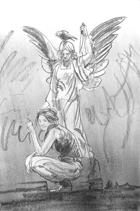
So- I went in and did another sketch, one instantly approved and with a clear path to execute. It was a bit more iconic, even Greek statuesque, but it made much more sense for this particular issue and compositionally did the job vis a vis the title and credits stuff I mentioned earlier. I also wanted to bank the close up shot for another issue later. For some reason I always thought of this as my Dan DosSantos piece. Maybe it’s his crazy trailer park zombie covers sinking in… in fact I’m sure it is. Whatever the reason I couldn’t get that fellow out of my head. I find it’s best to hug that than fight it- Dan is a good friend and I think what he does he does better than anyone, so clearly there’s a lot to learn and use. The trick is to be of the notion of another artist without duplicating. Maybe it’s the rough handsome woman with a smoke that triggered it- who knows. Like I said shrug and go with it. You could do a hell of a lot worse than ape the DosSantos.
Also with this series I have my editor acting as AD and Cait, the author chiming in on the pieces. Normally an editor will keep some distance between the author and cover/interior artist =for various reasons not the least of which is cross communication confusion syndrome. But I have worked with Cait before and we have a nice rapport, and this is her baby so we all three of us rule and argue over the details together. Cait will often bring in details I may have neglected small and large )i.e. that bird is too small- or as we did later… “The twins are two girls, not a boy and a girl you goofball”. For the record she has yet to actually call me a goofball to my face, though I have often deserved it.

Next up- draw the damned cover. Once again, graphite on paper and big- about 13×19″. I did not honestly know how much or what specific sort of environment we’d be getting into with the final, and while I usually don’t like leaving too much to worry over after the practical art is done, I decided to just stick to the basics going in on this one. The iconic pose, the statue, the crow… get that right and the rest will follow. I made some changes to the orientation of the piece- for the record this is a fine thing to do in this next stage even though it does definitionally counter what everyone agreed upon in the sketch stage. Reversing the staging was an obvious way to go since it flowed more as we read images here, left to right. The different pose meant a different relationship between these two characters and so we didn’t crowd the title treatment, the bird had to set upon Dancy’s shoulder here. I had come up on this big billowy cloud Franklin Booth thing for my work on the children’s picture book, COMING HOME, and I knew I wanted to scratch that itch again here. (I even brought it into the cover for INDEH as well- so apparently the itch still tickles. Again, don’t over-think it but be wary- I used a similar stars int he figure technique for a Tor.com project and while I think it worked great it also meant it was time to force myself to not use that trick again. This use of the cloud thing was less obvious but still… three times in, it’s red flag time. You don’t want to get caught too much in the tar pit of a schtick).
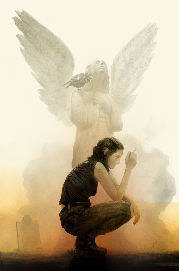 Next up was leaping right into the final. Now I do this as a method for myself and can do this largely based upon the trust and good graces of my editors ( in comics you almost always work with the editor as AD, the AD is never really heard from- in books the opposite is true), my generally fast speed, and my willingness to redo the final accordingly as to need. I find this works best for me- it may not for others, and it can mean a lot more work for me as the artist but in the end it also means a lot better work. Also with sketches and thumbnails I find there’s a trap of anticipated execution that can slow everything down and gum up the process as you are essentially spending a lot of time assuring the editor of your intentions not conveyed by the sketch. I find getting right to the final helps cut that off and leaves us to wrestle with what is rather than what might be. My first go was to go warm- it’s my natural color family of choice, the warms, but because of this I nixed it as an approach. It works and I still even now looking at this for the first time in almost a year, may even in many ways prefer it as a knee jerk reaction. But one of the other benefits of a series is that you get to try new things out and if they don’t work out perfectly, then you get to make up for it on the next cover. While I do love this version, it is not quite as fitting as the next approach. My gut prefers it, but my head knows better. They aren’t always in agreement, and in the end, we are not monkeys slinging our poo, and the head must win.

I honestly sat down and asked myself what color tone had I not used in this series so far… turns out it was blue! So blue it was. The nice thing this did aside from knock me a bit off my comfort ledge- and frankly my preference for black and white work generally means color almost always does this- the cooler tones also gives us a cold chill and fits the time of day perfectly- that cool morning dew-fogged swampy ness. It also meant getting a chance to bring in that giant burning through the mist sun thing you see down south especially around Savannah and the Bayou area. Which of course fit perfectly with our story. Of all the covers to date this one is the most classically design compositon 101 piece. Foreground middle and back… it’s the least daring overall but it works, and really that’s what counts most. Sometimes the old tricks are the best ones. And my theory for covers- especially in comics where the books are all displayed covers facing-out- is to consider the environment in which your piece will sit. Comics covers tend to be loud as hell, splashy and full of screaming colors and action designs. Things have changed slightly as covers have generally gotten better, but go into a shop and see for yourself if you ever find yourself doing one. it’s really important to know the jungle your cat is going to hunt in. A rack of comics covers is like the L train station at rush hour on Friday: loud, boisterous- even raucous and sometimes there’s an unappealing odor. (Not in the good shops though… but in the old days… sheeesh!) Anyways- one response to the noise is to shout louder, the other is more revolutionary and I find more effective despite being totally counter intuitive: whisper. In an army of people hollering the quiet place int he middle of it all can land like a hammer blow. Also centrally composed pieces like this in that environment can really create their own space in the melee, and pop out from the others. And that is in the end really the goal entirely for the cover artist: sell the book. Nothing else matters really- your job is to get a reader to pick it up and buy it for what’s inside. I know some who buy books solely for their covers- I have done this myself, but mostly it;s not about you except in what you can do to sell the story your covering. So be strategic, consider where and how and when your cover will land and be seen, and use that context to your advantage.
To follow the series and participate in the conversation about this new run and the ones that preceded it, you can find us on the Facebook HERE.
To order the first issue right this very moment, use this code: OCT150060

Amazing work, great post, and I love seeing your process…
and BTW, “Photoshop can be the siren that sings you to shipwreck on the shoals of mediocre work that looks like everyone else's” –no truer words have been spoken.
Thanks- photoshop tools, as awesome as they are, are so dangerous because they're so damned alluring. Anything that stamps out a fixed style should be avoided, whether it's some cool effect, filter, brush tool…. the best way to avoid getting stuck in the schlock temptation os to do as much work practically as possible, or avoid the common tricks anyway and anywhere you can.
I love this piece. I would also agree that reliance on photoshop trickery can (and often does) lead to disaster. The only thing I don't really buy is the idea that you (or someone of your talent level) couldn't do that exact piece completely in photoshop. Maybe that isn't what you are saying. But if it is I think there are too many great (purely) digital artists whose work disproves that assertion.
Oh no I don't mean to excoriate anyone working digitally- there are folks working in digital mediums now that absolutely blow my hair back in every possible way. I myself could never have created these digitally- it is for me a process that does not lead me to these places. But it does to others with incredible results. My warning is really to avoid push-button drawing, and relying upon tools and filters in photoshop or painter or any digital program to substitute for craftsmanship. There's no negative towards digital intended or anywhere in this or any article of mine. I love it when it's done right.
This series are amazing… i personally don’t like the feeling of working in photoshop I don’t have same feeling as working traditionally and I can see same thing in your work..it just makes me jump from my seat and go back.home.and draw some more.
“…and send along with the necessary apologies for the craftsmanship and explanations of what it should, but may not indicate”
LOL! ^_^
I agree with you on the avoid-too-much-trickery-when-painting-with-Photoshop thing.
And I do 80% of my illustrations digitally so I'm not hating on digital work at all, it's just the truth!
It can be useful in certain cases where your time frame for accomplishing something is extremely limited, so you MAY benefit from some filter/layer mode/brush (or you may not), but in the end the workflow in Photoshop should basically be the same as traditional, in its essence.
At least, for me.. I kinda use the same workflow I use with acrylics but with the benefit of layers and faster editing of mistakes.
I forced myself from the beginning to get used to paint in Photoshop with like 1 default brush and that's it and be able to complete a piece like that if it need be, and I found that (for me, not speaking for everyone here) it gets more enjoyable, feels more like painting traditionally and gives me some sort of constraint, that I need the medium to have when I paint.
And even then, it's a constant struggle to keep under control the too- digital-look of the piece.
It is a cool medium, but we should keep it under control and not be kept under control by it.
Anyway, I love your posts Greg, they are helpful and inspiring, and your work is just classy.
Thanks for the tips
I suspect a lot of the antipathy towards digital work is a combination of issues from both sides- the grouchy old get-off-my-lawn grandpa attitude that just sees anything not traditional as suspect and inherently bad, and the tendency to lean to hard upon the seductive quickness of the digital tools to stand in place of craft. But there's only a tiny smattering of work that isn't digital but looks like it could be (Brad Kunkle) or is digital but I would never guess it was, (Cynthia Shepherd). Aside from these rare birds, I find it's always easy to spot digital work gone bad, or an artist who tries to charade bad drawing or a lack of classical ability with digital trickery. At the end of the day it's all about to what purpose you put your tools to, and why. If it's done with a decisive intent towards a learned goal, you really can see it no matter what medium. Personally I am a physical tactile human and do prefer to see and hold a real thing in my hands. There's a veil of distance with purely digital work I don't love in terms of framed fine art. But that's like the angry grandpa in me. Ultimately visual art is a feast meant for the eyes and however one gets there, if its done well, it doesn't matter whether it's a photoshop tool or a dirty rag soaked in corn flakes. Just use your tools to execute a goal and avoid thinking of the tools as a goal and you'll be fine.
I love your posts Greg, they are helpful and inspiring, and your work is just classy.
Thanks for the tips