by
Greg Ruth
I grew up in front of the Creature Double Feature, Planet of the Apes Sunday Spectaculars, and Saturay morning westerns and have always adored movies and the Dollar Cinema was a bike ride away and a veritable museum of film art inside. IF you asked nice enough on Thursday afternoons when they were taking them down for the next run of films, they might even give you one. Now all grown up, one of my favorite aspects of my job is getting to tackle book covers, and lately even more so, movie posters. Some are fully licensed public ventures, others private individual commissions, some still are via directors or publishers… but all of them are opportunities to take a big narrative, and reduce it to a single image or theme. It’s a challenge to do this and each one is challenging in a different way. It prods me to really filter down to the heart of a given film narrative, or take a single aspect or moment, and the more iconic the film, the harder this can be. And the more fun. Here below are a handful of some of the ones from the last two years.
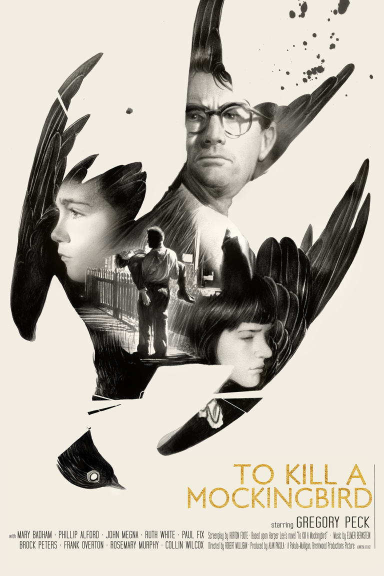
One of the most powerful films of my life and one of the greatest
films in history, To Kill a Mockingbird, has and remains one of the most
successful posters I’ve done, and was in fact the very first to do for the commissioned silk screen efforts. I had no idea what I was meant to consider with regards to separations for this silkscreen poster, nor whether or not my original drawing would upscale in an un-horrible way, but somehow thanks to help from Mo at Last leaf, Dayan and I managed to get it to come out pretty well.
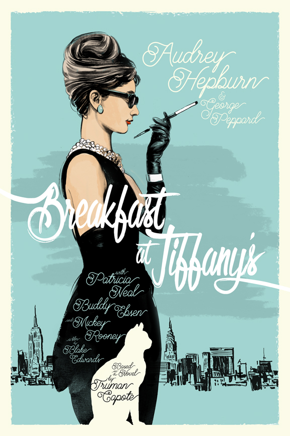
Breakfast at Tiffany’s was a totally different direction to swing the bat for me and was a chance to really go for something closer to the french poster designs of the 1930’s, It gave me the opportunity to try a full sumi ink style effort, and a sense of playful color and design that went outside of my usual wheelhouse. It was also the first moment I really started to realize, unlike with book covers where the AD held the power staff of title and text treatments, that I now had this particular power.
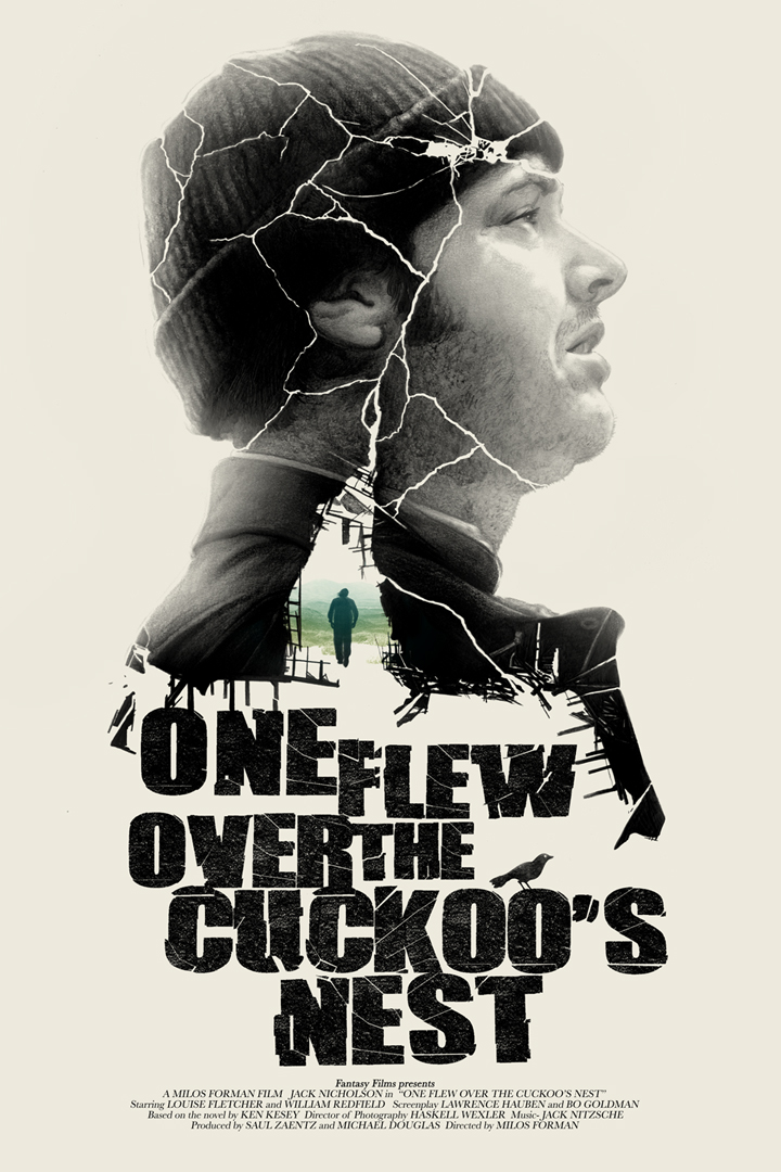
One of my favorite films and one of the trickiest images to create was this one for One Flew Over the Cuckoo’s Nest. Primarily because in many ways the film requires and demands a Nicholson portrait, but also wants to be something weirder and more psychological. For this I looked to the truly bizarre Yugoslavian and Polish film posters of the 1960’s and went right to this one. I thought it would be fun to let the cracks be the negative space for the drawing and well.. it wasn’t. Since the original drawing is on a cream colored bristol, and was slotted to go to a buyer I didn’t want to wreck it with paint or white out to cheat these crags. It came together in the end but not without a few tears and hand aches.
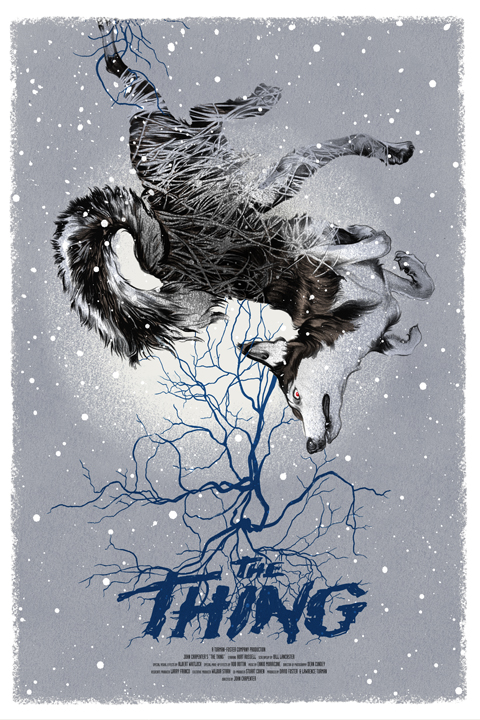
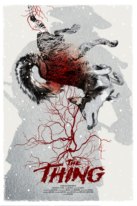
The John Carpenter film, The Thing, is a perfect film to tackle and the easiest to get wrong. For me a film poster should be graphic and immediately recognizable and for this film it’s too common to go after the image of the mutated anthropomorphized creature. So invoking my “before or after” rule of comics storytelling I decided instead to go with something before that and make it a more totemic thing to express the film, And got to do two versions of it to boot. Turned out I much prefer the alternate piece at top here.
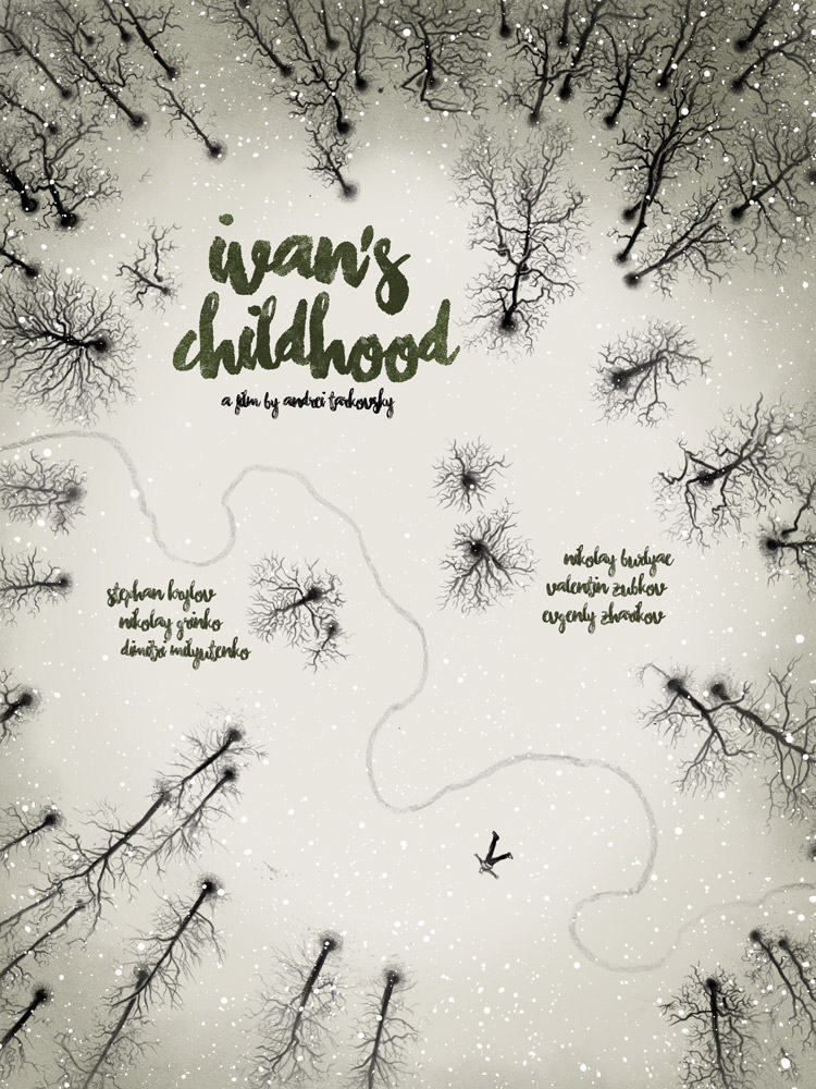
Andrei Tarkovsky is one of my all time favorite directors, so getting to tackle his first film, Ivan’s Childhood for Black Dragon Press, was a pure delight. I originally went for something to take on one of the most perfect moments in film history, the battlefield kiss, but the estate wanted to go in a different direction and so we did.
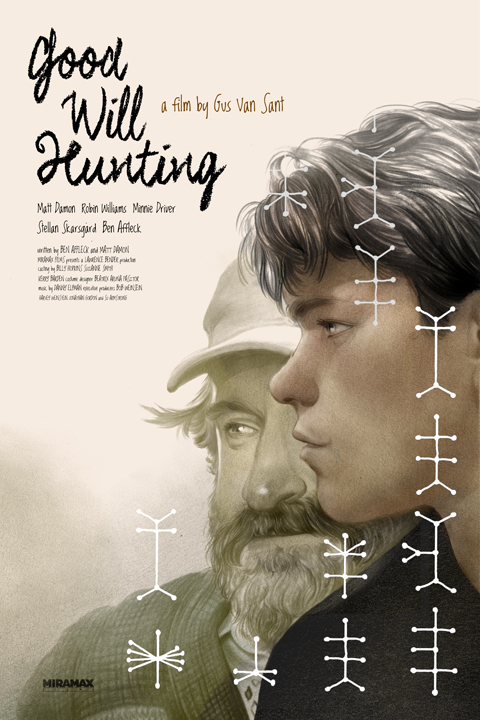
For some where there was never a majorly catching poster created for Good Will Hunting. It’s largely a character piece and all about conversation and in a way lacking in any major visual cues or distinctive moments other than the core characters. Since the first thing I want to avoid in doing these is replicating the typical headshot poster you get from the studio ad houses, this went through many different approaches before we got to where it belonged.
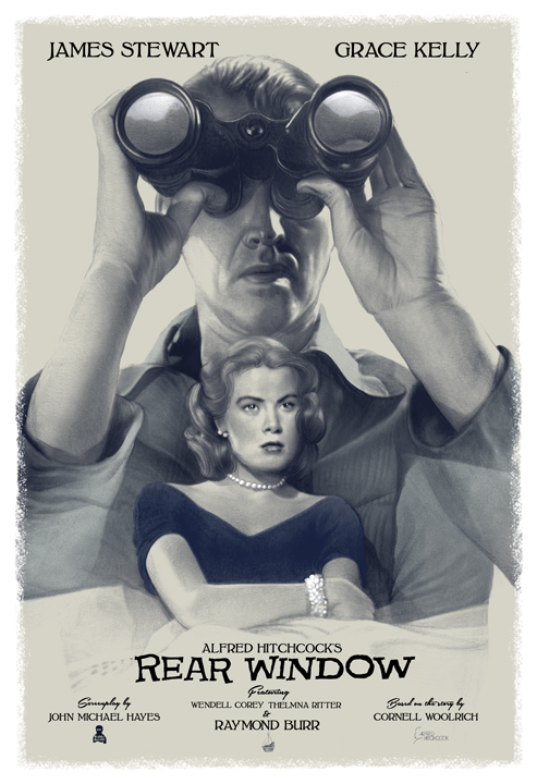
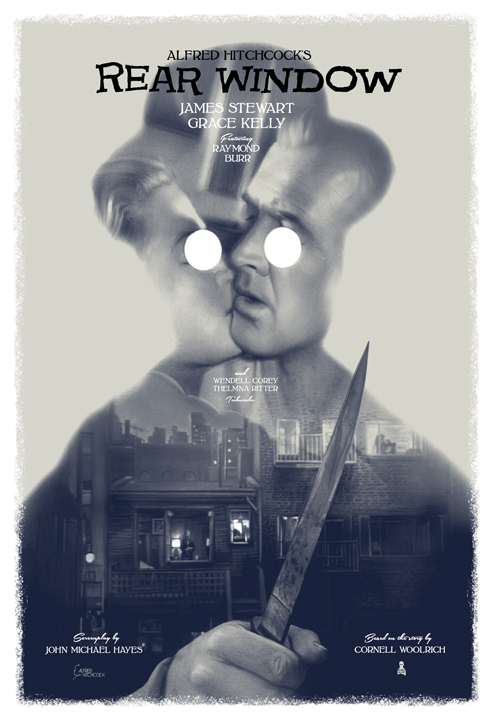
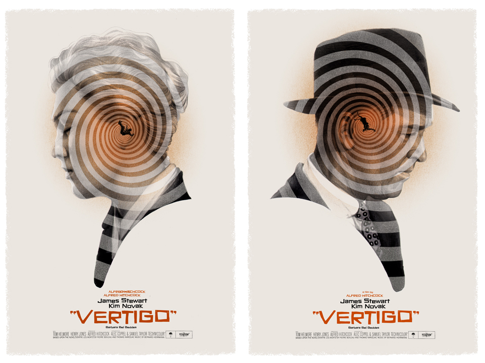
For me personally the Hitchcock films are the most exciting and the most intimidating. They’re so iconic and there’s been so many incredible posters created, both in their original production but also in the more recent silkscreen poster craze bringing in some of today’s best artists going to the 9s. Plus Saul Bass…. friggin Sal Bass is a mountain no one wants to fight with. This ongoing series is a special one to me as a personal project and I can’t wait to tackle more on the coming months.
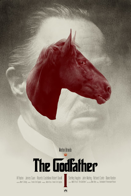
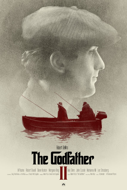
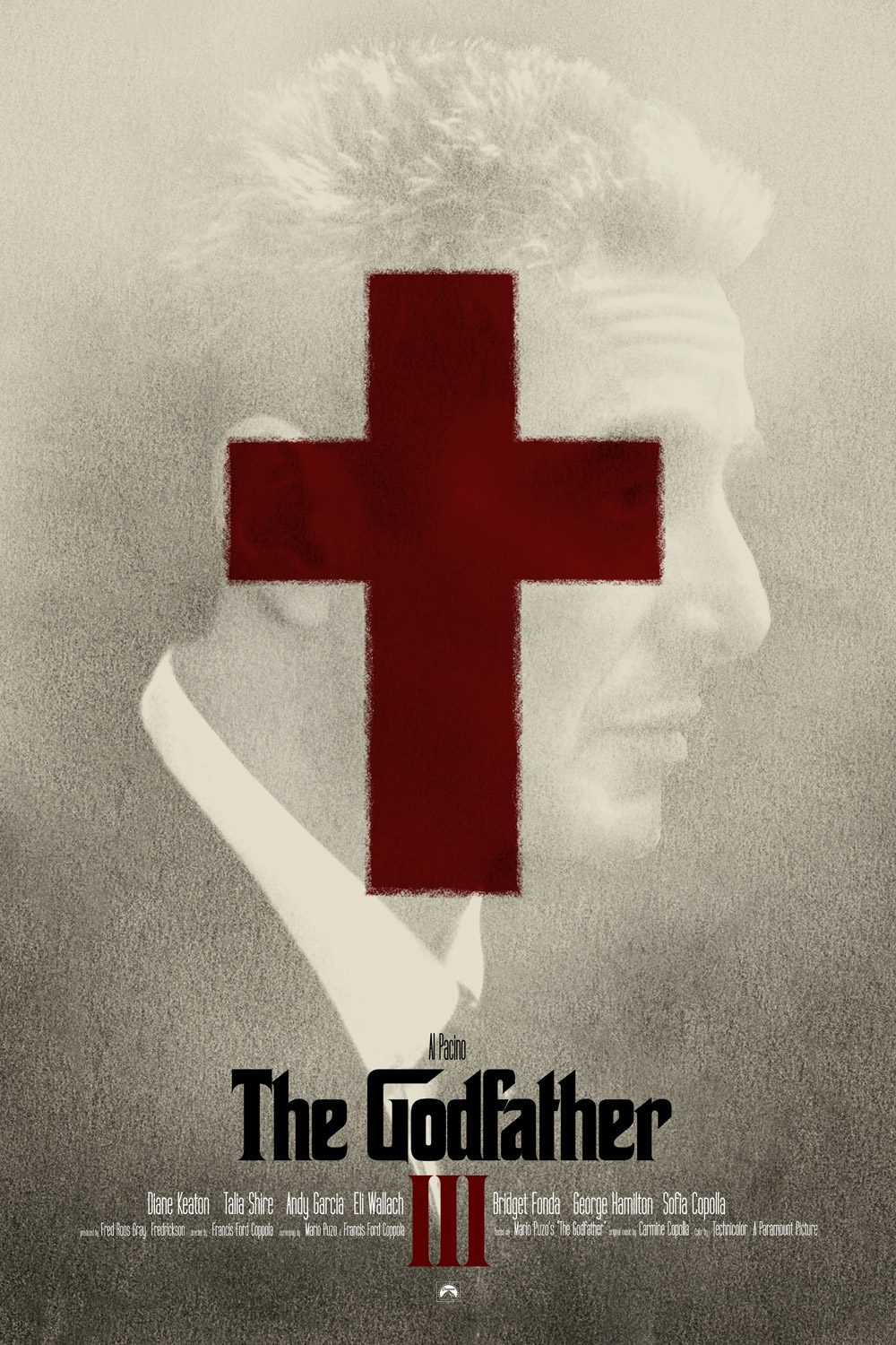
While we have a lot of visual cues to the Godfather films, we never really saw much of set of posters for them that ever did the film justice. The logo design itself became the iconography for the films, and the books alike, so in many ways there was a lot of freedom to taking the trilogy on. The characters are so mythic at this point, it’s hard to avoid just executing head-shots, or the dreaded, horrible head-flower approach. So instead I decided to pin down the iconography specific to each film and make a more surreal symbolist approach. These are still among my favorites, but we caught hell like you would not believe on the outset for them… after the initial shock though, everyone pretty much came around.
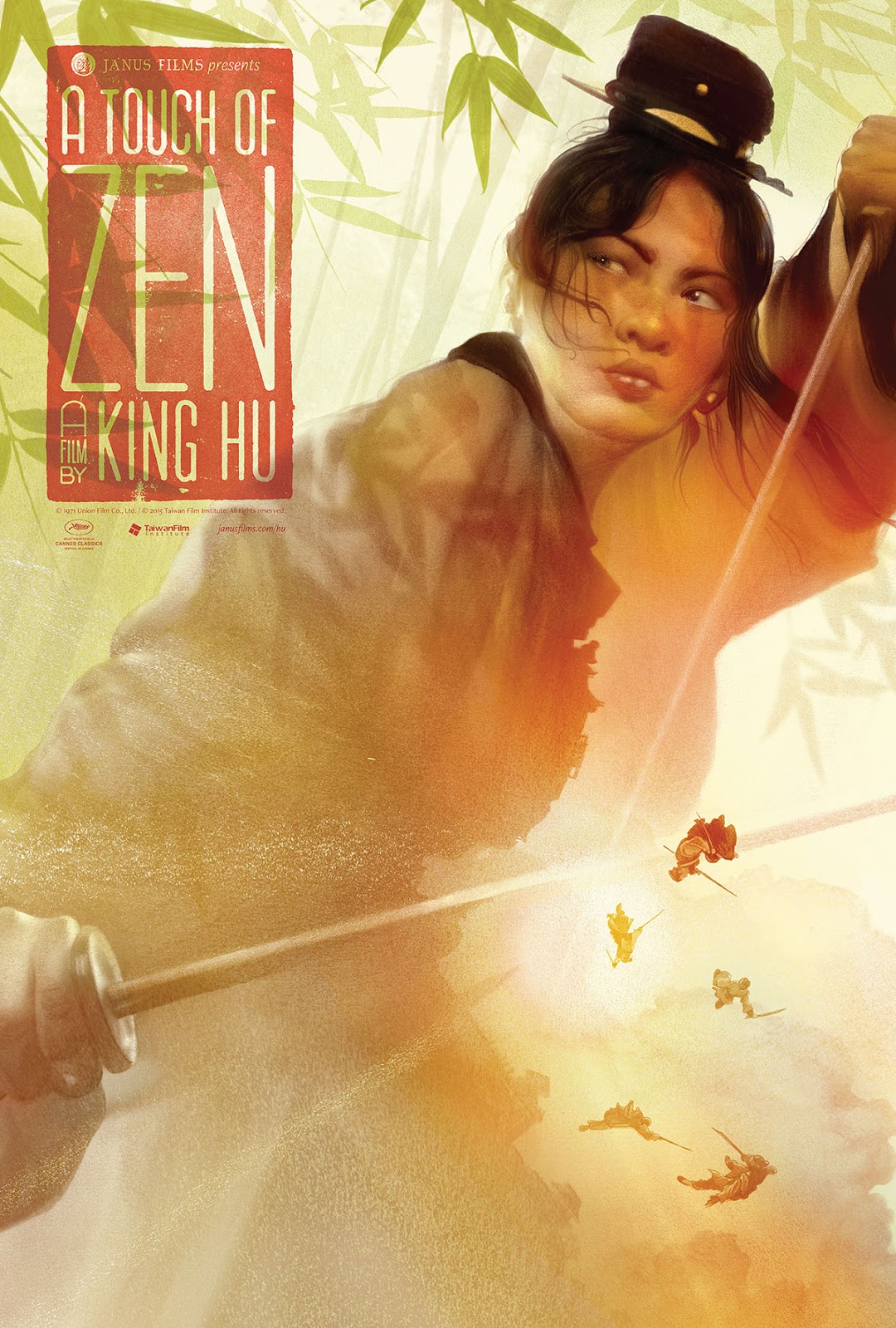
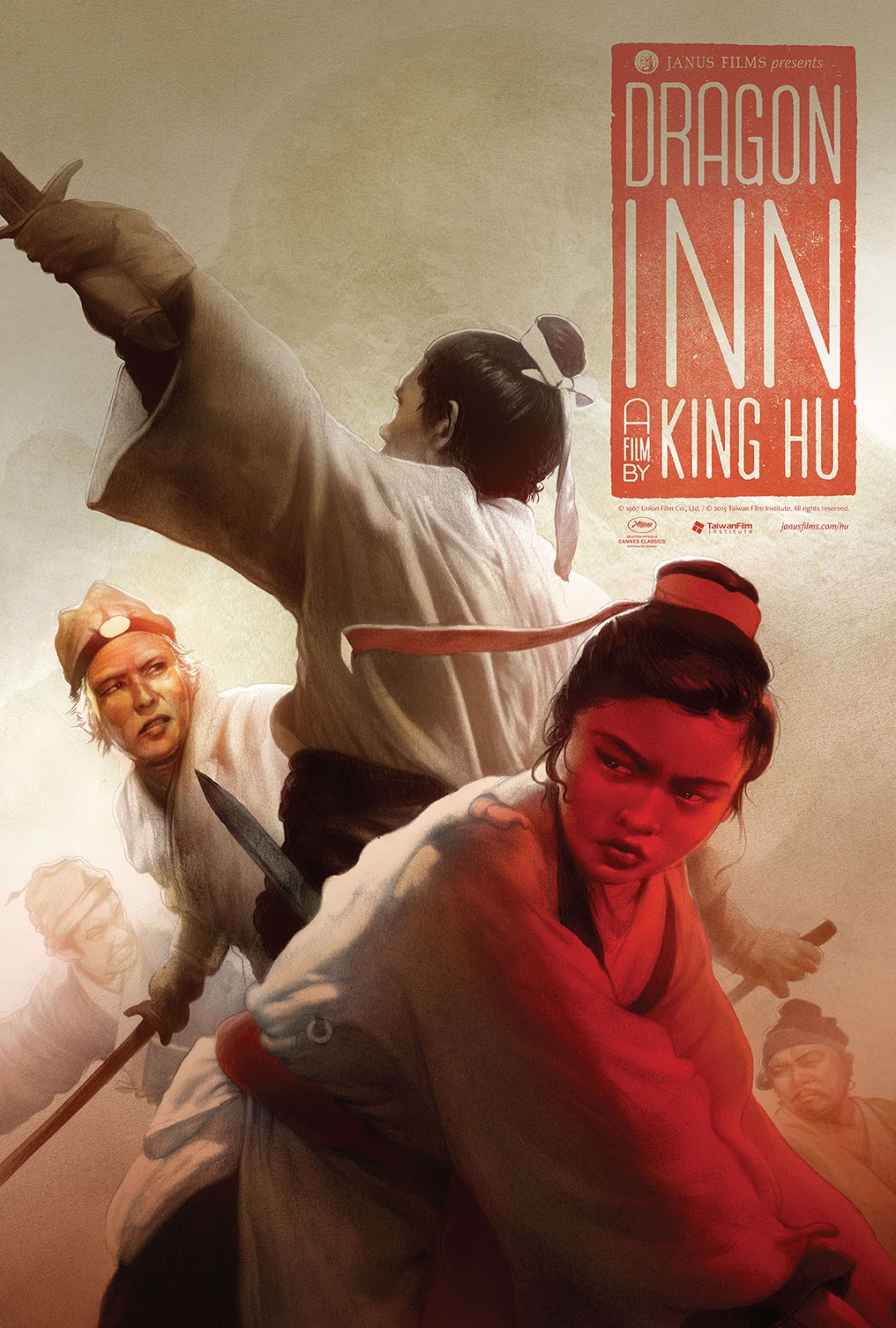
Sometimes I get assigned a gig, like I did with King Hu’s epic wuxia films, A Touch of Zen and Dragon Inn for Criterion. I’d done work for their release of Zatoichi and Tree Outlaw Samurai, but this was the first time they were making big full scale posters out of my work, so it had to really come together well. Plus it was a killer deadline to make the screening release. They are among the few companies today that will actually make a special edition series of printed full scale movie posters to accompany their short run screenings or releases and it’s always an honor to work for them and with the insanely prolific and brilliant Eric Skillman.

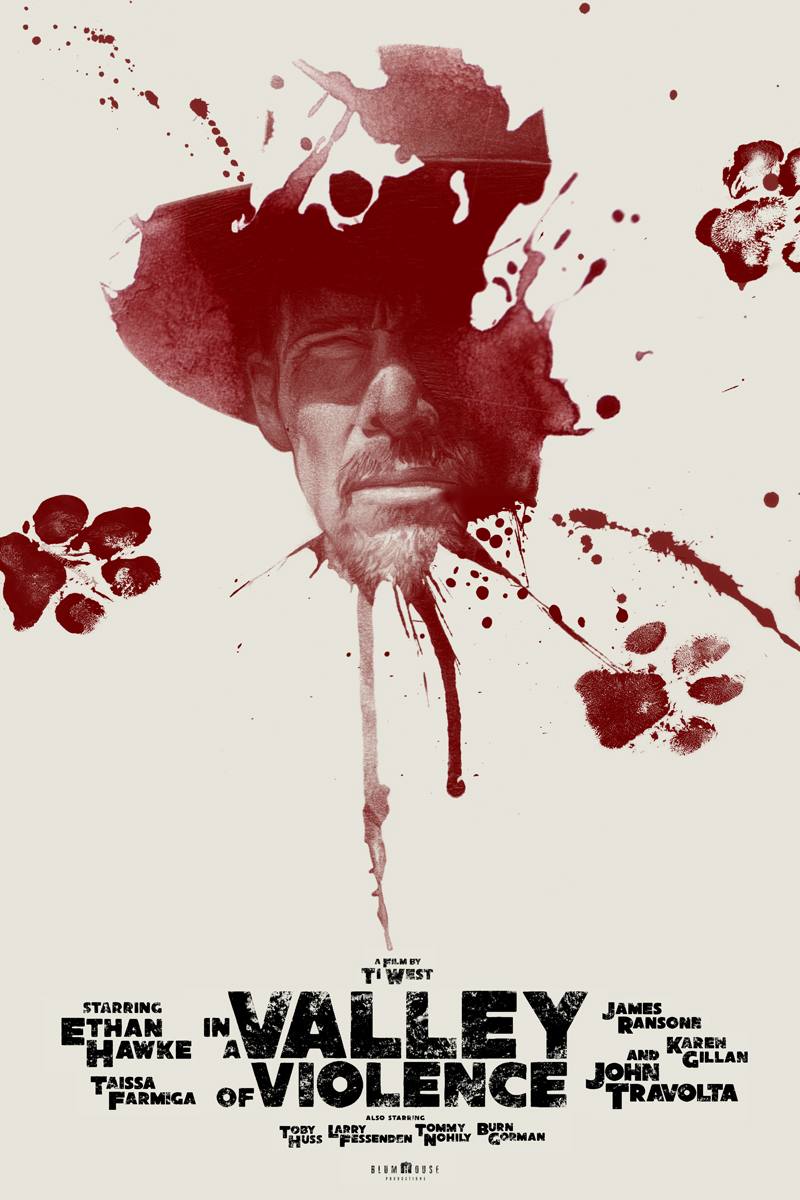
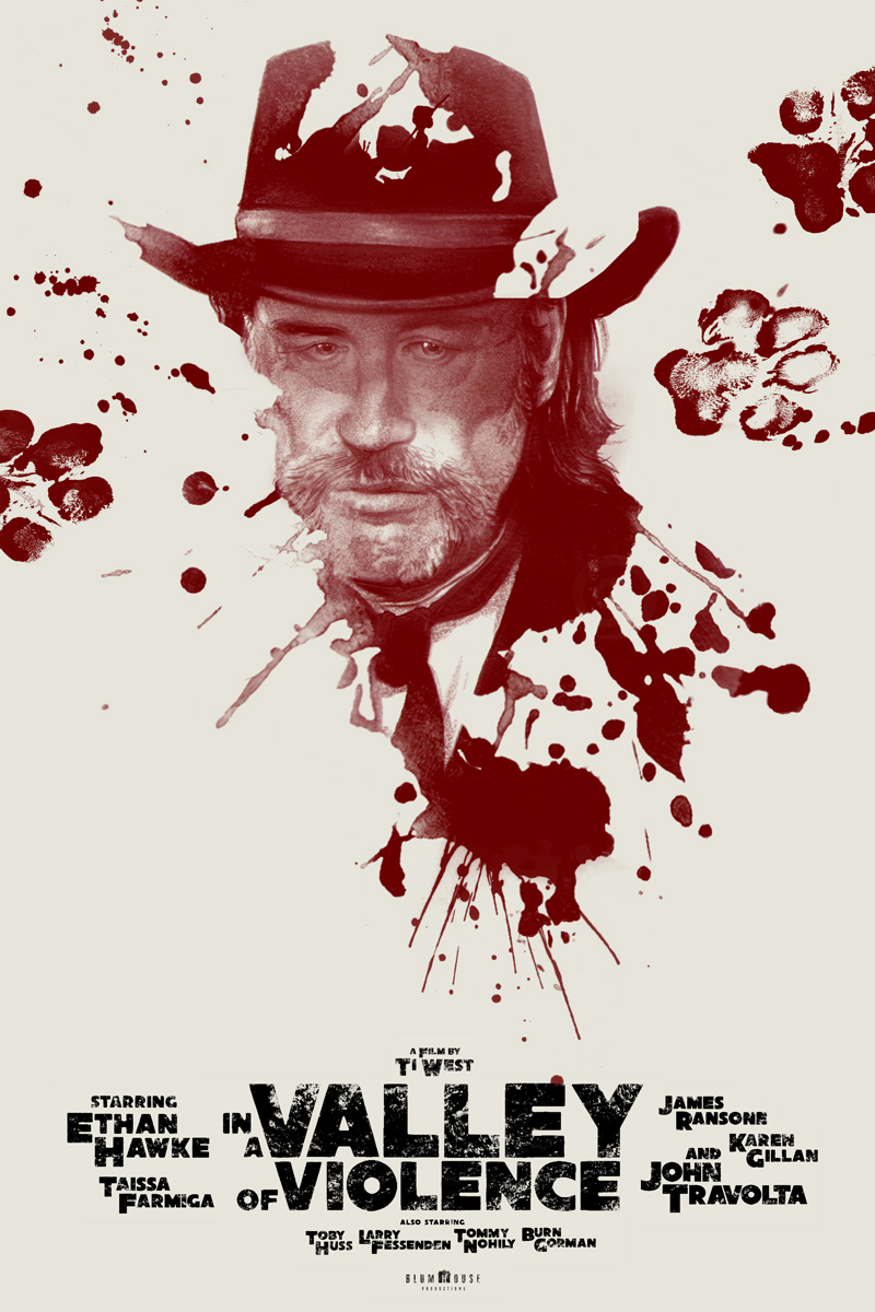
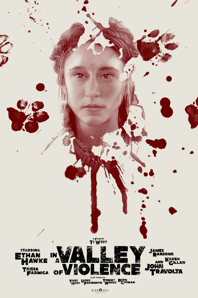
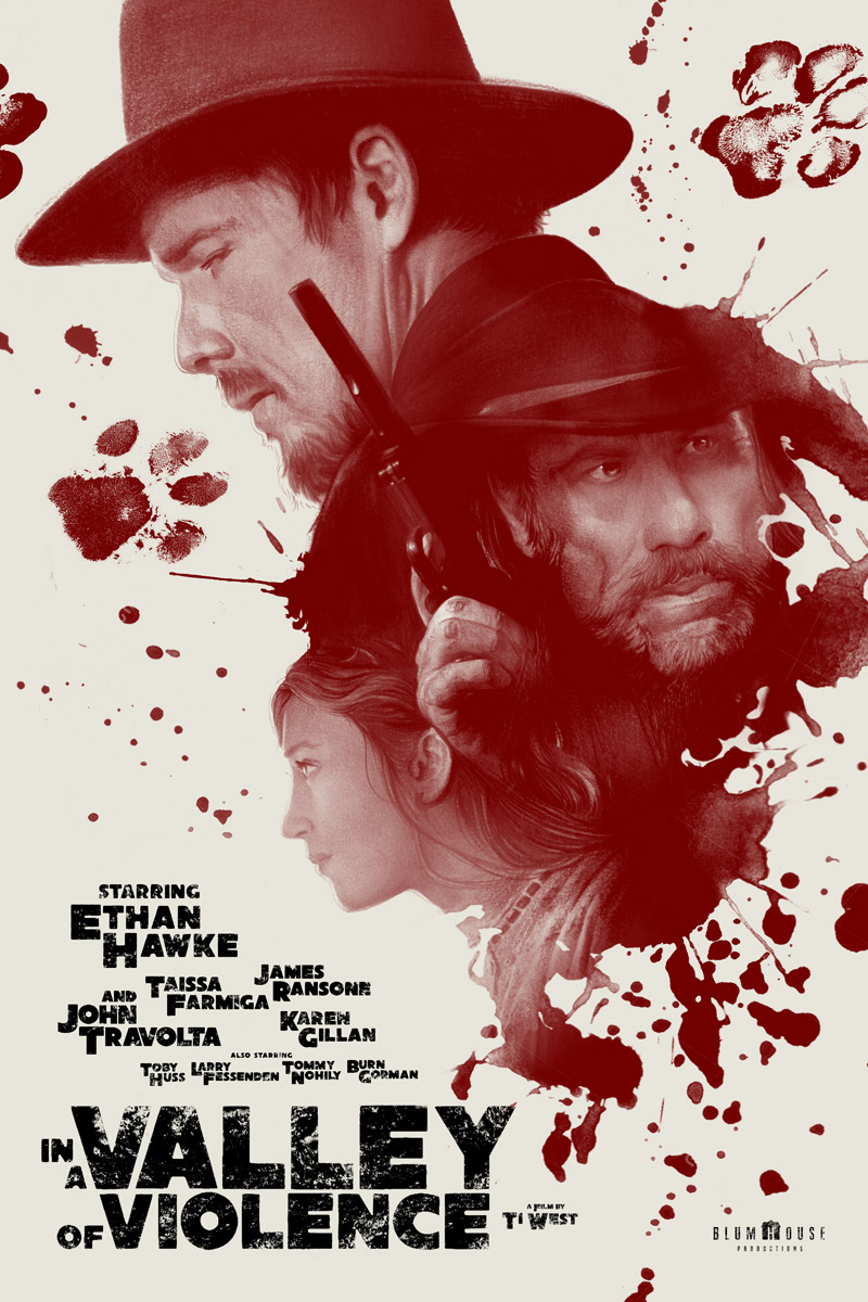
I was commissioned by Jason Blum and Ethan Hawke to do a series of posters for their forthcoming spaghetti western, In a Valley of Violence by Ti West. This was a film I knew of and watched develop from script to final so had a much deeper and more intimate perspective on it as compared to others. I can’t remember whether it was Ethan or myself, (as per usual probably both simultaneously), who came up with the idea of stringing them altogether so the doggy footprints tracked across them when lined up alongside… but of course it was a perfect notion.
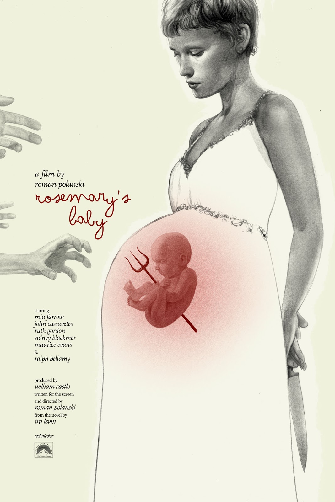
Rosemary’s Baby remains one of my favorite Polanski films, (following closely to The Tenant of course) and turned out to be one of my most enjoyable and instantly achieved posters to date.This is the one my manager/agent/spirit animal, Allen Spiegel really dislikes the most- “it spoils the ending!” he would cry. My reply being “It’s been fifty years, I think we all know how the movie goes”. And round and round we tumble.
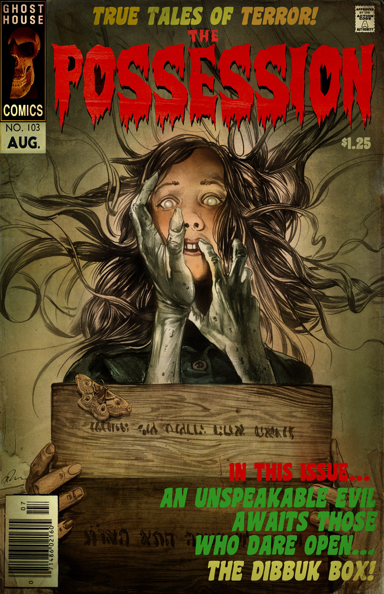
I was commissioned by by childhood chum, Stiles White and his wife/creative partner Juliet Snowden, the writers for The Possession, (previously known as Dibbuk Box) as a giveaway to Sam Raimi after the film wrapped up. Sam is a huge comics enthusiast so Stiles thought it would be fun to do a splashy garish EC comics style comics cover for it complete with logo bar and CAC imprint.
Needless to say of all the work I do professionally, or even when it’s simply a private commission or for myself, I cannot express how much I enjoy taking these on. it marries two of my favorite things in this world together, but I also find it a supremely effective thought experiment and the kind of challenge that helps feed back into my usual labors. Plus as a bonus I get to revisit these movies and see them as if new, which is of course, fantastic. Most of these were generated only within the last two or so years and a lot more are currently forthcoming, so keep on the lookout.


All of these are really great Greg. Excellent design, rendering, and typography. Most modern movie posters are generic and stale, the studios should be hiring you to create their official posters for a more unique look!
Thanks Joel- that's part of why i love doing these- they make you do it all, and exercise all the design, comcept, and execution muscles. General movie posters these days are farmed out to agencies that juet toss em into design pools, and so they tend to all have a simlar look. We used to make more imteresting posters and we're starting to see that more and more again. Appreciate the kind thoughts.
It would be nice to have your posters collected in a book.
I've been following these for a while, but it's even more impressive to see them all together in a collection like this! Really a treat, Greg, thank you.
To Kill A Mockingbird is one of my all time favorite movie adaptations and that poster is simply amazing. They all are. Posters today are all photo shop crap by committee.
I loved looking at your posters and reading your thoughts about them. Thanks for sharing!
Thanks Everyone- they are both simply a fun side effect of my usual work, but also have been found to be a remakably quality infusing exercise into that usual work. I don't know if it's the wildly varie subject matter, having to forfulate and design the text and title as part of the overall design, the enourmous scale (typically 24×36″ ), or having to think in silkscreen terms and separations… But I would highly recommend doing these when you've got the need to shake off the moss. They are tremendous teaching platforms for other artmaking.
Amazing. You're an inspiration, Greg.
Poster making for college students can only mean one thing, it means paper presentations for thesis, forums, special projects, special problems and the like. See more academic posters examples
Hello, Greg Ruth, this is a spectacular work I really admire, I am contacting because I am a Mexican student and as an assignment, in my high school e-commerce class we have to start a company. Our company is about Posters and prints and we are really interested in this work, of course, if you would like to share this work with us as free of charge it would be spectacular because we are on low budget, but nevertheless if the store hits it can have economic rewards for you because now in Mexico City there is a boom in prints and all kinds of posters and Hipster kind of things, what do you think?
Greetings
Where can I buy the To Kill A Mockingbird poster. I have a signed letter by Harper Lee, so would love your poster to compliment it.
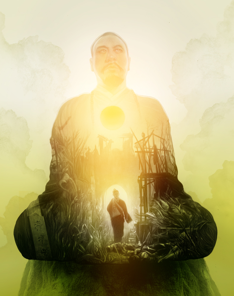
Here are also some posters from Chinese dramas
thx
Growing up watching Creature Double Feature, Planet of the Apes Sunday Spectaculars, and Saturday morning westerns, I developed a deep love for movies. The Dollar Cinema, just a bike ride away, was like a museum of film art packed with amazing movie posters. If you asked nicely on Thursday afternoons when they changed posters for the next films, you might even get one to take home. Now, all grown up, you can relive that magic anytime by downloading the app and visiting the official website. Explore and enjoy a vast collection of movie posters and film art on MovieBox WEB. Don’t miss out—download the app and check out MovieBox WEB today!