This post is an addition to the previous post I did on edges, this time defining the term “tiling” as we use it in painting.
First, I found this definition on mathforum.org and found it appropriate for the definition of the tiling method with paint. “When you fit individual tiles together with no gaps or overlaps to fill a flat space like a ceiling, wall, or floor, you have a tiling. You can imagine that you can use a variety of shapes to do this.”
I like this definition because of the additional comment at the end that you can imagine that a variety of shapes can do this, because so many of my students have thought that tiles are square, mechanical and rigid. They can be any size and any shape, and they snap together like tetris to complete a grid space (painting) of whatever size and shape you choose.
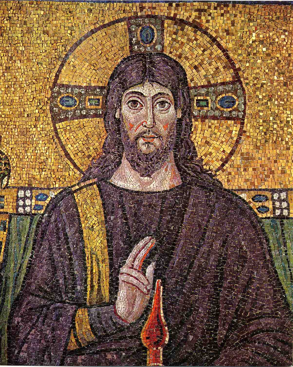 |
| In this mosaic above, notice how the “tiles” each explain a turn of the form from the lights to less lights, not quite shadows. Each tile adds to the modelling of the forms. |
I’m not sure of the origin of the word tiling, but Frank Reilly used it to describe what we now call the facet today. The term posterize is another more modern word also used to describe the “tiles” of colors to paint in a picture used by Fred Fixler and many of the other artists during the 60’s and 70’s.
Hollywood and the entertainment industry has long been a big advocate of tiling as the paintings hold a certain edge that is lost if the paint is blended together too much like many of the artists prior to the impressionist period would do with their paintings. From movie posters to book covers and back in the day magazine covers, tiling was the technique that grabbed the eye.

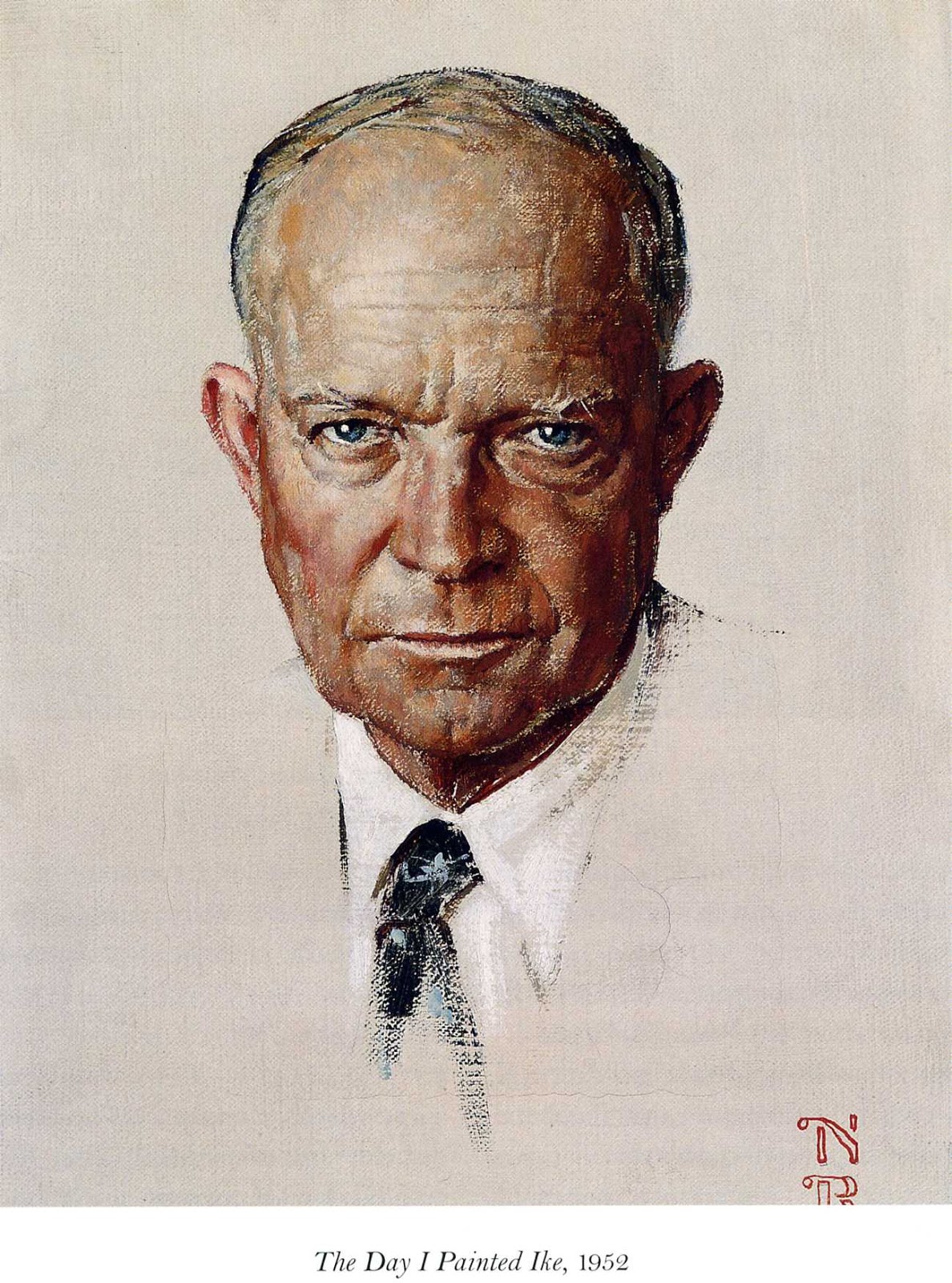 |
| Norman Rockwell took advantage of the tiling method which added so much extra depth to his covers that few other artists of his time could achieve as successfully as he. |
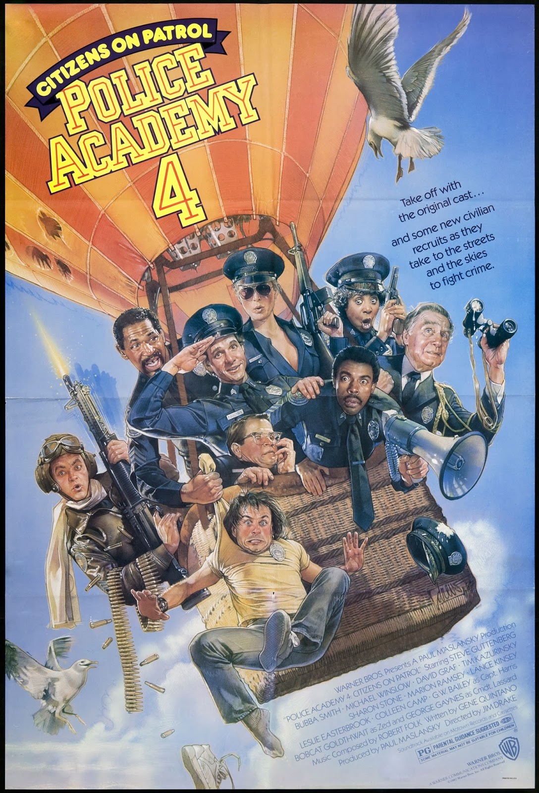 |
| This Police Academy movie poster done by Drew Struzan was done in a style that he helped popularize at the time . |
This demonstration is done with gouache paints on a brown sketchbook page using two brushes, a round number 10 and a rigger, my new favorite scratchy paint applicator. The palette is very limited in color with:
- two blues – ultramarine and indigo
- two yellows – ochre and cad yellow
- two reds – flame red and alizarin crimson
- van dyke brown
- titanium white
- ivory black
There is a much bolder approach to tiling that I did not do here that I will also later do a quick blog post about. This bold approach uses the body anatomy to decide upon the tiles crafted. Think like John Singer Sargent here.
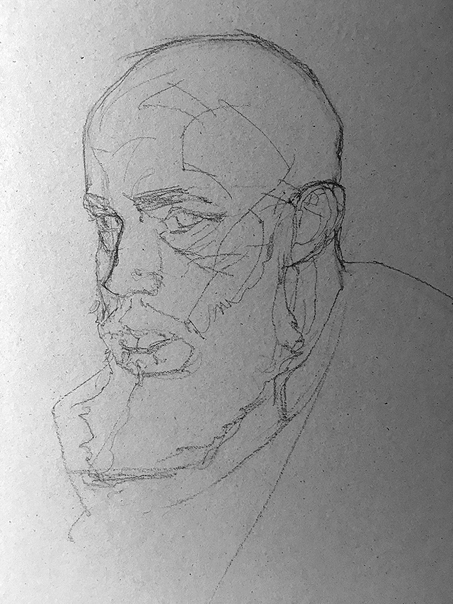
Create a decent line drawing that gives some indication to the possible shadow breaks on the forms and design them with graphic intention, that is, give them some kind of interesting shapes that also coincide with the forms they sit upon, but think eye catching, focus and fun to look at. This drawing was shot in this stage about 80% into the finished line drawing. I added a few more shapes around the nose and muzzle to help fill out the big empty space that this image shows.
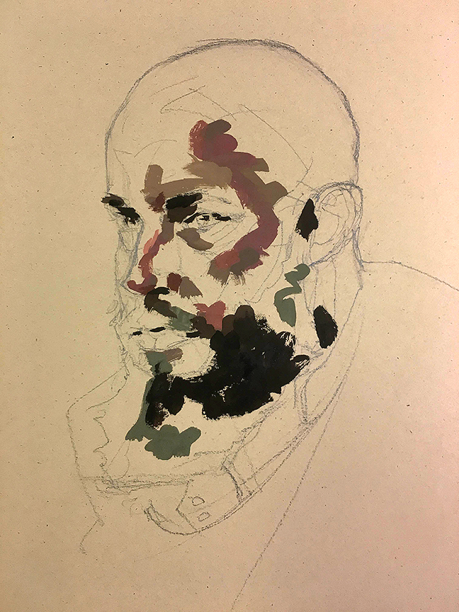
The initial tiles that are placed on the page are not thoughtful in their edge quality, but more resourceful or practical in filling the spaces with the appropriate value/color. Here I have shown several different color spots that have been blocked out as tiles, small ones because of the intricacy of the reference I was copying for this demonstration.
This stage should not take more than an hour at best for this size painting(the portrait is 5″ tall), with most of the time (70-80%) spent mixing the colors.
At this stage, before any blending out, the entire image should be assembled to whatever extent I thought would be correct in the value/color design. now that the image is assembled in this preliminary stage, the next stage is to blend out and adjust the values to correct the lighting. As you can see with this stage, nothing is blended yet since this stage is all about “shoveling” on the colors to get a base level started for the rendering.

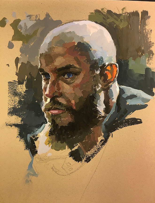
At this stage additional layers of tiles are added to the previous layers. I could blend, and I did at first but I forgot to shoot it to show what blending does to the forms, which in this case turned them to mush but at the same time set up an excellent gritty dirty layer for his skin which in the reference is not clean and smooth. This act of layering tiles is to partly soften the edges between the facets but to also create a broken color effect allowing the previous layers of tiles to show through in small portions to add more surface depth and volume to the forms.
Here I have added an additional blue and blue purple hue to the indirectly lit sides of the head as well as through the transitional edges of the terminator across his dome.
Also at this stage of the game, a rule to keep in mind with over-painting tiles: for each tile crafted try to keep a minimum of one of its edges soft and blended to the neighboring tiles. This is per brush stroke, as a brush stroke can and does more often than not have more than one side to it.
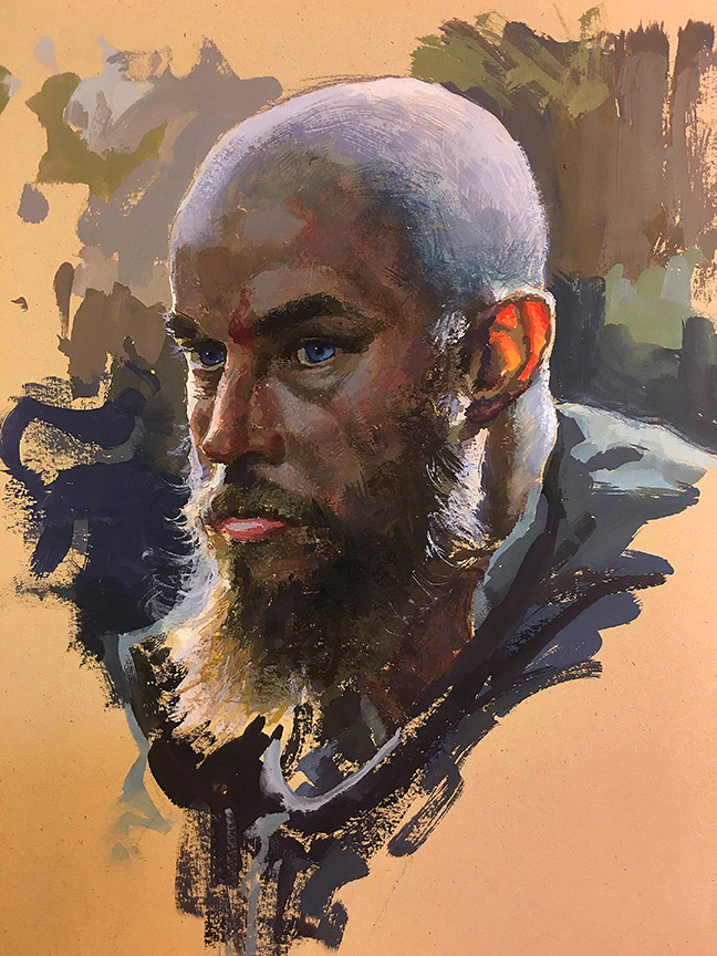
I have added another layer of tiles to the previous layers this time using my brush with the deckled edge look I shared in the previous blog post on edges. With the hairs splayed out the brush acts like a fan brush, gutless to push paint around in large amounts but perfect for feathering little dashes of color across edges that I would rather not use water on to blend out for fear of losing the gritty look of this gritty dude. If I added pure white to this surface it would be 3 values too bright for this painting. The brightness is occurring within the light color spots because of the surrounding darker values.
Tiling is how you apply the paint to the surface, but keep in mind that if you do not blend any of the edges out on the tiles then be mindful of the turning of the forms, not just around the barrel shape (x axis) but up and over, or down and around the forms (y axis) as well. I see too many tile paintings where only the x axis is thought out but the y axis suffers from a lack of thinking through the lights and shadows. As well, scale of the tiles as well as logic of what is being mapped with the colors. I might do an additional blog post on all of these short comings and how to deal with them.
Until then, enjoy painting and don’t let these mind numbing political days ahead before the elections eat at your creative energy or stunt your ability to produce great works of art for the rest of us to enjoy and escape into.

Thanks Ron. Terrific post!
Thanks so much for writing a post on what I didn't have a search term for! I've been niggling at this concept for years- most of my favorite paintings use this technique.
Can we get another one? Maybe towards rendering it on soft textures or digitally? I don't know- just want more 🙂
Best closing comment ever. Also a great write up, thank you!
Very good demo! Loomis taught planes of the head — which is the larger-scale idea of tiles. And if you have ever tried painting from one of the planar 3D head busts designed by John Asaro, they can be useful too — they encourage the same kind of see-the-head as “tiling” using planes of value. I like that Ron is inventing/improvising beyond the basic structural planes to use the kind of multiple value-based color tiles in step 3. Doing this tiling and planes, some people miss that it can be fun and is not just a geometric exercise. VIKING POWER!!!
I’ve been searching for a useful gouache demonstration online… I should have known when I found one it would be from Ron Lemen. Thanks Ron!