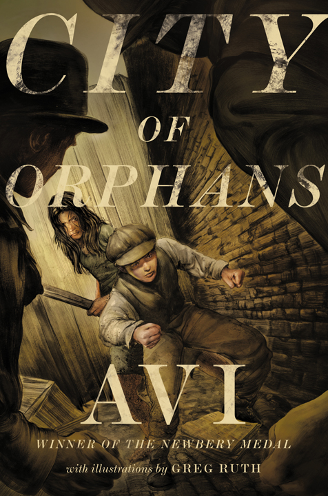
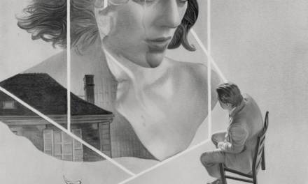
One of the most sought after, misunderstood, and rarely easy jobs in illustration is getting a book cover gig. They are despite the art-friendly bent of most publishing houses, really a tool of the publicity and marketing departments rather than a high end art exercise. You are as a cover illustrator, there to do one job: sell the book you’re covering. Anything else will subtract from your success at doing this. I’ll take an example of what I’d call a fairly average case in book covering and walk through it here, step by step until it’s final end. We’ll focus today on the first novel I covered for Avi, CITY OF ORPHANS. (This post was also inspired by a call out and answered by a pair of requests from both Jeffery Paul Hebert and Tony Guaraldi Brown).
Before we begin, a note on how vastly different these gigs can be. The process is often different each time you do it- which I entirely love- and the manner at which these things happen depends largely on the culture of the publisher for whom you are working. A big house like Penguin/Random House will have a heavy-handed committee aspect to the process which will mean a lot more work for you, a slower process, and sometimes a lot of frustration depending on how powerful/persuasive your AD/Editor may be in the room. A place like Tor, for example, will be more dependent upon your ability to do most of the work, deliver and be responsive to notes from your AD in a much more free and personal way. Both will end up having to go through and manage the final judgement of the marketing department, and their power will depend on their overall stature in the publishing house, (more and more in these times than ever before), and the scale/profile of the project. You do a Stephen King cover, bet on heavy fealty to the author’s input and the juggernaut of the marketing department to reall drive the train, and perhaps early. Do a new author’s first novel… well it’s like independepent film making: the less money and prestige inherent to the project, the less hassle from above. These early projects are the ones you’re likely to get early on- almost no one throws a newbie into a pool of giants for a cover image, so use these early days to exploit the freedoms as much as you can before you have to start wrestling with the big dogs.
So. What is a cover? Silly question, on its surface, but looking past the obvious answer that it’s a picture covering a book, there’s a lot to consider. First of all, and especially for you as an artist, a cover requires you to do a number of things at once:
1.) Be true to your subject matter, and express what your covering succinctly and purely from a place
of authenticity. A good sign you’ve done this right, the best sign, really, is when the author exclaims that you’ve somehow reached inside their mind and drawn exactly what and how they saw their own story. That really is the highest possible mark of success in any cover to be honest. Aim for this at all times.
2.) Find no more than THREE elements to include in the cover image. Big decoupage crazy calamity images pushing every possible button is not and never is the way to go. Keep it simple and avoid a bed of nails problem, (wherein a single nail can punch through, but a bed of them flattens out to feel impenetrable and ineffective). If you can do ONE, then do one. But just avoid more than three. A cover should be of all things, immediate, eye catching and concise in its message.
3.) Think graphically, even if you don’t paint that way. I don’t possess the minimalist jedi powers of a Jeffery Alan Love or a Mike Mignola, or even a Saul Bass, but I strive for them as a goal anyway. Covers have to be graphic to succeed- they need to grab a passerby in a store or on an online shop, and encourage a closer look. That’s just stage one. When you get their attention, you need to reel them in by rewarding them with more to see. If that means the giant face you saw from a distance is really a cloud of flying car parts in a crash scene, I guarentee they’ll pick up and hold the book. If it’s something that seems simple from a distance, and is simple at a close resolve, but attentatively so, then that can work equally as well. Some covers will not rely upon the art as the main draw in- and may need you to essentially be the hook the title and type treatment baits the reader towards. I’ve done covers that are almost entirely about submitting to a huge bold title logo, and my work is at that point essentially window dressing. Both can be made to work, so know which horse you’re riding early and don’t fight agains the tide. Again, this isn’t about you or about your work except to say that it matters as it sells the book your covering.
4.) BE ON TIME. This goes without saying of course, but I’ll say it anyway. If you’ve not worked in periodical mediums like comics, magazines or editorial news jobs, you may not full grasp the essential realities of being on time with your work. Book covers almost always occur after the novel is completed- sometimes you get in on early drafts and changes come- and sometimes you become part of the environment that makes those changes happen- but typically speaking, when it comes time to cover a book, it’s just about time to market that thing. So your bosses will be under the gun to keep things on track. Even if the book isn’t due out for 9 months, they may still need the cover yesterday. Book publishing is a yearly business, but it als markets its wares sometimes a year in advance. INDEH’s cover was completed and sorted out well before the book’s principle work was finished. Same for THE LOST BOY and there were even times in comics where the cover was the first piece of real art to happen for a project.
 Essentially, if you manage to stick the landing on all of these above, you’ve done your job and have set yourself up for the next one. And that’s a key here, to understand: Every piece you make as a career artist is about the next piece and never the one in front of you. Don’t take that to mean dismissing the piece in front of you at all- quite the opposite. You need to do well and good on your present work in order to get a second chance at bat, and a third and a fourth, etc… Everything you do should be the best thing you have ever done until you get the chance to do it again. Keep that in the forefront at all times.
 So here we are. When Michael McCarthy first got in touch to do this, while I had previously done some work for Simon & Schuster, I had not worked with either him nor Avi before, so this was essentially a fresh start with a whole new team. The first thing that usually happens is I’ll get a manuscript to read. YES, doing a book cover is best served if you actually take time to READ THE BOOK. Essentially this is true of all the work you’ll do going forward. If you’re planning for a career in books, be ready to read a lot of books. I know this seems obvious but even a well read artist will find their reading level quadrupling once you’re rolling along.
 More often than not, you’ll get a digital copy- a pdf or some such thing. In the not so long ago times they’d fedex you a printed out manuscript like the ones the editor is working with. And while that still happens, most times now you’ll get a pdf to print yourself, or transfer to your iPad/e=reader thing to read from. I like printing them out not just for the catharsis of page turning, but also as a ready made place to jot down notes. If you have an iPad Pro- you can split screen your manuscript and note app and that can work too- I do this often and more and more these last few months. Anyways… do your read through, and do it running. Just plow through the material stopping only to make a note or jot down an inspiration as you go. Typically you’ll have the cover image in mind before you get halfway through, and you might even be able to stop there depending on how much time you have. Sometimes you have mere days to do this, other times weeks or months. So budget your time well for this part. The reason you can grab a cover concept early on, and likely should is to avoid spoiling the story with a cover image of something best left to the prose. If you were drawing a cover to Empire Strikes Back, you would not want to show the “I am your father” moment, even though it’s THE moment from the story, for example. You are there to pave a compelling entrance to a story, not to tell the story. So unless there’s some detail to allude to later, some little sneaky easter egg or concept that will only make sense when read, try to keep things closer to the first and second act of the story as far as cover images go. If you are lucky enough as I was in this case, to get to do a series of chapter illos along with the cover, then you’ll have a wider playground to scratch that itch later.
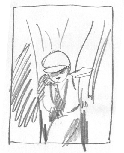
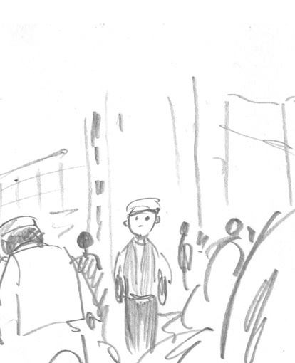
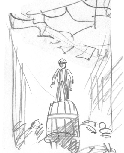
So, you’ve read the manuscript and now it’s thumbnail time. More and more I tend to find the cover image I want pretty early on, but you never know. I’ll first write down a few single lines like… “boy in an alley hiding”, or “boy picking a pocket”… if you get a job like this set in an actual historical time, you’ll have an extra wrinkle to sort out- research. Can’t have the kid checking his snapchat if the story is set in 1900’s NYC like this tory is, so even in this early stage start utilizing research not just to get the story details right, but to find visual information to perhaps inspire an image. In this case, old tenements, clothing wagon wheels, hats, horses even can be a source of an image, so be sure to get on this early.
Another thing you want to keep in mind even at this early stage is title and author treatments. You will likely not have one to work from at this stage, but one is coming so make sure to keep room for them. Generally speaking the upper half- or third of the page will be title with the lower fifth or so for author credit. Sometimes you get a gig with an author as the HUGE draw, but most times the title is. Now this is not to say that you can do all sorts of things, work with a title on the side, at bottom across the middle… and yes you can make a case to steer towards a design of your liking. This is a power you have being early to the game like this. Use it. But remember to be able to make a case for your choices. “it looks rad like this” is not what I mean.
 The above images are all scrappy little craptastic thumbnails to denote basic concepts. Some of these are what was suggested, some are dummy offerings meant to fill out the illusion of choice, and one of these was the one I felt needed doing. But I would be perfectly happy tackling any of these. never submit a concept, even one meant to act as a red herring or a dummy piece that you aren’t prepared to take to final. I’ve done this and lo and behold they picked the shitty one I never intended and that was a pickle. So while you don’t need to show your best work at this stage, you should always only show your desired ideas at their best. Right now you just need to pick a horse, and do a broad design in broad shapes. The characters, details and impact lighting comes later. You are also going to be typically working alone with an editor or more likely an AD at this stage, so no need to impress. If you are so unfortunate as to be in the Sarlac Pit of committee heavy jobs, then well.. it will indeed feel like you are being digested over a thousand years. In these instances, sketches will create room for more input than you’d want, and more questions than answers. Limit then the amount of the offering. usually the AD will be your agent to bridge the worlds of the committee he or she has to please and you with whom she/he is working with. The really good ones will never let you know how much crazy they have to deal with, others will let you feel the fire hose of insane ideas from people who lack a basic ability to see and conceive things visually. Be ready for “isn’t this supposed to be yellow?” or “I think the boy looks to Irish” or my all time favorite “that rope is too… ropey”. Just roll with it and keep moving. Save your fire for the real battles to come.
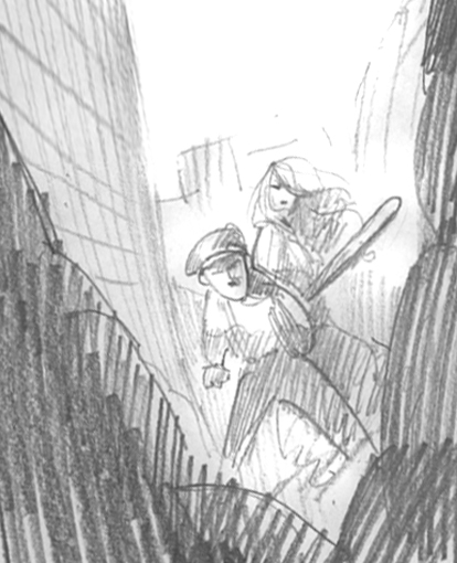
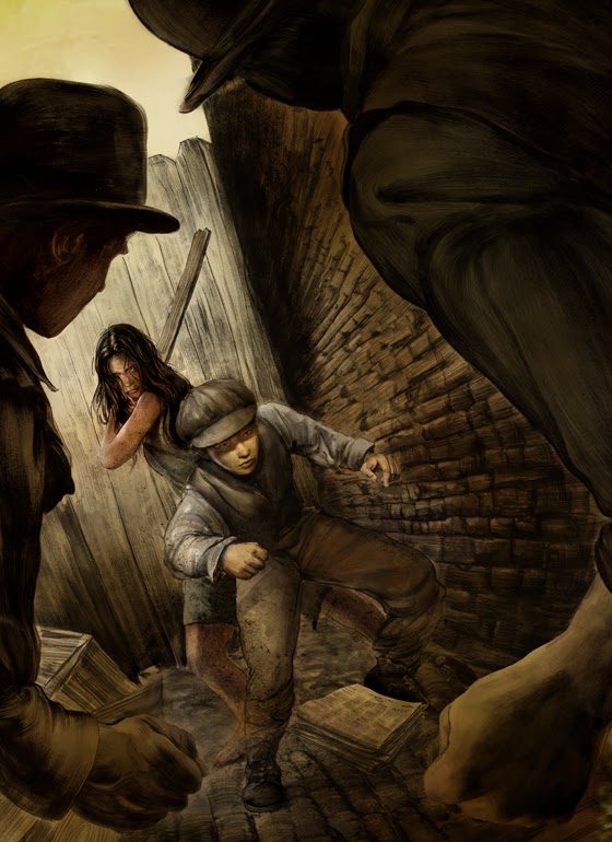
In this case the committee was never really a big part of this experience, and that largely had to do with the fact that Avi is a big hitter and once he liked something, that something was locked. Michael knew this and relayed ideas when ready to and through him and it kept the experience smooth as silk despite tweaks and revisions later. The concept I liked best was a scene early on where the lead boy is trapped in an old crappy alley having to defend himself a homeless street urchin girl against a gang of older boy-thugs… with the caveat that the girl was much more capable to this fight than the boy is. There’s our three concepts right there, and the sketch just above shows what I had in mind. Even though this is an action cover for a YA novel, I don’t typically like to deliver an active moment for a cover. I prefer to take on the moment just before a punch is thrown or directly after rather than the punch itself. It’s an old action cinematography thing that I have always found works best, so what you see here is the final deep breath before the plunge of the coming brawl.
 Next up was the more fleshed out drawing. This is not a stage I usually do to be perfectly honest. I tend to like to get right into the final drawing once the thumbnail is approved. I am told this is an insane way to operate and maybe it is, but I find it helpful for me to get the characters down early, and really show where I’m headed. Especially in a committee situation. Less questions to have to field from folks and marketing people who may not be able to fill int he visual blanks a rough sketch can provide. Anyways, in this case a middle stage was a necessary thing to do, and so I did. I reversed the image to suit the picture better and laid out the space and some of the intended lighting I had in mind. The reversal was a big deal because of how we read images in the West: there is a natural current moving from left to right, and even left corner down to right corner you always want to keep in mind when making a cover. Especially an action shot like this. If the wind and natural power moves left to right, having the boy and girl facing left gives more power to the bullies. Reversing it gives them more natural power. That’s where I wanted it: it affords me the opportunity to make the bullies huge faceless goliaths about to crush a tiny pair of ants… but it feels like, because of this composition, that the ants are where the power is. That’s a nice tension to play with and certainly far more interesting to the reader than the other way. So just because the flow is left to right doesn’t mean you HAVE to go with that flow, but you need to work with it for your image to work. It’s basic opposition/Flow stuff and something you always want to keep in mind. The way this composition was formed, you can it acts as a kind of sunburst of angles all emanating from the boy and the girl behind him. This keeps the focal point clear and set, and makes early on what will need to be maintained as the central attention of the rest that’s to come as the paint begins to fall on the paper.
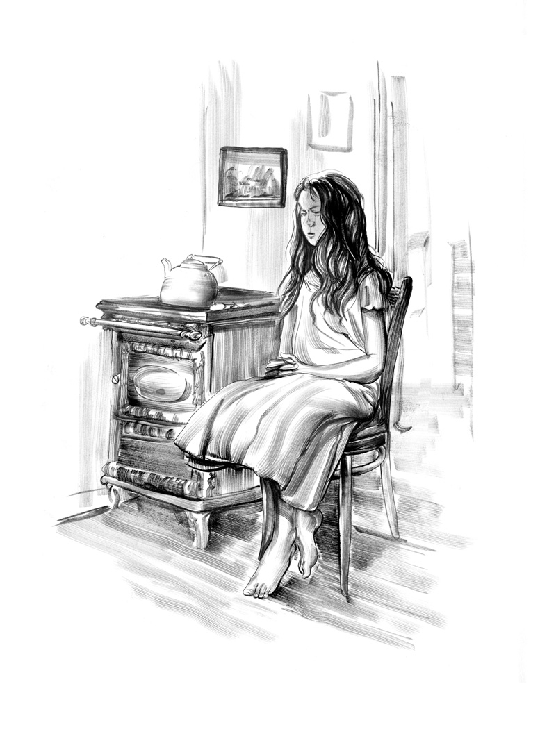
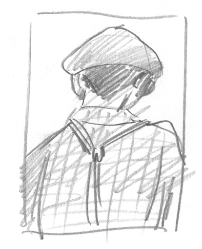
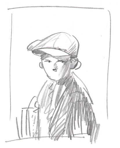
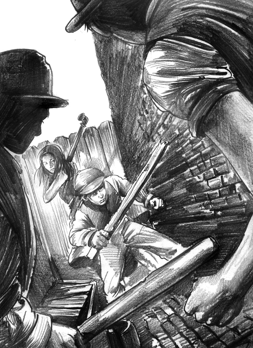
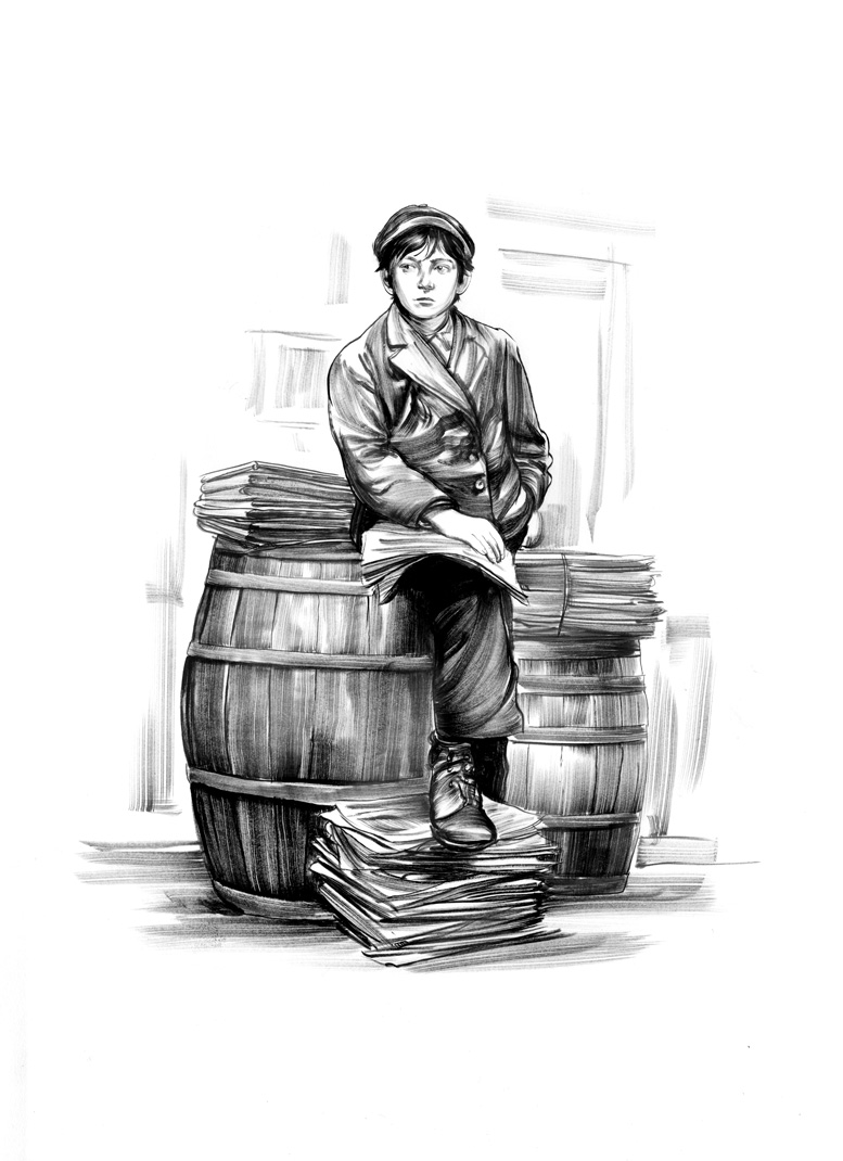 Next up is a hard jump to the final. I don’t have process shots of this, and probably wouldn’t have taken any as I worked anyway, so sorry for their absence. I don’t like the inherent self-awareness that doing that brings into this stage of the process and I find stopping to take a pic of a stage of work be bad for the flow needed to do what I do. Not all things are meant for the world and I must carve out some square inch of privacy for the art. Disclaimer aside… What next was a bunch of considerations- namely and firstly focusing upon our two main protagonists. I was also in the midst of this working on the interior drawings as well, and used them as a backdoor training ground to get a grip on these characters as you can see below. Once I knew them, it is with them that I began.
 And so the final was attacked and readied. This was what Michael saw next from me after the sketch. Again I try to limit how much in terms of stages to show both because Michael is working on a number of projects simultaneously as all ADs are, and need to be brought in when need is there. Also It’s my job to answer as many questions as I can myself, so deciding on a brown minimal color to let the logo pop more visibly, to get their emotional content, their faces and expressions to be real and true to their characters as I saw them, their physical stances and the overall lighting and composition… these are all things that are my job to answer and stand behind. So i doing them I commit to their veracity, but also in doing so expect and prepare for calls for change. And change always comes. Since I work right into final like this there is a fair amount of neutering that comes from it vis a vis the AD or editor or even the committee that they must answer to. At least to some it comes off that way. The benefit is that it makes solid things which people might be apt to fiddle with that will merely take up time ending with the same result, and it also fully clarifies what my intention is as evidenced by what’s there rather than via some promise not yet kept. But in doing this I always try to assure everyone that none of it means its’ unfixable changes. This isn’t an oil painting I have to redo to do well and add changes. Even if it was I make sure to scan it in and work on the final digitally by dropping in scanned changes and tweaks so that what sees print meets with everyone’s desires and needs. it’s more about avoiding offense than it is about making everyone happy. And not everyone will necessarily be happy, at least not right away. the more folk that come in on a job the more likely you’re going to see some diffidence or differing ideas in play. That’s okay and normal. This isn’t personal, this isn’t pure art, this is work and I am at their service. I do and will fight back if there’s crazy suggestions or ones that require massive changes just so someone can see if an alley cat would be cool to see, or if the light should be pink or whatever. But really these folk are professionals and tend not to go there. And again, with a good AD you’ll likely never hear of the back court battles they fight for you. As much as you are often working solely and directly with an AD, know that they are your friend, and they are fighting for you even though they may not tell you the shape of their battles. Often you don’t really want to know. It’s a partnership- a kind of temporary marriage in which the making of this baby is the real goal and purpose, and even if you come back together again to work on another, it’s a different thing always. But the way in which you previously worked together will determine a lot of how round two goes, or depending on how you behaved, whether a round two ever comes. Remember, publishing is a small world where more or less the only way to advance within a company is to leave it and return. So people get around know a lot of the same folk and will carry the word of your quality, or lack, to their peers in the business. A rep formed at S&S will be heard at Scholastic or Harper Collins. Do what you can to make sure that conversation is positive and affirmative as possible- this isn’t to say avoid trouble, just manage it well and professionally. The rest then will take care of itself.

So The lighting was a lot more vivid and the shapes more defined and the popping yellow sky and all was fine on its own, but now we were getting into title treatment time, which can happen at this stage, and there needed to be changes. Where her raised board once was needed some space, and the defined forms needed to blend a bit so it didn’t play havoc with the title. I never want to see a haloed title treatment if I can simple because it means I’ve failed to make the space for it to contrasty or variant to read without such a cheat. So I needed to darken things up, brings things down and make things now dance more fully with the text that was coming. As you see here to the right- I can’t recall the exact reason for lowering the raised board… I think it might have been a request from marketing for some reason that made no sense to me. I recall not at all agreeing with the choice compositionally, but I had other battles I wanted to win more with regards to her face, and the boy’s and sometimes you are bets served by compromise and horse trading. Choosing your battles makes a big difference in this process and it’s a skill I encourage everyone to hone and perfect. You won’t always win, and sometimes winning in certain areas means sacrificing ground elsewhere. All I remember is that the change was grudging to me, but in the end not nearly as important as the other things I wanted to fight for. Some tweaking of the boy’s fists happening, some facial changes and tightening… all pretty standard stuff, really.

Once we both got the title we wanted in place, which I simply loved by the way, it was time to layer it and go back and forth with tweaking tones and shapes to better fit things. At this stage Avi has seen and loved the image so far, and that means every other opinion went silent save for what Michael and I had to do to tweak. A lot of these changes would be invisible to anyone else save for those of us who’ve been staring at this thing for all these days and weeks- a cover can usually take about a month start to finish to process approve and finalize. I made sure again to even limit further some of the variant color tones so the kids’ faces popped, and made some other compositional changes so the type would hit the forms in just the right way. I always recommend you getting a chance to do this before it goes to press. There are things you will see that they may not and finding that out when you open your box of comps is not the place to do it. Silly stuff like the way the “r” hits her in the head gave her a weird face, or just barely bumped up against her eye… that kind of thing. So be sure to really study it in detail for the final pass because that is exactly the kind of stuff that will make you want to chew your leg off later when it’s too late to make it right. For the second printing, they went with red text to differentiate it from the first edition hardcover and it still worked really well. In the end of it all it became a cover I still quite like, which is a small miracle in and of itself. And it made for a handsome book to hold and read. The book was a hit too and Avi declared it as his favorite of any he had seen of his numerous novels which for me was the whole game right there. Again, a book cover is a marketing tool at its core and as such needs to hit certain notes to pass through the gate. The interior drawings for the book were easy and we were largely left alone, mainly because anyone who got to those images were already ours and the book was sold.
 Covers are candy. No working artist can make a living just from book or album covers without a nice trust fund keeping their feet dry. They come when they come and sometimes they come rarely and others too often, if that’s even a thing. If you do well you’ll get another crack. The average time between gigs with the same AD at the same house can be a year at least to three, so the idea is to spend yourself around as much as possible- widen your scope, genre and qualities and work for as many different folk as you can so those staggered times for cover work end up adding up to consistent monthly income that keeps the night screaming away. As much as it is upon you to be as artistic as you can, and expressive and unique and potent as you can make them, allow for your lightening to be contained where it’s needed. And don’t forget who you’re really working for if you want to get to do them again. Covers are a kind of holy grail for illustrators and can be humongous boosters to one’s presence and career. Just ask James Jean how those fables covers helped him out, or Dave McKean about his early Sandman and Hellblazer work. They are hard to get and should be thanked overtime they come around- covers are a chance to really shine and be seen by more than just the kids at Magic the Gathering, or the YA readers at Scholastic. A book is reviewed, it’s your cover that will be the face of it. If you’re into art awards, then it’s cover work that will get you some. You may see giant building sized murals of your work, or posters on a the side of a bus, or big screens of them up at a convention. Enjoy those moments and soak it up because they are truly awesome. If you’re lucky enough to stumble into a series enjoy the opportunity to outline some themes and carry throughs for the series that will reward you and the reader who follows it through.
This was fantastic! Just what I was hoping you'd talk about Greg!
Thanks for sharing your insights into the world of book cover illustration! I never realized how much of this work is about marketing and selling a book, rather than about artistic expression.