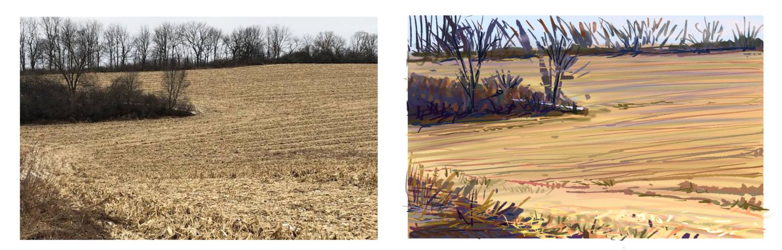
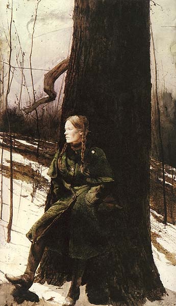
If I gave you a reference shot like this and I asked you to do a study of it, what would the chances be that you would use a palette like this?


This represents a typical limited landscape palette-an ill informed way of devising a palette, but one that has been advertised for years in art books.
And what are the chances that you would paint the image with these colors? I am not painting to be pretty here, just to show the color relationships. With little color training, this would be the obvious end result to copying this picture. I have had many students pick images like this to study from because they think they are going to be easy to copy, which is NOT AT ALL what the goal is when we study. We study with goals in mind, if this were a painting about the light of day, this palette would fail and so would our painting.
Standing in front of this field, we would see both the light from the sun, and the sun scattered light bathing the field, and we would see the blue-ish sky influencing the shadow side of this space. If it were more overcast than sunny, we would see mostly cool tones with warm shadows. However, in this reproduction, the camera did not know which way to go with color, and was focused on high contrast, losing almost all the color component in the darker values as well as the color changes in the lighter hues of the ground.
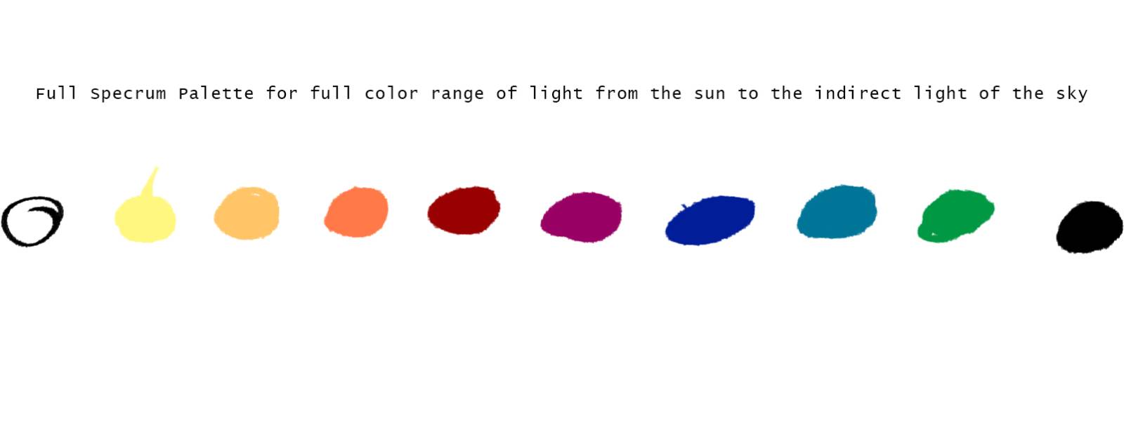 This is the Full Spectrum Palette that allows for the maximum range of hue offered by the sun and the sky.
I use this palette a lot, so whether I work digitally or traditionally, when I am studying light and shadow I think exclusively in the above hues. Like a soldier, I was trained hard to think a way and so were my reflexes. I do not have trouble navigating the color space digitally with extensive color training to help me. Regardless, I am saying this just in case someone here happens to want to argue that I am doing this one digitally while the next one I did traditionally. This one was a result of a need to illustrate an idea that I had not yet painted when starting this article and had to work on the fly to finish this otherwise I would have done them all in oil.
Warm lighting version which I then pushed thinking about what the camera loses when this is shot.
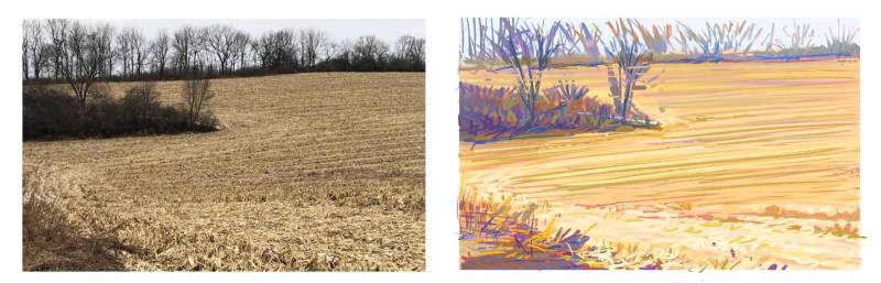
Having experienced lighting conditions like this in my training, I am aware of what to put back in, although I too am guessing at certain things since their color space has been so crushed down and lost to the data stream. This allows me to cross into the high chroma space knowing that I do see something in those spaces, and it does feel warmer or cooler, and that helps me identify what to use, and distance, focus, and which chroma scheme I am working towards helps me narrow down the choices to something close.
Here is another condition where someone without experience would paint the weeds in the field with a brown, adding white to it, dulling it even further, and as a result, those areas would look dead to the brighter colors painted in the trees.
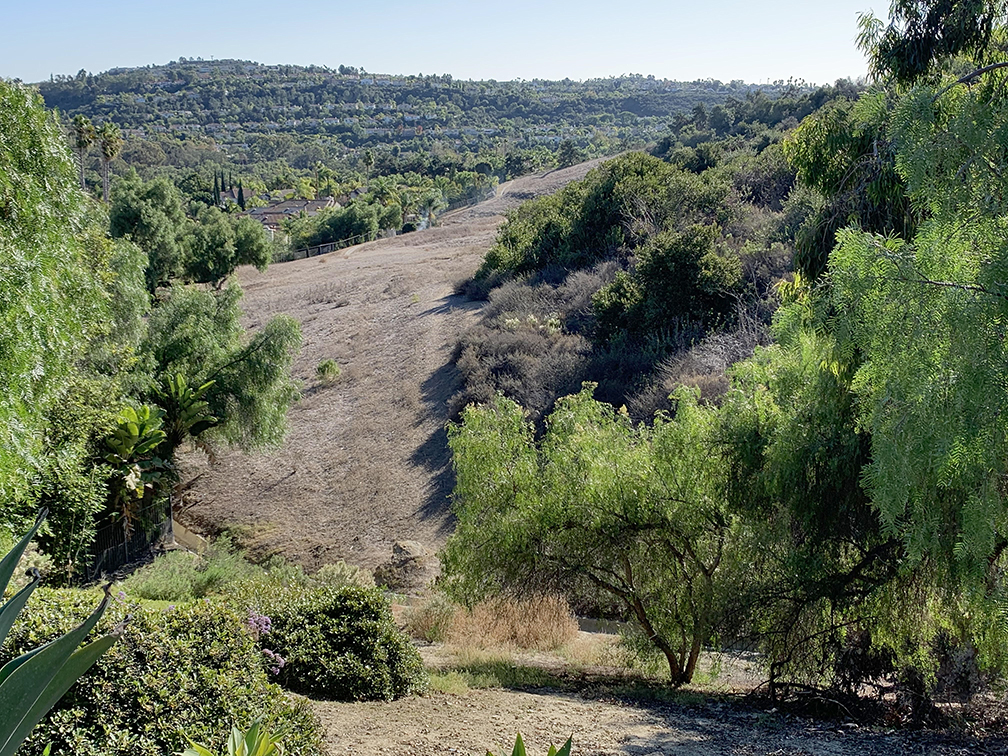
This is an example of what would likely occur if given to a student, as this is a student image, given 1 hour, how would you color interpret this image? The shapes are not bad, but the colors are all over the place, and the picture space has no depth to it since all of the darks are similar. This pulls all the fields of depth into one flat layer rather than letting them breathe and separate with value groupings per each layer.
Regardless, the color scheme is both high contrast, and colorful, both of which are two differing devices that should not both exist in the same space together at once, or like this image, lose any chance of holding a focal point down, and the other problems I mentioned above.
HIGH KEY OF CHROMA
We know that low key of chroma helps you find that all color is value, all colors are value, so we can learn half of the equation color=value=color. By omitting color at first, and focusing on the lightness and darkness of all the objects, we have a better sense of how to perceive their relative values to each other. This is the very exercise you were doing when learning to draw, taking apart whatever it was you were studying and indicating all the colorful things with a pencil, or with charcoal, reduced to value.
High key of chroma helps you find color in all objects regardless of how gray or “brown” which means gray, they might be. The above photo would not be handled well by many who have not had training in how to see light, and how light affects everything around us since the greens in the trees make everything else look dull and grayed out.
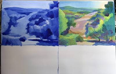
In starting any chroma exercise, the first place to go is a value comp. For color theory, the comp should be done with the Ultramarine Blue and White Palette. The blue underpainting is equivalent to the brown underpainting in that it is a representation of the indirect light. When we add the local color back in to the shadow areas at the same value as the shadow, the blue mixes with that color reducing its chroma, and altering its appearance. It gives the hues a feeling of being lit by a totally different light source than all the warm hues we paint in the sun lit parts.
This blue and white study is the control. It is what you judge both your low and high chroma studies off of, to make sure you are keeping the local values true enough that they hold up to how bright or dull, how light or dark they should be.

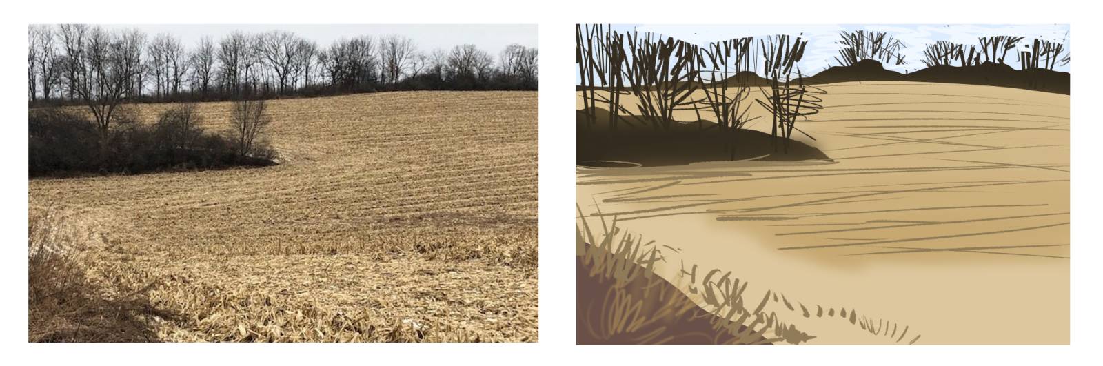
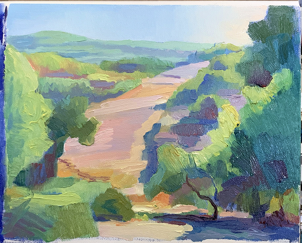
This is the Ultramarine blue study. This was done using only bristle brushes, and was done on a canvas pad 18 x 24 in size, this panel is 9 x 12, one quarter of the size of the page.

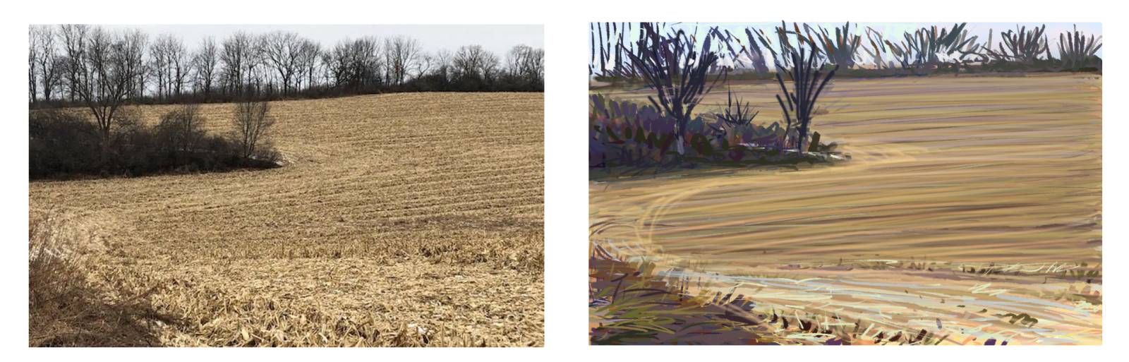
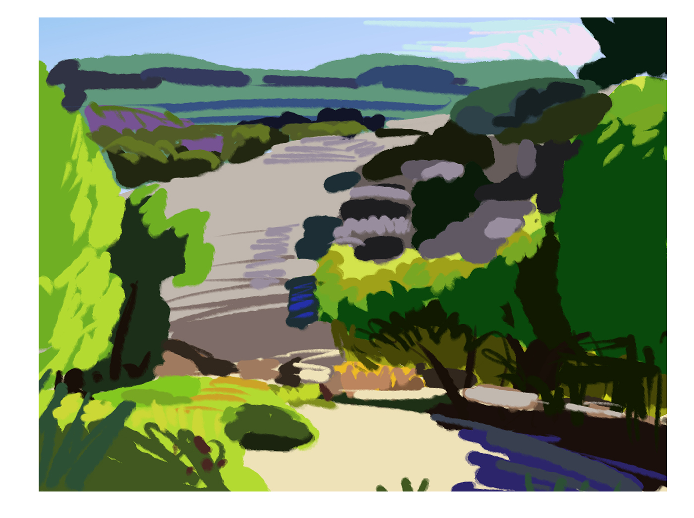
This is the start of the high chroma study, the green in it is an OOPS on my part. I meant to shoot this before I started adding color to show that the high chroma study should begin with the same line drawing and the shadows filled with a tone that is close to what will be used as the shadow value in the final image. Then add the colors over the shadows to alter them in balance between sky color and local color. Then add the light side making sure not to match any values to the darker side.
The darker side should not be as dark as in the photo since this is not a high contrast study. High chroma painting requires that all the values share the same middle value range together since true hue, or clean color is mostly a middle value range for the majority of hues we use. The lights will be a little darker, and the darks will be a little lighter. This will ensure that you have enough space to hold onto the cleanest representation of color that you can for each space. Consider this a color study so that you do not treat this delicately and try to paint pretty trees and nice grasses, etc. It is about matching colors and combinations to see the light affecting the forms and making the best possible color decisions when mixing the colors for you image.

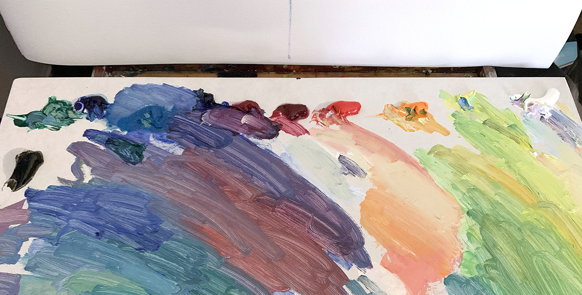
Here is the palette and a small portion of the mixtures used. As you can see, if there is any color that is too gray or browned out they will stand out amongst all the other hues mixed. The palette is the first place you will note whether the color you mixed is correct or not. Do not let it touch the canvas if it is dull or ill fitting with the rest of your mixtures. I am also doing this impromptu, which means I am mixing as I go instead of building up premixed color strings. You should be able to perform under any conditions, with any palette needs, and any limitations you are given. You learn to help you solve through any shortcoming or limitation you might encounter.
I cannot say that this is a quality photo. The greens do not reflect the greens I used completely, they are being affected by the lights in the studio that share a similar temperature., thus altering anything with yellow in it making it look cooler than it actually is. And some of the lavender hues I used for the dry field look a little more gray than they do colorful on the canvas in front of me. The shadows look muddy when they are actually nice purples and blues. Light is a beast and is one reason why converting any canvas to another medium is such a pain in the ars.
High chroma studies are to help you determine the color relationships between everything, color as in primary hues, warms and cools, temperature opposites, how light affects the surfaces and distorts those hues. Purples in the shadows are a result of the optical blending of reflected sky light and the dark hues of the leaves, the sticks, etc. optical blue mixing with anything warm will look like it belongs in the purple family, warm or cool.
To figure out how to determine the colors in the field, I needed to know their surroundings first. By plotting all the other hues, I was then able to break down what was missing from the color spectrum and also compare what is missing to what has been found, and ask myself this important question: IS IT WARMER OR COOLER THAN WHAT I SEE. This will help you figure out what temperature you are viewing. When you know the temperature, you know the family of hues left to work with. If it is warm, yellow, orange, red, if cool, green, blue, purple. Sometimes the color is a warm green, like orange green, or sometimes it is a yellowed purple. In these conditions, broken color is the best way to identify this conundrum.
With these two studies out of the way, I have the low chroma study to add, then, when all are finished, the middle chroma version, or the “how we actually see” version. This is like doing a regular painting study, only now we are much better informed of the value range to work with to optimize the colors so we end up with a canvas that looks like we were there painting from it and not a “COPIED FROM A PHOTO” debacle.
A short list of demands for high chroma painting:
-NO BLACK on the palette
-Blue underpainting done in ultramarine blue, and titanium white to cut it down from being so dark.
-Mixing colors, DO NOT MIX COMPLEMENTS. Mix from a color 1 to 2 colors from the initial hue you are using to keep all the hues from becoming earthen and dull.
-When a color starts to turn too gray, which direction is the gray heading, and add a little of the neighboring color from the palette to enhance its chromatic appearance. This means using the above palette in the color order you see them in.
-Tinting is a must, so do not think that adding white to a color is bad. If you mix too many different hues together then add white, you will end up with a gray surprise.
-Do not mix more than 2 colors together at one time, and make sure they are both the same value to one another before mixing them.
-Value is NOT how you solve light and shadow, USE TEMPERATURE JUST LIKE OUR SKY DOES.
-If done correctly, you can paint the time of day down to the minute with the correct colors of the day. Yes, they do change throughout the day even if you do not optically notice them doing so.
-Earthtones are not high chroma, they become higher in chroma when they visibly share their root hue. Dirt is an example. it might look burnt sienna, but what is burnt sienna? Orange/red. Pushing the dirt in the more chromatic direction ensures it does not dull into a lower chroma than it should be.
HOW TO SEE COLOR IN NON COLORED ITEMS
I mentioned it above, but again, the secret to seeing color in everything gray, brown, dull, and shiny, is to compare it by TEMPERATURE to the surrounding hues. Once you have determined the temperature, you only have a few choices per each side of the 12 section color wheel, the wheel used on the field, and the standard divisional wheel used today. Temperature is the key to solving any color you are looking at. By solving this, it helps to determine where on the wheel to look for its perceived root hue, or the standard hue family it appears most similar to in comparison.
All dull hues are still hues, just considered a lower chroma point, like the hues to the left of these color strings. Isolate any one of those and you would not really think that the root of their hue is the vibrant red to the right of them. Of course dirt does not have a root hue, it is what it is. A painter still needs to paint it, and match it to the rest of the image. Therefore, we have to find an answer that is something of a solution for all artists to understand. Colorism does solve this problem, and these studies I have presented so far really help you learn to identify it. If you really do put in the practice, the beauty is you can never unsee color in everything ever again. At that point, how do you control it to tell your story?
DO NOT FEAR THE CANDY STORE APPROACH TO THIS! Tonalists will tear their own eyeballs out long before they would ever be caught dead working with such vibrant hues. Too bad for them, as this would help sharpen their color control so much more if they just believed that colorism is not what they think and not what they think it will do to them. We are not going backwards with technology so instead of thinking in the mud, it is time to sharpen the tonalist approach and improve their color sensibility regardless of how high they are going to gauge the colors.
THIS IS AN EXERCISE, IT CAN BE AN END RESULT, BUT IT IS NOT! IT IS DESIGNED TO HELP YOU LEARN HOW TO SEE COLOR IN EVERYTHING AROUND YOU. Chroma exercises scare way too many painters. They do not understand the goal right away, and the colors are impossible to see for a spell. It takes time and energy to gain the sight of color. It is a subtle thing you are learning how to see, but once you do, you have total optical control over your color optics of your piece. Working with colored lighting, working with color formulas and recipes are easier than before and not the end all be the way illustration schools can make it out to be.
BONUS
If you have made it down this far, and you are following these articles on color theory, I am happy to announce that very soon you will be able to experience all of this in video form, as I have a comprehensive color course coming soon on Gumroad. It will be a lengthy set of videos once finished, and a very comprehensive course on color for painters, far more in depth than I could ever be in a few articles, with tons of demonstrations to help with everything you are learning.
This course covers everything from spectral or white light color theory, colored lighting, and color formulas. This course will cover both digital and traditional color space and color science enough for an artist to wrap their head around the information, exercises to help you level up, and information on how to handle color from the sun, to picking any random colors and building a composition from them. I will also be covering a lot of the more contemporary palettes, how and why they are set up the way they are, with demonstrations covering a wide variety of color mediums.
Part 1 should be available sometime near the first of the year. And expect more added to the course over the next year. This is the color course, and order of information I wish I was had when I was coming up. I’ve put this course together so that you have a road map of how color works on every level, and have no fear of working with it. Color is really simple and easy to use once you know how to see it and have technically worked with it enough to feel comfortable getting yourself out of a problem when there is one.
Enjoy your time learning.


Waiting anxiously for the course to come!
thank you for this one Ron!
Color Theory Part 3 delves into the fascinating concept of high chroma, revealing how vibrant and saturated colors exist in all objects around us. High chroma studies are essential for artists and designers as they train the eye to identify and appreciate the bold, vivid hues in everyday life.
Fascinating read on high chroma! Learning to see and use bold, vibrant colors really brings depth and energy to artwork. Looking forward to experimenting with these techniques!
Love how this breaks down high chroma colors – really opened my eyes to seeing color in places I never noticed before!
CricketID247.com is the ultimate destination for anyone looking for a trusted online cricket ID. They provide the best online cricket ID with a seamless and secure registration process. Whether you need cricket online ID for live matches or a reliable online cricket ID provider for betting, CricketID247.com has you covered. Their platform is ideal for obtaining a cricket bookie ID or an online book cricket ID, ensuring you have access to the most reliable betting options. For a smooth and hassle-free experience with a cricket ID online, CricketID247.com is the go-to choice for beginners and experts alike. Don’t miss out on getting your online cricket satta ID today from a provider you can trust
Exploring color theory is as engaging as solving a Wordle puzzle each discovery adds a layer of depth and understanding. High chroma studies sound like a fantastic way to sharpen the creative eye!