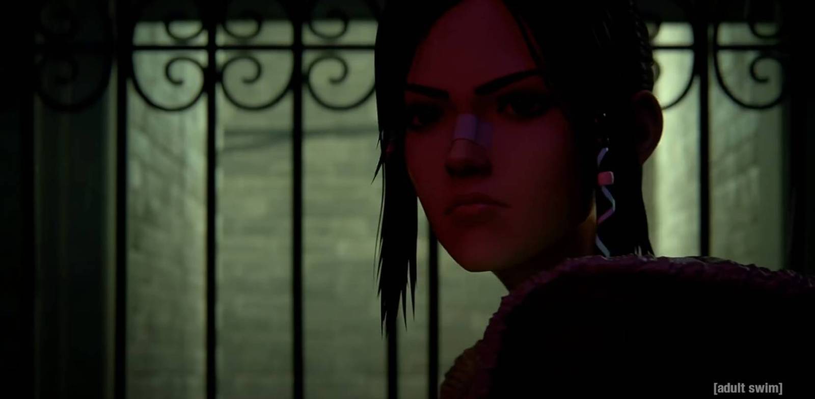
So before the absolutely crazy season that brought in Dune, Gunpowder Milkshake, The Piano, Titane, etc… I was asked to tackle a new iteration of the Blade Runner universe with the newly released BLACK LOTUS series airing on both Adult Swim and Crunchy Roll. Black Lotus takes place a few years prior to the events of Blade Runner 2049, and is a proper cgi-based anime style and as such is a method of working that is waaaay out of my usual comfort zone. I mean a whole other planet outside. My excitement to be asked to tackle this was only matched by the secret question that kept nagging me throughout… “What in god’s name are they smoking to think I am the right fit for this?” It required me to completely reorient how I make work like this, get comfortable with a color scheme that is wholly off map from my usual warm earth tones and come to realize so truly essential and basic rules with representing an animated thing that I’d only just begin to realize…
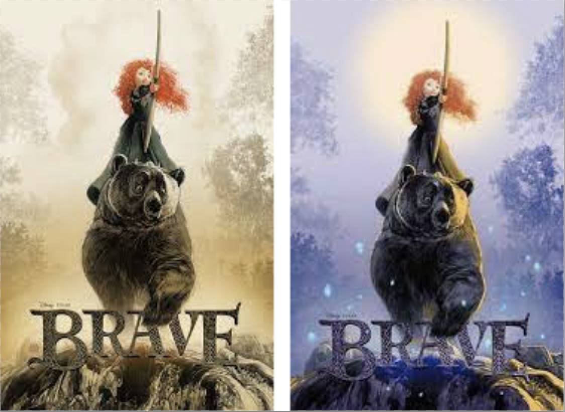
I think the closest I’d previously come to something like this, particularly in needing to depict an animation thing versus my usual live action fare was my poster for one of my all time favorite Pixars, BRAVE. The thing I learned from this job that made BR possible was HOW to depict the characters. With film work, or more realistic approaches, there’s always room to interpret, morph and change the look and stylings of the piece, so long as it still represents the core basics of the characters. There’s a million different ways you can draw Cary Grant and still make it clearly a Cary Grant piece, for example. The subject is real, photographable, and that foundation carries with it a lot of encouraged freedom to lift off from. With animation subject, for a project like this, you’re not just tasked with depicting the character as it is, but as it’s DRAWN. So there’s a lot more inherent constraints. Especially if you’re doing work to be a part of a promotional campaign for the film or show to come.
You can for example, run will reimagining Bugs Bunny because he’s such an established icon, as long as you grab hold of certain essential Bugs-isms, and make your interpretation recognizable, then you’re golden. But with a new thing like this, loyalty to the source is more requisite of the process. Your job is not so much to invoke, and even vamp in front of the source, but to reflect. And that means for a job like this, being even more loyal to the depiction than usual. Which back to this gig, for me, means drawing and painting a piece in a way that is completely not my usual thing. Almost unrecognizably so. Despite the terror of having to do this live, in real time and for such a high profile effort, there was a lot of excitement in the challenge of puzzling out the solution for me here. It meant not only aping the stylistic approach of the show’s look and design, but also using to effect a color scheme that frankly is beyond me. But its Blade Runner and having loved the first film when it came out in 1980, and then rendered even more expansive Denis Villeneuve’s film later, the chance to play in this particular sandbox was a no brainer.
The first thing to do was to make a test piece to try out this methodology. Not something I usually do given my years doing this kind of thing, but again, this was a deep dive into a new pool and I had to show myself and prove to the clients at Alcon and Mondo/Death Waltz that I could do this at all. In all honesty… I wasn’t at all sure that I could.
Now security on this thing was TIGHT. Insanely so and more than I’d experienced before (until DUNE which was a whole other level), and it took a lot of back and forth, begging and cajoling to even get the opportunity to see the episodes- most of which were still in some degree of production, and many barely rendered and keyed in. The fear of the show leaking out online in any way was humongous at the studio and not even a ironclad NDA would soften the hardness against sharing. Once the dam broke I was able to get a chance to see the first six or so episodes all within a short window of a few hours before the screeners expired and I was Locked out.
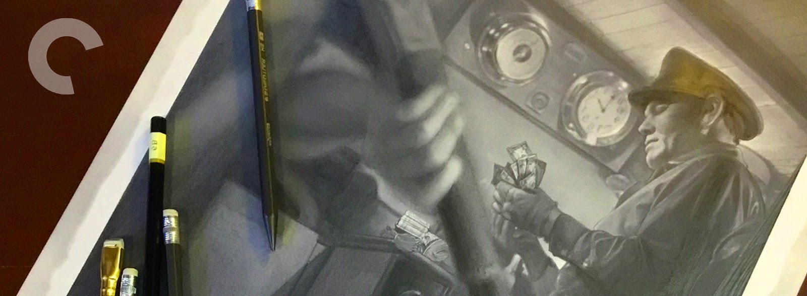
*(Many of these final pieces that were assembled in PS contained as many as 190 layers- the cover in particular, so I’ll spare you as much of tedious laying out as I can and use this test piece to sort of explain how the rest was tackled).
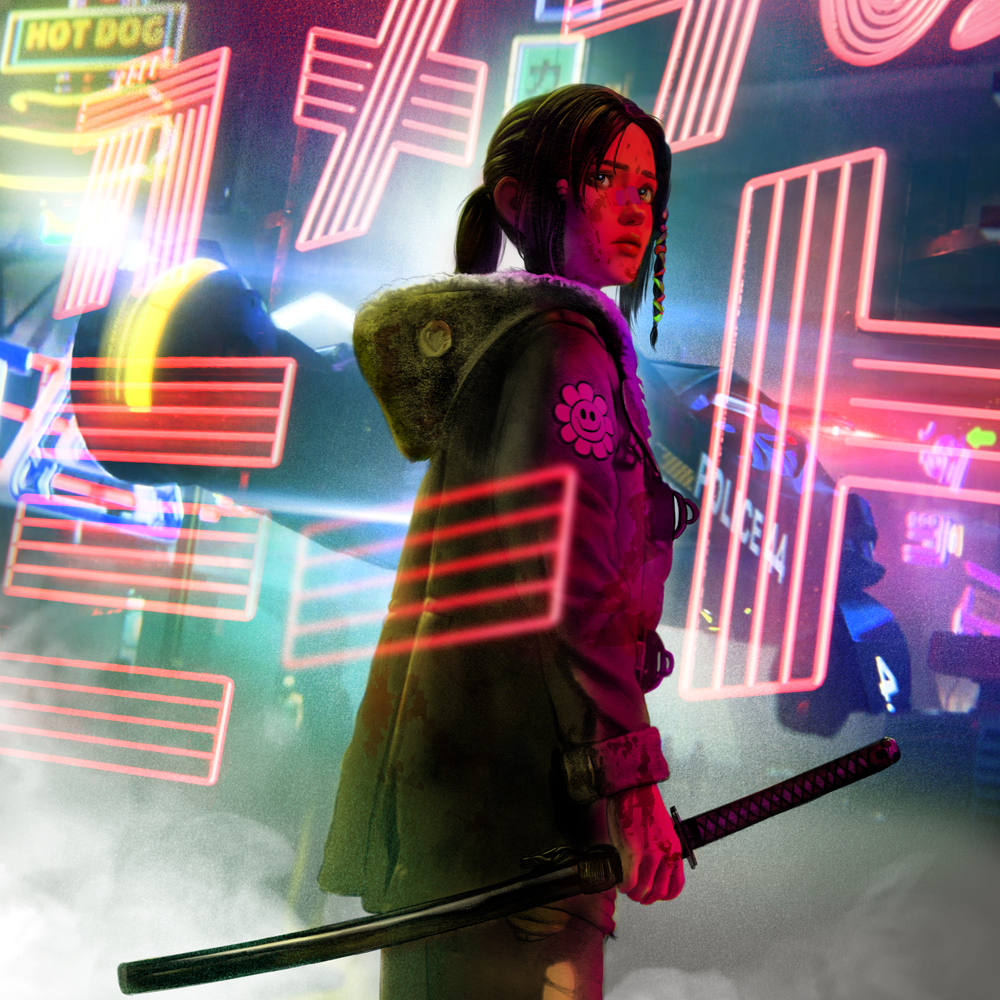
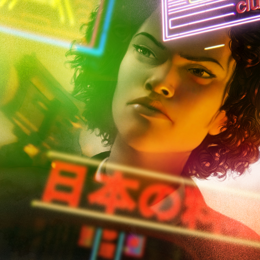
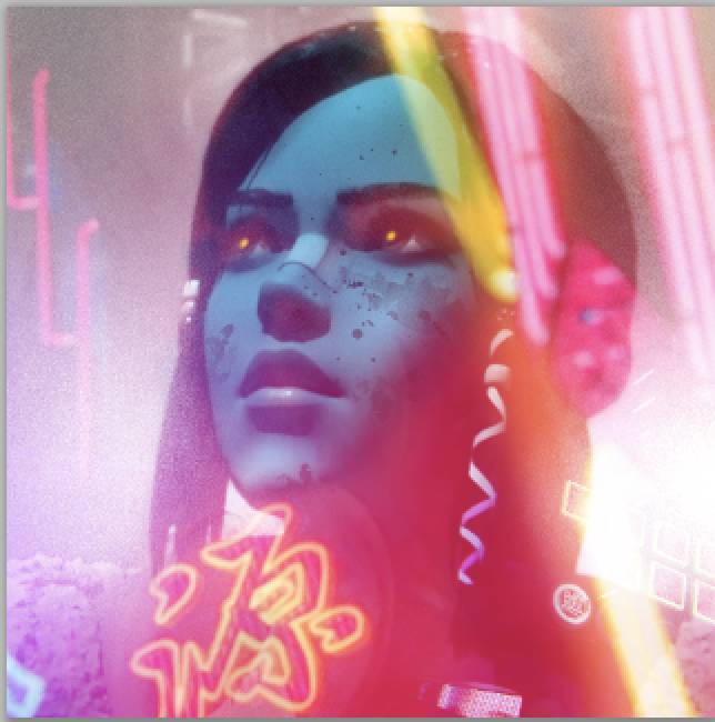
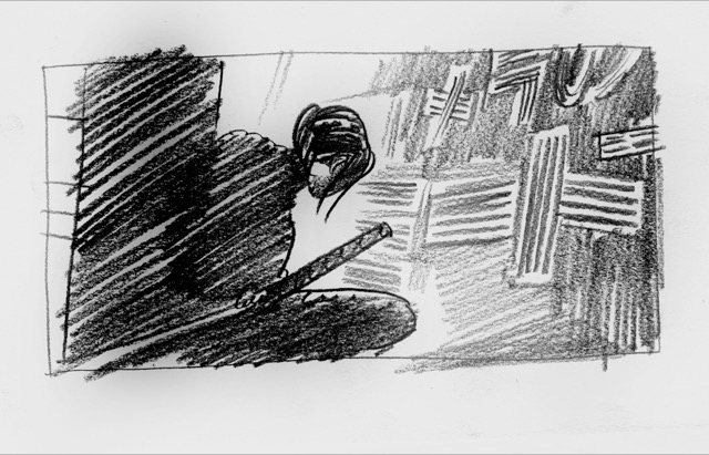
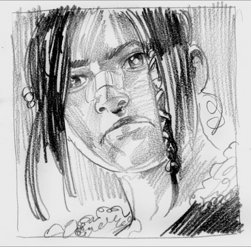
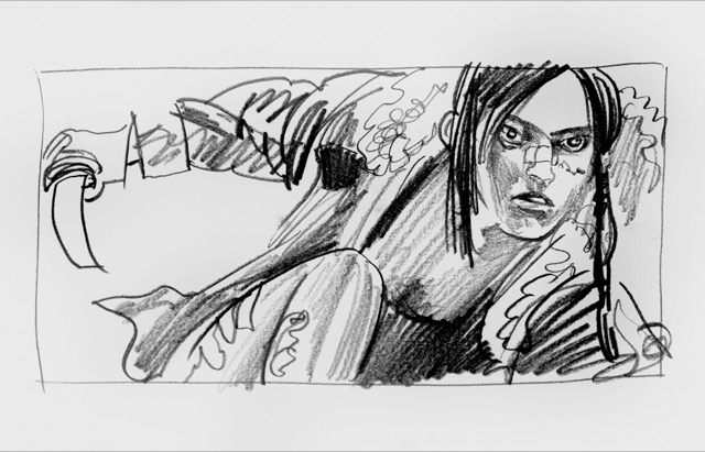
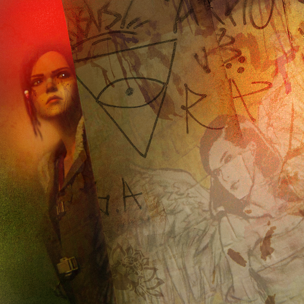
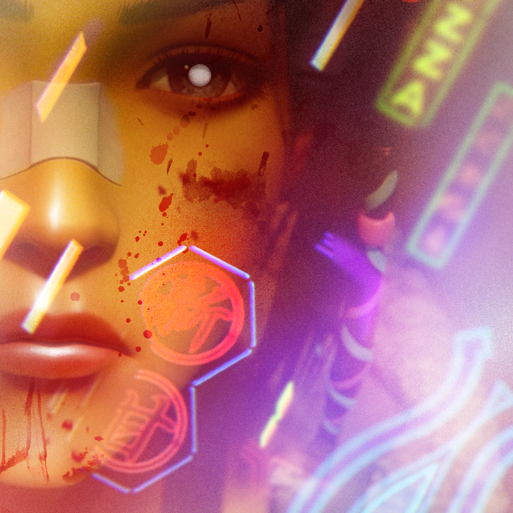
I first did my usual square graphite portrait on paper with some of the expected flourishes and leaving most of the color and neon schemes for later. The most important thing was to capture Elle, the show’s main character, and to likewise grab a hold of the visual style in which she’s depicted. Looking back now I’m glad I departed from he over slavish way I dd this, and returned to doing my more usual way of drawing hair and some of the other details. as much aping a style doesn’t have to be slavish, as long as you can express the truth of the subject in the end. Likewise for the fur of her coat which was more modeled and bumpy than my usual way of wild fare that I love to draw, her hair here was more helmet than hair, and her eyes a little too obscured. But the lighting and values were right so far so I marched on.
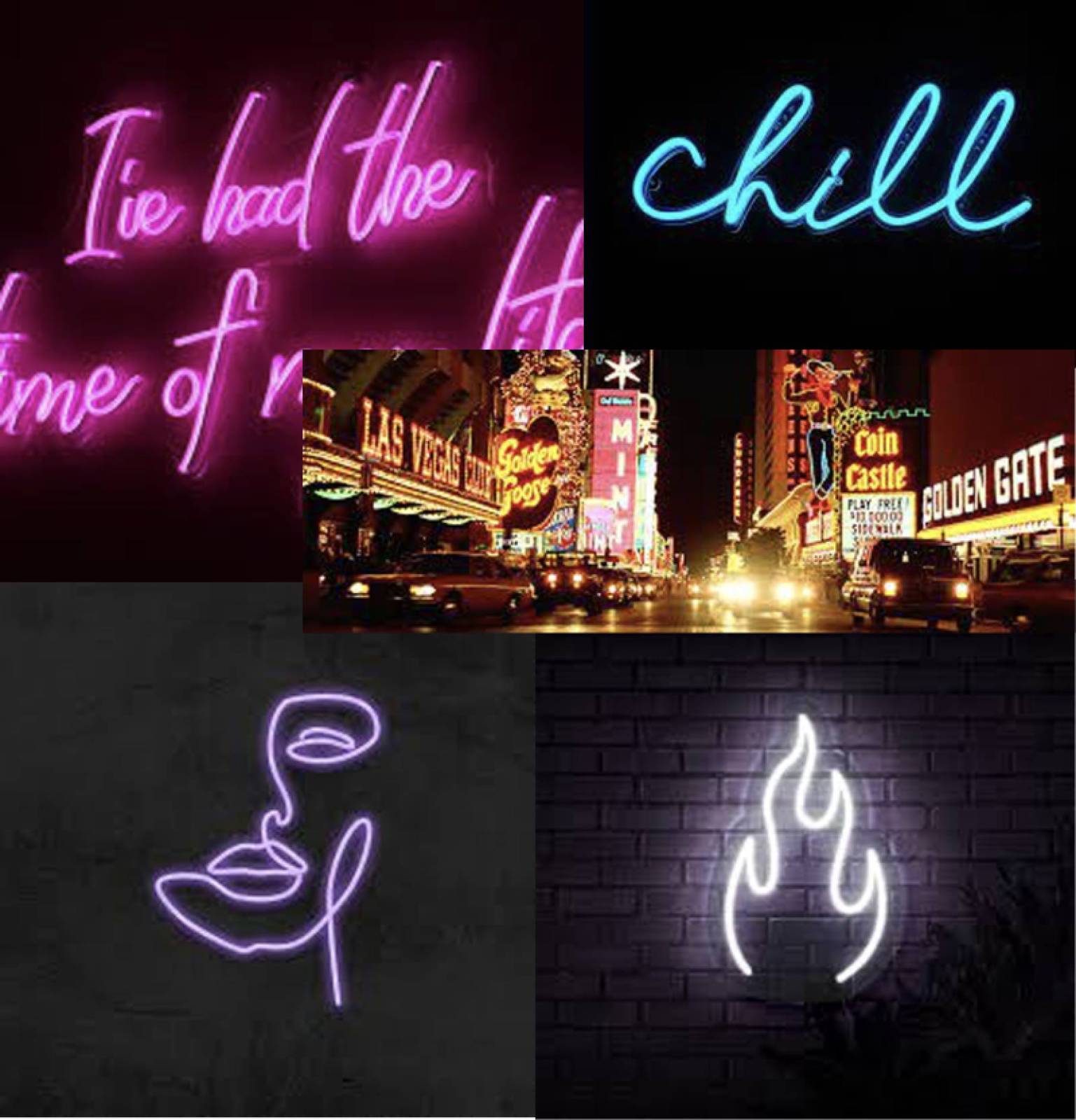
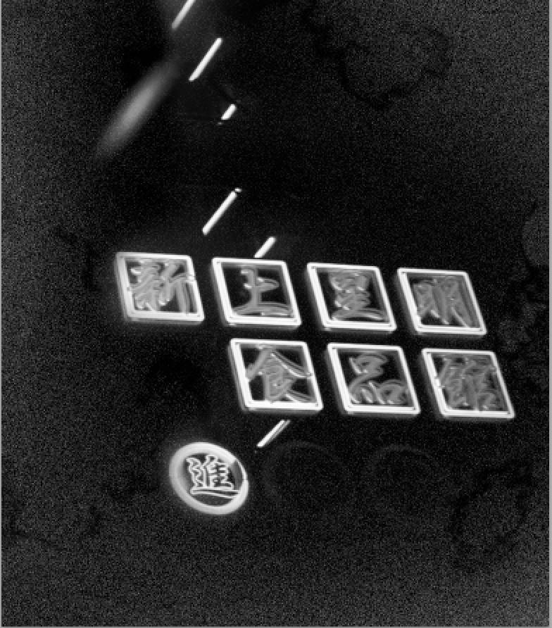
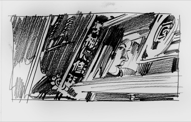
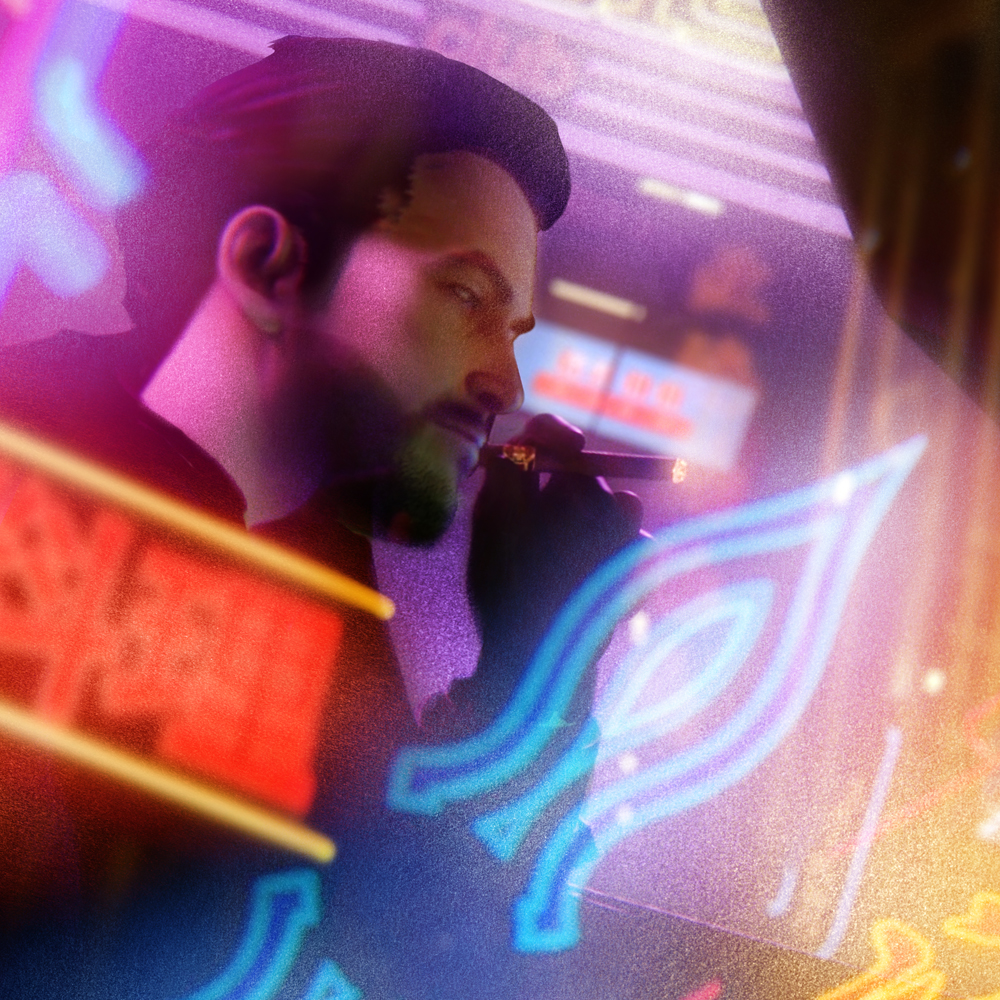
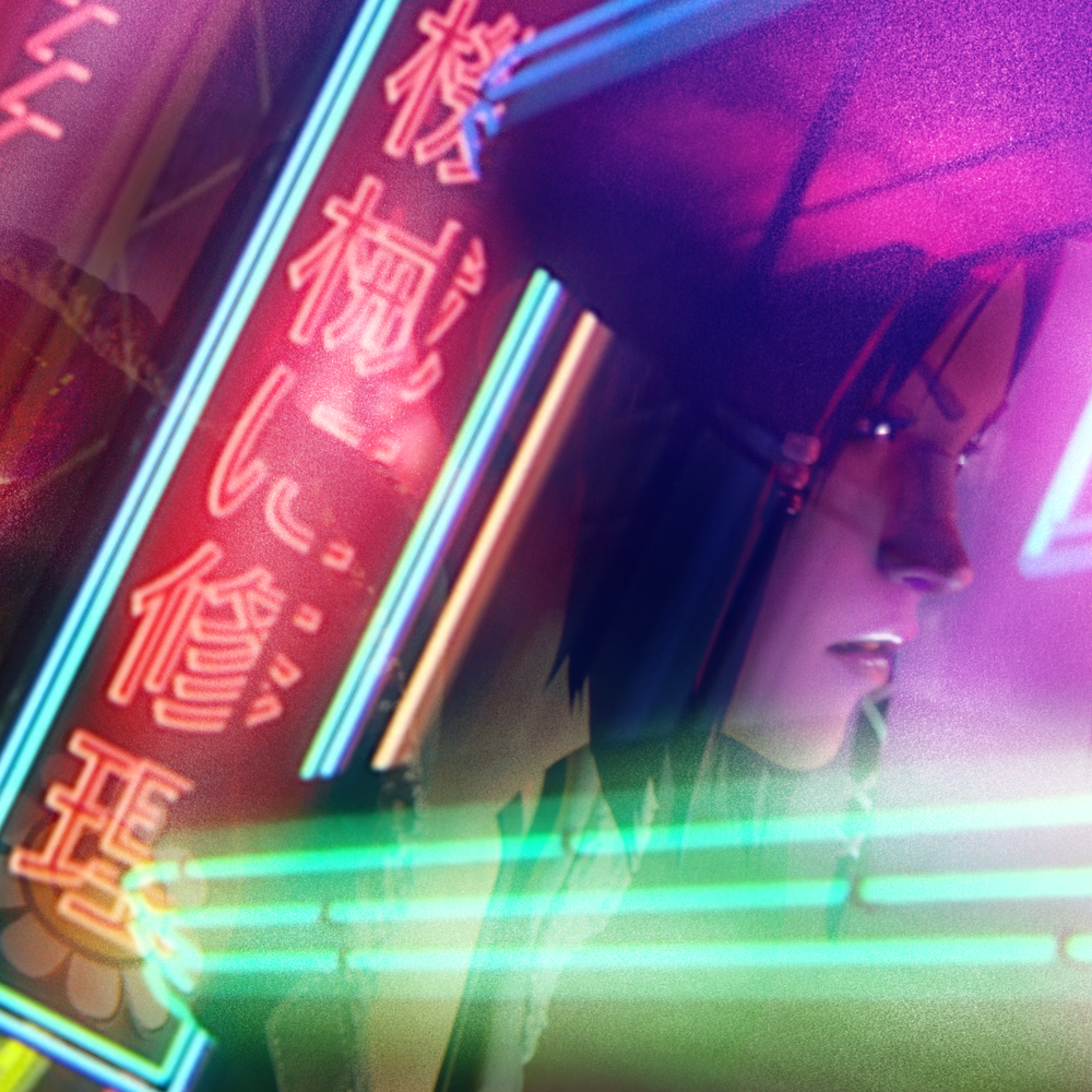
Next up was all the LA noir neon that permeates the BR future, and when I was racing through the episodes knowing my own lack of multilingual abilities, I wanted to use signs from the show as exactly as I could. In my usual way of taking elements, creating them practically, and then scanning them in to utilize in my monkey way I use photoshop, (which is essentially a glorified paste-up machine), I did a lot of research into neon signs and Vegas, in the shape and form of how it looks and the glow and reflective nature of the tones. Since I was going to be doing this in a shattered kind of way as opposed to my typical approach of drafting it all as a whole on paper and then merely coloring that drawing into shape, I had a lot more freedom to play around and find new ways of doing this.
I know that for all the imagery I wanted to do, even the planned character portraits for the LP, I knew I wanted to bestow a sense of trip space, reflections and depth. Have the shine of the lights both in the extreme foreground, push back behind her, illuminate the surrounding fog and mist and rain. Like we’re looking at a merry go round through a shiny glass window and mirrors. The character is sort of a novice to this world and as she stumbles through the streets of LA a sense of her confusion and being overwhelmed by this electric environment seemed an interesting way to run, especially given the more practical and direct way the show seemed to depict it.

So I drew signs sometimes inverted and then flipped them in ps to negatives, and used smudged and blurred them a big here and there. The most essential tool became a little graphite smudge circle stardust thing I drew and then used to stretch and overlay onto the neon sign drawings to given them that particular glow. The little bits made it seem like it was light bouncing off flaked ruins and dust and smoke which suited me just fine.
Once this was repeated for about a dozen or so none pieces, it was back to the salt mines for the art and applying them onto the drawing. Using some color I created with pastels, and then blurring them out to a gentle fog I ten started laying layer after layer of color tonalities over the piece, adding the streaks of light like camera flares and neon afterglows, one on top of the other before then dropping int he constructed neon signage and other details. Then going back into darken areas, throw up reflected light and invert some of my usual color schema to these pinks and blues and purples I swore never to use. 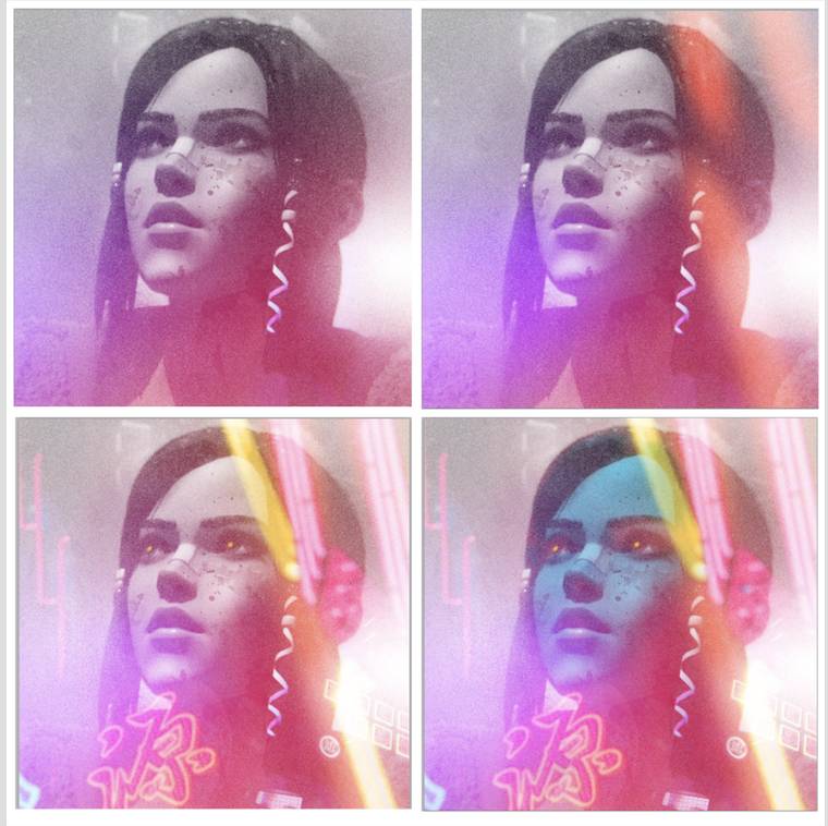
The end result landed well, and I think the only real note was to make sure we added a more nourish darkness here so that it wasn’t;t too bright and cheerful. This is a post apocalyptic future of environmental ruin in a cityscape so that made a lot of sense. After this it was off to the races on the rest of it.
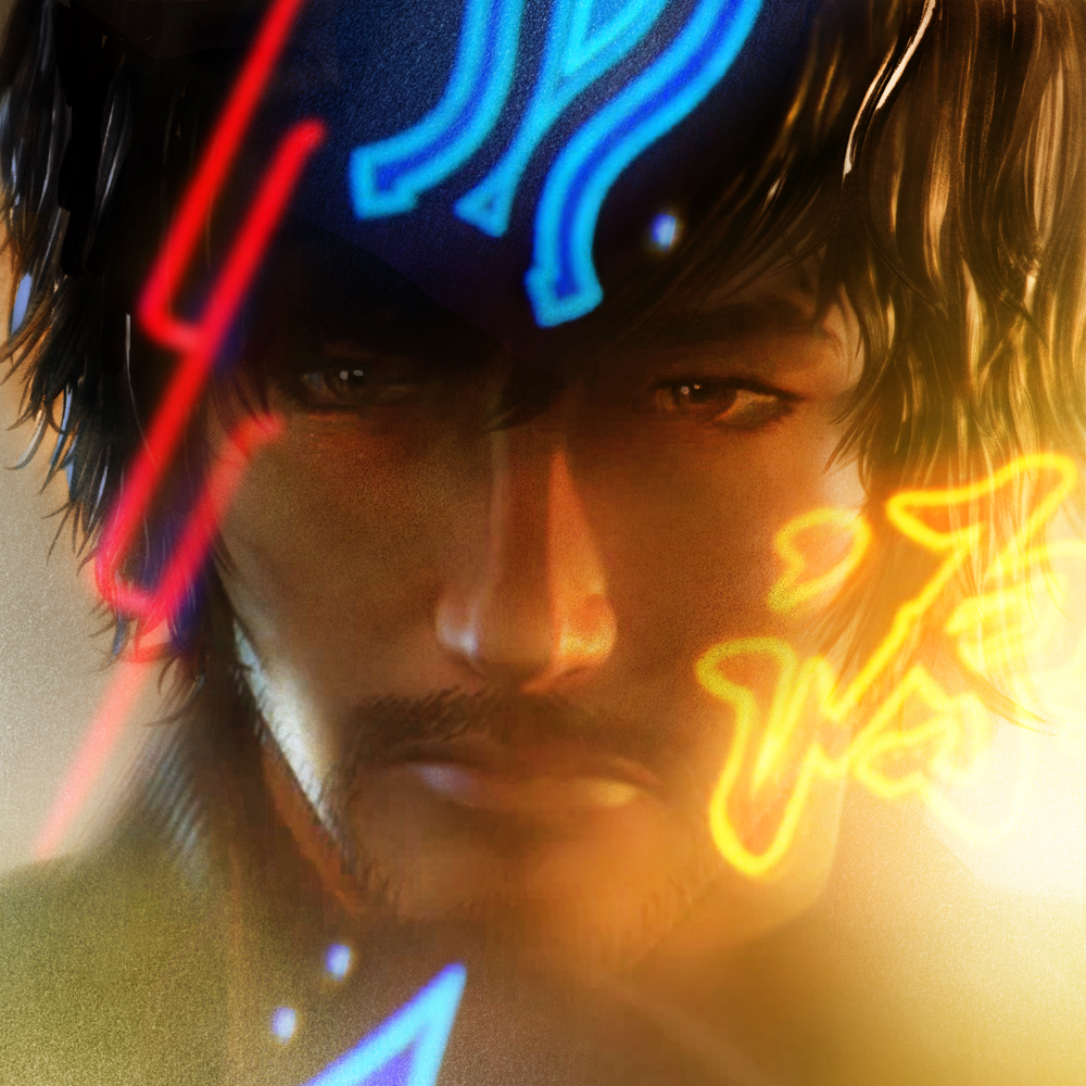
Using color tonalities as compositional structures was not a well used muscle of mine so it took a lot of pump priming each day to get going. Luckily we had a REALLY tight deadline to get this in so there wasn’t enough time to winge and wonder after choices. I raced through a bunch of thumbnail sketches for the coming art, we picked the ones we liked best, and using the design structure of the gatefold LP laid out the three portraits we’d utilize for the design.
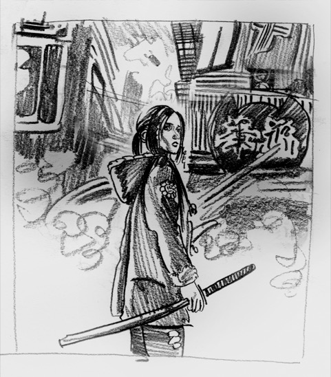

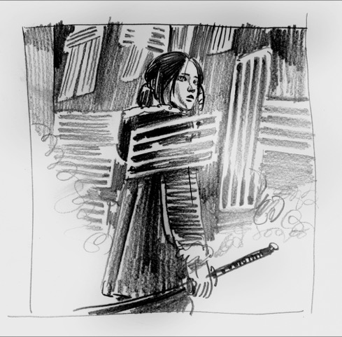


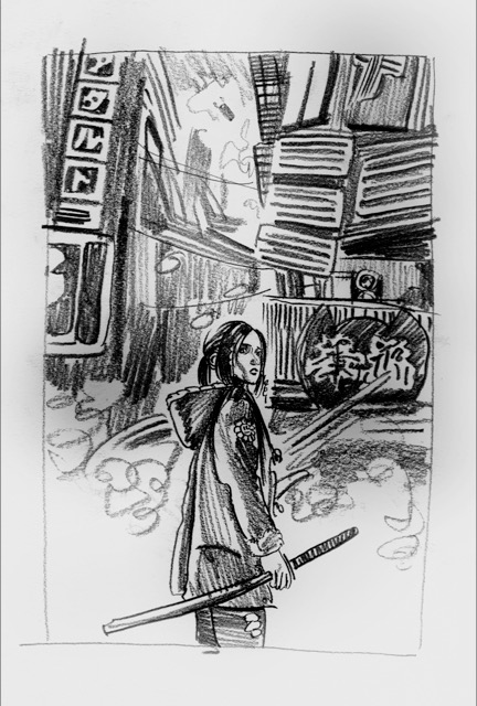
The image we settled on for the cover was a kind of Miyazaki Spirited Away kind of approach of the lost innocent int he big bad city dynamic, but also hinting at the reality that SHE was the biggest and baddest thing on these mean streets. Because I had done that sample piece and built a methodology, I was able to with these rough thumbnails give over a promise of what would come. But because this was not a thing like my usual thing where I’d be doing a big detailed finished drawing ala THE PIANO work, this project meant basically going hard into the final full color pieces. The only way to show the intent was to do the thing in full. This time more than ever. So there was a lot of risk added to doing it this way, but because it was so layered and each piece had SO many moving parts, we could shuffle and compose around text or design or practicality fairly easily.
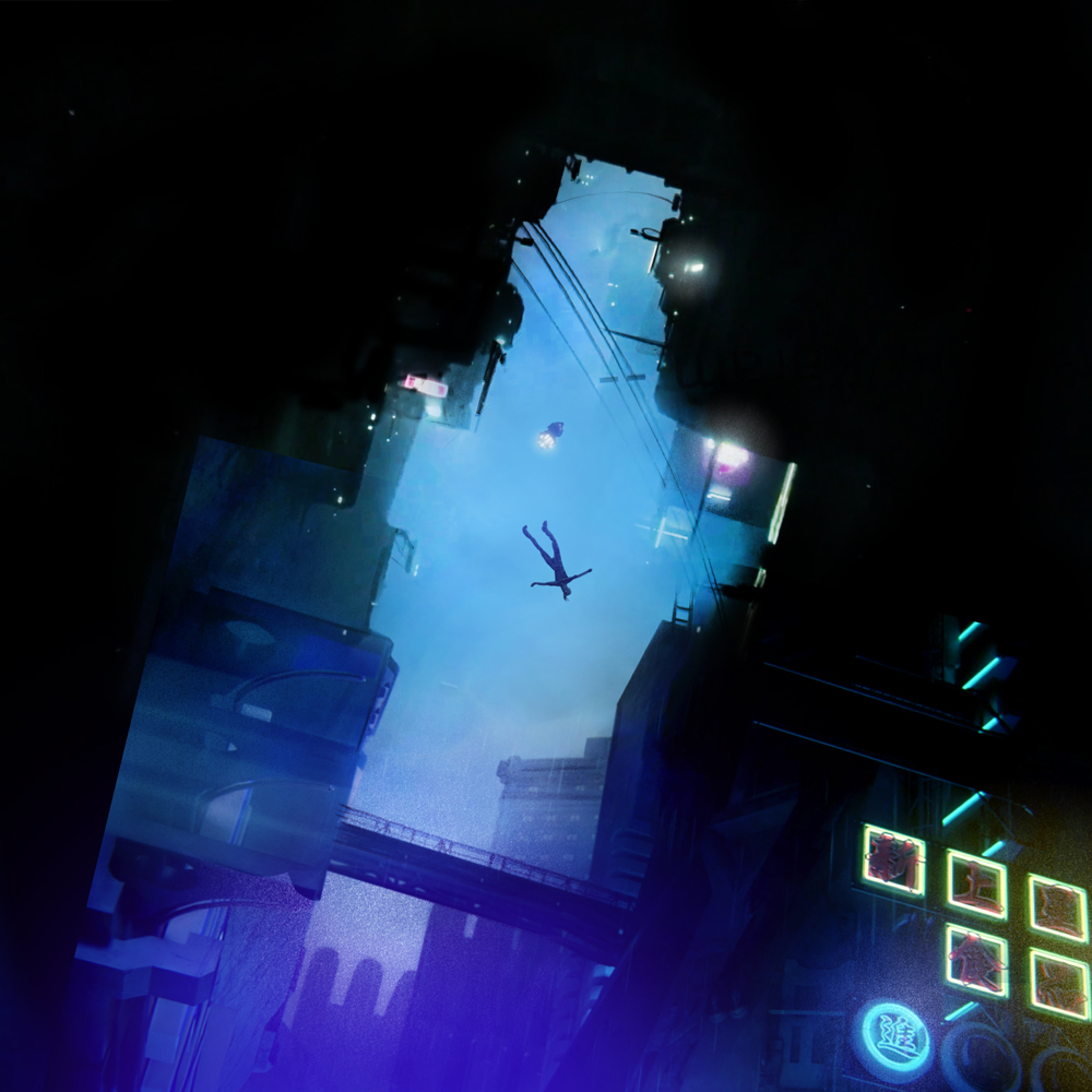
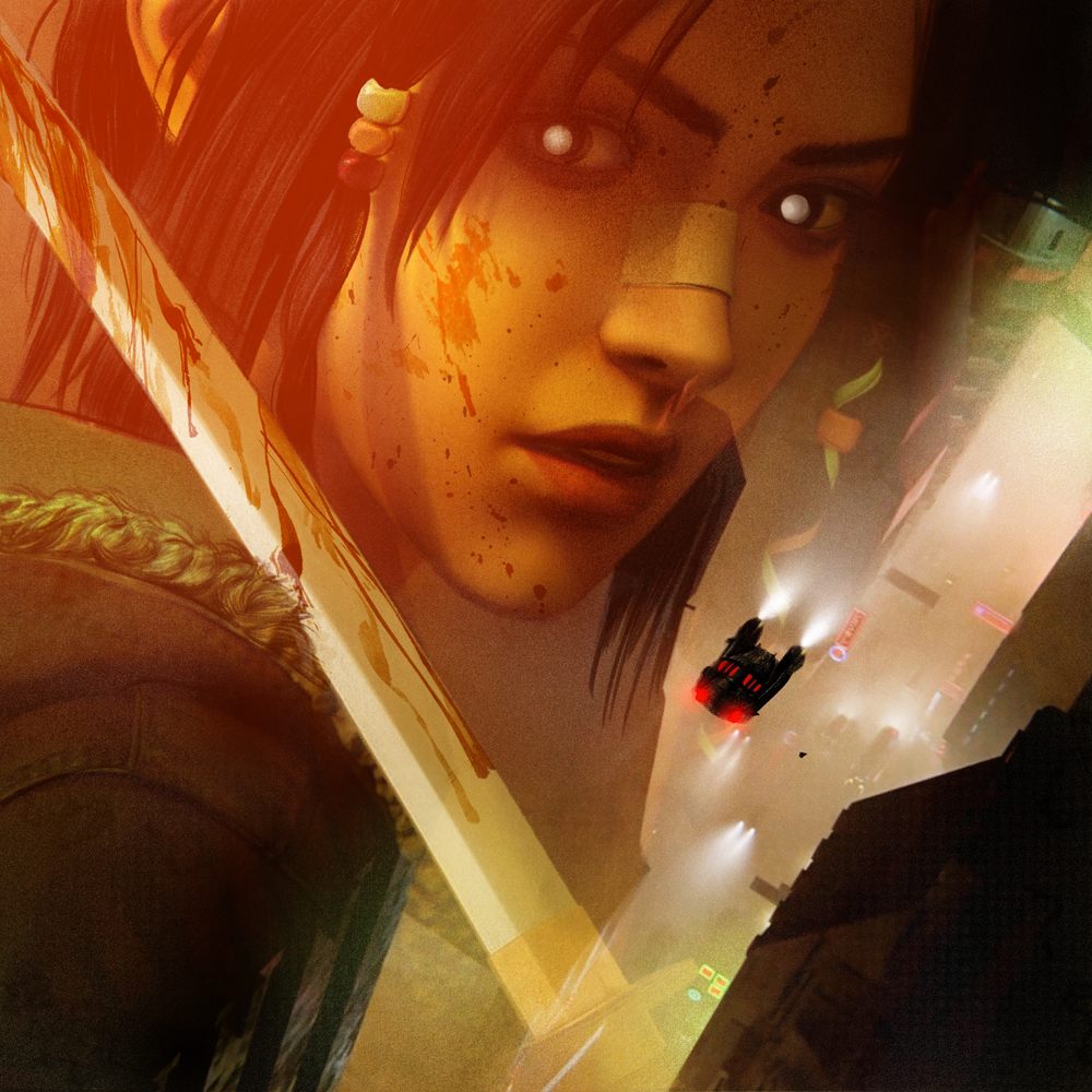
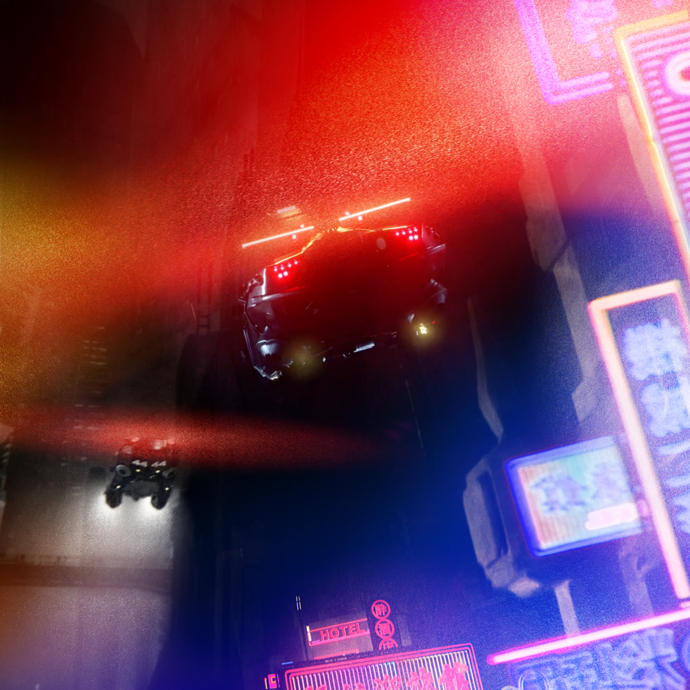
Front and back cover were next- on the back the studio was interested in depicting this scene of Elle falling from one of the buildings down towards the street level while J, the retired Blade Runner-turned-friend, raced on his speeder bike to save her from the crash. The original sequence in the show was a reversal of what I ended up doing looking down on Elle as she tumbled unconscious to her death, (not a spoiler- she does not hit the ground in this scene) but I thought it might be more interesting to show her fall from the ground up as if seen by a passerby so the buildings of the city loomed up like teeth as she fell into a great black mouth… the light of J’s bike racing towards her from a seemingly impossible distance.
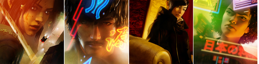
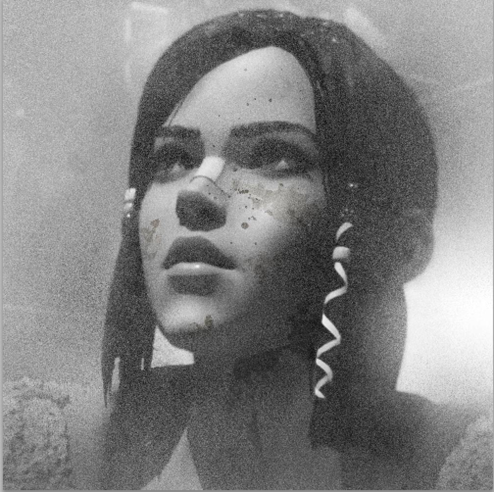
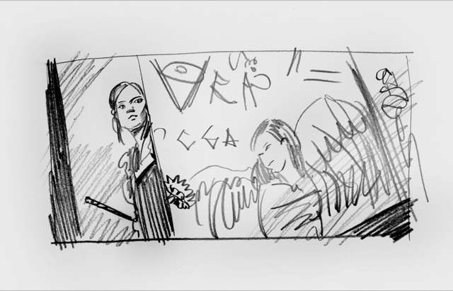
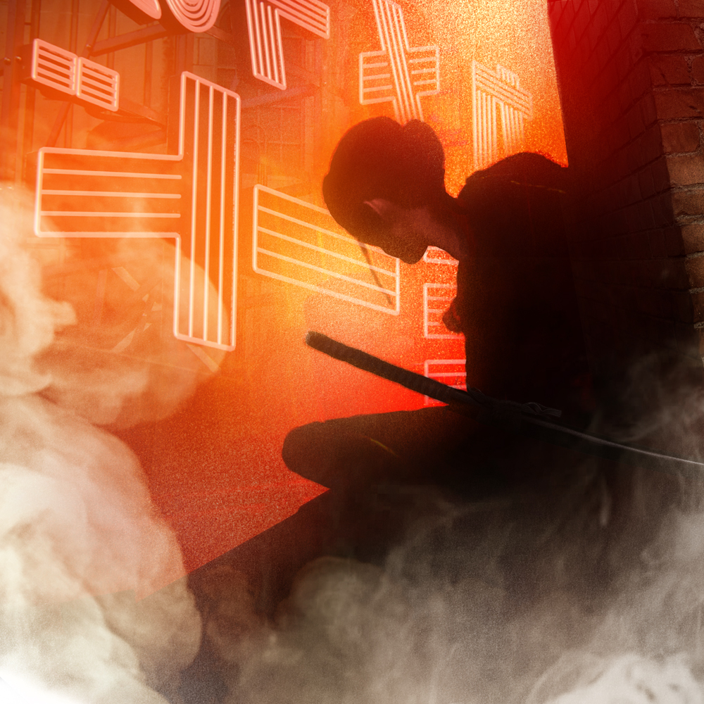
After that it was picking and choosing which of the characters to depict here, make sure they spread out and worked with each other and coordinated overall.
You can see the method being used throughout and getting more refined as we went along. After it was all done and we managed to get everything greenly and off to press, the studio reached out with an offer to do a few more pieces for the Def Jam release of the singles. While there is a soundscape to the show that is VERY Vangelis-y Blade Runner, there’s also an approach they had to lure in a younger audience both with the style of the show, but also with a more opt music quality, and they wanted to tease this show out before it launched on November 14 with a series of teaser visuals. They loved the world we did for the Mondo LP and simply wanted more, and on an even crazier deadline. At first I wasn’t;t sure because by then I was in the full tooth and claw of The Piano, Titane and also the recently affirmed DUNE work so it seemed insane to do more of this level of complicated work… but insane is sort of my thing.
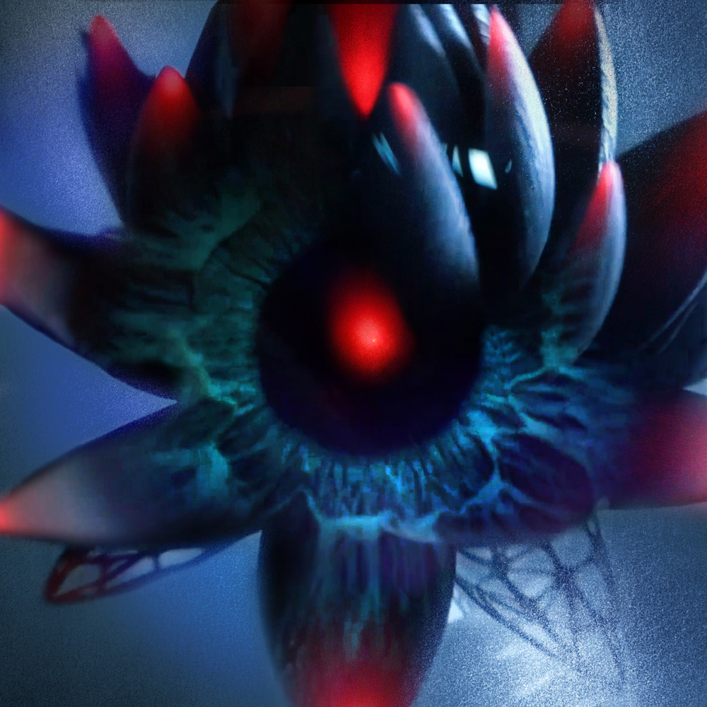
I found, hilariously that all this complex way of working nearly vanished from my brain, like the way birds dump old memories to make way for new data because, well, bird-brains. Of course I discovered this AFTER I agreed to tackle this extra work. but managed to get back in there and figure it out all over again. Luckily most of the pieces were derived from prior sketches so the concept and execution phase were very short. The fun thing about these new pieces was being both afforded the chance to draw portraits of characters that got left behind on the cutting room floor from the LP project, but also because there was a new thematic freedom, to chase more abstracted ways of showing the work and depicting the music.
In the end, it was as you can see a whole lot of dang work, but the result made everyone happy and myself especially for the mere audacity of having pulled it off. I suffer like many of you with an ongoing persistently strong sense of Imposter Syndrome, and it felt like I had somehow again managed to con my way through yet another project that I had no business doing or pulling off. It taught me a ton of how to operate on a project of this scale, to stretch beyond my typical way of working and to pull resources from familiar and unfamiliar places in a way I had never before been forced to do. A reminder that taking on jobs that are seemingly totally wrong for you, embracing the scream and terror of the fight against oneself to rise above the conventions preset by habit make the work better. And not just the one you’re in- but the ones to follow.
If it wasn’t for BRAVE, I wouldn’t;t have understood the dynamic of working from an animated piece like this. If it wasn’t for GUNPOWDER MILKSHAKE, I’d have never learned to love pink. And if it wasn’t;t for my toxic habit of saying yes to every crazy and fascinating project of all varieties, I’d have not put me in a situation that had such a tight schedule as to force me to work so fast and avoid overthinking or fussing around. I t doesn’t mean this is now how I will work, but it does mean I now know I CAN work this way if need be. and it points to the notion that I can still bend a goodly bit towards new ways even if really, as it all boils down, they’re really just expanded or hyper attenuated methods I already employ. I still don’t dig on drawing digitally myself, but I do appreciate the apish basic way of working with photoshop that affords this kind of work I would normally never be able to even think of.
Whether it was time as a crunch or trust I could not be more grateful to Alcon, Def Jam and Mondo for letting me run wild like this, and be so supportive of the effort along the way. It was truly fun. Insane, and terrifying, but like most rollercoaster rides, fun enough to make it hard to resist the impulse to get right back on the ride and do it again. Which I clearly did.
You can pick up the LP soundtrack via Mondo HERE
And you can also grab some Black Lotus swag and news HERE
You can watch the trailer HERE


Trackbacks/Pingbacks