By Charles Vess
I’ve been working up my illustrations for the collected Earthsea stories by Ursula K. Le Guin for over 4 years now and am just starting to pick up speed, sprinting to meet my fast approaching deadline.
When Joe Monti (Executive Editor of Saga Press) called to ask me if I wanted to illustrate a collection of all six of Ursula K. Le Guin’s Earthsea books I was both wildly excited and stunned. For almost 50 years millions of people (including me!) all over the world have read these books and now I was supposed to show them what that world and the characters that walk its landscape actually look like.
I had to take several long, slow breaths and hope for the best.
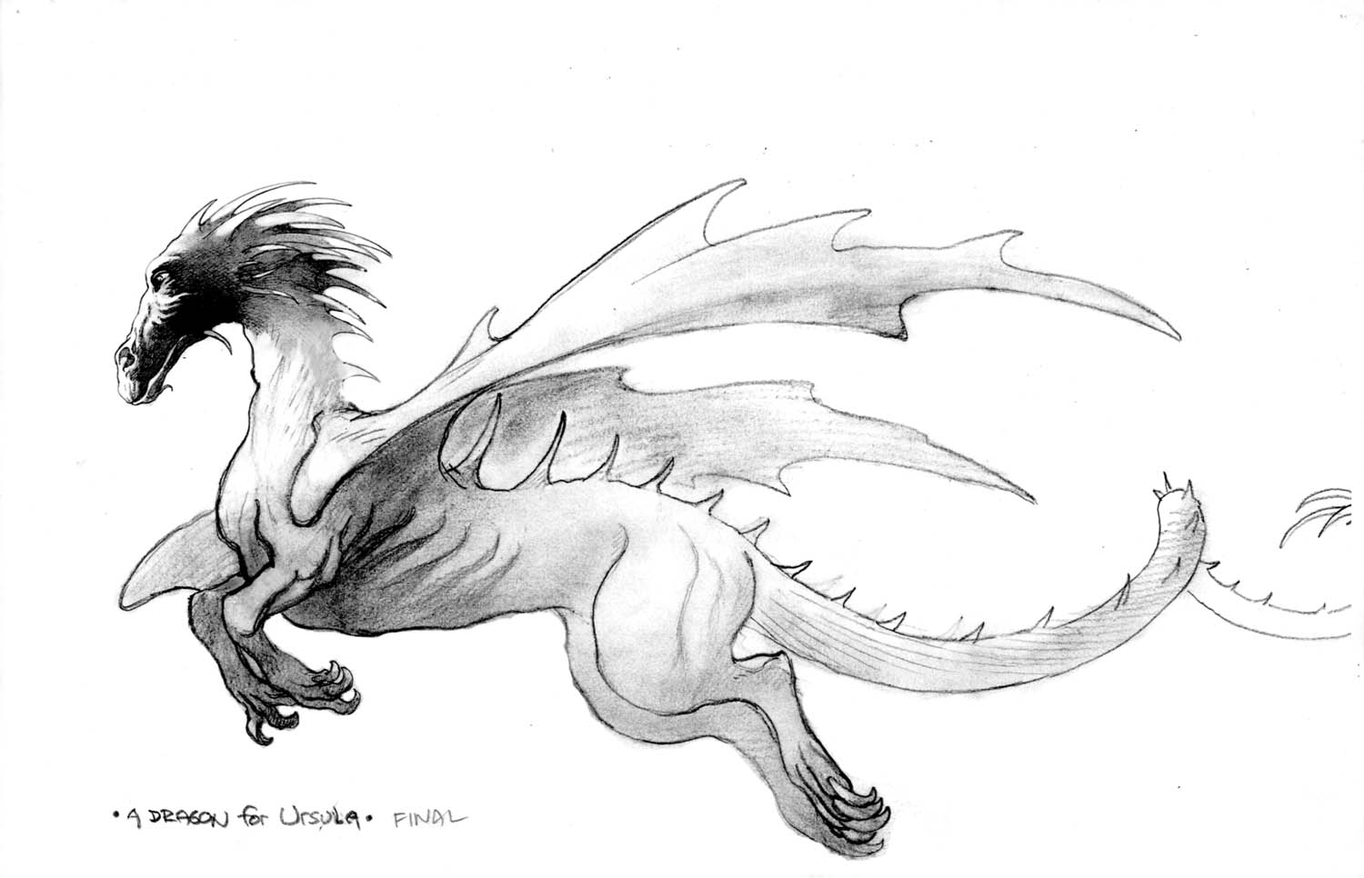 |
| Dragon in flight. |
To begin with, as Saga wrestled contractually with the three separate publishers that between them had the rights to one or more of all six books, Ursula and I exchanged a steady stream of e-mails. We used that time to settle into a comfortable working relationship. Which was good because I soon realized that she was indeed the de facto art directer for the entire project.
One important consideration for the cover art was that the spine of the actual book would be almost 4 3/4” wide and I had to plan out my drawing more carefully to depict something of value in that space.
Having the luxury of so much lead time allowed me to make aesthetic decisions, not in the white heat of an imminent deadline, but with enough down time to gain critical perspective on individual pieces. Sometimes as much as a full year would pass before I returned to finish a particular image. I could view it then with fresh eyes and make small (or big) alterations that I might have had to ignore in the typical rush to the finish line. Haven’t we all seen exactly what we should have done but only after the piece has been printed? Learning in public can be very difficult.
Since the series features two main protagonists, Ged and Tenar, I thought that I should depict them both on the cover. When completed this was the first image that I ran by both the author and Saga Press. Ursula commented that she thought my composition was very Tiepolo like but was bothered by her wizard’s clothing. To her it looked too much like something Gandalf might wear and thus too typically fantasy like for her world. To be sure there are some grand halls with kings and princess to be found there but much more typically her characters live simple lives tilling the soil and herding their goats. Of course there is the occasional dragon to be concerned with!
 |
| My initial, very loose idea sketch for the wraparound cover art. |
 |
| My first fully realized pencil art for the cover. |
 |
| A revised cover drawing. |
All that blissful lag time allowed me to finish quite a few illustrations before returning to the complete this cover art. In that time I had became more familiar and much more comfortable with how my author saw her own world. So before I began to outline my pencil drawing with various colors of ink I made a few decisive changes and out went the flowing robes, Ged’s features morphed a bit and other details were added.
The final piece was worked up on Strathmore Series 400 Bristol, with a medium surface and then taped down securely to a hard board before any color washes could warp my board.
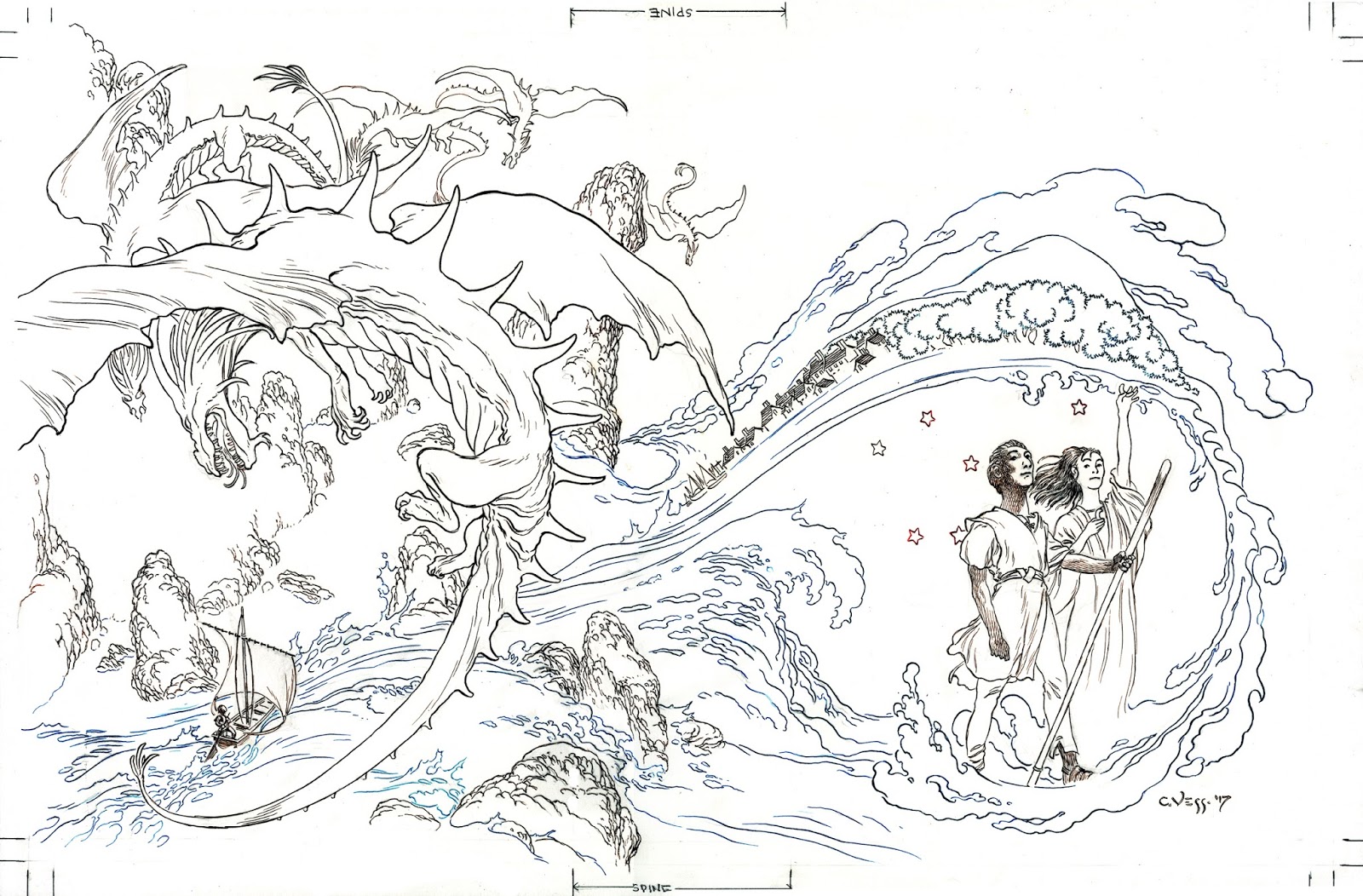 |
| The revised cover art inked. |
More than a few years of developing a preferred method of going to finish have given me some confidence in which contours to outline in ink and which to leave for my color washes to define.
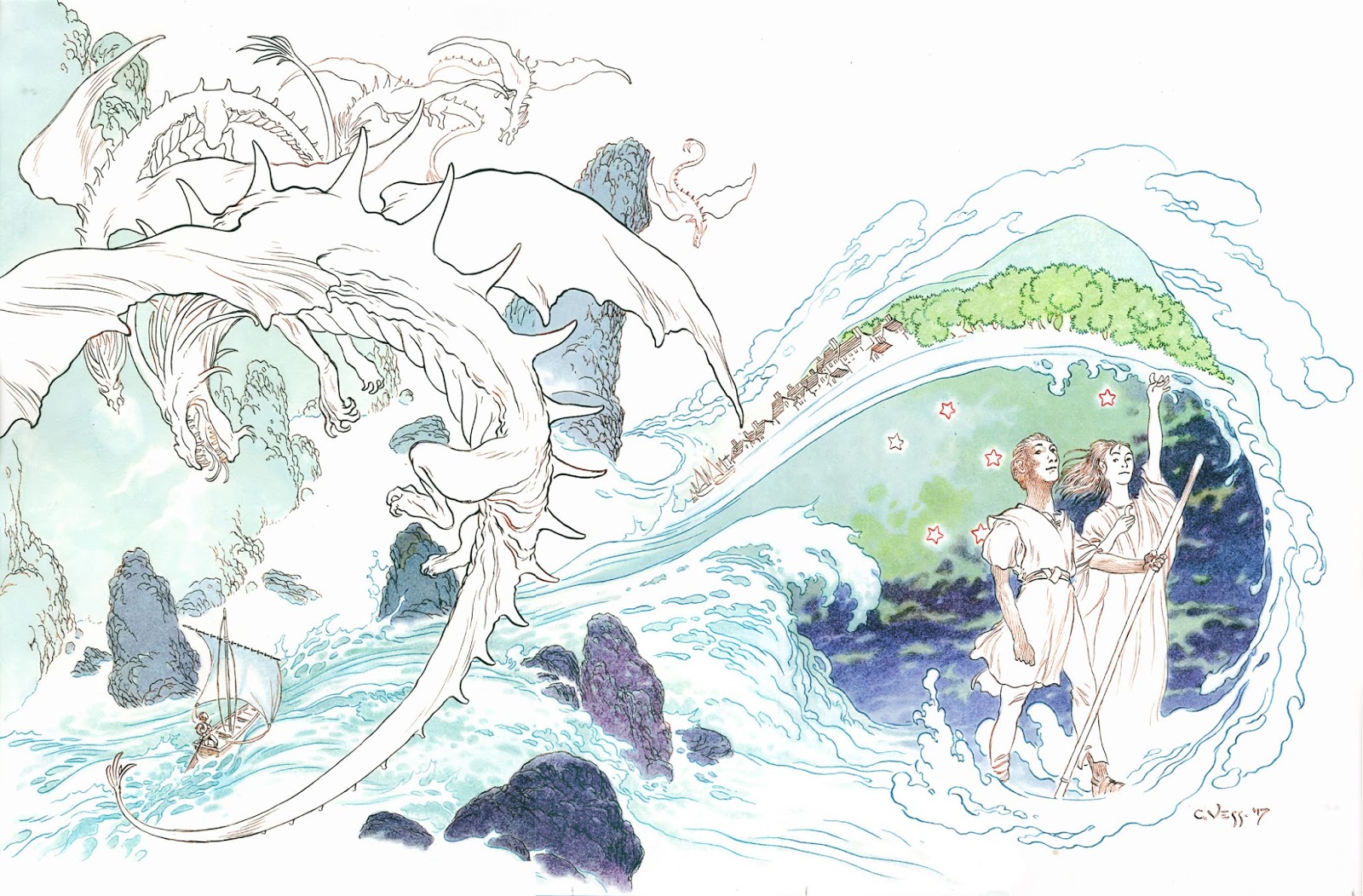 |
| My first applications of color. |
I use a multitude of FW colored inks that are diluted with water and mixed in handy metal trays. A word to the wise: FW is lightfast unlike Windsor-Newton inks which will most certainly fade over a very short time.
 |
| About halfway through the color. |
My inks, once put down onto the paper, stay there, unlike watercolors, so that you can continually layer more and sometimes subtly different colors over the first to adjust the colors to suit your desired mood..
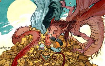
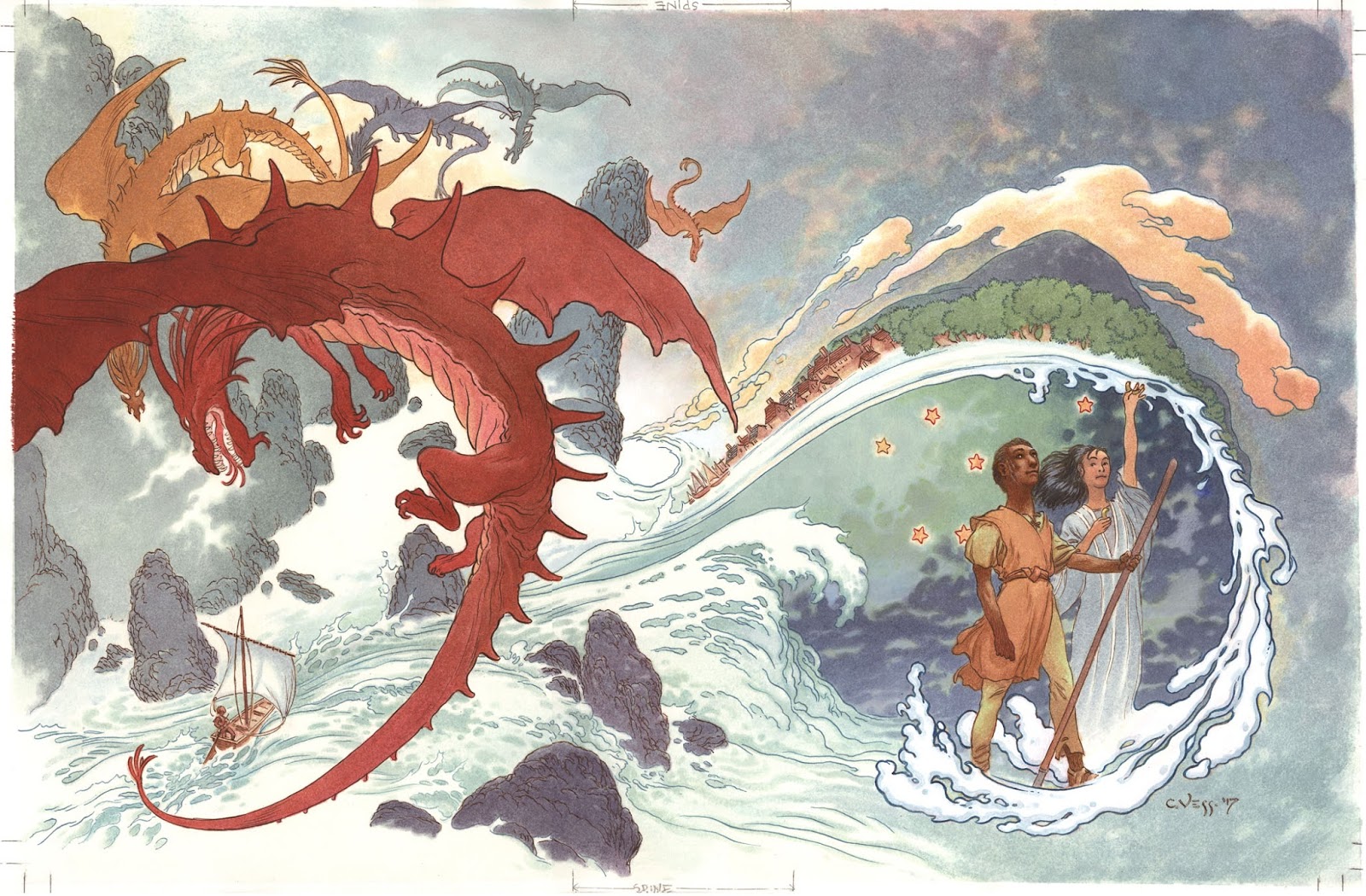 |
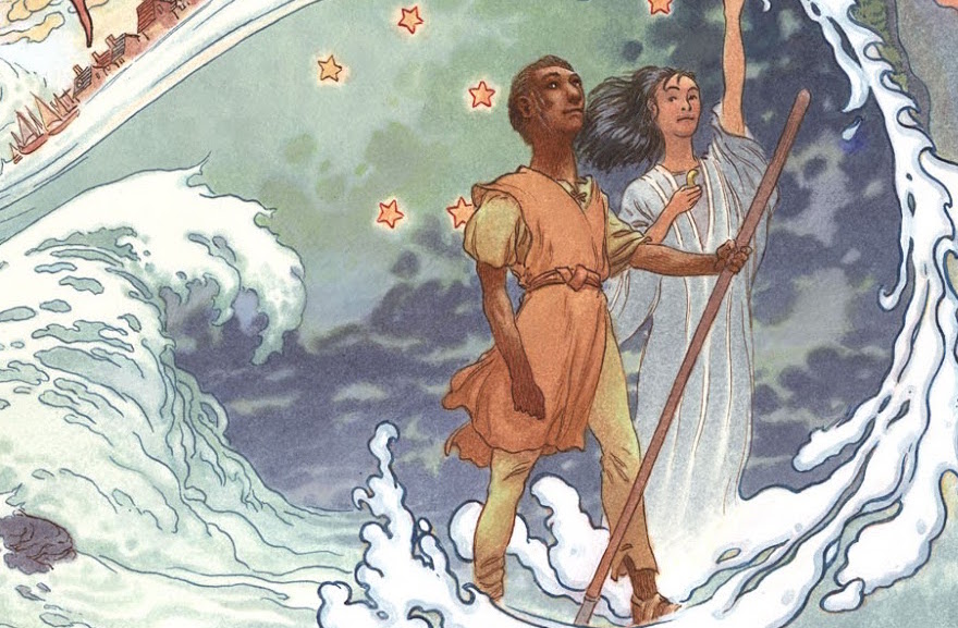
| The cover final (so far). |
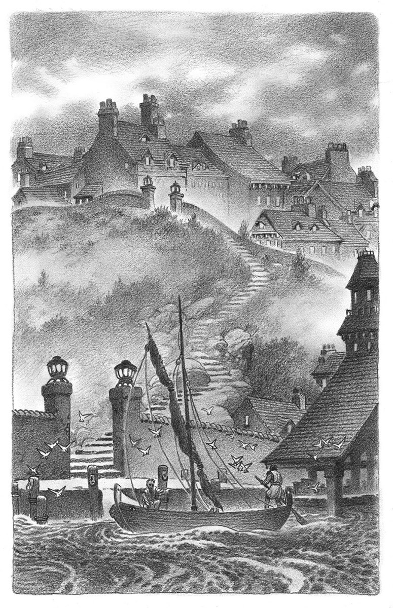
Besides this cover there will be a total of 7 color plates and almost 60 b/w illustrations sprinkled throughout this massive collected edition, but, if there were no deadline involved I’d be very happy to draw twice as many.
 |
| The Painted Chamber, Prismacolor black pencil, |
 |
| Away in the Morning, Prismacolor black pencil, |
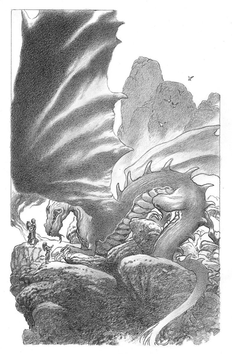 |
| Kalessin’s Daughter, Prismacolor black pencil. |

I really love your work! Great post!
really interesting!
I have a question: how mix the prismacolor and the black pencil? When I tried the pencil fade away.
The initial pencil sketches are done on a separate paper and then retraced via a light box onto thin (but 100% rag) drawing paper so that the pencil and my final Prismacolor finish don't mix.
Ahhh! I love Earthsea, and was always hoping to see someone extensively illustrate LeGuin's work. These images are beautiful, Mr. Vess! Watching the cover come into focus is incredible. Thanks for sharing. (And thanks for the FW/W&N tip.)
Really loving those b&w drawings, Charles. More, please!
Excellent work, Charles!