I recently spent the better part of this year working on a single project that is really special to me. I was asked by DAW Books to illustrate one of my favorite novels, ‘The Name of the Wind’, by Patrick Rothfuss, for a special 10th Anniversary Edition of the book.
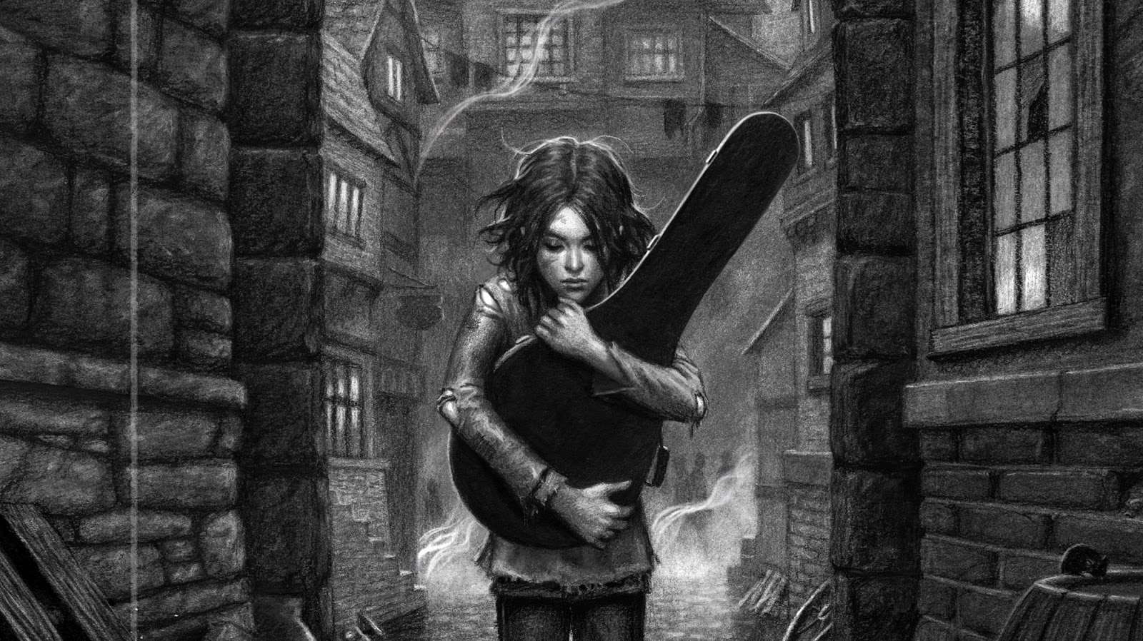
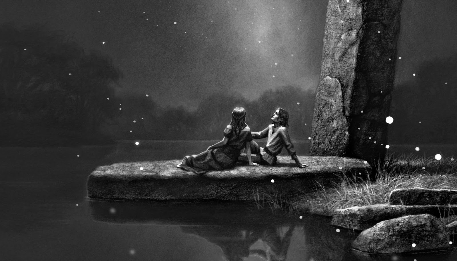
In total, I created 23 original paintings for the story, and dozens of concepts.
It’s not often a project comes along that one can truly say is “A Dream Project”, but this one really was. It was an official version of one of my favorite novels, and I was given near total creative freedom… And it was horrible.
I don’t mean to say that working with the Author or the Art Director was horrible. They weren’t. They were both amazing as could be, and are regarded as the best in their fields for good reason. But the pressure of trying to adequately portray source material when you are reeeally in love with it, is an unbelievably stressful task. Nothing you do seems to do it justice. It’s like trying to explain to your friend why your favorite movie is so amazing, but you can only pantomime it. It’s frustrating, and horrible.
Further more, I was given so much creative freedom, that should the final illustrations not look good, I had absolutely no one to blame but myself. Cue the self doubt!
I confess, I choked. A lot. I started this project over multiple times, trying to find the right approach, the right style, the right medium. I would think that I finally got it, only to decide two weeks later that it wasn’t good enough and had to start over… again.
Eventually, deadlines dictated that I had found my ‘chosen style’ whether I liked it or not.
It’s like trying to explain to your friend why your favorite movie is so amazing, but you can only pantomime it. It’s frustrating, and horrible.
Fast forward 6 months, and I’m left with a completed series of paintings that may not be everything I had hoped they would be, but will hopeful make some new reader fall in love with the book as deeply as I have.
I figured I would do a walk-through of my process for our readers, missteps and all.
PART ONE: PLANNING
The project started with me re-reading the book. It had been 10 years since the book came out, and I definitely needed a refresher. I chose to listen to it on audio book so that I could easily sketch as the book was narrated to me.
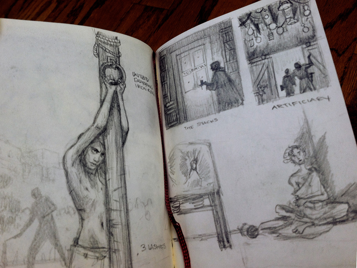
I put in my headphones, and kept a small journal. Whenever there was a scene in the story I thought would make a nice image, I would jot it down in the form of a crude thumbnail as quickly as I could. Some scenes were so close together, that the sketchbook pages often took on the appearance of a comic. I quickly filled the book with a combination of compositions and note taking.
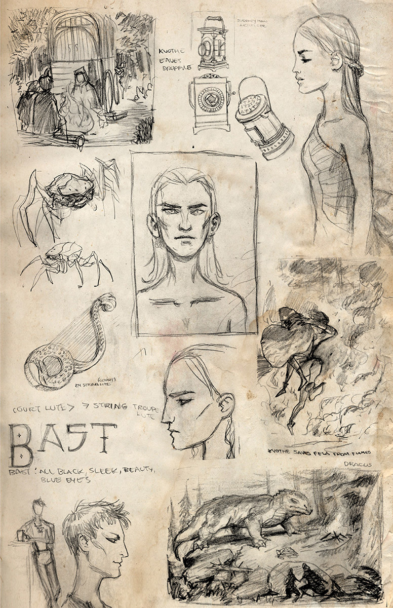
If there was a lull in the story, I would work on character likenesses, props, creatures, cover concepts and various other items.
When you read a story, it’s easy to have an image of a character in your head that you ‘feel’ is accurate. But therein lies the problem, it’s often a ‘feeling’, and not an actual visual arrangement. When you try to actually capture that quality in a single, stationary image, it becomes a lot more elusive.
PART TWO: COVER CONCEPTS
Once I had gone through the book I immediately began working on cover concepts, which the publisher would need far in advance of the interior art for promotional purposes. I knew by now that I wanted to try a slightly different style than what I usually do, and possibly a different medium as well.
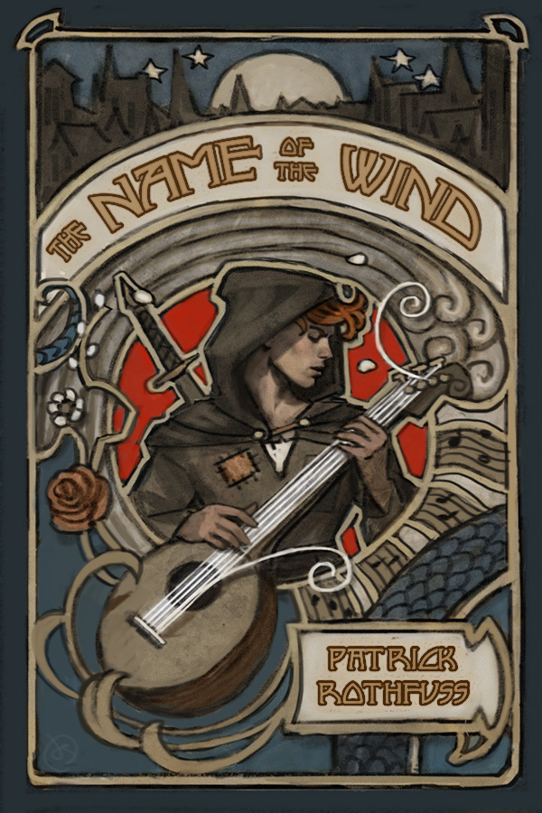
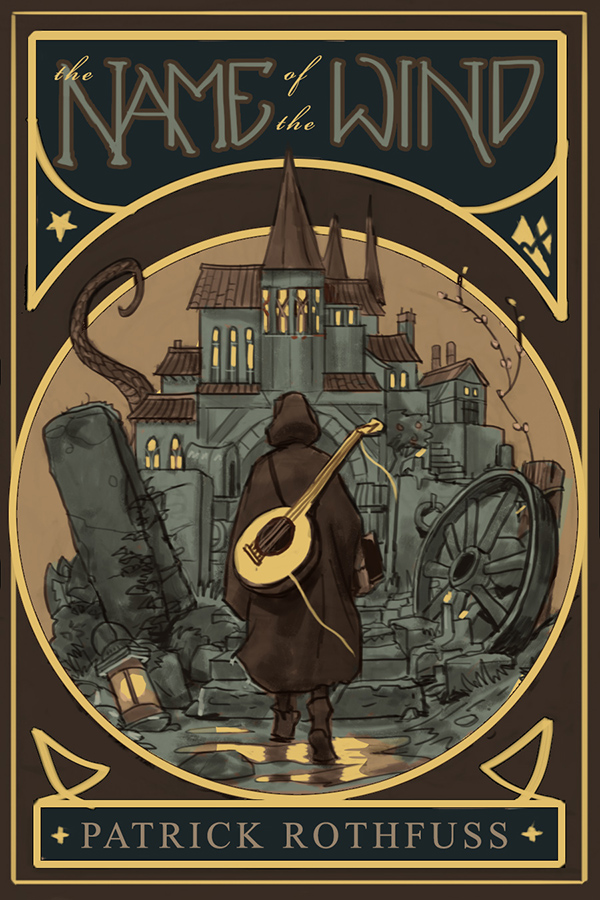
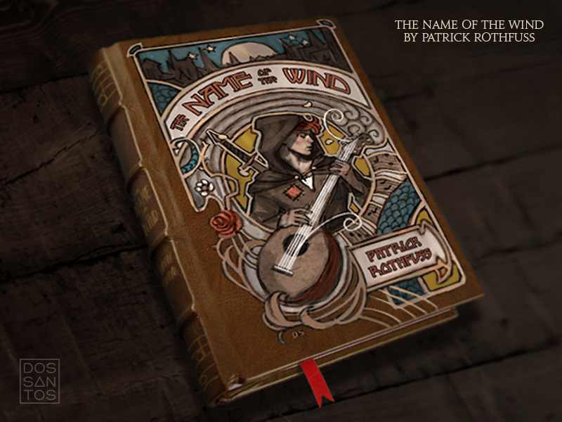
To me, the story in ‘The Name of the Wind’ feels much like an opera. In fact, the main hero’s life even mirrors that of an old ballad told within the book. Additionally, something about the world the hero lives in feels very early 1900s to me. Because of these two things, I kept coming back to visual concepts that I felt were reminiscent of old Parisian Opera posters. That, and embossed leather books harkening back to early adventure novels like those of Jules Verne.
Something about ‘The Name of the Wind’ just feels like an old story. I wanted the book to feel that way too.
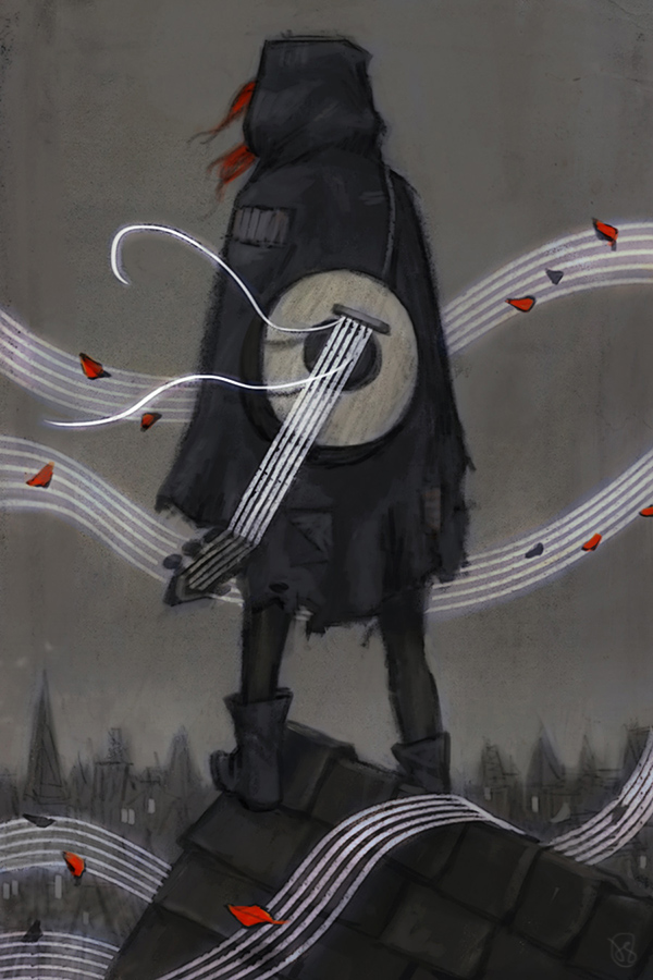
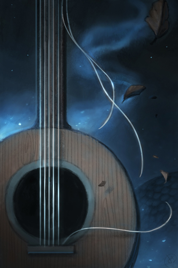
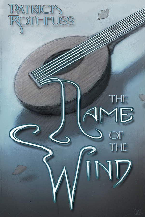
Below are some of the cover concepts that I submitted for the 10th Anniversary Edition.
Soon after submitting concepts, the plans for the look of the book changed a bit, and the Publisher hired several more artists to work on the project. Nate Taylor added some maps and appendix art, and Sam Weber ended up painting the final cover.
Although the concepts that you see here never actually made it to the final cover, these images still served to develop and really dictate the look that I wanted the interior art to have. As I would move forward, I would have these unused images in mind.
Stay tuned for the next installment…



Dan, I just love those cover concepts! The 'hard' graphic design elements would have created a terrific visual frisson/contrast with your art. And I certainly know what you mean about choking when it comes to illustrating books that you love.
Thanks, Charles! There's always sketches you have to leave behind, but I was really sad to see those go. Looking forward to checking out your latest 'passion project'!
I was so delighted when I saw your art for this, which is also one of my favorite books. Awesome stuff!
dude, that page of inked sketches and thumbnails on the textured stained paper is so damn cool. Feels like something you'd find in Kley's studio, or what Tenniel doodled between Alice illustrations. Really cool to see that flavor of your work.
Thanks, Tora. I hope you enjoy the art as much as the story.
Thanks! I feel like some of the doodles did a better job of capturing things than the final art did. But I guess that's always the case. A little give and take.
Maybe you can let Patrick know that his deadline for book 3 is past.
Great art by the way.
Looks great man- congrats on the gig and the completion of the work!
Ah, Dan. If anything's inspired me to pick up a pencil again this year, it's your work here. Breathtaking.
Yeah, I'm pretty certain he's aware of that.
Thank you!
Thanks, Elliot!
Thanks! I admit I've never done much with charcoal until this project, and fell in love with it. It's just so forgiving.
I always love to note how you go about a big project like this. And the b&w illustrations are FABOO. I have such a weakness for b&w. Would you happen to have a run-down on how you made those? What media did you use? Charcoal and…on which ground…?
Wow. These images are incredible. And some of those alternative cover designs are just inexpressibly excellent. I am in love with that last image – if only such a copy existed!
Is there any way I might get higher resolution versions of any of these, please?
Thank you for sharing this!!
As an aspiring artist and long fan of both your art and Pat's books, I'm delighted to see your process. It is also (kinda?) good to see that even professional artists like you share some of the insecurities that us amateurs struggle with. It was really inspiring for me!
These are stunning. Quite honestly my favourite book of all time, I’m even having someone paint a scene from it! But these are breathtaking
These are stunning. Honestly my favourite book of all time, I’m actually having an artist paint a scene from the Eolian ! But these are seriously breathtaking.
Oh that's cool! Getting custom commissions is the best.
You're welcome, Ignacio.
Those insecurities will likely never go away.
In a weird way, I think it's a constant sense of small dissatisfaction that drives me to keep painting. I keep wanting to get it right.
We will be getting to just that in the next few installments of this post.
Awesome! Kvothe and Denna on lake at night is exactly like I imagined that! Can I use as Wallpeper?