Thank you for joining me for my second article on ‘Illustrating The Name of the Wind’, where I will delve a little deeper into my process of creating 21 original paintings for this fantastic book. In Part One of this article I spoke about the process of creating cover concepts as well as re-reading the book in order to document the story and loosely plan the interior art.
As I mentioned previously, I had filled a small sketchbook with what were essentially ‘visual notes’. These notes were crude thumbnails which served to help me remember certain scenes, rather than actual thumbnails that I would use as compositional inspiration. Which leads us to the next phase of my process.
PART THREE: SELECTING SCENES
After filling a sketchbook with notes and drawings of various scenes, all of which I felt were deserving of their own illustration, I had to figure out which of these scenes were actually going to get painted.
This was easily one of the most difficult aspects of the project for me. Sketching concepts is always a bit stressful, because a few days work will dictate what I’m going to paint for the next week or so, so a lot is riding on the success of my concepts. But in this case, these thumbnails were going to dictate the course of my work for the next 7 months, so I really had to be certain things were planned out well.
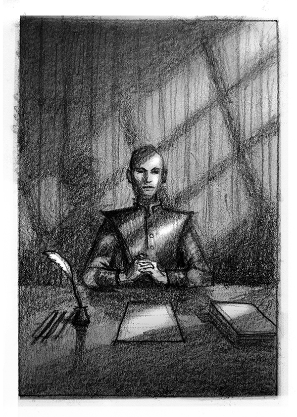
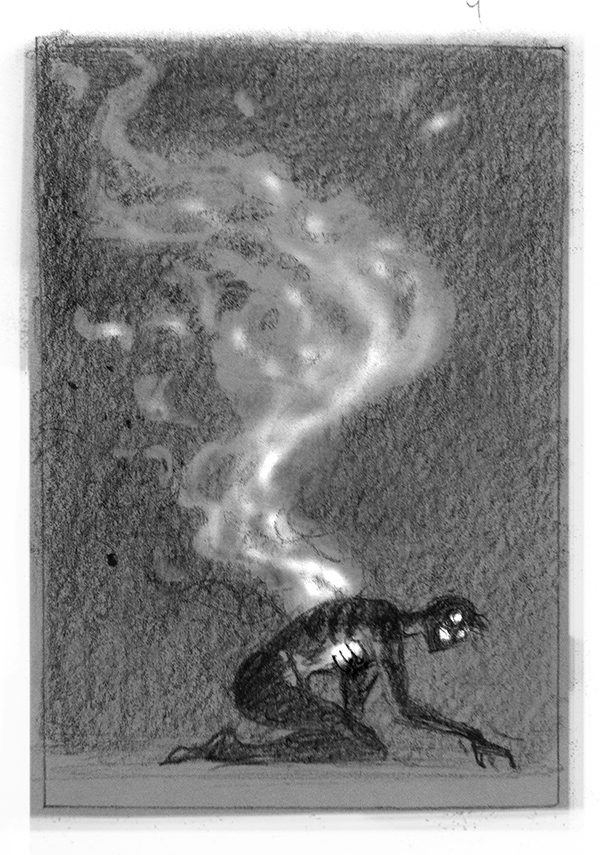
I went through all my notes, narrowed things down severely, and worked up new thumbnails for every scene I felt should be included in the book. In the end, I ended up with 31 images.
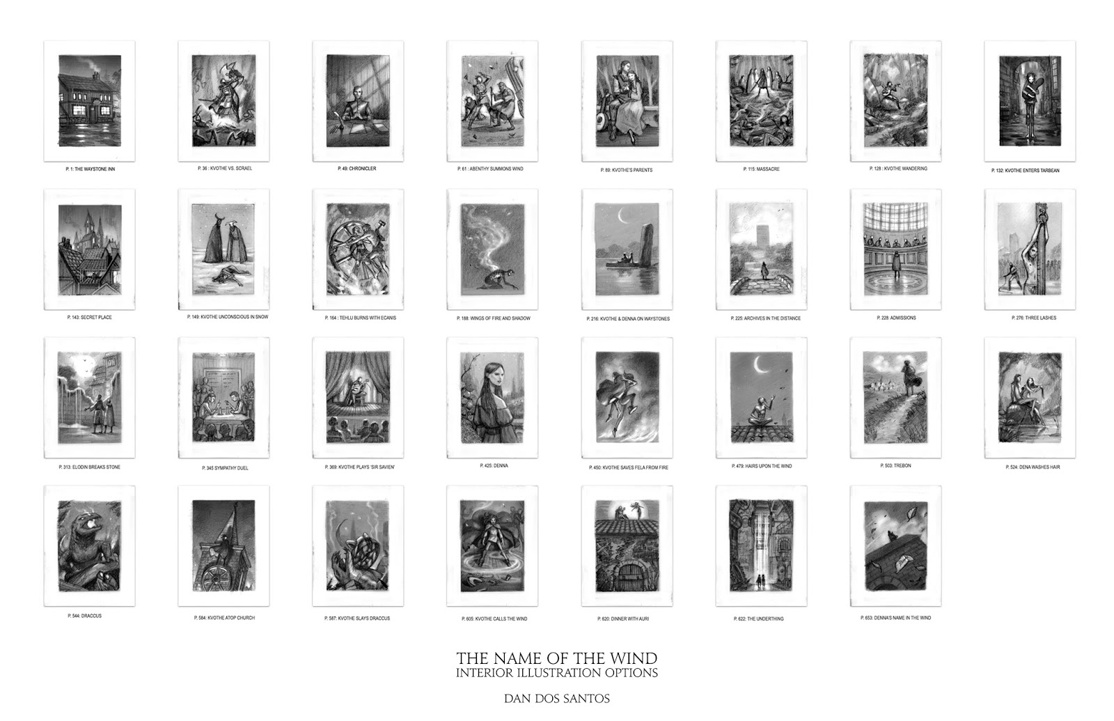
My goal was to try to tell this story in such a way that a viewer could understand what was going on, even if they didn’t read a single word of the book. For instance, we see the boy’s parents, we watch the parents die, the boy is all alone, the boy ends up in big city… etc. I wanted the pictures to hit all the major beats, and provide an abbreviated, albeit crude, telling of the story. I felt these 31 images did that fairly well. The problem is, we only had the space, time and budget, for 20 illustrations.
Something had to get cut. Multiple Somethings.
This when things got tough. No matter what scene I picked to cut, it always felt like an injustice to the story. Either I was leaving out a really beloved character, or I was leaving out a scene that had a major impact on the story. Or sometimes, just a chance to depict something amazingly cool. So I sent the thumbnails to both the Editor and the Author. All three of us picked our own personal ‘Top 20’. I then ‘tallied the votes’, so to speak, and came up with a group of 20 images that was a small compromise, but satisfied us all.

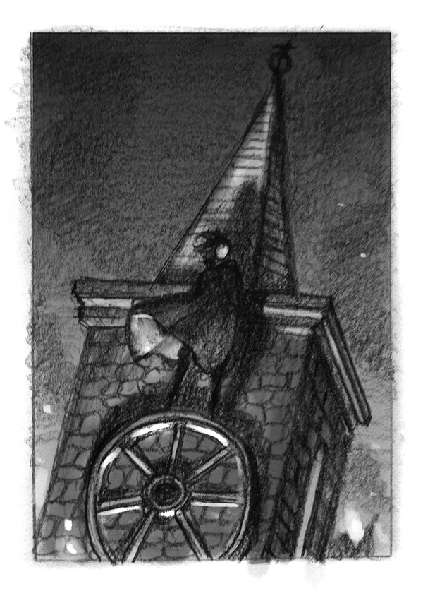
This really was the most stressful part of the whole project for me. As a fan, there were certain things I really wanted to depict that just didn’t fit into the plan. There were also a LOT of issues with pacing. There are parts of this book that feel really long, and a lot of important stuff happens, but in retrospect these scenes all happen within just a few pages of one another. For instance, thumbnails 5, 6, 7 & 8 all happen within a 30 page span. Conversely, there are scenes that go on for dozens of pages, where nothing particularly “visual” happens.
The result is, if you picked just the ‘cool’ scenes, you’d end up with a ton of illustrations stuck back to back, and then easily go 100 pages with no pictures at all. It simply wouldn’t make for good reading.
Even though the Artist, the Editor and Author all got a vote in what scenes to depict, it was the book itself that ultimately got the final say.
I ended up treating the problem a bit more mathematically. The book is just over 600 pages, and we had 20 images available to us. That means we needed a picture, on average, every 30 pages or so.
With that in mind, I went back to the story, marked off 30 page increments, and tried to find which thumbnails would fit into the book in a well paced way. Weirdly, this is what made all the major decisions for us. Even though the Artist, the Editor and Author all got a vote in what scenes to depict, it was the book itself that ultimately got the final say.
PART 4 : REFINING THUMBNAILS
Even though I had reworked my initial sketches, my thumbnails were still meant to be more about legibility rather than actual composition. I wanted the Author and Editor to be able to understand what was going on more than I cared about them liking the specific layout of things.
That worked well for selecting scenes, but now that I needed to actually execute these paintings, each image would need to be planned much better. So each thumbnail underwent another round of changes and considerations.
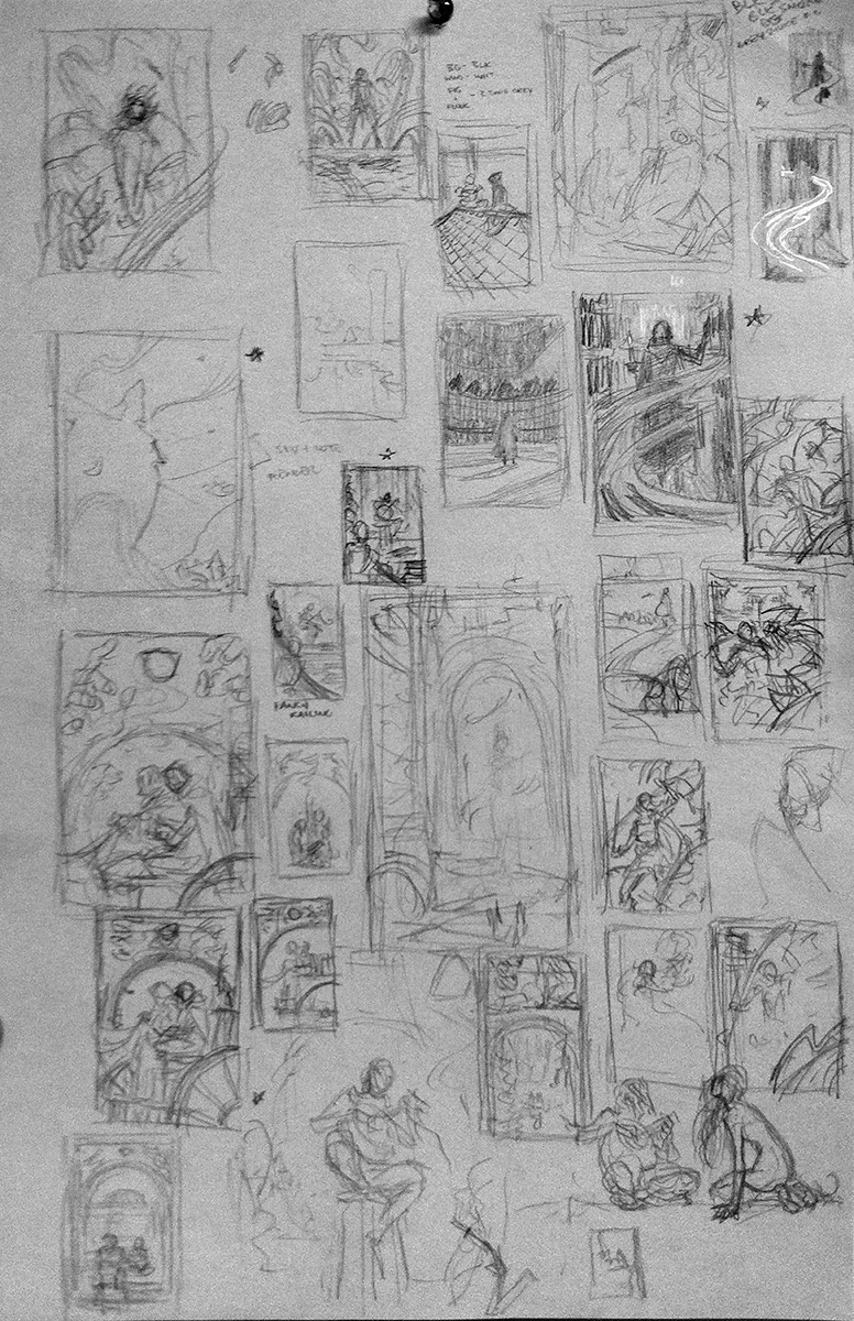
It was in this redrawing phase that good things started to happen. Now that I knew what I was going to paint, I was able to explore specific ideas much further. Very seldom is my first idea a good idea. I find I have to dig quite a bit deeper to get to the good stuff. For me, that means putting in the time and continually reworking an idea until something gives. It’s when I let myself go down these conceptual “rabbit holes”, that I come away with my best ideas.
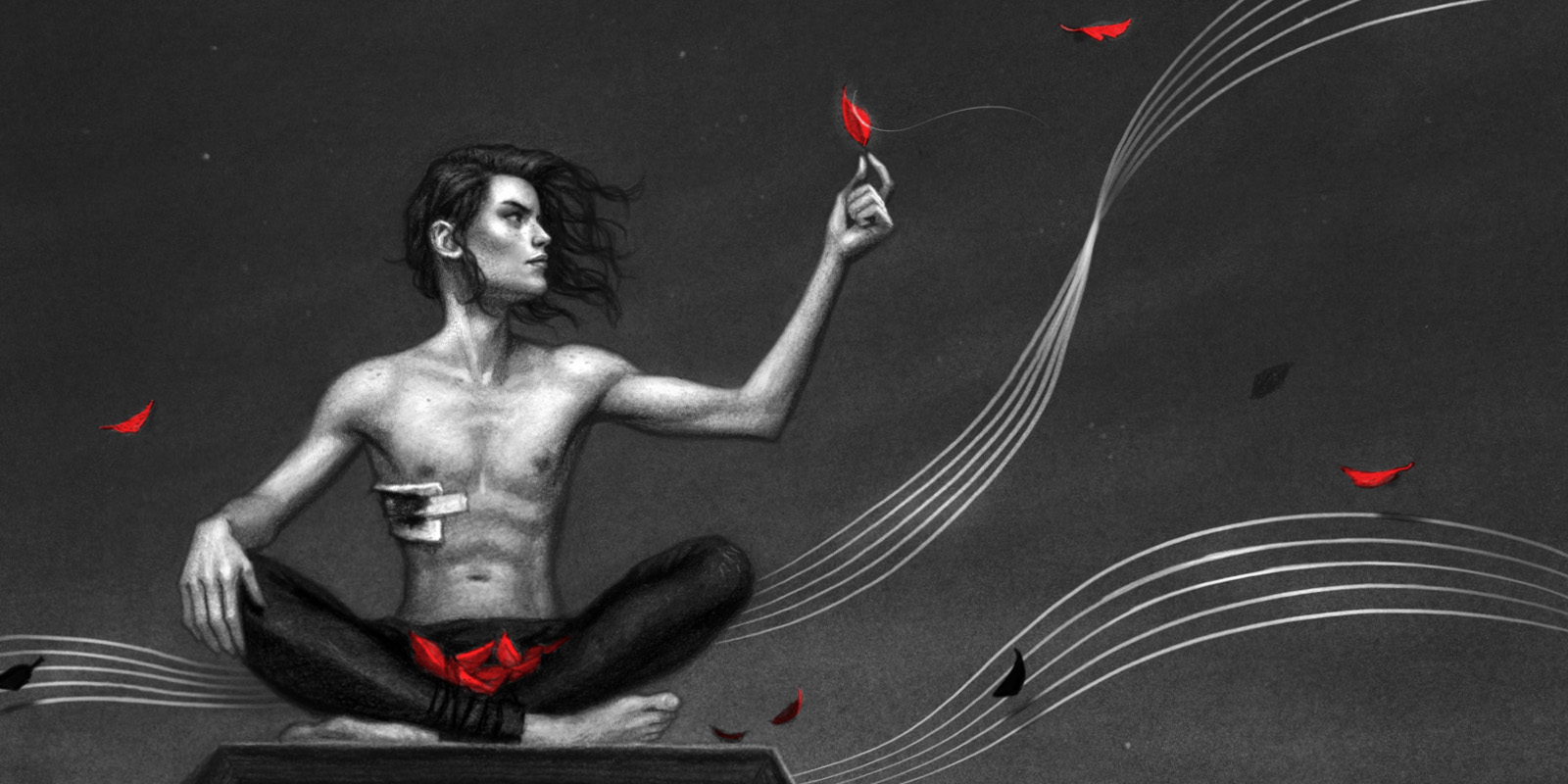
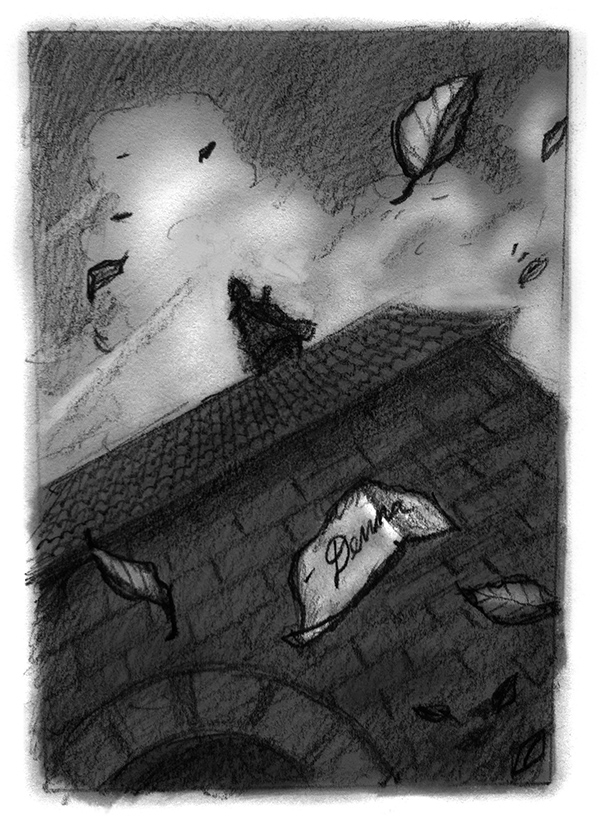
A lot of this story revolves around Magic, and Wind… both of which are pretty tricky things to paint. After all, how do paint something you can’t see? Do you simply show it’s affect on other objects?
It was in this second round of thumbnails that I really allowed myself to begin playing around with some stylistic choices, seeing how things might look if I added, say, decorative borders, or montaged images, or treated certain elements as purely graphic shapes. There were a lot of artistic hangups I had to work through here, many of which I’ve struggled with for years (most notably a tendency to over-render things). But eventually, I broke down a few mental barriers and stumbled across some graphic solutions that I really liked.
Once I decided to handle the magical elements in a purely ‘metaphorical’ manner, all sorts of compositional doors started to open up to me. The wind could be a musical staff, the leaves could be notes on that staff, light could be tangible, magic could have form! This is when things really started to click for me and suddenly the project took on a whole different feel.
It may not look like much, but these scribbles you see above are where all of the major breakthroughs happened on this project. It was here that I truly decided on what the final ‘look’ of the book would be.
PART FIVE : REFERENCE
Because of time constraints, I had actually booked and shot a model before I had completely resolved my thumbnails. Initially, I thought I had a really good idea of what I needed, so this seemed like a prudent use of time, but as I started to re-evaluate the style of the book, much of the reference I shot actually became moot. In fact, I ended up using surprisingly little of the reference I had.
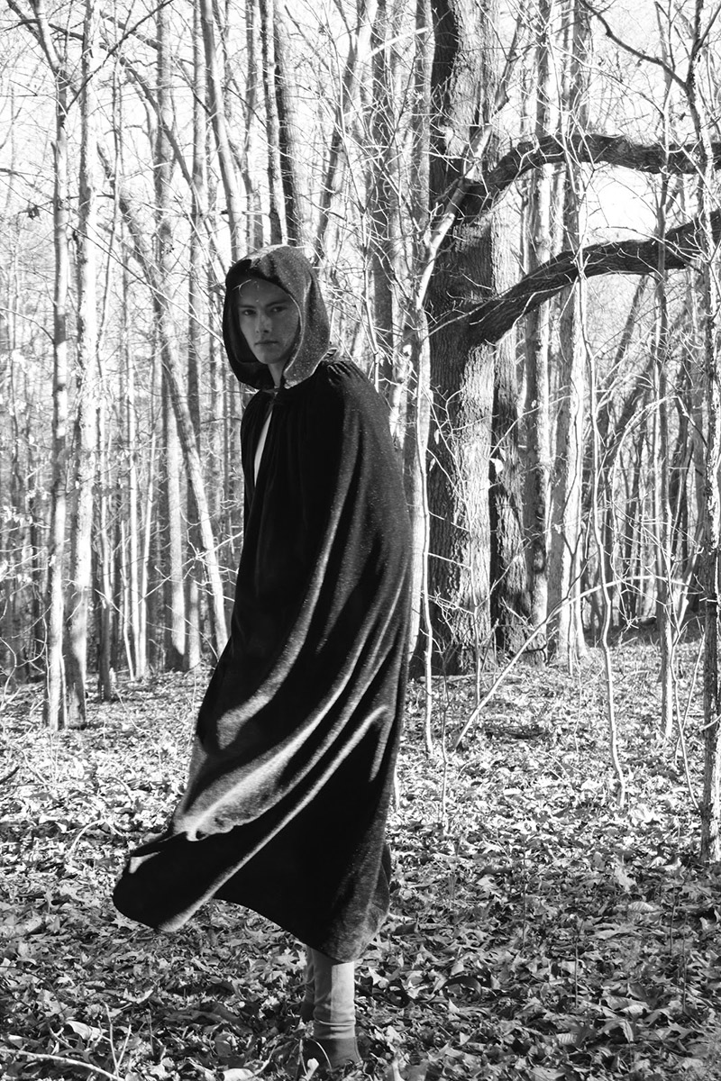
I hired a local model to pose for my main character, Kvothe. And although he didn’t have the right sort of hair, his chiseled yet feminine features were exactly what I wanted.
I had him act out all 31 of my original thumbnails, as well as stand in for any secondary characters I might need. I shot a lot of reference, figuring I would sort through it all later and see what I really needed.
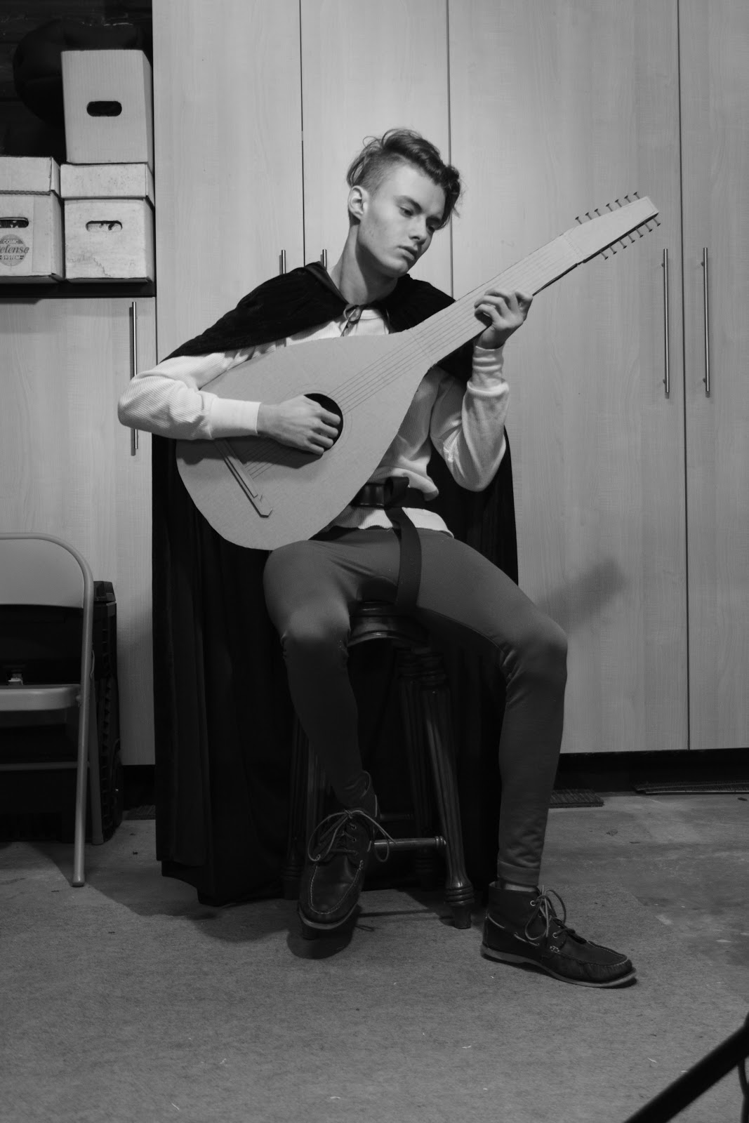
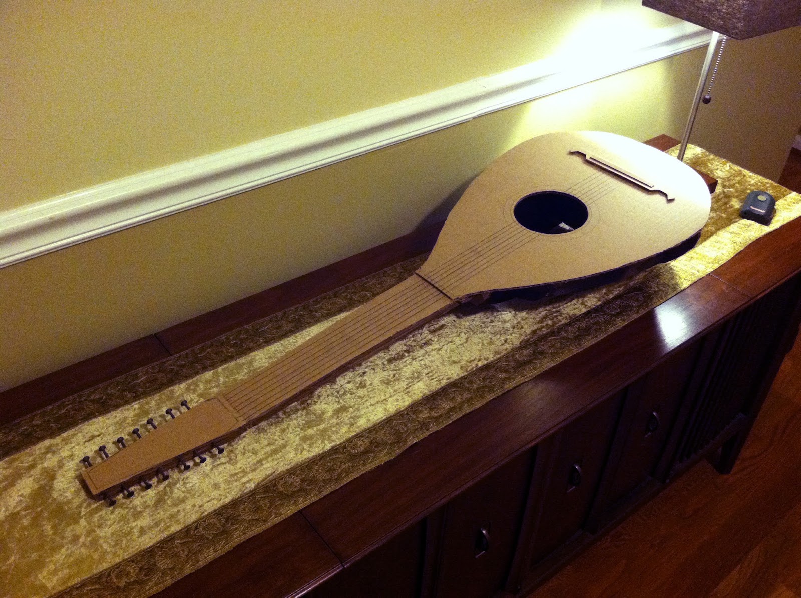
I’m a bit of a sucker for good reference, so I even went so far as to build a cardboard lute for my model to use as a prop. The character’s lute is a major element of the story, and apparently a real lute is astoundingly expensive!
Thankfully, you can do amazing things with cardboard, masking tape and a few drywall screws.

Once I started plotting the final art, it quickly became apparent that the overall look of the illustrations was so stylized, that making the figures look too real was actually a detriment. It made the more graphic shapes that I wanted to implement look silly. I needed to add some distortion and characterization to things if I was going to pull it off.
Eventually, I settled on simply trusting myself to make stuff up.
Still, having good anatomical reference to fall back on really helped, especially for things like hands and feet which I have a difficult time rendering realistically from imagination. I’m a firm believer that it’s better to have reference and not need it, than to need it and not have it. This was definitely a good example of that. Even though most of what I shot served no purpose at all, those few instance where I did need it, were absolutely invaluable.

Stay tuned for the next installment…
Incredible how much work goes into this! Looking forward to the next part.
Thanks, Nico. The amount of work was a surprise to me too!
So excited for this project. Thank you for sharing all these behind the scenes glimpses!
Appreciates the peek behind the scenes !! Looking forward to the article on the workup to the final product
Oh, this is so intereating! I like the book very much! I'll be wainting for the final illustrations!