
For my third release from MONDO, and what soon became my favorite, I was tasked to make a poster for a new release this time for the director of The Lobster, Yorgos Lanthimos. This film was a much darker more sinister revenge story entitled THE KILLING OF A SACRED DEER, and brought back Colin Farrell in the lead, as well as an incredible performance by Nicole Kidman, newcomer fresh off Dunkirk fame, Barry Keoghan. I won’t get too much into the specifics of the plot or anything because frankly it is a delight to discover while watching, but I do confess that this post will make a lot more sense if read after seeing the film, which came out on blu-ray and dvd two days prior, as well as the final silkscreen print from Mondo which can be acquired HERE.
But I wanted to focus on today was the process of how these things come about as the pattern of events mirrored many of my previous Criterion work, and other film related posters. It’s probably a pretty basic way these things unfold but for those of you uninitiated I thought it might prove useful when you get the chance to do something along these lines. Here’s how it went.
So. straight off the bat, this is really just getting to watch a movie before anyone else gets to see it and make a drawing from it. Nice work if you can get it. Eric, Rob, Mitch and everyone at the Mondo HQ sent me a link to a secure server from A24, who was releasing the film with a password protected, and watermarked copy for me to see. The film wasn’t going to hit the theaters until end of November, (this was mid-October), and these days with all the pirated uploads and all, this is how it rolls out. Not my favorite way to work- the not so old days I’d get a burned dvd, or a presser copy, but again.. the terrible pirates have made things more complicated for us all. First up I put the film on and bust out my Ipad for notes, and a few scraps of paper, usually just some printer paper and a pencil if a particular image comes calling while the film is on. The point on the first viewing is to just take it all in, and mostly I tend at best to jot down certain scenes, make note of their time stamp int he film for later, and write a few quick incomprehensible words to summarize whatever idea the scene brought. You always think that you’ll remember why you got inspired by something later, but you won;t trust me. Whatever happens between now and then, the magical alignment of stuff that births the idea is not a permanent thing, and I’ve found the best way to recapture that lightening later is not just to note what image you have in mind, but why. Even if it’s just a couple of words. I cannot tell you how may times I go back over an older sketch and wonder what in the flippity flap I was thinking when I was so excited to draw it.
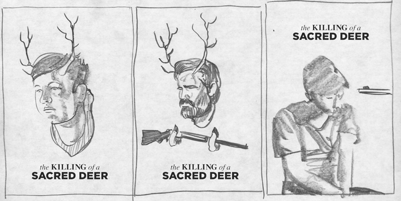
Once the first viewing is done, I’ll then go back over it in more detail using these moments, sketches and notes as anchor points. Just to make sure that whatever seemed like genius at the time remained so. (They rarely do). Depending on the subject I can come up with anywhere from two to twenty two ideas. With great lament to my long suffering editors and ADs, it’s largely the latter. For this one I must have had about thirty or more different approaches- it’s a quiet and distilled film, but filled with remarkable narrative imagery. The studio had already drafted an official poster using a screen-grab from the film so that helped me to make sure not to repeat it. And the stunning posters for The Lobster presented me with a challenge that was for me a particular trick to pull off as they were as images go, something I myself would have done on any given day. But this is the early stage and you don‘t want to overthink anything yet.

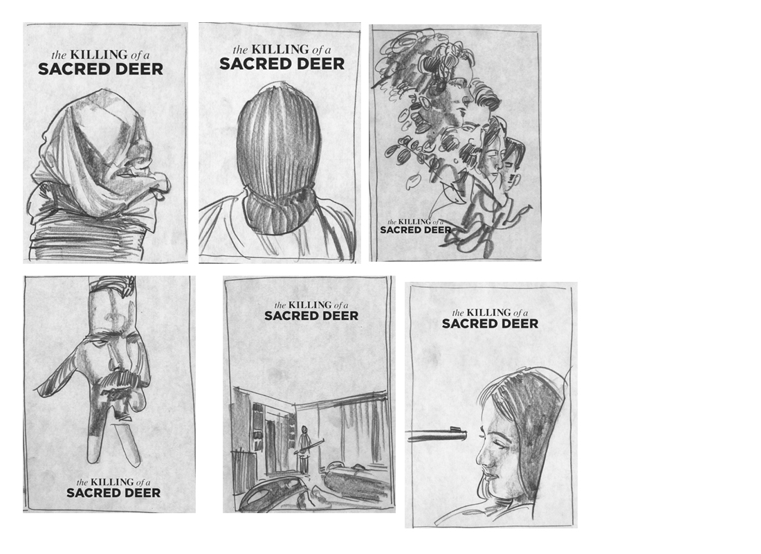
After I narrowed it down to a solid dozen, with about six or so as leading contenders, I sent them off to Mondo to begin to choose. Depending on their license and relationship with the studio, they’ll also bring them into the process, and they’ll let me know which they like best. We had a long drawn out thing over the Bride of Frankenstein licensors and was also working on some Kubrick pieces, which are also usually tricky paths to navigate, so this was expected to be smooth and freer. Surprisingly this turned out to be exactly the case. The one that I wanted most of all but had the least hopes for going through, simply because it was the weirdest and the oddball of the bunch- particularly because it eschewed using any of the actors’ likenesses was unanimously chosen and we were off to the races. I do find a great benefit in this early stage to draw as many ideas as can be squeezed out, because you never know what you might come to otherwise. I don’t think I would have thought to pursue the deer sketch if I hadn’t exhausted all the other approaches. And it also helps to bring your AD/Editor on board to where your mind is going so they can help you fine tune it to its best effect later. Don’t worry about impressing them with your chops here… this stage is really just about getting the ideas down on paper and communicating them clearly.


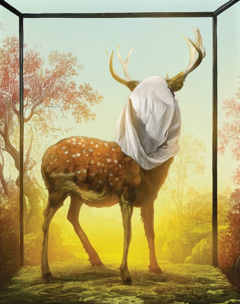
I have a deep and abiding affection for Natural History Museums, especially the one in NYC which is in and of itself a kind of museum of how museums used to be. Filled to the ceiling with taxidermied birds and whales and those incredibly detailed and oddball dioramas of cave-people and tigers on rocks forever just about to pounce on some unsuspecting antelope or whatever. There’s something remarkably curious and a little sad about these deluxe prison cells, their inhabitants frozen in some moment in between thoughts surrounded forever by an environment that is as unreal as it is unchanging. They always seem to have a thought perched on their lips that never comes, and all of that seemed a perfect palette for doing something for this film. But, this is a marquee art-house film with movie stars and the usual need is to feature those prominent actors in some capacity. There’s always a way to do it to avoid the classic and terrifically overused head-cloud approach, but it’s not always an easy sell to the principles. Doing something this weirdo and personal even less so, but one of the great things about the Mondo folk is a bent towards crafting a new approach to these things. Ostensibly the official movie poster is out and done already, and dollars to donuts, they’ve likely gotten that head-cloud itch scratched… so there’s a huger for something else. Which for the artist is terrific. I made a case for this deer-in-a-box approach, with my main concern being that invoking the titular animal meant in the title as a symbolist metaphor, being a bit on the nose. It does follow a similar vein of some of the sketches of the family with bags over their heads, a really dark portrait approach, by repeating that theme in a less humanly consequential way. Somehow it sailed right on through. Before going into the final I did offer up the possibility of doing a full museum-style nod and have the window effect of the print belie a reflection of museum goers, and using that brass plate style for the title treatment, but happily I was warned away from this approach as it clearly just gilded the lily. At best.
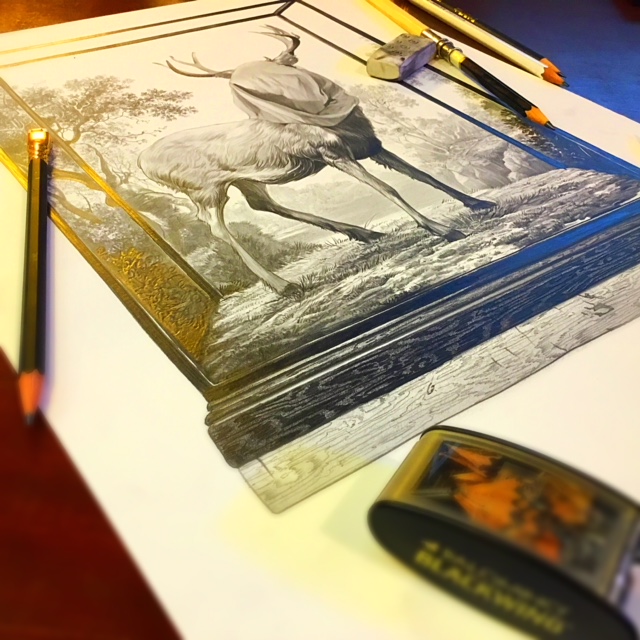
The next step is laying down the original graphite drawing. it was intended to be a full on vibrantly rich color piece. This was such a departure from the other cover work I was already doing, as well as the daily work on writing the script for my next graphic novel with Ethan entitled “Meadowlark”, that I could literally not wait to get into work and get going on it. It turned out to be a much more complicated and long winded effort than I expected, but overt the course of about two days it came together. My usual go-to resources here being the esteemed Blackwing 502, Palamino and Pearl, on an underdrawing of the Staedtler All X-Write woodless pencil. Which is a dense HB that doesn’t really provide the needed darks, but is really mistake friendly and provides a perfect middle grade tonality that can then be expanded into deep deep darks later with a 6B and eraser. This one was a bit tricky in both the need to express different textural stuff with the same medium as well as my own impatience to get to the aspects of the piece I most wanted to draw- the deer, the way the fabric hung from its antlers… and keeping the paper relatively clean of smudges and mistakes so it in and of itself could remain a worthy piece of original art. We had a short window for this one to get it in before the premiere date of the film, so as I had nearly finished the piece, I took a simple iphone snap of it on the table to get the approval ball rolling while I continued to work on it:
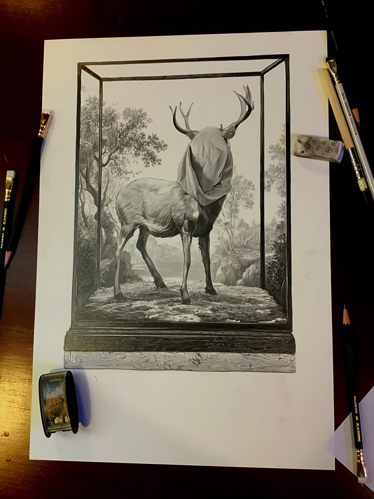
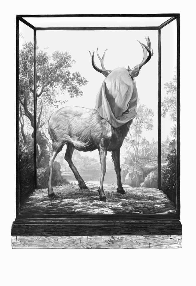
I figured if they could make sense of the clunky thumbnail, this would help push the ball forward a good bit more, but hopefully also get back some red lines or wrong turns without going to far on the final. I have a large flatbed scanner so I can capture the piece all at once without having to stitch together sections later. Seems like a minor point but this can really save hours of time later. I have this incredibly inexpensive Mustek that has been a dear and devoted workhorse for me for years now, scanning daily with it without much trouble, but even that process of scanning and then cleaning it up in photoshop later can take a goodly sum of time too. I also tend to scan dark to make sure as much information is captured digitally, but making sure not to get too dark as to lose the nuances. Sometimes, depending on the piece, this takes a few passes to get it just right. And let me encourage you to take this time because if you don’t get this stage right, it can cost you tremendously in terms of time later. The image here on the right is the result of that work, which can take anywhere from one to four or more hours. This one was a long one.
This approval process went through rather easily, and so it was off to the final. One of the benefits of skipping right to a detailed final effort, for me at least, is being able to fully express the idea of the piece on paper and let it show rather than tell, my intentions. You don’t always have the most visually oriented people in the approval chain of a given project, particularly one that’s licensed and coordinated with a production studio as this was. I don;t mean that as a dig- not everyone is everything, and lacking a natural or trained visual sense is no less worthy than my lacking an understanding of orchestral structure in music. I just find that in these cases, leaving less to rely upon the imaginations of others, especially at this stage, the better. It does mean there’s a gamble here: not all clarification bring upon you that which hoped. So know that if you pursue this nutty course, be ready to let it go and start over, with your time and investment in the final as being a burden you carry, not that the project should have to honor. No final piece should ever be approved on the basis of time and investment, but always of its quality and effectiveness in executing the needs of that piece. It sounds noble, but in practice it can be heartbreaking to put a lot of effort into a thing that is summarily rejected. So don’t pursue this road without being ready to pay the price of it failing, both in terms of time and effort later.
The next stage, and one of the final portions of this journey, is really just a series of layers and layers and LAYERS of scanned in watercolor, and mixed digital tweakings. Nothing one couldn’t do in a classic paste up arena, more or less. My overall ethos with photoshop is to keep the principle art making off the screen and onto the desk as much as possible, and using the computer to basically act as a glorified paste-up machine that doesn’t do anything you couldn’t accomplish in a darkroom. This has less to do with a high and mighty ethic than my own limited digital talents, if I were to be perfectly honest about it.
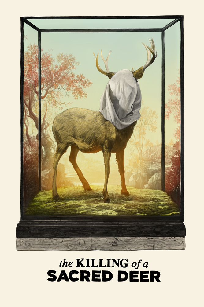
With this one I knew going in what I wanted to do. The image and approach was already fully fleshed out in my mind’s eye, so all I really had to do was follow that north star to shore. Originally I had a notion to have clouds, billowing up behind it, and follow a classic almost George Innes-type of landscape background, in keeping with the trompe l’oiel landscape painting you see in these old dioramas, but the practicality didn’t shake out exactly as I had hoped. The clouds made it too busy and began to detract from the central image, etc. It’s important not to get lost in the details of what you want to see and enslave the needs of the piece to that particular obsessiveness. Losing the forest for the sake of the trees, somewhat. That ability to keep seeing the piece clearly can be found in the eyes of others, namely your Art Director or Editor, but also more closely in your spouse or simply by stepping away from the thing and coming back with fresh eyes the next day. You’d be surprised what supreme glories reveal themselves as terrible in the light of the next day. Another trick is to reverse the image, either by flipping it on screen or finding a mirror. A lot of compositional errors leap out at you by doing this as long as you remember that even so, sometimes what works in principle isn’t necessarily going to read well in reflection. But it does help to prove it out wherever you can. You can get art-blind when staring at a piece for too long.
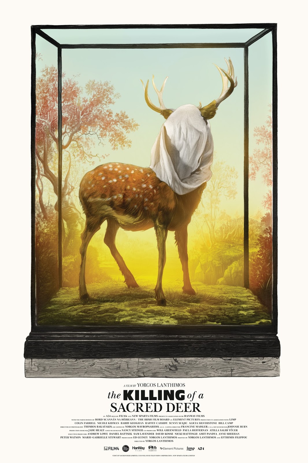
One of the benefits of this is that it opens the door for new solutions that would not have otherwise occurred to me. For this one as we went to final, the spots on the deer suddenly seemed like a perfect solution to save me from the sense of missing something that the clouds; absence left. Other details like the intensity of the yellow sunburst behind the deer, and the way in which that light would be blocked by it’s torso, but wrapped by the legs, and the blue sky to punch the white of the pillowcase over the animal’s face would get better tuned towards a more effective direction. It also allowed me to send the file over to the Mondo team to start fiddling with the title treatment. This is an area I do like to layout generally, but have found their capacity to execute finally to take advantage of. We had a logo and title treatment already as was in evidence in the above thumbnails, and orienting it to hint to the brass title plates in a museum was a main goal, but there’s always a lot of attending, and often political wrangling that comes with the rest of the credentials, the actors names, produces and various logos that they are far better suited to wrestle with than I. So I’m happy to let them have at it, the result being what you see here to the right, and larger way up top.
It’s not always the case that these things sail through as they did on this one. A lot accounts for A24 being very open and amenable to interpretations of their films, and the working relationship with Mondo. But sometimes, as with Bride of Frankenstein’s likeness issues, the powers that be can be very particular, and that can drag things out for months if not a year or more to get through the system. And not everything makes it through as each year you see in Mondo’s feature presentations of the failed attempts of the year before and various misfires. It’s not always about what’s the best poster or image, and sometimes is about not cutting against some ethic the studio sees for the property, or an actor’s input with regards to how they are portrayed. With my work being so naturalistic, that can be as tricky and it is smooth at times, and is often where the most success and trouble can be found. Doing a piece that wasn’t about the actor’s in the usual literal sense, cut that high stakes gamble from the enterprise in a good way this time. But it also afforded us the opportunity to do a picture that I think/hope works as piece of art in and of itself on a wall regardless of whether or not one has seen or even enjoyed the film. I loved it myself, but it is undoubtedly a dark, and emotionally bleak and terrible journey for others. So the challenge here was to honor that darkness fully but also celebrate the love and affection that is clearly behind it. THE KILLING OF A SACRED DEER is a remarkably beautiful and visually arresting piece of film work and to date, my favorite effort by Lanthimos. To paint a world where fables and magical realism exists as an assumed fact of life in a way that is somehow unremarkable to the characters that live within it is something I have a particular interest in right now with my new graphic novel, and it was wholly enriching to see it executed in this particular way as evidence of its ability to work. Plus Nicole Kidman brings an unvarnished raw performance on a scale I haven’t seen from here since her debut in Brian DePalma’s masterful Dead Calm, so make sure that if you missed this in the theaters, you get out and pick it up on disc tomorrow when it comes out.
Also it goes without saying that you should also extend that same support over to Mondo’s sale of this screenprint tomorrow as well- they do incredible work and I am so loving and proud of the working relationship I have with them. We have a lot more coming I can’t wait to share, but until then, thanks for reading and I’ll see you here next month on Muddy Colors, (this time in my usual Friday slot. Be sure to check out the video post from Miracola who was gracious enough to trade places with me this month).
If you’d like to purchase the ltd ed. silkscreen, please go to the Mondo page tomorrow HERE
If you wish to purchase the original drawing, please go HERE
To get the disc, or stream it via Amazon video, please go HERE.

Incredible work, Greg! Thank you taking the time to share your process. You inspire me to develop and refine my own graphite technique!
Just saw this film the other day. It’s fantastic. Really love the symbols you used in the final. Great work!
I feel completely spoiled by the number of images and the depth of reflections that you’ve shared here – thank you. I adored/was terrified by The Lobster, but haven’t seen Deer yet, so this whets my appetite considerably.
Also, that angled photo of the graphite original is pretty delicious, texture-wise.
If it’s not too much to ask for, I would love to see in a future post the watercolor washes that you use to tint your drawings, and a glimpse at how you assemble them. (I assume it’s a bajillion overlay, multiply, etc. layers, but it would be very fun and informative to get a concrete look at how that comes together.)
good!