These last few terms I have been teaching students to prepare their portfolios for the professional direction they are interested in pursuing. Because they have been developing their skills in a figurative school, they assume they need to stick with the realism they have been training to achieve. Contrary to the realism they have been learning, they need to forget about it and reach for a desired goal, whether it be children’s books, animation, character design, or whatever else intrigues them, and learn to identify with the skill sets required.
I teach them to break down their favorite artists into specific design categories, so they can understand the lens of distortion and technique these artists are using to define their own work. It doesn’t get into the psychology of “why” they do what they do, rather, their work just is what it is and a body of it explains so much about process.
To also understand that representational or communicative art is developed within a very narrow set of graphic parameters, and once they identify with these tools they will have an easier time discovering their own design sensibilities and control their work without it looking or feeling confused (as much).
I have started a chart that plots out the different ways we see art in 2D space vs. the three types of 2D tools we use for pictorial symbol design whether graphic or illustrious. I am not finished with my own examples, so I have borrowed from the many great artists out there to help explain the gradients of design that is laid out in this chart.
The design tools we make pictures with are line, shape/Notan, and form/Chiaroscuro. This chart separates them from one another, but the fact is that all great representational pictures rendered share all three of these in the same pictorial space in a hierarchical triad. However, learning to recognize your own habits or what you gravitate towards when you draw is a fantastic place to first explore. And with a few touchstone artists broken down into a process is a great way to begin practicing.
The different ways we view art on a flat surface is as follows: graphic, stylized, or realistic, or, another way of thinking of each category respectively is to think of them drawn primitive or childlike or cartoony, subjective or through the artists personal interpretation, or photographic. Within each of these categories is another series of subcategories that stretch out the gradient even further. This chart is yet to be built since I am trying to make all the examples in my own hand and this first chart is still under construction. I will certainly share the end results as they are completed. I hope to have them done before this semester is completed.
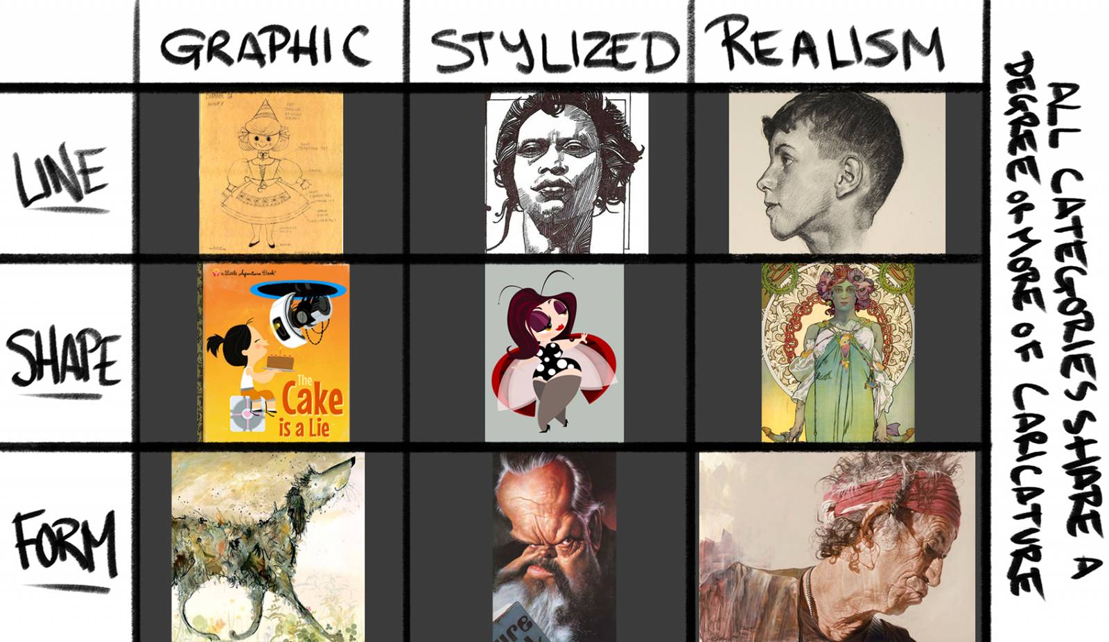
Graphic Images tend to be more primitive or forward facing, Stylized is through the artist’s eyes and through their personal point of view, and Realism is the illusion of reality, fooling the eye into believing the image was a genuine moment in time.
For now, here is a temporary chart and a few extra examples here in this post to help get you started with thinking how you would make art in your own hand, your own way, based upon what you love and not necessarily what you have learned. Oh, and be okay with what you choose, regardless of how far down the food chain you first perceive it to be positioned in your tool box of newly minted skills.
The hardest thing for some of these students to take is not using everything they have learned in the work they do. I have to tell them again and again it is not about doing realism in your own work, its that realism was a learning tool, a vehicle for them to learn the concepts of seeing, calculating, and translating visual space and translate that into something intelligible, legible, smart, and easy for anyone to see the meaning before seeing mistakes which pretty much anyone can see, or eventually see. And, if realism is the only means to super success and notoriety, then what’s up with Cory Loftis, Creaturebox, Miyazaki, Sienkiewicz, Niño, and the many others that are just as popular and well known?
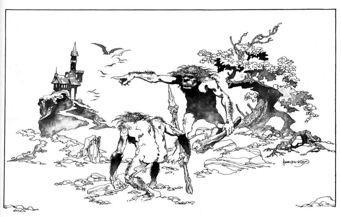
Alex Niño in one of his many amazing stylistic approaches.
So, what was it that you really wanted to do with your art? Go do it and enjoy what you want rather than what you think you need. And if realism is you, then do it the best that you can and understand clarity of communication before technique so that you can convey the strongest and most emotive story image possible.

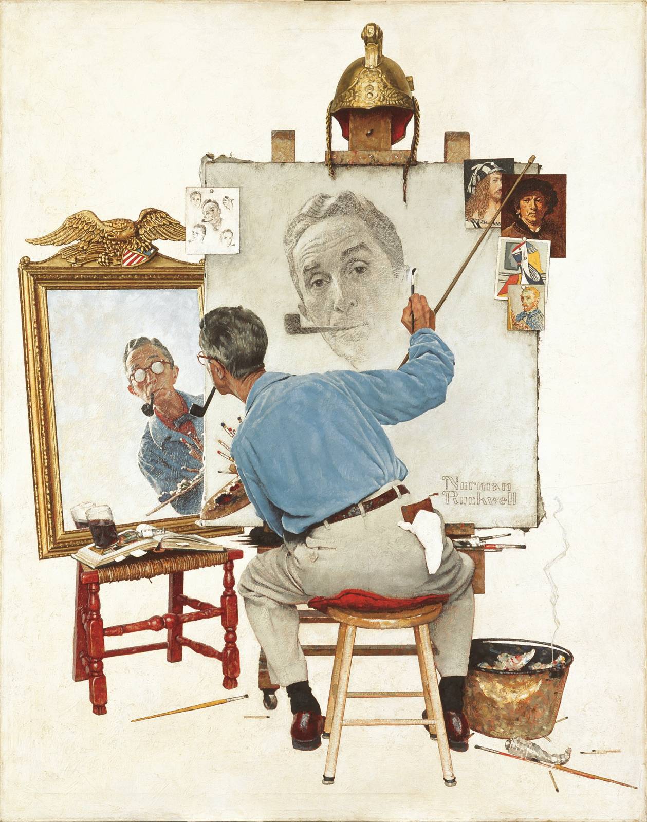
The Norman Rockwell of Cartooning, Cory Loftis.
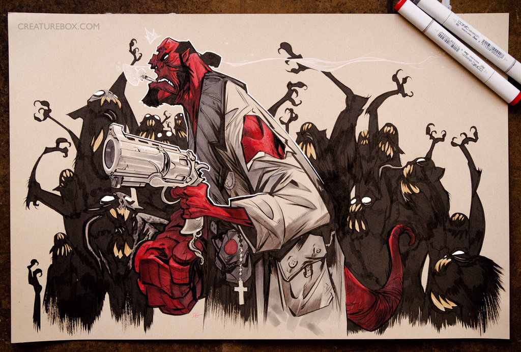
Creaturebox is amazing even when doing other IP’s.
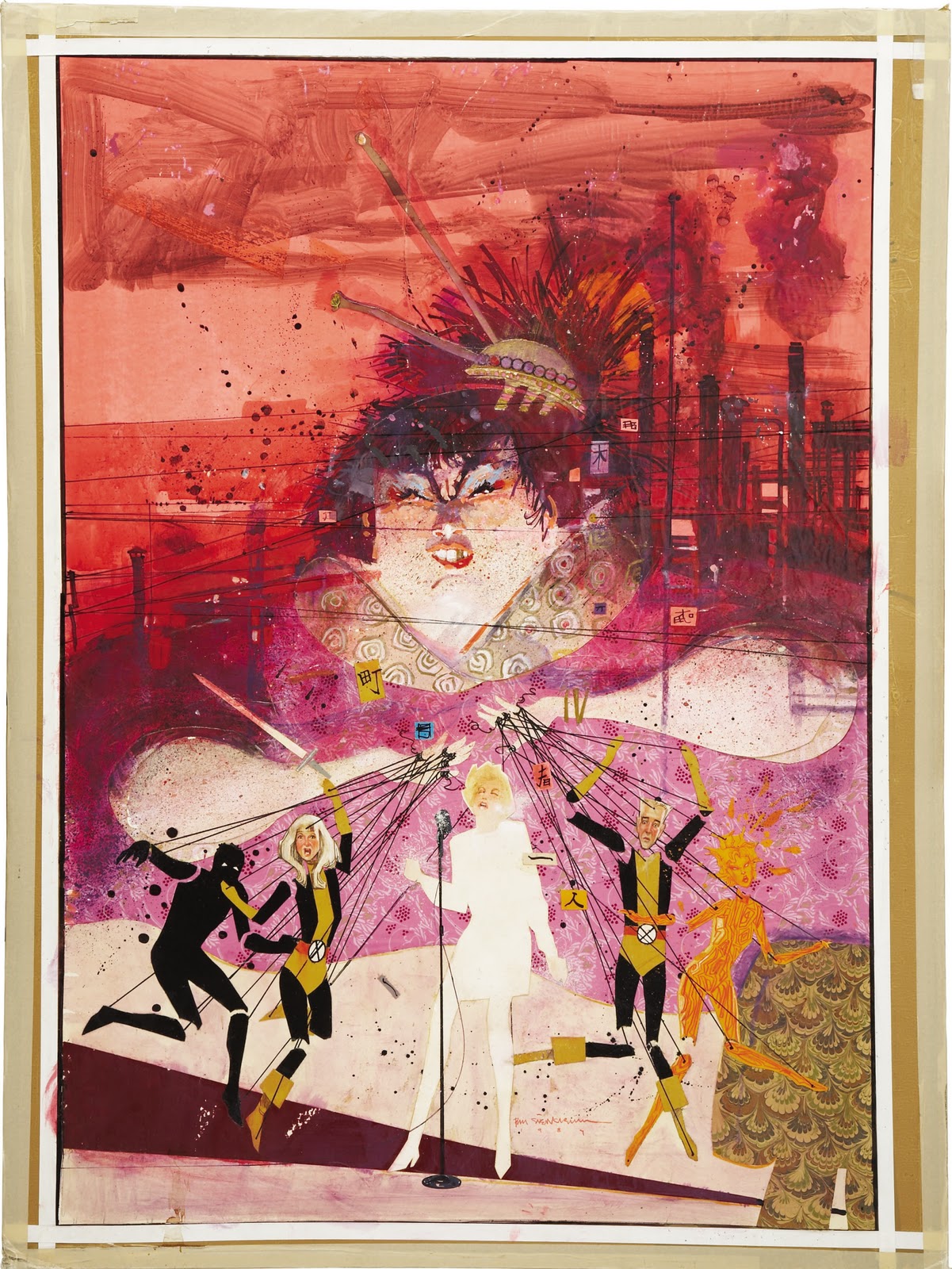
Bill Sienkiewvicz and one his many versatile approaches to making images.
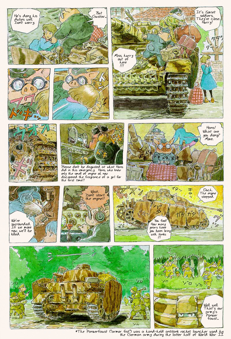
And of course, Miyazaki and his beautiful fluid comic approach.

“enjoy what you want rather than what you think you need” Time is so valuable that we all want to make the most of it, often forgetting about the fun part of the creative process and focusing too much on becoming technically “better” . Thanks for sharing this.
Time is a convention. No need to stress about it. 🙂
It was revelatory to see Art Nouveau categorized within Realism. I have always admired the use of color and line but felt it would be considered cartoony in my own work. Thanks for opening my mind!
Glad that helped. Every art movement has its realism, we have to cut past the fabricated titling and dig into the content a little. You will find every movement stylized realism is a part of it, graphic arts and commercially realism is the only things that sells to the masses. All the other stylizations are personalized to a small group only and if there is to be any real commercial success it has to speak more universally to do so. Realism is also in the abstract movement, just have to know who to look for.
I’m gonna make one of these now! Thank you Ron!
I’ve made PDF’s for myself out of your Master Studies post as well as your post on Purposeful/Deliberate Practice.
Your posts answer many of the “How” and “Why” questions I think we struggle with.
Thank you! x
Jay
Thank you and I am really glad to hear that the articles are helping fill those two parameters of learning for you, as they are the basis for many of the reasons I write at all. It is not enough to just write step 1 step 2 etc. but please follow up with why the steps and why what I do within the steps. My brain needs this to process what I am doing for the next time, and on, etc. Thank you for replying and saving these, it is truly appreciated.
Ron, honest question. What do you do if you hate all of your own art, even the best work? I’ve been practicing daily for over 10 years now and still don’t think any of it is at all close to the standard set now, my heroes art or how I envision it. I often feel ashamed to show it to others because as someone with aspirations to make this my living it’s not a quality I want to associate my name with and for how bad it is it just looks like I wasted 10 years of my life. I see the work here as the pinnacle and my art as the pit. How do you recommend someone start over? I’ve done countless studies of figures and everything people say to do but none seem to positively affect my personal work. I honestly don’t know what I’m doing wrong. I tried posting my work online in hopes to help my progress but anything it kept me at a standstill from all the conflicting advice. Anymore I want to only post art I’m proud of and art I’d like to see but the only thing I make is art I’d like to see permanently forgotten. Love to hear your advice from you or any of the muddy color community.
Hello Anon, I totally get it. I have been here many times with my own work. Remember that skill is relative and the lens is through your own, not someone elses and in addition, you are your own filter. SO, it is tough to objectify what your work means to you without feeling it from so many different personal and close to the heart angles. But one thing is certain, as I have said, we all, no matter how good or not, we all come down on ourselves for what we do and how we do it, etc. AT EVERY SKILL LEVEL THIS EVIL DEMON PLAGUES US ALL. I have no answer for how you can personally remedy not listening to this voice but that is a starting point. Allow it to speak, but then quiet it down and reflect on what you heard. Does it really make sense, or is something else priming these thoughts? Many times we get down on ourselves for something else entirely unrelated to our art but since we cannot separate ourselves from ourselves it seems to all get bottled up together.
One thing to keep in mind is the different paths in the day. One route is to produce work, the other is to improve upon your skills. To make improvements we have to have objective lessons with objective and practical outcomes that we can scrutinize and criticize towards another answer, or objective result. Unless each time you sit to improve one facet of your art skills, it’ll seem like you are repeating the same BS that got you just as far nowhere as before, right?
I also want to say that work and practice are entirely different. Work is to accomplish said goal under timeline of so many hours-days-etc. Practice is to improve with the allowance for horrible results. This is your training grounds and just because you make it does not mean that it is art, nor should it be. Without the mileage of failure to reflect upon, success is impossible to find. Nor does success have a face or notable markings so it is rare that we would ever spot it in the first place. I have a feeling that maybe sometime you should pull all your work into a bin, save it for a month, then open it and reflect on what you see from someone’s point of view of rummaging through someone else’s stuff and looking at it from an entirely different perspective.
Sometimes it is what we do that makes us feel as if we are getting nowhere. Take NC Wyeth, a fairly accomplished artist, eh? He HATED everything he did because he thought he wasn’t making real art, but fake are for kids who don’t care about art. WOW. What a head trip that would be knowing you have all these skills and are producing nothing of great merit to you, but, and here’s the kicker, it pretty much influenced everyone in the field after you….My point is that sometimes we do not see that we are actually making what we should be, but because it is hinged to something that we don’t necessarily like doing we can’t accept that it is “good”, “great”‘, “revolutionary”, etc. Some of the best and most influential art was made spontaneously and if the artist had thought too much about it it might not have happened.
Make what you care about. This is a place to start. As much as that might seem or sound so petty, it is actually quite truthful and meaningful. Do what you love in your work, and you will hit a nerve that “feels” right. It has nothing to do with whether it is commercially popular or not, “does it feel good to you?”
Everything is perception and sometimes our perception is skewed enough not to see our own issues as non issues, because we are turbulent through them and we are the ones dealing with the experience. Step outside that experience and how do you perceive it from that perspective? Is it the same as when you are immersed in it? If not, that is another place to begin demystifying what it means to do “good art” for yourself. Maybe you have done something meaningful in what you have done, but because the artist has no connection to the audience it is impossible to know.
If you are looking for any technical help, besides this wonderfully packed resource center of a blog, you can go to my site, lemenaid.com to check out videos, articles, or anything else I have over there to help you with your skills. I am just now building it out so if you don’t find something you need it doesn’t mean it won’t be there, eventually that site will be well populated.
If there are any further questions you can always contact me here or through social media regarding any other concerns with your skill building or your work. I wish I could see some of it now, I would like to know what you mean when you say these things, in regards to what you make. Willing to share any of it?
Thank you for writing and I hope any of this has helped.
Thank you very much Ron for your very thoughtful comment, I’m amazed by how fast you responded to this and am completely honored and inspired to have your time. Knowing your work I feel very unworthy. 🙂
I agree with every topic you put down and it honestly feels at some points you’ve been over my shoulder the entire time how you explained the first paragraph. I could write a book with all the things the voices have said to me. Thinking visually for me used to be quite a natural thing but now that I’m getting older and getting more non art responsibilities using my imagination feels almost like turning on a rusty switch and the voices have only gotten louder.
I also agree with separating work with practice but my issue is making realistic practice goals. I see where I want to end up but I don’t see the bridge that will take me to it. What do I practice when my work doesn’t turn out? Somethings are easier like if I mess up a face, I can practice skulls, muscles, asaro heads, Loomis concepts and do gestures, those issues I feel I can fix, but the issues I run into are usually vaguer. Like my biggest issue of all, how do I make my work look finished? I feel I get how to study and understand a subject like if I wanted to draw a skull, understand each part, but what I don’t understand is the mechanics of an image (I think). How do I practice things that make me attracted to an image like design, appeal, style, etc. I can make a technically accurate skull, but how do I practice making it look cool and have moody lighting or stylized? Like wanting to draw like Kim Jung Gi, I can sometimes picture a thing in my head, put it down and it’s recognizable, but it just looks bad as an image. Looking closely seemingly for every 1 line I put down I did 10 other things wrong. I don’t know how to improve that.
The biggest passion of mine has always been dragons and anthro characters. I love the idea of mixing western real with eastern appeal. I can even pinpoint the exact painting that made me get into art in the first place. I’ve also asked many artists I look up to how they do specific things and what’s held me back was learning that many told me they don’t know what they were doing and following their vague advice has only made me view them as art gods. My thoughts being “how can I study to become as good as they are if even they don’t know how they got there?” Looking at their work now I feel like a lowly peasant looking at the fingerprints of a god. I’ve tried for many years just drawing what felt right and getting better through numbers and bruteforeceing my improvement like I heard they did but I feel I’ve learned very little through my 10s of thousands of failures.
My art is not online anymore but I would be happy to email them to you if you would like, I can also separate my work and practice if that helps. Just tell me where to send and how much.
Sorry this was so long and thank you so much for your time Mr.Lemon.
ron.lemen@gmail.com. WOuld love to see some of what you feel is your best work.
As for what to study: Thinking like a student is difficult but it would be a mixture of thinking like a student and then thinking of the ultimate Mister Miyagi moment: Look at your art, what is the first technical thing that stands out to you…what is the first legibility issue that stands out to you…can they be labeled, distilled down to a few words, i.e. technically the head is too small, the form doesn’t feel like form, more like a combination of comic book lines and some badly placed shading…a form issue…legibility issues, I meant for the warrior to be cutting the dragon but it looks more like he is handing the dragon the sword…that is an acting issue.
Believe it or not, illustrating is 3/4 acting on paper, the rest is technical stuff. Without a flare for acting the picture can feel stiff, like how we would behave if “we” were asked to go up on stage and pull of the role.
For the head size, practice wire frame armatures until you see the “ideal” head unit thing working with them. This could be weeks, days, minutes, before it triggers how to “see” the problem and fix it. The problem will always exist, but do you see it clearly enough to make the fix.
For the form thing, practice shading basic forms as an exercise, from high key to low key so you can shade with mood in mind, remember the acting thing?
And as for the acting thing, practice rhythm drawing and gesture drawing without joints in the figure at first pass, then design the joints in with motion in mind. How do you design them to help suggest the motion of the limb rather than the design and structure which is a still life…
To help put into perspective what others say, when they mention they do not know where it all came from, they really don’t know because the thousands of hours they have clocked in chock full of failures and successes has created a dialog internally with a problem solving junky who doesn’t realize that’s what they are, if that makes sense. problem solving is about the next one, not twenty ago, albeit 20 ago is just as important to them because the memory helps curb the next attempt. If someone doesn’t normally teach in their day then finding a solution to every question asked to them of their work and process is an impossible task. Unless you express your process or describe it, as in a classroom setting, the words are so difficult to properly select, as well, select to sound meaningful and helpful. If that makes sense. Most will start the conversation with I don’t know how I do this to steer the questions away from that part of the process because they don’t have the dialog prepared for it.
Many others just do it so much without thinking that it is their history with doing it that gives them insight. If you do it enough without thinking you just do it all the time without a blink of an eye, it becomes habitual. Habit leads without edit and edit takes a back seat, therefore everything I do is good because edit doesn’t tell me otherwise. Know any artists like that? They exist all over and at conventions. The psychology of art is really fascinating and something to ponder from time to time to help with labeling for self as well as curtailing any strange comments that might fly your way via the interwebs, friend, family, etc.
Your passion with combining Eastern with Western Fantastical is great, that thought process helps advance new ideas and concepts if you are engaged and observant to look for it.
Because there is so little ref or influence of this kind out there it is all uncharted waters and so it can feel at times like you might be going on and on with no answers and since you have no influences to lean upon it might feel like failure. Each and every time you sketch out one of these drawings you are creating a history of sorts that helps you with the next drawing, the next series of edits, the next concept, etc. So, the one thing you should not do is prevent yourself from sketching. Without that history there is none and reflection feels hopeless…I don’t know if any of that makes sense but I hope it helps. Gotta get to work now, thanks again for writing, there is a lot of good stuff here that I think so many of us go through all the time and there aren’t enough answers to lean on to help us realize so much of this is just internalized distortions that need some clarification and course correction. Have a great day.