The Coen Brothers’ latest, The Ballad of Buster Scruggs, is possibly one of their most lovingly created achievements. The way the stories are presented, the craft of performances, the light, the color, the camera’s ability to reach from intimate setting to sun-drenched vista, reveal the care and quality of direction to produce this cinematic gem.
Thrilled to have contributed to the picture, I illustrated all the chapters of the book seen in the movie.
An artist works a long career of failures and successes to get to a level of abilities that allows one to be ready when calls like the following come in. I’ve worked a number of years with Eric Skillman, art director at Criterion Collection, who has a keen eye for designing with illustration in mind. We’ve worked together on close to a dozen dvd covers for the company. When his call came in, I had to pull the car over.
“Hey, would you want to work with the Coen Brothers?”
First thought: who wouldn’t want to work with the Coen Brothers? My reply was easy and simple. “Absolutely.” But I had to ask, “will I get to work with them or for them?” At this stage, he didn’t know. No matter, I’d figure that part out later. Meanwhile, I was in.
Next thing I know, I’m reading the screenplay. Beautifully written, to the degree that I could feel the imagery in the script, see the shots, visualize the characters. It had a touch to it that was undeniably sensitive. Composed as chapters of a book, a series of short stories, each chapter started with a full-page painting, like the NC Wyeth illustrated novels.
But how do you go about meeting a couple cinematic legends? I knew from past meetings with powerful creatives the last thing you want to do is try to impress them. Just treat them as you would good friends. And like you do with good friends you sometimes fail. So, after a small but significant miscalculation of time on my part, (did I just blow off my first Coen Brothers meeting?) I came to the NEXT meeting with sketches, painting examples, and a signed copy of my novel. Fully prepared.
They couldn’t have been more gracious, but I recognized a familiarity. These two were creatives on a mission. They had that look of paying attention to what you say, but at the same time analyzing how it fits into their vision. They were painting images in the back of their minds, linking thoughts and footage together while being polite as ever. But I know the look. Espionage agents call it, The Tell. I know the thousand-yard stare of a creative at work.
I quickly relaxed. I knew I could work with them for a common goal. We jumped into talking about images immediately while I spread sketches and paintings out on a coffee table to discuss possibilities. Like kids talking about comics, Ethan paced back and forth making comments while I pointed to different techniques in the paintings, and Joel discussed the practicalities of which sketches worked for them. All dead serious. I just had to keep telling myself not to make that little box with my hands that you see directors do.
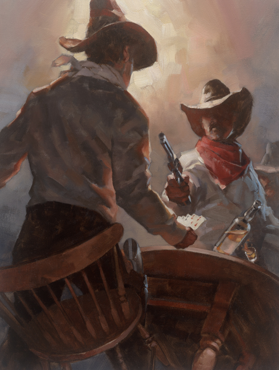
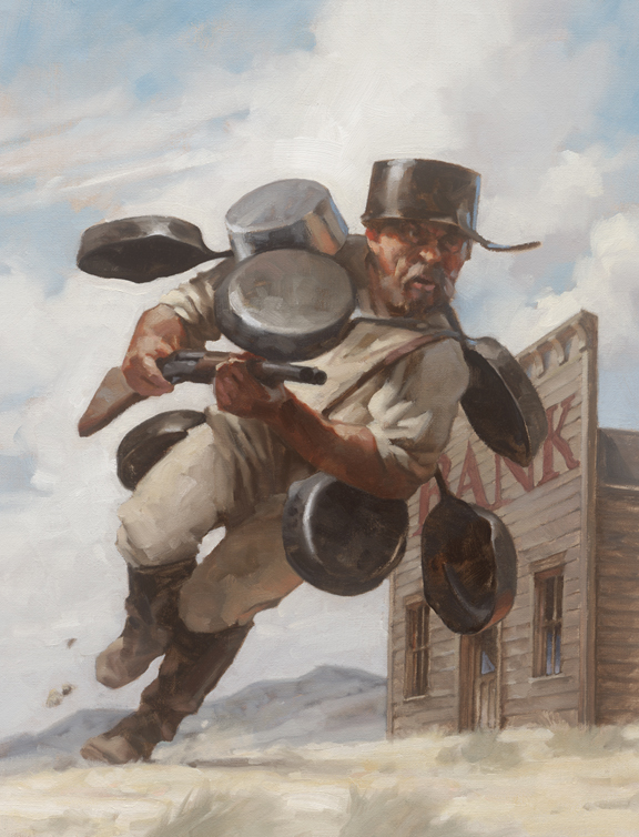
The main concern in creating the oil paintings was to capture moments from the screenplay that told stories as pictures, not as photography from the film. If that were the case, I could’ve just asked for screenshots and painted from there. But they were after a special feeling from each piece. Something that hinted at the essence of each tale without giving too much away, or ruining a setup. After all, Joel and Ethan were working to create a feeling of a lost volume from some forgotten library.
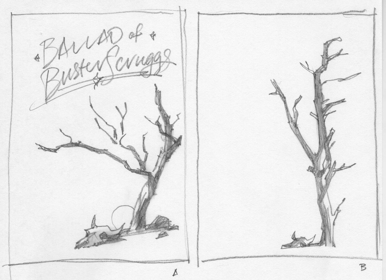
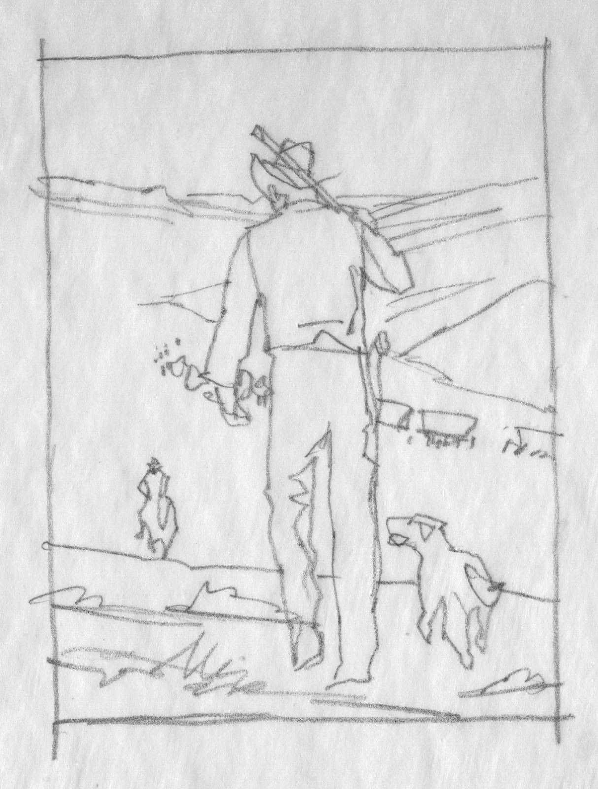
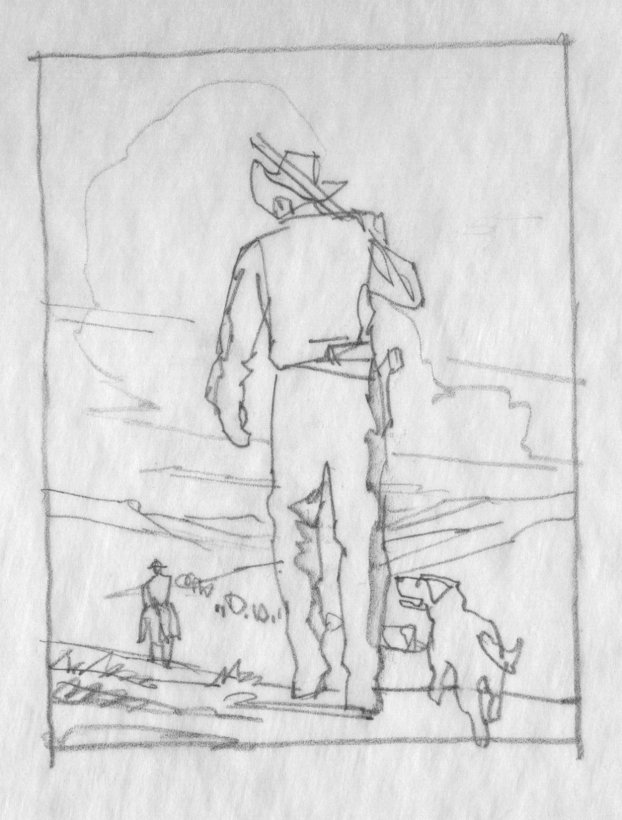
The authors wrote their descriptions in the screenplay of what the visuals should look like, what characters, what setting, etc. From these initial views I started, as always, with small thumbnails sketches to capture each chapter opening.
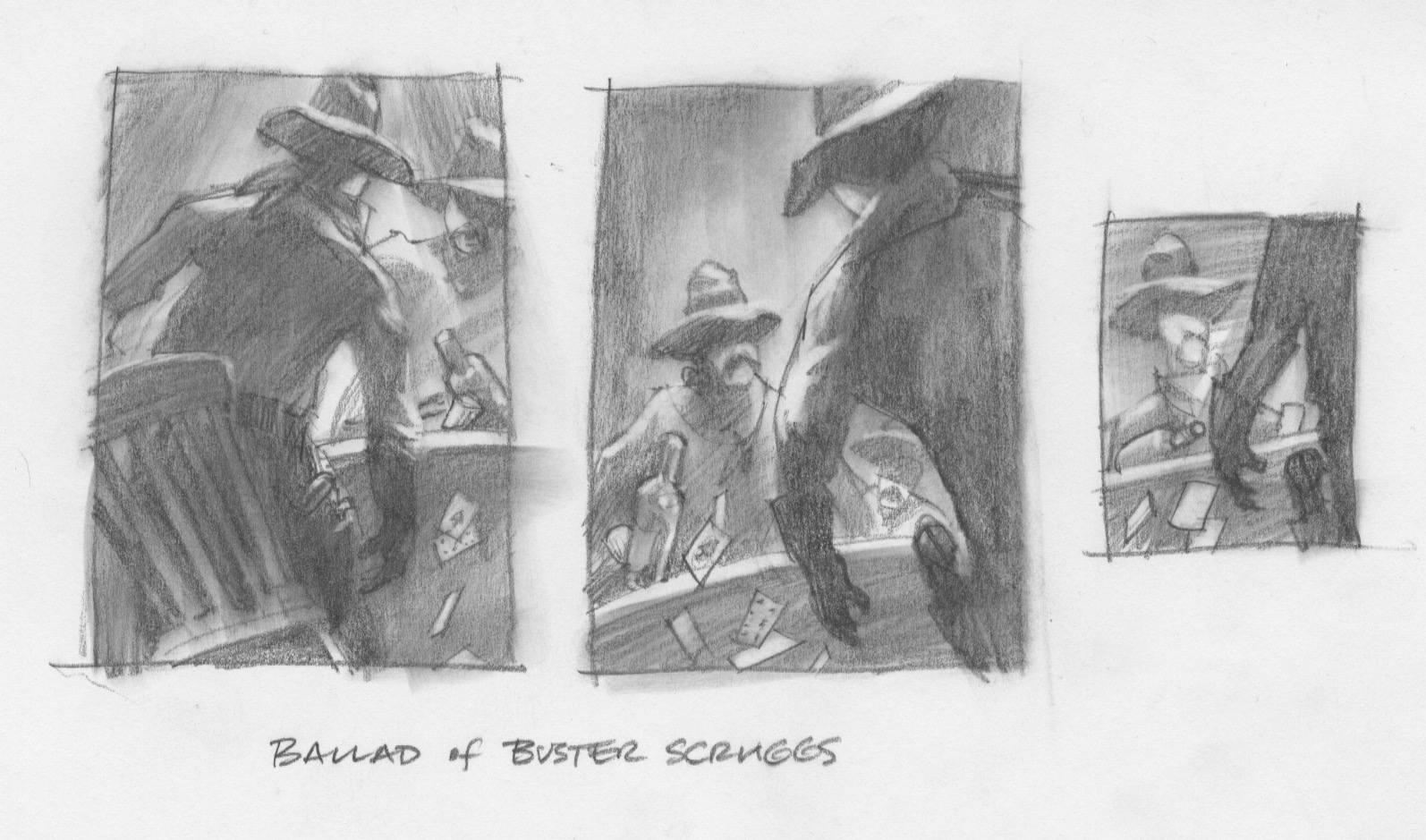
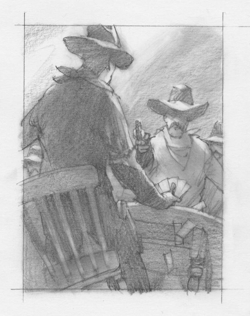
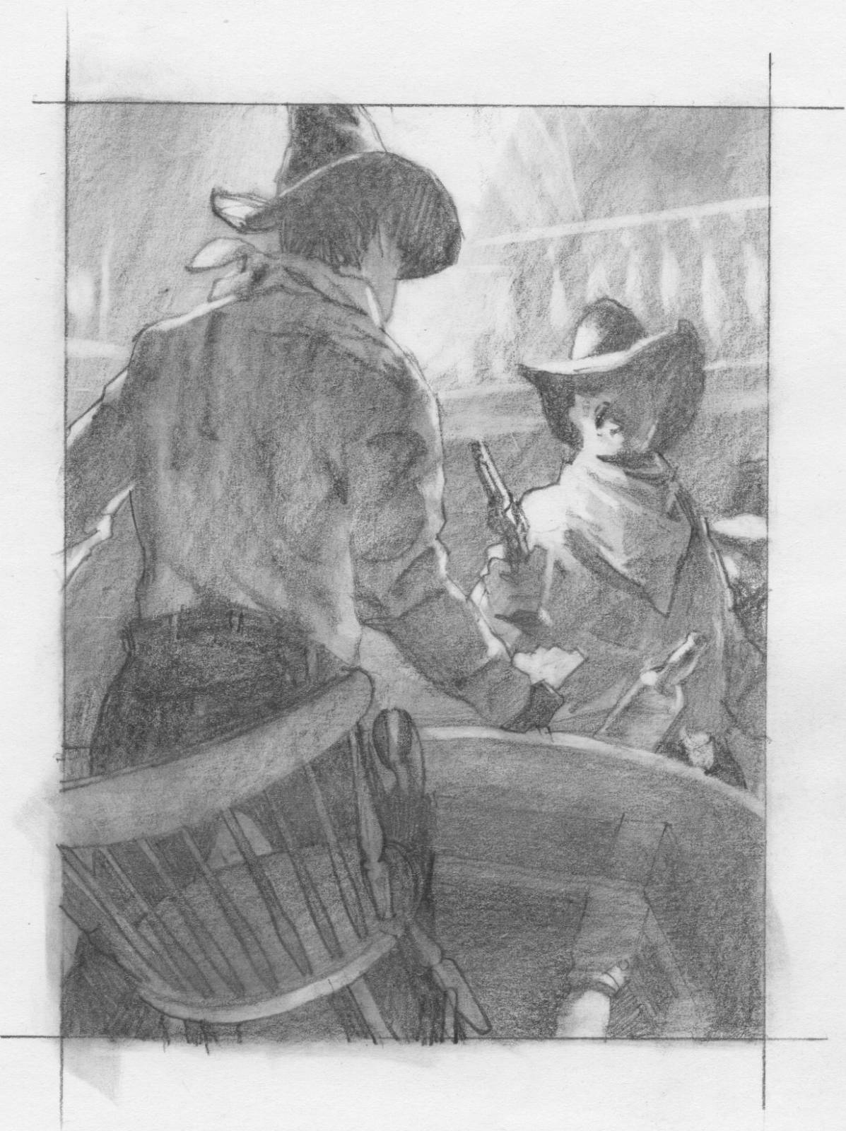
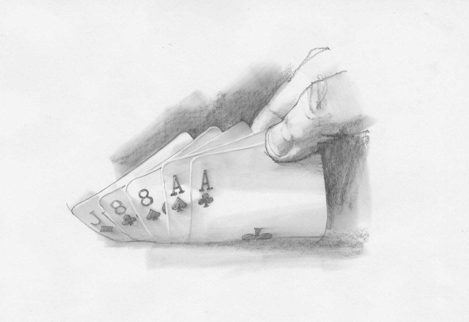
At one point, while working out logistics on the first painting of Buster, we were all playacting the parts of the two characters at the card table. My first sketch of the scene had the figures pulling guns on each other, but that wasn’t quite the moment they were looking for.
Joel said that the character of Buster needs to be drawing back, but not going for his gun. And we have to see the cards, but how are we going to show that? I stood up to mimic the movement and as I did I realized that if Buster had cards he’d momentarily flash his hand to the audience. They were delighted at this and asked if I could sketch that up.
On my way home I texted a friend, “I’ve been helping the Coens direct.” Yeah.
The Ballad of Buster Scruggs
I returned several times to discuss upcoming paintings for each chapter and one day, while Joel was flipping through an iPad looking at old embossed book covers, I asked him who they’d gotten to do the ink drawing for it. He said they hadn’t and weren’t sure where to go. I basically said, ‘guys, I’m right here,’ and mentioned that I used to do tons of b/w work for a living. I asked if I could show them more sketches and the following day I came back with ideas for the embossed image on the hardback cover.
While talking about specifics for the ink drawing, they were discussing techniques with Randy Balsmeyer for mocking up the book to be shot. I noticed that they were talking about small drawings to be included at the end of each chapter. So I asked who they planned to have for the finish work. Ethan said, “uhh…you?”
I came back with sketches for the next meeting, when I promptly asked about painting the endpapers. It was only natural to have the same hand for this aspect as well since the old illustrators used to paint all these sections.
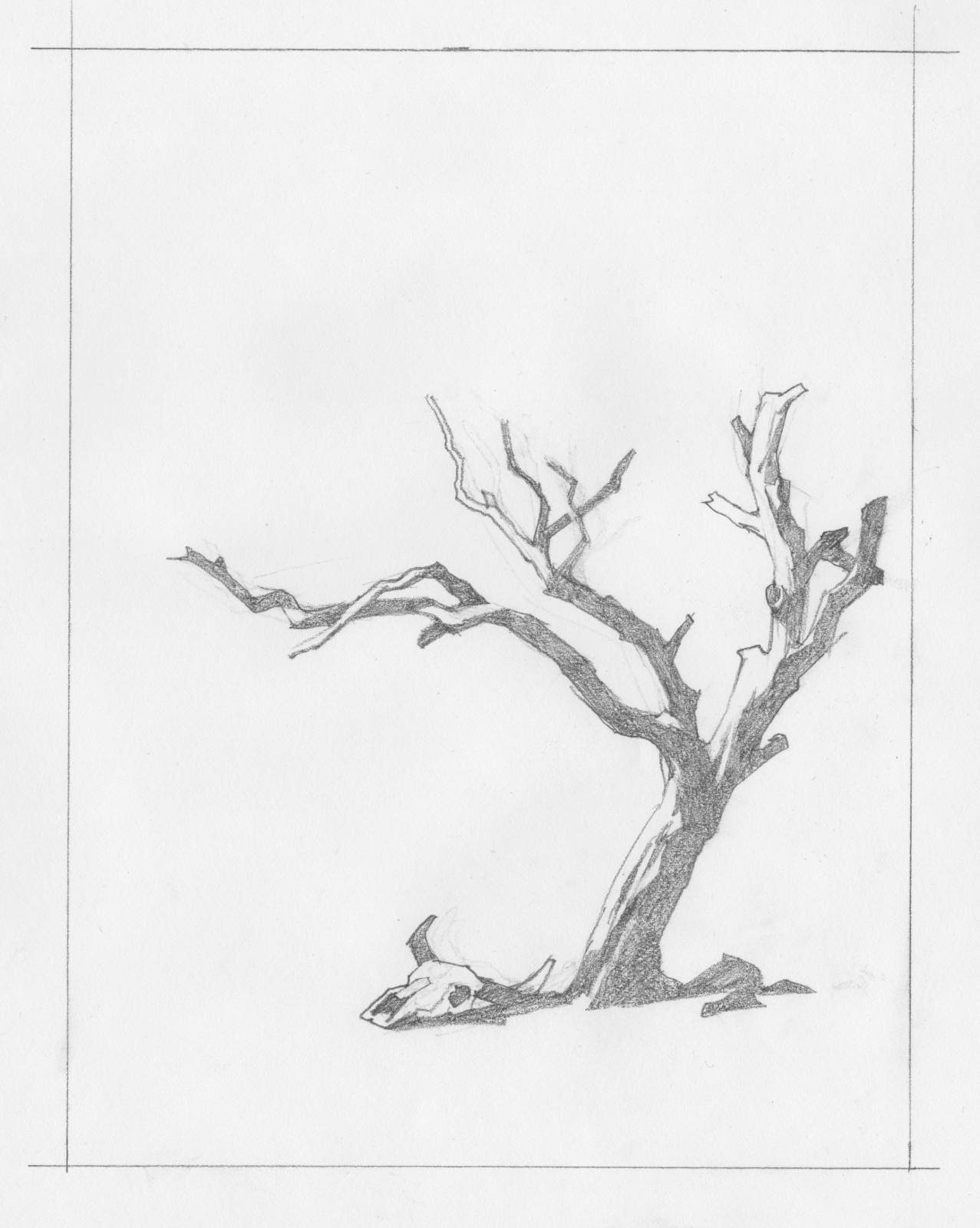
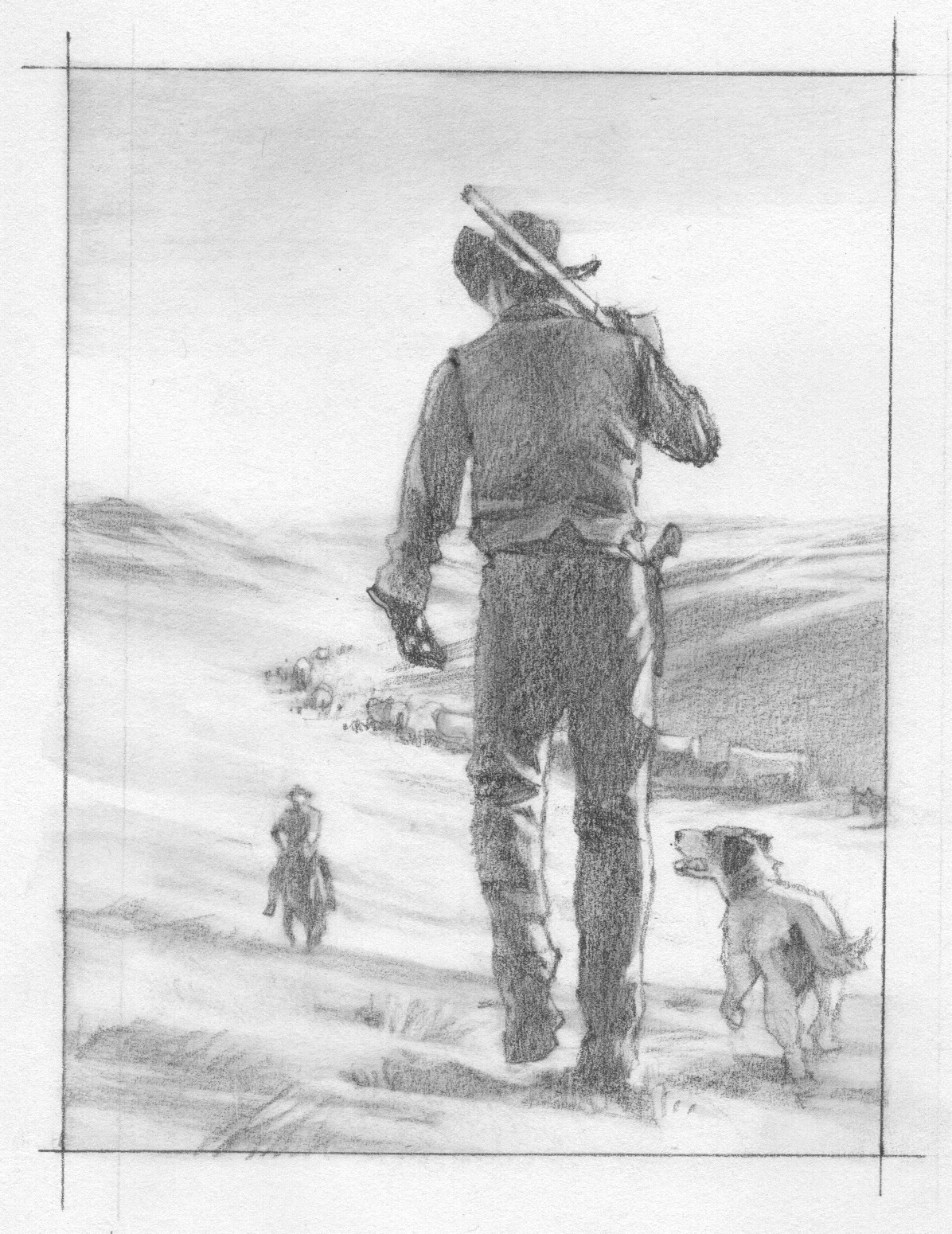
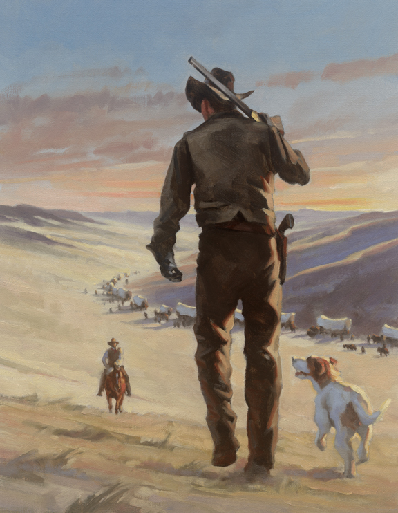
1st chapter, The Ballad of Buster Scruggs
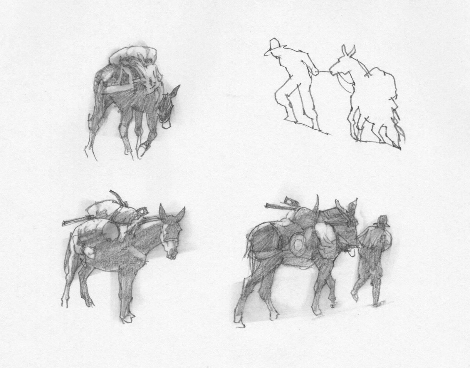
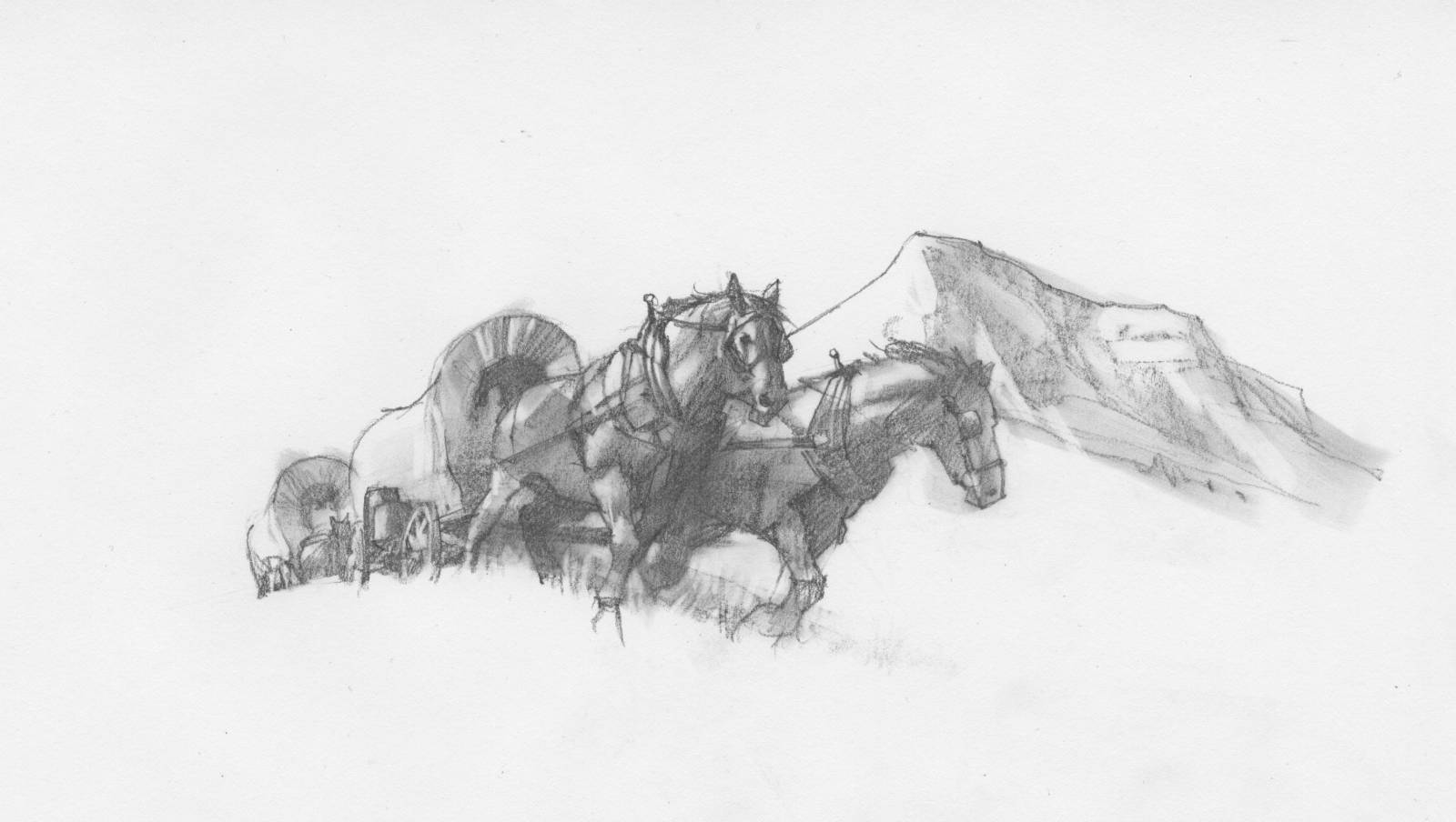
2nd chapter, Near Algadones
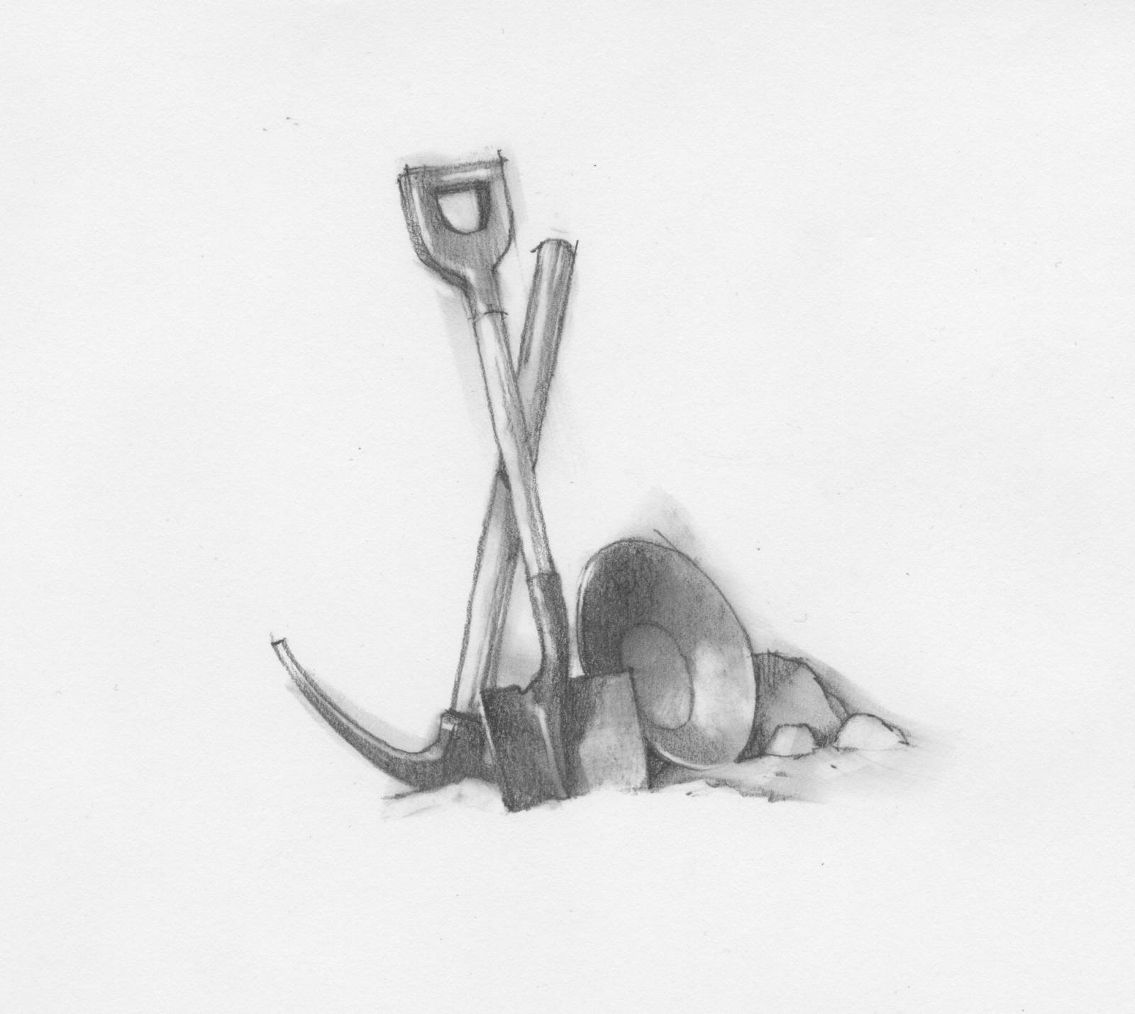
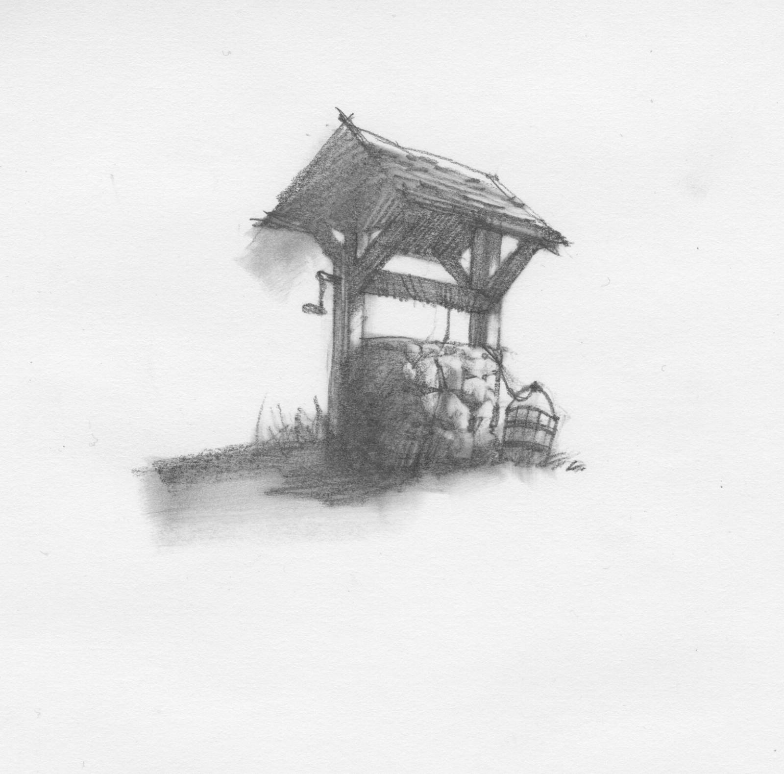
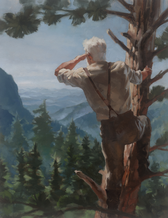
3rd chapter, All Gold Canyon
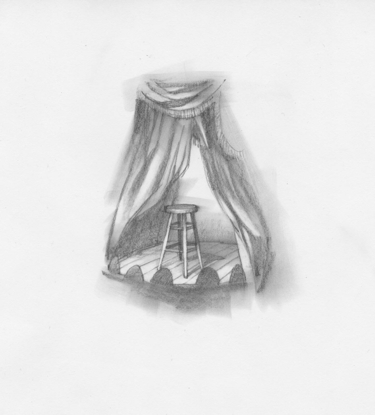
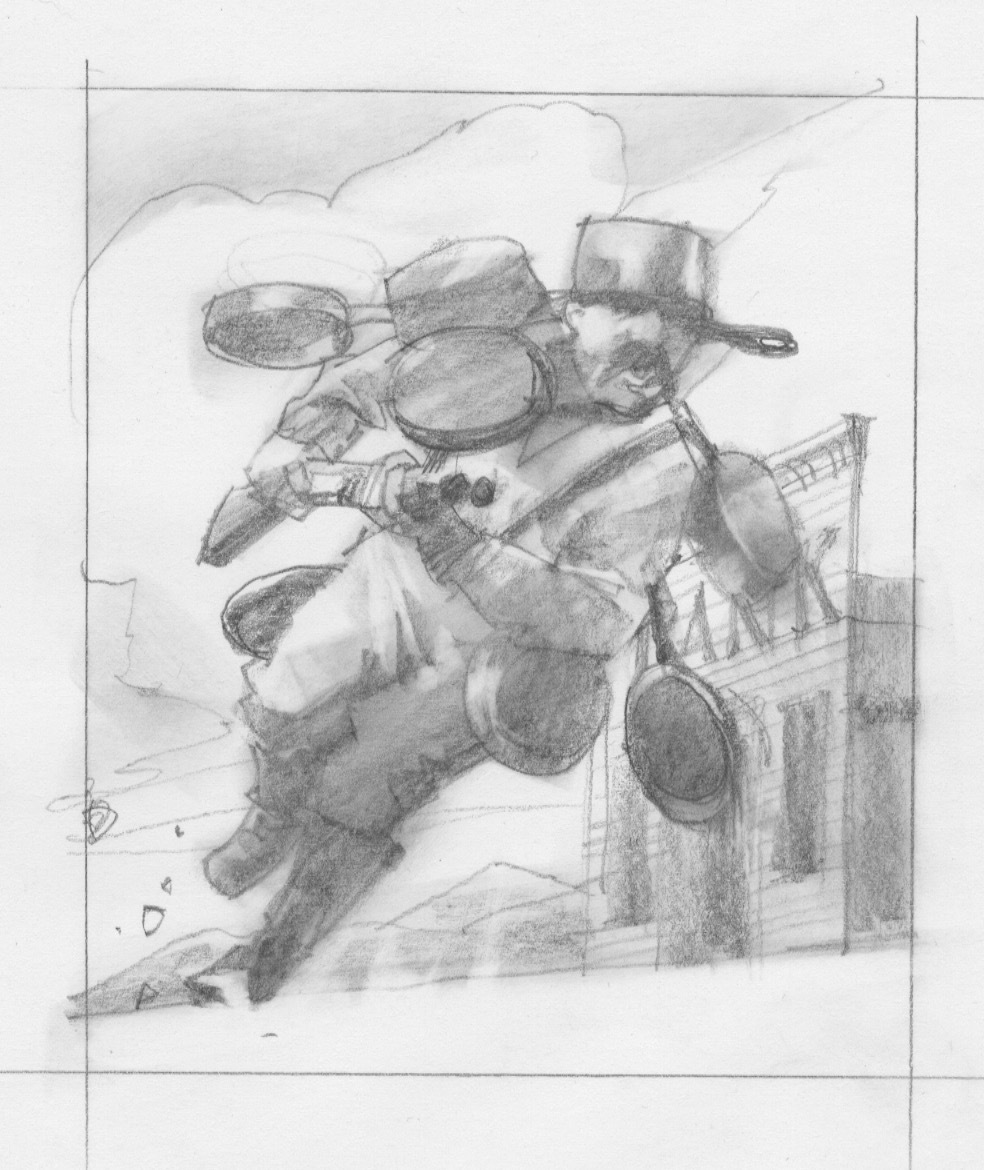
4th chapter, Meal Ticket
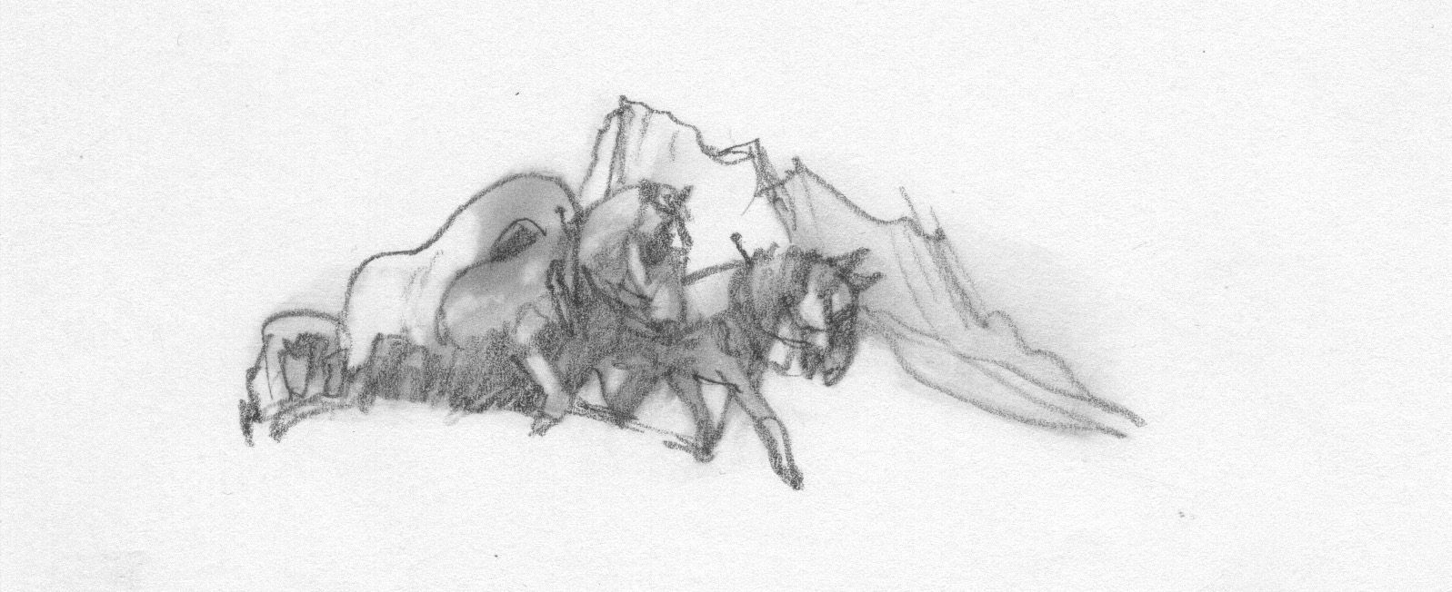
5th chapter, The Gal Who Got Rattled
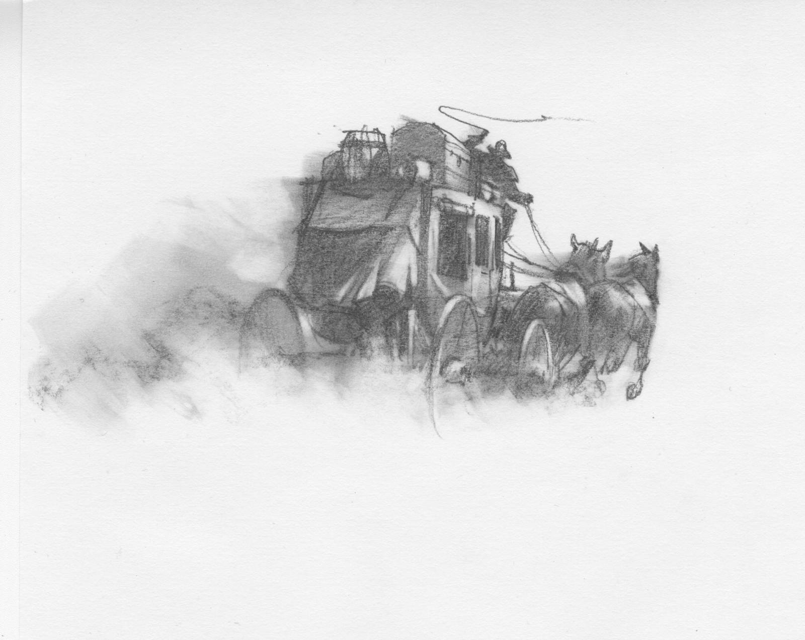
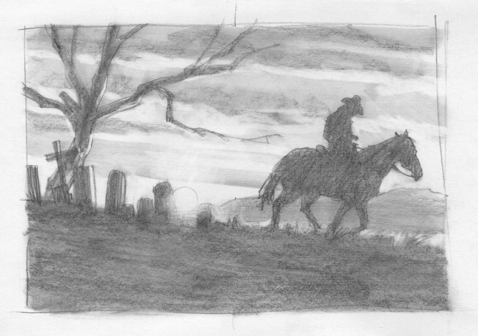
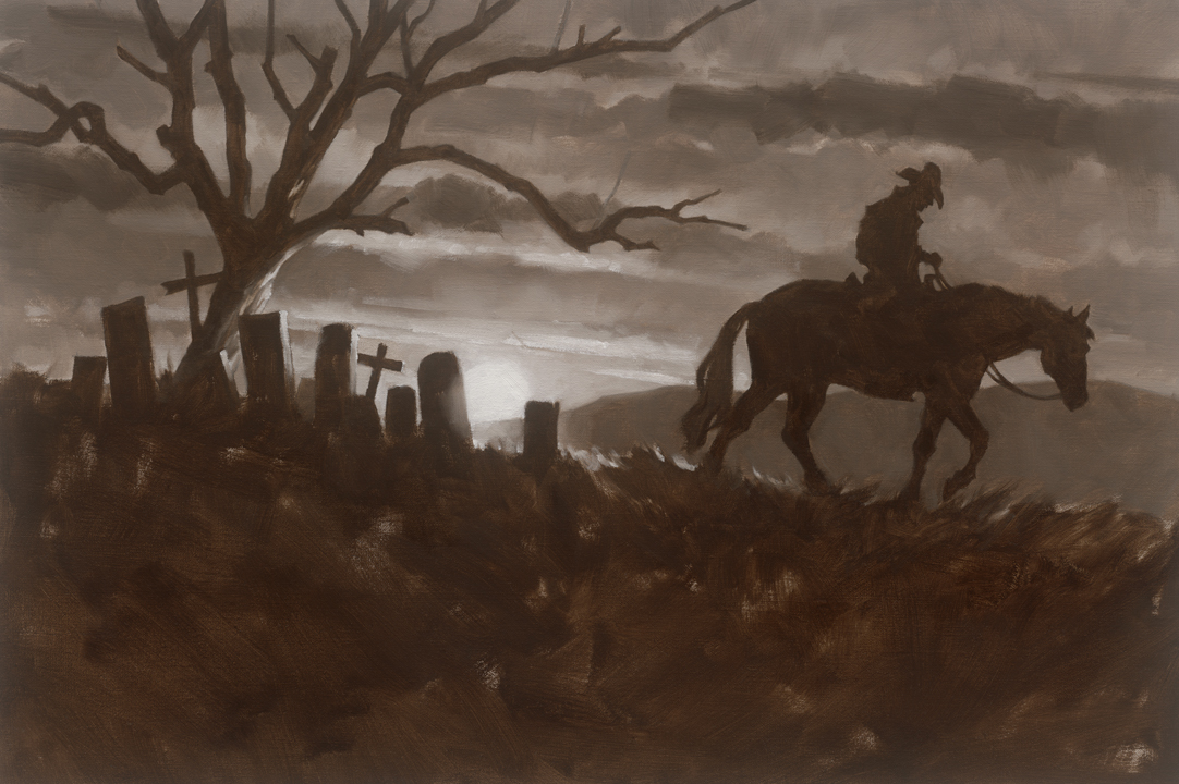
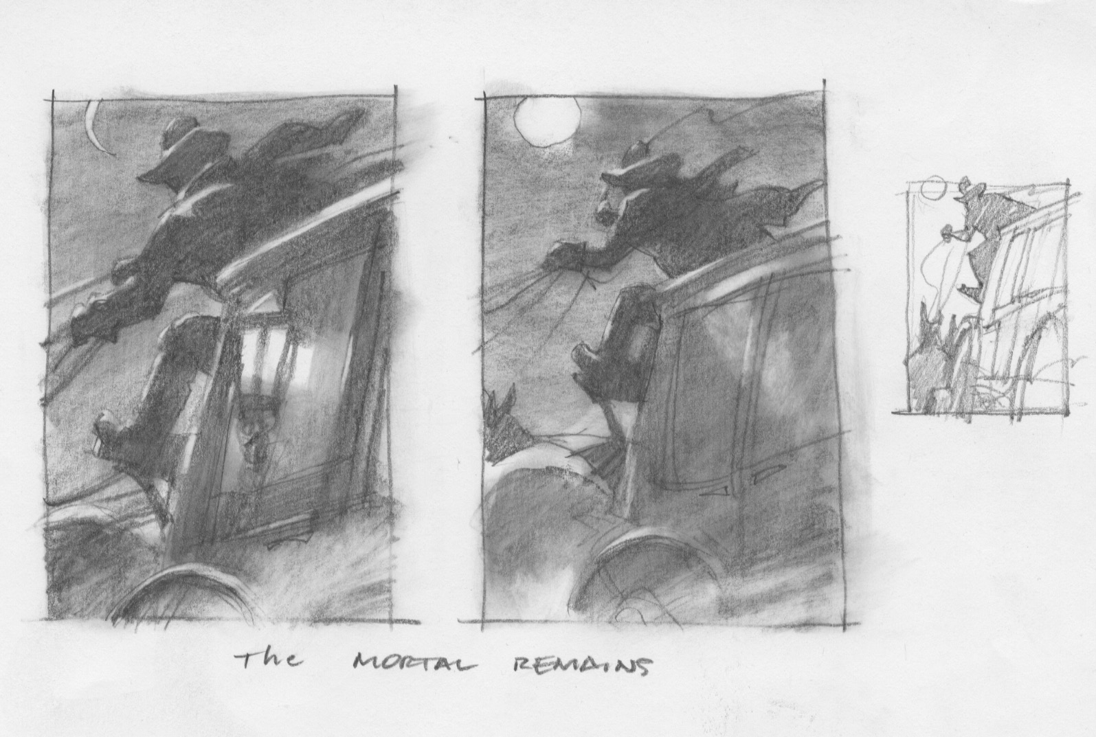
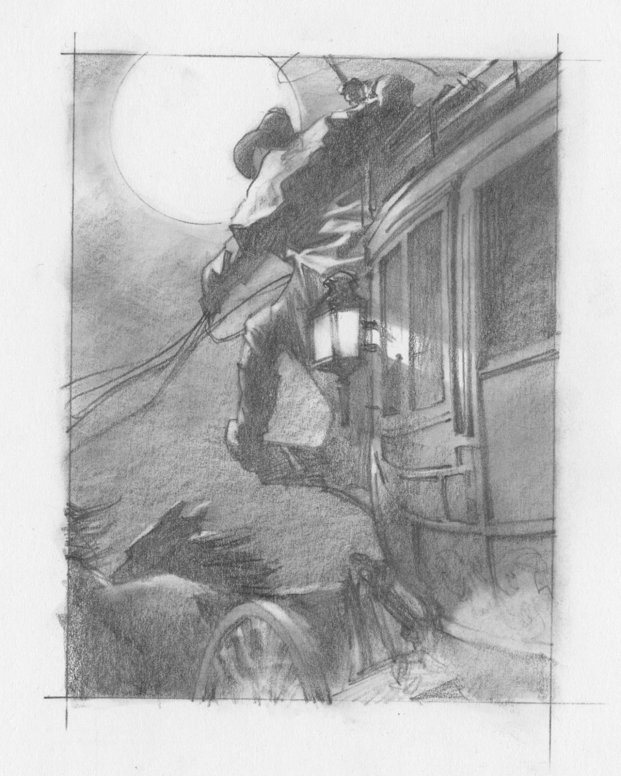
6th chapter, The Mortal Remains
We went back and forth like this over a delightful two months. I would come in with new sketches and we’d spread them on a table and go over the specifics. Frankly, there were minimal changes and very little adjustments needed. Sure, I had to simplify some areas while giving others more detail, or change the light and color a bit, but that’s just part of the job. They knew what they wanted and I appreciated that. Nothing worse than working for a client that doesn’t know what they want until they SEE it. The. worst.
Endpapers
Working on The Final Paintings.
I’d actually captured the feeling for Near Algadones in the first thumbnail. Ethan liked it right away, but when I worked on the finish sketch for the final, based on figure reference shots, I’d kept the character too real and lost all the life from the sketch. Ethan recognized it right away and pointed back to the initial thumb. In the end, I projected the original thumbnail to keep the shapes and figure fresh and painted from there.
Near Algadones
The idea for Meal Ticket was to have the character in the story looking up, but needed to look very close to the actor. I kept missing it until I asked if the actor could just take a selfy with his phone and send it. The lighting was wrong, but the photo showed his eyebrows, eyes, nostrils, lip line, chin, and ears in exactly the right places for the angle. I was then able to capture his likeness under the stage lighting I made up which was necessary for the story.
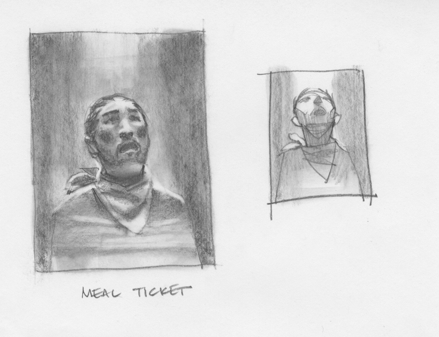
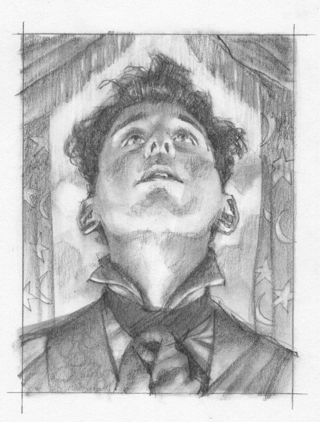
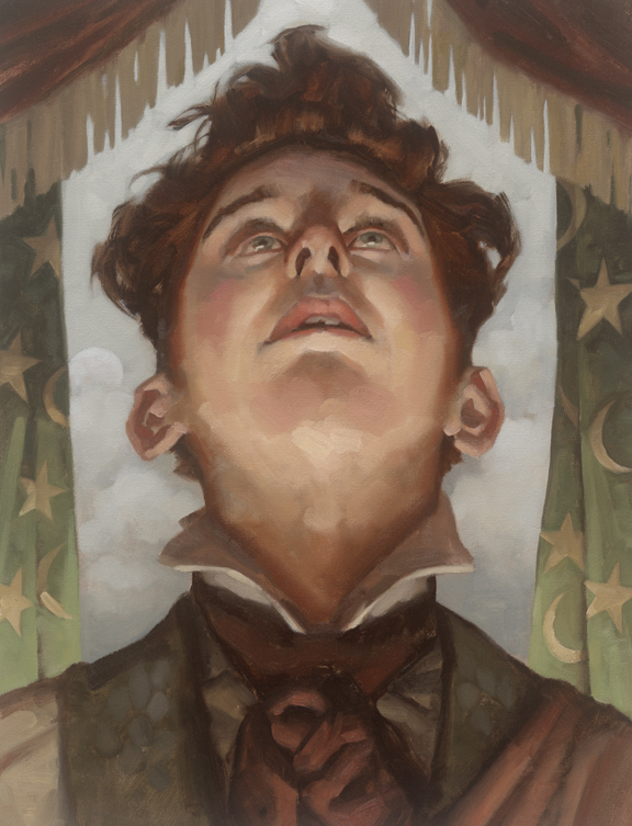
Meal Ticket
To capture the painting for All Gold Canyon, I drew the figure over and over again, searching for the right body posture. It wasn’t until I took a shot of me hanging off my cats’ tower that I got the gesture right.
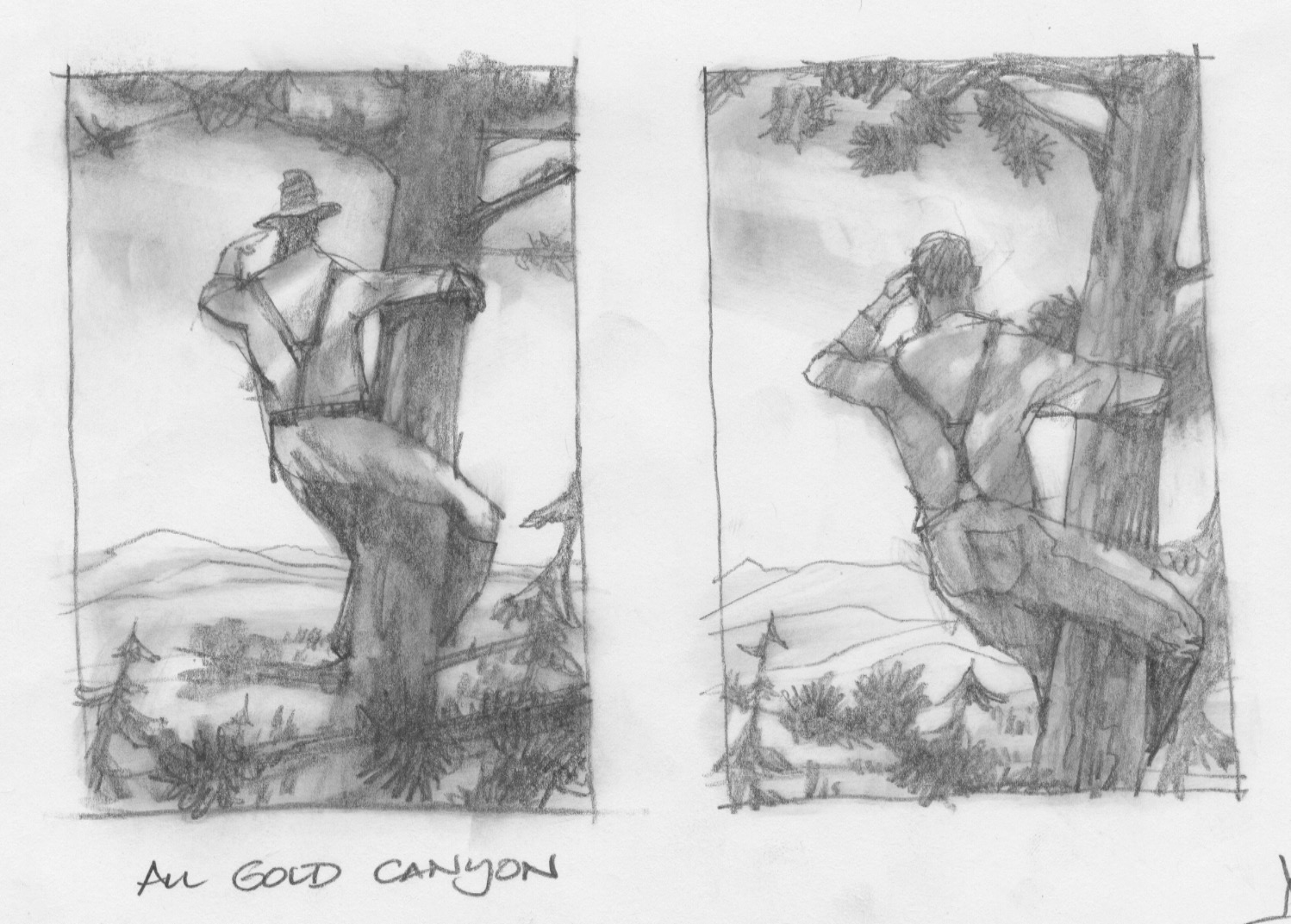
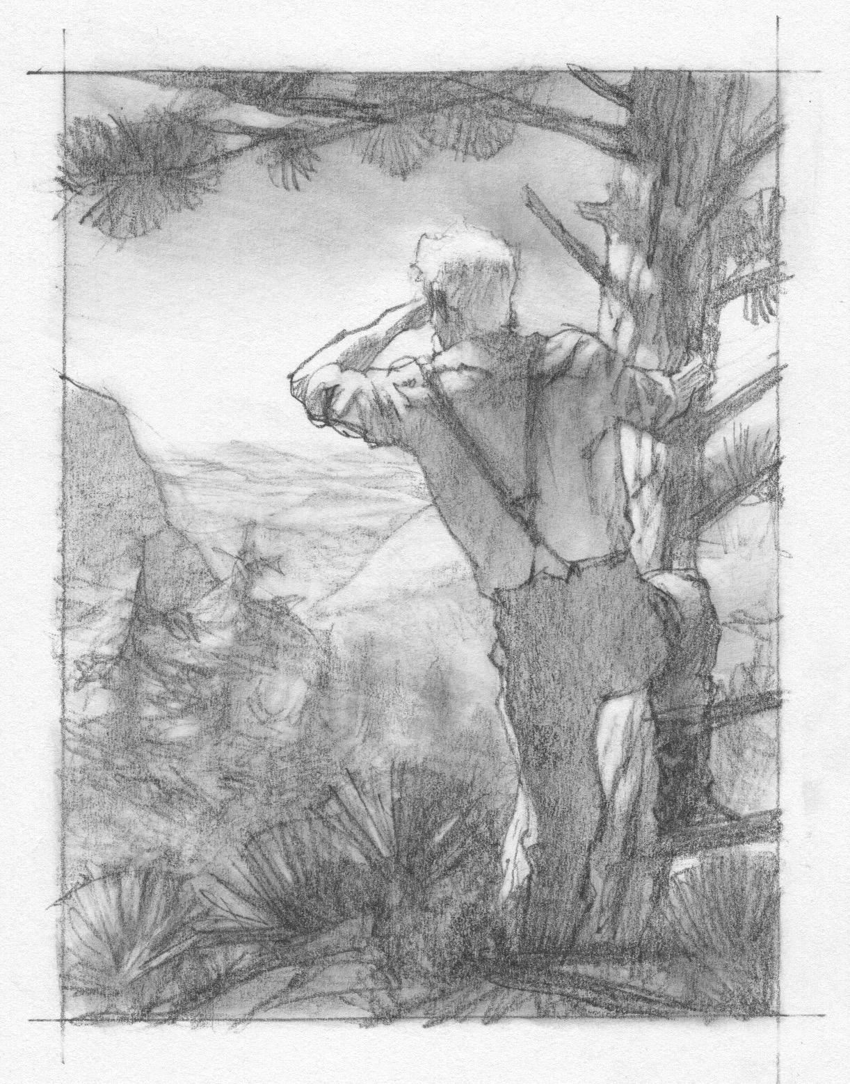

All Gold Canyon
We shifted point of view a couple times for The Gal Who Got Rattled. The trick was to capture a moment in the story that was very subtle yet set up with all the right components to pull it off. I think in the end, Joel and Ethan had captured the feeling necessary in the photography. This is the closest any of the paintings got to the photography in the film.
The image, however, still needed to work as a moment. It needed to have the horizon at just the right level, so I redrew elements from the basic scene, rearranging them to make sense in a painting. For example, redrawing freehand from reference will distort reality just enough to make sense in a painting. It needs to FEEL accurate, not be technically accurate.
It had to be a moment that didn’t depend on a camera moving. The movie actually describes through story the differences between telling a story as a visual moment and telling it cinematically. A painting doesn’t have the luxury of movement to describe a scene or a character.
The Gal Who Got Rattled
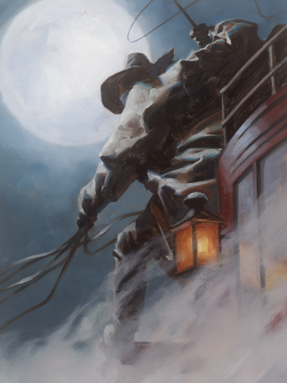
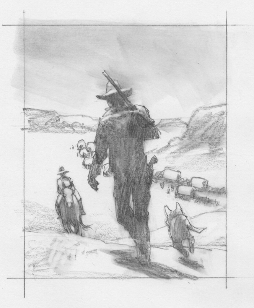
The Mortal Remains will always be a favorite from the film and the painting as well. The coachman sits atop a stagecoach, whipping his coursers in frenzied moonlight. I remembered that on 53rd and Madison the Wells Fargo Bank has a pristine specimen of one of their stages from the time period. Perfect reference. (I wish I’d known that when I was working on L’Amour covers.) Ethan commented that we need to get closer to the coachman, and add lots of dust. Even after the painting was initially finished, Joel and Ethan said almost simultaneously, “More dust.”
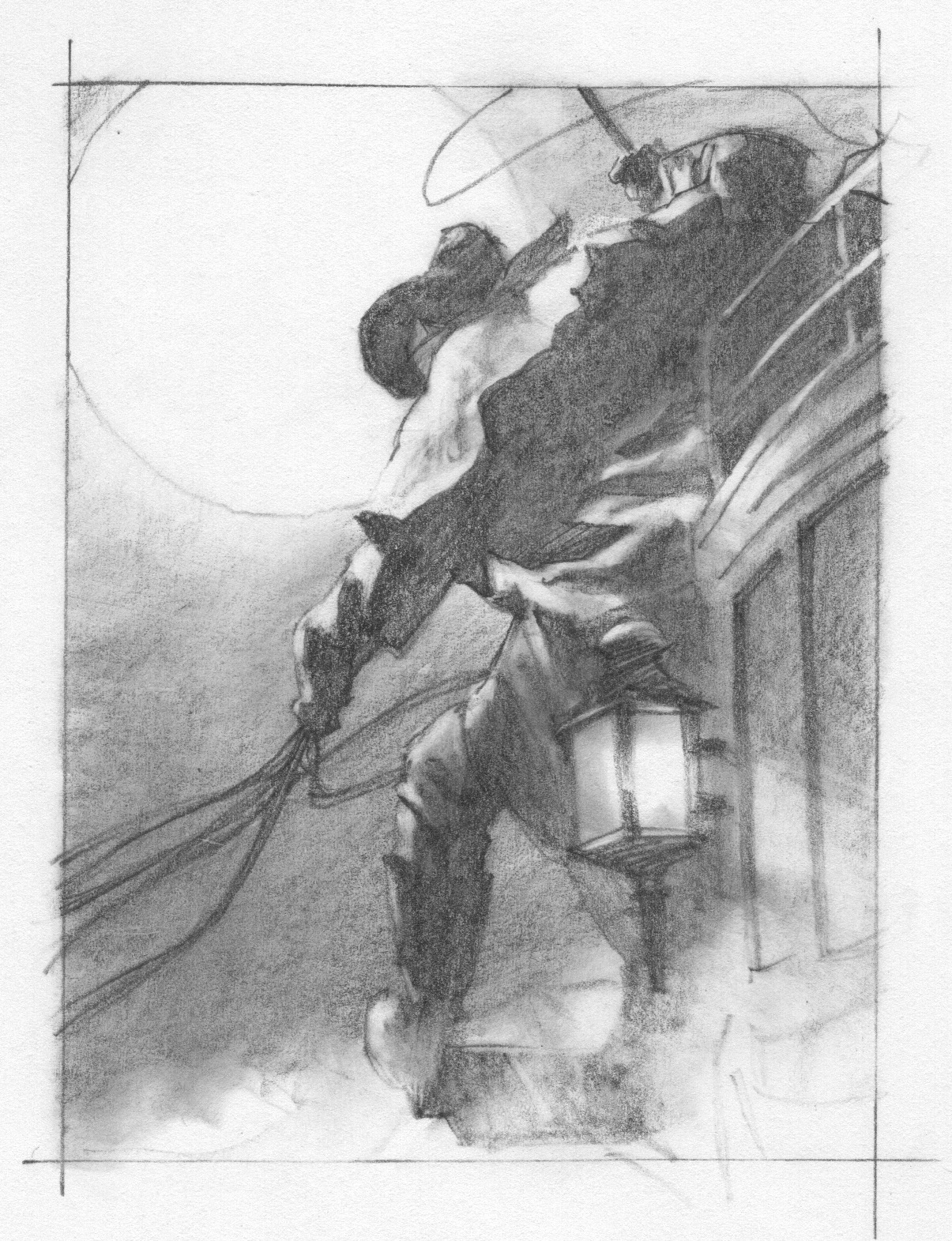
The Mortal Remains
Once the paintings and drawings were finished, and each were scanned and sent, my job was done. I’d gotten to know Joel and Ethan, and everyone in their work space, a little bit better. I came away with a feeling of accomplishment. And just the idea of working with these two amazing filmmakers and storytellers is indescribable.
But it wasn’t over yet. I got invited, as did everyone that worked on the movie, to the screening at the Directors Guild Theater in NYC. My work is onscreen from the first frame, and sitting in the theater watching my artwork fill the screen is a moment I’ll always relive.
When the credits came up, no one left. I realized that nearly everyone there had worked on the film. We were all watching for our credits. (I missed mine…duh.) Afterwards I met many of the creatives and I felt a kinship with all of them. Joel and Ethan were there, of course, and they made a point of asking if I liked how they shot the artwork.
The thousand yard stare was gone now. They’d finished their work and crafted a superior addition to their repertoire of film stories. I could feel the relief in their eyes when I told them both how much I loved the light and how they’d made the work look beautiful. Smiles all around.
Artists understand The Tell.
You can watch The Ballad of Buster Scruggs on Netflix, and check out the classy Buster Instagram page.


Always a treat to see your process Greg! Thanks
Incredible, Greg! Congratulations!
Congrats Greg! Incredible work, and great to see the sketches to finals.
wow! this is really awesome. thank you
This is absolutely fantastic. I watched the film when it was released and kept thinking, “is that Gregory Manchess’ art? Sure looks like him…”
I was delighted to see your name in the credits and even more delighted to read your perspective on the whole project. Thanks so much for sharing this!
Loved these so much in the film, Greg. Learning the backstory is also great, as I was very curious about that side of it – and the spot illustrations are perfect. It’s hard to imagine a job more tailored for you than this one!
The costume designer Mary Zophres was a friend of mine in high school (not to mention our valedictorian!), and seeing your creations and hers in the same place was a real pleasure.
Brilliant work as usual… Newman! 😀
THANKS, Everyone! You make me happy.
Holy gun smokes, Dave! Someone you went to high school with?!? AMAZING! I may’ve met her. But don’t know. I hope I get to say hi again sometime. She in NYC?
And again, glad everyone likes the background info! (Figured you might!) Took awhile to get clearance from Netflix, but they were wonderful about it. I salute them.
My first thought when I saw the coach driver whipping up his team under the full moon was, “Aha! The mysterious coachman giving Johnathan Harker a lift to Castle Dracula.” Very atmospheric. Wonderful work, Greg.
I hadn’t heard about “The ballad…” until flipping through Netflix I found it. As a fan since “Miller’s Crossing” of the Coen brothers I couldn’t miss it. When the coach driver illustration appeared as the first frame of the film I shouted: “That’s Greg Manchess!!!”. How I envy you, Greg. The illustrations fitted perfectly with the film, their shots are perfect (how they flip the pages of the book is mesmerizing), everything is perfectly interlaced….
And the movie… It stood for several days in my head. At first I was a bit “WTF?” with the first chapter, but soon everything came into place. So deep, so profound, so BEAUTIFUL (the tale about the pans, with that James Franco at one side, the bank in the middle, the well at the other side, with a reduced brown palette…). Just ART everywhere!
Congratulations on the Commission. It was the Hollywood commissions that really helped Frazetta build his family home.
And Thanks for sharing the working/process sketches.
Once in a while, share a BIG jpg of a painting.
Your work is more than just image. You’ve got a rich, aesthetic, calligraphic brushwork and direct layering technique, and it’d be nice to revel in them ever so often.
SO glad to have found your site after just searching on the prints in the book, They made the telling of stories so intriguing. And at almost 70 years old Ive seen a lot of movies and this one is in the top ten for me.
My daughter is a growing artist in college and I will share this with her as she is much better than me (my medium were custom motorcycles)
But I just have to ask do you have rights to your work to sell prints? Im interested in just one, of Mr. Arthur and President Pierce That story and the telling of it has melted me every time I see it and your print was a beautiful yet sad way to end it.
If a print is available please let me know, I love it!
I agree with Curtis! I would LOVE to purchase a print of the “All Gold Canyon” for my husband – your artwork is breathtaking Greg!