A lot of posts talk about work that ended up being successful. That’s good. There’s a lot one can learn from success. But this post is going to talk about one of the worst pieces I’ve ever done in my professional career.
Okay, maybe someone would argue that I’ve done other pieces that are FAR worse, but this one’s pretty bad and at the very least owns the title of my least favorite.
Now, normally the instinct would be to hide one’s failures, and I think that makes a lot of sense. But sometimes those failures aren’t the kind that just go away and are forgotten about. Sometimes there’s no rug to sweep those failures under. That’s the case here, and rather than ignore it I choose to plant a flag on it, own it, and discuss how it came to be.
The offending piece in question was called Maelstrom Nexus and was done for Magic: the Gathering. Unfortunately, before I go on, I need to explain a few things about the game for the uninitiated. Sorry. Normally I’d skip this, but as the information I’m about to convey has a direct impact on decisions I made on the piece, it bears a mention.
In the game of Magic there are five factions that draw their magical power from different land environments. These factions also are represented by colors: white for plains, green for forests, blue for islands, red for mountains and black for swamps. However, to say that each faction is represented solely by that one color isn’t quite accurate. There are other colors that tend to be associated with specific factions. Purple, for example, is associated with black and swamps. This is in part due to the fact that it’s not always possible to have a black “glow” to black magic any artist might depict, and so purple will often stand in as a color for any necessary black magic glow. So too can yellow sometimes stand in for white magic, when a pure white glow isn’t appropriate or doable. Both the use of yellow and purple (along with the green, blue and red) became necessary in the creation of this image for reasons I hope will become clear below.
So here’s the premise: there was a world called Alara that was split into five different shards. Where the world was once one, now there were five separate worlds, each of which was associated with a single color of magic. However, these five worlds were still joined in one place, and that place also happened to be the source of all the different magic that flowed through each of these worlds. My job was to paint a picture of that nexus of worlds and magic.
Because it was the source of the five different worlds and their magic, the nexus needed to be somewhat neutral in color and not weighted in any one color direction. The easiest way to convey that neutrality was to keep the center of the nexus pure white and have the five colors of magic surging out in separate directions in order to reinforce the separation of each of the world’s shards and their respective magic. The problem, of course, with using pure white at the center is then I have to go with a different color for the white magic. Hence the use of yellow. And since the entire premise was built around glowing magic, purple would need to stand in for black.
So, with those things factored in, I had to come up with an image that essentially depicted a giant, glowing, candy-colored, cosmic chaos.
Seems simple, really. But it’s also very abstract. I mean there’s no place I can go and find a picture of such a thing or even things that are similar. It’s some weird, cosmic and theoretical stuff. In a way, there should be no wrong answer. And really, the solution I landed on wasn’t wrong either. In fact, none of my answers were. They just weren’t that interesting and I never came to anything remotely resembling a satisfying image.
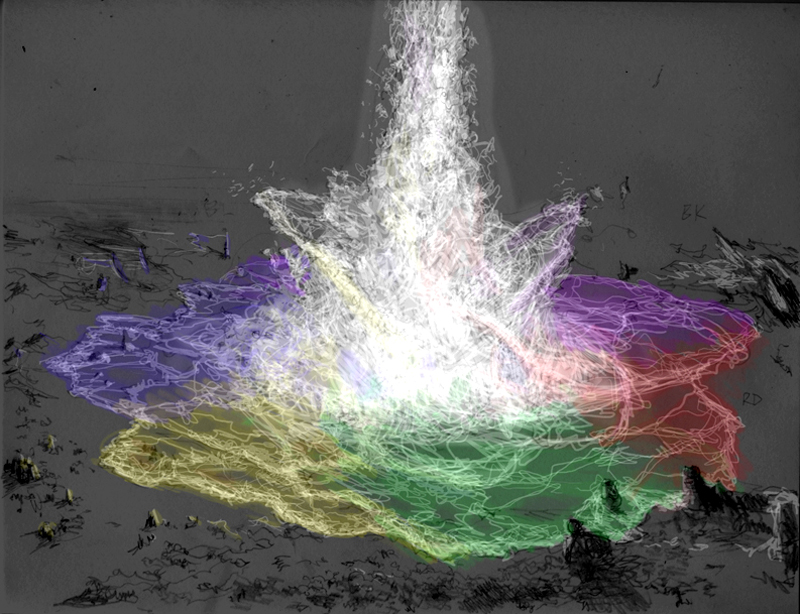
First off, here are the sketches I did:
These…are not my finest sketches.
This first one is the simplest version: a central point with rivers of magic flowing directly out becoming more saturated in their respective hues as they get further from the center. Various landscapes spread out from the center.
Not a strong idea, honestly. Also doesn’t really sell on the idea of separation. Whatever. I submitted it.
Seriously. This is embarrassing.
The second version is more of a giant fountain of magic flowing outward, the colors bleeding into one another (how I was going to do that I have no idea). Again, weak on the idea of separation of the various worlds and how they came together.

In my defense, these are over a decade old. I got better.
The third version is a giant swirl of land and magic, sort of a reverse black hole. The rivers of magic serve as the separation of the various lands.
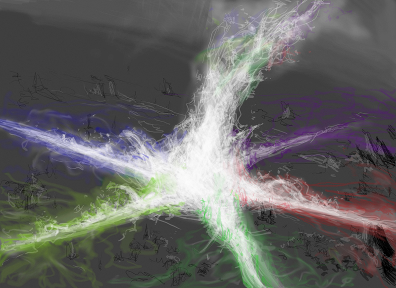
In the end, the third option was chosen with the request that I crop in a bit to increase the sense of scale. So, I did just that and cleaned up the digital file, printed it out, pasted it down onto a piece of illustration board with matte acrylic medium and painted on top of that.
Going to paint, I knew I was going to have issues. The big problem for me was the color: I really didn’t have a solid plan. Plus, bright color has always been hard for me. It’s something I’m WAY better at now than I used to be, but it’s still something I don’t always feel comfortable with. I find that I work best when I have a color theme to work around or a limited palette to rein me in. But that wasn’t really an option in this case since I needed to depict the five colors in some semblance of equal fashion. I knew deep down that I wasn’t up to the task. I didn’t know how to keep the colors balanced and every time I tried to push the piece in one color direction or another, the balance was instantly affected.
In short order, I was paralyzed with indecision on how to crack the problem. Still, I dutifully continued to render the piece, hoping that things would come together. I stupidly figured that something would eventually click into place and that I’d be able to build on that. Sadly it took way to long before I realized that wasn’t going to happen.
What I decided to do was call the art director. I emailed an image of where I was at and we hopped on the phone together. After a long discussion, the art director said something to me that I’ll never forget: part of this was his fault, he felt. It was clear to him that he’d given the piece to the wrong artist.
That is a surprising admission that may have been gutting to some artists, but I frankly agreed with him—and still do. While I’d tackled a lot of odd concepts that required all of my visual communication skills to solve in the past, this one was different. It was FAR more abstract and out there than anything I’d done to that point. Sure, there’s an argument to be made that I should be able to draw and paint ANYTHING. But I don’t know that that’s true. There are folks who are great landscape painters but terrible figurative ones. There are folks who are great at making monsters but whose work falls apart as soon as there’s architecture. Different folks have different skillsets and while I feel that my skillset is pretty broad, this piece always felt just out of reach to me. I think it’s fair to say that part of the art in an art director’s job is pairing the right artists with the right assignments and I think this job was a lesson for both my art direct and me.
Still, the mismatch of artist and assignment aside, the piece still needed to be done and handed in and some relatively specific things needed to change. Primarily, the core of the nexus needed to be brightened and whitened and the rivers of the various colors of mana needed to be intensified, as well. And that was kind of it. I did what I could, made some tweaks of my own and sheepishly handed the piece in.
Yeah. This is it. In all its horribly mediocre glory. May you forget it as quickly as you’ve taken it in.
Honestly, I fully expected that they’d re-commission the piece and I’d get a kill fee. There’s a part of me that really wished they had. But they didn’t. And so this thing actually saw the light of day. What was worse is that it became art for a mythic-rare card that was pretty valuable. And so not only was the art out there, but it was out there on a high-profile Magic card. A card people would actually use and play with and would continue to play with for a long time to come.
Anyway, after I handed the piece in I threw the painting in my flat files in disgust and moved on. I couldn’t do anything about that piece, but I could do something about the next piece. And the one after that. And the one after that. And so forth. There simply was no point in dwelling on this painting or the feelings of inadequacy it conjured. There were other opportunities to succeed and I needed to put my energy there.
Eventually I went poking in my flat files to look at the painting with fresher eyes. Unfortunately, it was as bad as I’d remembered it being. While I could have made money selling the thing, it’s not something I wanted out there in the world. I hated it with a passion and the idea of someone putting a frame on it and showing it off to friends sickened me. So eventually I did the only thing I could: I destroyed it. It remains to this day the only work I’ve done professionally that I have removed from existence. Besides not making prints of it, that was the only proactive thing I could do to minimize the damage.
The great irony in all of this is that the image was released, landed with a thud, and frankly no one really cared. The audience never seemed to, anyway. In fact, I probably have done more to advertise the awfulness of this work than everyone else combined. But hey, it’s for educational purposes!
This piece was sunk by a variety of factors. As has been established, I probably wasn’t the right guy for the job. Second, I really didn’t know what I was doing with it. But thirdly, it suffered from a shocking lack of imagination. Seriously. Like Khan from Star Trek II, I was thinking two-dimensionally. My head couldn’t get past the idea that five different shards of Alara were fully physical and occupying adjacent space on a relatively flat plane. While that could potentially be interesting, it wasn’t something I could make interesting. If I had to do it all over again, it would be a lot less a disk of land with a glowy thing in the middle and a lot more out there.
Fortunately, I won’t be asked to do it again.
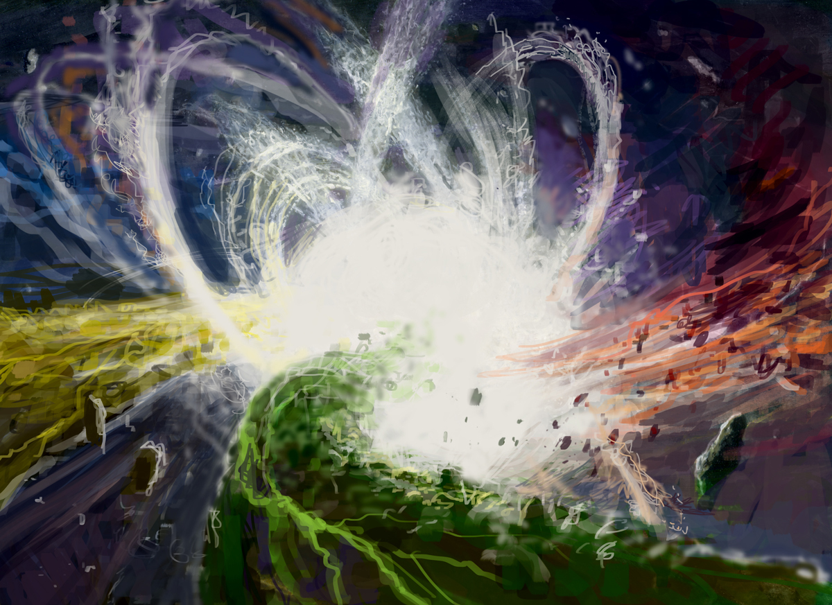
But if I did, it might look more like this than that other thing. Or not. Who knows? I did this in 15 minutes just as an experiment. Pretty sure it’s better. Or at least more interesting to look at. It’s definitely more colorful. So there’s that… Whatever, any improvement (if only marginal) would’t exist had I not failed in the first place.
Failures will happen. Each of us can try and prevent them, but at some point in your career it’s likely something will go wrong, a piece will get away from you, and you’ll end up with something you’re at least a little embarrassed about. Sometimes you lay and egg and you’re lucky. It could have been done for a small publication that no one paid any mind to, or it could be something you could deny credit for. That…wasn’t the case here. And that still kinda bothers me. Don’t get me wrong, it’s not the only stinker I’ve done that’s out there in the ether. It’s just the one I’m most frustrated by. But, like all mistakes, you have to learn to live with it, to own it, to make it a part of you. Sub-par paintings needn’t, in the end, be but lessons to learn from and inspirations from growth.
So if or when it happens to you, find a way to pick yourself up, dust yourself off, and keep going. Concentrate on the stuff you got right. For me, this piece was only one of three that I had due for that assignment. I was pleased with these other two, and according to Meatloaf, two out of three ain’t bad.
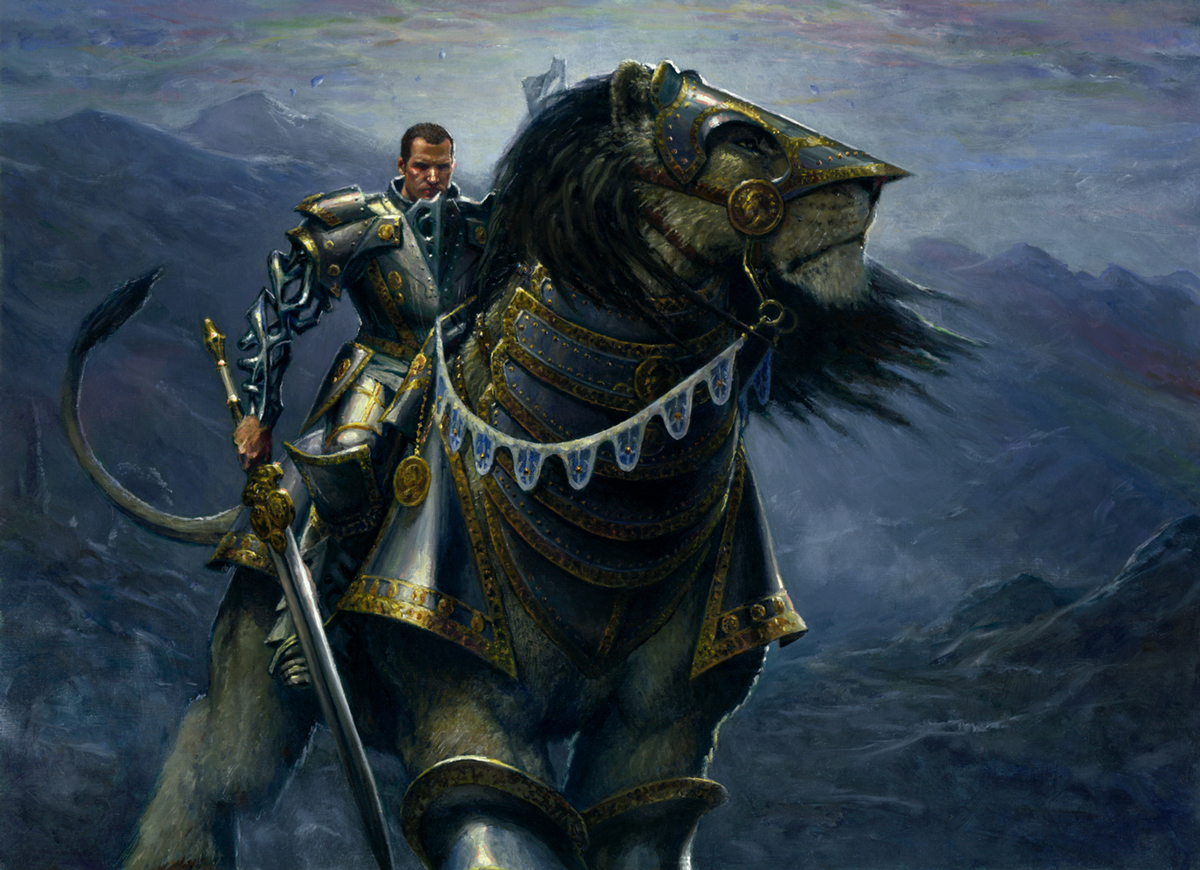
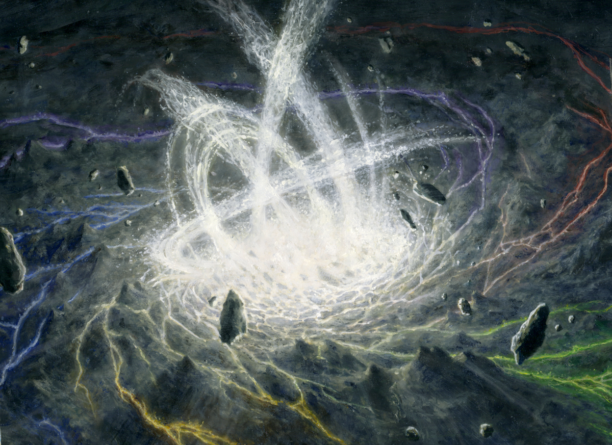
Ethercaste Knight
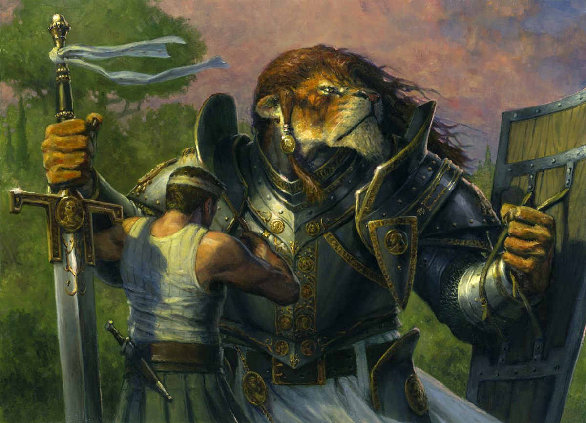
Leonin Armorguard


Personally…. I dont “get” MTG ?♂️. Never been into it.
Some advice from Frazetta… dont read the books. His covers were HIS. Had nothing to do with the stories.
You should have gone that route.
Other than that, I like the one they picked, because its READABLE. It translates. Ordinary humans can interpret the idea without knowing the backstory.
Thats why they picked it.
You didnt “fail” you succeded unexpectedly.
I suggest you read the Michael Whelan book and his stories of executive meddling. Frazetta tells stories of how both Stalone and Eastwood picked the thumbnails he himself wouldnt.
Boris and Patrick Jones have similar stories in their books.
C’est le Guerre! ?♂️
Wait, what? Don’t read the books? Frazetta was great, but I don’t think you can fairly compare fantasy publishing in the 60’s to what the industry is like in 2019.
Regardless, a great post Steven. Thanks for sharing, and being so brave and honest about it all.
Interesting take, but I respectfully disagree. If nothing else, by my own standards this piece failed to do what I wanted it to and that’s not even taking into account client disappointment. There are challenges with every job and at the time I never managed to fully address all of them and come out the other side with a piece that even the client was crazy about let alone something I liked.
Readability is one thing. Interesting is another.
Per insinuations of corporate meddling, I don’t think I insinuated that at all. At least I didn’t mean to. In fact, this was done for one of the least hands-on AD’s I ever worked for, who trusted my instincts more than any other art director ever has—and who continued to do so even after I turned in this piece. Beyond that, I don’t need to read books about corporate meddling because I’ve lived it. Like…a lot.
As a reader of books and a player of MTG, I appreciate when the artist is in tune with the work that their images will support. I’ve heard plenty of times when readers are frustrated with a cover that doesn’t match the book, clearly misses something important about the protagonist, and otherwise is a beautiful but completely irrelevant piece of art.
Thanks for your article, and some reassurance for when I look back at my terrible learning experiences as an amateur! I’m still trying to figure out what I like doing (and if I’m any good at it).
I both really like this card, and really like the art. It’s definitely easier to see the parts that don’t work well at full size as compared to a couple inches on the card itself, like needing more colors, but I think that kind of style is cool.
I think it’s really cool that you revisited the piece in the quick mockup at the end. It’s clear how significantly you’ve improved in ten+ years!
A music teacher once told me the best lessons are the ones where we go full frontal into a wall.
Yeah, it hurts, but those are the ones we learn most from. It’s inspiring that this happens not only to students like myself, but also to professional artists like yourself. The inspiring bit is how you turned this around to learn from it.
Thanks for sharing.