Hello everyone! This month I’m shooting down a myth many illustrators have about illustrating bookcovers, especially artists who are trying to break into publishing work: The idea that you need to leave “empty space” for type. Does type need to fit on a bookcover? Absolutely. But your illustration still has to work as a composition without any type on it. Why? because a strong composition under the type still affects the viewer more strongly than an unbalanced one.
Mistaken ideas about “leaving room for type” is one of the 3 big issues I see pop up in portfolio reviews of folks who are trying to break into bookcovers. For the record, the other 2 issues are 1) putting your own type over your illustration (never do that unless you want to be judged as a designer too) and 2) making every bookcover sample in your portfolio an automatic wraparound cover (wraparound covers are really 2 complete cover compositions linked by a spine, not one big horizontal cover — they’re rare and hard to do well. If you are trying to break in, do not make it even harder on yourself.)
I’ve already written a few posts on bookcovers in general, so check them out if you’re interested in working in publishing: How to find contacts at publishing houses. How we decide whether a bookcover is going to use a photo, an illustration, or just design. Why Visual Hierarchy is the most important thing you need to know to get bookcover work. And some reasons why not all good illustrations make good bookcovers.
Now let’s get back to the topic at hand: the difference between “empty” space and “less interesting” space. First off, let’s make sure we’re on the same page (pun intended) — there ARE bookcovers with illustrations on them that are not meant to be fully illustrated covers. There are covers with spot art, strips of art, insets of art, or frames of art. That is not the kind of cover I am talking about here. I am talking about fully-illustrated covers, where the illustration is covering at least 90% of the cover.
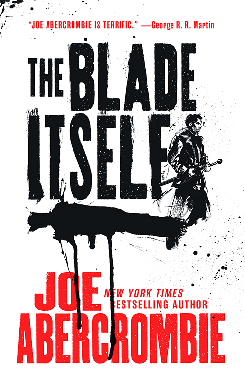
These are not the kinds of covers I mean, the illustration is too entwined into the design for the illustration to be expected to stand alone:
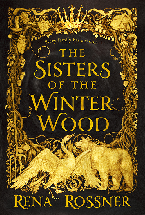
Here we purposely commissioned a framing illustration (common when evoking fairy-tales) and purposely left a gaping hole in the center for the title. Art by Rebecca Yanovskaya
Here we knew the covers were going to be primarily type-focused so we commissioned spot art (the figure and the shadow) that I then designed into the cover. Art by Greg Ruth.
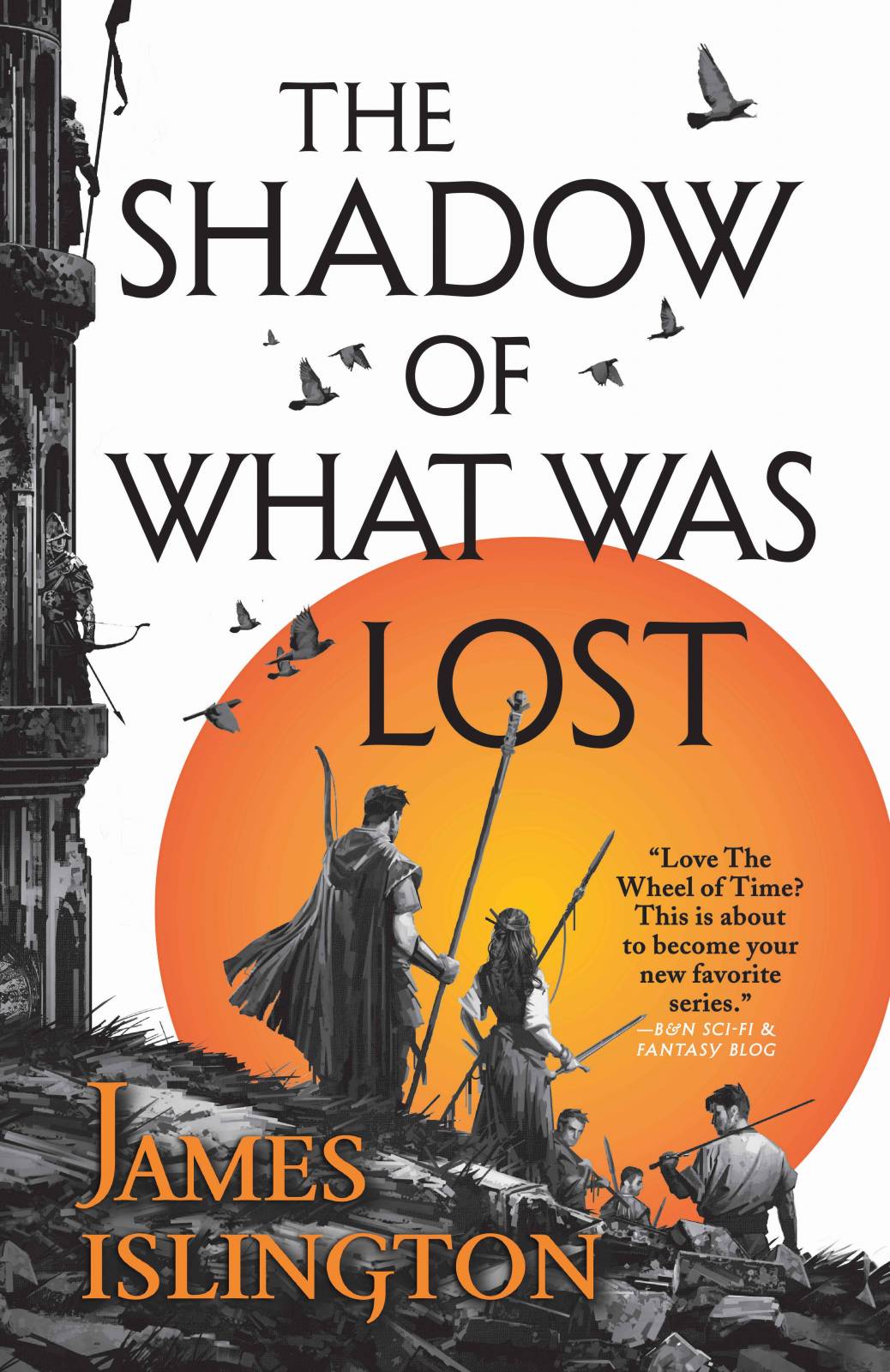
Here the illustration of the figures and tower are also acting as a kind of framing device for the type. The process on these covers was especially collaborative between illustrator & designer. Art by Dominick Saponaro
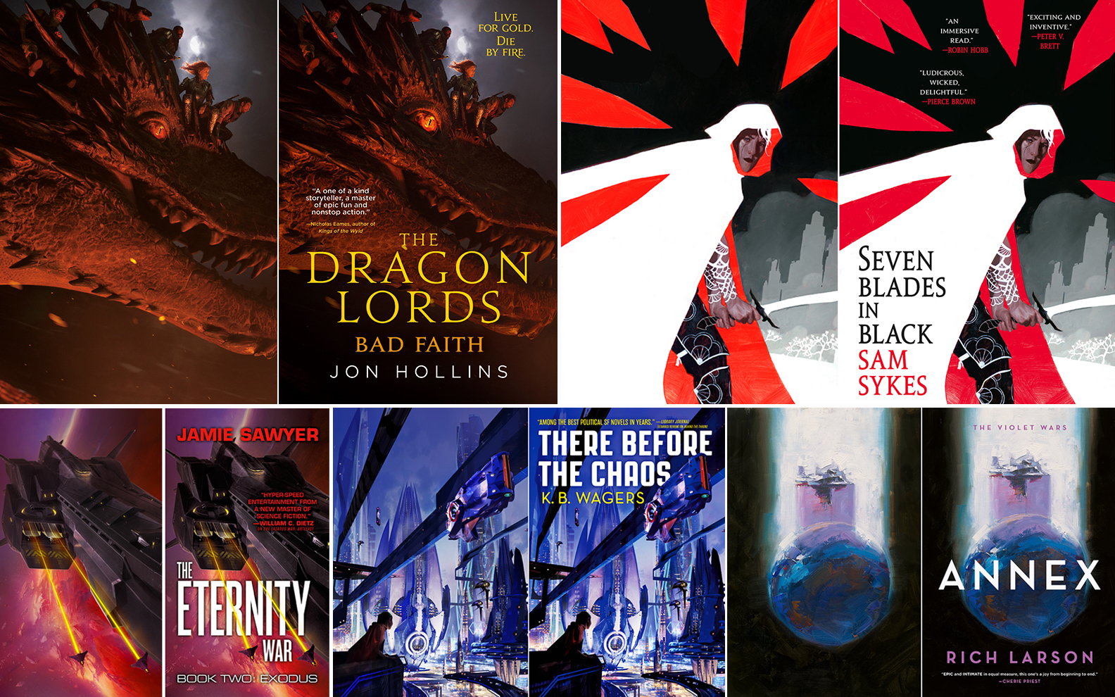
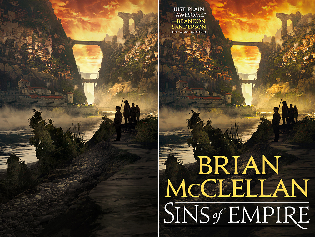
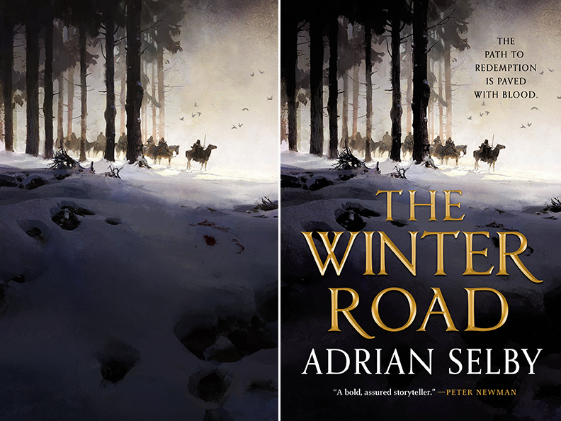
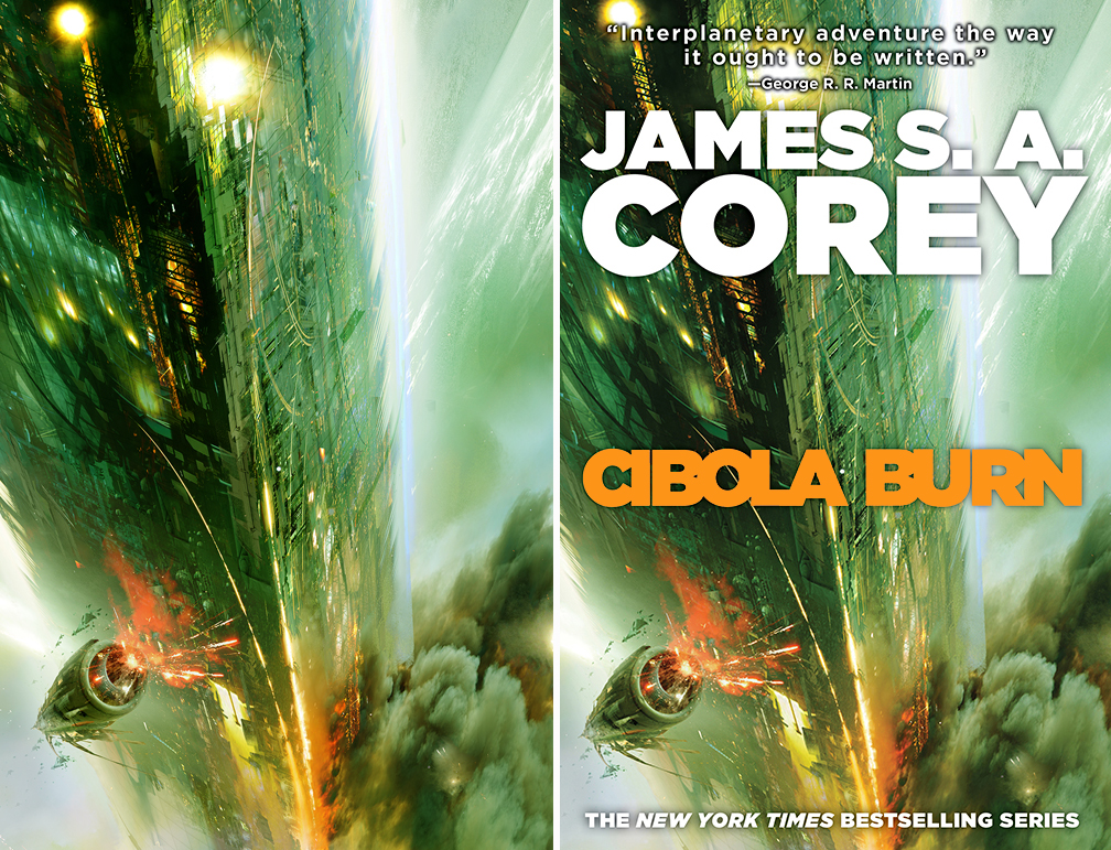
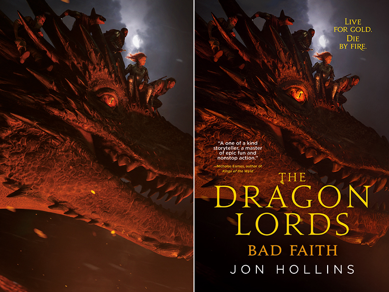
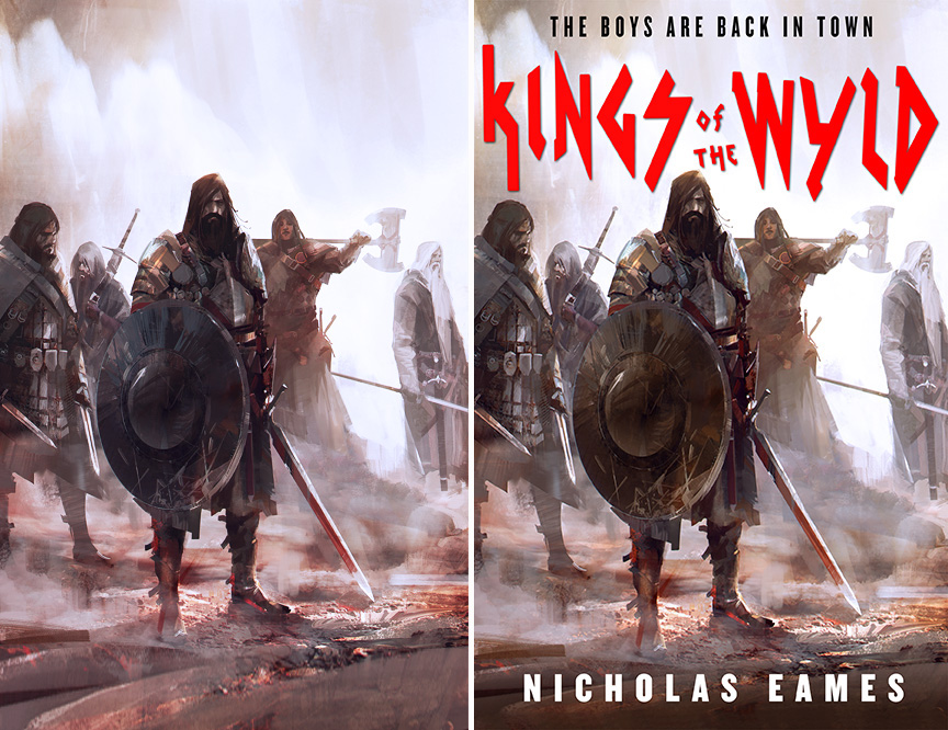
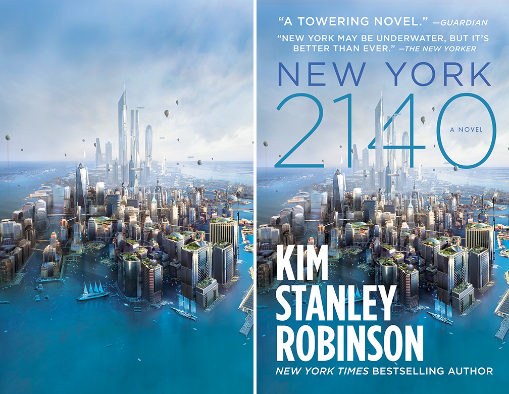
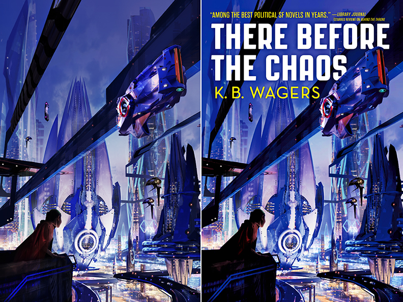
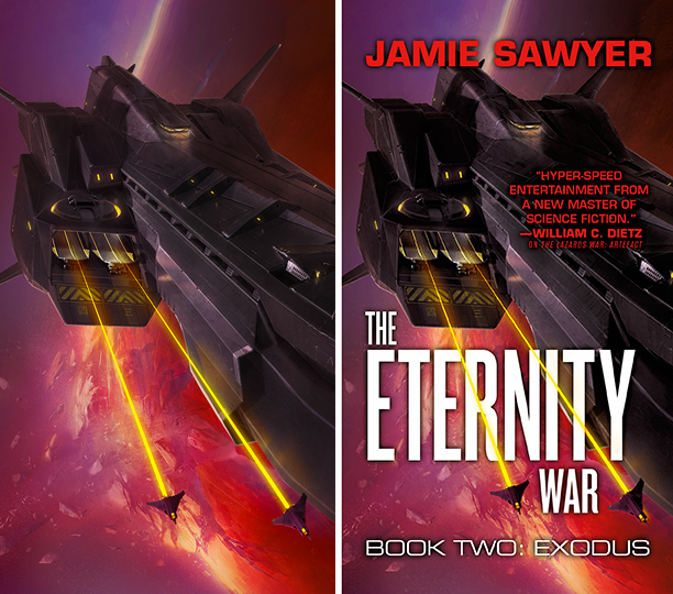
These are the kinds of covers I mean — plenty of room for the type to overlay the illustration, but the illustration is a perfectly strong composition without the type. The areas that the type goes over still have function in the composition once you take the type off:

Art by Jeremy Wilson
Art by Thom Tenery
Art by Jaime Jones
When illustrating a full bleed cover, you always want your illustration to look like a complete, well-balanced composition even without type on it. There should be no “empty space” or glaring holes in the illustration. What there should be is areas—ingeniously worked into the composition—that don’t have anything very important going on in them. And, ideally, these areas are of a continuous contrast and tone, so that you can either put light type or dark type over it (depending on the art) and have the type be clearly legible.
Art by Greg Manchess
Art by Daniel Dociu
Art by Chase Stone
Sometimes we cheat a bit and extend the top and/or bottom of an illustration to make more room…but the artist can crop it back down to show in their portfolio:
Art by Richard Anderson
Art by Stephan Martiniere
However a good designer will be able to work the type into even very complicated illustrations:
Art by Sparth
Art by Stephan Martiniere
Art by Ben Zweifel
Do you have a copy of Spectrum handy? Turn to the book section. None of the bookcover pieces have type on them. How many of those illustrations look like they’re off-balanced or have something obviously missing? Very few I bet.
When you’re thumbnailing, you really have to focus on the composition overall, and make sure that it holds up without the type. Once you send those thumbs or sketches in, the Art Director is already thinking about what they (or a Designer working with them) is going to do with the type. Not every Art Director works like this, but I often send the thumb back with rough type sketched on top, so the illustrator knows what area not to put anything important or intricate in that area.
Often the type style for a series is set in book 1, and then it’s very easy to know what kind of type is expected to show up on the rest of the series. A savvy illustrator will already be planning their composition with that style of type in mind. Again, some ADs will send back your thumb with the series type superimposed. Sometimes if the type style is set in stone for a series I give the artist a layered PSD version of their thumb with the type on a separate layer, so they can keep checking to make sure the piece is working with the established type.
When you put a bookcover illustration in your portfolio, it should stand up on its own, and you should display the non-type version as the main image. It’s totally acceptable to have the type-on finished version as a secondary image or thumbnail size, especially if it’s a well-known author or house, or if you’re particularly happy with how the type was designed over or into your illustration, but the hero on your site should be your work. That’s what Art Directors are looking at to judge whether your work would be a good fit for bookcovers.
P.S. Kelley McMorris has some great collections of more covers like this over at her blog
Thanks so much for writing this one ~ it’s definitely been on my mind all month! Your series of book cover posts has been invaluable as I’m working on my portfolio this year. <3
<3
Thanks Lauren, this was really useful, especially the section on complicated compositions
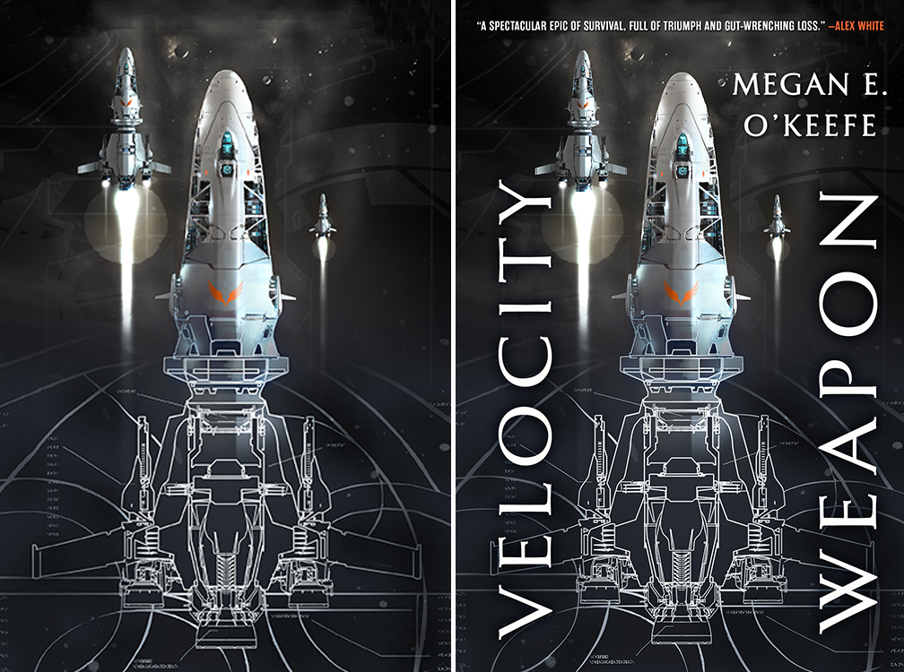
“However a good designer will be able to work the type into even very complicated illustrations” Will really stick with me, That “Velocity Weapon” book has such good type design! Not like i’m planning to purposefully make my illustrations as complex as possible or anything :’)
lol you only get away with this kind of thing when the designer is working WITH you between rounds…
A great article that really helps to show the involved process and careful balance between the work of the illustrator and the publisher. Thank you for writing this!
If anyone wants to see more examples of book cover illustrations before and after the text is put on top, I have lots of collections of them at my blog: https://kmcmorris.blogspot.com/search/label/book%20covers%20before%20and%20after
Holy cow! Thanks for sharing this. What a great resource.
Oh these are great! thank you Kelley, adding it to the post too
As an indie SF author, I am also an art director out of necessity. I like your stuff here. I searched your site quickly for any discussion regarding narrative in covers and I do not mean a narrative “style” book cover. Rather, your example of SEVEN BLADES IN BLACK art by Jeremy Wilson, versus any of the examples that follow it (which are merely narrative style), rocks hard. It’s a powerful graphic narrative and I love it. Because it doesn’t give it all to you. In fact, it gives almost nothing to you that makes any sense besides entangled drama. Sword wielders? Typically, forget it. But I want to know everything about THIS sword wielder. This type of narrative power is perhaps akin to the panels in a comic or graphic novel. You gotta dive in to get more! The thing MOVES. Hence, it works the magic trick of a story-in-a-flash that I would click on and pray that somehow the story, writing style and the cover belong together. And even if I discover that it’s a bait-and-switch, not even metaphorical, or the writing is crap, I’m still going to give this book cover a triple thumbs up (despite the silly blurbs). An image to cherish.