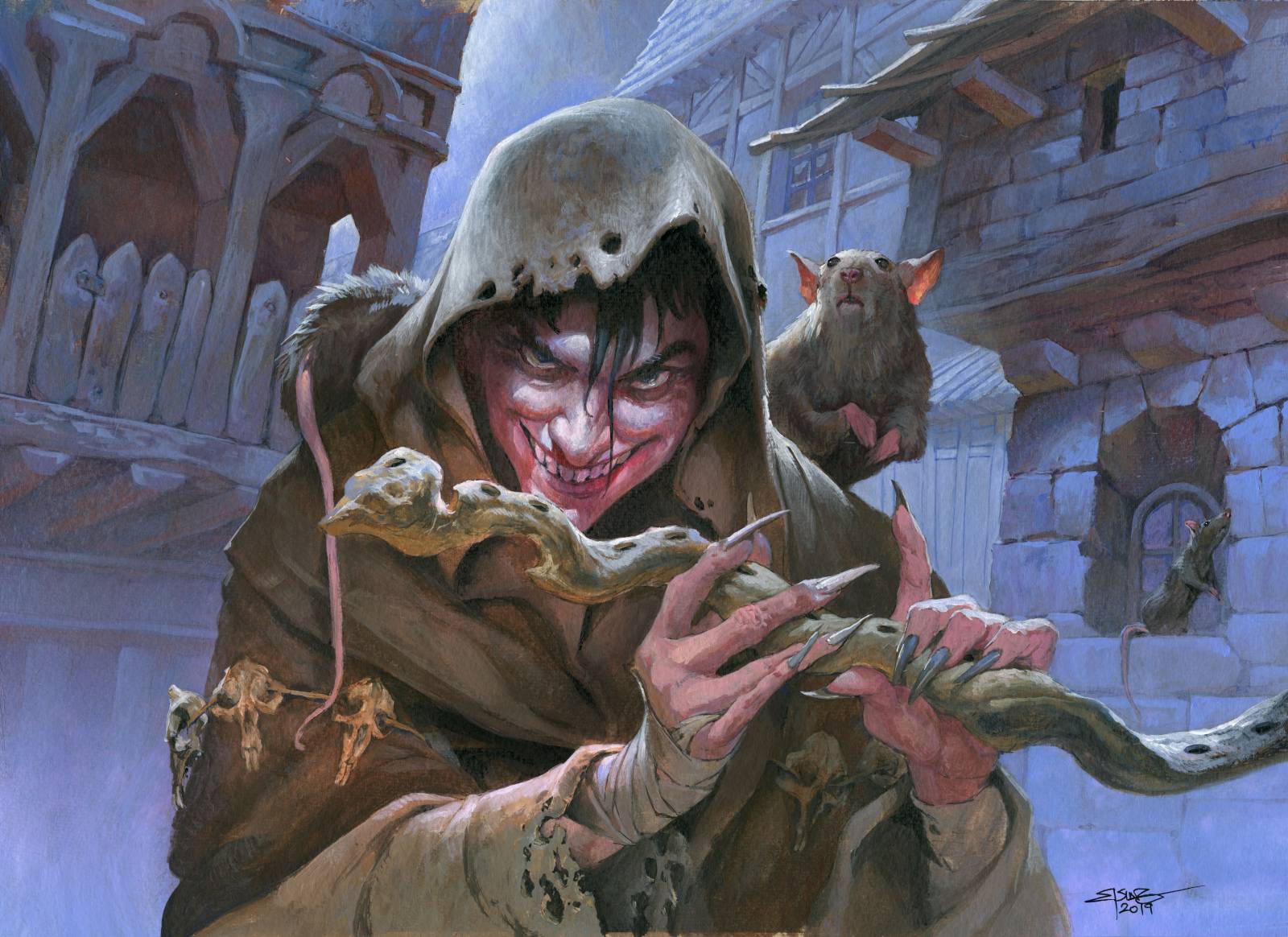
Piper of the Swarm, Throne of Eldraine. Magic the Gathering
I noticed that I do not paint many details. Compared to others of my fantasy artist friends, I have a significant amount less detailed backgrounds and much less rendered details and equipment attached to my figures. You might say I am lazy in that regard and perhaps you are right? But I will try to spin this lazy appearance into a strength.
I think it is a matter of personal taste. I really like the figure to stand out. I like the focus to be around the expression and the gesture of the main character. I want nothing to stand in the way of you reading my illustration clearly, and if I can have you see the exact same thing that I had in mind when painting it and not have you guessing what is happening, I think I solved the job. Okay; so that is my sole steering point in making the choices through out a painting: Clarity in image narration. It right away answers so many of the questions I ask myself during the creation of an illustration. when I painted the Piper of the Swarm, I was tempted to create a cityscape with lots of details in the architecture, but hey; that would take away attention to the figure. So the answer is No. Should I use painted wood like in medieval German cites, with stones in one color and wood in another? No; lets just use 2 colors for the background to add focus to the figure. Also, no black in the background but spend the darkest value in the foreground; yet again to add the focus to the main figure. And lastly; When I had finished painting the background, before I peeled of the masking film from the figure that I had masked out beforehand, I took a large flat brush with white paint and gently brushed down the contrast in the background. The wash of white faintly killed the contrast. It unified the tones and value in the background and it slightly diffused the edges of the strokes and blurred the background down: kind of like a camera lens does when you focus on a face and the backdrop gets fuzzy. Once again all is to draw attention to the area of the painting where I need you to look. fuzzy edges, blurred lines and color tones that gently mixes into each other is key to having the background be a background.
Next step is painting the figure and now its time for the hard edges. In the figure I use deliberate strokes and go for dark almost black values ( I can always tone them into a color later). The main figure have maximum contrast and is thus pulled out from the background.
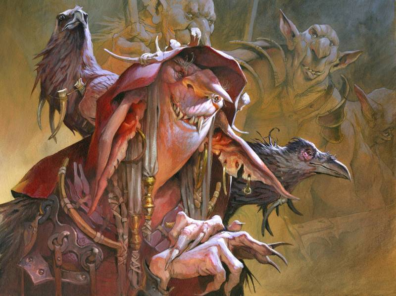
Goblin Matron, Magic the Gathering
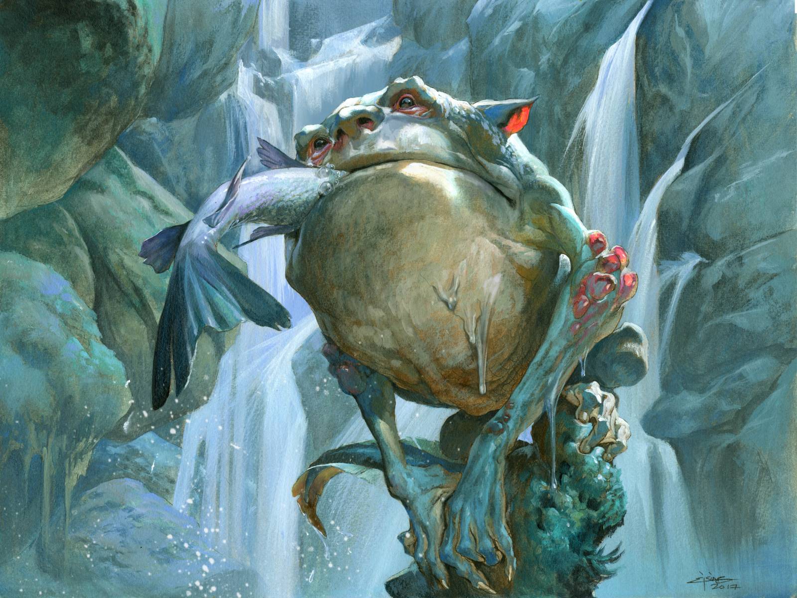
Slippery Bogle, Magic the Gathering
But even within the main figure I will tone details and elements down that is farthest away from the central focus, namely the face and the expressions. In the Goblin Matron painting I had unintentionally added too much details and contrast to all the gear she was wearing and the costume part of her shoulders and hair and neck. When I noticed that, I took a irreversible decision: With my air brush filled with water I misted the whole bottom part and very deliberate took an orange hue and smeared it all over the details. Its a bit risky painting directly on top of a final rendered area, but the airbrush water lets me work on it until I am happy. Since I can mist the surface constantly while working it, I keep the acrylic wet until I am satisfied. What the orange mist did was redirect the eye back to the face and removed a lot of attention down in the less important area.
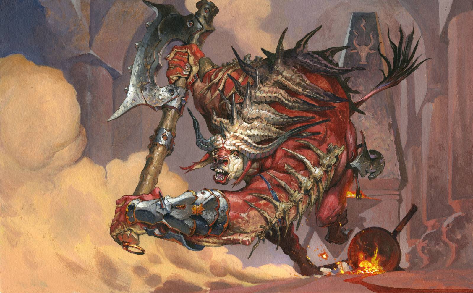
Spinehorn Minotaur, Magic the Gathering
I have used this technic a lot. The key phrase is: Less is more. And edge control and less busy areas are helping me to direct the attention. If you take a look at the three first paintings: piper of the Swarm, Goblin Matron and Slippery Bogle you will see that they all have the background disappearing into mist in the bottom half of the background. It clears out the silhouette and makes the figure read well. But it also creates and area of almost no details. An area where nothing happens. A place where you do not have to figure out if anything is important. I think its important to keep these areas and I search for them in every composition.
The opposite spectrum of this is a Where´s Waldo picture. I like to remove all visible obstacles for you, so you can enjoy Waldo…or the Mad Piper, or the pretty faerie…
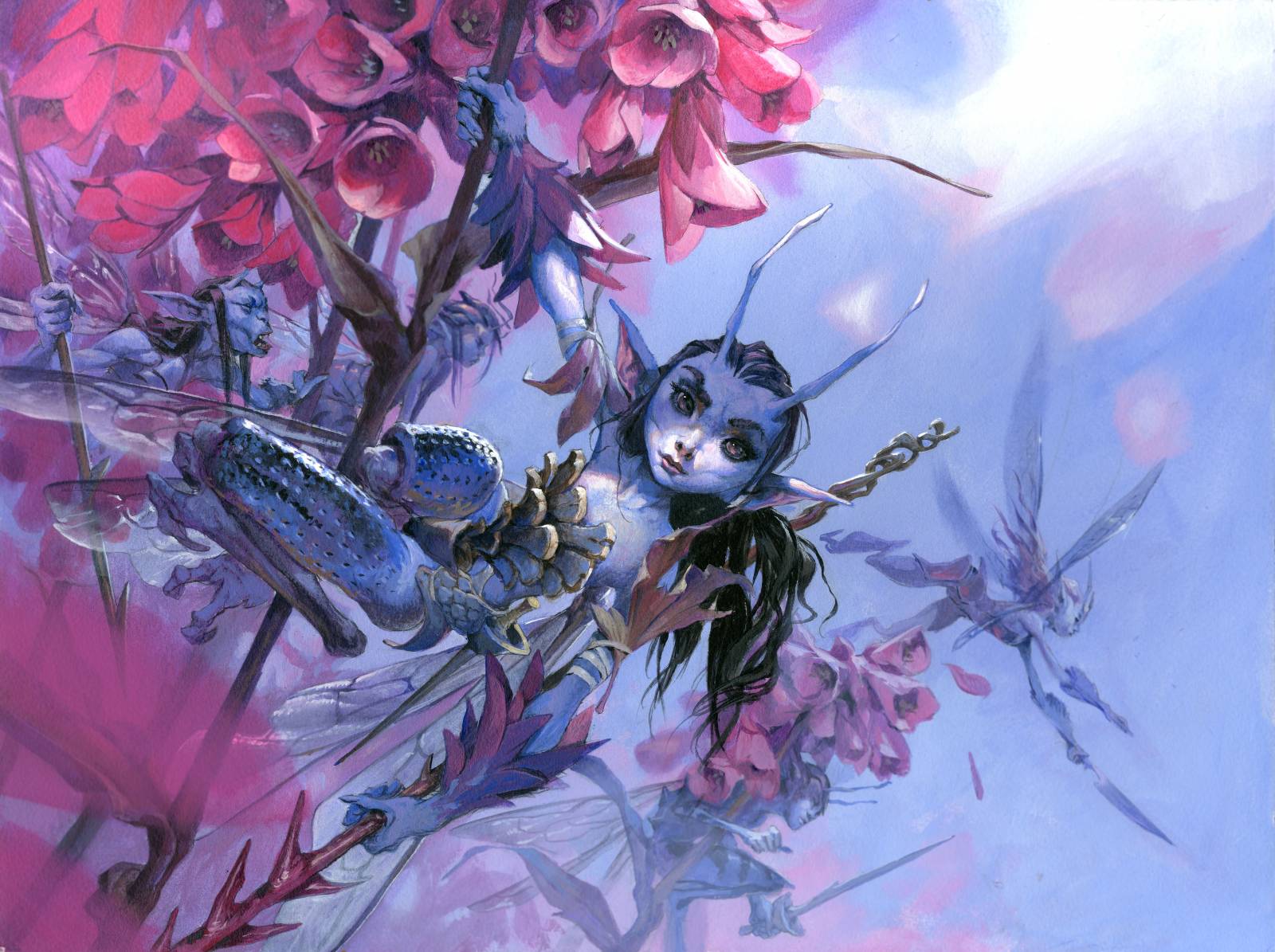
Bitterblossom, Magic the Gathering

Well, Jesper, you convinced me: your laziness is strength 🙂
Great post, thanks for sharing!
Well, you’re also making paintings for cards – they’re small, and you have to be able to easily read and appreciate the artwork in hand. I love your work.