Let me begin to confess the obvious that I adore movies, and always have since I was very young. ADORE THEM. They were and remain for me a place of respite and escape but also where I found myself engaged in a way that helped build my passion for stories and narratives that now occupy most of my working life as an adult. They always made me want to draw and paint and back then- I’m talking the 1970’s and 1980’s here- and at the time it never occurred to me being able to do so as a job was actually a thing that was possible. Less so then than now- a lot has changed in the intervening years, happily. But to grow up into a world where this not only could become a thing that’s a real thing, and not just for energizing the classics, but coupling with current and new cinema… well I don’t know what Heaven is supposed to look like, but if it’s anywhere near it’s promise it looks a lot like this.
So I was deeply honored to be tapped to make some original art for Bong Joon Ho’s stellar new film PARASITE, for their studio, NEON. A long time admirer of his films and first came to know how work with one of my all time favorite monster films, (which I still profess is a secret back door superhero family movie), THE HOST… it was an obvious hell yes. Despite neon’s utter deep belief in this project, I confess I had my doubts about how a Korean language film would resonate here beyond the usual arthouse cliques, and those concerns were joyously proven ridiculous. For me it wouldn’t matter either way when it comes to the work. The subject and the art dance with it is really the only bit that registers with me. Despite that, I am delighted with the success of the movie, and in particularly for Bong and the crew and cast of PARASITE for the insanely wild ride they’ve been on. I remain agog and delighted by it all. SO in the spirit of celebration I thought it might be interesting to dive a little deep behind the curtain of doing these pieces, and the wild ride they took us all on. Get your gochujung ready, set Ho:
You don’t get asked to be a part of a major history making Oscar winning project like this on the outset, you get offered a project and it speaks to you or it does not and you work from there. It’s easy to forget a lot of the now huge cache value of the film is a year or more after it’s completion. This is the part of the project’s life that is utterly out of your hands, and long past any control. I have worked on projects in books and film I believed in as furiously that never saw any significant success after it was released. It doses’t diminish my feeling for the material any more or less even if I feel a little wistful from wanting it to be seen by more than it ends up being seen by. The successes are far rarer than the failures in this department in our thing, and will continue to be. I don’t anticipate another hit like this falling into my lap like this for some time if ever. Yes the success of this puts me on the radar to receive more than I would have otherwise, but even so there’s no guarantee, and certainly no real parallel to something like this coming. I get back to work, do my best dance as I always try to do for each thing that comes along, and the rest afterward is just gravy, be it sweet or bitter. My own particular manias about art trophies notwithstanding.
There’s two places you heart lives when you take on a project: 1) The work in and of itself- The process and experience of interacting with the subject in the art making. And 2) The project’s afterlife and how the work is received and celebrated or castigated. You as the artist are in control of the former, and have nothing to control int he latter, so I always recommend putting your biggest heart into that first column. The work is what matters and in the end being proud of the work and doing your best at it is the best possible way forward for the work you do next and for your own spirit and caring for the work you do overall. There is nothing worse to hacking out a job and having it fail and feeling the legitimate responsibility for being part of that failure, and worse if it succeeds and your hackwork is out in the world wide and seen by all. If a project doesn’t;t and with its audience, but you made great work for it, there’s a deeply set quiet satisfaction there you never lose. If you find none of it worked out and you need to get a day job, or have come to the end of a long career in art making, having done good work that you’re proud of is a currency that lives long after the money you received for it got spent.

I didn’t know much more about what PARASITE was beyond my familiarity with Bong’s work and the film itself and that was a perfect place to launch the work from, creatively speaking. Essentially Neon approached me directly after PARASITE’s big historic victory at Cannes as they prepped their rollout in the West and US. They wanted a poster image, presumably from seeing my prior film work for Mondo and Criterion, and made special note that they were all particularly inspired by my TWIN PEAKS poster image for my series THE WHITE LODGE, that eventually found print life and a gallery show via Mondo in the form of the series THE ART OF GREG RUTH: A TWIN PEAKS INTERPRETATION. (That clunky title was as a result of a lot of negotiations between all parties concerned… what can you do?).
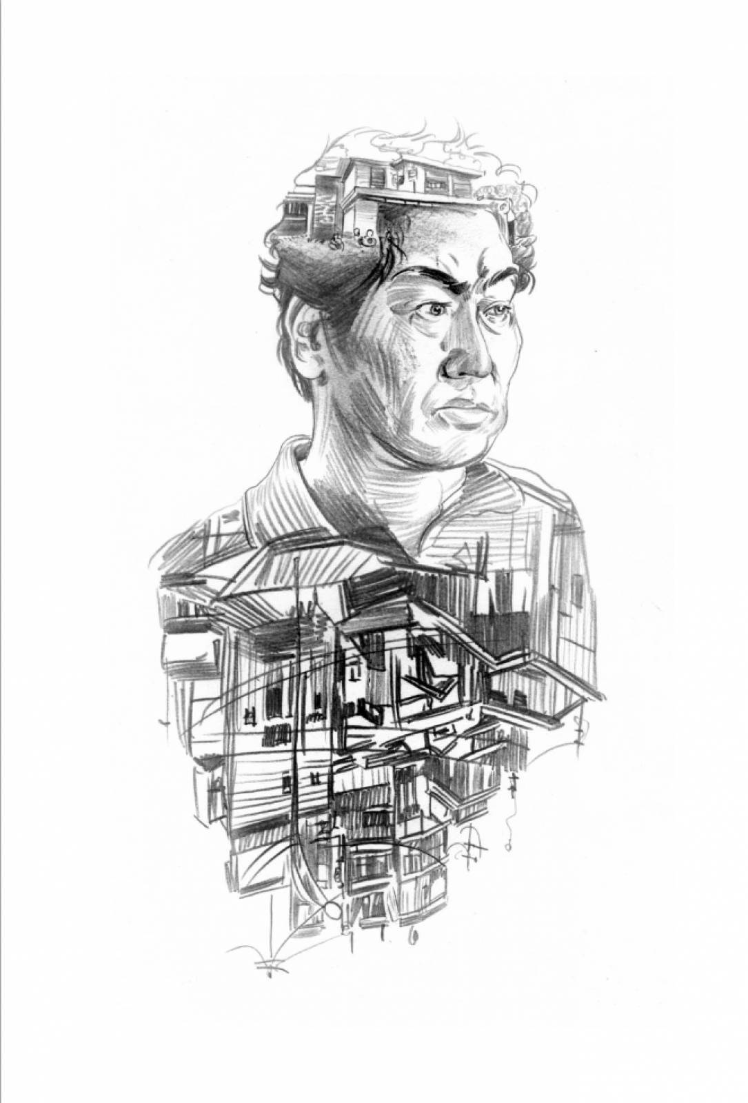
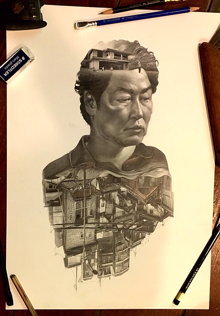
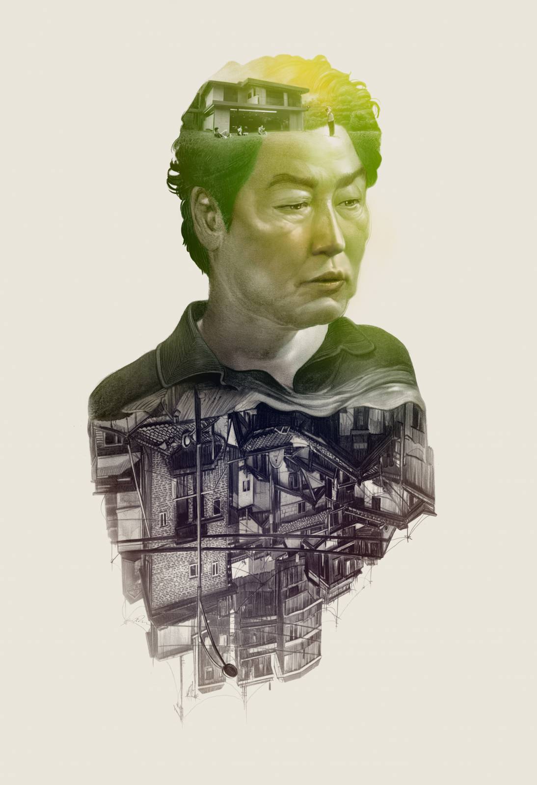
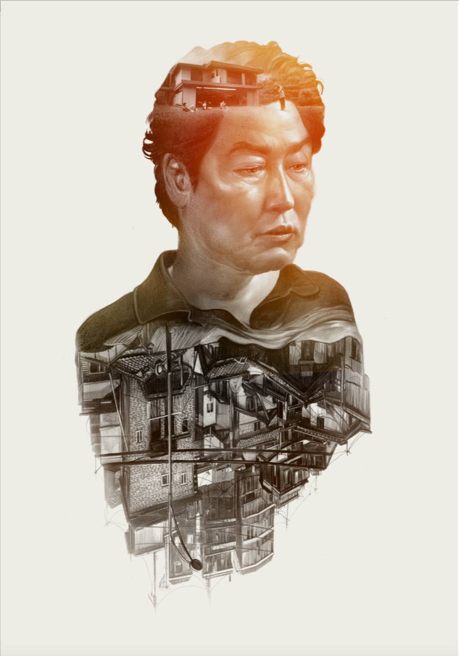
They wanted a similar portrait of Kang-Ho Song as his character from the film, Kim Ki-taek. Beyond that I was free to run the field. For the record this is always a bittersweet thing. To be gifted with a largely unleashed opportunity to make a piece of work and the trust it implies is a true wonderment. TO be likewise inspired by a previous piece… well that’s where things can get tricky. It’s your schtick you invented so it’s not like you’re being asked to costume yourself in someone else’s clothing, but for me personally, being asked to repeat a thing makes me immediately uncertain. Sure standing not he shoulders of a previous success is a fine thing, and one could argue in art this is the ladder we all climb if we’re lucky and successful enough to be able to rise this way. We always build from our previous efforts… either from their mistakes through a learned repair or by further exploring the successful themes and practices that made the past thing work. And yes we all sort of repeat ourselves, have our things and tricks that define us. I accept this but also stringently try to push against it as much as possible. (and more and more so as I get older as the natural tendency to settle into one’s style or way of making work begins to harden with age. To me this isa call to force more adventurism in the work wherever possible).
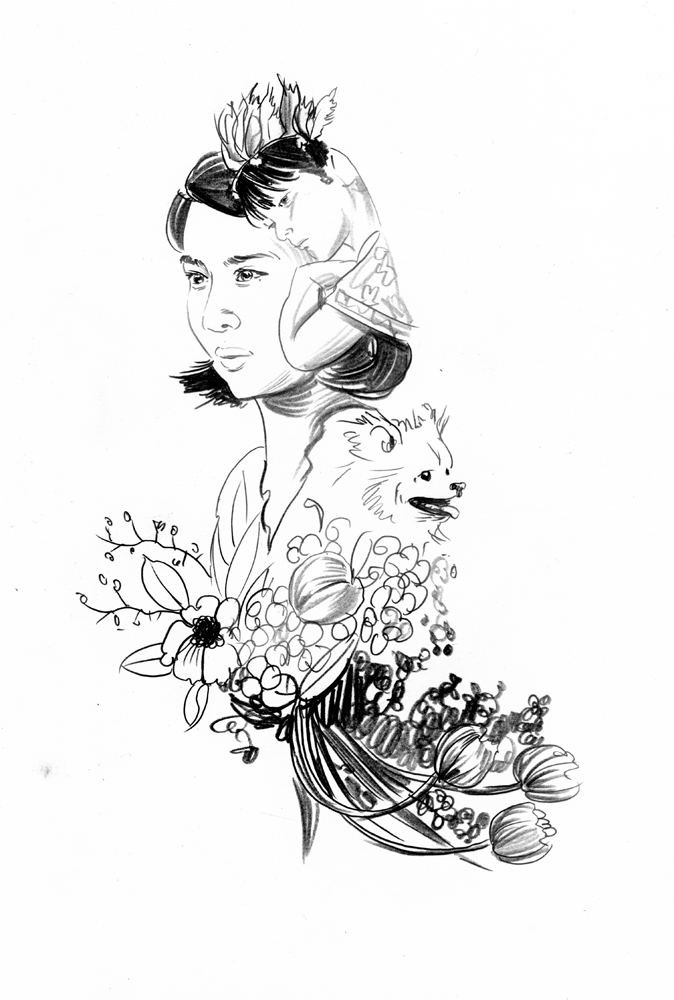
In the end this was job and I was being asked to do a thing and as is usual for me, I settled on the notion of making it the best thing I could. The stark floating portrait with the inverted setting was a narrow box to dance in, but I imagined the Dale Cooper piece as a sketch and this as the final as a mental exercise to push past my grudges. Now this is a spectacularly densely rich film with deep characters and themes so it’s an easy get to play with the legos and build something big with it. When they came back with a desire to see two poster-portraits done, and add a piece featuring Yeo-jeong Jo’s marvelously insane character Park Keon-kyo, the themes for both came into crystal focus. It was an upstairs/downstairs story and the pair became a conversation between the two: The poverty and ruin of Mr Kim’s worlds and the castle like wealth of privilege of Mrs. Park’s.
I immediately sent in some sketches for review to the team and Bong to mull over and received immediate approvals for both. As is my usual way of things, I raced into the final drawing as you see below, sending some teases along the way. Normally I try to keep a lot of the process stuff away from the clients, especially when dealing with big film projects or publishing gigs because I’ve found the committees involved tend to fiddle overmuch when given overmuch to fiddle with- and the result is rarely an improvement. With this one I had the benefit of working with a relatively small cabal of enthusiastic clients- largely Christian Parkes as my AD and getting approvals internally through him via Bong and Mike Winton at Neon. This meant we weren’t really answerable to many and we could focus in on the work we wanted. This ALWAYS makes better work. Always always always.

So as I sent in snips and studio shots of the work in utero, and received hearty and excited thumbs up, I charged onward. Once the principle graphite pieces were done, it was time to get jiggy with the color process. The palette for Mr Kim’s piece was all about the dull colorless life they lived, but ignobly. They loved each other as a family and the warmth and clear love this father had for his wife and children was clear, and needed to be expressed. I initially had a warmer tone applied to the first swipe at the piece and was encouraged to go more green by Christian to convert envy, and act as a counternotu to Mrs. Park’s warm glow- this of Cours made all the sense in the world, and while I may have gone this way in then end, I may not have and this is why working closely with your AD is essential: they can see from above what you may miss being not he ground.
The final piece was submitted with great fanfare from Bong and the rest of the team and I was off to tackle the second one fueled to the brim with the energy of that win.
Once Mr. Kim was sorted, it was on to Mrs. Park. Now we had a set course and response in place she was even easier to do right. To note for you all who do this, even while I was still doing this project we were still in negotiations and not under final contract here. There were some serious bumps along the way and while it is absolutely risky to continue to work without the protection or money to pay for the time and effort in place, I fell back on to the previously mentioned first heart of these things: the work and doing it well is what mattered. If it all fell apart and I got fired then I would at least still have a piece of art to be proud of. That was my umbrella through it all, and not one I immediately recommend to use as a process. I can actually hear the face palming and groans of Dan, Greg, Iain and many of my peers in this game as I write this, but sometimes crazy chances need to be taken and can lead to crazy good things. This was lucky turn that did both, but again, not the norm.
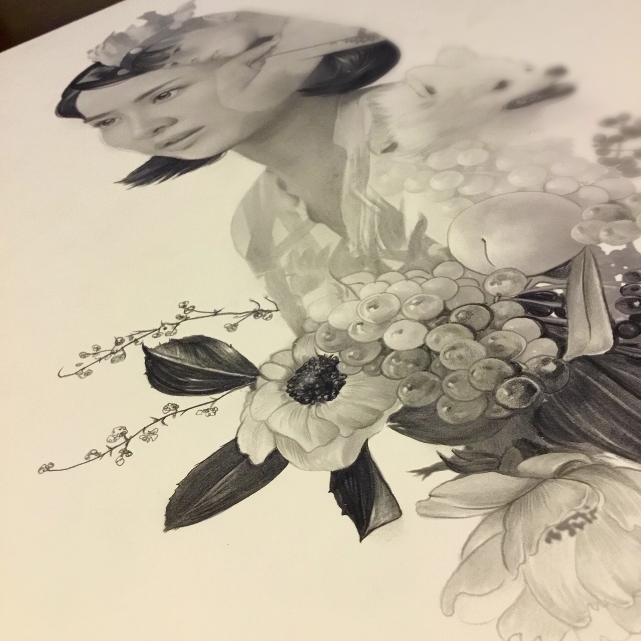
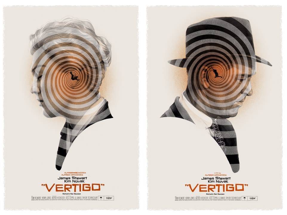
For Mrs. Park, it was all about eh beauty and lush life of her world, flowers and fruit and her quirky son’s cartoonishly racist affection for Native American culture via play, and that insaner little dog all made for rich fodder to draw on. For all the empty shell of Mrs. Park’s self, her love and devotion to her family was where she and Mr Kim met on like terms. So I turned her to face him even if they weren’t looking at each other specifically. It’s a trick I confess to having used before in a poster pair for Alfred Hitchcock’s VERTIGO I did a few years ago, that had a similar conflicted and awkward coupling of the two main leads. (Stealing from yourself just aint stealing as my Mee-maw likes to say).
Around this time I had been likewise gifted with doing a poster for favorite movie of the year, Ari Aster’s insane MIDSOMMAR, which was likewise to be lushly filled with flowers and beautiful imagery, and all deriving further back towards my piece for ANNIHILATION to be sure… but the difference here was a practical one in that it wasn’t to be a screen print at all, and as a result I had the infinite range of color palettes to play with without having to count added screens and cost as a blocker. I could make a kind of still life’s level of tonalities here and detail not possible in my usual poster work. And I did.
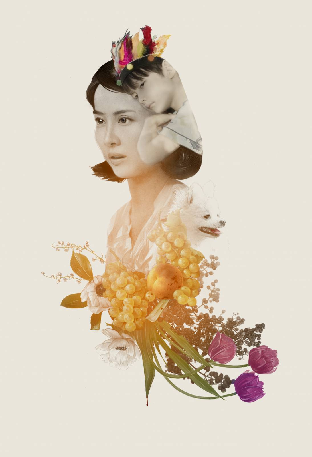
Mrs. Park was met with the selfsame enthusiasm as Mr Kim and that was it. Not really much drama in the process at all outside of the furious negations between our side and there on the contractual level. I was largely left to be me and to run my show as I saw fit. This again is a mighty gift, and yes it does come with the attendant travails of being responsible for it all, success or failure. But I felt good about the work, and thought it did what it needed to do both for the film which I loved and more selfishly for my own personal need to reconcile with Dale Cooper: These were related blood brothers and sisters but not repeats. They were the obvious next steps in the evolution, but also in being so a more cemented feeling of being done or needing to for a time at least, to be done with this particular form of schtick.
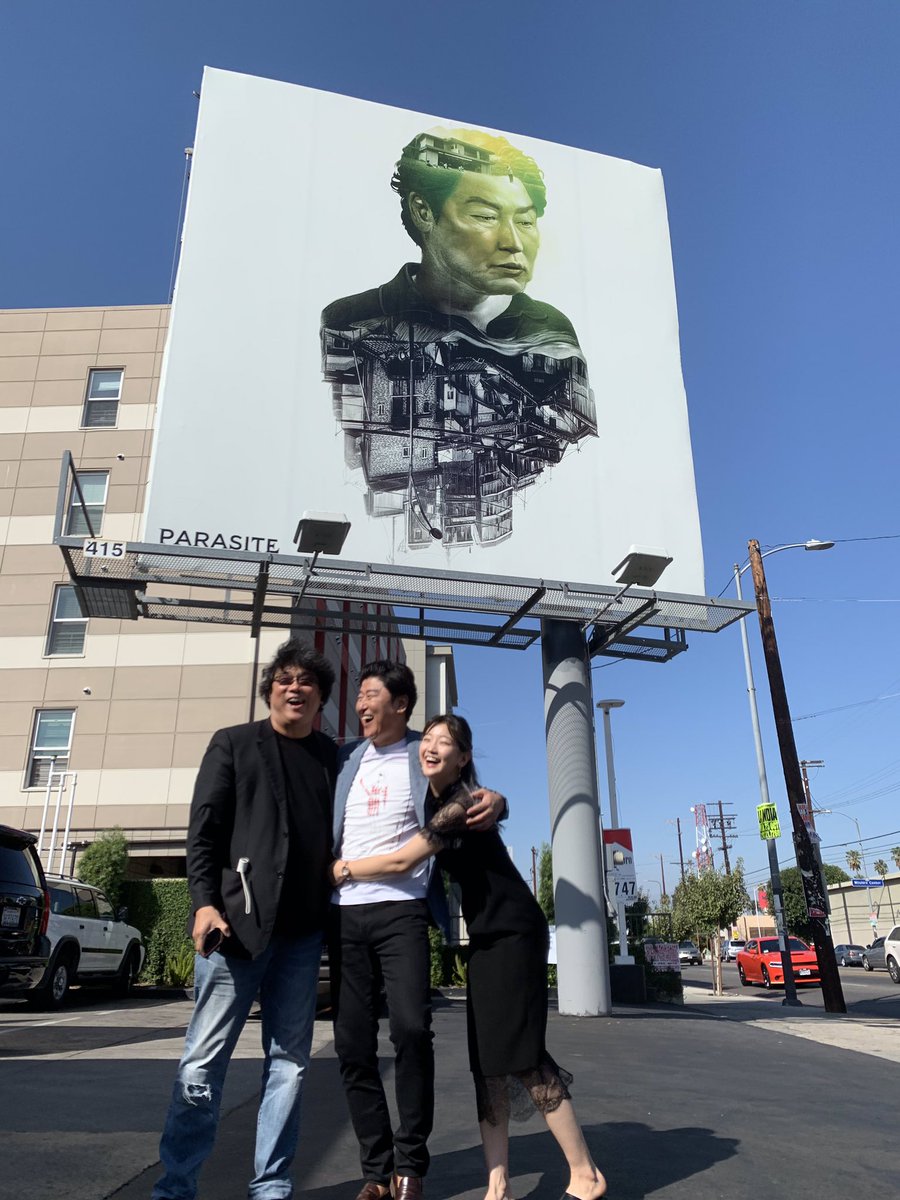
We weren’t entirely certain hat the work was to be used for even at this stage. I knew they wanted to make prints and there was talk of some other attendant press stuff. The film was hitting the domestic theaters around when this was all wrapped and done, and given the usual preference for photographic movie posters as the main line charge, it was anyone’s guess from my end where they would end up. They had the full license to run and it was then a shock and pure delight to have them make and send this picture over to me having secretly had a plan all along.
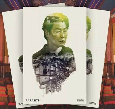
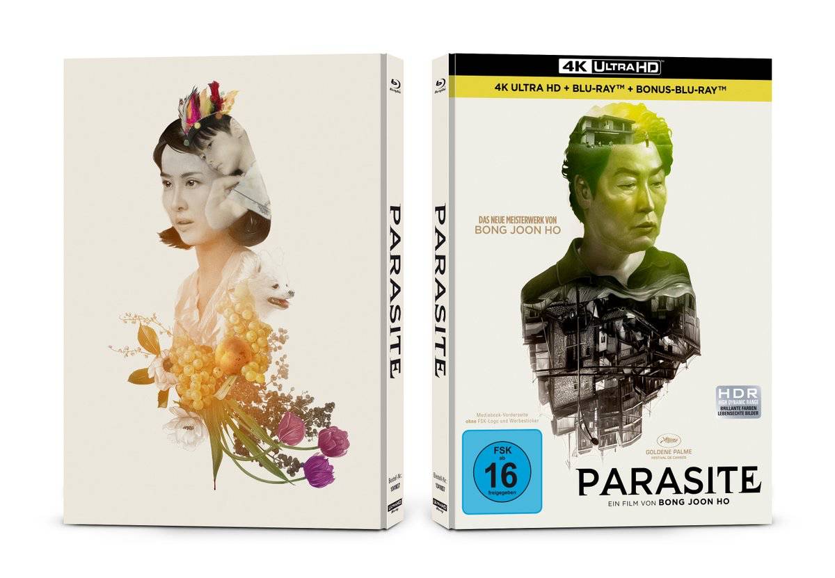
It really doesn’t get better than that, and what followed was a dozen or more sightings by various passersby as these billboards got seen and noted as the firestorm of affection began to grow around the film. They had repined smaller 11×17″ prints as giveaway at screenings and in the initially arthouse round of viewings and Q&As that attended them. Overseas dvd and blu ray releases started donning them and the snowball just kept snowballing. If I had made compromises to the work in its making this would have been a rolling nightmare, but I was true to myself and allowed to be by the clients and so it has been nothing short of a delight to see it all come together like this. This is the gravy as I now having been long ago done with the work that went into it and back to work in my studio banging out pages for my final graphic novel, MEADOWLARK (once again with the Ethan Hawke), and daily seeing how people have responded to the work… and the mistaken idea that I have somehow orchestrated it all, and am of such an olympian place of strata to be connected with one of the most historic turns in the film industry in a generation. Honestly none of that is true, nor does it feel as such. It’s like having kids… you can claim responsibility for their upbringing but once they go out and make good in the world, you can just cheer from the bleachers like everyone else.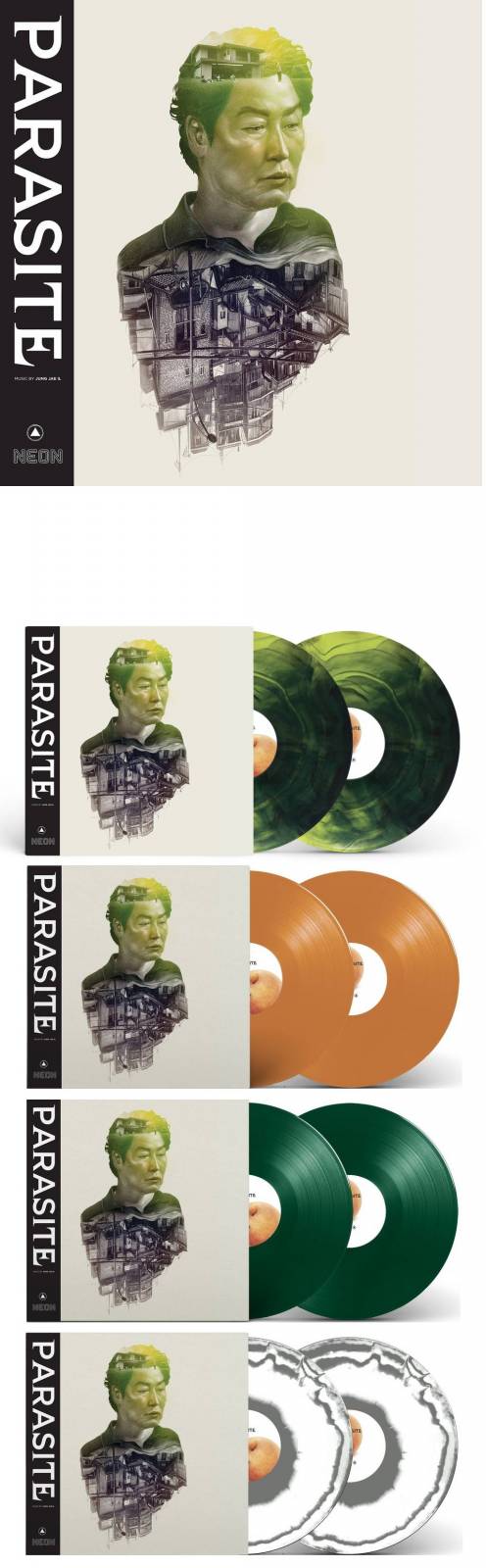
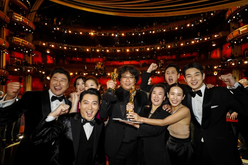
Heartiest and most heartfelt congratulations and thanks to Mike and Christian at Neon for gifting me with this opportunity and most especial love to Kang-Ho Song and the res to nth marvelous cast who now fins themselves rocketed to the world stage, and most especially to Bong Joon Ho for being rewarded so mightily for simply making work he believes in during an age where most successes at this level come from franchised mega projects and high-concept big budgets. PARASITE is none of those things and yet risers above them all as a value unto itself, and this is something to derive hope from. Get out there, work hard, make trouble… rinse and repeat.

** For those of you hunting after a fuller scale art-level poster release, I can say at this point is that sunshine is coming and I think you’ll be excited. We’re currently mapping out the best way forward and News on this through my usual social media platforms coming very soon. To stay in the know, Daddy-O:
Le Website: www.gregthings.com
The Facebook: https://www.facebook.com/gregthings
El Twitter: @GregRuth
Los Instagram: @gregthings

Just watched this amazing film last night for the first time. This article couldn’t be more timely. Great job, Greg! A truly beautiful piece for an incredible film. Thanks for taking your time to explain the process behind how this piece came to be.
Thanks- So glad to hear you saw the film, Jacob. It’s well earned it’s place as a cultural moment for sure. I have to watch these movies many many times, in whole and in pieces, to do these posters. This was one of the rare few that was always enjoyed more and more with each viewing. Once started rarely stopped. I love seeing someone’s personal, and singular work get rewarded in the way Parasite has. I find it deeply inspiring and creatively affirming when art rises.