Here is a list of all the information typically found in a Magic: the Gathering art description:
Art ID number. Pretty obvious. Wizards commissions a LOT of illustrations and each one is given a unique art ID number. It’s important for illustrators working for Wizards to keep track of that art ID number and to incorporate it into the naming conventions of digital files so as to make all images we create for that ID number trackable.
Size. Easily glossed over when reading the assignment, it’s actually important to make note of because the size also indicates the orientation of the piece and its proportions. Per design conventions, width is always listed first followed by height (which is contrary to how fine art is listed, but this is illustration and design, so it’s important to keep that in mind). Since some cards have vertically-oriented artwork, it really helps to pay attention to the listed size in order to prevent major issues.
Price. Compensation. Important for budgeting.
Due Dates. Always two there are, no more, no less. Sketch due date and final due date. While there tends to be wiggle room on the sketch date, I like to treat final due dates as FINAL.
Art Description. Here’s the meat of the matter and contains the most important information. That information tends to include the setting of the image (usually this is specific to a particular plane of Magic), the color faction of the card (which circumstantially can impact the visuals of a card), type of card (creature or spell or land, etc.), and the actual physical location of whatever the illustrator is asked to depict (words like “forest” or “swamp” tend to go here). Plus there are several sentences telling illustrators what the Art Director would like depicted. Sometimes it’s a thing. Sometimes that thing is doing something. Sometime there’s more than one thing. And sometimes those many things are doing something.
Focus. This is usually just one or two words that tell you what the most important subject in the image is.
Mood. A sentence or two here that typically gives…the mood—the general vibe that the fine folks at Wizards are looking to see.
Notes. I can count on one hand the number of times that there was information in this spot. But generally it’s been a reminder about something specific going on with the piece, be it an atypical dimension or orientation, or a reminder that the card I’m making art for already exists and has been illustrated before. That kind of thing.
So with each assignment comes a chunk of information with many different facets. Typically, this is what happens with me: I read the description several times and then I prioritize the information. If the piece has an odd proportion or a vertical orientation (which is less common in Magic), I immediately take note of it since it’s something that will affect the piece throughout development. Next, I look at the description and—despite its brevity, boil it down further and prioritize the information therein. After that, I take a look at the setting to see how it may affect the design or the general look and vibe of the piece. I tend to save mood for last, because that matters a lot to me and I like it to stay freshest in my mind as I let everything stew. Only after the pot begins to boil do I begin to draw.
The piece I’m going to talk about today is one where the stewing was prolonged and a bit muddled. Here’s the gist of what I got in the description:
Yorion is a 30-foot long, sea-serpent-like creature flying through the air. It’s got several sets of wings and maybe a golden horn. It’s rarely seen and is maybe half-obscured by clouds. It’s beautiful and elusive and is a blue/white legendary creature.
The immediate issue I had was that the description had my brain tugging in two different directions. First, it’s a legendary creature. Typically in Magic, such things are pretty clearly shown. They’re pure bang-for-buck images. The juxtaposition of that and the idea of obscuring the creature was a bit of a conundrum to me. Left to my own devices, I’d have put all of my energy into finding a way not to show the creature at all. Or maybe the creature would be there, but it wouldn’t be a blatant glamour shot. However, I knew on some level that that wouldn’t fly. So, my gut compromise was to show only a part of the creature rather than the whole thing. And even then I’d be obscuring the heck out of it. With that in mind, I started to do some thumbnails to see if I could nail down a gesture.
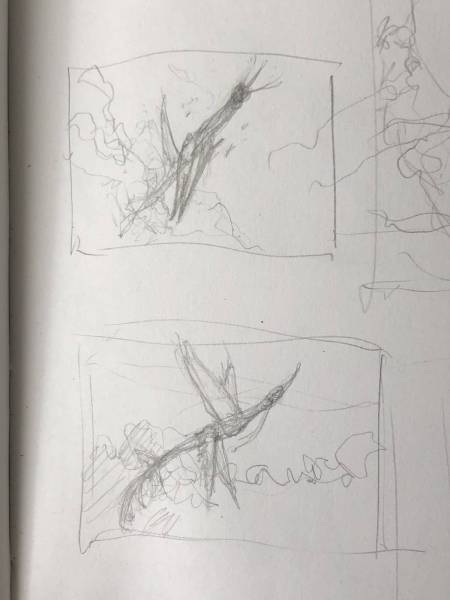
Confession: I don’t always do thumbnails in boxes. Horrible, I know. Whatever. I do what works for me. Still, there are boxes around these two, so I was clearly playing by the rules on this day. These two ended being my favorites and the ones I built on.
Despite thinking I’d nailed a direction down, I vacillated back and forth on how much of Yorion to show. Maybe I was putting too much thought into it, but I couldn’t shake the notion that the fine folks at Wizards would actually want to see this thing. And so I thought about it some more. In the meantime, I knew that I wanted to get a relatively clear shot of its head in there and so I did a design exploration of that.
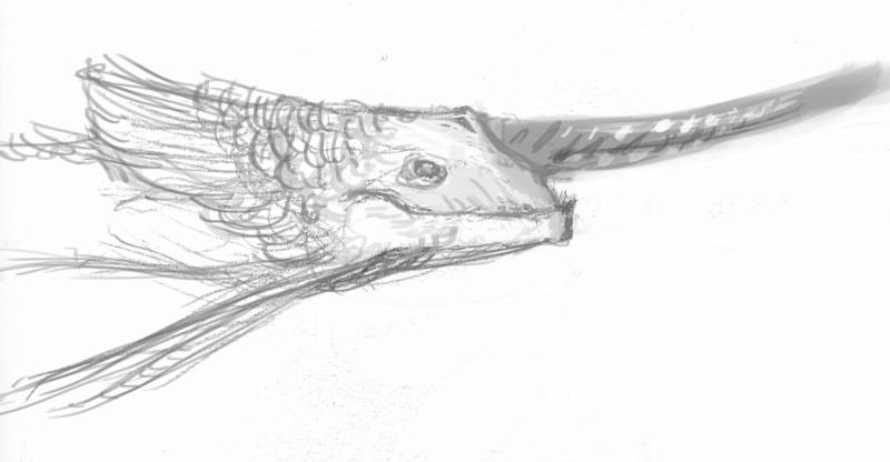
So yeah, nothing crazy detailed, but it’s enough to make it clear what direction I was headed. I figured I’d incorporate feathers onto his head so they weren’t isolated solely to the wings.
Eventually, with the clock ticking, it became apparent that I really needed to make up my mind. So I moved on to my sketches.
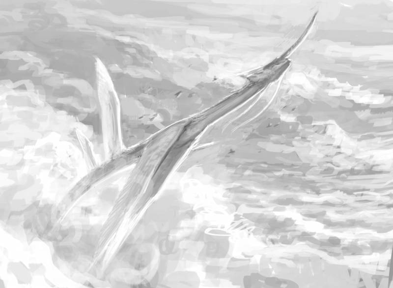
I started with this version which obscured Yorion very little. Still, I didn’t feel like it was mysterious enough.
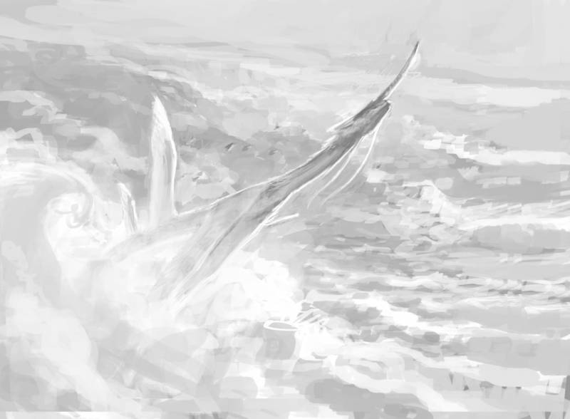
In order to obscure him further, I decided to push the level of mist at the edge of the clouds. It’s a relatively small change, but one that I think felt more like the viewer was only getting a climpse.
A couple of notes. Design-wise I quite fancied the idea of giving Yorion the wings of a gliding bird—like a gull. I surmised that if it was a creature that was rarely seen, it likely lived almost its entire life in the sky and so it seemed to me that giving it a gliding bird’s wings made a lot of sense. I spent a bit of time watching footage of various gliding birds and grew annoyed by the fact that I’d drawn the main wings in a position that just isn’t something gliding birds actually do. But then I remembered this creature doesn’t exist and is part of a fantasy card game, and I got over it and moved on. Aesthetics won out over any real attempt at accuracy.
Lighting-wise, my thinking was that backlighting the beast allowed for another means of obscuring it. I kept coming back to the notion of seeing Yorion without showing Yorion. If that makes sense. I’m not really sure that was achieved in the end because things shifted a bit, but so it goes.
Anyway, I sent the two sketches in. While they liked the first sketch that showed more of Yorion, they felt that it didn’t quite show ENOUGH of Yorion. So, a bit of mystery had to go out the window. They wanted to see more body, more wings and a bit of tail showing. If I’m honest, I’m not sure I loved the notion of showing even more of the creature, but it’s their piece and so I put together this revised sketch:
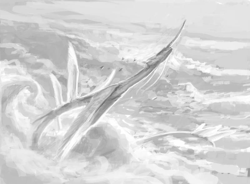
I may be wrong about this, but I got the vague notion that they kind of wanted Yorion to have wings all the way to the tip of the tail. I deeply resisted that notion as in my mind’s eye it frankly wasn’t very attractive. Again, it might completely be in my head. Regardless, I gave it one extra set of wings on the main body and then two sets of wings at the tip of the tail. That felt like “enough” wings to me.
I sent that in and in the meantime put together a quick color study so I knew what I was doing paint-wise.
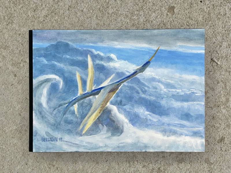
This was super quick and dirty, but it also nailed the lighting I was hoping to achieve. It also kept the palette fairly limited, which I was also looking to do. I contemplated doing a second sketch with a sunrise palette, but I felt that this version really did a good job of visually conveying the “blue/white” of the creature. I kept the tail out because there was a part of me that was really hoping they’d end up seeing the tail as unnecessary.
The revised sketch was approved (tail included) and with that I had everything I needed to go to paint. Unfortunately, I only took two process shots, but honestly it was as straightforward a painting as I’ve ever painted. With so much legwork done up front, there was very little guesswork along the way.
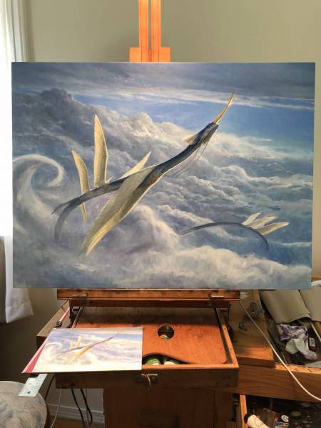
This is pretty close to the end of the piece. The foreground clouds and the tail wings look a bit undercooked, but the majority of the piece is figured out at this point.
A quick note about the painting process on this one. I usually work on Ampersand Gessobord. I like the surface and the tooth (though I sometimes sand the boards down with ultra-fine sandpaper to smooth the tooth out a tiny bit). Unfortunately, I didn’t have any more of those boards for this piece and neither did any of my local art stores. So, I was forced to use a competing product made by Dick Blick. It’s a pre-gessoed board that’s a bit heavier (the board is three-eighths of an inch thick or so) than the board I’m used to, and more importantly, the gesso is almost glass smooth. Normally, I don’t like to experiment with surfaces on an assignment since things can go horribly wrong, but I had little choice this go around and I figured I’d get the hang of things as I went. What I found was that I liked the surface for the most part, but the lack of tooth sometimes caused issues with paint adhesion. Paint that normally would either be dry or have enough tooth to cling to the surface of an Ampersand board was picking up as I worked over it. Not a huge issue if deadlines weren’t a thing—and I can’t even say it was a consistent issue throughout the painting—but it did cause some frustration along the way. Still, I’ll likely give the Dick Blick boards another go if I can still get my hands on them in the future as the surface was perfect for pushing thin paint around and I think they’d be ideal for more experimental work.
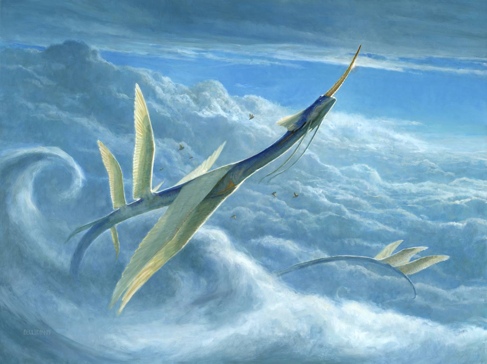
Anyway, the finished piece ended up looking like this:
Interesting note: the Art Directors for this changed mid-project. I was originally commissioned by Andrew Vallas, who I had never worked with before. I was excited to work with someone new—especially on a piece that I felt was pretty promising. Unfortunately, Andrew had to leave Wizards before I’d even handed in my sketch. While I was a bit disappointed not to get to work with him, it was good to have Cynthia Sheppard take over and guide me home. I’ve been through a number of mid-project art direction changes in my tenure of illustrating and most of the time transitions have been smooth. This was one of those smooth ones. I’m really thankful for that since I’ve also been through other handoffs that were…bumpier.
Regardless, the whole project was a pretty good time throughout and I’m pretty pleased with end result. It’s not exactly what I saw in my head when I started, but I really love where it ended up.




Lovely piece and nice to see the progress.
What I love about this piece is that it has the same feeling as a whale jumping out of the ocean. It’s awesome how the clouds feel heavy, while the giant serpent feels light and airy.
Nice! Reminds of those pieces that ran in National Geographic and other science journas back in the day speculating on what life on other planets might look like, especially the gas giants where creatures would live in the cloudy atmosphtere. I love how you worked this one out.
Thanks Steve for such an indepth description of your process, it is really helpful.
i really love this design, its a very tranquil yet powerful image, you can practically hear david attenborough describing it.
This was a really nice insight of the process of creating some art for MTG. The art for Yorion is one of my favourites for a creature so it was nice to see the process for this card in particular. Good show to you, Steven!