For the most part I use oil paint for my finished work. But lately I’ve had a desire to shake things up a bit and have been experimenting with water-based media. I started with small acrylic paintings, which eventually led to completing an assignment in acrylic (which I can’t show yet, but eventually I will). Then I decided to give gouache a go.
The first time I used gouache was during a summer program for high school students at Pratt Institute (where I’d eventually go to college). As part of that program, I took an illustration class, and my professor, Don Albright, suggested I give gouache a try. Throughout the month-long intensive, all of the work I did for Don was done—either fully or in part—using a basic five-color set of gouache (red, yellow, blue, white and black).
In case anyone is reading this and is totally unfamiliar with gouache, I can sum it up by saying that it’s basically opaque watercolor. The more water you add to it, the more like watercolor it becomes. A couple of added features to gouache are that it tends to be a bit cheaper than watercolor due to the fact that it’s a bit easier to manufacture. Also, gouache dries to a consistent matte finish, which is very easy to scan and photograph. The downside of gouache is that, like watercolor, it remains water soluble even after it dries. While that may be helpful for the paint on your palette which can be reactivated with water if it should dry, on the painting it has the potential to be a headache as it’s possible to reactivate the paint in areas you’ve completed if you go over them again.
It’s probably worth noting too, that there is another type of gouache paint called acrylic (or acryla) gouache, which is more of a mashup of gouache and acrylic paint. Application-wise, it’s a lot like normal gouache, but it can dry a bit faster and is no longer water soluble after it dries. Like normal gouache, acrylic gouache also dries to an even, matte finish. While I’ve used these in the past, I’ve never been a huge fan.
Anyway, by the time I reached college, I had become interested in other mediums and a lot of my professors encouraged experimentation with a wide variety to find the ones that best suited us. I tried a lot of different materials, but I eventually landed on a mixed media technique that involved layering all sorts of different things. Despite how fun that process was, the best work I put out there was the assignments I completed in oils, and so in my senior year, I completely transitioned to oils.
That was…twenty-two years ago. And it’s been twenty-six years since I so much as squeezed a blob of gouache out onto my palette.
Anyway, point is that I dipped back into it this year because…well, I’m starting to grow a little tired of oils. It’s not that I want to quit oil painting. It’s more that I feel I need to revisit other mediums and techniques to relearn some old lessons—and maybe learn a few new ones—that maybe I can bring to my professional work in oils.
Or maybe not.
So…why go back to gouache instead of some other medium?
Mostly because of my vague familiarity with it and the ways that it’s similar to oils in the way that it can be opaque or transparent, but I also felt like it could be a fast medium, too. It just felt very immediate. Also, the chemistry is a lot simpler than oil paints which has so many varieties of mediums and varnishes and thinners. I just wanted a cup of water and some paint for a change.
Anyway, I picked up a few watercolor brushes and a few paints. Once again, I bought a primary set (which this time consisted of six paints) made by Winsor & Newton:
Zinc White
Ivory Black
Primary Red
Primary Yellow
Primary Blue
Permanent Green Middle
To this I added the following tubes from Holbein:
Magenta
Cyan
Yellow Ochre
Burnt Umber
Burnt Sienna
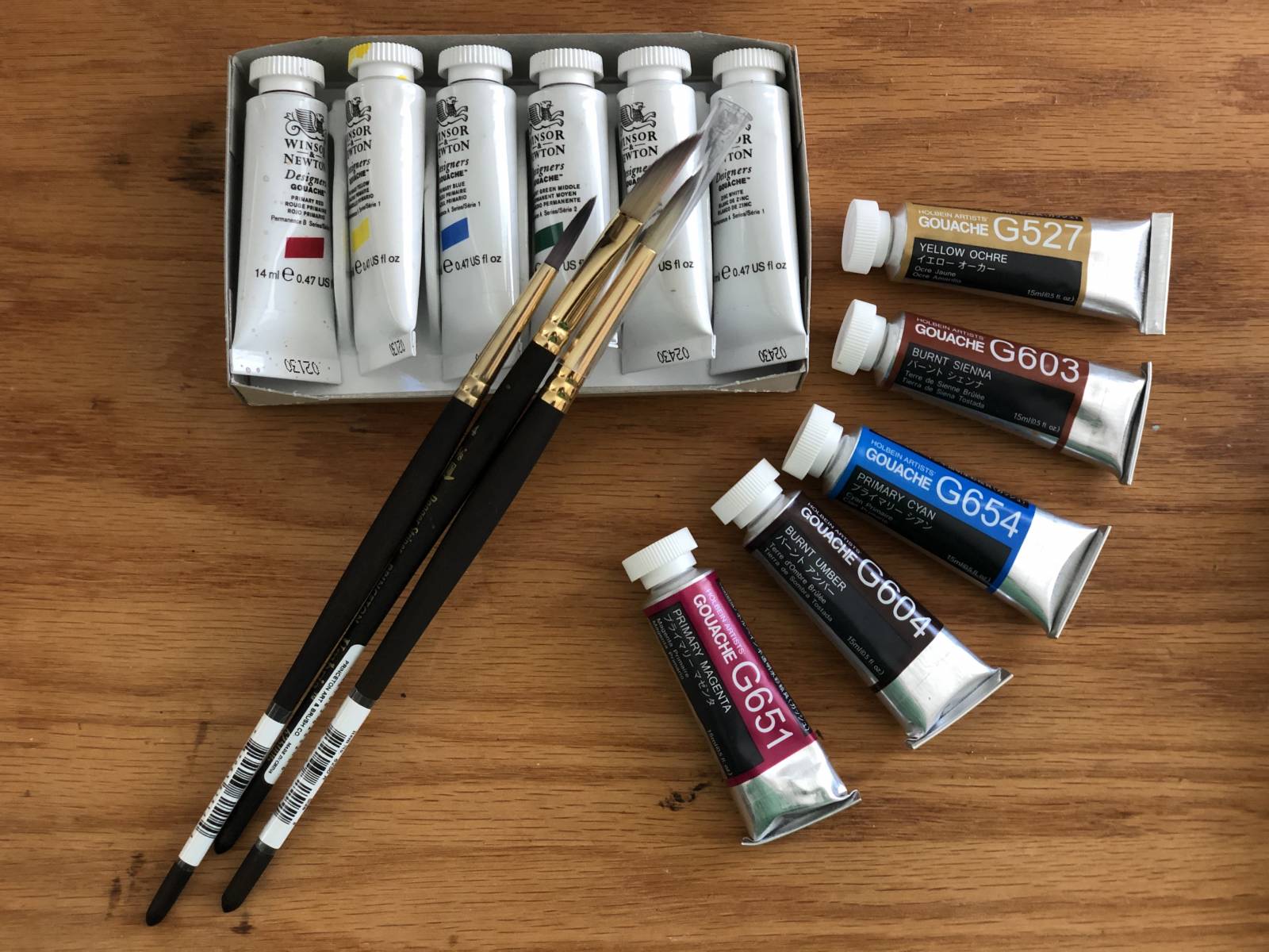
The brushes are Princeton Umbria brushes. Two rounds (no. 6 & no. 8) and a no. 4 dagger striper brush, which I’ve yet to figure out quite how to use.
Why the addition of the other colors? Well, the earth tones are things I use regularly and I just wanted to have them handy since it’s a lot faster than trying to mix them. I added the cyan and magenta because they—along with the yellow from the primary set—are actually more of a primary set than the traditional red, yellow and blue. The green that results get from yellow and cyan is more vibrant than the muddy green that comes from mixing yellow and blue pigment. I find that the oranges that come from magenta and yellow tend to be more vibrant, as well. As an added bonus, these colors also provided me with a cool red and a warmer blue, which allowed for more color experimentation (and hopefully depth).
Why the two different companies? That’s mostly because the colors I wanted to buy were all available in Holbien. Plus, having paint from two different companies allowed me to see how each felt independently, and also how they worked (or didn’t) with one another.
Before I started, I consulted a local gouache artist, Brian Snoddy, for some tips. I’d wanted to meet up with him in person to kind of nail some ground rules down and soak up some of his wisdom, but I ended up committing to diving into the deep end and seeing where that took me.
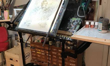
The surface.
As do a lot of artists who work in gouache, Brian works on Strathmore 500 series Bristol. The paper is 50% cotton, comes in a variety of plies and can take a beating. In fact, I used to put matte medium on three or four-ply Bristol and paint in oils on top of that (this is how most of my spot illustrations for Dungeons and Dragons were done, and a few early Magic pieces as well). Unfortunately, I didn’t have any Bristol. I’d have gone out and bought some, but Covid hit and stores closed. What I did have on hand, however, was a block of cold pressed watercolor paper. So I used that.
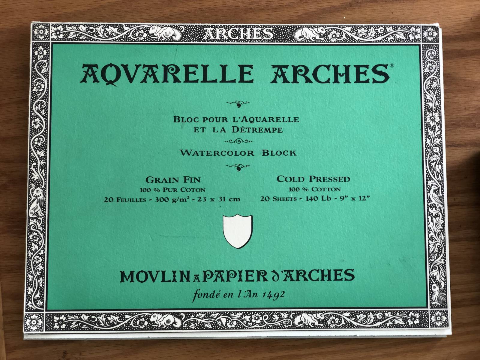
In case you’re unfamiliar, a watercolor block is basically a pad of watercolor paper. However, unlike a pad you can’t flip through it. This is because the paper is bound together on all four sides to a heavy backing, which keeps each sheet taut, thus minimizing buckling. Then, when you’re done, you can slide a (clean) palette knife into a small spot that is left unbound, slip the knife around the edges and separate the top sheet from the rest of the block, revealing the clean sheet below.
The subject.
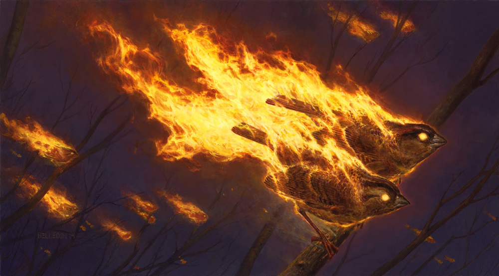
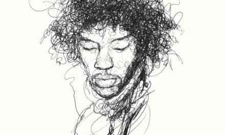
It is extremely rare that I repaint old work. But I chose to do that in this case. Sort of. I did a painting of flaming birds years ago and I decided to take the bottom bird and repaint it in gouache. My primary reasoning was that I didn’t want to have to concern myself too much with the subject matter, preferring to concentrate on getting reacquainted with the gouache itself. Additionally, if I managed to get a half-decent image out of the experiment, I’d have a direct comparison of the birds in two different mediums. I’m not sure what I expected to learn from that, but I thought it might reveal something.
I like this piece, mostly. My main concern with it was that the scale of the fire never felt quite right to me. The shapes were too broken up, making it feel small. The truth is, the more the air is moving, the more broken up the shapes within fire will become, and so its scale can be deceiving. Still, I felt I could improve on this piece.
Anyway, I laid the whole thing out very lightly in pencil (the flames were barely an outline) and I went to work.
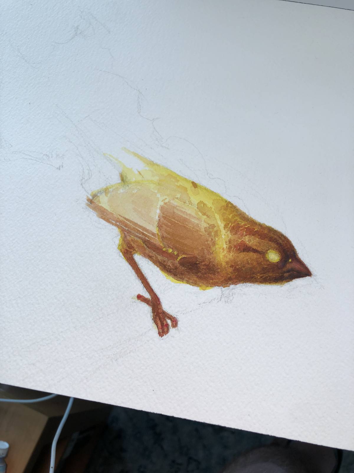
This is about an hour and a half into the piece and there’s a part of me that wishes I’d just stopped here. There’s something really nice about its unfinished state. But I wanted to see how far I could take it and so I kept going.
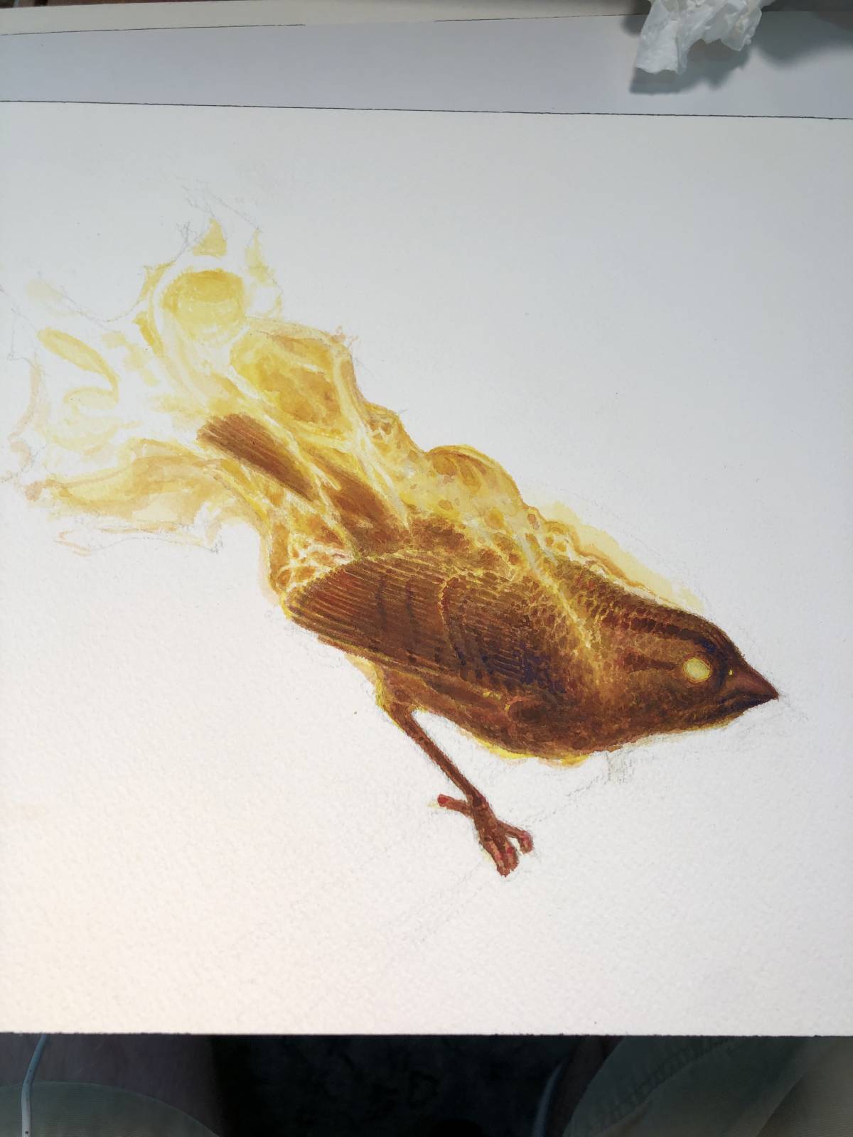
My technique (if you’d call it that) was to sort of start transparent and then build opaquely on top of that. It was a timid approach, but in my defense, this is the first time I’d painted in gouache in decades.
This is another place I feel I could have left it. But this is a good indication of my approach. The fire is very lightly tinted and I’m beginning to build up the values of the background.
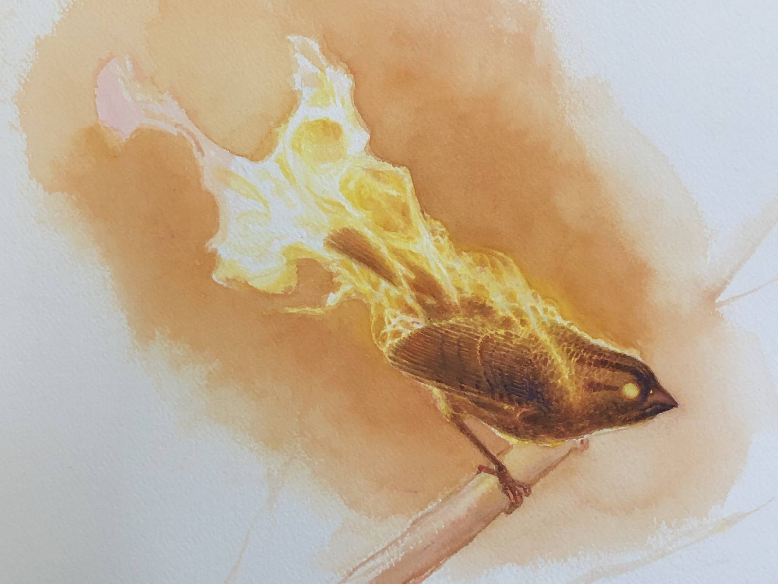
Time passed. But not a lot of time. I suspected this piece would be fast, and I was right. I burned through it. The time between the image above and the completed piece was…maybe a day? And of course I forgot to document it, which stinks because it changed a bit. So now, I’m forced to do one of those cooking show transitions where I pull the completed dish out of the oven after hurriedly going through the steps on how I made it.
I just happen to have a completed piece here:
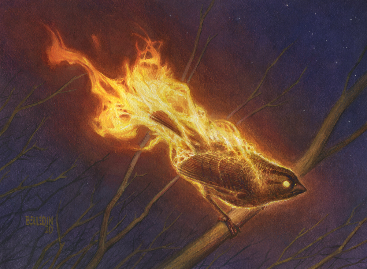
The finished piece is 12 inches wide by 9 inches tall.
There’s a philosophy that an artist can take any medium and make something of it. And maybe that’s true. But familiarity with that medium helps, and despite taking this piece as far as I did, I still don’t feel confident enough with gouache to complete an assignment in it. I feel like I need to spend more time experimenting, and I’ve committed to doing so.
Some things I learned or remembered:
Going into a gouache (or watercolor) painting without a plan is…not always the greatest idea. It’s not undoable, it’s just going to be a lot harder. Because of the nature of the paints and the degree to which they can stain the paper you apply them to, it’s advisable to know where your light values are all going to end up. A lot of watercolor and gouache painters I know work from light to dark throughout the course of a painting. I didn’t quite do that here, but then, I knew exactly where my lightest values were going to be and kept them mapped out throughout. That being said, I was able to introduce the branches in the background relatively late in the game, so there’s still some play there.
Additionally, I mentioned it above but I want to stress that it’s very possible to reactivate the gouache when you go over it again and lift old areas up when trying to rework them. Sometimes that can be an advantage, and might be something you do intentionally. Other times…not so much. While it can be frustrating, I found personally that the key was to take a deep breath, fix it up as best I could and then let it dry. The drying time helped calm my nerves and allowed the paint to set a little bit thus allowing for a bit easier a time fixing my mistake.
Lastly, surface matters. I personally didn’t love the cold press watercolor paper. Throughout most of the piece I felt like I was constantly fighting the texture. By the end, though, I did find ways of using the texture to my advantage. For example, I found that raking paint over paper allowed me to tweak colors a bit. With a light hand, only the highest parts of the paper texture grabbed the paint. As more pressure was applied, the paint was pushed further into the cracks and crevices of the paper for a more thorough coating. Thus, with a little strategic thinking, the texture ended up providing an easy way to create color transitions.
Next time.
I’m not done with gouache and I think my next step will be to paint something from life or a brand new image using a different surface and see how that feels and where that takes me. Perhaps hot press watercolor paper will be more to my liking. Maybe the Strathmore Bristol that other gouache artists prefer will be even better. I also plan to add a few additional colors to my palette and see experiment a bit with those. As soon as I get a chance to give all that a go (between assignments), I’ll be sure to report back with results.
And, if folks are interested, maybe I can start revisiting other mediums, other ways of working and start throwing those at you fine folks to see what you make of them…and maybe make with them.
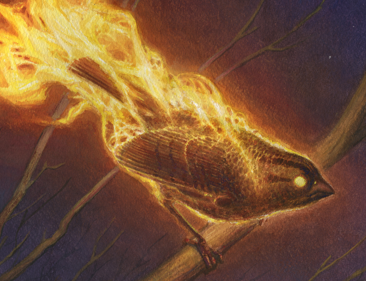
I leave you with this closeup. Because…closeup.

You should try Canson Pure White 80lb. drawing paper a try. It comes in various sized ring bound pads. It has just a little tooth, so not as slick as Bristol. It works very well for acrylic, gouache, or watercolor. I work mostly in watercolor mixed with white gouache in later stages to add opacity, or overlay previous color. Canson Mixed Media paper also works well, but prefer the surface of the pure white.
Thanks for the tip. Personally, I think there’s a good deal of tooth in Strathmore’s 500 series Vellum finish, though admittedly the ultra-smooth finish is quite slick. That being said, there are plenty of artists who used watercolor and gouache on the ultra-smooth finish with great effect. I suspect that would be true of the semi-smooth surface, as well. But I’ve never used it.
Thank you for this article! I am orimarily a watercolor illustrator, and recieved a gouache set as a guft but have yet to experiment with them. I’ll admit, gouache makes me far more apprehensive than watercolor.
Painting fire has always been a challenge and a struggle, but your colors and tones here are so clean and strong. Are the colors of the flames the result of mixing the yellow with the magenta as opposed to red, as you mentuoned?
Thanks again for the walkthrough!
Thanks for that! The flame colors are a combination of both yellow/red and yellow/magenta mixtures. As it fades to a duller red, I’m using the yellow/red mixture, whereas the more intense reds and oranges are the result of the yellow/magenta mixture. It felt very situational.
Per the actual drawing of the fire, I find that it’s really useful to do some digging and find images or video of fire at the scale and with the lighting you’re going for. If at all possible, get the shots yourself (though this can be…dangerous for larger scale flames). That being said, for small stuff, it’s surprising how much mileage you can get from a tiki torch and a little bit of wind. Having a bit more specific a flame to shoot for—at least in my experience—helps fill in gaps. I’m not great at making that stuff up. I mean, I can do non-representational flames, sure. But I’ve been working at more representational fire to help better understand its shapes and movement for those times I can’t get good reference.
As for experimenting, go for it. Even if it’s just painting an apple or something. Start figuring it out. You know, if you’re interested. So far, I’m really enjoying it. Hopefully you will too.
Lovely birds, both in oil and gouache! As it’s opaque watercolor, you can indeed work from light to dark in gouache. But I’ve worked a ton in both watercolor and gouache, and found it’s best for me at least to usually go light to dark in watercolor and usually dark to light in gouache. Here’s a piece where I worked all in gouache dark to light, and the aim is to make it look like oil or acrylics: https://www.instagram.com/p/CCWs-J8HAY_/
Thanks for this. Personally, I’m a little hesitant to go full dark to light, mostly because putting white down opaquely still will never be as bright as white paper. It’ll invariably pick up some of the darker colors underneath. But in certain circumstances, that may be exactly what’s called for, so it’s very much situational. Thanks for sharing!
I find Arches HOT-pressed watercolor paper very nice to paint on with gouache. Especially for building up from washes to opaque. I’ve painted on Bristol quite a bit, and it’s probably better if you like to go straight for the opaques. Anyway, great article and great piece!
Thanks! I think my next go is going to be a side-by-side comparison of both of those. Maybe not Arches hot-pressed, but definitely hot-pressed watercolor paper (Arches wasn’t in stock at my local store, unfortunately). If I can get my hands on some, I think I may nab some ultra-smooth bristol, as well, to play around with how the paint can tend to pool. Could be a fun exercise.
Thank you for an insightful article!
Hey Steve nice study. I switched to gouache a few years ago as my go to medium. It does have a lot of similarities to oil and I have been happy with the transition. You should experiment with mixing some watercolor into the layering especially some of the darks. It gives a great luminosity that even with watered down gouache can’t achieve. That said I think you will like this video by Jeff watts about tiling technique. It was informative for using opaques. https://www.youtube.com/watch?v=gsTAsfjR_uk&t=8s&ab_channel=WattsAtelieroftheArts
Paper- I like hot press arches and Saunders watercolor as well. Neither cheap but you get what you pay for. Strathmore makes a great mixed media board I have been happy with as well. I tried the Strathmore 500 bristol and while the smooth surface was good, it was not crazy about all the water and washes I was putting on it. It is not as good as it used to be when Burt Silverman was using it for his watercolors. Oh and don’t be afraid of light over dark I do it all the time working from a midtone. I hate leaving the white paper and the most fun of a piece imo is carving out those light shapes.