In short:
Improve, train and practice.
Each attempt, a step forward
Positive Progress
511 – TL;DR
Student Demo checklist:
Time to spend on study: Long enough to note objective goal(s) are accomplished –
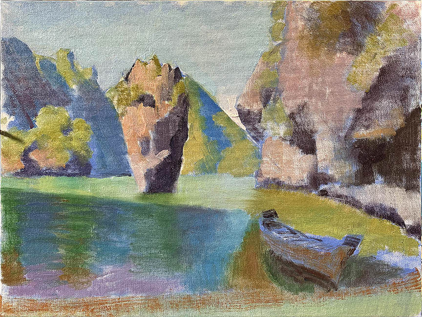
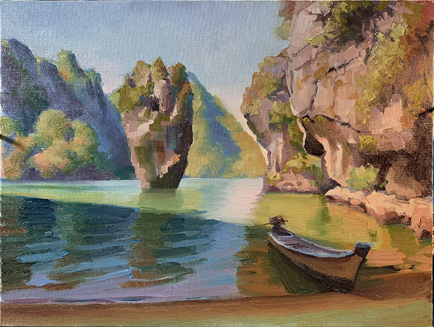
Student’s Objective goal: Mix colors to emulate late afternoon tropical outdoor lighting in Phuket Thailand
Student’s Secondary goal: Abstracting the colors towards a calligraphic realism within specified regions of surface (focal center and foreground foliage)
Steps 1 – 2: Design grid, measured with Design Index (a gestalt of perspective, color theory, and composition tools) and drawn using the shape overlap design principle – (shape/terminator/cast) in order of discovery respectively (Images were not shot in time to preserve these steps)
Focal point: Off-center steel yard
Design Matrix: 1/3rd rule – contrasting diagonals
Color Key: Full Contrast – Realistic Sunlight Late Afternoon 3-5PM Tropical Sunlight – Strong off camera left frame lighting
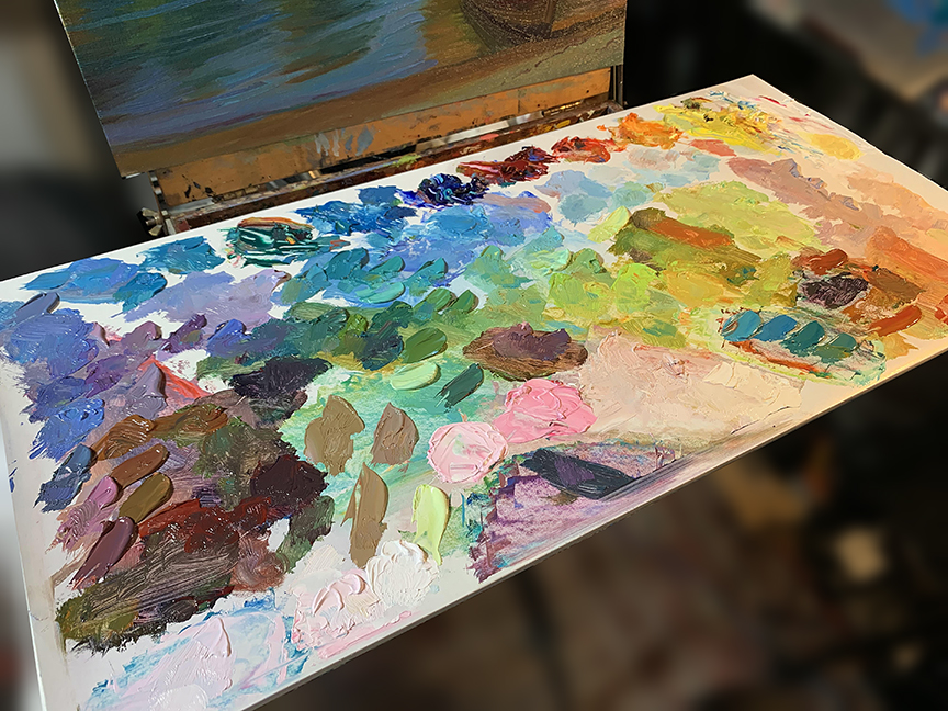
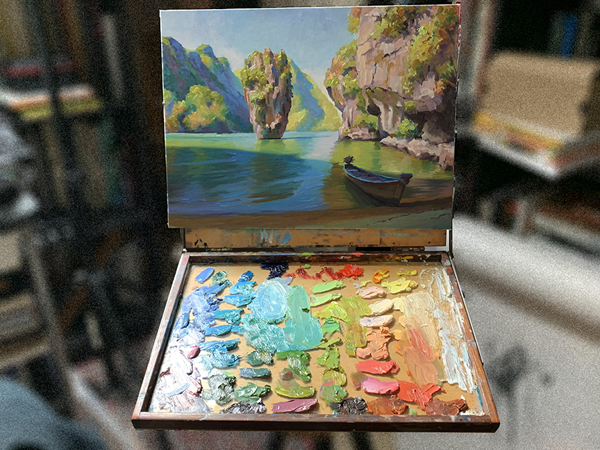
Palette: Full Chroma Palette Temperature pairing hues/no black -only tinting agent added for hue adjustments-
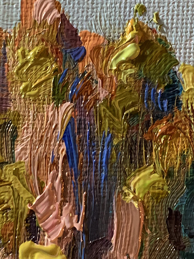
Step 3: Flat color lay in – no noodling, use only big brush with big strokes and simple quick fills, edges do not matter at this point and the surface should not be completely coated with paint
Local colors mixed with sky hues – (the mostly forgotten or unseen hues that affect the adjacent surfaces from the direct light source).
Palette constructed with temperature and hue strings regarding local surface gradations
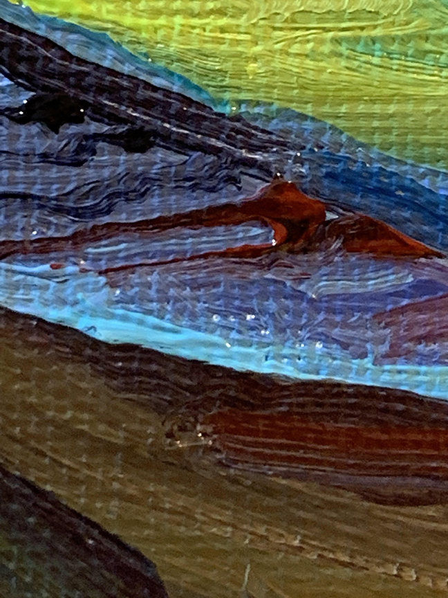
Canvas weave creates a pixelated cancellation of strokes when paint is applied thinly – good for first layer and spectral sweeps (theoretical) allows for dimensional build up of calligraphic layering of pigment (optical mixing) – retains color clarity and reduces unwanted graying (muddy color) In addition it brings a new layer of depth to the surface breaking the monotonous pixilation of the canvas weave
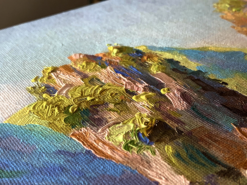
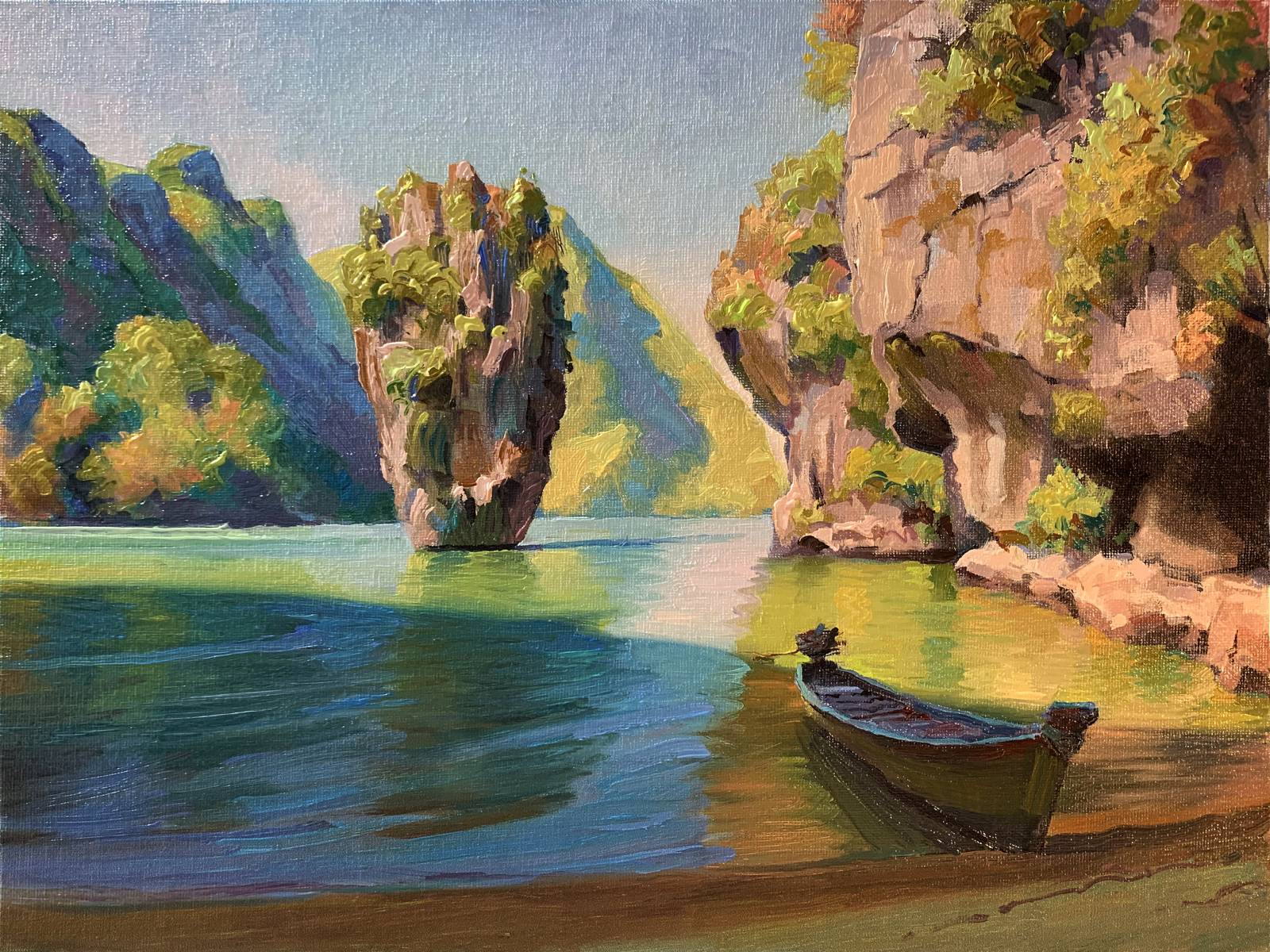
Step 4: Gradation stage – softer brush, lighter paint handling, weave with calligraphic sweeps along surface forms – rolling forms using local color to direct light influence, local color to indirect light influence, Fresnel transitions, distance to kelvin shift or blue shift shading
This calligraphic approach is liberating in learning to find distinguishing marks that might summon the illusion of something greater than just random paint splotches, and different from the optical mixture of layered colors over a value drawing through the use of glazes and scumbles which strictly adhere to the first layer drawing or “dead color” layer. Most publishers have little use for this approach, but like jazz, it is liberating (so much so the author repeated this word in the same paragraph like a mindless funkwit) to “get lost in the technical confluence” for a moment and explore more than the architectural cartooning (line work) we are locked into when we work on finishes.
Allow the calligraphy to work instead of thinking “Render by over handling the paint” aka, blending-the-fu¢ out of the paint. Load brush, nearing surface, shut off brain, allow brush and hand to dance with reason somewhere in the distance helicopter parenting the stroke to completion.
Check canvas at a distance (the overview), not up close (the battle zone), also check canvas under other lighting conditions. Do the big picture values stay relative or do they fragment and disrupt the big picture read? Fix accordingly.
At a distance, the picture should be magic card art size or phone photo preview size to the eye – you are preventing the eyes from shifting or the head from moving and seeing the “entire” image all at once to get a total impression

Cool low light shows if temperatures within the light and the shadow spaces are relative to one another or not – also, try turning off lights and let the ambient light allow your eyes to view the graphic design for potential holes (value related) –
DO NOT BEAT YOURSELF UP OVER THE PAINTING NOT BEING “LITERALLY LIKE SUBJECT”! Painting pictures is not a copy machine experience. Each study warrants an objective result and should be critiqued solely for this objective; did the painting meet the goal(s) you set for yourself? Anything else positive from the experience is an added bonus.
Toss study aside and move to another and don’t look back. Studies are like exercising and should be done frequently, daily if possible, to maintain a constant improvement in your work. A stack of ten studies is harder than any kiln fired brick. Bundled together, you can build a tiny house with them within a year maintaining a “one-a-day” study pace.
IOW, they are not “precious” however fun they may be. Treat them as such and they are easier to do, and easier to do many with no worry whether they are “good” or “marketable”. Amen to studying because you care to improve.

The demo checklist I Easy to understood. Amazing content sir…