Back in 2017, I attended a working art retreat with friends. I was working in games, so my day job work was all digital, and I was itching to get the traditional media out and paint. I didn’t feel a pressing desire to paint a fantasy scene or portfolio piece at the time. I’d been meaning to paint a portrait of my mother and had taken photos the last time I visited her with that purpose in mind, so I decided that would be my traditional piece for the week.
I’m a big fan of mixing powerful, saturated colors to get neutrals. I don’t usually use a lot of earth tones, and prefer to use intense color and do a lot of my mixing on the brush rather than pre-mixing on the palette.
Looking at the photo I intended to work from, I set out all the tubes of paint I might need. The photo was taken in front of Lake Superior at twilight, and I knew for the sky and water I wanted a lot of the Gamblin Radiant range, which are incredibly fun, highly-saturated tints.
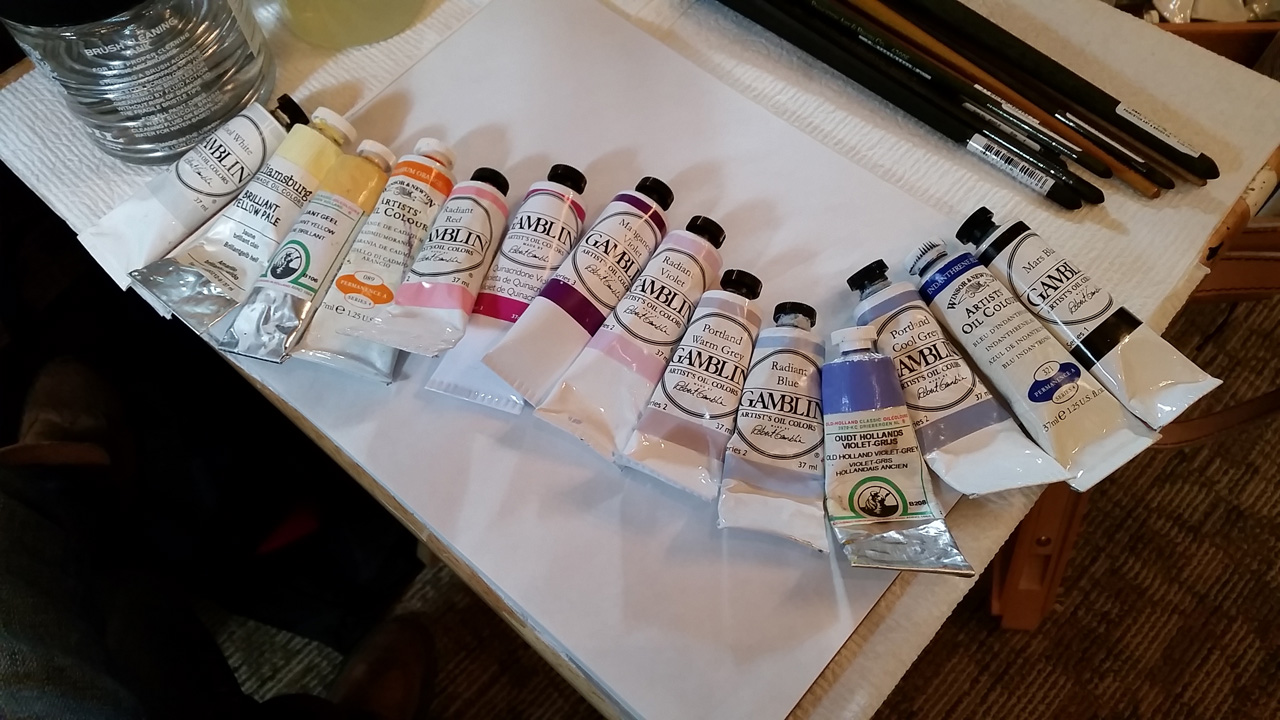
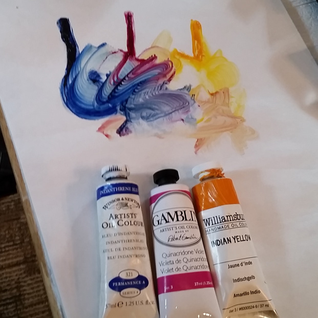
From this array of tubes, I select a variation of a favorite combination for the underpainting: Indanthrene Blue, Quinacridone Magenta, and Indian Yellow. My usual go-to is the same but with Phthalo Turquoise instead of Indanthrene Blue. These three colors when mixed together in the right proportion make a very nice chromatic black, while the blue or turquoise plus Quinacridone Magenta gives a lovely purple, and you can mix orange or green, etc. I settled on this combo through experimentation, but then it was pointed out to me that it’s essentially the CMYK palette which is totally a thing. Strangely, if I had read about it first I quite possibly wouldn’t have tried it, since my training was in a variation of the more traditional Zorn palette and the CMYK thing might have sounded new-fangled and gimick-y to my atelier-trained brain. I started playing with mixing high chroma complementaries after seeing Boris Vallejo paint in person. I like using both palettes, but the high chroma seems to just fit my brain better.
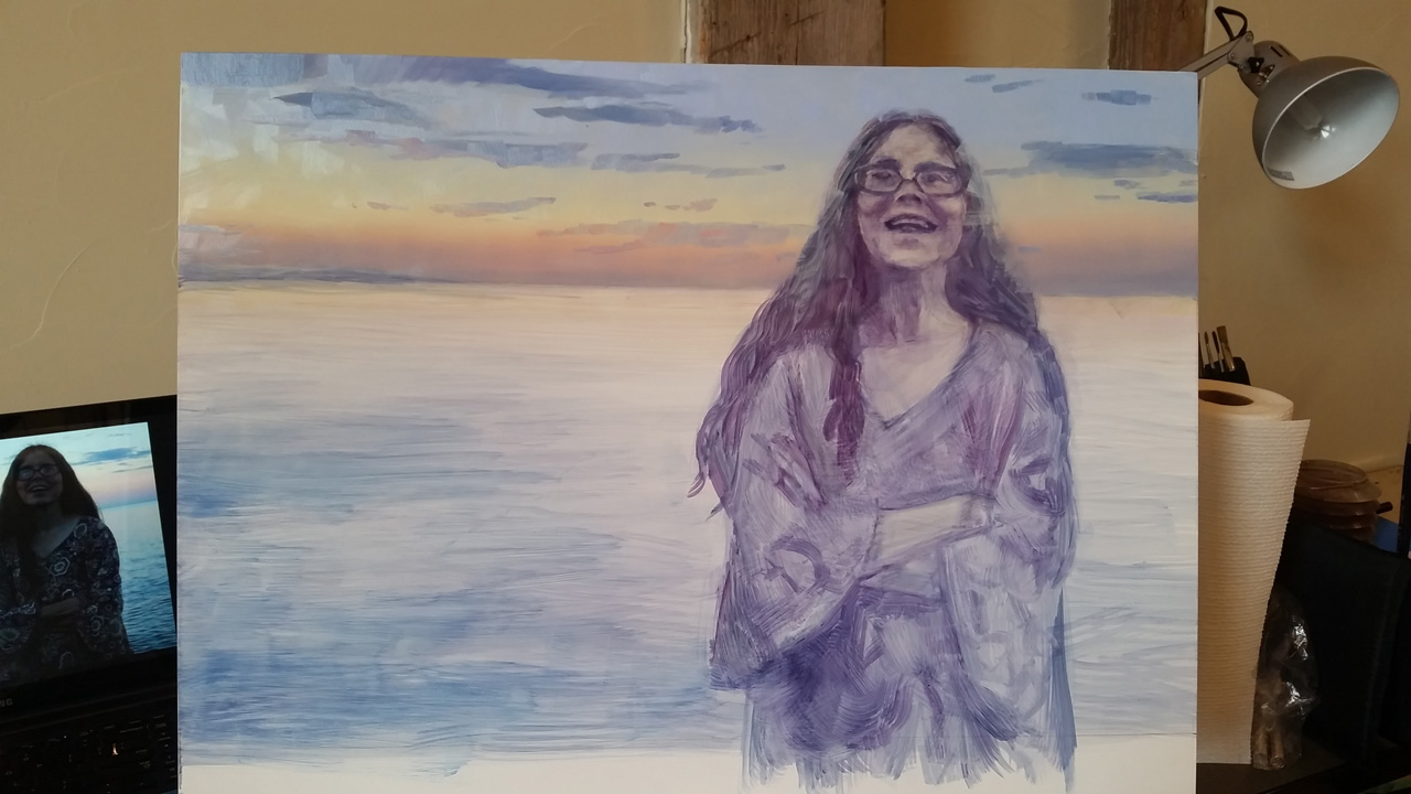
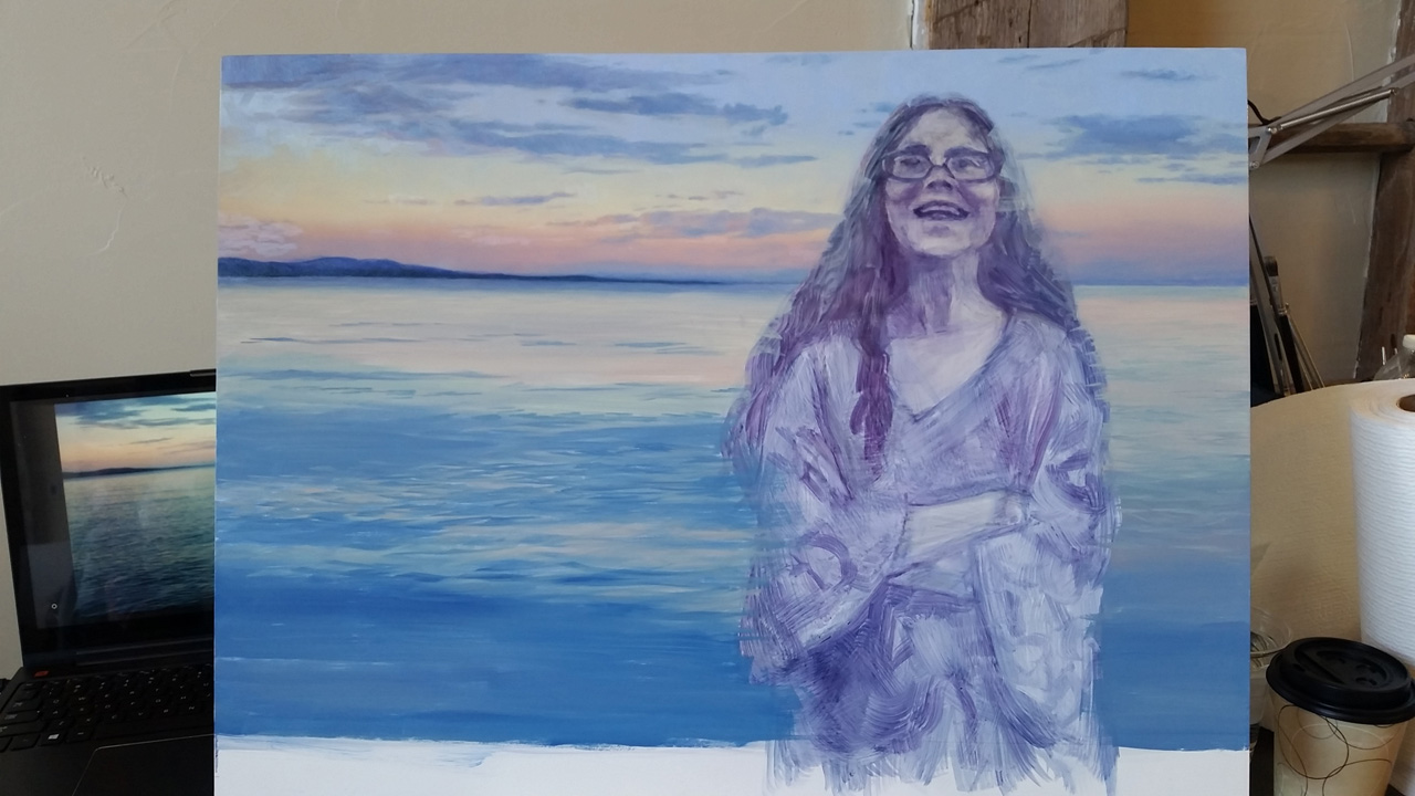
I often like to work without a detailed line drawing. I’ve got a well-trained eye for accuracy thanks to the atelier training, and intentionally skip the drawing step in order to keep myself from being too stiff. It’s not how I always work, but I really enjoy it when I think it will work for a piece. It invites a bit of stylization and, to me, more expressiveness, and leaves room for more of my motion and emotion to be captured in the brush strokes. I do measure key proportions and angles, and start the rough-in by marking the outer extents of the silhouette. Then I slowly add in angles and anchor points like the joints in a figure and edges of shadow shapes. This is how I was taught to block in a figure from life, which requires more speed due to working from the living model. In this case before doing any of that I set up a plan for the temperature zones of the background. I’m using turpenoid as my only medium in the underpainting stage. The surface is a Blick brand gessoed panel, an 18×24 inch board from which I’ll be cutting off the bottom two inches after the piece is finished. I really like these boards, the finish is significantly smoother than the Ampersand brand gessoed masonite, which has a pebbly texture. You can see my reference photo open on my laptop in the bottom left of the photo.
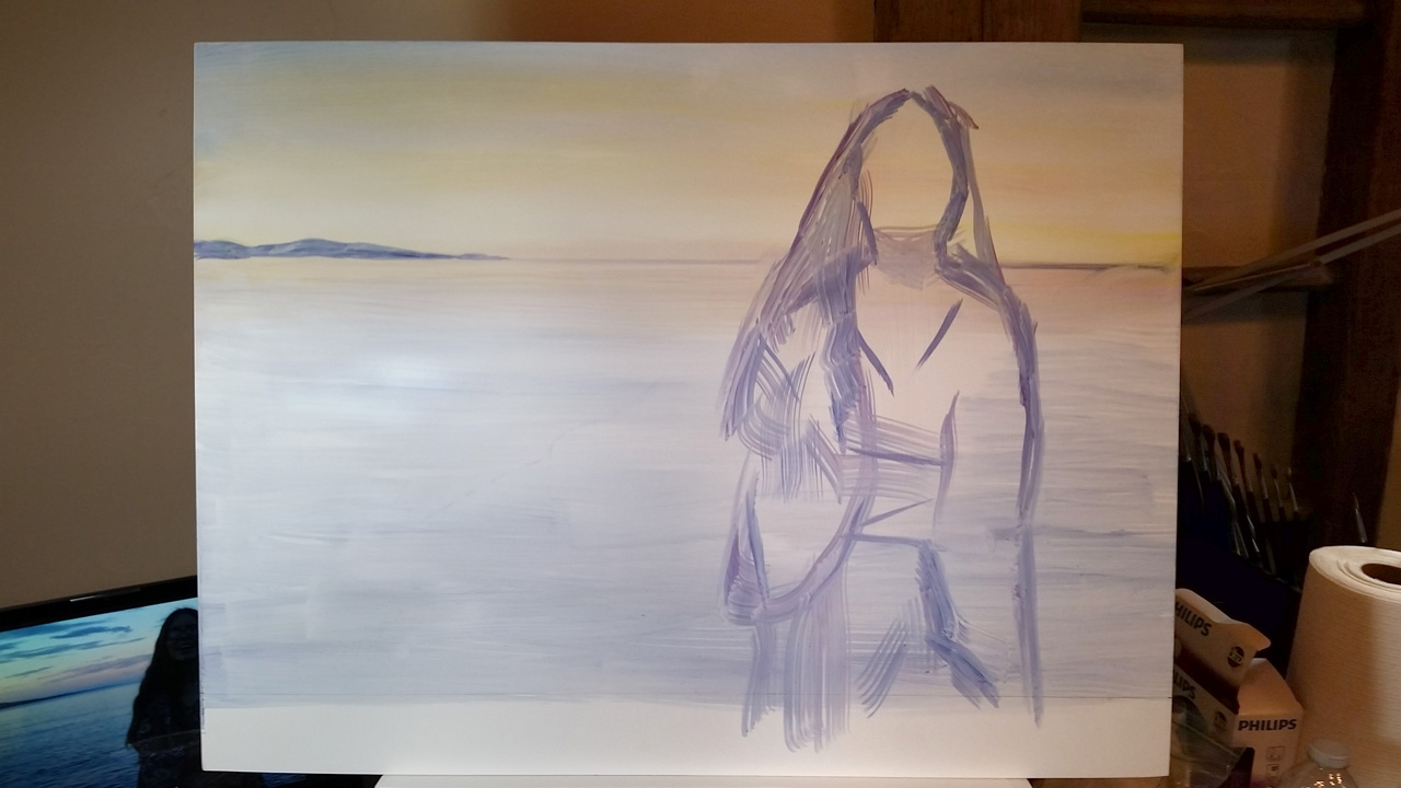
Here’s a middle stage of the underpainting. I’ve steadily added more information, starting to establish the value plan for the figure. My photo captured my mom in the middle of telling a funny story, smiling because she’s getting close to the punchline—an expression that she wears so frequently it’s already feeling to me like I can hear her voice repressing her laughter.

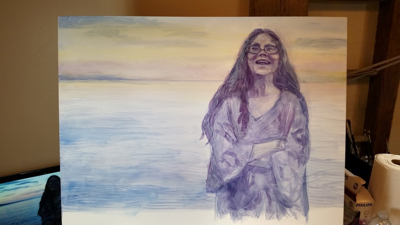
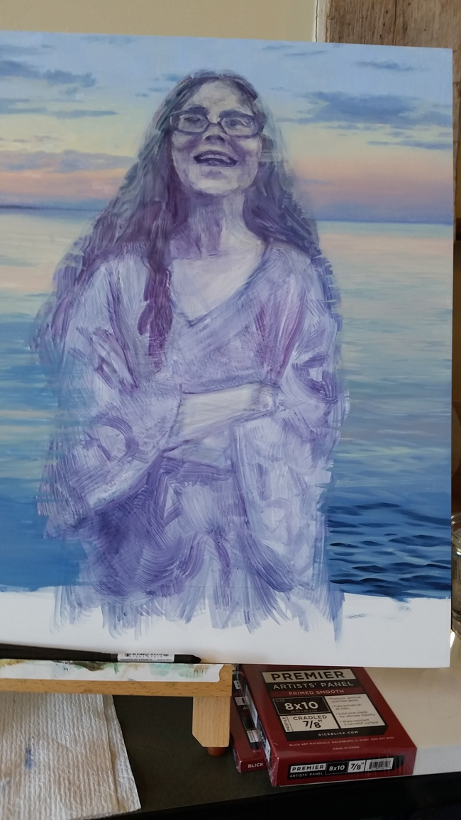
Finally I push the values darker in a second pass of turp-thinned oil paint, as the first is mostly dry at this point. I go into more detail in the face and really try to capture her expression. The apples of her cheeks, the upturned corners of her mouth, her eyes squinting and eyebrows lifting a little in her mirth. There are fun technical challenges with this portrait due to her glasses. The lenses are thick and cause distortion, and her eyes are being partially obscured by reflections on the glass. I mark in a bit more of her eye placement than I can see in the ref here, just to note for myself where they are before obscuring them with the reflections. And that’s the underpainting done, and time to sleep for the night.
The next day after finishing day job work, I set out the full palette I’ve planned, and start painting the gradient of the sky. I adore the Gamblin Radiant colors and use a lot of Radiant Red and Radiant Blue in this sky (Howard Lyon covered the Radiant range well here on Muddy Colors). Along with Williamsburg Brilliant Yellow Pale and some Old Holland Violet Gray toward the horizon I believe those were all the colors used in the sky gradient, making for a nice restricted value range leaving lots of room to go darker with other areas of the painting.

After establishing the larger color areas, I blend a ton, and then start blocking in the clouds, using Violet Gray and a touch of Indanthrene Blue to bring in a bit of darker value. I’m still being careful to keep the sky high in key, because I’m reserving the darker values for the figure, the water in the near foreground, and the distant bit of land on the horizon.
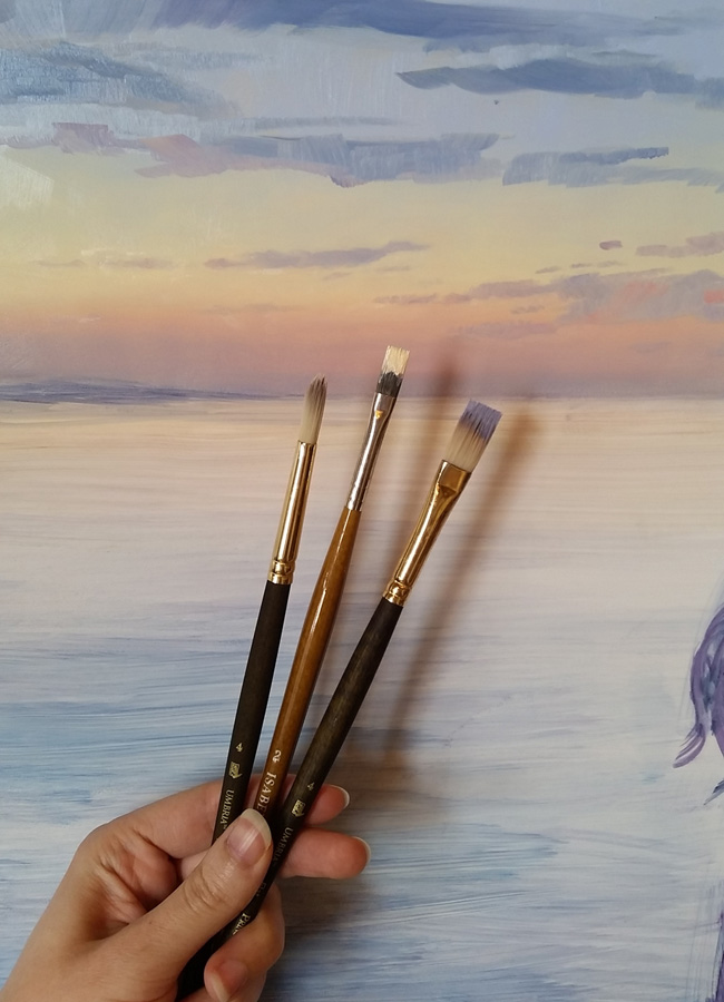
Here are the brushes I’m using for the clouds. One flat for the darker color, one for lighter, and a round with nothing on it just for blending. I really like Isabey and Princeton Umbra brushes, both synthetic, because they stand up to being a bit mistreated without losing their shape too quickly.
Here’s the sky all roughed in. At this point I’m losing the light and stopped for the night.
The following morning I started out with the dark shoreline in the distance. This painting is as much about Lake Superior as my mom. You can see the lake from almost anywhere in my hometown of Duluth, MN, and its constant presence deeply affected my soul growing up. It’s really important to me to capture this moment, the silvery calm of a summer twilight, after the sun has dipped past the horizon and the temperature drops. This lake is cold, and isn’t riotously full of life the way the ocean is. There’s plenty of fish deeper down, and some slimy green stuff that grows on the rocks of its shores, but for the most part you don’t see much of the animal life that calls the lake home, despite the water being clear down to more than 20 feet on calm days. It takes a tough fish to live in that lake, just as it takes a special kind of person to live that far north where winter is extreme.
After blocking in the distant shore, mostly with Indanthrene Blue, I filled in the rest of the field of water using the same palette as the sky, only with a bit of Indanthrene Blue mixed into all the blues. Indanthrene has a touch of green to it and works perfectly here for the slight temperature difference between the water and sky. I want to get the paint covering the whole water area so that I’ll be able to blend a lot.
Along the bottom edge of the piece the water gets these beautiful dark ripples, which I paint in using Indanthrene Blue, allowing the paint to mix on the board.
Here at the brushes I’m using for the water: a round for lighter color, another for darker color, and a flat for blending. It’s so fun putting these dark ripples in, as they complete the value range I’d planned for the background.

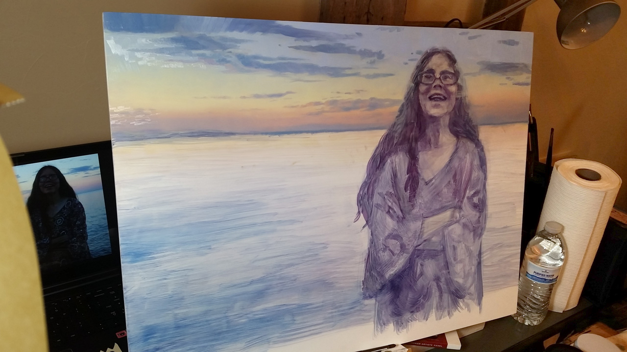
And here’s the background finished! I don’t always paint the background first, but knowing this one would require a lot of big gradients and blending I didn’t want to have to worry about going over the edges of a finished figure and then having to fix it.

The next day it’s time to get into the figure! I start with the darkest darks. This is going back to my mixture of Idanthrene Blue, Quinacridone Magenta, and Indian Yellow to make a chromatic black.
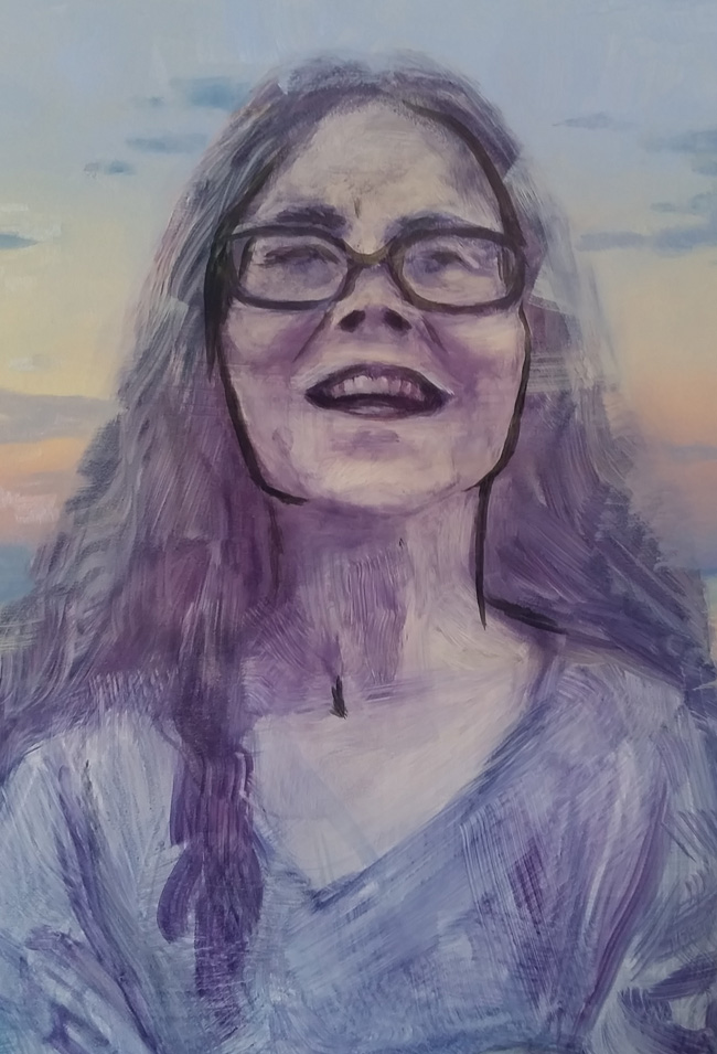
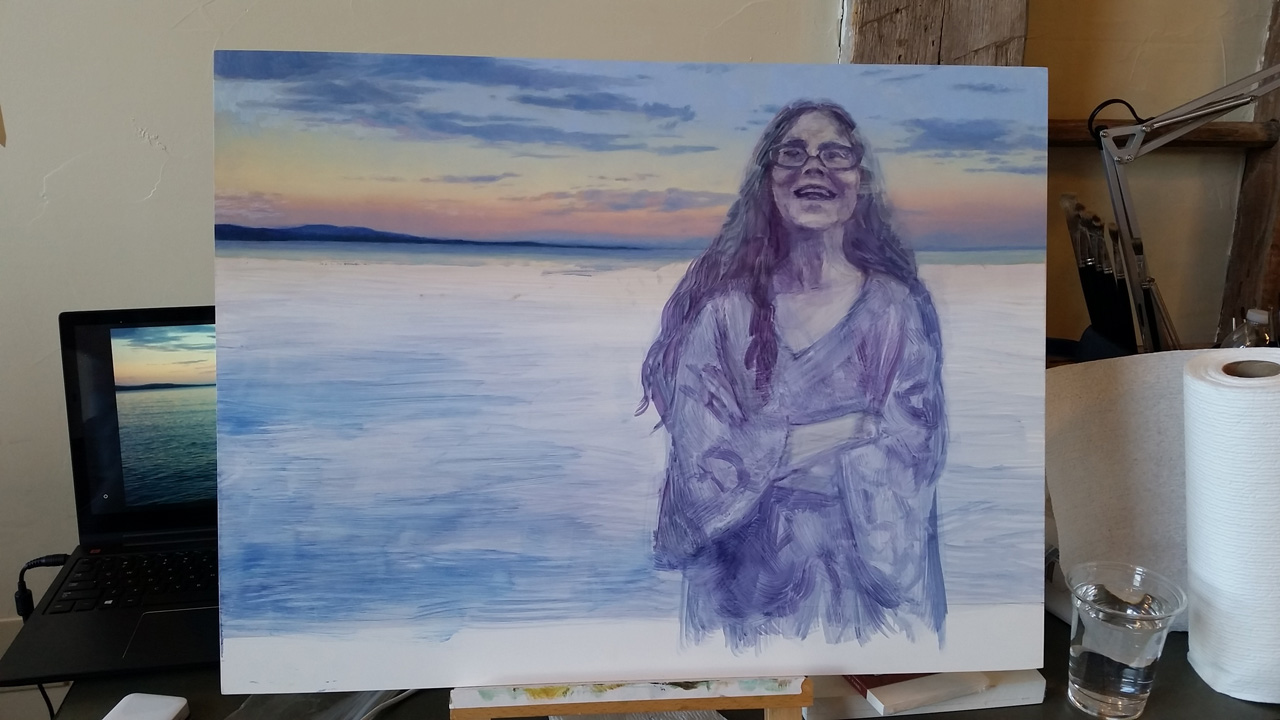
Then I start blocking in the face, paying attention to the temperature zones of the forehead, upper cheeks and nose, and then lower cheek and jawline, and down into the neck. The lighting at twilight is very cool and diffuse from above, with the sky acting as a giant reflector for the sun’s light after the sun has set.
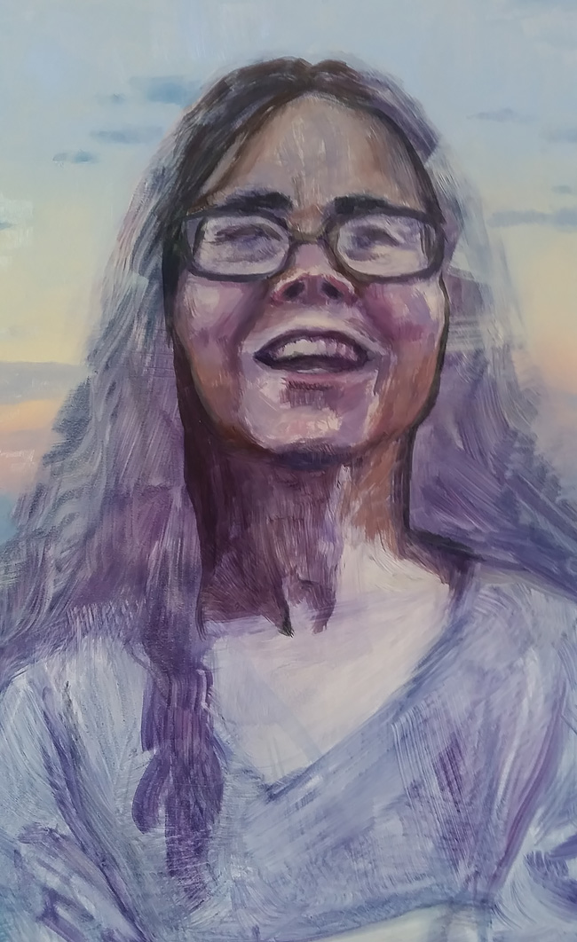
Then I block in the hair, which in this light is a big very dark mass! There are a few brighter areas toward the ends. Like mine, my mom’s hair gets lighter at the ends from sun exposure in the summer.

Also like mine, Mom’s got these glittery silver hairs sprinkled around, which I scraped into the wet paint with the back end of my paintbrush. This was one of the most fun moments in the whole process, it worked perfectly and made all the hair, which is painted very roughly, look super detailed.

A second pass on the face, wet into wet, strengthening the reds in her cheeks and nose and oranges of the jaw and neck, and getting the reflections into her glasses lenses. I’m starting to feel a little freaked out by her face, out of the corner of my eye it almost feels like it’s moving. Like any moment she’s going to laugh so hard her whole face turns red, or like she’s going to go off to the kitchen to make my baby brother a snack.
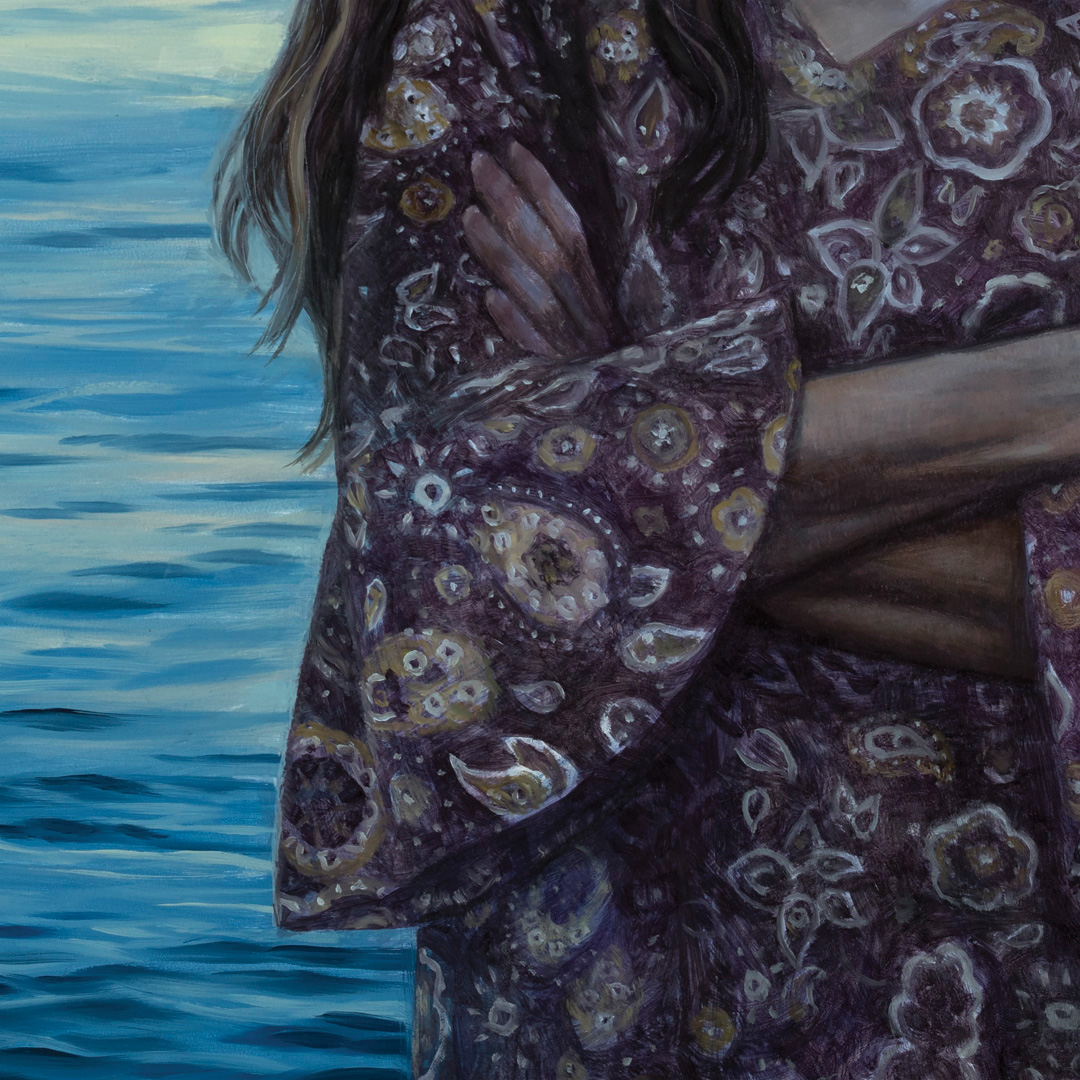
Then a third pass on the face, really focusing on the forms and blending, and another pass on the neck and chest. I also block in her top, using the blue-magenta-yellow mix but leaning it more purple. She’s a big fan of paisley, which is going to be another challenge. I’m careful to set up the values of the drapery now, before I start in with the details of the pattern.
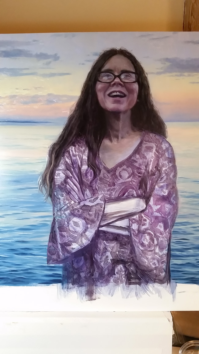
The arms and hand went in in one pass, and then I start filling in the patterning. This is close to finish but this one area is going to be time consuming. My brain switches to a very calm zen-like mode for this type of repetitive work, it’s very satisfying.
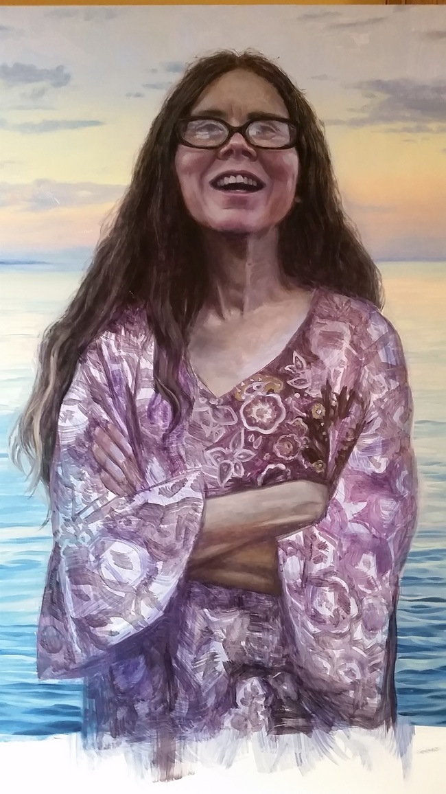
Paisley paisley paisley
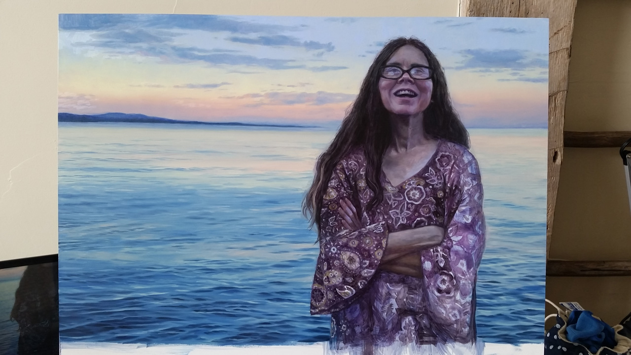
I didn’t get all the paisley in by the final day of the retreat, but finished it up as soon as I got back home. This was painted in April, and in July that year I went on a road trip the north way around the Great Lakes, through Canada, and brought it to her. The border agent when we crossed back into the US was momentarily suspicious that I had something of value in the back seat, seeing the frame and the back of the painting, but when he asked what it was and I said it was a portrait of my mother I made for her, he seemed to decide it was worthless and let me go without looking at it, haha.
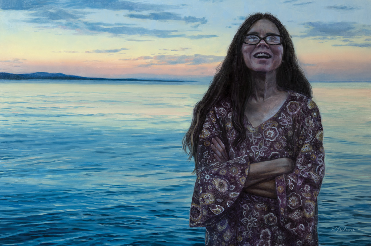
Mom hung it up in the living room of her house, where she tells funny stories and brings my baby brother snacks and hangs out with her dog and cat and husband and laughs every day.


Superb article, thanks for sharing!
Really like the combination of technical insight as well as the motivations and anecdotes behind this piece. The soft ambient light of evening, with the figure being relatively dark in the twilight reminds of the excellent paintings of Jeremy Lipking. The result is a stunning portrait, different to what one would usually associate with the genre.
Thank you! Jeremy Lipking is amazing, there’s definitely an inspiration at work here 😊
Great painting, great mom, and nice choice of light.
Thank you! She is a pretty great mom!
Love the step by step and hearing your thoughts on colors and mixing. Also, beautiful painting, Cheers!
Thank you! I had a lovely time working on it and my mom loves it 😀