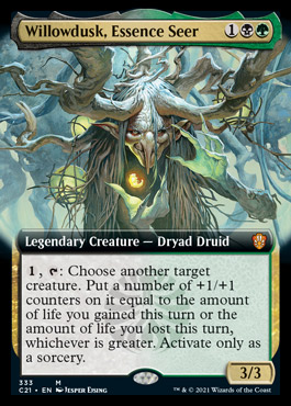
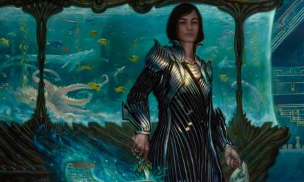
 The newest Magic the Gathering set is called Strixhaven. It takes place in a school for magicians and they have different class factions and different types of magic for each academy. Its a heavily Harry Potter inspired universe, and I simply love it. The tone of the set is very playful and sometimes silly. It has the right combination of fun and flashy magic and colors and creatures to match what I think is likeable in fantasy.
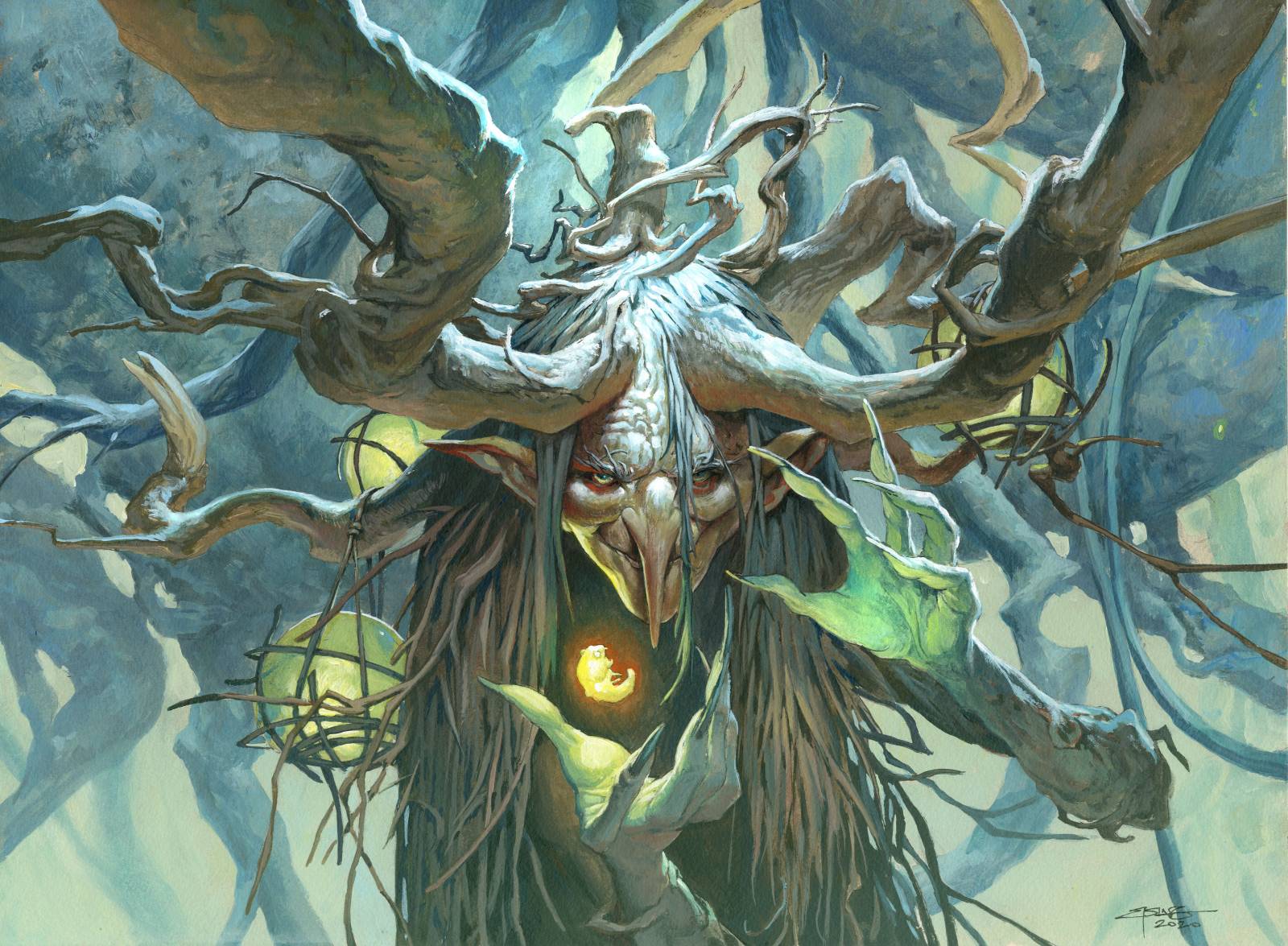
I was asked by Ovidio Cartagena, my art director, to paint one of the Commanders for this specific set. And I was butterflying away in my stomach right away. Playing commander is a huge hobby of mine and being able to paint one of the official ones ( and play with my “own” commander) is a special treat. The assignment asked was an old Dryad. She is the teacher of the class dealing in life and death. In growth and resurrection. She holds the secret to give and take life.
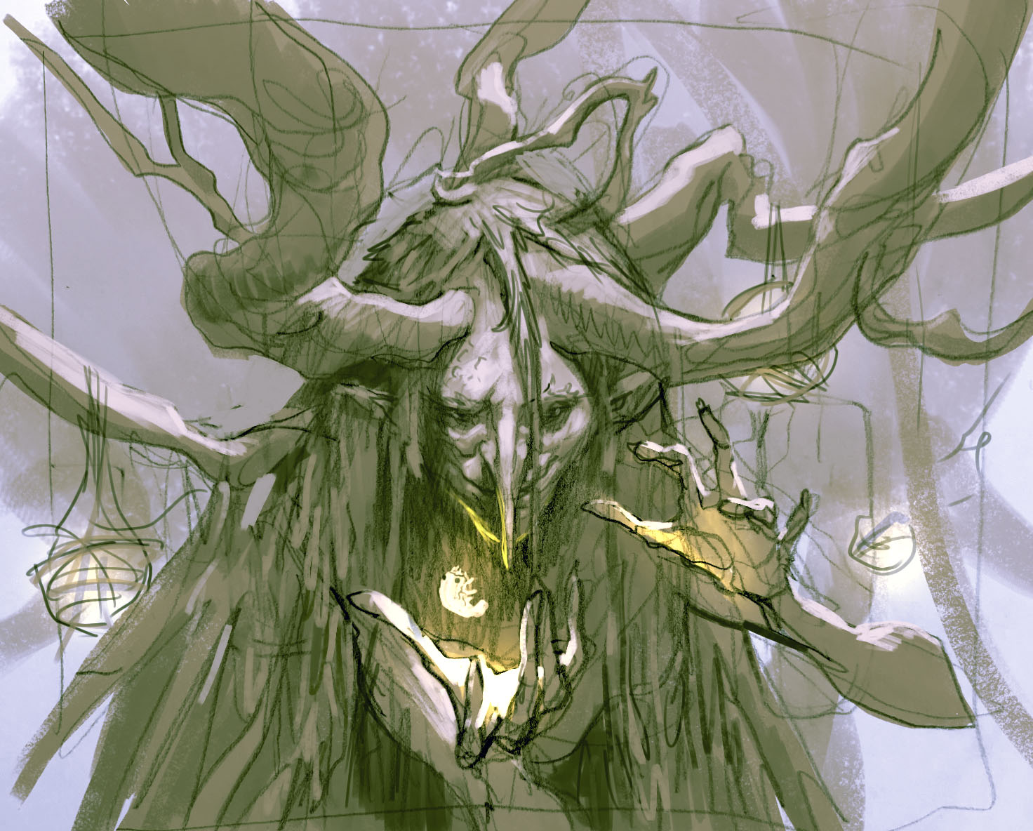
My thoughts was centered around how I could make it look like she was able to raise dead creatures but not in an evil way,. Its not necromancy. She just don’t see a death as nothing but energy going in and out of creatures. Sometimes you take it cos you need it for something else, and sometimes you give a little of it, to enhance a certain pet or friend. In the style guide the mages was keeping small worm or beetle like creatures called pests and I thought that she could be manipulating one of those to show that. I would rather have her doing a physical kind of magic rather than glowy ethereal trails of magic, because that kind of stuff is just super hard to do in acrylics and never works out well for me. I submitted 4 sketches and Ovidio gave me greenlight to #3. I kind of liked #1 for the centered portrait angle and the fact that she was holding the pest forth with a foreshortening. It gives a better 3d effect. I liked #2 because of the way that magic is portraited as a glowing bobble of ectoplasm but the side view is not great for a portrait. The #4 was just too human looking and didn’t show any magic. My #3 was a little glowing egg that I imagine she had just pulled out of the pest, as if its the tiny lifeforce she took away from it. I originally wanted slimy lines going into its stomach but decided against it because it would be too grimy. I started the painting in black and white on a board and right before I was about to start adding colors, my glass of doubt ran over. 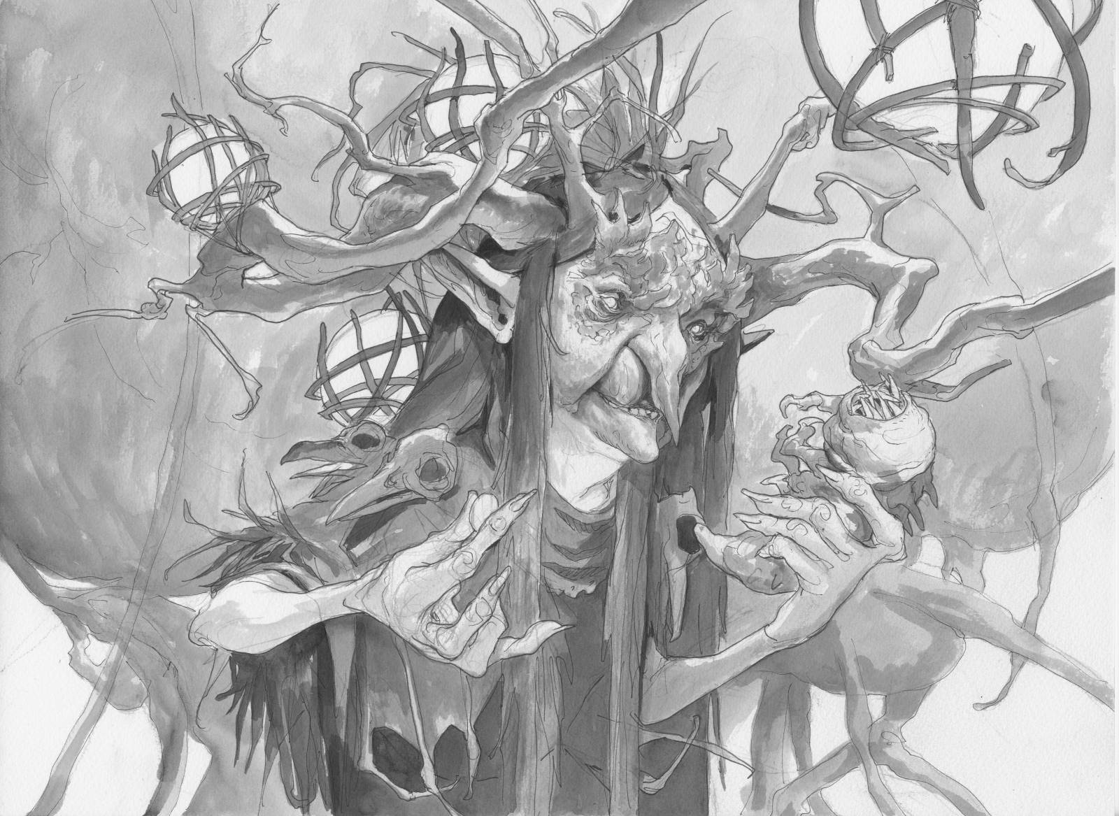 “This was not the image you had in your head from the beginning”, my inner voice warned me. The first day I got the assignment I was doodling away at home in a sketchbook and made a very rough composition of my foist idea. It had kept lingering in my head, but I hadn’t taken it further: Now that I was about to start the final painting that first image kept pushing forth in my mind as being better. So I went home and got the sketchbook out and snapped a photo and went back to the studio: I quickly added some values digitally and send a pleading mail to Ovidio asking if he would reconsider my already approved sketch and perhaps let me go with this new one instead? He trusted me and gave me the go. I am so grateful to have the guts to listen to my gut feeling. this painting came out as one of my strongest magic compositions ever and ended up with the exact gaze that i had in mind from the beginning.

sketchbook sketch
 The choices of colors was kept simple. I tried a simplified palette because of the many details in the branches and fingers and lamps and all that. I needed a unified color theme that would center around blue and green: Most of the light was kept cold and I used a bunch of hansa yellow to add the cool light from the back ground and the lanterns: So they would not take attention away from the glow worm. The light around the magical hovering little worm, was done with a very warm orange. I framed it with the darkest area to make it seem like it was emancipating light the clearest: the orange ( and most warm color in the painting ) enhance the effect of radiating warmth. And it acts as a bounce light source for all the areas pointing downwards like the branch-antlers chin and nose. Compositionally everything points in towards the face. The hands almost frames the face and the body is deliberately kept almost to a trunk in order to not take away the attention. I think the key to making a clear image is often in its ability to stand simple and with as few strong notes as possible. Often that means you got to remove a lot of noise, like extra color, details in the background and so on.
The first magic cards I did 15 years ago all had a very simple background, sometimes even a flat color. back then I did that to make sure my figures would stand out and because I was afraid of not being able to do it right if it had too much details: this image is more or less back to those original Lorwyn pieces. with a simple background color and a main figure with a clear silhouette. Perhaps its also why I feel this image is speaking to me. Its like I was back where I started.
Beautiful work, Jesper.
I always love reading your posts, thanks for sharing your process!
One of your coolest pieces to date! Amazing work.
I think starting over was a very good call because this is one of the best pieces of MtG art I’ve ever seen!