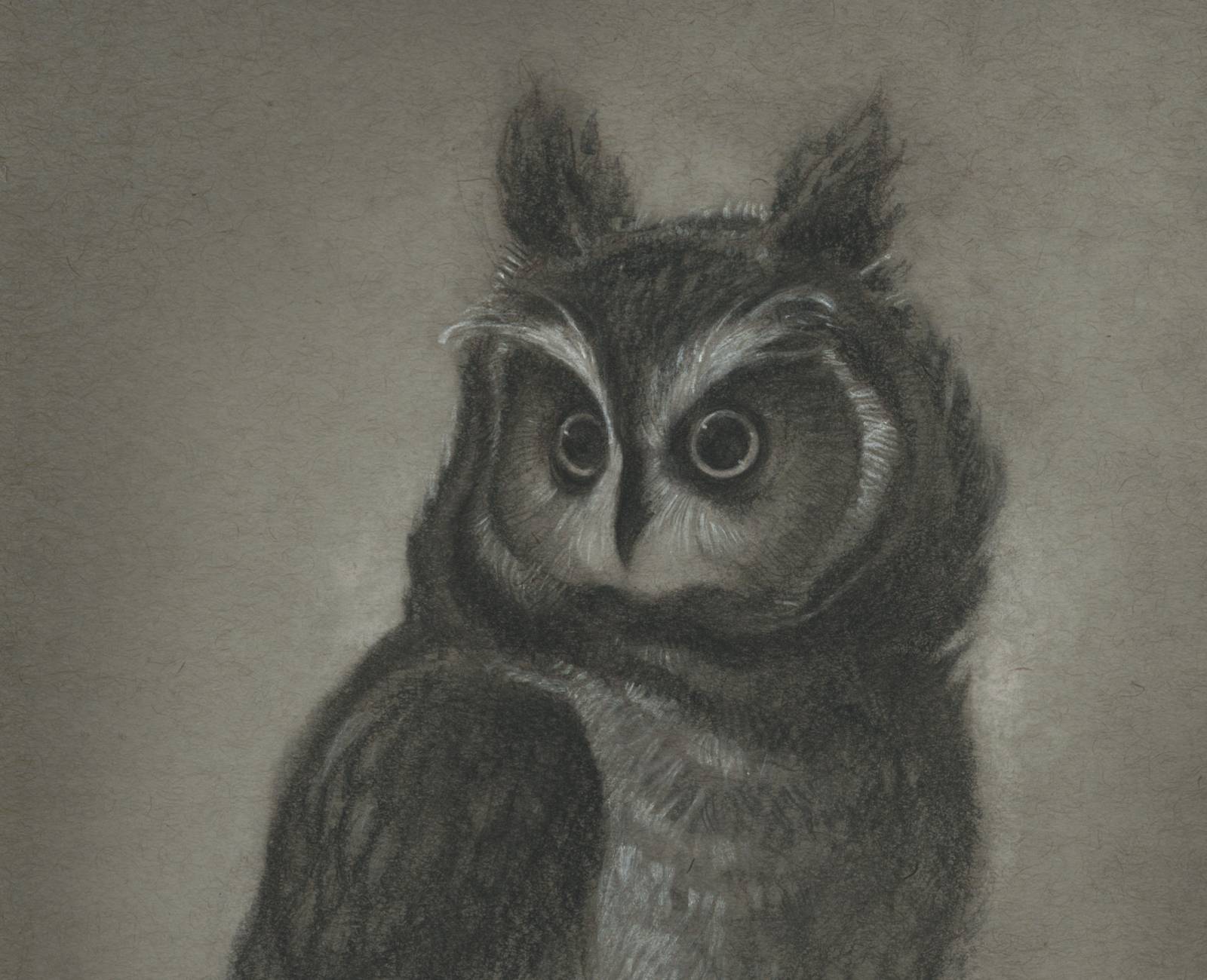
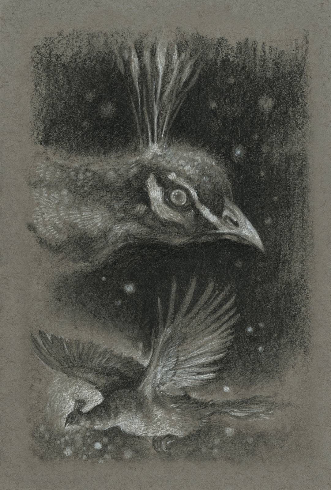
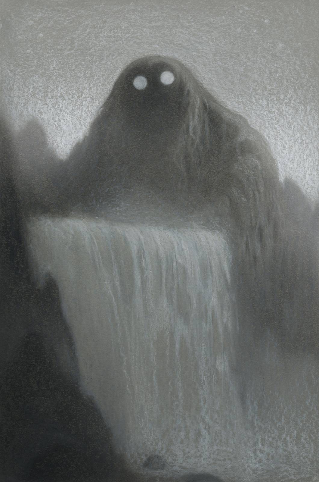
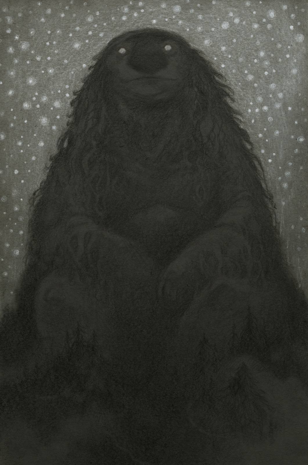
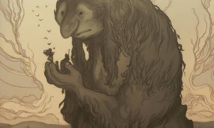
Over the years I’ve arrived at some of my favorite personal pieces while working with toned paper and white charcoal.
Even though I’ve produced an annual sketchbook since 2008, I’ve only really been experimenting with toned paper and white charcoal for the last five years or so, since my 2015 collection, Wanderings.
I wish I’d stumbled into it sooner; I’ve come to really enjoy the process and the unique feel each piece lends to a sketchbook.

Whether simply a study or a finished piece in it’s own right, a toned paper drawing has a lot to give to any project.
Visually, it can add a lot to the flow of a sketchbook beyond drawings on lighter paper. What I’ve found is that it can add emphasis to a particular moment in a series and encourage the reader to pause after pages of scribbles or sketches. As studies they can carry a little more weight than a regular sketch.
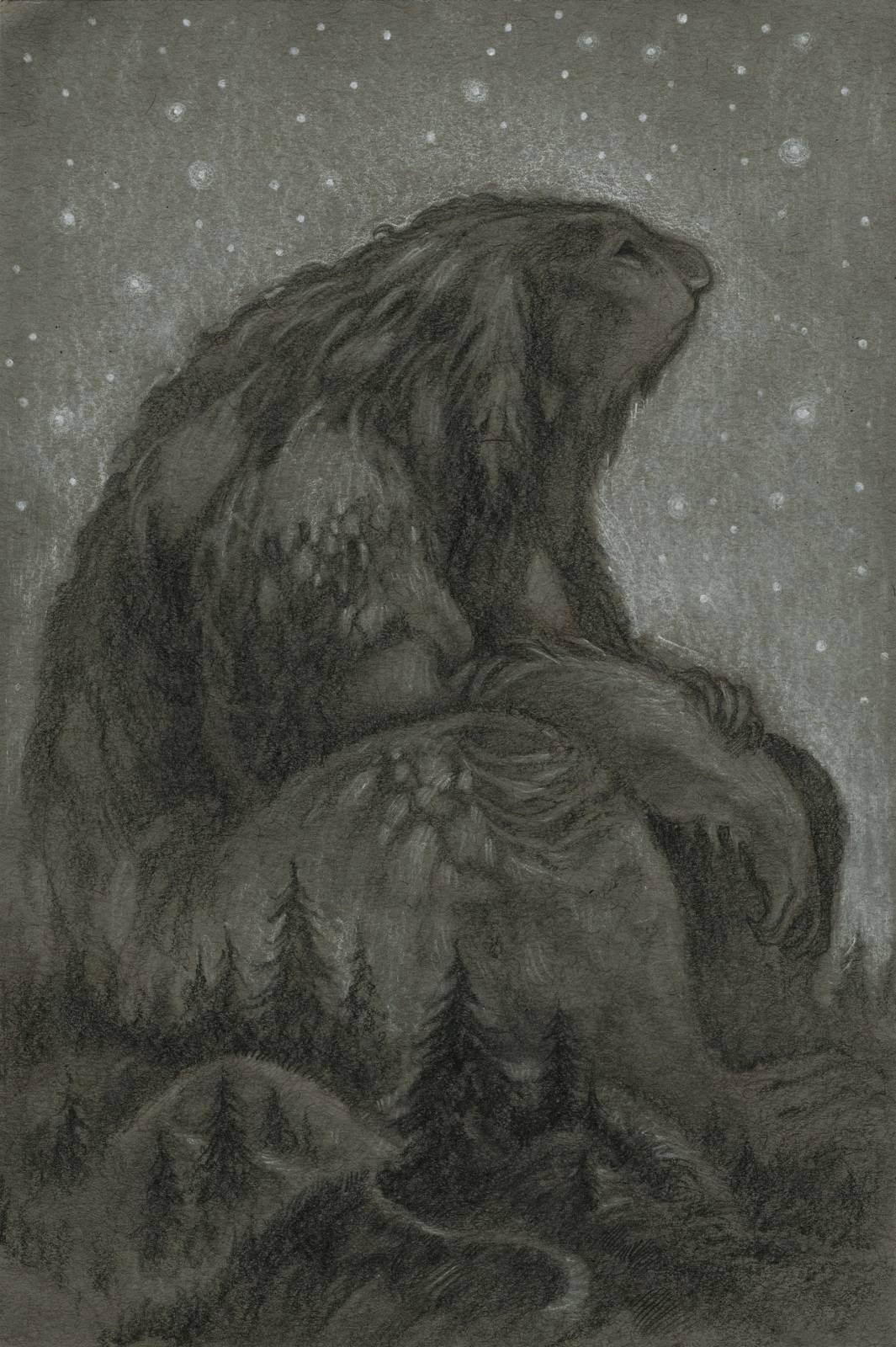

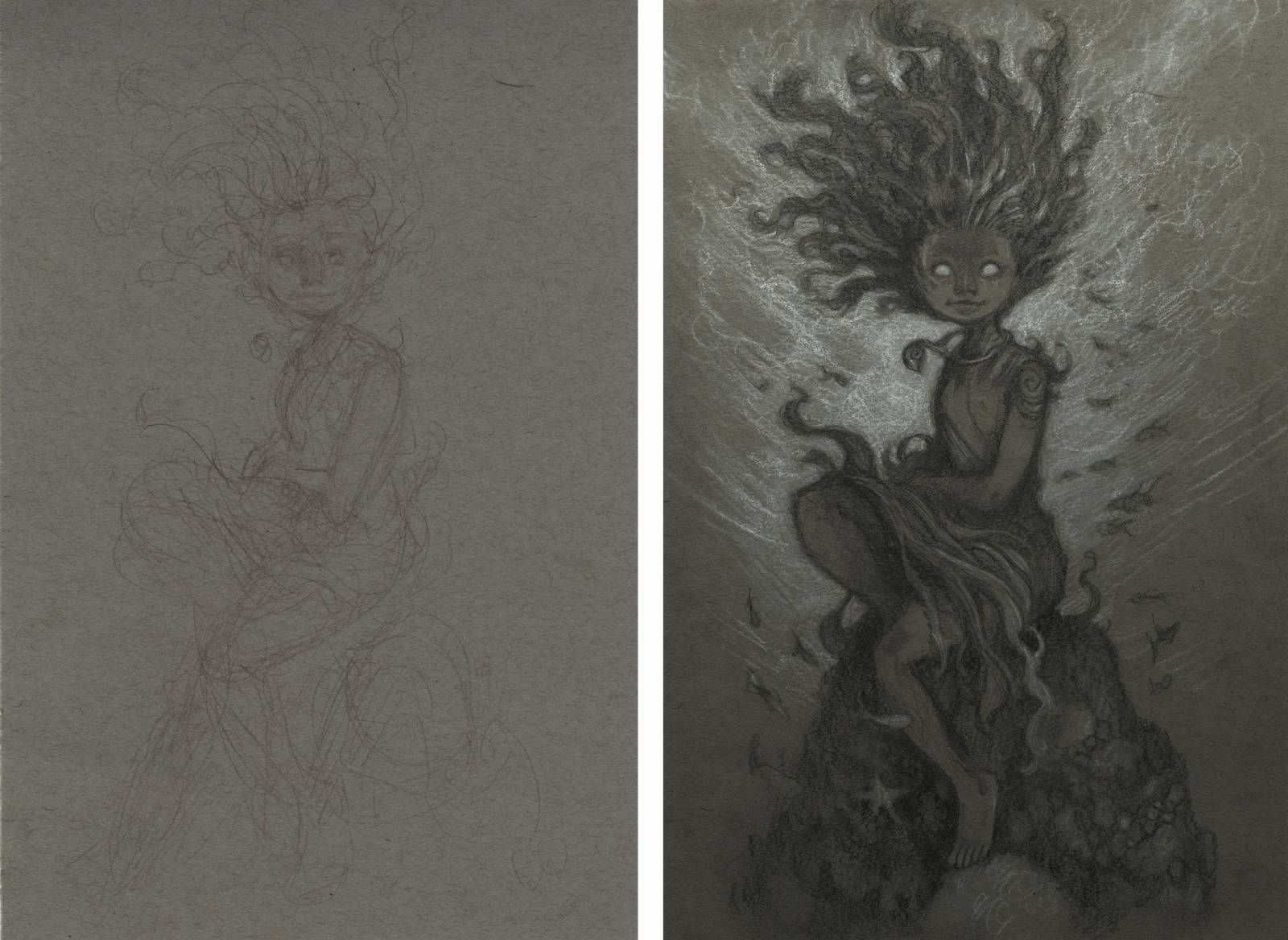
In the context of a larger collection or on it’s own, the way the pencil and charcoal can play on the paper never fails to delight me. I’m not sure exactly what it is but I think it’s the immediate access to values; the whole endeavor is a little more direct. Plus, how that white charcoal sings when it hits the paper.
And so for each sketchbook, 2015 and onward, I’ve included a number of toned paper drawings. My collection last year being no exception, of course.

What I’ve found while exploring this alternative method of drawing is that it’s a great way to ease into a new project. The way I plan my annual sketchbooks I’ve usually got each main piece thumbnailed and figured out well in advance. I like to explore the relationships between each of the larger pieces in the collection ahead of time but toned paper drawings offer me a greater degree of flexibility since you can arrive at something which feels finished a bit faster.
Time feels less precious with them, if that makes sense.
The last couple sketchbooks I’ve actually begun with some toned paper drawings, once I have the series mostly planned out, to help me move forward. As it’s not something I do for client work it’s become a handy mental switch to let me detach and inhabit whatever world is this year’s sketchbook.
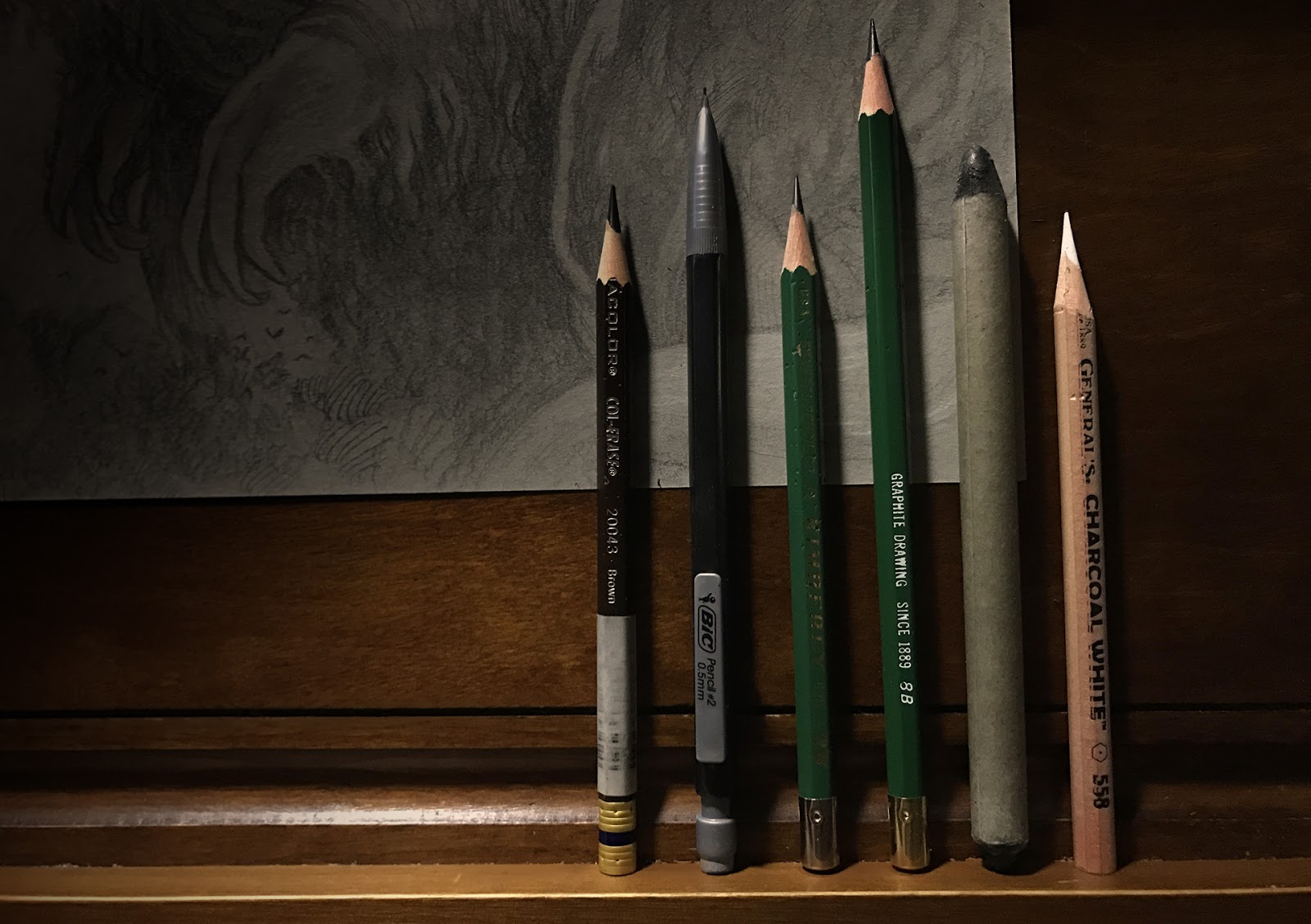
If you’ve never given toned paper and white charcoal a whirl I’d say you should! It’s a relatively low cost, low barrier entry point and you can arrive at some nice pieces in pretty quick order. The materials list is nice and simple. Low stakes entry point, well worth experimenting.
Whether you treat them as studies or finished work the experience is rewarding and enjoyable.
These are fascinating! i’m mesmerized by the subtle textures!! is there by any chance a hint of blue in the troll waterfall piece? Now I feel like digging up some toned paper and giving it a try.
Thank you for sharing your beautiful work!
Wonderful work, Cory. You put the medium to good use to bring out a mystical, other-worldly feeling in these pieces. I see what you mean about the difference between this and even a fairly finished sketch. Thanks for the post.