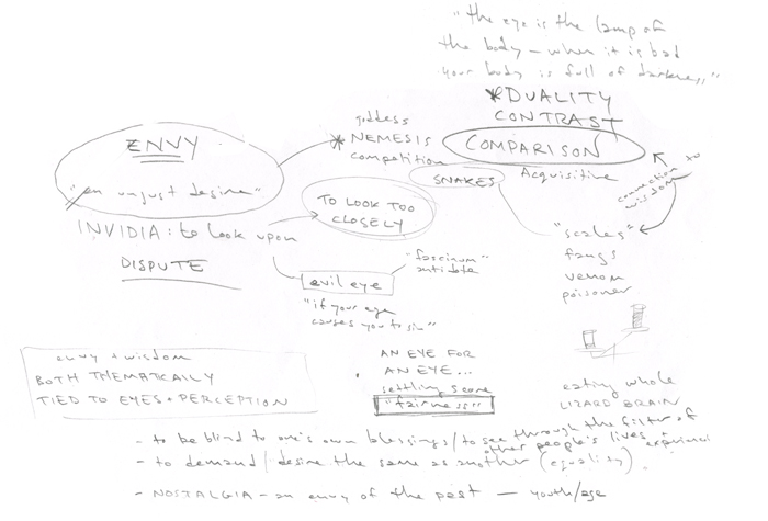
The prevailing wisdom is that a painting starts with a sketch. My own methods are a little less direct; usually the beginning of one of my paintings looks something like this:
I’ve found this sort of written concept exploration is damn near essential to making a good painting – first and foremost because it helps me avoid making the kind of rote images (“girl standing badassedly with sword; flames optional”) with which the fantasy art world is already well-supplied.
More surprisingly, it does quite a bit of the heavy lifting for a painting. It’s a lot easier to get away with a bit of broken anatomy or an imperfect inkwash if your image is ABOUT something – keeping the eye and mind of the viewer too busy to dwell on the way you drew an arm in the wrong place (and seriously, who among us couldn’t use a break from all that technical pedantry once in a while?)
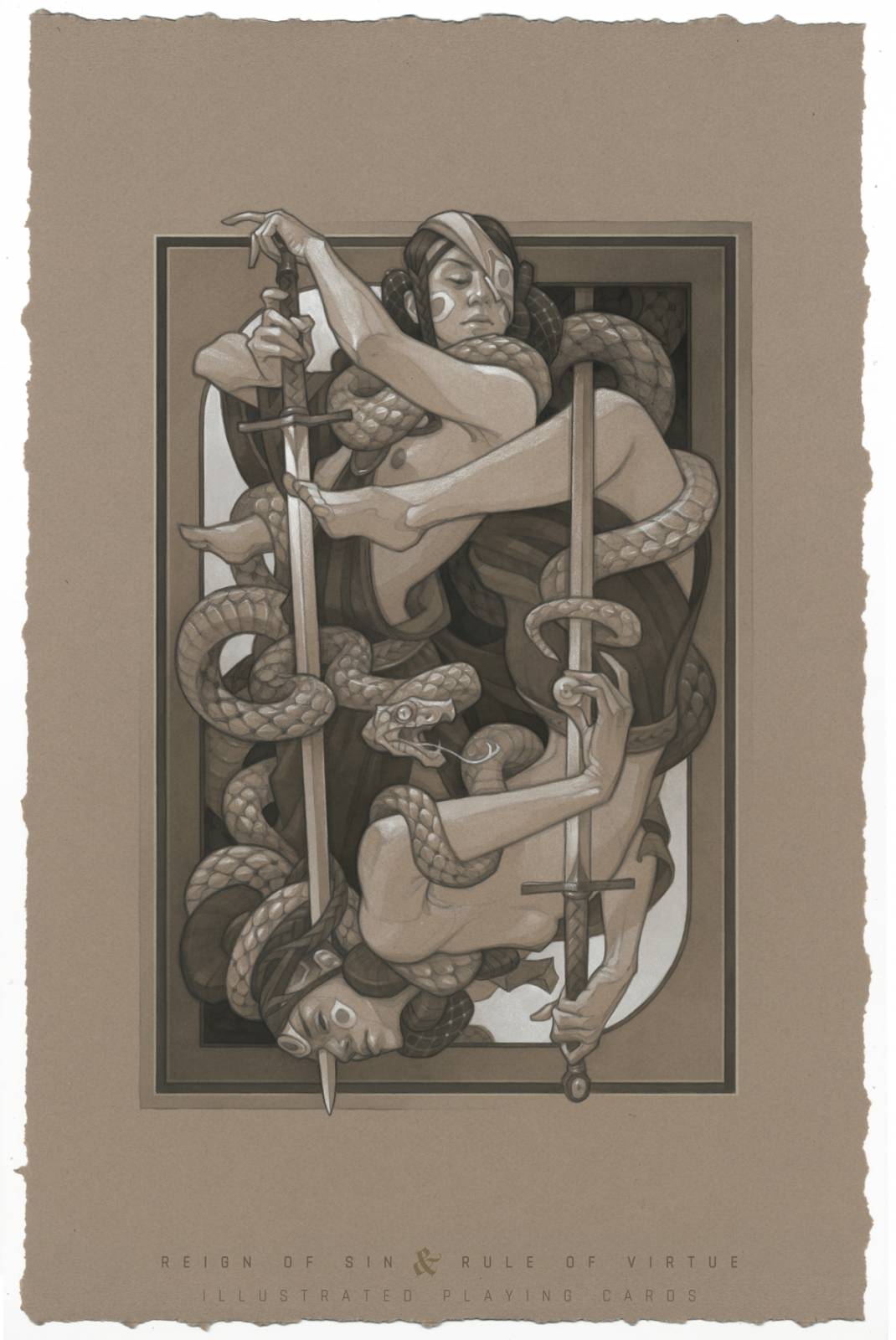
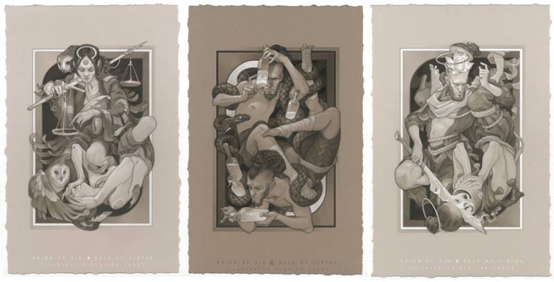
For this article, I’ll be showing some of the lead-up to the sketch for one of my illustrations, the Queen of Hearts (Envy) for my ongoing playing card project, Reign of Sin and Rule of Virtue.
To find that conceptual scaffolding for a piece, I usually start with some online research — Wikipedia is my go-to, especially for big universal concepts (like Envy) that have their tentacles in all sorts of history, culture, and religion. I follow the links and subsections wherever they take me, jotting down any words or images that feel important or interesting along the way. For my Envy concept, a couple of tidbits that just felt “right” were the Latin definition of Invidia (“to look upon in a hostile manner”) and the concept of the Evil Eye – the belief that an envious gaze contains magic to harm the object of its attention.
I loved this idea so much that I didn’t follow too many side paths in my Envy research; I was already feeling so many great possibilities with the eye motif that I had the luxury of being a bit lazy.
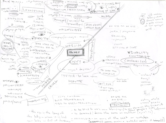
I don’t always get so lucky, of course – most concepts don’t come with a conveniently pre-packaged visual motif. Envy’s sister suit from the light deck, Wisdom, required a lot more fumbling in the dark to find the right imagery. In these trickier cases I usually find myself playing random word association games, going down rabbit holes of internet research, and staring into space a lot before my abstract concepts begin to gel into the right visuals for the job. The result is a much more chaotic idea map:
Since I was developing the Wisdom and Envy concepts simultaneously, I took special note of any parallels in themes and visual motifs that occurred to me (for example, I realized that scales could represent both the objective judgement of Wisdom and the the petty comparisons of Envy; an eye could represent Wisdom’s unclouded sight as well as Envy’s covetous gaze.
You can probably spot some of the ways these concepts were incorporated into the other cards from the Envy/Wisdom suits:
Finding a way to weave my hazy visual concepts into a composition – especially one confined by the rigid playing card layout I’m working with on this project – is probably the hardest part of the whole process. I try to simplify things by distilling my scattered notes down further into a few words that sum up the specific theme or action I’m trying to portray;
The resulting “sketch,” if you can call it that (above) is about as bare bones as it gets, but once I have those stick figures down on the page, I usually congratulate myself on a job well done and clock out for the day… or the week, depending on how much I’ve depleted my creative reserves to get to this point.
When I eventually return to my studio, I have to tackle the problem of turning those awkward stick figures into something a little more compelling…
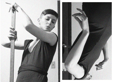
Photos of dancers have been a great source of pose inspiration for my playing card pieces; looking at out-there poses encourages me to think outside the box with how I’m arranging my characters in the composition. They’re also very good at conveying emotion through body language: I like the confidence of the dancer’s pose in the upper right photo for the upright character; the deep backbend in the center photo is very much in line with the mood – vulnerable, overthrown – that I want for the reversed character.
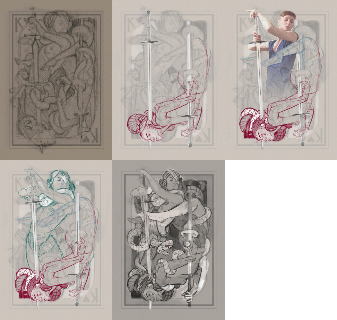
With a clearer picture of my goals for the image, I start a new sketch (above) incorporating the visual cues I’ve gathered from my reference hunt.
While it’s a lot cleaner than what I started with, there’s still a long way to go – but most of my changes from this point forward are, in the grand scheme of things, pretty minor. I’ll usually take a few reference photos of my own to help refine the poses further…
…and do a great deal of cutting, pasting, and rearranging before I arrive at the tight sketch I’ll be using as the basis for the finished image. As much as I love working in traditional media, this is almost always a phase where I switch to Photoshop to allow for maximum flexibility in tweaking the sketch… and also to preserve my sanity through a thousand rounds of tiny revisions.
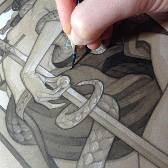
From here on out, all I have to do is paint the damn thing! This is child’s play by comparison, and can usually be outsourced to my harem of unpaid interns, the overseas factory of my choosing, or a clever dog with paintbrushes taped to its feet.





Great conclusion 🙂 And very interesting post. The work before the painting is quite frightening here.
On the plus side, it really does make the actual painting part feel like a vacation 🙂
Really great insights into your process, thankyou! 😀
I’ve been really enjoying your posts on playing card art. It’s been quite helpful to me while I’ve been developing my own playing card art. Looking forward to more posts and card sets from you.
Thank you! Playing card art is such a different animal from all the other types of images I’ve done — taking on a multi-deck project for the current one (something like 40 illustrations in total, I think?) has really driven home how the limitations of the format shape the artwork. Only 3 cards left to go before I can finally launch the Kickstarter, though!!
It is a tricky format to mess with. Lots of decisions involved with each card depiction all the while trying to keep it all cohesive. I’m looking forward to your next card set. I backed your Wicked Kingdom project awhile back and will definitely back your next one when it’s ready. I look forward to your next article 🙂
That is a wonderful breakdown of your method, Wylie. I’ve used something similar- making an idea/theme map- for environment design projects in animation. I was first exposed to it in a book on Maurice Noble, the legendary production designer for Looney Tunes cartoons. He’d take the script for a Roadrunner short or something like that, and start by writing down all the ideas at play before any drawing or painting even began. His notes looked a lot like yours. beautiful images and compositions, too!
This is one fantastic article! Thanks for sharing your process.
At times I also start a piece completely different to the methods used by most. It can be a single term, like ‘Envy’ you used here, daydreaming up a short story (it doesn’t have to be Pulitzer material) or something as mundane as … having an empty picture frame and letting inspiration come from it.
Thanks again!
This was very exciting and insightful to read. Thank you, Wylie, I’m a huge fan of your work and I love seeing your process, since visual storytelling is the most frightening thing about illustration to me personally, probably because it’s a mashup of so much technical (design, perspective, composition) and personal elements. I will definitely try to research the concept before the thumbnailing phase in the future.