Here’s some new personal work: a mock book cover illustration for a recent favorite, Piranesi by Susanna Clarke.
The story centers on a nameless man we know only as Piranesi — trapped within an infinite labyrinth full of changing tides, shifting weather patterns, birds, and statuary (a place he refers to interchangeably as “the house” and “the world”), he has no apparent knowledge of how he came to be there, or any concept that anything — or anyone — else exists outside of it.
My work tends to be narrative and/or character-based, but I felt like I’d be doing this book a disservice if I tried to approach it from either of these directions. It has such a unique, specific mood; the story is told completely through the eyes of Piranesi himself, who is immersed in such symbiosis with his environment that depicting him visually would have just felt wrong.

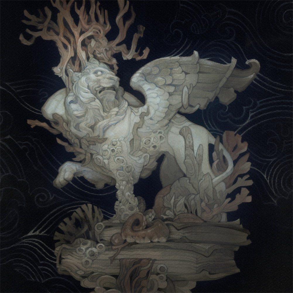
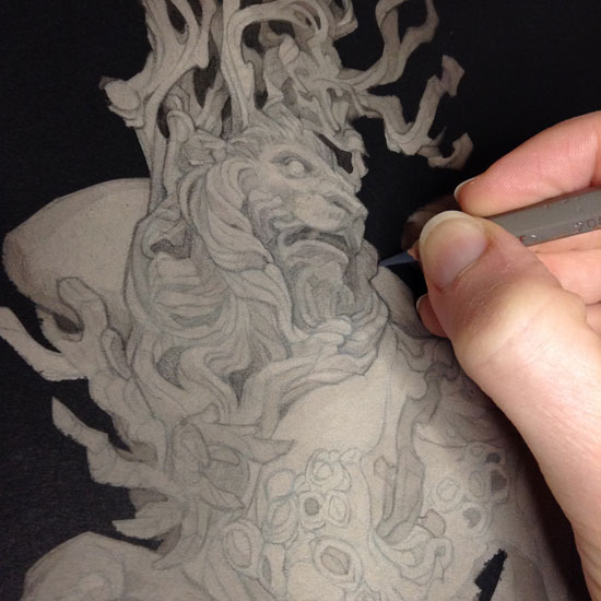
Instead, I opted for the sketch above, centering on one of the drowned statues (“a Lion enmeshed in a cage of coral”) that felt symbolically appropriate. Like the statue, Piranesi is both trapped and transformed by the influence of the natural world around him. Over the course of my research and reference-seeking, I learned that a winged lion is the symbol of Saint Mark, patron saint of prisoners — a connection too good to pass up.
For this piece, I wanted to audition a new tool: airbrush! When trying a brand new technique, I don’t like to risk sinking too much time and energy into a full-size painting that might end up in the trash heap; a tiny “test piece” like the one below is usually a safer means of learning the ropes. 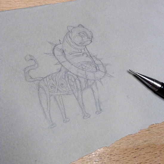
First, a quick pencil sketch, based on a cool artifact off Pinterest.

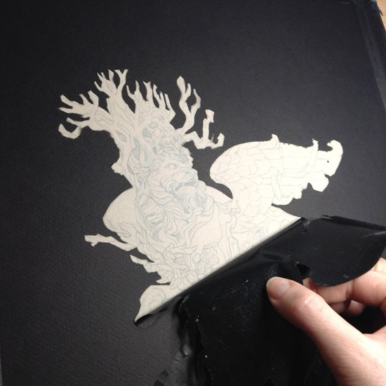
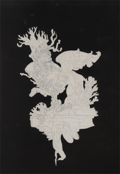
I applied frisket film to the drawing (I used a low-tack film, though it did lift some of the graphite when I peeled it off — something to keep in mind when applying it to more elaborate sketches.)
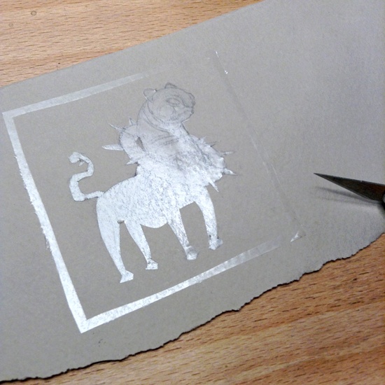
Above, cutting the frisket with an Xacto, then peeling it away. It took a little bit of experimenting to get the right amount of pressure where I was cutting through the film without scratching the paper – with a fresh blade, though, you only need a SUPER light hand.
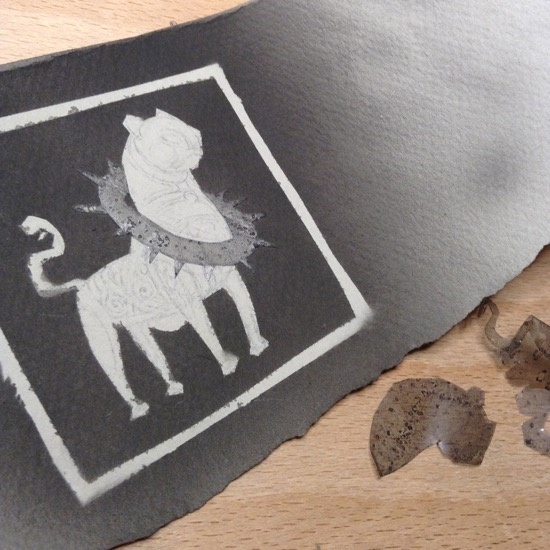
I used the airbrush to spray the black background with a few layers of diluted india ink, then cut away most of the remaining frisket (I wanted the collar to be ink-free, so I left it masked off until the very end).
I can’t say enough good things about the airbrush for this sort of large flat wash. With a brush, it’s one of the slowest, most mind-numbingly boring parts of my process; it takes forever and I never seem to get a smooth enough finish or deep enough value. With an airbrush, it was almost instantaneous (minus the dry time between layers) and the coverage is perfectly even despite my wild lack of skill.
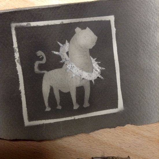
Above, airbrushing more ink (same dilution as I used for the background, but just a single light layer) to the body of the lion. I tried to concentrate the spray a little more strongly near the edges, feet, and under the chin for a soft spotlight effect.
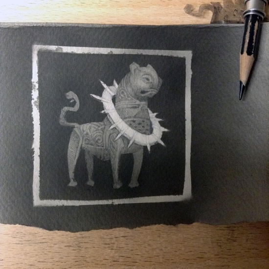
Finally, I peeled off the rest of the frisket, and used black Col-erase pencil for the details…
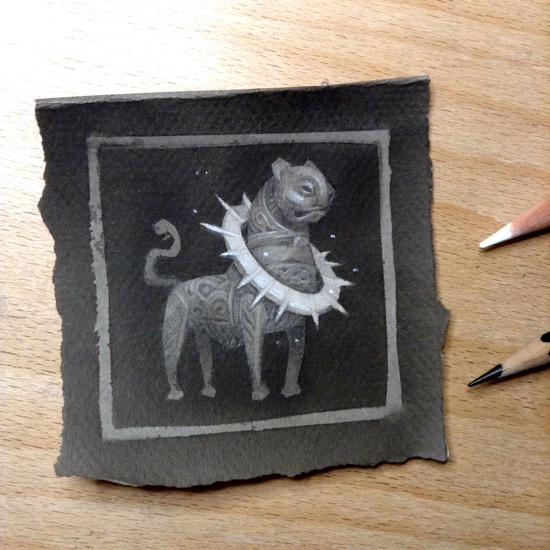
…and added some white charcoal pencil for the little highlights!
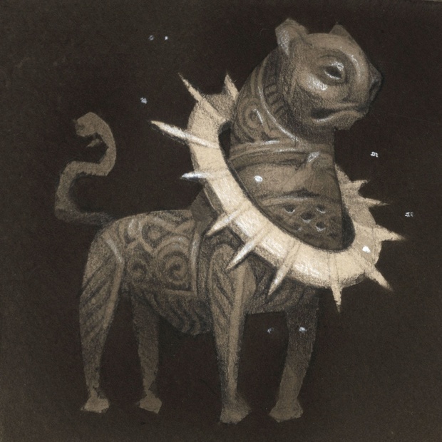
At just a few inches tall, the finished painting hasn’t cost me too much time — but it’s served as a valuable test run for my order of operations, and has given me a bit more confidence with a completely unfamiliar tool.
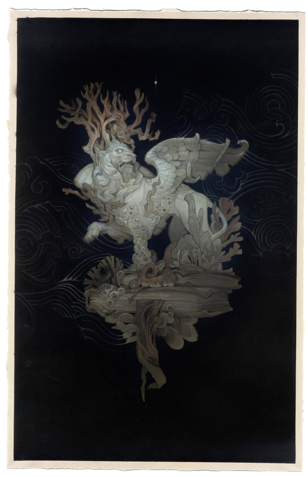
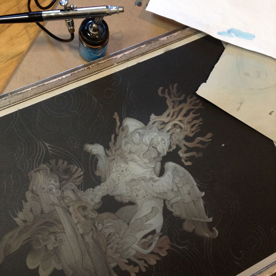
Here’s how this same process translated to a scaled-up piece for my Piranesi illustration:
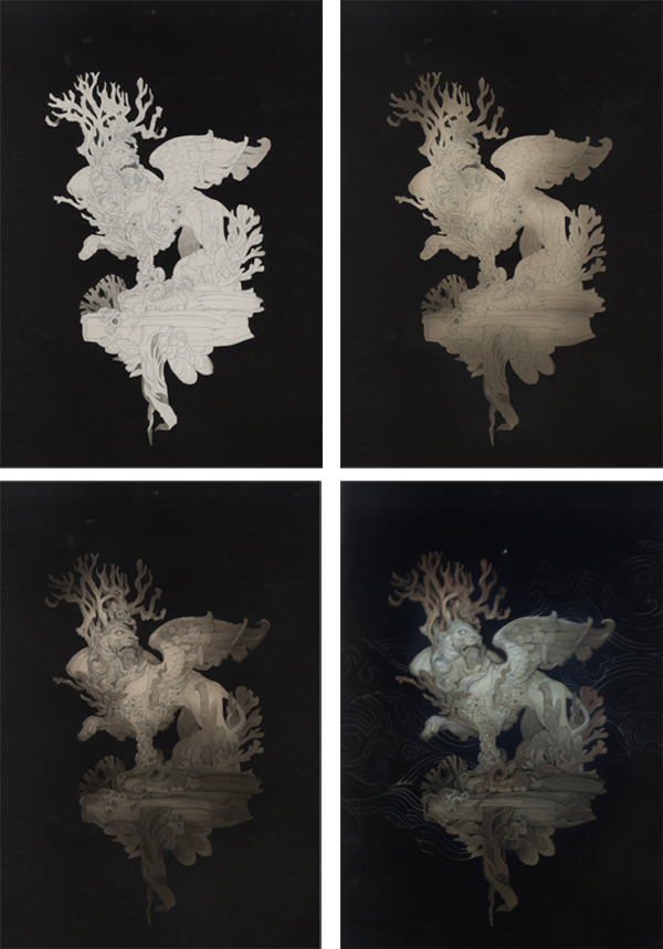
Even though the subject matter is a bit more ambitious, I found myself retracing the steps of my test painting to a large degree. Once again, the usually-interminable black background became the easiest part of the process:
The added complexity of the drawing meant that some details were easier to tackle with a brush and inkwash (below). However, I was impressed with how quickly I was able to build up the overall value structure in airbrush, and found that the soft, hazy transitions it created made a great base. I was able to pick and choose a few areas to get an eye-catching hard-edged treatment, while leaving more of the image than usual murky and indistinct.
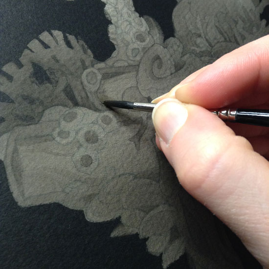
Not TOO murky and indistinct, though. I’m a sucker for pencil lineart, as always.
This piece is only slightly less monochromatic than my test painting: just the slightest temperature shift (a few touches of warm watercolor for the coral) give the image the feeling of being “in color.”

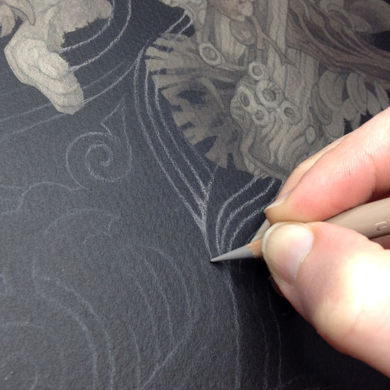
I also discovered the wonders of using colored pencils — in a rainbow of French Grey shades — in lieu of white charcoal for the finishing touches. The lower-contrast shades let me go crazy with detail, without the garish false highlights a misplaced touch of pure white can create.
Airbrush also turned out to be an amazing tool for subtle color adjustments. The slightest overall wash of cyan brought out the cool tones of the marble, and gave the whole thing that mysterious, submerged flavor I was hoping for.
While the final result may not feel TOO different visually from my usual brush-and-inkwash work, the relative speed with which the image came together — even in my utterly inexperienced hands — was a testament to the power of the airbrush. It’s been a long while since I’ve found a process tweak I’ve been this excited for; I’m looking forward to seeing what new art doors will be unlocked by this small addition to my toolbox!
Thank you for this post! I just finished this book and it has been on my mind. What a beautiful set of images.
Beautiful work!!!
I also loved Piranesi, and I think you did an amazing job capturing the mysterious mood of the book!
Very nice work! The addition of an airbrush to your arsenal seems to be working out very well. Thanks for sharing!
This is a beautiful piece Wylie, thank you for sharing your process.
Gorgeous piece, Wylie!
Watching you develop this in class was a treat. I’m glad you an airbrush got on like gangbusters; it really seems like it solved a lot of problems for you.
It was wonderful to discover a new book by Susanna Clarke. It does leave visual impressions of vast empty spaces and drowned statues. I love your illustration. Terrific work.
Piranesi is one of the most unusual and awesome (in the truest sense) books I have ever read. Somehow, your artwork has captured the imagery of the book, yet even surpassed and enhanced the descriptions. Well done, indeed.