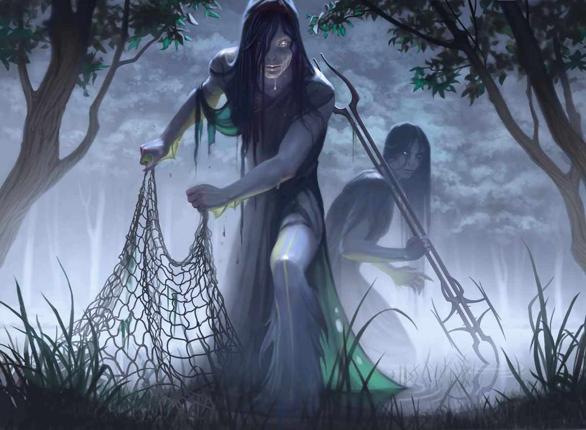
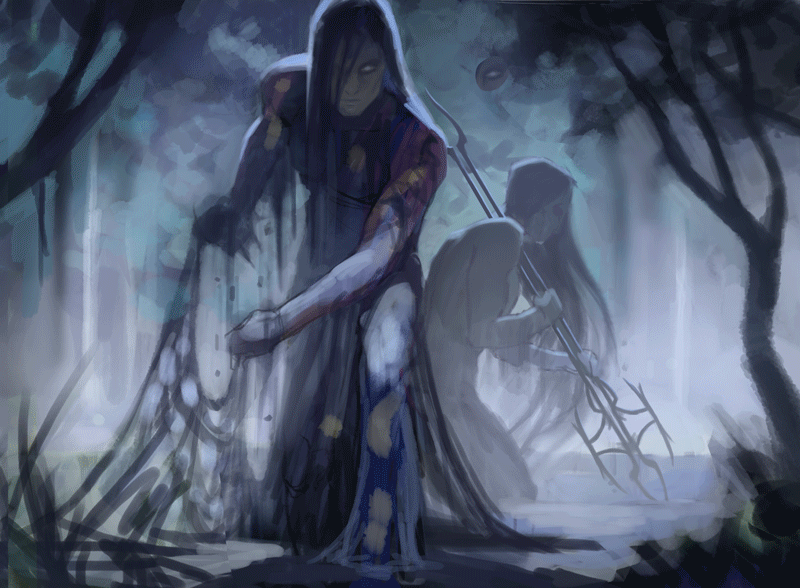
Today I’d like to walk you through the process of creating my first Magic card illustration: Moonlit Scavengers. I got the assignment back in 2018, and I remember being stoked that it was a merfolk creature; it sounded like so much fun to paint! Creepy merfolk rising from a murky lake in a dark forest? Yes please!
After playing around with some options digitally, here are the sketches I submitted. I wasn’t sure about the specific look of the weapon (hence the two very similar top sketches), and also provided another sketch with a fairly similar composition, just a different type of environment.
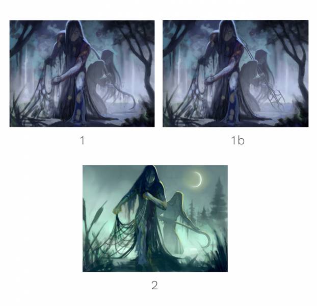
Sketch 1b was selected, probably because the environment matched a Blue card better than a swampy environment (that’s usually reserved for Black cards). Onto the reference!
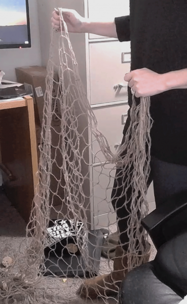
Reference is very important when it comes to making a believable illustration. While I made reference photos for the figures of course, I knew another really important part would be the net. It seems like an object that would be easy to paint without reference, your brain would likely be confident that you already know what a net looks like, and it seems silly to have to look at a photo. This is a common thought process when it comes to other things like leaves, trees, branches, grass, etc. (I catch myself thinking the same thing all the time!). These are objects that we see every day; they seem formless and organic, but they often have a personal shape language if we look closely. When we have reference, it helps us be more observant and true to the individual patterns of each subject. It also helps us avoid predictable brushstrokes. Your brain is constantly trying to find the easiest way to get things done, and in a case like this, it would mean creating more unique and interesting patterns while contributing to the legibility and believability of the object we’re painting.
Below, I’ve included a gif showing my process of the illustration, from the sketch phase all the way to final.
If you watch the loop a few times, pick a different area to look at each time. Ask yourself why I made certain changes in different areas.
For example, you might notice that I decided to get rid of a big chunk of net, right below his left hand (his right hand to our view). Although this gathering of net was in the photo reference and I originally painted it in, I decided to get rid of it because it was drawing too much attention to itself. Visually, it was creating an unnecessary heavy “spot” right in that area. I don’t want the viewers eye to linger there, it was creating contrast I didn’t need, so it ultimately didn’t make any sense to keep it in.
A large portion of the illustration process is just editing, as well as being purposeful about each stroke. Each change is a conscious decision, a deliberate attempt with each subtle adjustment to make a painting better.
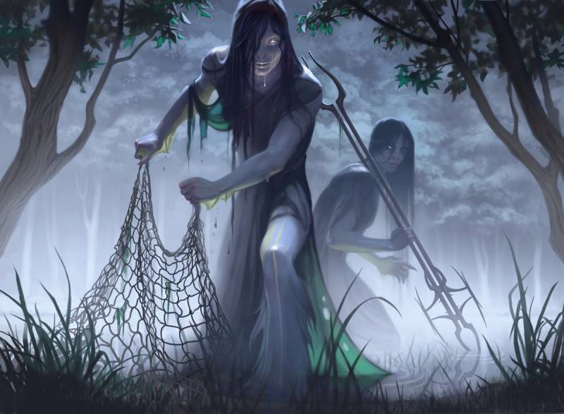
Finally, after a lot of time and hundreds of layers set at 3% opacity (haha), we get to the completed digital painting. Yay!
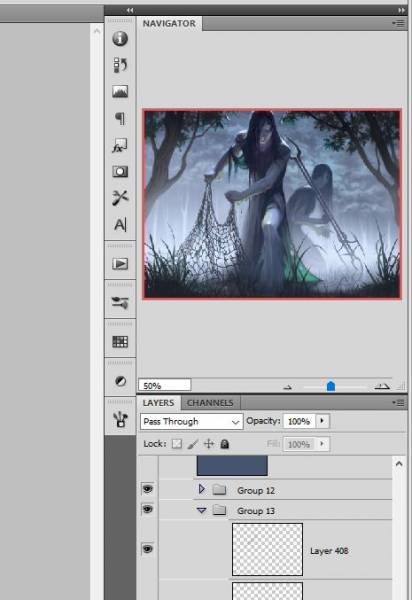
One tip I learned and have used ever since is this: in Photoshop, adjust the size of your navigator window in the corner to be the same size visually as a real magic card. This helps you maintain perspective and make sure the image is legible at a tiny size, without getting too lost in the details.
Another thing I did that helped is I applied a temporary adjustable layer over the final painting and lowered the levels a bit and saturation (make sure turn this layer off before submitting it! It’s for informational purposes only). I wanted to try and mimic the printing process and make sure I brightened up the final image enough to offset any darkness created when it was finished. Images almost always tend to print a little darker than the digital version, and less saturated, so it’s important to make these adjustments before turning it in, so it has the right balance of contrast and sufficient brightness in the final product.
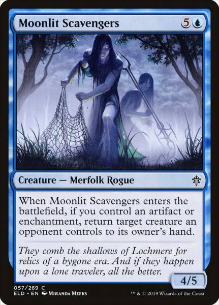
One of the perks of illustration is being able to see your illustration translated to the final product. What a satisfying feeling!
Thanks for reading, and as always, take care of yourselves!
– Miranda
Wow – you knocked this out of the park! Love the animated builds you included here. And congrats on your first card! I beam with excitement whenever I see someone get their first (of many) Magic Cards – a stretch goal for me someday 🙂
I just learnt about the final adjustment layers tip for print a few weeks ago from Jason Rainville but wanted to know why you turn it off before sending it. Don’t you want that adjusted version sent to the AD so it’s printed correctly
Carl, if I understand her correctly the adjustment level mimics the printing process (making it duller and darker). So she manipulates the other layers to make it a bit brighter and more saturated than she might otherwise, and then when she turns on that layer is should “dull down” to what she really wants. Then she turns off that layer and sends it in. If she left it on, then the card would be even more dull and dark than her conception.