Color = Value / Value = Color
There is no sorta, kinda, or maybe, it just is, period! I find it very strange that this point is even argued, I guess we have deniers of every sort these days, why wouldn’t we have them in art? But it is still strange to me that this statement is met with resistance by some artists. Yes, I have gone tangent once again, veering away from my previous series and I will get back to world building next time. A student asked me to watch a few tutorials that burned my brain, reflexively I had to respond to this, and made this chaser for anyone who happens to down one of those videos and needs to cleanse the thought process.
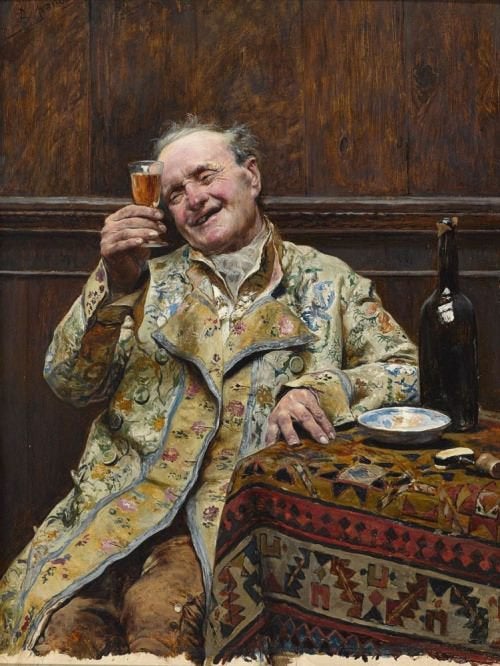
Jose Jimenez Aranda
If you were one who went into the atelier system, then you started your art school training deconstructing color from life into gray-scale drawings that mimic the form to the best of your abilities, describing both the local values and the changes of value across the forms from the light source(s). There is no color in the training in this system until the concept of form is well understood on a Value level. Color is something you work your way towards in your atelier growth. Why? Color can be absolutely confusing and color has a lot of rules to learn that make better sense when form is understood and a method for constructing it has been well established(according to the atelier system).
To make things easier in this regimented training the artist starts by learning that color equals value and learns to render it realistically with only charcoal using a black and white value system to reveal the illusions of form. When proficiency is shown in the modeling of form, quality choices for the local colors, and quality subtle gradations that depict direct light, terminator, and indirect light, color is the next level of complexity introduced into the learning curve.
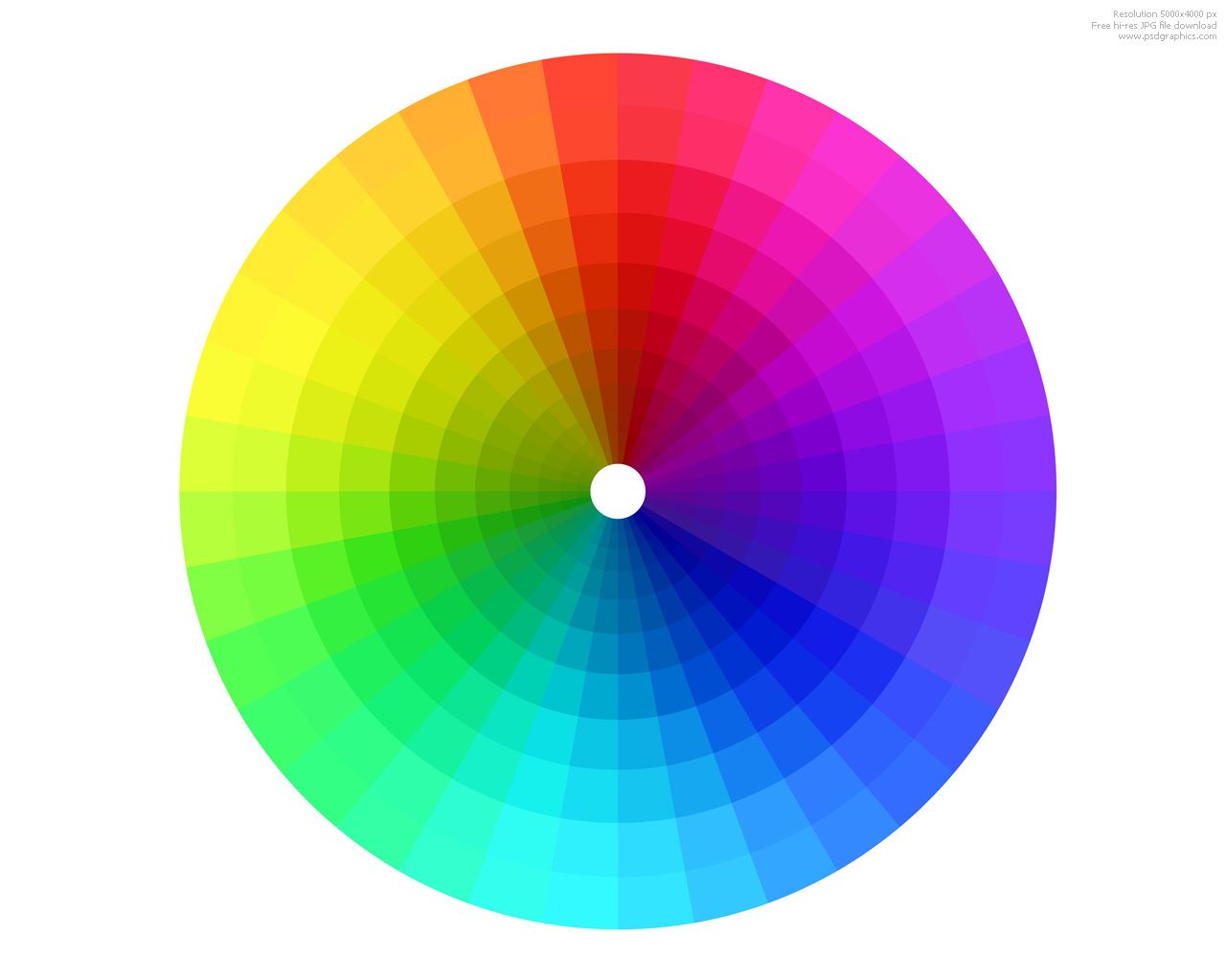
Color then substitutes the gray-scale value choice, and does not alter it or changing its relative appearance. The error with most is to think that brilliant colors are just colorful, or have no value but are replaced with extreme saturation instead. Below are examples from the Munsell color wheel. One shows the wheel, or sphere with a pie slice removed, the other is one of the many slices removed from the whole. These show that all colors are value, and in addition, it also shows the gradation of saturation towards a pure hue vs. grayed, pure chroma where the color is more brilliant than the gradual saturation scale leading up to its purity.

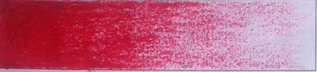
These pie slices show the gradual change of hue as it goes from gray-scale to its purest hue possible at that value. The entire length of each string is the same value as you can see in the second example. Just because the color becomes more chromatic does not mean it changes value.
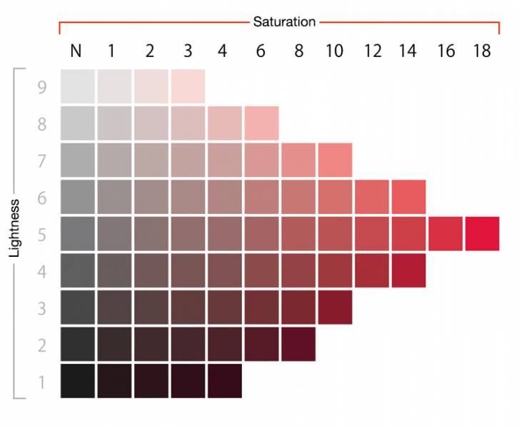
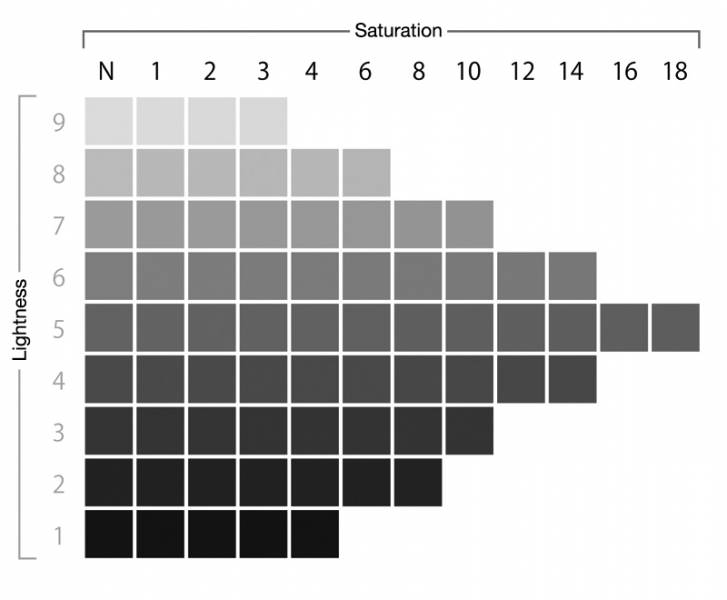
This is the same red string as above showing that each string shares the same value as it transitions from gray to pure chroma.
These strings of value are seen real time when we use the Hue/Sat slider in Photoshop to convert the image from chromatic to gray-scale. Converting the image to gray-scale is converting the colors to only values. The values are not random, each color has an inherent value as we have seen above, and when it is converted to gray-scale, that value is revealed or more pronounced.

For those who do not believe this concept, I hope this article will shed some objective light on the subject. For those who are on the fence about it, the below lists might be a reason for the internal dilemma and can be adjusted accordingly:
1. Vibrant and Florescent colors do have value and some of them are darker than you might think. Refer to the YURMBY wheel for a visual example.
2. Different functions in Photoshop do different things to the color values when they are converted to grayscale, the grays will change drastically due to the code that is written for the conversion of the particular tool. This will certainly lead the naysayer to believe that value and color have nothing in common if they are calculated differently with different tools.
Each of these images was done with a completely different method and you can see the subtle to extreme changes in all the half tones where the changes are most apparent.
3. If you use different apps on your phone to shoot the same object they will not be the same grayscale, nor will they be the same color table. This is again due to entirely different code processing the pixels and how the programmer(s) either understand actual gray-scale/color or not when coding the app.
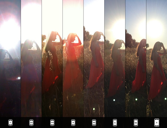
These were shot using different iPhones but it is still the same, different cameras, different apps, shoot differently from others.
Sidebar:
We have a sensor in each of our cameras that are different sizes for each kind of camera, the phone having one of the smallest, which means it takes in light completely different than a camera with a larger sensor. In addition, the onboard technology can be calibrated differently ever so slightly in each camera so the reds might look a little different, or the greens, or the blues, etc.
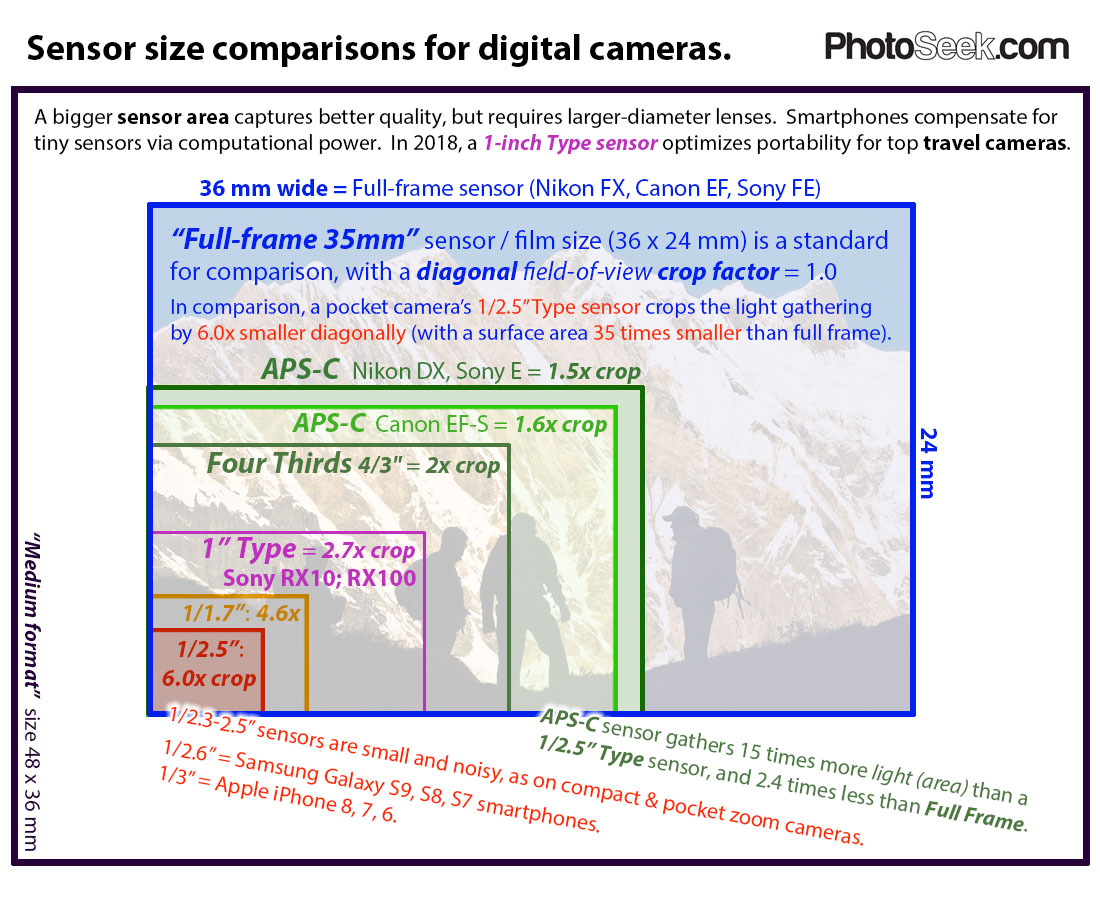
In this illustration, compare digital camera sensor sizes: full frame 35mm, APS-C, Micro Four Thirds, 1-inch, 1/1.7″ and 1/2.5” Type. For new digital cameras, a bigger sensor area captures better quality, but requires larger diameter, bulkier lenses.
To optimize the size of a serious travel camera, consider 1-inch Type sensor or up to APS-C sensor size. “Full-frame 35mm” sensor / film size (36 x 24 mm) is a standard for comparison, with a diagonal field-of-view crop factor = 1.0 In comparison, a pocket camera’s 1/2.5” Type sensor crops the light gathering by 6.0x smaller diagonally (with a surface area 35 times smaller than full frame).
4. You did not learn to render only learning to draw in line, therefore you do not see color as a value at all.

5. You have never done an image that is full value in range, and have not developed a sense of what full value means, therefore when viewing certain objects at a certain color range and lightness or darkness due to the light source(s), forms will flatten out and subtlety is not well perceived.
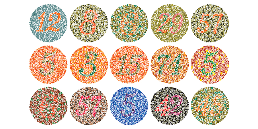
6. Colorblindness is real, and does affect our ability to judge the hue, therefore judging the value is also in question. Do you know if you have this or not? I have been surprised at how many of my students did not know about having it until they tried to work with color.
7. An artist starting with Digital painting and not learning the value system through the practice and control of pressure and density of a pigment or particulate, not that traditional media is important, but there are fewer cases of learning digital painting by starting in gray-scale then colorizing the values. There are more tutorials about this online, but for the beginner this is not necessarily how it begins.
8. If you learn with a medium like pastels, the medium does not completely cover a surface and does not offer an objective way to see value clearly with the paper showing through the powder intermittently. With this type of medium, an artist learns relative values, related to the materials used.

9. One who does not think art(seeing) is a science, and that rules/tools are unimportant, or that art is what flows from you and is not trainable.

10. How many drugs you on my dude?

And now back to world building. Cheers!


To your first point, about fluorescent and vibrant colors and their values… I was having this discussion with a client this past week. How the colors they look at on their monitor that they believe look good together—specifically red on dark blue—were not going to convey the same pop when projected on a screen. The distinction between colors seen from the light of monitors and light projected to a screen and reflected is challenging for some combinations of color (especially at lower lumens from the projector). The values are what determine legibility and distinction. This fall-off is particularly aggravated by color blindness.
The only thing I agree with is #10.
I’m now worried that I’m confused and don’t understand.
But actually though I was with you until #6 and Id be curious to hear your thoughts.
When it comes to rods and cones rods make up the majority (120 to 5 roughly) and are responsible for judging light and dark among other things. Being colorblind, which stems from the cones as I understand it, would clearly affect one’s ability to judge the hue but by all accounts this makes a person almost more focused on the light and dark relationship.
I’ve heard tell of colorblind people being used in both the military and Search and Rescue efforts because this allows them to see shape and pattern in a way that is less distracted by color, or be less thrown off by camouflage.
So while someone who is colorblind might have a harder time viewing the “correct,” color they are still getting relationships and a full value range. This makes me think that bringing colorblindness into this is semantics at best.
Part of me finds this interesting as intellectual discussion but the other part of me is just getting mad thinking, “Yo struggling with color is hard enough, don’t take value away from me too!?”
Curious to hear your thoughts further on that if you care to share em.
I’m on one drug.
Well now I want to know what the tutorials were that melted your brain lol
That’s really a great blog.
recommend trying out Aniwave
Thanks to Admin of post for such great information. I like your blog post and subscribe your blog for all your future post.
Rize Tours Travel Agency is a professional tourism company offering unforgettable experiences for those seeking to explore the unique natural beauty of the Black Sea region. Dedicated to showcasing Rize’s captivating plateaus and providing visitors with the best service, the agency creates ideal routes, particularly for nature lovers and photography enthusiasts. Ayder, one of Rize’s most popular plateaus, stands out with its lush forests, hot springs, and mystical atmosphere. Pokut Plateau captivates visitors with its breathtaking views, while Gito Plateau stands out with its tranquility and serene nature. The Elevit, Badara, and Sal plateaus are also ideal for those seeking a closer look at traditional plateau life. We offer the opportunity to explore these natural wonders with safe transportation, guidance, and comfortable accommodation options. For a unique plateau experience in the heart of the Black Sea region, Rize Tours is the perfect destination..