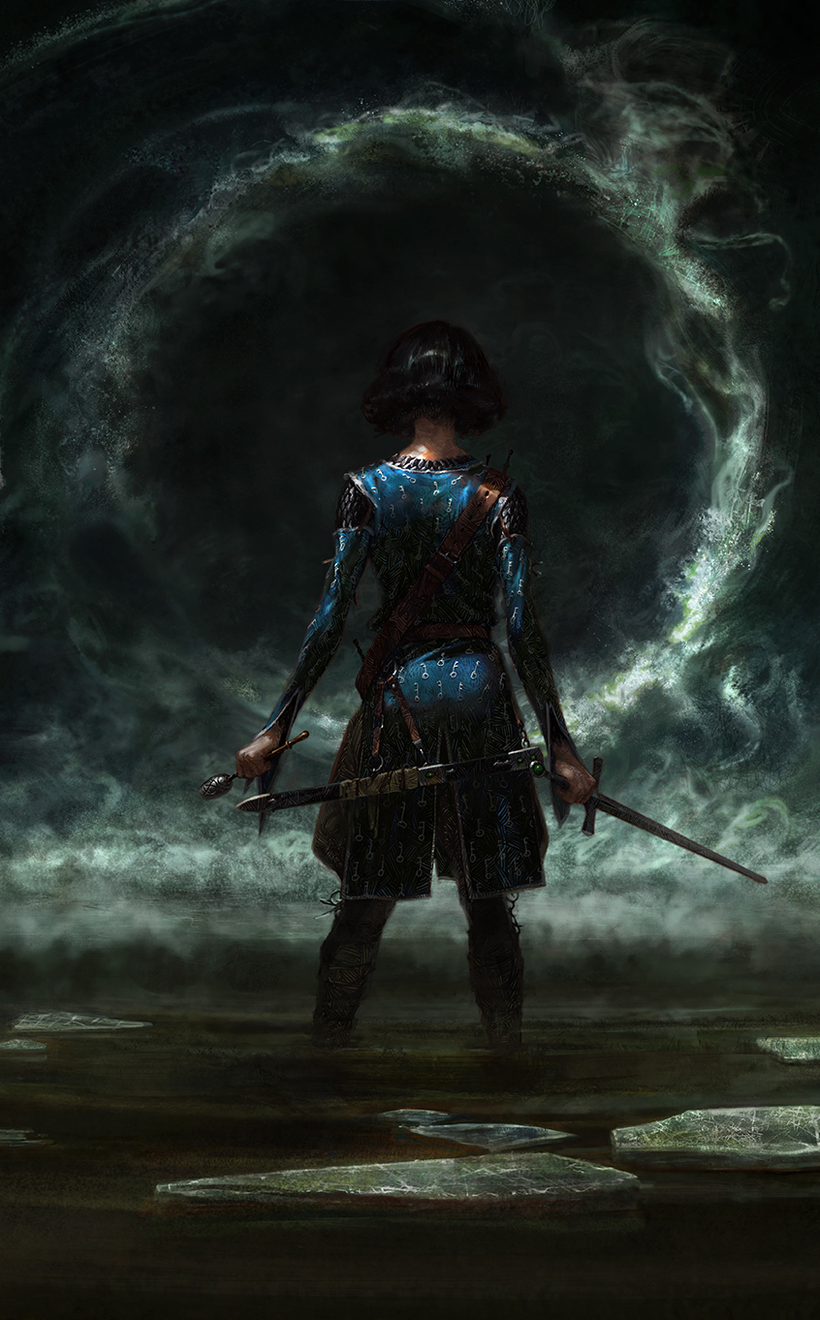
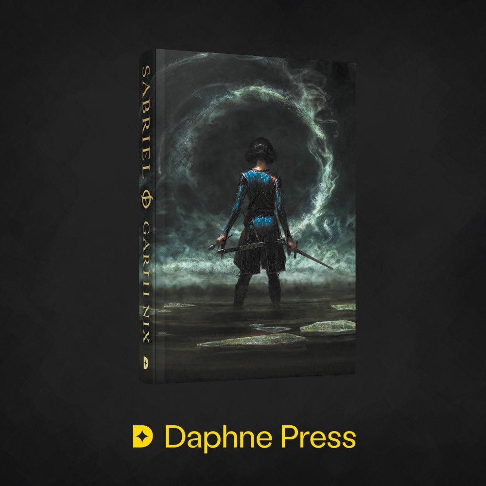
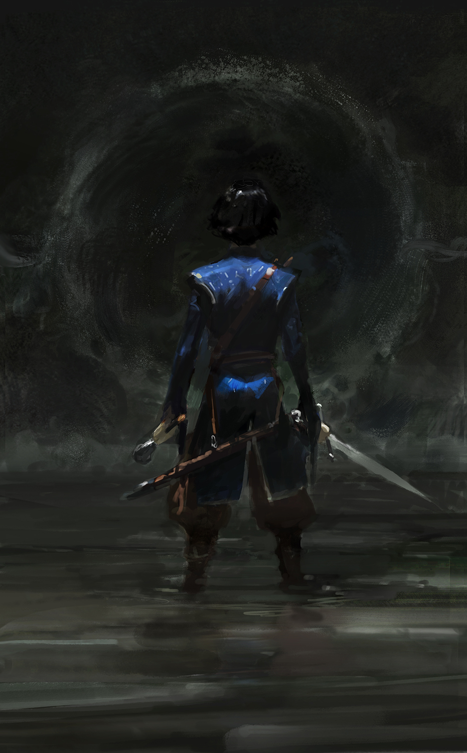
Finished cover.
Today, I wanted to take a look at the recent process of painting a big wrap-around cover for Illumicrate / Daphne Press’ 30th Anniversary Edition limited printing of Sabriel.
When I’m starting a job like this, I always read the book if I can. In this case (since the book has been out for 30 years), that was no problem. The client sent me a PDF of their inside layout and I spent about two days just reading on the couch. When I have a digital copy, I take screenshots of relevant or inspiring passages and write little notes to myself, for reference later. So my iPad fills up with screenshots that look like this:

(When I’m reading a physical copy I just keep a page in my sketchbook with all these notes scribbled out, with the relevant page numbers beside them for reference later.)
I think reading the book is so useful because it lets you find out what you resonate with in the story, instead of being told what’s cool. And for making great images, nothing can fuel you like your own genuine interest. Seriously, try and put all your effort into an image you think is stupid. Go on, I’ll wait. See; you can’t do it! Or at least, no one I’ve ever talked to or heard of can. So you have to find a real connection.
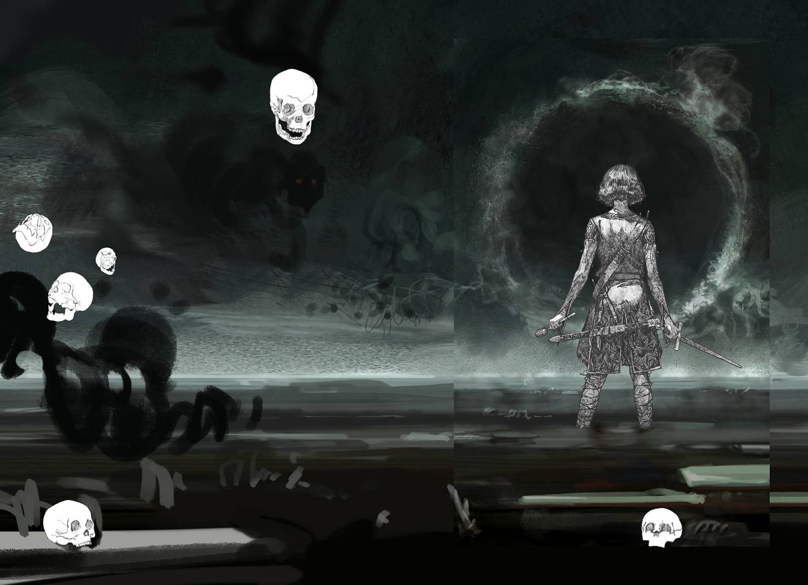
In this case, pretty much all my favorite parts of the story involved the passage of Sabriel into and out of Death. For those who haven’t read it: Sabriel (our protagonist) is a special kind of Necromancer whose job is not to raise the dead, but to put them permanently to sleep. In order to accomplish this, Sabriel must be able to move between the world of “Life” and the world of “Death,” using a special form of harmonic magic produced by ringing bells. When in Death, her body in Life looks totally still, and her body becomes so cold ice forms on her skin and in her hair. I drew heavily on this visual for sketches B and C, as I just thought it was absolutely wicked. Sketch A is derived from the descriptions of the “Gates of Death,” which are massive water and mist-based structures formed along the “River,” which flows through all of Death.
ANYWAYS, here are those sketches:

When emailing a client sketches I usually attach each one as an individual jpeg, and also include a composite shot of all the sketches in one jpeg (like this) for easy comparison and discussion in their meetings. I’ve heard this is appreciated, so I keep doing it.
Also of relevance: even though this commission is for a wrap-around piece of art, I’ve learned that you can save yourself a lot of time by just presenting the fronts of each image, and then “extending” the selected sketch later. Of course, you have to have a plan for each wrap and know that they will work – otherwise you can end up in a pickle (this has happened to me sometimes and it hurts so bad; in the end you just hate the full image).
(Is that a spoiler alert I hear?)
I was pretty darn happy with these, but got back the rather flummoxing answer: “None of these, please. Can you try something else?” At least, that was my initial reading of it. The actual email said this:
Thank you for sending through the different options. Our initial thoughts are that we absolutely love the first concept, but we feel it a) might be too dark and b) it’s a shame not to see Sabriel’s face. I mean the idea of her staring down death is very cool and exciting, but I think it’s a genuine shame to not see her face.
The second one would work well as an interior piece but sadly not as a cover I think.
The third one, she sort of has a funny stance and also is this through death? Wasn’t it through the beginning that she was being followed?
I wonder if there was another direction we could take? I thought perhaps like not a specific scene, but more of a concept. I’d love to show off her, her bells, Mogget, maybe Abhorsen’s house somewhere? I don’t really want it to look like all the other editions of Sabriel out there, but at the same time I still want it to be recognizable?
Sorry for being so picky!
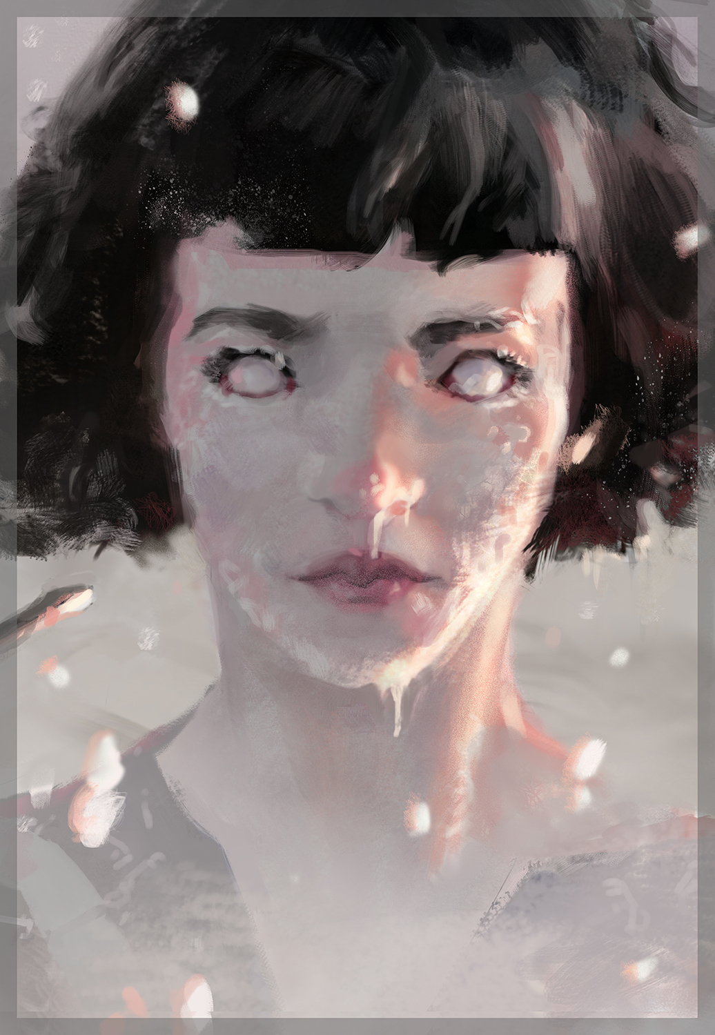
Sketch B
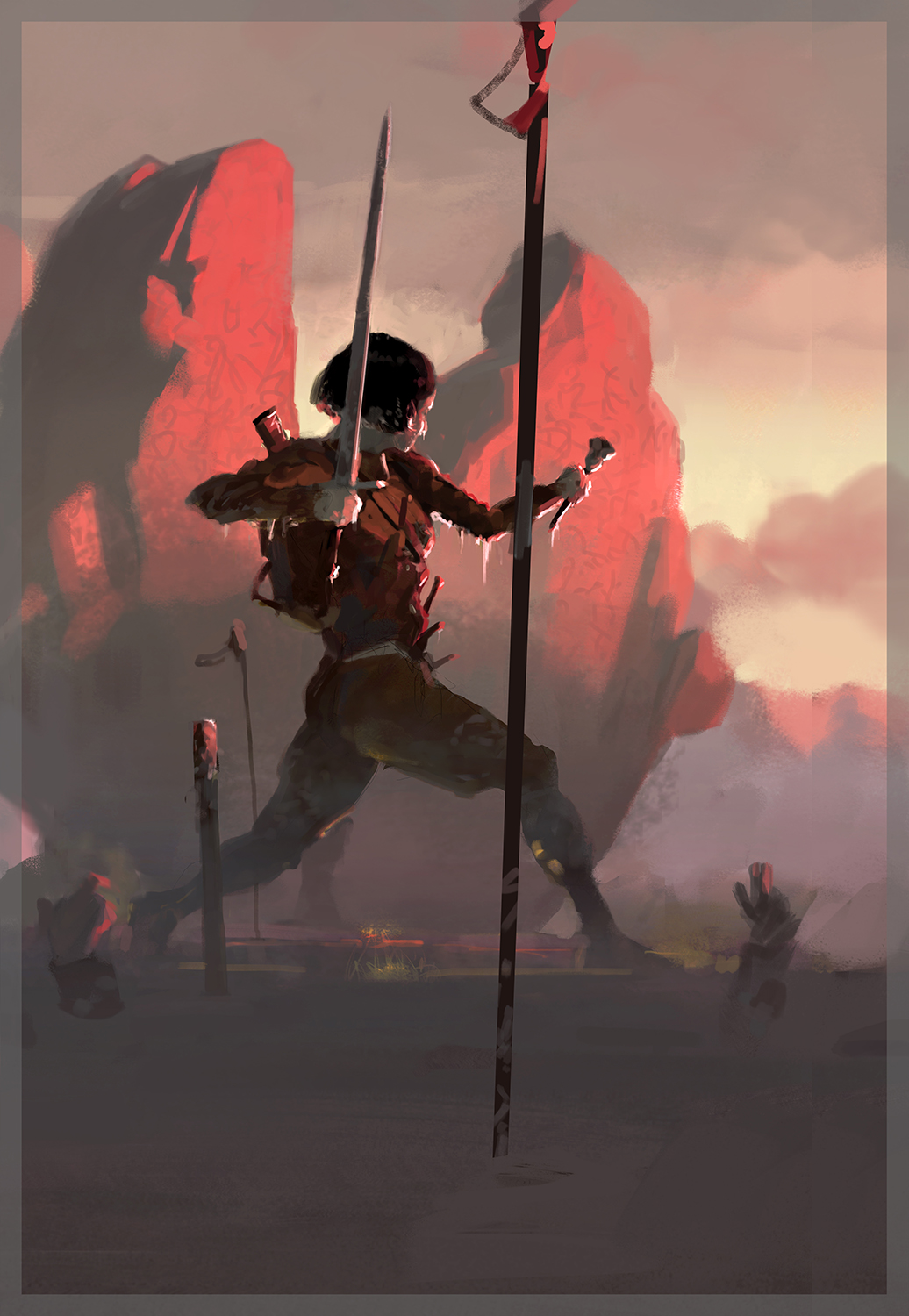
Sketch C
Hmmm. I thought about this for a little while. For everyone who read the last article (Servant Mage), you know that I’ve come to think of these decision points as their own little “spots,” relevant nodes in a decision tree that branches throughout the entirety of the job. Each one has a potentially massive effect on the potential of the final image, so it’s important to treat these spots carefully. I’ve found there are a few good things to keep in mind:
- The Art Director is not your enemy. In our culture we’re trained to see most interactions as zero-sum, so we often bring that bias to new situations where it doesn’t belong. You can read Sun Tzu’s The Art of War and apply every single chapter to emailing with ADs (I have literally done this – facepalm), and you won’t get anywhere, because this isn’t War. This is a non-zero-sum game (where my Arrival fans at?), where you and the client both stand to gain and to expand the pie of resources by working together. You and the AD are on the same team, and you’re BOTH trying to help a new piece of art be born. This piece of art has very specific needs that it must accomplish for each of you, and it can’t do its best if Mommy and Daddy are fighting.
- There are no rules, only choices. If an Art Director emails you and says “do this,” your possible responses are myriad. (Also, they very rarely just say “do this,” but as illustrators we tend to take all suggestions as commands for some reason – see the above point). So you can say “yes,” but you can also say “no.” Now, flat-out rejection doesn’t tend to foster a cooperative and harmonious working relationship, so we mostly just never consider this possibility. But in reality, if you decide to go to law school tomorrow you can just not reply to the email at all – problem solved! I’m taking the long way here but what I’m getting at is that there are as many ACTUAL possibilities of response as you can think of.
In this case, my real goal was not to get my way, but to make a piece of art that would appeal to fans of this book in a new and exciting way that would compel them to buy this edition. That’s my real job here, and these sketches were ways that I could think of to achieve that. I knew they worked because I was a new fan of the series, and they appealed to me.
I considered what the client was asking for, and spent a little time researching every known edition of Sabriel in print. I had done this before, but I had to be sure. Yep, they pretty much all match the description of what the client is suggesting that I do. So if we went that way we weren’t differentiating our edition; we weren’t making a compelling case for why someone should spend a hefty chunk of money on this edition, when they likely already own the book 2 or 3 times over (book fans are really like this btw).
With that in mind, I sent back this reply:
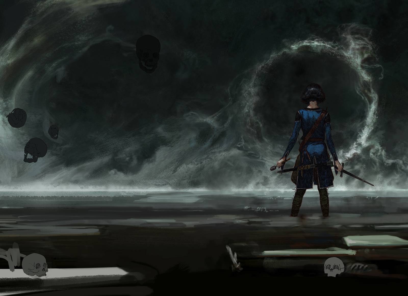
Since you loved the first concept (that was my favorite shot too), I thought I’d give it one more go (attached), taking into account the things you said were important to you. I brightened it up and moved the lighting onto sabriel to highlight the iconic elements like the blue Abhorsen cloak, the sword, the bells, and the bandolier. I also made her bigger. The only thing we don’t get is the face, but in my mind that’s sort of a good thing, as it let’s the reader preserve their own vision of her. Especially since Sabriel is defined in large part by her world, by her fears, and by her role, I thought showing her world in a way that has never been done before would instantly resonate with fans, while giving us something special about our edition. It isn’t just another interpretation of Sabriel – we get to see the world she’s so beholden to, and such an integral part of. Anyways, that’s my little pitch 😛
If you’re still not sold I’m happy to go off in another direction – just figured it couldn’t hurt to explain my thoughts!
Cheers,
Tommy
And here is the sketch I’d attached (a rough mock-up of the new version, since this was all a gamble):
…and you know what? They went for it! I got back the following:
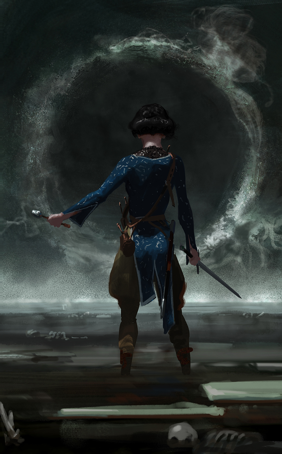
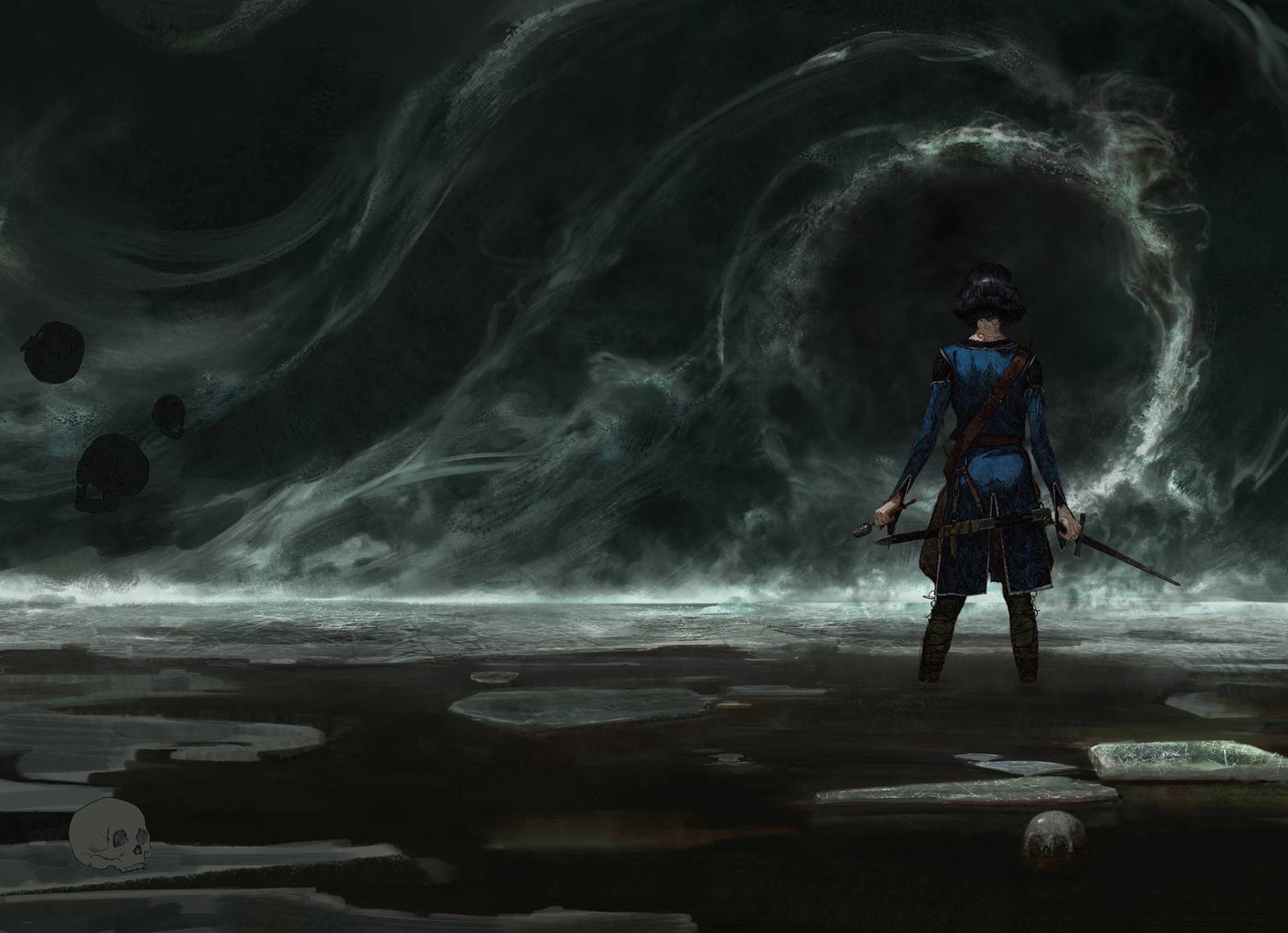
Ok, you have me convinced! My only change on this is that I really would like it even brighter. I know colours tend to dull when printing and I want to make sure she’s really distinct from the background, the colours stand out and the whole cover spread doesn’t just look black, if that makes sense? Can you strengthen the light source a bit more and up the contrast on the background?
This was exciting because I really did think it was the best thing for the image. I re-did the sketch to try and hit the requests on brightness and color:
I also messed around with a new pose, but in the end the client said “Yes” to this level of brightness and color, but please use the old pose. OK! So it was time to actually paint the thing!
By the way, during all this I was struggling with some bad pain in my neck and back. It’s getting better now, but I bring it up because I knew I would have to paint this quickly. In maybe….half the time I normally do. That worked out because we wanted a very vacant shot in some ways (there’s not much to see in Death, and the author asked that we take out even the little nods to context like skulls and bones).
Knowing I needed to go quickly, I used an old method: a dimensional line drawing. Drawings like this are great (especially when you have minimal subject matter – here just one figure), because they paint up SUPER quickly and can be kept on layers more easily until the last second, which helps you stay flexible. It also segregates the processes of drawing and painting, letting you put your full focus on one thing at a time. Normally these days I like to do everything at once, but staying focused enough to make it work while you’re in pain can be tricky.

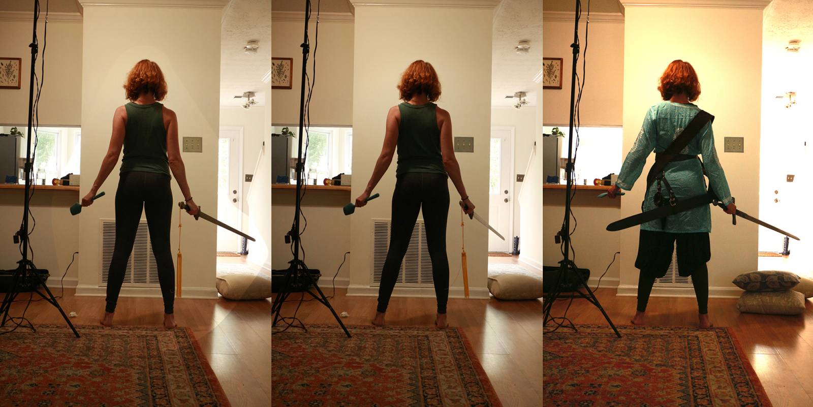
To facilitate the drawing, I took a little home reference and dropped that into my file to start with as a base. I’ve been enjoying pushing myself recently by using less and less reference where possible, but when the clock is ticking you don’t play on hard mode. Once the basic proportions were in there I went in and defined all the little plane changes and details; the full drawing took about 6 hours to complete on my iPad using Procreate. I had these two images open in Photoshop on my main rig while drawing, for quick and easy reference:
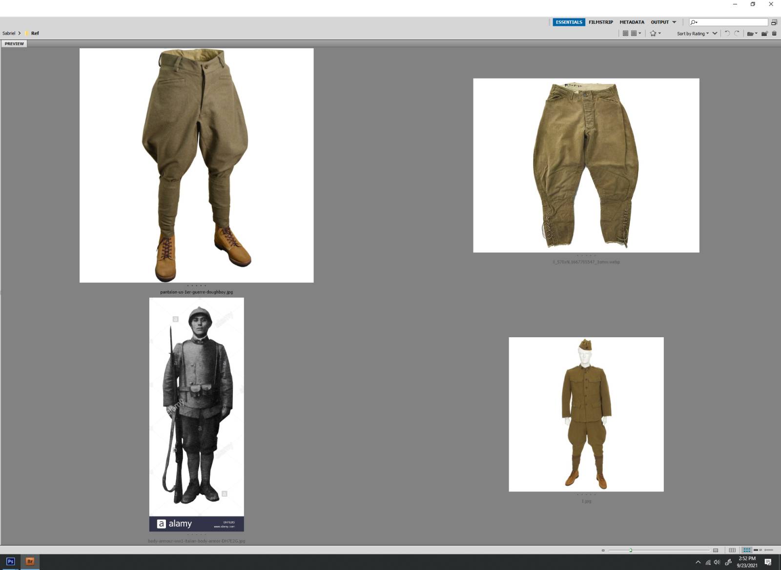
These shots of Dughboy uniforms were from my Pre-Sketching folder, where I saved down every bit of reference I came across after reading the book but before beginning to sketch. You find all sorts of great stuff that way, that can be folded into your sketches as you work and bring them a lot more authenticity.
From here I’m going to be discussing the final painting progression: the first thing to do was get the drawing in the full wrap-around file, and put fills under the lines (these fills became saved selections in the file, and let me do all sorts of useful things later on).
Then I flatted the fills with color, and went straight into the background:
Being able to paint the background of this image without worrying about disturbing the foreground elements was a big boon of the process I decided on here. You can see that even though I thought I had a plan, it took me some time to find the flow of the swirls I wanted back there. After I had sunk quite a bit of time into this set of shapes, I just got fed up with hating them and repainted them to be more like this, bringing the whole image together:
Now we were getting somewhere. You can see I had planned to include all these little skulls and a couple skull-headed wraiths being pulled into the swirling mists of the Gate, but the author asked us to cut them in the end, which is why I’m not saying much about them. Honestly, that request probably saved my ass because I don’t think I could have painted them all in the amount of time I had to work with and not died. The client also wanted Mogget (who manifests as a white cat) in the image for fans, even though Mogget never travels into Death in the book. Hard to argue with doing fanservice on an edition like this, however, so I managed to get him in there:

And I still hadn’t touched the main figure. I knew she could be painted lightning-fast since the drawing was solid, and would give whatever marks I laid down a great feeling of texture and dimension. On the last night before the deadline, I stayed up all night to paint her out, and finish the thing! I don’t recommend this, but I really had no other choice. If you do have to do this, I recommend healthy doses of food, coffee, and Mateus M.
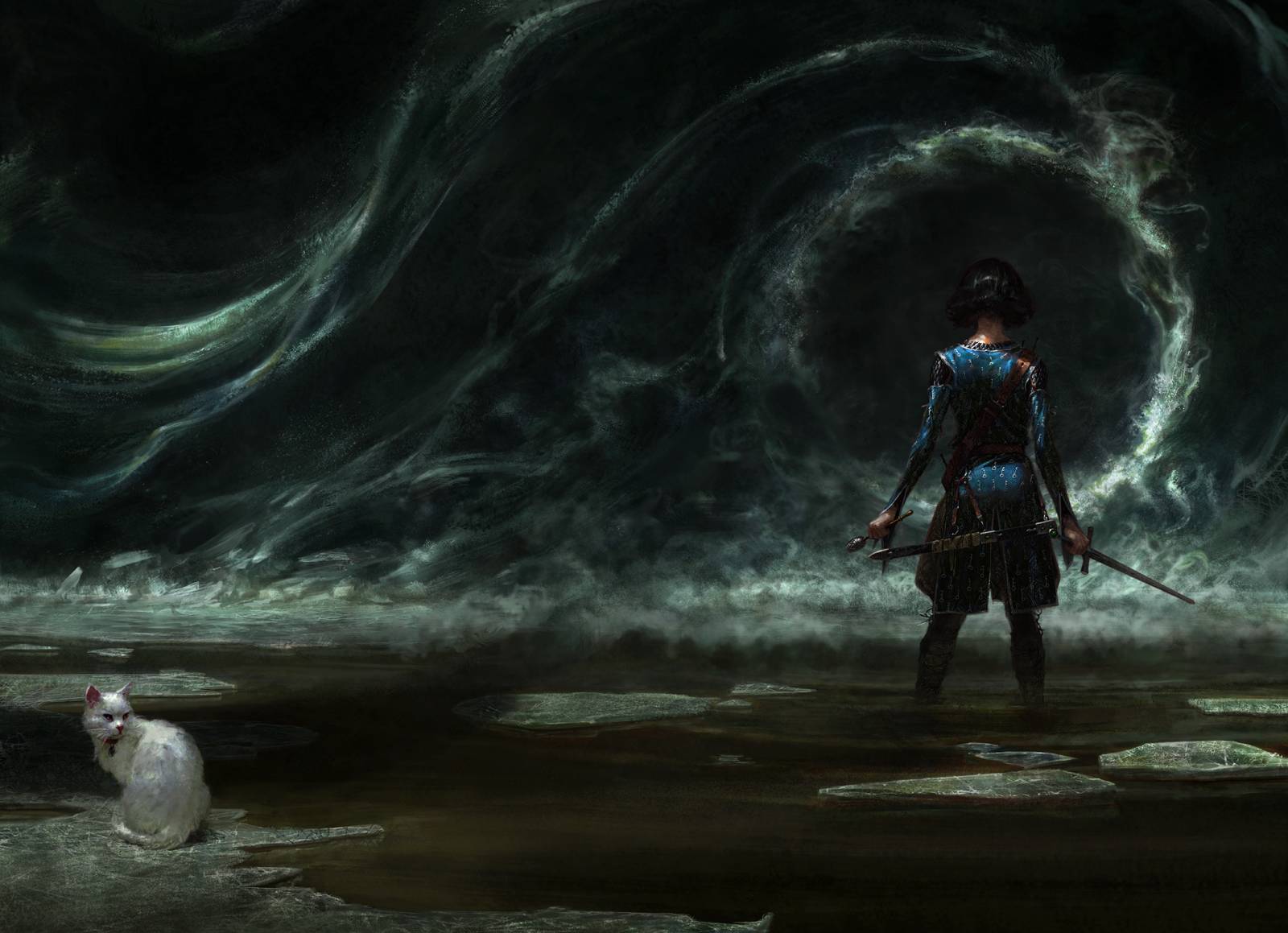
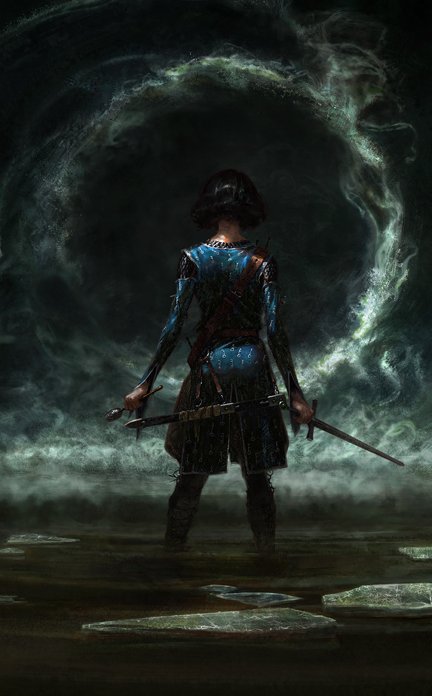
In the end, I feel like we produced something cool and iconic on the front, and something nice on the back, but I’m unhappy with how the two relate to one another in the full image. I could have done a better job of marrying the two into an image that would work equally well in full and as a cover crop, but I didn’t really believe that going in. I brought with me an old assumption, that either the full image OR the crop would look “better.” In fact, I used to turn down all wrap-around covers because I believed so strongly that the wrap would always sabotage the front, or vice versa. But that’s just another incorrect assumption based on zero-sum thinking – both could have been great if I’d planned more carefully and expected that outcome from myself. That lack of belief was just my fear talking. Luckily, I have a shot at redemption. I’m working on another project right now with a wrap-around cover, and I’m using my experience on Sabriel to make sure I create something that’s great all around. At least, that’s what I’m trying to do! And I’m excited to share it with you when I can.
Godspeed for now, valiant art peeps!


Beautiful piece, and thanks for sharing a look at your process.
Thanks for sharing. Knowing how it actually works in production helps in structuring my own process. This is awesome!
Awesome work, Tommy!
Big fan of “Sabriel” and of your work, so to see two things I love come together like this is super cool.
Very informative to read about your process as well! I’m trying to refine mine a bit and learning how others do it is helpful 🙂
P.S. I also love the work you’ve done for The Locked Tomb series’ covers!
Wonderful to see the thought process behind the work. I really loved that you clearly read the book! Most of the older covers of Sabriel have her with long hair as opposed to the clear bob cut she’s described with. When I saw she’d have short hair on the new cover, I was really excited! And pretty interesting that you were able to convince the art director on the first concept when it was initially rejected.