I recently had the pleasure of illustrating Spear by Nicola Griffith. The project consisted of a cover, along with 5 B&W interior illustrations. I want to share the process behind this project because it falls into a bit of an unusual niche; it’s rare for an adult fantasy book to feature interior art, and I would love to see more like it out in the world!
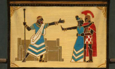
The book is an Arthurian retelling, based on the story of Percival and the quest for the holy grail. Set in 6th century Wales, the main character here is named Peretur. At the start of the book she is a young woman who has grown up in the wilderness, and much of the story follows her journey (disguised as a man) as she makes her way to King Artos’ court.
What I resonated with the most in the book was the beautifully poetic language, especially in the descriptions of nature. It gave the story an ethereal tone, and capturing that ended up being the main goal for the illustrations.
Cover Sketches
A new-to-me thing on this project was that alongside the manuscript, my art director at Tor, Christine Foltzer, sent over an art survey document completed by the author. This listed important themes and symbols in the story, and other crucial historical information, describing how things should look for the time period. It was SO helpful for understanding what the client expected, and the visual notes I’d have to hit.
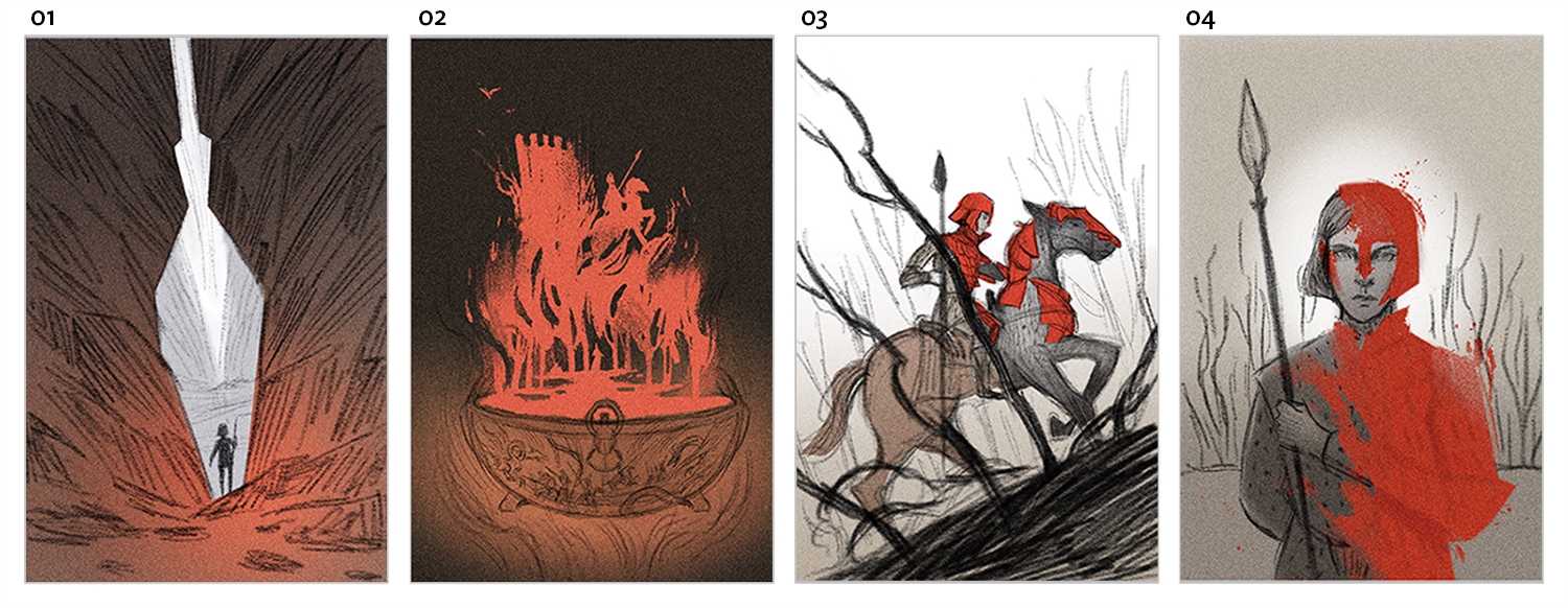
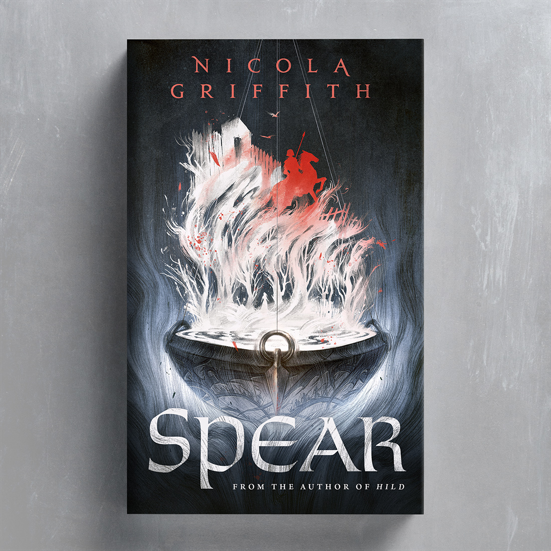
From this document, key ideas emerged; the spear in the story is both literal and symbolic so I definitely needed to sketch that. Then there’s the “grail”, which here is an enamelled bowl/cauldron. The colour red is significant, representing Peretur’s distinct armour and also the colour of blood – there are lots of battles in the story. I also wanted an image that conveyed the character’s search for identity, and how she changes over the course of the story. With all of that in mind I sent off these four rough sketches for the cover:
Cover Final
From the sketch options, Christine picked #2, the bowl with the er… blood goop? It was definitely a bit weird, but I liked the graphic shape and the idea of incorporating various elements from the story into it. I had been looking at a lot of silhouette art by Golden Age illustrators, and was particularly interested in the way that they often created little pockets of narrative within a larger image, and I wanted to do something similar with my graphic shape.
I must admit that the process on this project was somewhat experimental and meandering. Some projects are quite linear; the AD and I will have a pretty specific idea of the final before we even start. But not on this one. As you’ll see, it was a bit of a winding road to “find” the final.
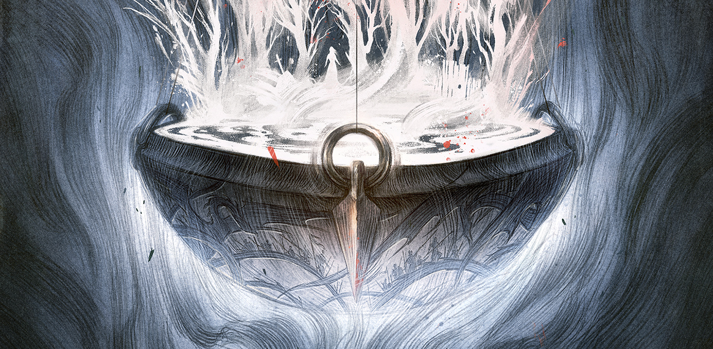
Here is the first final that I sent in:

Initially I imagined that the red graphic shape would be fairly subdued, and that type could go over it. But Christine came back and said it looked a little too dark – I could certainly see that, so it was back to the drawing board! Because I work digitally it wasn’t too difficult to make changes, even if they look drastic. So I played around with different options until I settled on these three:
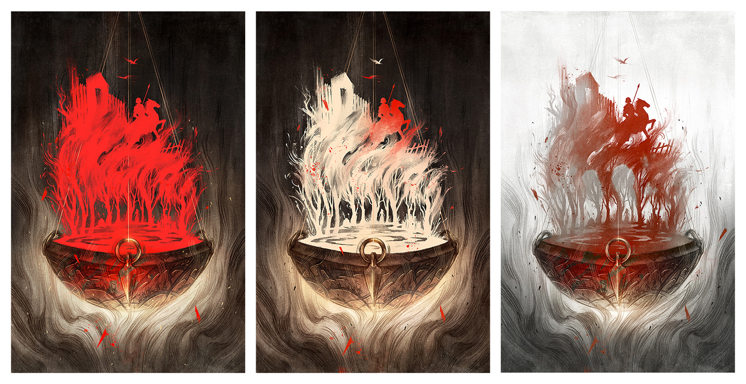
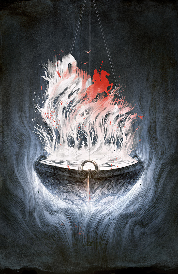
Another round of feedback: “We love #2, but can you make it more of a blue-ish tone?”. Funnily enough, I had been really trying to avoid the blue-grey colour palette because I use it so much, but sometimes we have to stick to what we know! Christine had included a mockup with her feedback, and after seeing it I knew she was absolutely right; the cooler tones gave the image that ethereal otherworldly quality that was so prevalent in the story. And here is the final-final-actual-final-v3.0:
Interior Sketches
Moving onto the interiors! When I sketch for interior art, I tend to look for the emotional hallmarks within a story; not necessarily the most exciting action sequences, but moments where significant plot or character development happens – often in the quieter moments before or after the action.
While illustrated special edition books have become more popular lately, it is still rare to see art in a “regular” mainstream book like Spear, so I wanted to do an extra good job here, to prove that illustrated books can be a great thing! I think the reason that illustrations in adult books is not so common is the misconception that pictures are (only) for children. Another complaint I often hear is that illustrations can clash with how the reader imagines characters and scenes. To avoid these issues, I knew the interiors for Spear had to be more conceptual – hinting at the emotions and themes of the story, rather than illustrating scenes outright. Less “here is this cool battle!” and more “what does this fight represent within the story and how does this character feel?”.
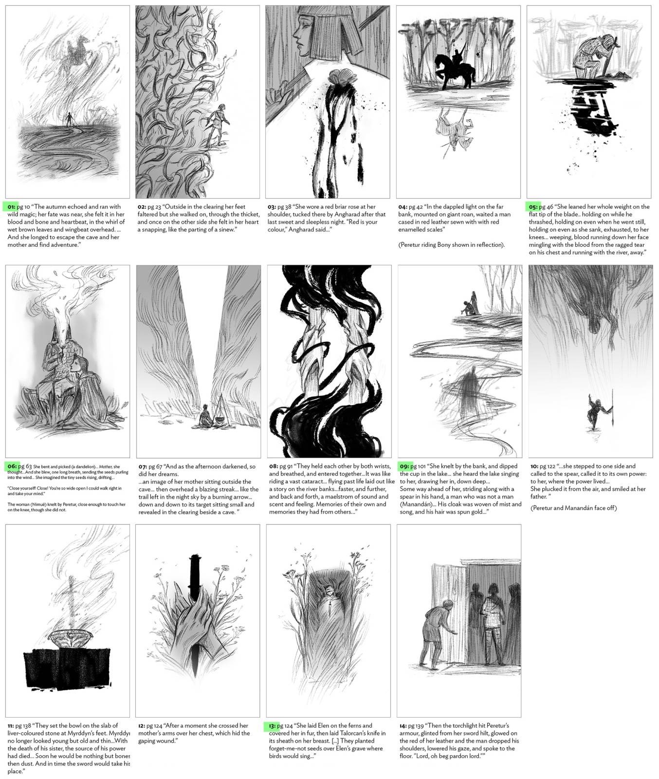
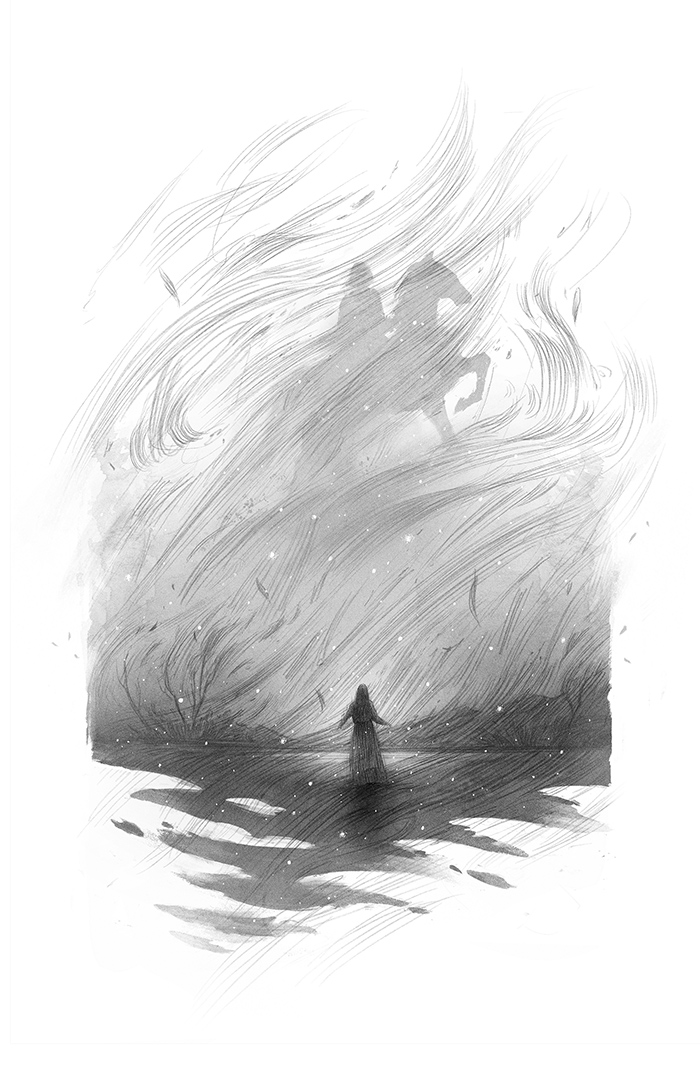
I was basically given free rein to choose what to illustrate, which is always nice. Initially I sent in 11 options, and after some feedback and discussion, I added 3 more. From those, Christine then narrowed it down to the final 5:
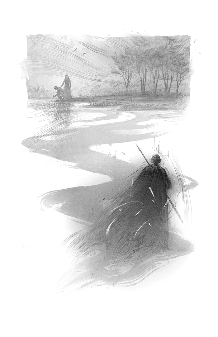
Interior Finals
By the time I got around the the interior finals, I’d already completed the cover. This was helpful because on a multi-image project, the cover can be the foundation that dictates the look and feel of the interiors. As with the cover there were specific themes I wanted to convey, among them; the sense of awe and magic in nature, mystery and otherworldliness, and just a hint of brutality.
The cover had an emblematic feel to it, slightly reminiscent of heraldry – which seemed fitting for an Arthurian story – and I wanted to carry this through to the interiors too. The idea of anchoring organic flowing lines inside a solid shape is something that I’ve been exploring a lot lately in my work. Drawings by nature tend to have a softness to them, and I find that framing them with a more graphic element with sharper edges often makes for a stronger image.
With some minor adjustments and revisions made to the sketches for story and historical accuracy, all that was left was to actually draw everything. And here are the 5 final interior illustrations:
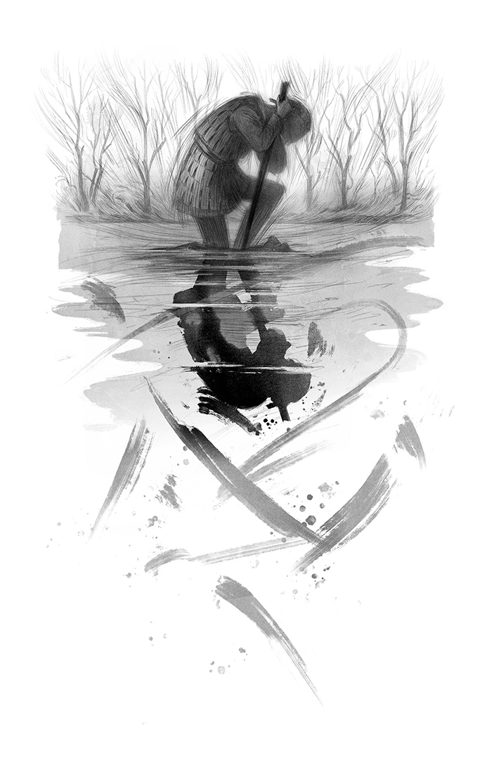

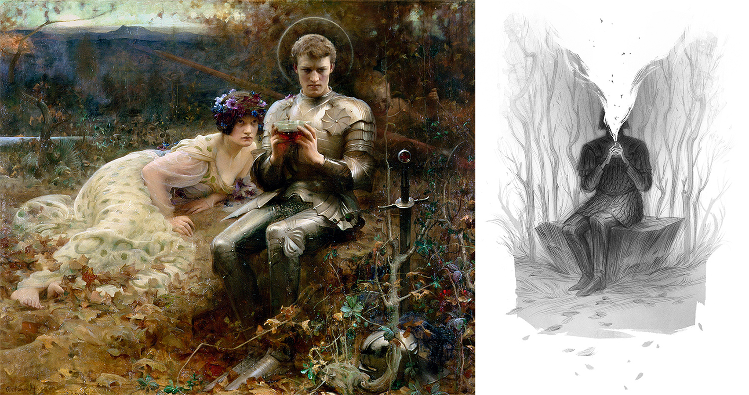
To end on a fun easter egg; I couldn’t help inserting an art history homage into one of the illustrations. Arthur Hacker’s painting of Percival is one of those images that I immediately recall when I think of Arthurian art. So of course I had to have an image of Peretur sitting in the same pose! It always fills me with joy to see other artists sneak homages into their paintings, so it was fun to do it here.
And I hope you’ve enjoyed this look at the somewhat meandering and slightly chaotic process behind illustrating Spear!

It is so interesting to see your initial sketches and the finals all turned out amazing! Wonderful stuff!
Love to read about your process, Rovina, thanks for sharing it.
Wow. This is really helpful. I’m about to do the same (cover and 5 illustrations) for a short story, and it’s wonderful to get to see what goes into keeping it cohesive.
Amazing! Interesting read and I love seeing how the cover developed. Also, it made me laugh reading “final-final-actual-final-v3.0.”
thx admin