This piece was motivated by a recent Q&A question that I felt needed to be illustrated with a real-world example:

Getting client work can be broken down into doing two things: 1) Making not only GOOD work but also the RIGHT work, and 2) Putting it in front of people who can pay you for it.
Honestly, the second step shouldn’t worry you too much. It’s as easy as sending a postcard, going to a convention, or hunting down the right email address. None of these things will do you the slightest good if you haven’t dealt with Step 1 — and 99% of aspiring artists haven’t (which is why they’re still aspiring). I’m not saying this to denigrate anyone’s work – your art can be quite proficient, and still not be right for a client. Which brings us to the first step…
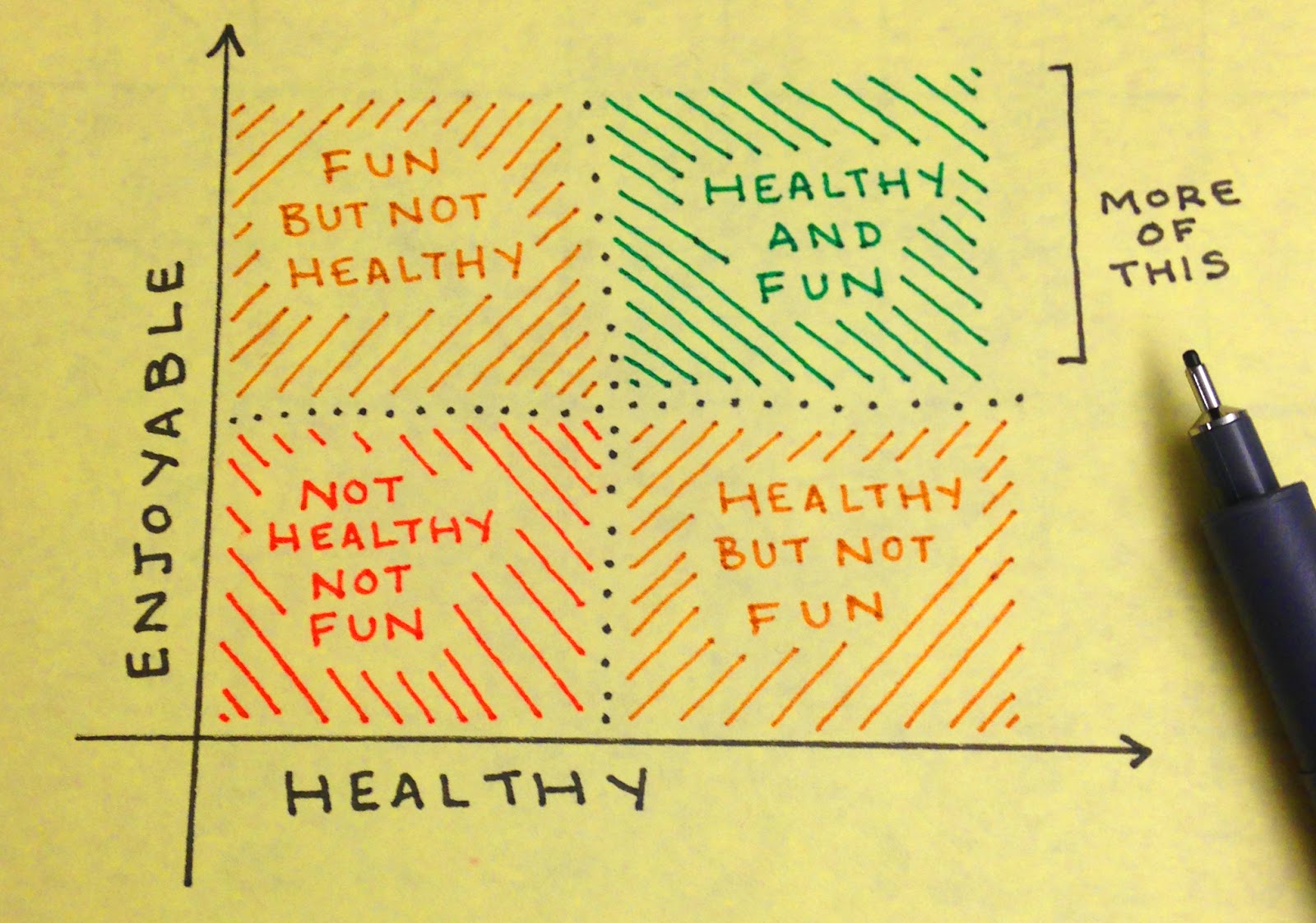
INDENTIFYING A CLIENT’S NEEDS
Every client has a different set of needs – and those needs are going to shape the type of image you’ll need to create to get their attention.
To use my own work as an example — my main “clients” are online patrons who support my work financially (that’s you guys, and you are amazing for it!!) Happily, as long as I’m creating something beautiful in my own voice, the “needs” of the average fan – to see something new from an artist they enjoy — will be fulfilled.
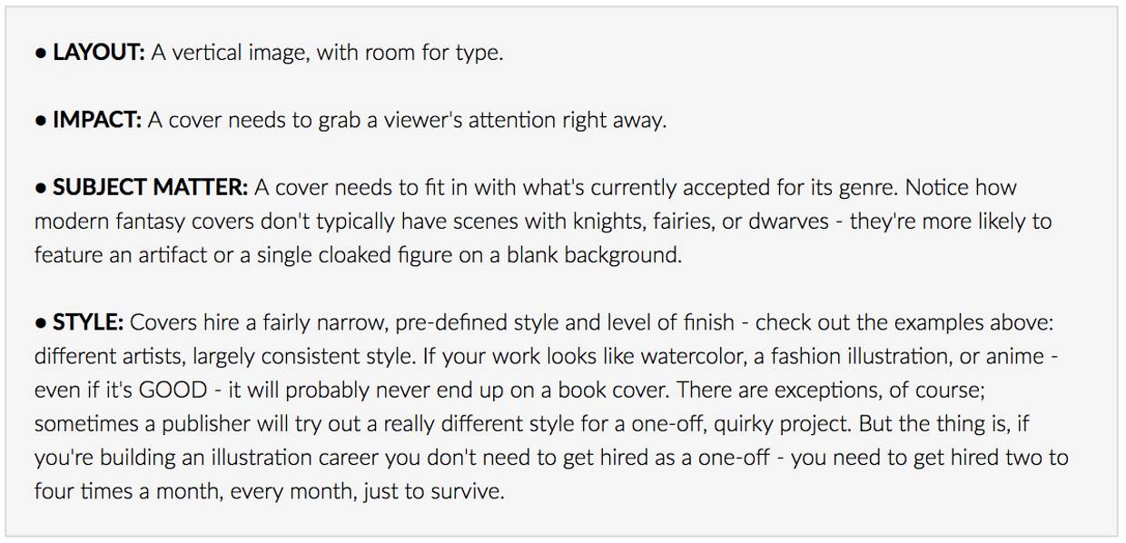
The needs of a traditional illustration client are MUCH less forgiving. A fantasy book cover client, for example, needs some very specific things out of a piece of artwork:
To get hired by a specific client, it isn’t enough that work be “good” – it also has to be suited to the needs of the client.
EVALUATING YOUR WORK IN CONTEXT
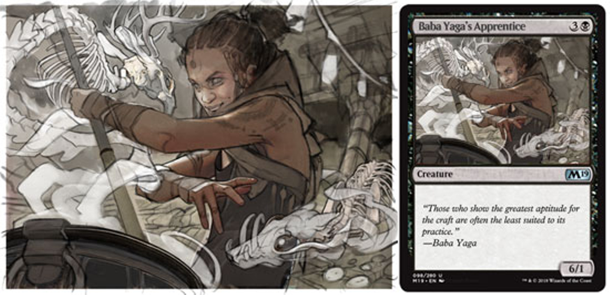
Here’s where my real-world example comes in: let’s say I want to get hired by a specific client, Wizards of the Coast, for work on their card game Magic: The Gathering (this is a pretty common goal among aspiring fantasy artists).
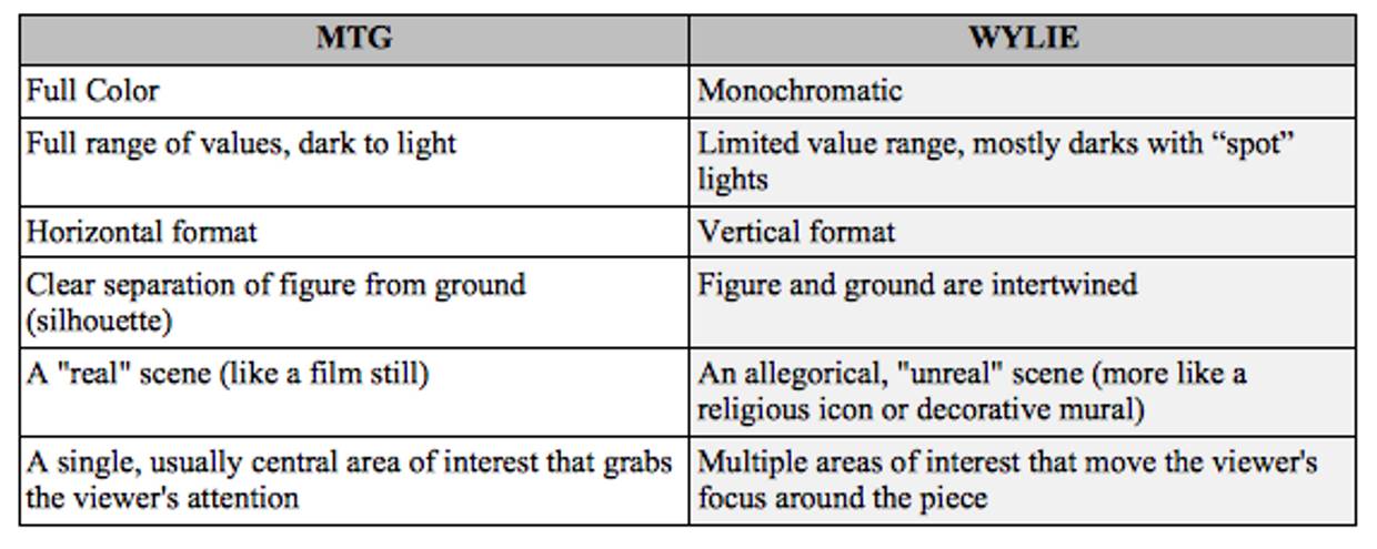
The first thing I need to do is compare the work I’m doing to the work this client is hiring. Actually placing one of my own paintings among a few MTG pieces is rather eye-opening…

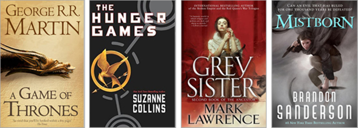
Above left, a couple of illustrated MTG cards from their 2018 set (for a client that has been in business for a long time, finding examples from within the past year or two is really important, since tastes change over time). Above right, one of my Reign of Sin cards. Looking at them side-by-side, I can spot some common features among the MTG cards, as well as some ways in which they differ from my own work…
If I send my existing portfolio to this client, my chances of getting hired are fairly slim, even if the art director likes my work — what the client needs and what I offer are just too different. Instead, I’ll be using the list above as a guide in creating a sample illustration geared towards this specific set of needs.
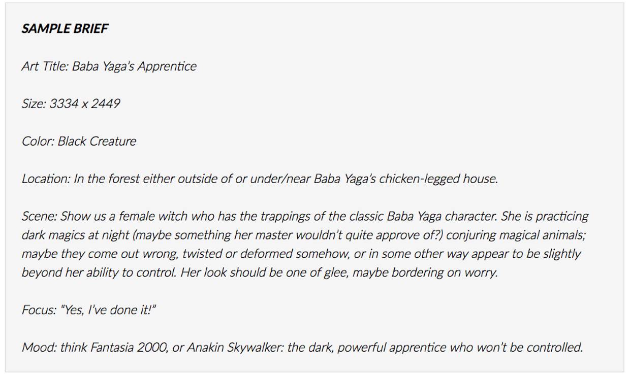
DESIGNING A SAMPLE ART BRIEF
To get started, you’ll need an art brief: an imaginary assignment from your target client to guide your sample illustration. In this case, my target client has art briefs from past assignments and style guidelines available online) – but regardless of whether or not your client offers this type of resource, an understanding of their needs and the purpose of the artwork they commission is essential.
Do your research: hunt down a ton of (recent!) pieces published by the client, drop them all into a single gallery, and try to figure out what common threads — style, subject matter, composition, mood — tie them all together.
If you aren’t intimately familiar with the property you’d like to work on, it never hurts to talk to someone who is. Happily, a few of my friends work on (and play) MTG regularly; one of them was kind enough to help me put together the mock art brief below.
PLANNING THE IMAGE
Client work is a balancing act — I’m trying to create a piece that fulfills the client’s needs while still staying true to my own aesthetics. At first, I take the “twisted and deformed” creature description from the brief a bit too literally, attempting to design creatures with huge fangs and lots of eyes, which resulted in a lot of false starts and frustration… I really like creating “beautiful” images, so freakish horror isn’t something I can really get excited about drawing.
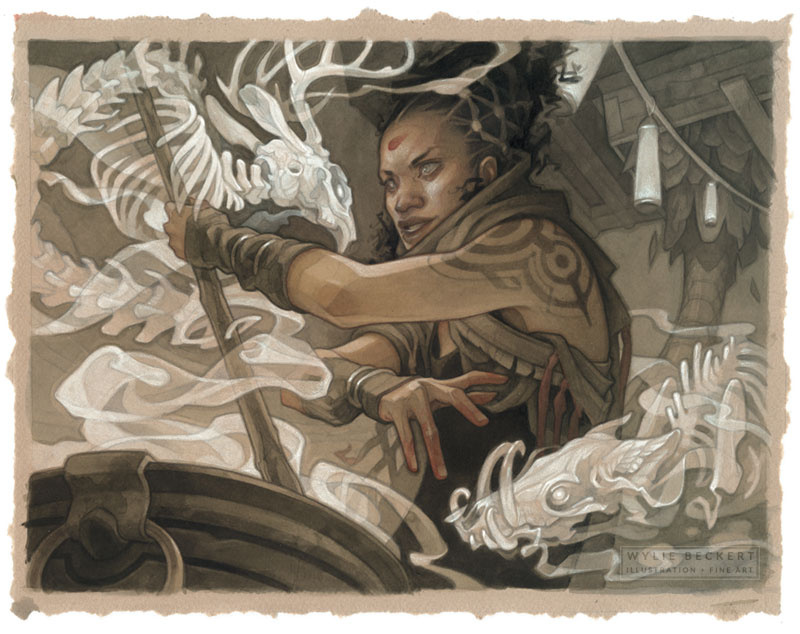
When I take a step back to consider my own preferences, though, I’m able to find a solution that appeals to me visually AND fits the brief : the “twisted” creatures can be skeletal apparitions built of the intermixed bones of unrelated animals. This is one of the areas where personal work and client work can (and should!) overlap; you always want to be on the lookout for ways to take a commissioned project and make it your own within the confines of the art brief… there’s no surer way to doom an illustration to mediocrity than to paint something you have no interest in.
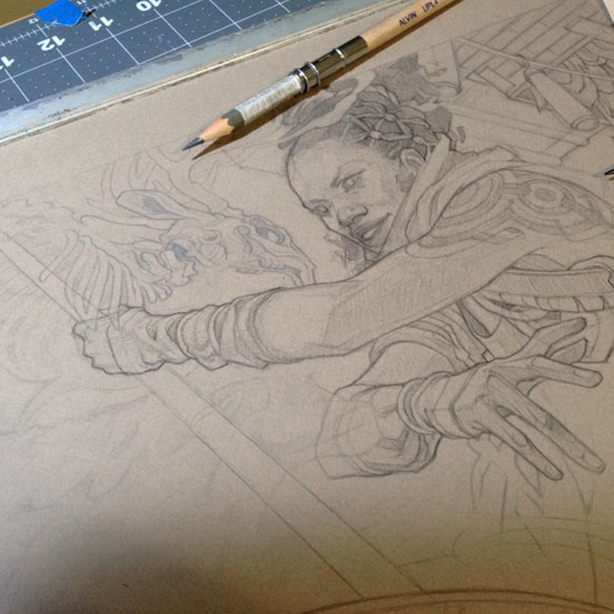
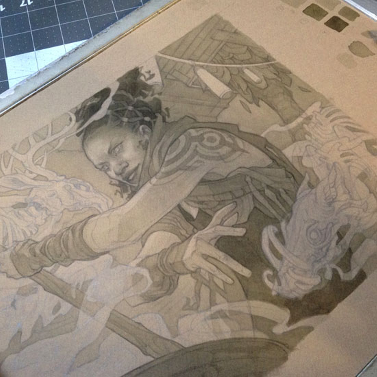
Since the finished art will appear in the context of a specific product, it’s important to take its final incarnation into account from the very beginning. Both the color and design of the MTG frame will affect how the artwork reads, so I’m building my thumbnail sketch within a mockup of a finished card, and zooming out to double-check that the image reads clearly at a smaller size as I go.
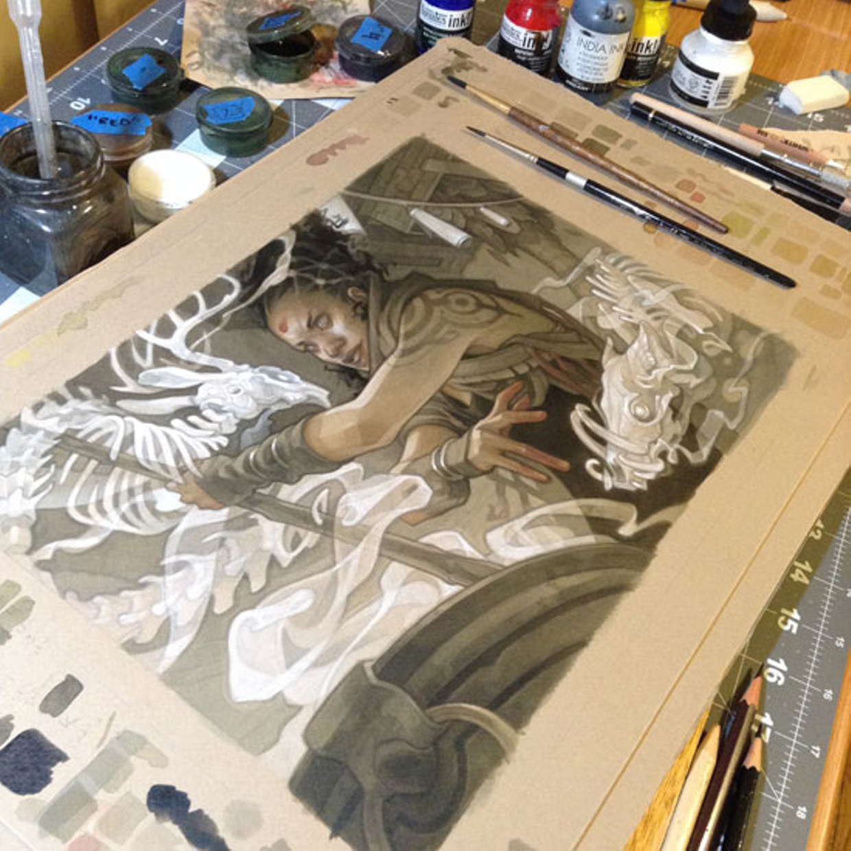
PAINTING THE FINAL IMAGE
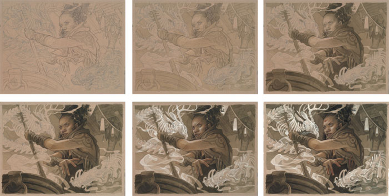
My process is usually fairly predictable when it comes to my personal work; however, I was surprised to find myself making adjustments to my usual techniques at almost every stage of the process to accommodate the requirements of my target client.
You can read more about the specific tools & techniques I’m using in the complete process tutorial ($5+ patrons, check your inboxes for this month’s password!) but the snapshots below capture a few of the eccentricities of the process…
Normally my paintings are pretty much either all dark, or all light. In keeping with the aesthetic of most MTG cards, I’m using a broader range of values – which meant borrowing aspects from my two separate “light” and “dark” processes for different parts of the same piece. Above, you can see the two different shades of Col-Erase pencil that I’m using for the underdrawing…
Since I knew I’d have to bring this image into color, I figured my usual blackish-brown ink mix would be too dull. Instead, I chose a slightly greenish hue for the monochrome ink washes, above.
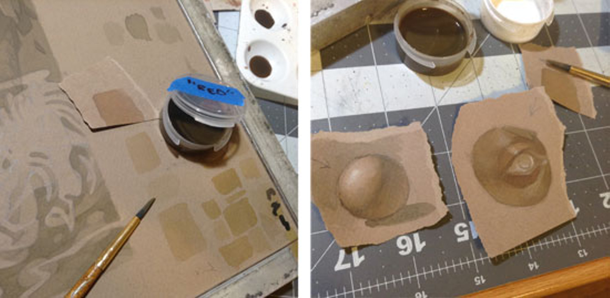
Traditional-media color is fairly new territory for me, but it’s an absolute necessity for this client, so there’s no avoiding it. I tested out a ton of swatches and simple practice paintings (above) to try to nail down the exact mix of colors and strength of application that would add a hint of color, without making things too garish.
Skin tones proved especially tricky; I found that bringing color to the piece via subtle temperature shifts rather than vivid washes worked best. A few washes of my “red” ink mix (actually a brownish color, shown in the palette above alongside red ink from the bottle) completely changes how the greenish underpainting feels by comparison.
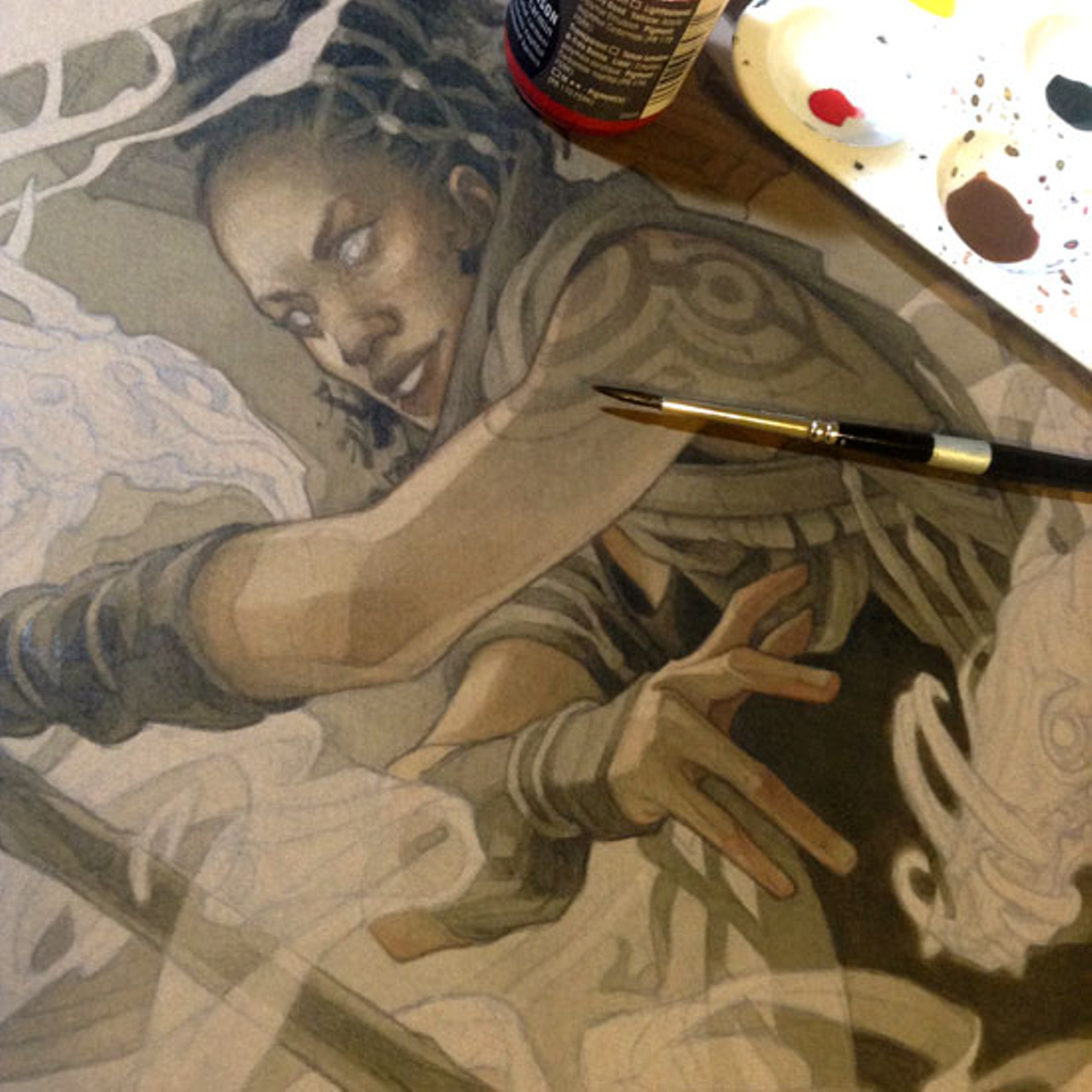
The introduction of color also made for some uglier middle stages than I’m used to in my painting process… making things a bit more nerve-wracking than usual!
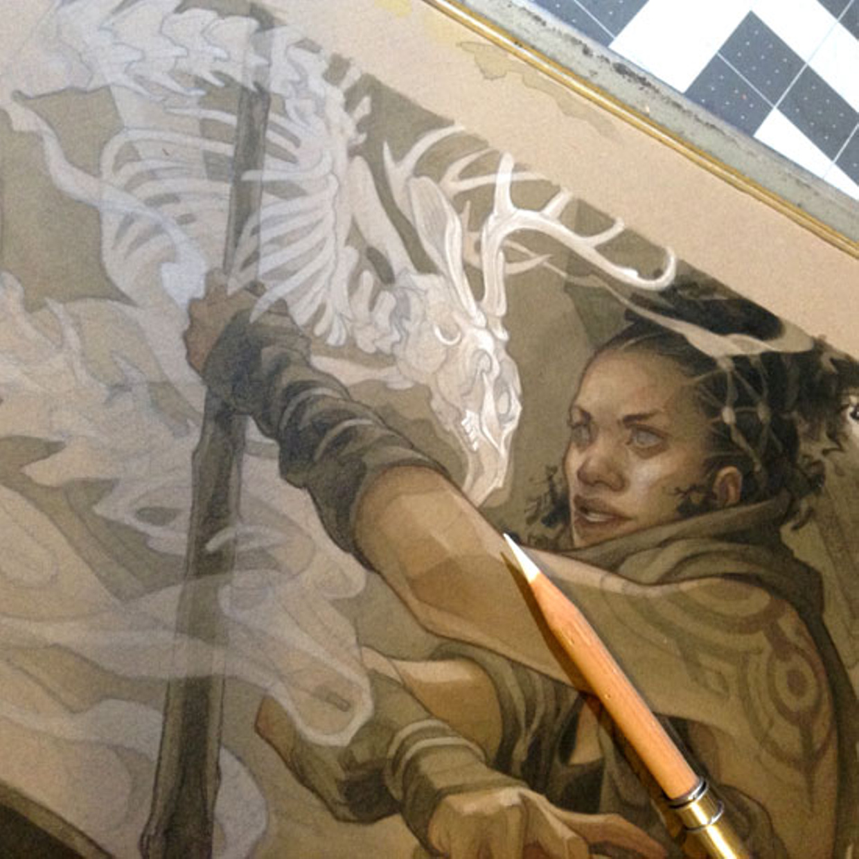
Certain stylistic concessions needed to be made as well – I normally love bold, graphic outlines, but I knew that they wouldn’t be a great fit for MTG, which tends to commission work in a more painterly, “realistic” style. I had to find new ways to bring that final polish to the painting that I would normally achieve with lineart… Above, targeted use of highlights added definition in lieu of outlines in some of the lightest areas of the piece.
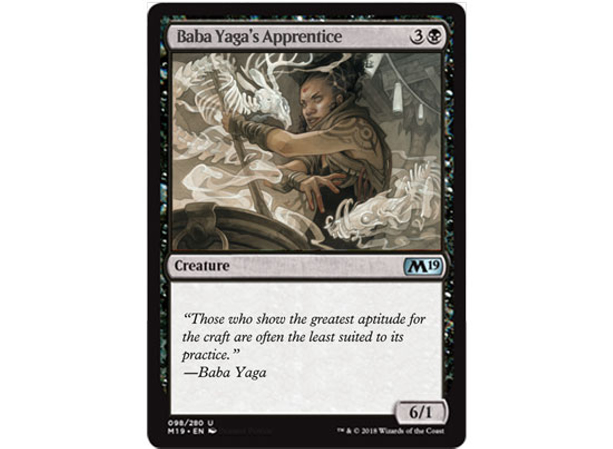
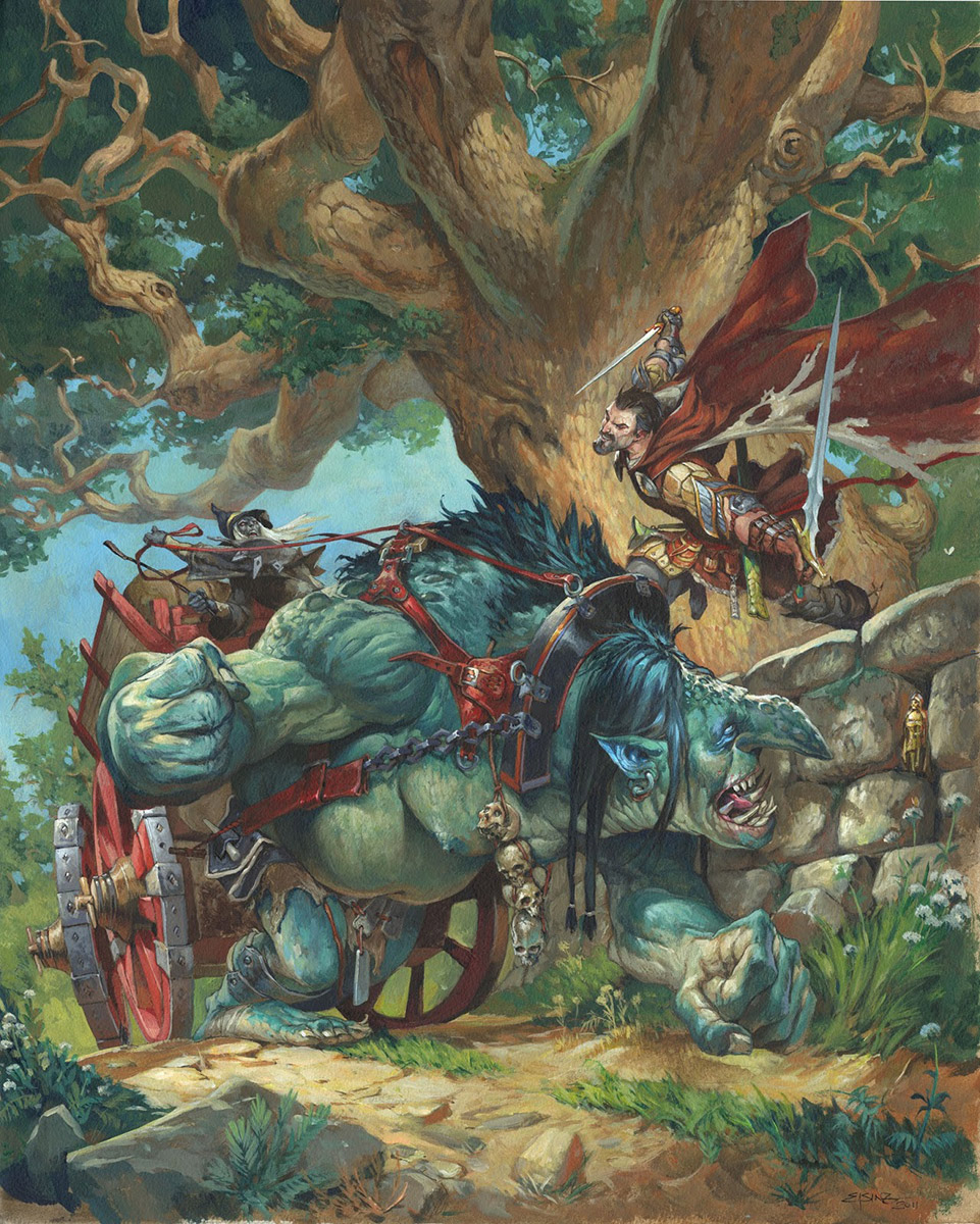
The finished piece! (The original painting is available for purchase HERE; timed edition prints are available in the shop until Wednesday, December 5th in the shop.)
I’ve already pushed the color and values in the original painting further than I normally would, but I still add a little extra contrast and saturation digitally to ensure that the card’s frame will harmonize with the image, rather than compete with it.
The final test: dropping my finished card in its frame among others of its kind, and seeing how it fares…
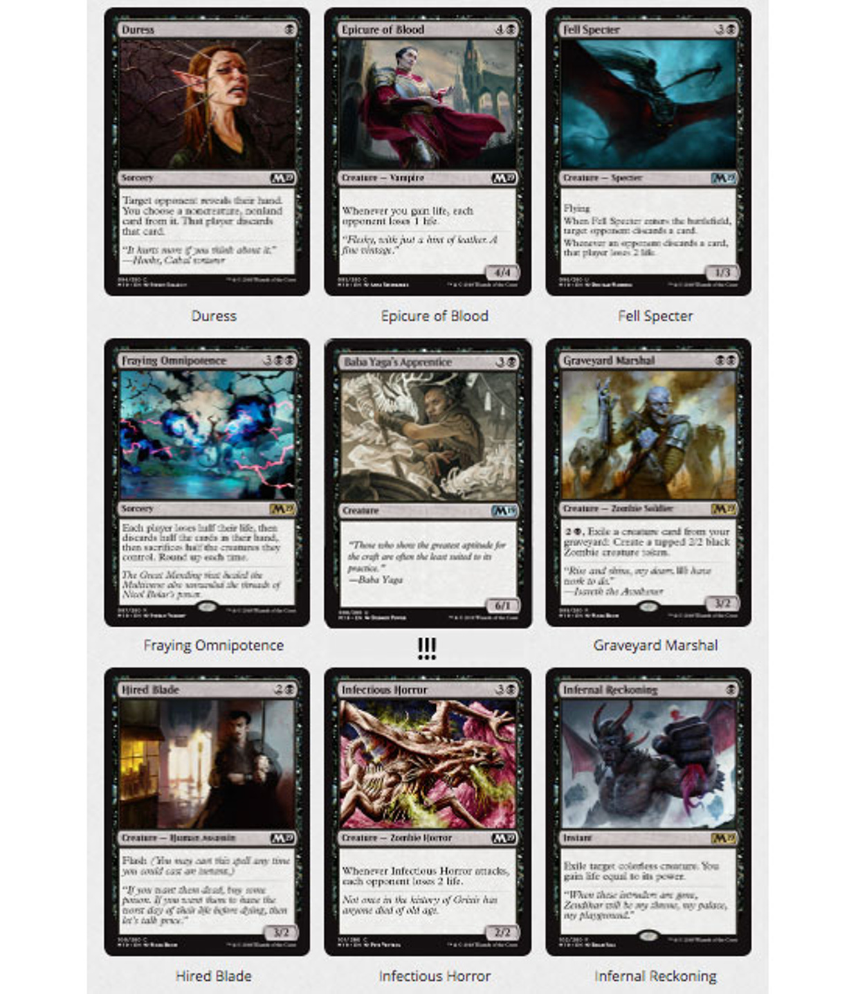
As you can see, this sample blends into a MTG set much better than my Reign of Sin card!
You might notice, though, that I’m not closely imitating any specific MTG artists – it’s still very much my own work, which means it’s missing a few elements like bright colors and super-smooth digital rendering that crop up a lot in MTG cards. There’s a good reason for this: it’s simply not the kind of work I like to create. While I want to put my best foot forward with an image that addresses my client’s needs, I don’t want to put anything in my sample that I wouldn’t want to be called upon to paint for a real assignment.
The purpose of an illustration sample isn’t just to land a commission; it’s also to scope out whether your art is a good fit for a particular client. Think of this as the “are there any questions you’d like to ask us?” portion of a job interview; what I’m asking the client with this sample is, “I like visible lineart/muted colors/traditional-media textures — can you work with these?” Speaking from experience, working for an illustration client who wants you to paint like some other artist is a special kind of hell.
Hope this info is of some use to those of you who are lost in the strange divide between aspiring artist and top-hat-wearing, cane-twirling billionaire illustrator (ha). If anyone has any questions, feel free to leave them in the comments!

Hello, how are you?
Thank you for this interesting article. I have saved it on my favorites so i can consult it regularly.
One question though, it may be silly but, if you try to make your work to “fit in” the clients needs, taking MTG for exemple, there are countless artists trying the same thing, wont your work disappear in the crowd? I mean, will not everyone end up having a simillar style or way of representing things? Its just a question i had to ask, as im not familiar with the industry nor anything.
Thank you bery much for your time!
A similar look across the board is actually something most clients are striving for; many (including WOTC) even provide artists with fairly rigid style guides in an effort to keep things consistent. The best way to “stand out” in these cases is going to be through the quality of the work – creating an image that’s interesting by virtue of its great composition, nice lighting, a dynamic pose, etc – rather than something that’s unique in style or subject matter, which would likely render it unusable to the client.
Did you accidentally download the same file for the card grid that was to show style samples prior to your adjustments or am I misreading something? Great post. I had two students that ‘art wise’ were two of the best talents I’ve seen (one even won twice in a very familiar, prestigious fantasy art contest). But they had great difficulties coming to grasp that they couldn’t show up and show their great art and get commercial clients to pay them to make whatever they wanted vs what would suit the client.
Very informative, Wylie Beckert. Thank you for sharing your experience.
Just the article I needed to read this morning. Thank you!
This was a very informative article. I’m already trying to fit my work in the MtG style, but was missing some subtle characteristics pointed here, thank you for the highlights!
Great! tanks for sharing your knowledge.
this is a really good post. and the final art is beautiful. but nowadays all big and small publishers closed their submissions. so cathering to a especific client feels like a shot in the dark. yeah my dream is making magic cards. but Im suppose to focus my portfolio to it without knowing if an AD from Wotc is even looking at it?
cold emailing art directors feels like an advice people told me NOT to do.