I recently shared my process for painting a very small piece. Today I’m back to describe the creation of something a fair bit larger.
If you are interested in drawing comparisons between this painting and the one linked above, I should note that this piece was art directed while the other was not. This impacted my process a bit in requiring more preliminaries. While it maybe shouldn’t matter and I might do just as much sketching and prep for a personal piece as I would a commission, the truth is I tend to produce more prelims when I need to communicate with an AD.
The prompt for this piece was unusually broad. I was asked to create key art for a marketing campaign and it needed to be an exciting scene of a heroic figure and dragon. Details were open ended, but it would ideally have a balance of fun and danger. Additionally, the piece needed to fit some specific crops, best achieved by designing an image with a wide margin around the central focus. My original plan was to go with a square composition that was very flexible for cropping, and I roughed out three different ideas for the art director in pencil. These are basically glorified thumbnails. I wouldn’t normally turn in something this early, but it was important to start narrowing the options given the complexity of the piece combined with the loose concept.
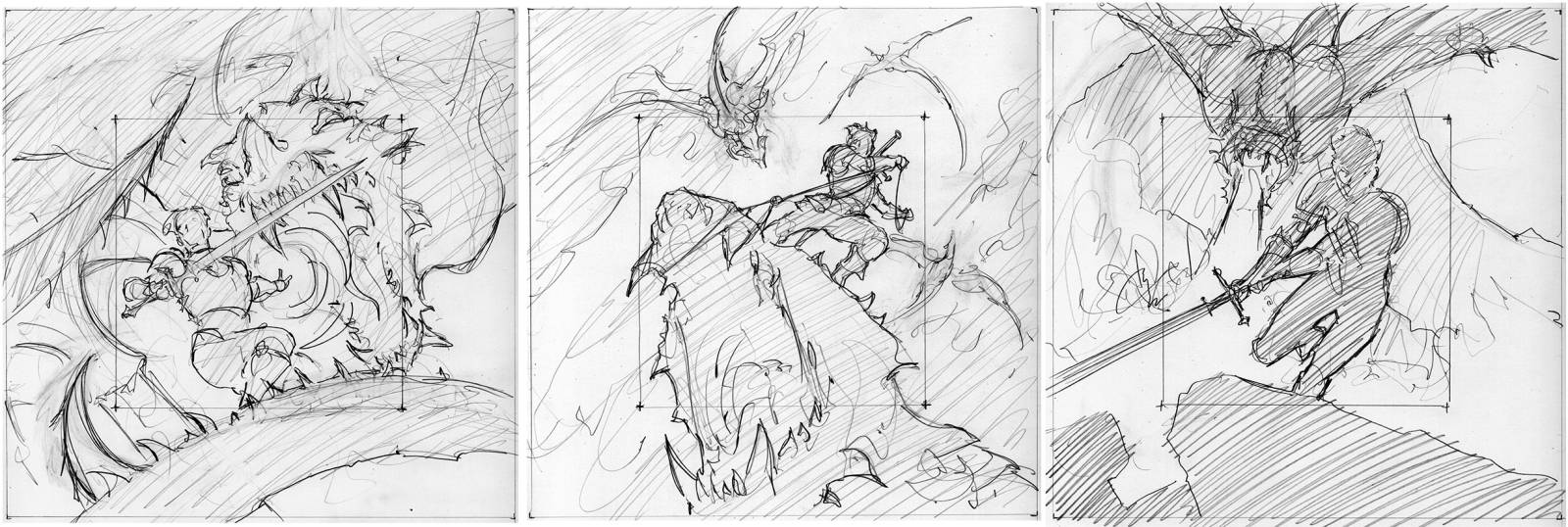
My first group was of square compositions with the hero in various combat scenarios against the dragon. The biggest challenges were: 1. showing the hero and dragon both facing generally towards the viewer while still engaging with eachother, and 2. the large difference in scale between the two
The sketch of the figure riding the dragon proved the most appealing and so that became the concept moving forward. It was also decided that the dragon should be a Blue Dragon. I started refining this composition and sent in another set of options.
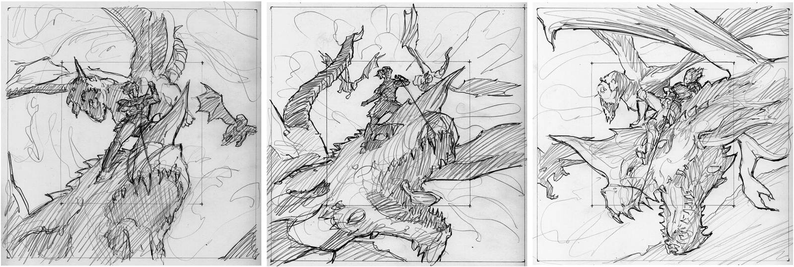
Still working in a square format, the concept is taking clearer shape
Of these, the middle image was chosen to go forward. At this point, I felt confident to start working up my more typical painted sketch. There was a request to show more of the dragon’s body, which concerned me because that would mean a smaller hero. After working this over awhile, I realized a good solution was to make the piece a landscape format instead of square, which would allow more view of the dragon for horizontal crops but keep the figure prominent when used vertically and not waste space with unnecessary additional sky. Because I would ultimately be painting this in traditional media, I’m also being mindful of how large the painting will need to be and still be able to get into the central figure with sufficient detail.
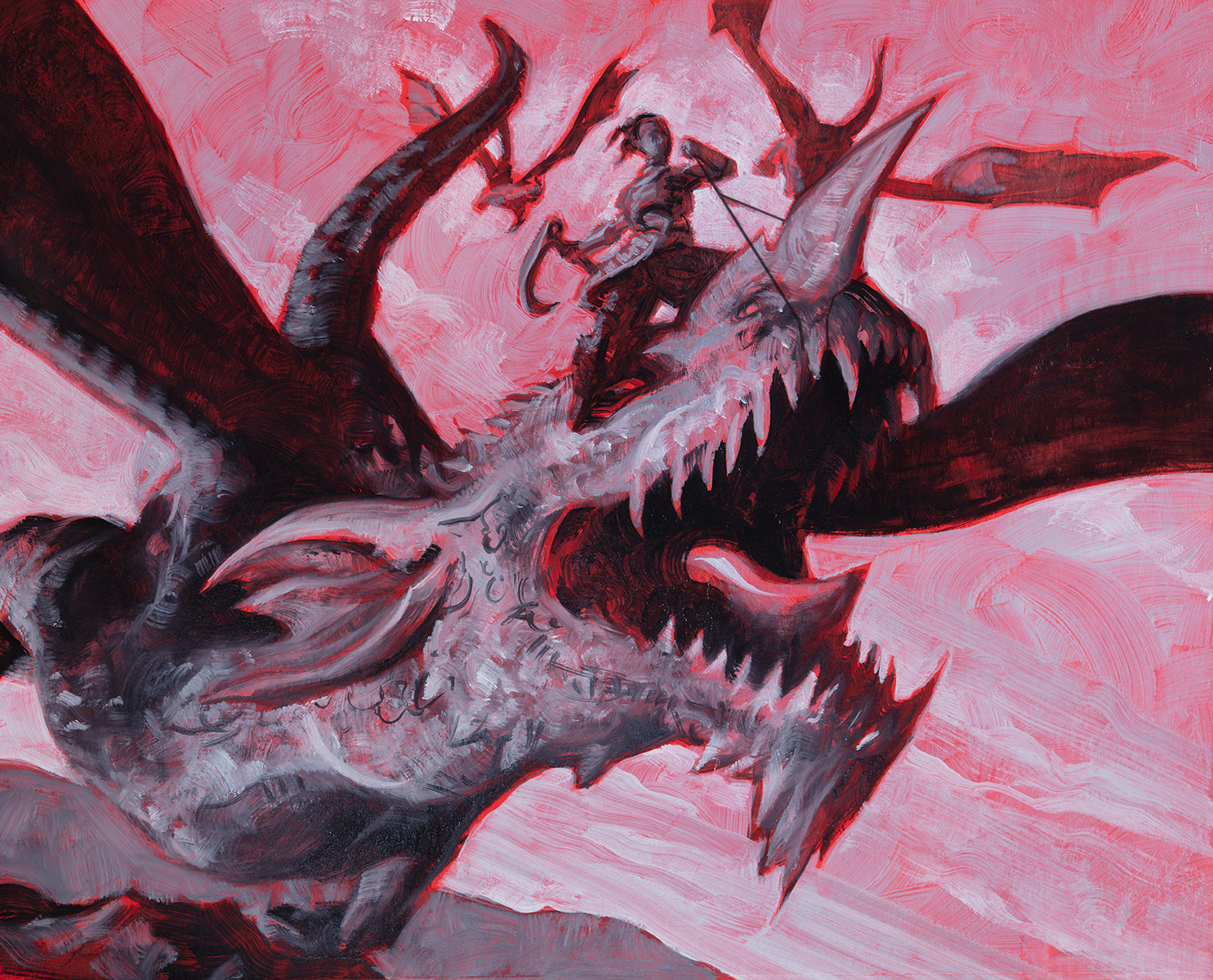
the preliminary sketch, oil on watercolor paper
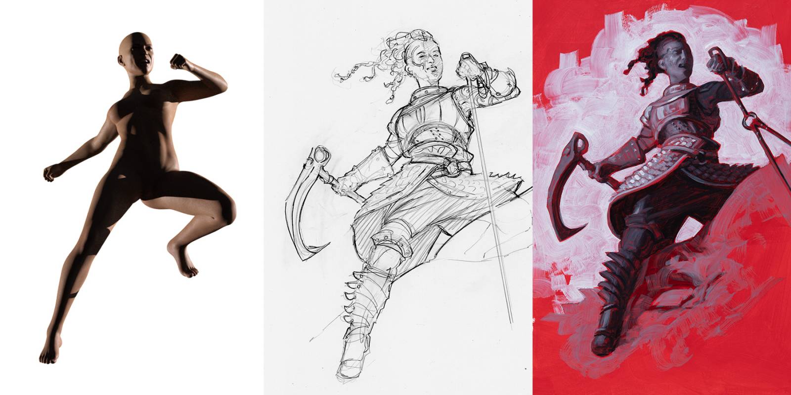
Because the figure is so small in my sketch, I did a figure study to send along as well to better describe her costuming. I used 3D to aid the development and explore pose and lighting variations
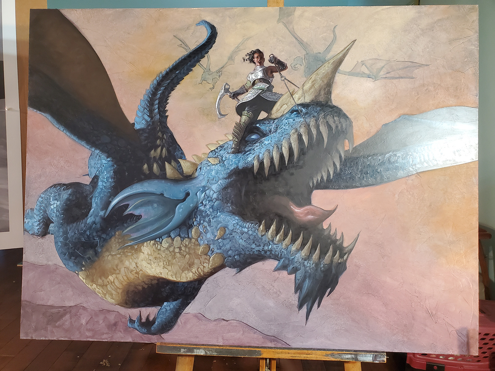
There were a few notes regarding the pose and some other details, but I was then cleared to go to final. I ultimately decided to do this piece 30×40 inches in order to balance overall size with the needs of the figure. This would allow for a figure about 9 inches tall, which is sufficient and about the same size as the prelim figure study.
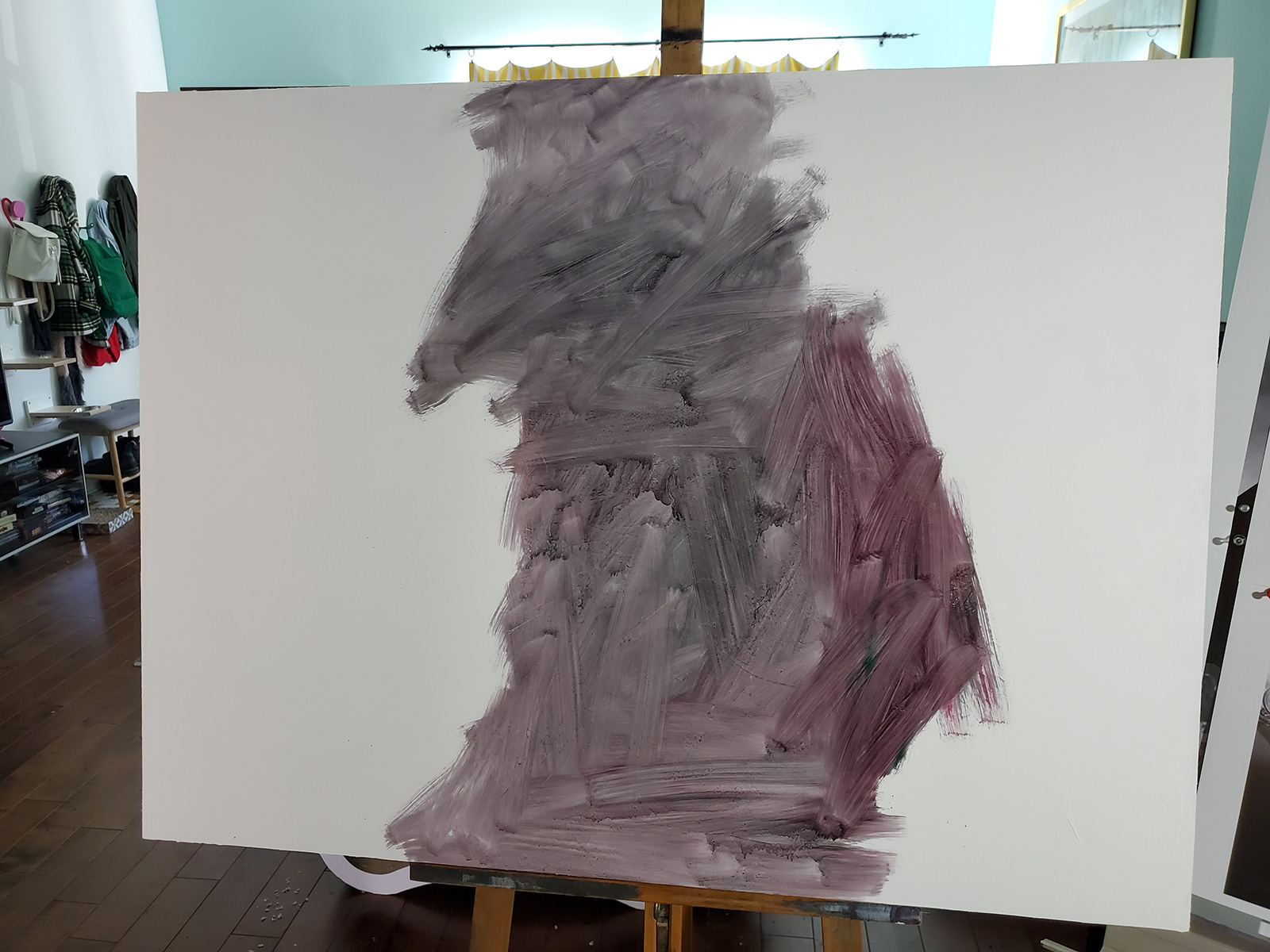
I began with a cradled wood panel. Gesso was applied in 4 layers with a large palette knife which gives my surface some organic texture. Then the surface is painted with a neutral midtone and buffed, and then the structural drawing is applied. I used a projector to scale everything up.
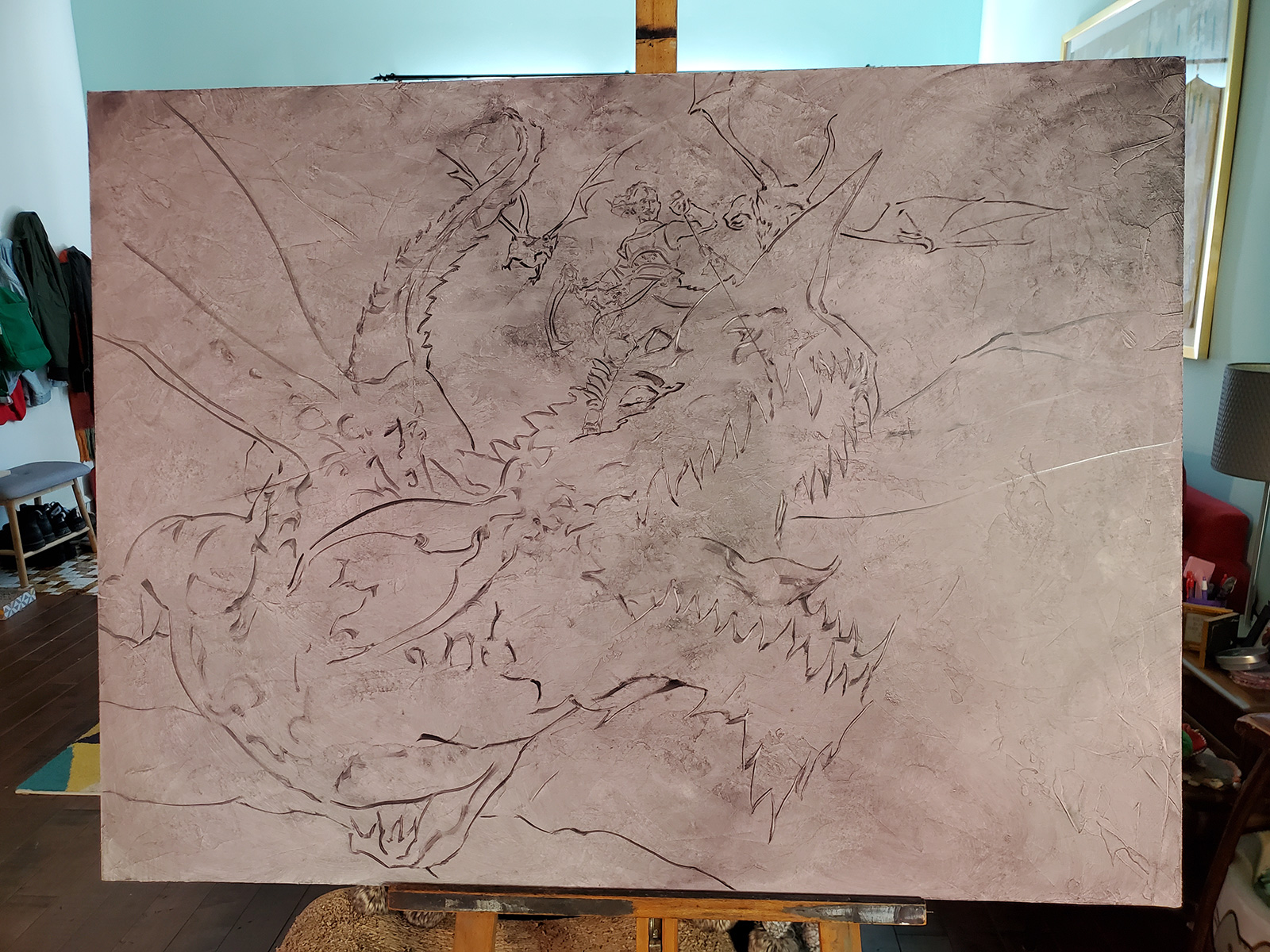
When my structural drawing had dried, I went over top with some transparent color washes to begin planning out the overall colors of the piece. I usually allow this to dry again before going further.
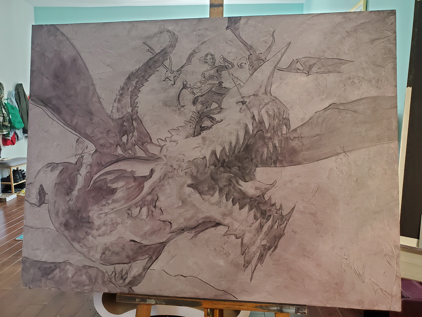
The biggest challenge for me in a piece this size is feeling overwhelmed by all those square inches. It can feel paralyzing at this point, seeing how much work there is yet to do. But the only way forward is to start putting down paint, and the best place to put it is the most important and interesting areas. I start with the figure here and make crude generalizations of color and tone. From there, it’s progressively easier and easier to bring the figure along adding light and shadow. The more it begins to take on volume, the less stressful it feels.

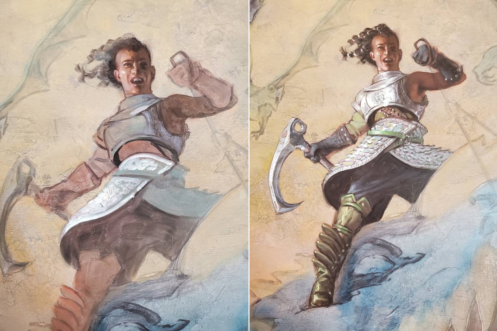
I work outward from there, moving next to the other key focal area: the dragon head. Then the dragon body. Then the other dragons, then the sky. I tend to work most pieces this way, starting with the most critical areas and gradually reaching the supporting areas. I can clearly see how much rendering is needed for any particular section like this without getting lost in unneeded details.
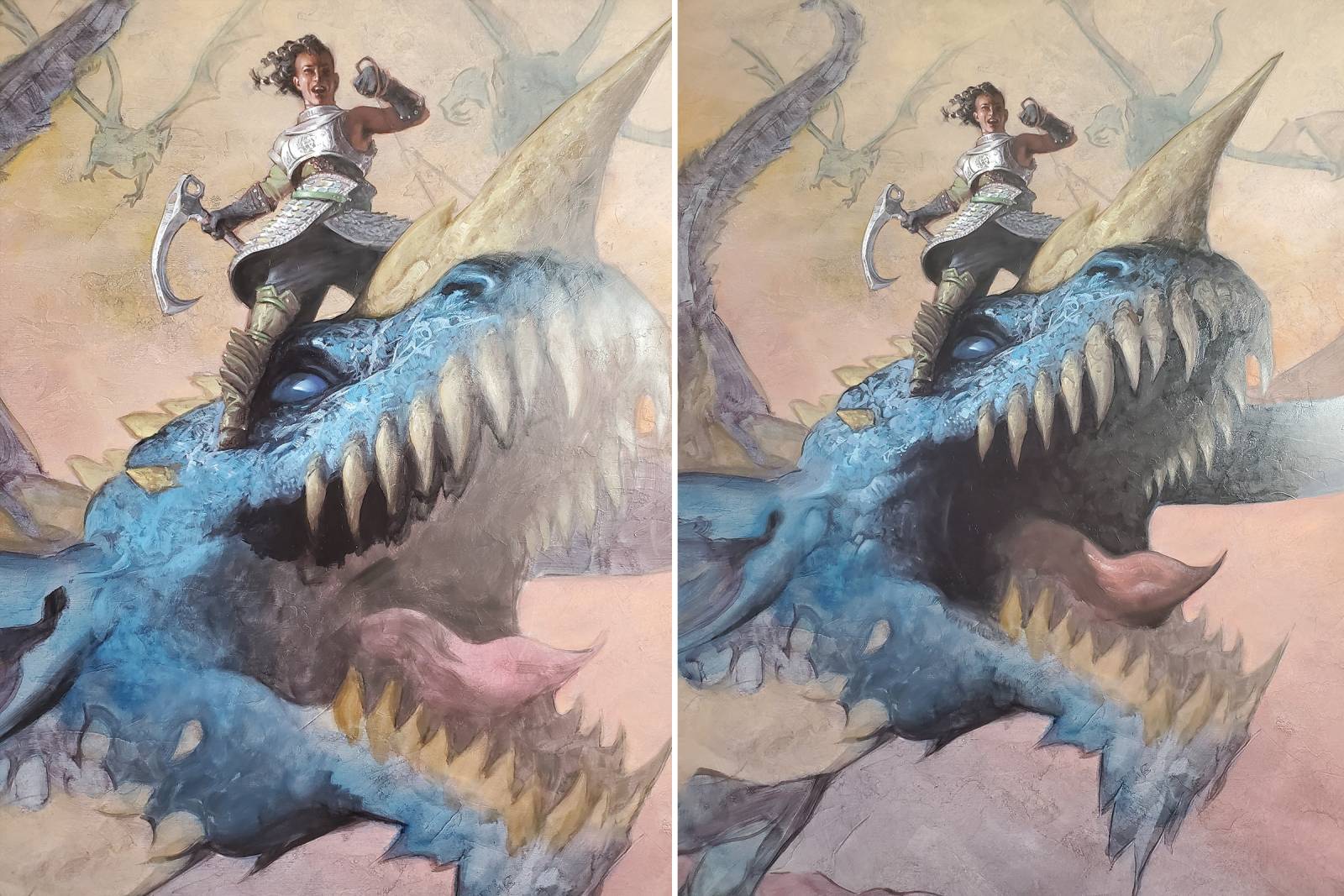
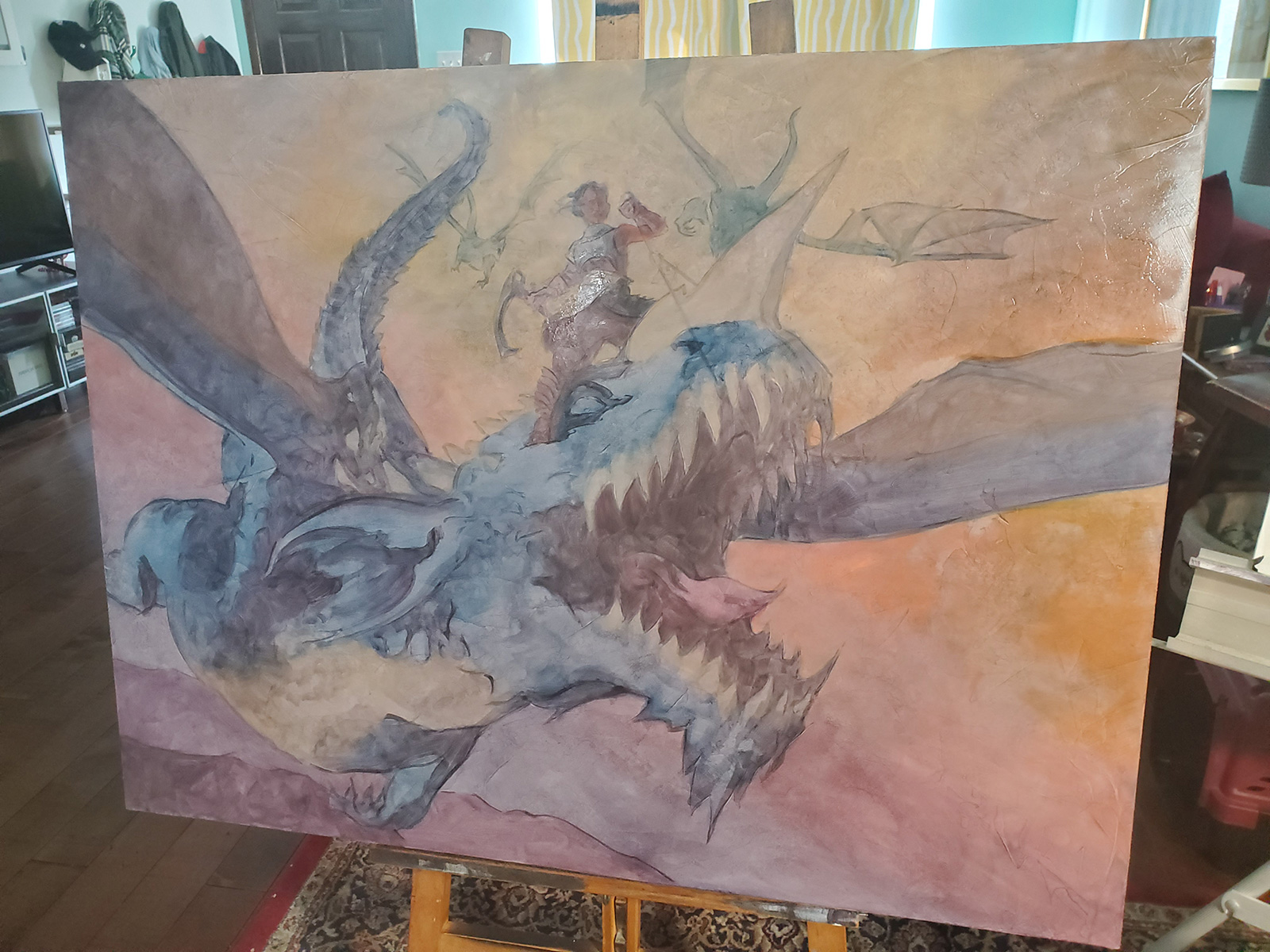
For a piece this complex, this occurred over several sessions. I was working with galkyd gel medium which speeds drying time so that I could oil out when needed and bring the colors and tones out to match fresh paint. Eventually the piece was ready to deliver.
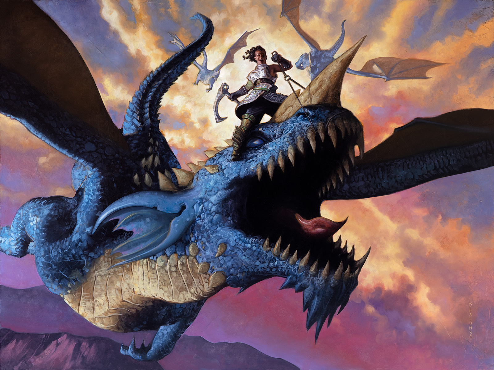
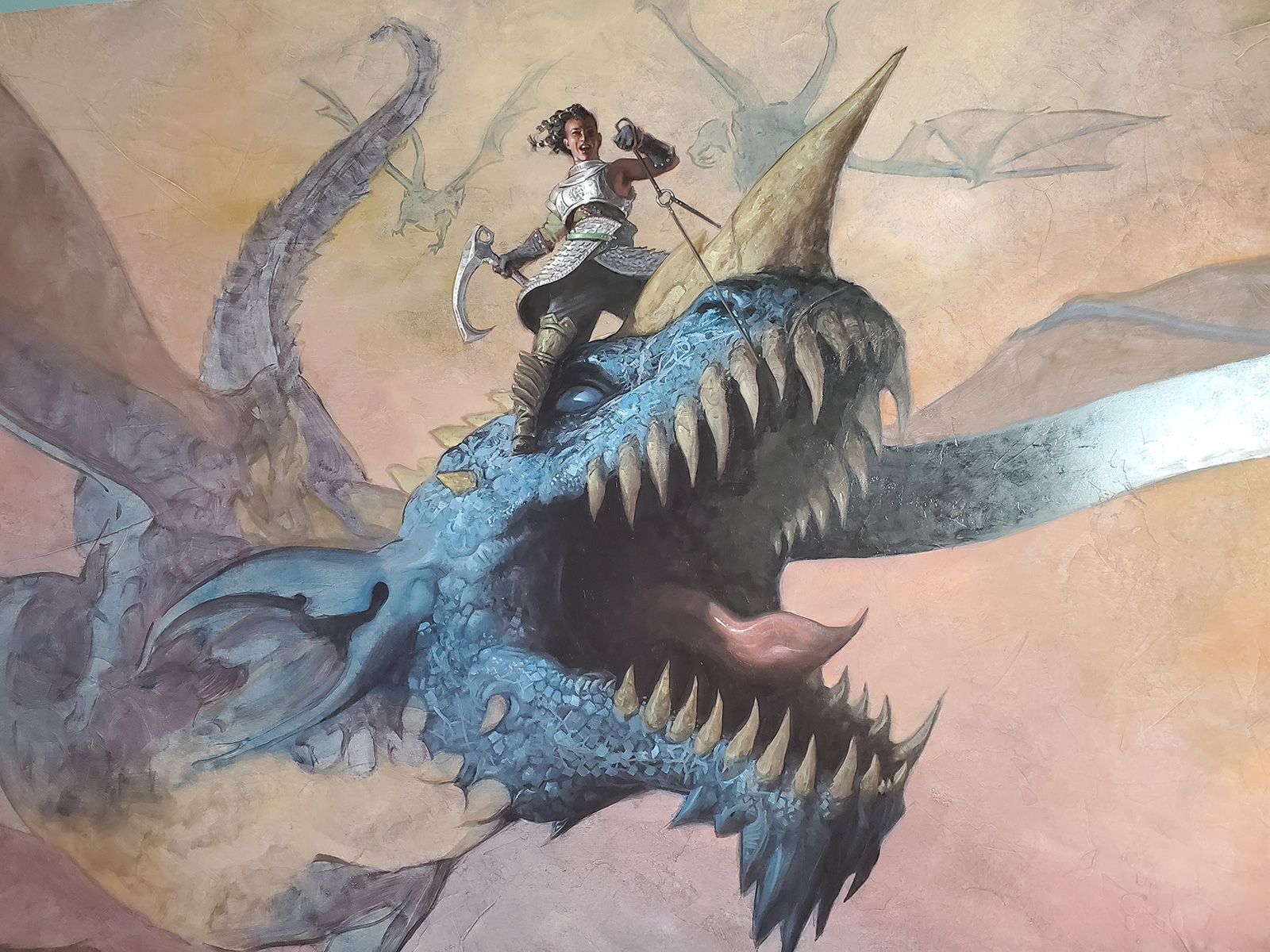
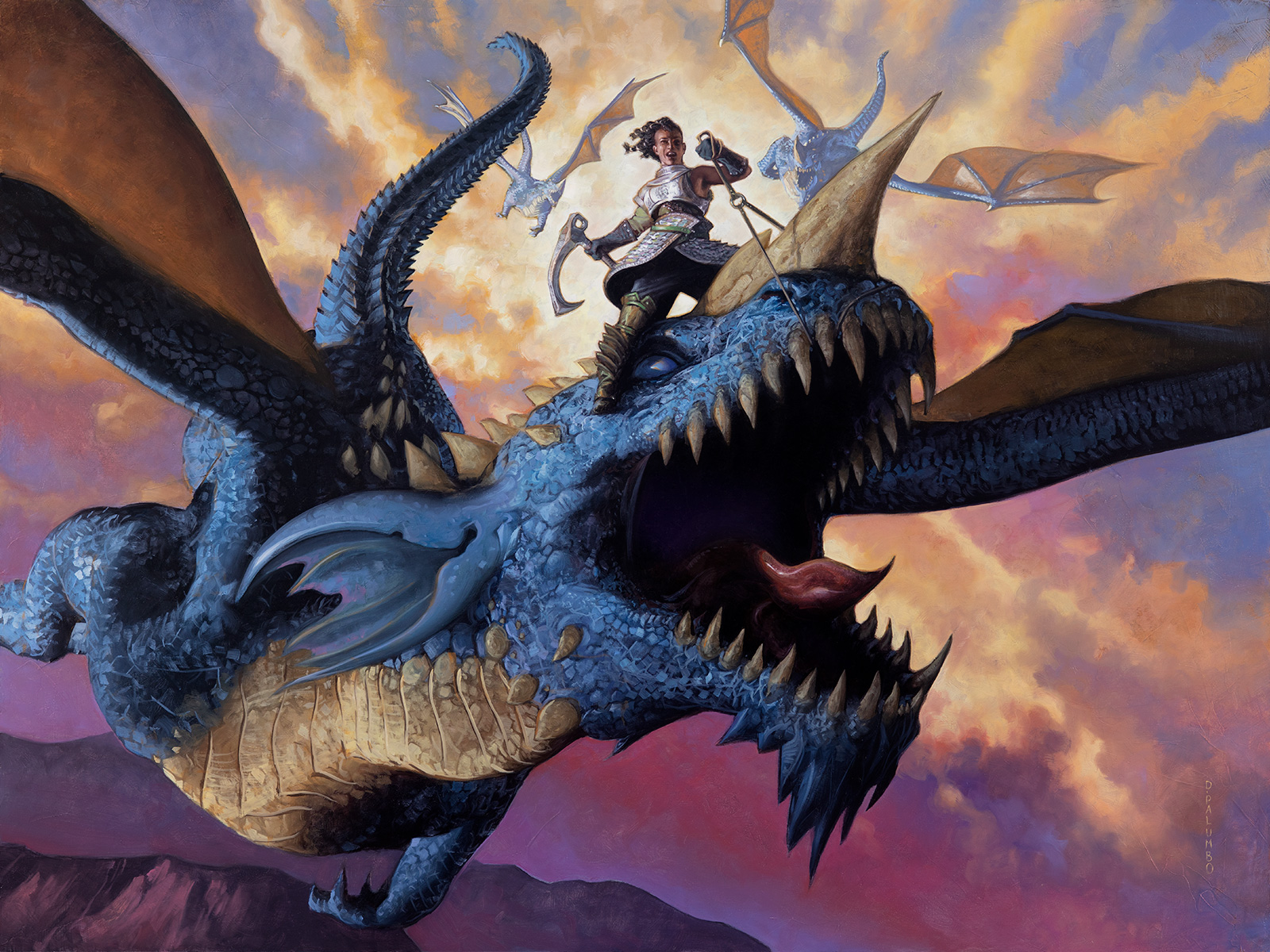
But of course there are often notes. I was asked to give more refinement to the dragons, the portrait, and some translucency to the wings. All excellent improvements that really brought the piece home!

Stellar work! Thanks for the write up Dave. Love seeing those pencil sketches.
Wow, that’s a good one! Powerful and dynamic composition. I like how you draw attention to the figure with the cloud direction and it being the highest contrast area. Thanks for showing your process.
Thanks for the writeup! I’m liking the idea of leaving the gesso as an organic texture.
Killer piece!