 |
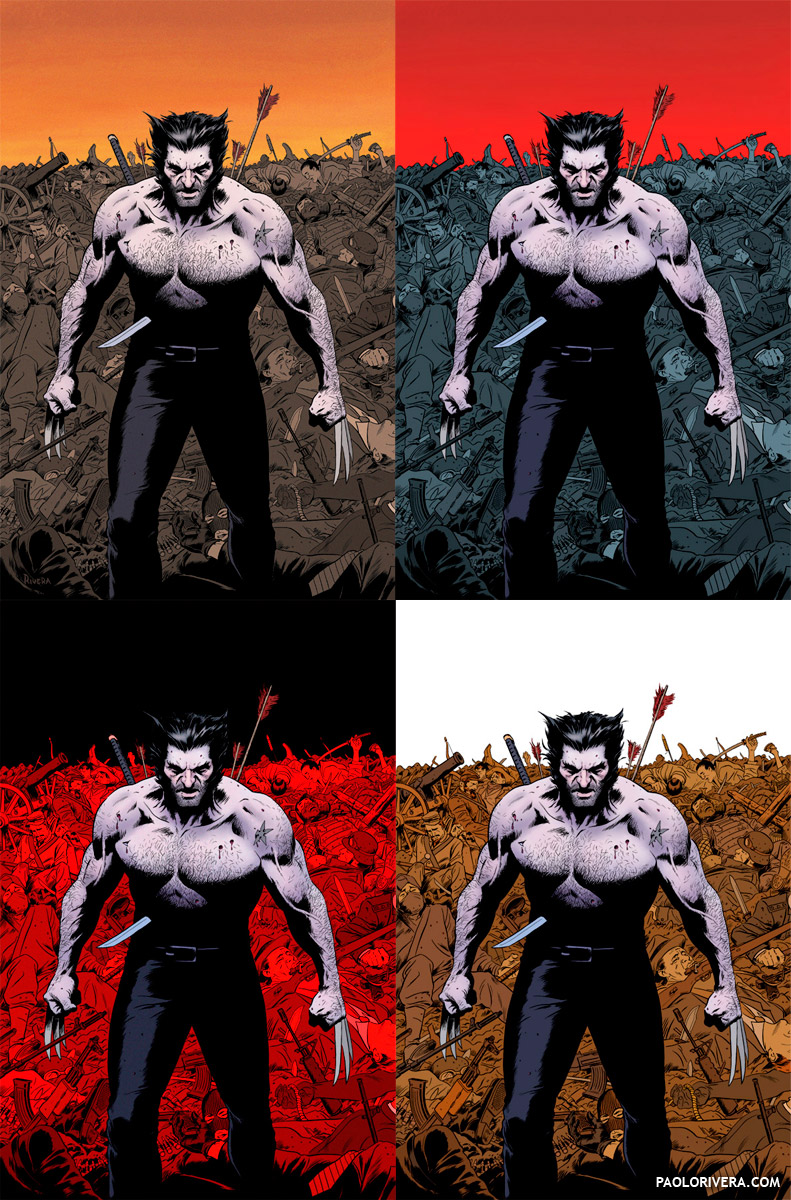
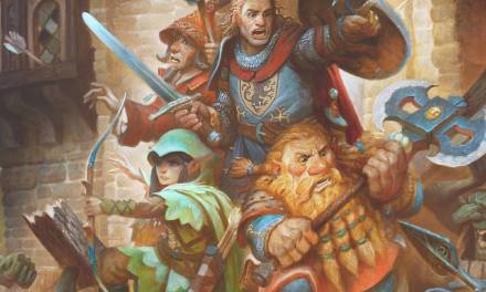
| WOLVERINE MAX #1 VARIANT COVER (color options). 2012. Ink(ed by Joe Rivera) on Marvel board, 11 × 17.25″. |
Welcome to the last of 3 posts on digital coloring for comics. Today’s post is all about the finishing touches. I have a very basic approach when it comes to style, so there’s nothing particularly fancy, but I do want to go over the various “special effects” that I use. As with most things involving Photoshop, there are countless ways of achieving the same goal — these are just my methods. (I didn’t have time to finish up the second video, but there’s quite a bunch of info to cover below. I’ll be sure to post it at a later date.)
 |
| An example of a “color hold” |
(Be sure to click on each image to get the full-scale effect.) First up, we have what’s known as a “color hold.” This is where the black areas of the art are replaced with another color. It’s a great technique for pushing things back in space — it’s essentially a form of aerial perspective — and also for elements that are glowing (fire and energy beams) or evanescent (ghosts and smoke).
On the “inks” layer, use the Magic Wand to select all the black pixels. If you’ve done everything right up to this point, there should be nothing but black and white pixels on that layer, making it a clean selection. Press Command-J to copy that to a new layer (also found under Layer > New > Layer via Copy). On the layers palette, click the Lock Transparent Pixels option — this means that the transparent areas on that layer will remain that way.
| Lock Transparent Pixels |
Using the Pencil tool (to keep things aliased), color every area that you want to be a different color. You are welcome to use as many colors as you want, but it’s best to keep things simple, especially if you’ll be making subsequent edits.
This can act as your sole layer for line art, but I like to keep things separate. I usually select all the black pixels from the Color Hold layer and delete them. I then select what’s left on the layer (by Command-clicking the layer icon) and delete that area from the original Inks layer below. This is not a necessary step, but I like having the option. Since I color myself, I often end up erasing many of the Color Hold lines, and so wouldn’t want the ink lines below to peek through. (However, if you’re coloring someone else’s work, they probably wouldn’t appreciate you altering the art.)
 |
| Basic, two-tone coloring |
My particular style is part of the “flat color” school. It’s not an official designation, but people often use the phrase to describe it. All it means is that I use little to no gradients or highlights. The closest I get to the modeling of form is what’s known as “two-tone” rendering, which is probably most familiar from animation. It’s an economical, but very effective way of creating the effect of light on objects.
Still using my pencil tool, but with a rougher brush preset, I map out the interaction of light and shadow. This keeps things easily selectable, so you can still make color adjustments later down the line. Occasionally I’ll use a more textured pencil for “softer” transitions, but it’s still just 2 colors — the blending is merely optical.
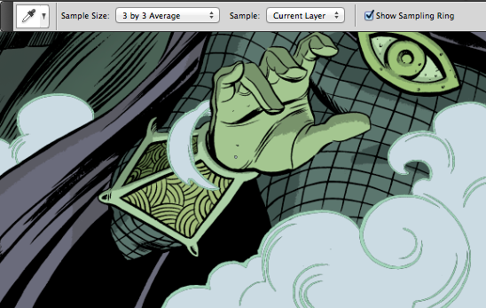 |
| Make sure the Sample is set to Current Layer. |
Most of the time, I’m choosing a darker shade to create a shadow, but if it’s a lighter image, I’ll “paint with light,” instead. Choosing the actual colors is a manual process, but something that gets easier with practice. The first thing I do is option-click the color I want to adjust — this is the equivalent of using the Eyedropper tool, which samples the color you click so that you can paint with it. (An important note: it helps to select the Sample: Current Layer option, which will disregard the effects of any adjustments layers above it.)
Once the base color is acquired, it can be altered by clicking while holding Control+Option+Command. This brings up the Heads Up Display color picker — a new color has been chosen as soon as you release the click.
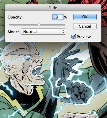 |
| Fade is a quick and easy way to “Undo” on a sliding scale. |
If, after painting with the new color, you find the change to be too drastic, you can split the difference using the Edit > Fade command (Command-Shift-F). The dialog box that appears acts like an opacity slider — you can choose precisely how strong you want the effect to be. Not limited to color, this process can be applied to almost any edit just performed. This is particularly useful on skin tones, where we are most sensitive to subtle changes.
In general, my shadow colors tend to be darker and less saturated — no big surprise there — but I almost always change the hue slightly, thus creating a warm/cool dynamic. This is the same way I play with color in my painted work, it’s just a whole lot easier to do here.
 |
| The tops of the arms have been slightly darkened with the Burn Tool. |
Once I’m completely happy with the overall look of the piece, I copy the Flats layer and rename it Color (in the layers palette, option-drag the layer to copy it above). I then select each and every section that requires additional rendering, mostly the shadow areas. First, I’ll use the Burn Tool to darken areas in deep shadow. This results in the subtlest of gradients, but still gives the overall effect of flat color.
 |
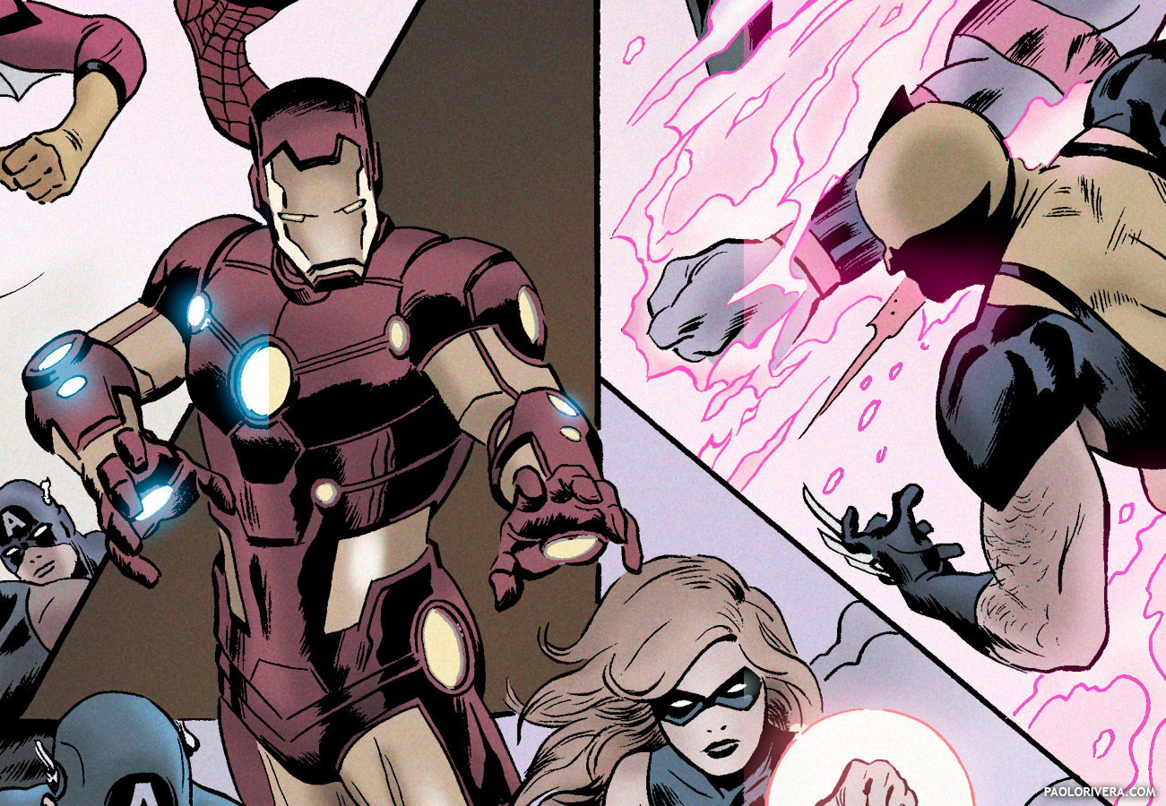
| Note the way light bleeds into shadow SUPERIOR SPIDER-MAN TEAM-UP #1. 2013. Ink(ed by Joe Rivera) on bristol board, 11 × 17″. |
I then switch to the Brush Tool, armed with an airbrush preset. I copy the color from the lighter tone and “dust” the shadow tone wherever they meet. This maintains the hard edge between, but gives the illusion of bright light bleeding into the darkness. As with everything, the degree to which you do this is a personal preference.
 |
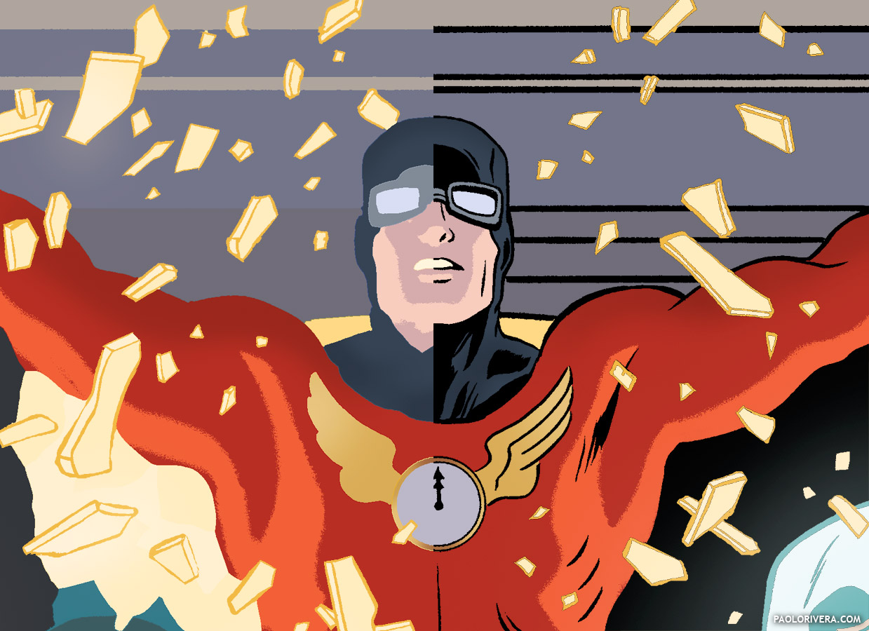
| Glow vs. No Glow AVENGERS 34 VARIANT COVER. 2012. Ink(ed by Joe Rivera) on Marvel board, 11 × 17.25″. |
I save all the super-duper special effects for a separate layer called “Glow.” I set the layer mode to Screen — this makes all colors below it brighter, even when using a darker color — and airbrush over anything that is a strong source of light. This takes a lifetime of practice to do with paint, and a nanosecond on the computer (which is why it’s often overused). It may be cheap, but it’s effective, (and looks great on repulsor blasts).
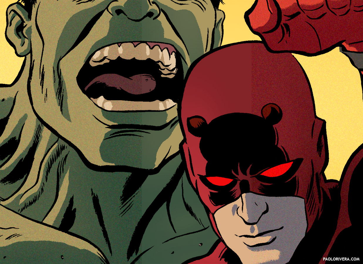 |
| Grain vs. No Grain (not a ton of difference) INDESTRUCTIBLE HULK #10 COVER (detail). 2013. Ink(ed by Joe Rivera) on bristol board, 11 × 17″. |
The final step is not necessary, but I prefer the look. Computer coloring is perfect — too perfect. It can have a sterile aspect to it, and so I use a filter to add a faux finish. All this does is add texture and variation to the otherwise featureless tracts. It’s a small gesture, but it gives your eyes something to lock onto — makes it more tangible. I use Filter > Texture > Grain, but you could even scan in real paper to achieve the same effect.
OK. We’re done… almost. (Hopefully, you’ve hit Save already). During this entire process, we’ve been working in RGB mode, Photoshop’s native gamut (Proof Colors turned on). Since our goal is print, we need to convert the image: Image > Mode > CMYK Color. It will ask you if you want to merge the layers. You do. Next, downsize the image to 2750 x 4175 px (that’s standard comic size at 400 ppi). Finally, Save As a TIFF file (Command-Shift-S) with no layers or alpha channels. Check LZW under Image Compression (a lossless method) and hit OK. Now we’re really done. Please let me know if you have any additional questions in the comments section.
Awesome! Thanks for all the examples to illustrate your different techniques. It's helpful, and also just plain fun to look at. I can't make it through a blog post unless there are plenty of good pictures 😉
Jameson Gardner
My pleasure, Jameson! Thanks for reading!
This 3 part'er has been really great. I love how you make it look so easy.
If only that were truly the case. Glad you enjoyed it!
Thanks for this series, Paolo, it's been really informative! Mostly, I appreciate that you explain WHY you make the choices you do when coloring.
I used to do a lot of digital color work, until I found I was spending more time tweaking via layers and modes and filters and functions in PS and if I wanted to actually *finish* anything, I needed to be bound by traditional media constraints, but it looks like you've really streamlined your process!
Yeah, sometimes knowing when to stop is the hardest part. (Always helps having a deadline, though.) Glad you enjoyed the series!