As image-makers we naturally focus on the 2D picture plane, contemplating the arrangement of elements on the page, the subject matter, and creating the illusion of 3D space. Rarely do we need to think beyond the boundaries of the picture’s edge. However, a new world opens up if we consider the context in which our images appear, and this is especially true for book illustration. The physical form of the book, from things like paper stock to the way readers navigate through its pages, can enhance the reading experience and elevate it to an object of aesthetic beauty. So it follows that good book illustration is not just about the image, but how it functions within the printed book.
When I was a student – first in graphic design, and then in illustration – some of my assignments required the creation of a mockup, to show how the final design or artwork would look in context. I absolutely delighted in making these. Being student projects, they were not bound by the constraints of budget and practicality, so I created all sorts of elaborate “fake” books, somewhere between design project, illustration, and book arts.
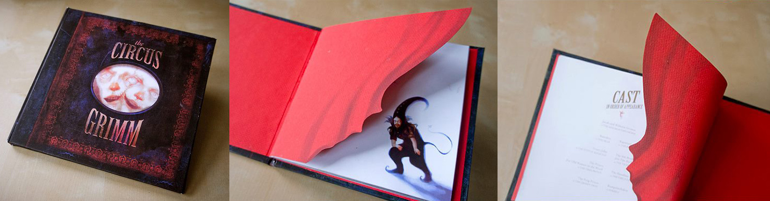
Student assignment – a book featuring creepy fairytale characters as circus performers. The endpapers are cut out to look like stage curtains.
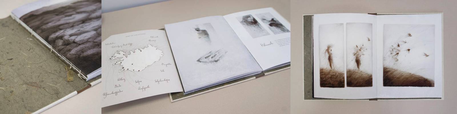
Student assignment – a collection of sketches and reflections about a trip to iceland. Bound in a way to look like a tattered sketchbook.
Though working on published books is very different from the whatever-goes mockups of my student days, with each project having its own limitations, and many of the design decisions not being up to me, I continue to think about book illustration in a holistic way. I am not only interested in what to illustrate, but the picture once it is printed and bound, and how the reader will encounter it on their reading journey.
The Physical Book
A printed book is a tangible object; you can place it on a shelf, flip through its pages, hold it in any orientation, and smell that fresh book smell. Readers will typically follow an expected path through a book; first encountering the cover, then proceeding through the pages in succession. The illustrations in a book can take advantage of these physical aspects, introducing an immersive or interactive element to the act of reading.
A cover can draw the reader into the story.
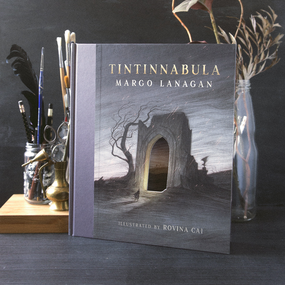
From Tintinnabula by Margo Lanagan. A doorway cutout on the cover shows a portion of the illustration within.
An illustration can be revealed when the reader turns a page.

From The Seventh Raven by David Elliott. A spot illustration is revealed on the page after an illustration with a negative space, showing how one raven is different and apart from the others.
An illustration can be oriented in an interesting way.
From And the Ocean Was Our Sky by Patrick Ness. The story takes place in a world that is upside down, illustrations appear oriented in various dizzying directions throughout the book.
Multiple images can come together to create a whole.
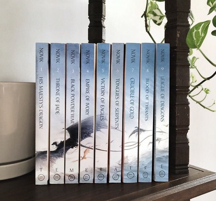
From the Temeraire series by Naomi Novik. The spines of each book in the series line up to create one image
The Printed Page
Aside from its physical form, a book is also defined by the words on the page and the story being told. It is obvious that illustration should honour the text, providing an accompaniment to the story. And indeed, many readers only think of illustration in this context; that they are there to look pretty, and tell you how the characters and setting should look, and sometimes “getting in the way” of reading. But illustration can be so much more than that; things like the layout of the page and the deliberate placement of images can play a role in engaging the reader, pulling them along like a steadfast friend, guiding them through the book.
An illustration can create a moment of excitement at a key point in the story.
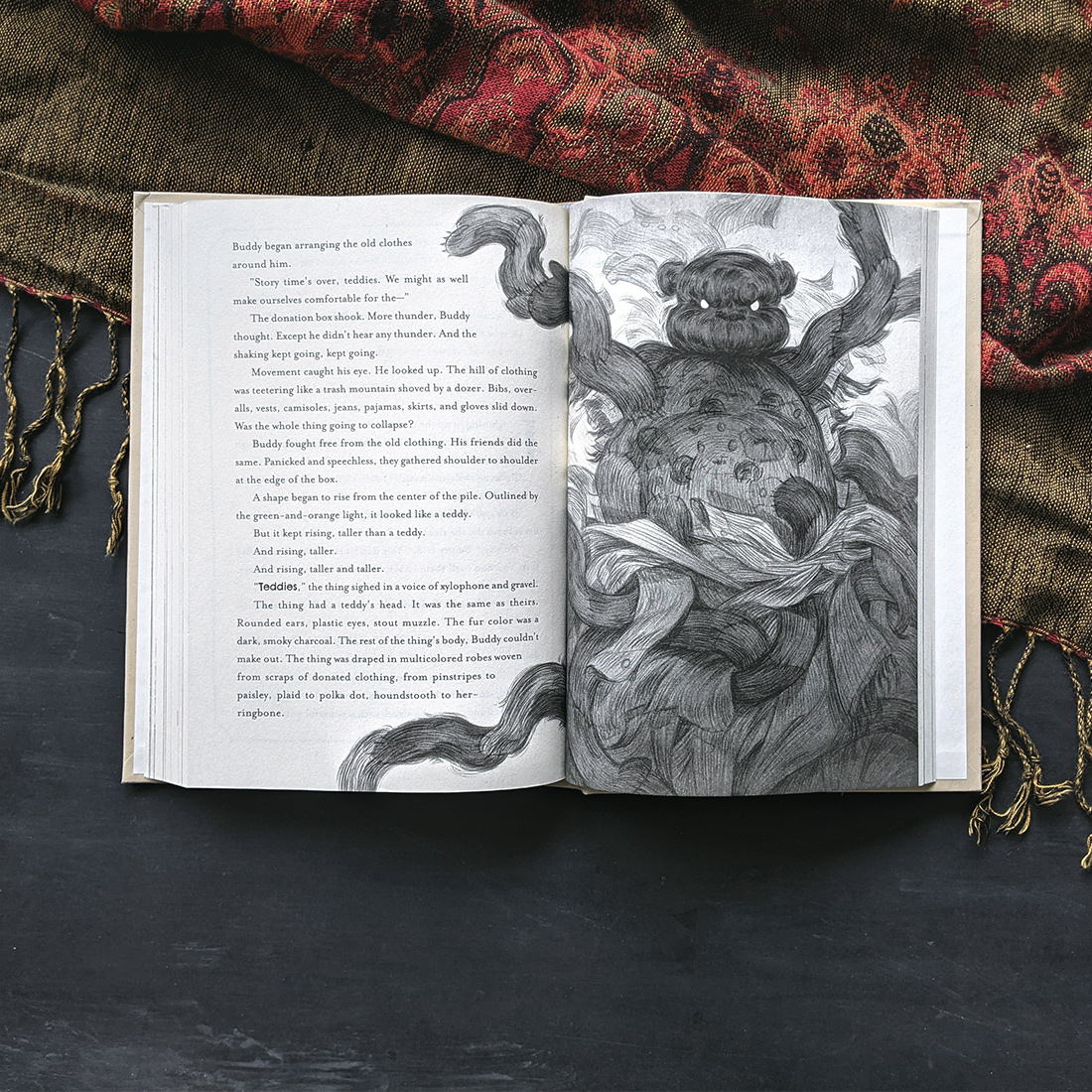
From They Threw Us Away by Daniel Kraus. An illustration of a dramatic villain reveal in the story, the image extends beyond the edge of its page, almost like a jump scare in book form.
An illustration can provide a moment of rest for the reader, allowing them to process what they’ve just read.
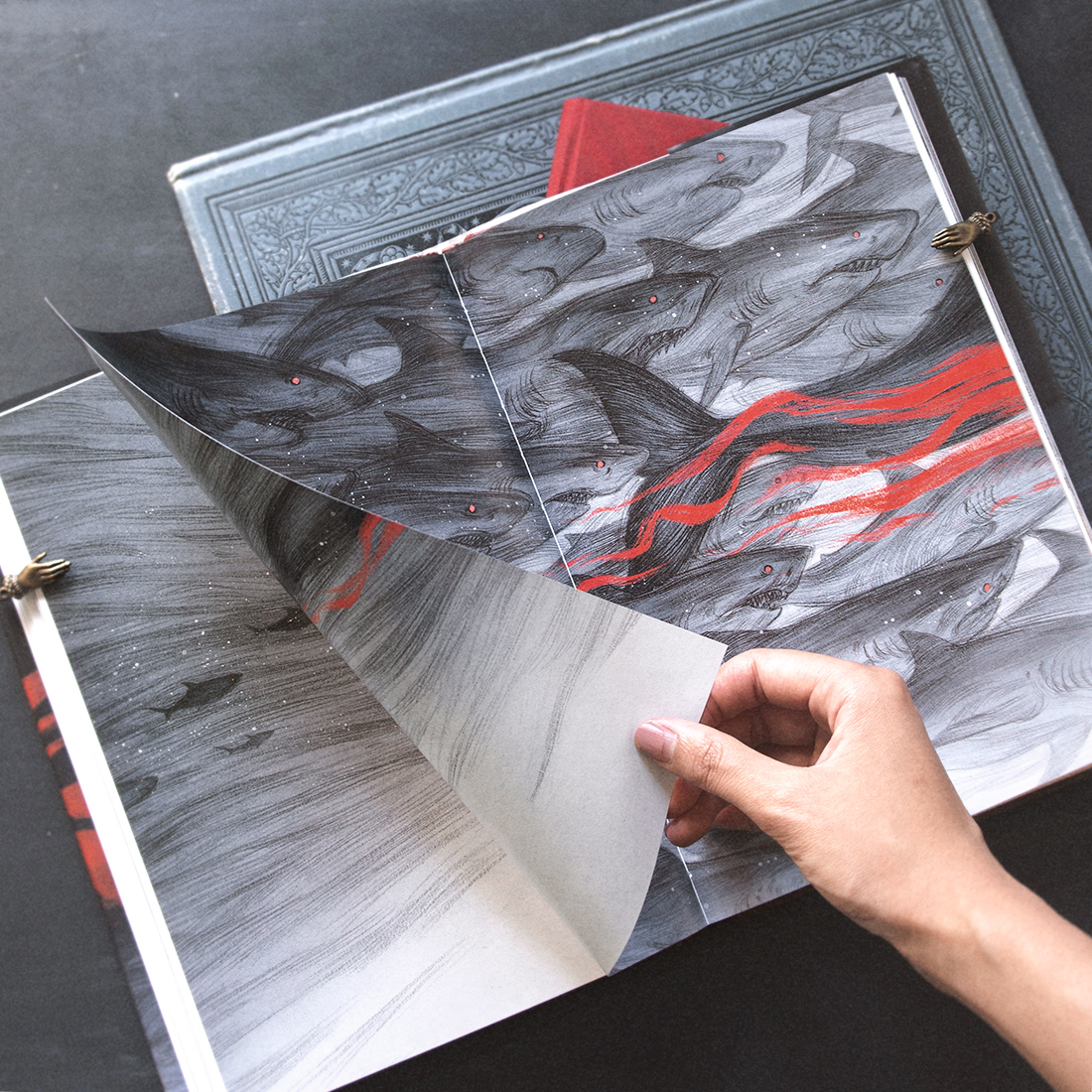
From And the Ocean Was Our Sky by Patrick Ness. After a particularly haunting passage, the reader is met with several successive spreads of art with no text, providing a lull in the story so they can let what they’ve read sink in.
An illustration can frame the text, providing visual context without disrupting the flow of reading.
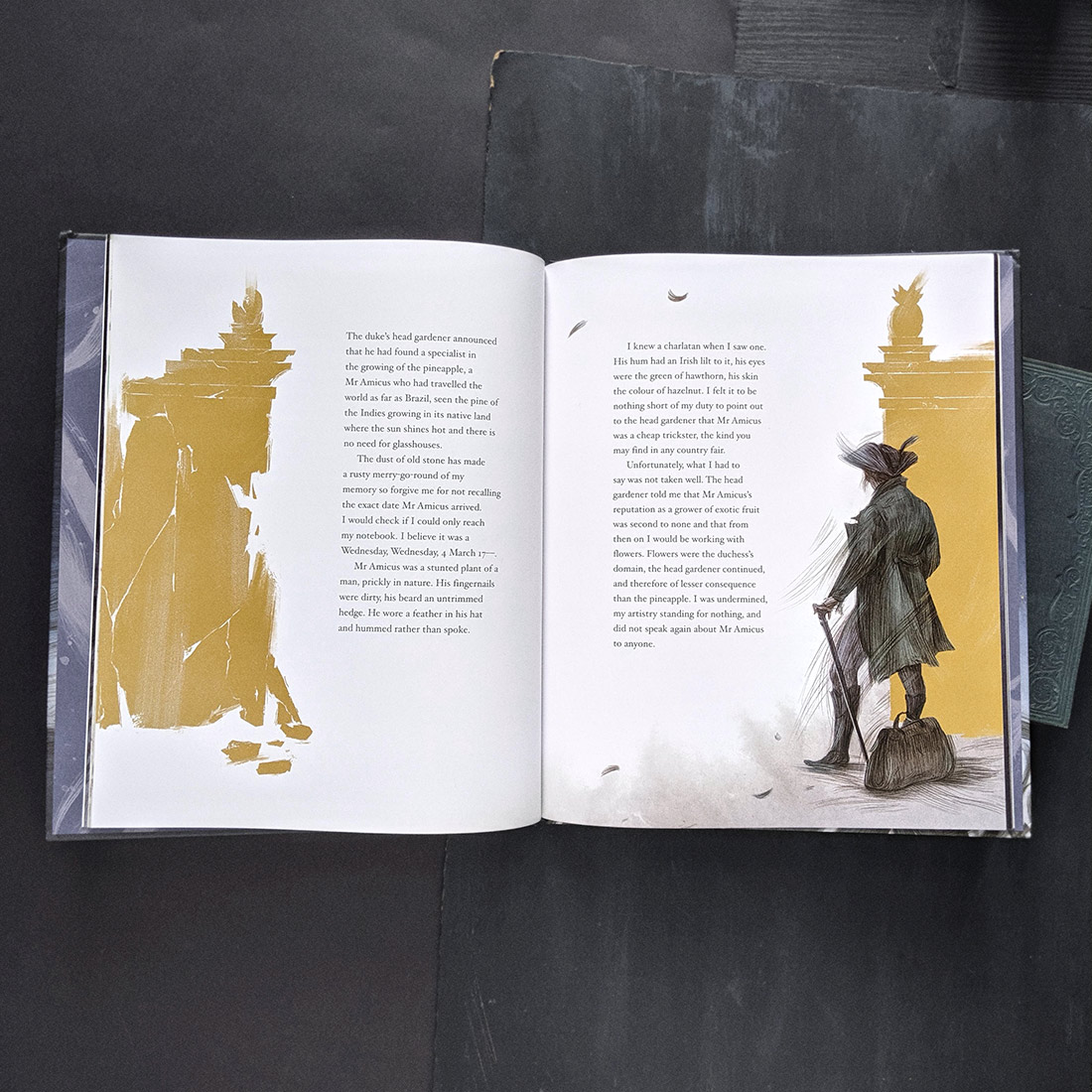
From the Wind in the Wall by Sally Gardner. An illustration comes in at the edges to provide a subtle visual cue, but leaves enough for the reader to fill in with their own imagination as they are reading.
A Kind of Magic
So many components come together to create the tactile experience of a book. While aspects like paper stock, layout and printing effects are often the responsibility of the book designer, the illustrator brings their own contributions to the book as object. I’ve always found the designers and art directors I work with to be very open to integrating image, text, and layout, and the final results often come out stronger due to this exchange of ideas. It is this collaborative process between people with different skillsets, and the consideration of illustration in tandem with story, design, and the physical form of the book that makes illustrated books so special.
Some artists are driven by process and materials, while others focus on the subject matter and narrative. For me the magic lies in the printed book itself and how the illustrations live within its pages. Many of my earliest memories of art are tied to books; being pulled in by a particularly beautiful cover, getting lost in the illustrations, running my fingers along the deckled edge pages, and this reverence for books has never left me. In considering the physical form of the book, we honour the stories they contain.


Recent Comments