Not surprisingly for a person that contributes to this blog, I am a huge fan of the “Golden Age of Illustration” and especially J. C. Leyendecker. For someone that has made her career in commercial art, I have a deep respect for the illustrators of the past who have literally shaped culture so much that their work has embodied entire eras of our society. Mucha and his art nouveau posters. Gibson and his Gibson Girls. Leyendecker and the Arrow Collar man and the creation of the prototype (for better or worse) of American masculinity in the era between World War I and World War II.
It wasn’t until relatively recently that I learned that this work — literally used as a prototype to inspire American men to “be more manly”, especially as we neared the Second World War — was gay, and his most famous model was his long term romantic partner. The paradox there absolutely floored me. And this isn’t a rare phenomenon — American culture often takes things from groups marginalized by their race or sexual orientation or gender identity and washes it of those associations as it absorbs it into the mainstream. I grew up in the 80s & 90s so Madonna’s Vogue era was huge for me, and it wasn’t until much later I learned of the connection to the NYC drag balls and queer culture. As this is an art blog, I’m going to keep focused on the art, but it has always been fascinating to me how the performance of mainstream masculine and feminine fashion and gender roles is so often and so heavily influenced by gay, lesbian, and queer artists—while the much more conservative mainstream majority following these trends remains completely oblivious to their origins.
One of our very own Muddy Colors contributors, Marcos Chin, was on a panel during the exhibition about these themes.
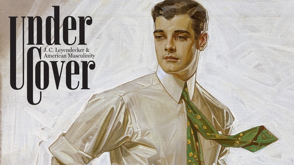
So I would have gone to see any exhibition nearby of Leyendecker’s work, but the New York Historical Society did one better and gave us Under Cover: J. C. Leyendecker and American Masculinity, a great exhibit of works from Leyendecker, but put in context of the times in regards to the history of gay and queer culture in NYC in the 30s and 40s, alongside the mainstream context of the World Wars and America coming to become a leading industrial and commercial world power.
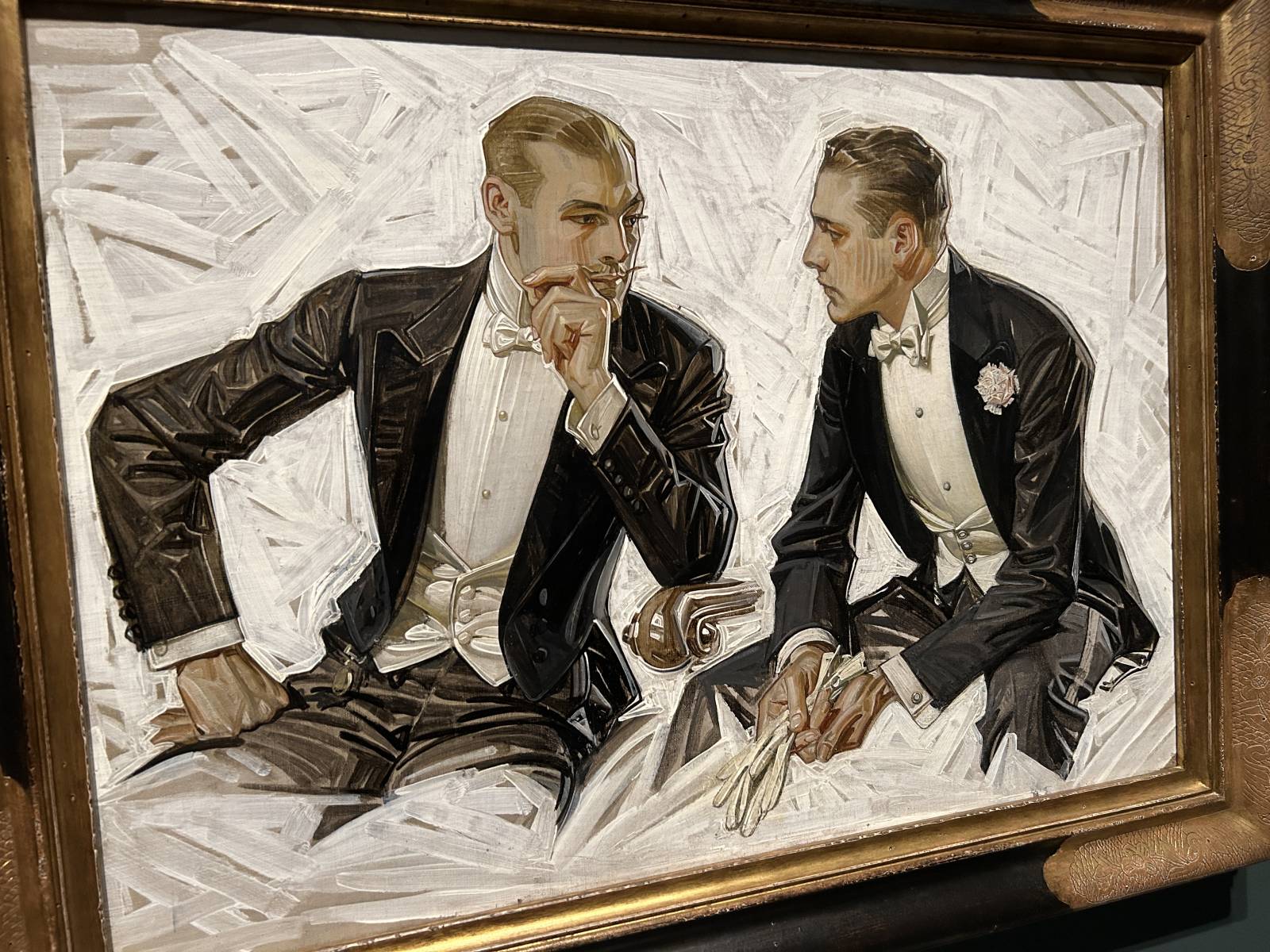
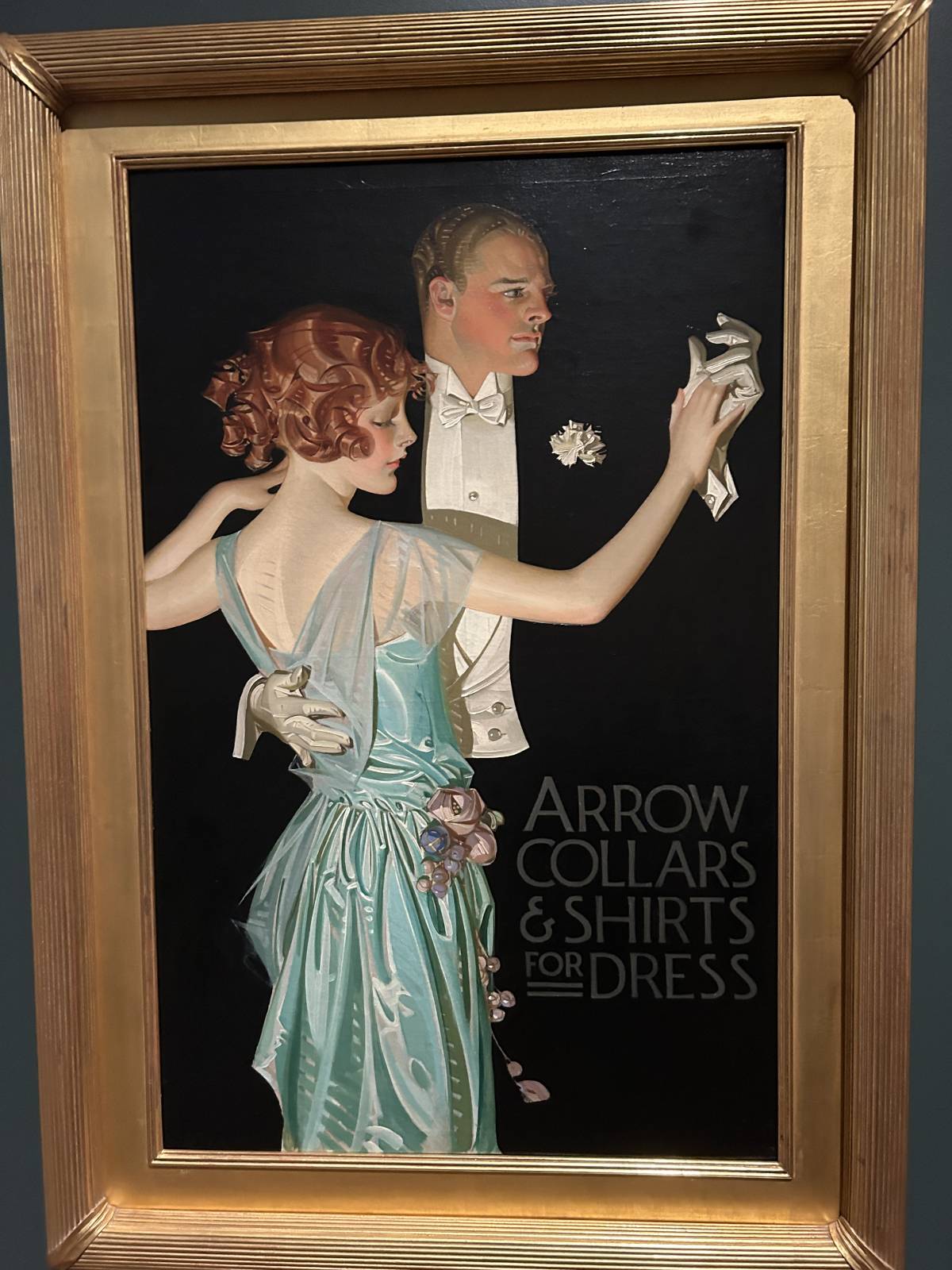
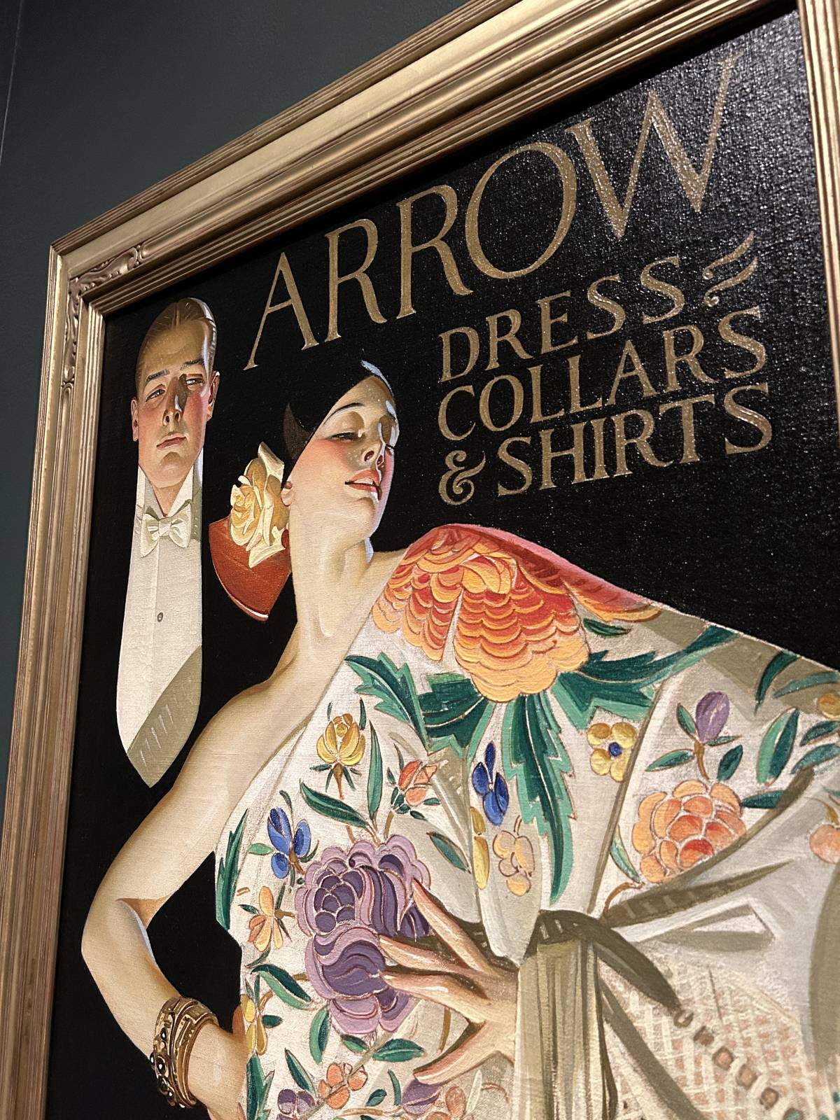
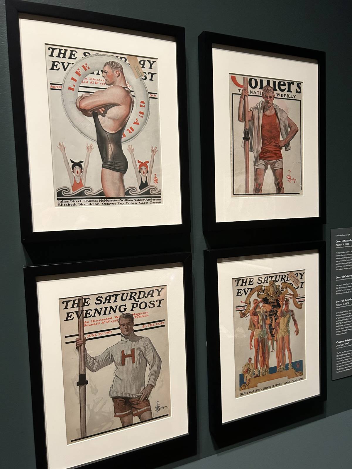
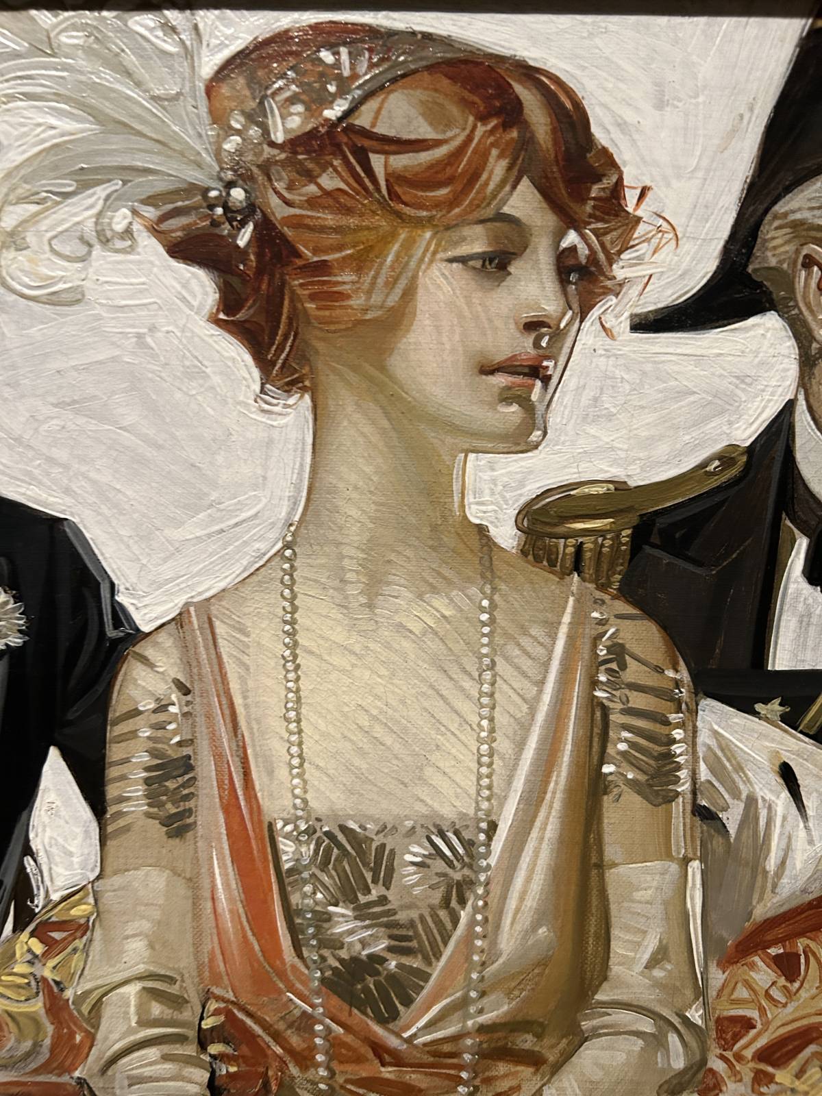
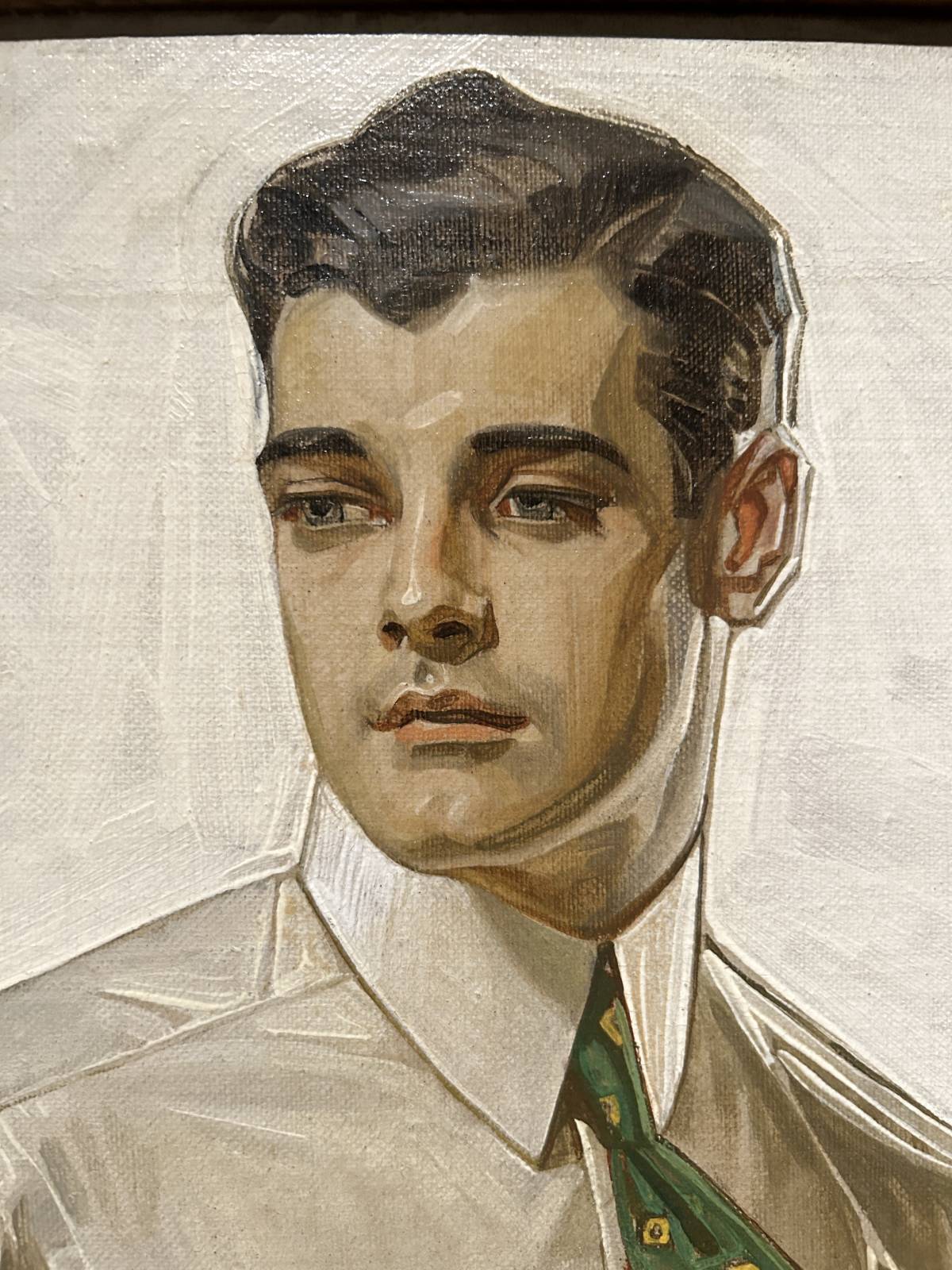
What struck me immediately was the range of finishes from piece to piece, and how you can so clearly see the difference in skills and final pieces between what was done as commercial “illustration” work and what was polished to a “fine art” finish. It was fascinating to see the originals next to examples of the printed finals. Leyendecker was an absolute expert at knowing how his work would be reproduced by the printing technology of his time, and his originals absolutely show that. The pieces he knew were for black and white printing have a markedly difference brush stroke quality than the pieces he knew were going to be printed in color. And you can see him giving various levels of polish for cover work for something that would have high quality printing like the Saturday Evening Post, as compared to ads that would be in color inside other, cheaper magazines. This man did not waste a single brush stroke that wasn’t needed.
Legs? Who needs legs?!

I can’t get over how abstract his backgrounds got, especially for ads that were destined for black and white repro
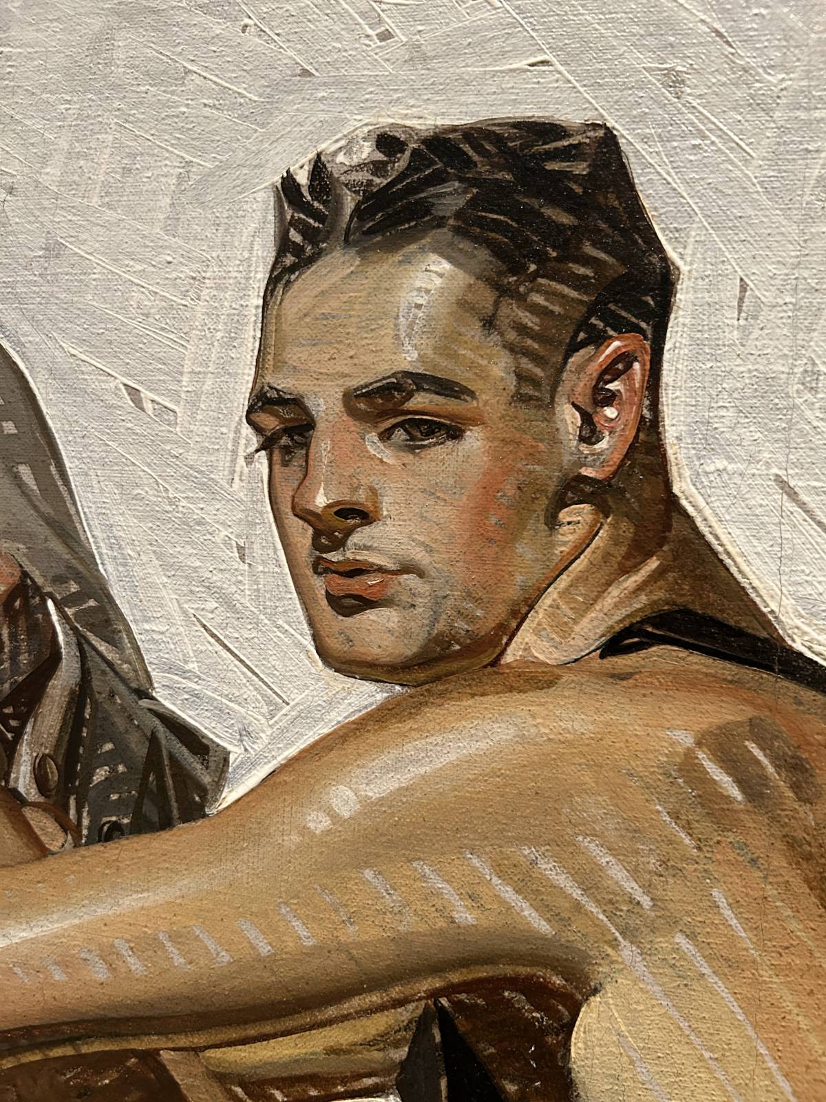
I was struck by how effective his really loose brushstrokes for fills and fabrics mixed with his really sharp rendered edges. In Muddy Colors terms, I feel like it’s like mashing Greg Manchess and Dan Dos Santos together in the same illustration. Clearly he was looking at artists like Sargent, but controlling the eye through his sharp edges and high contrast. The effect in person is really staggering.
And holy crap could he paint dramatic lighting:
These models had to be sweating under those intense lights in the studio
So much drama
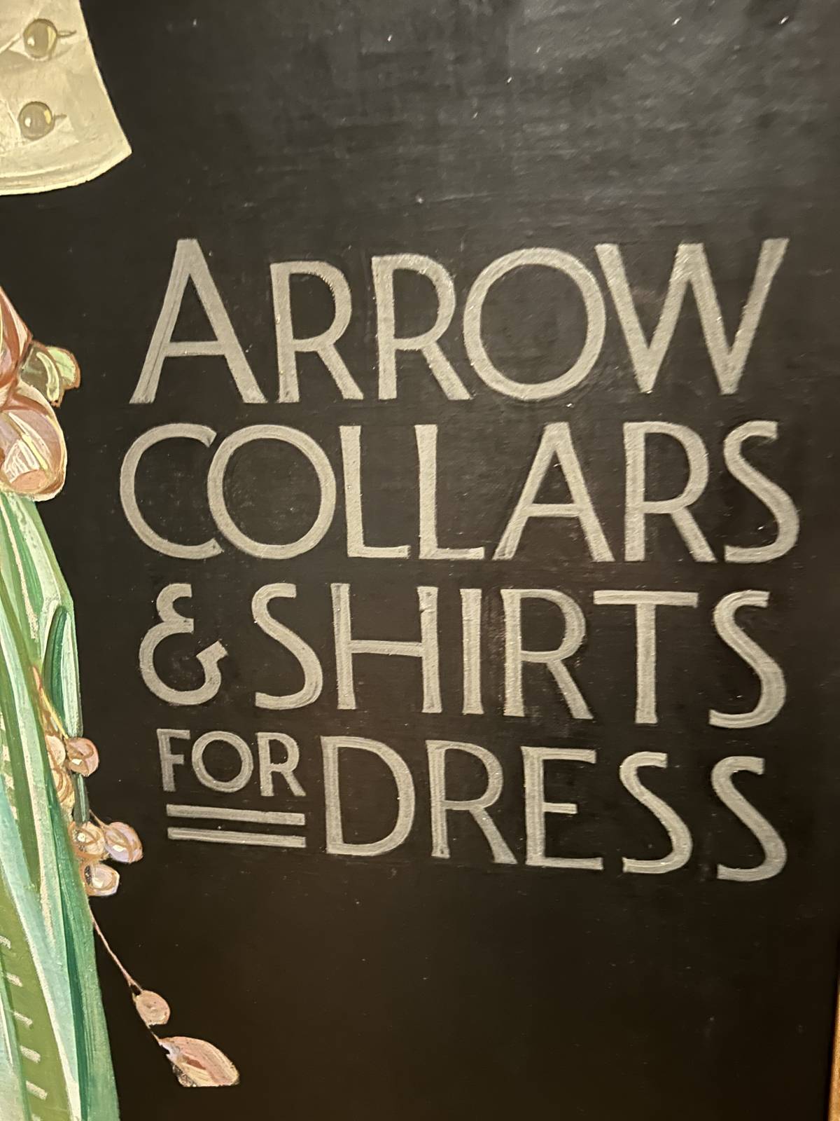
Also, be thankful, modern illustrators, that you’re no longer responsible for painting on the typography by hand:
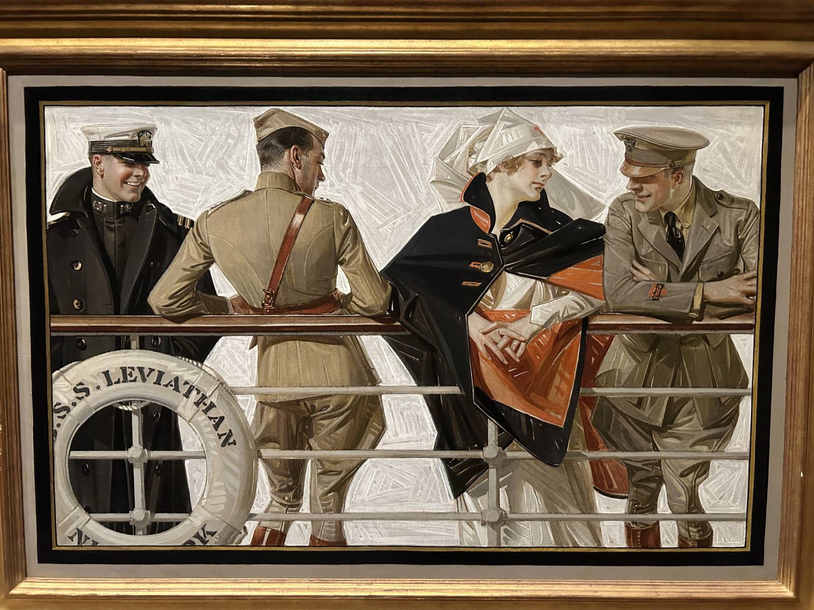
The other thing that struck me, after drooling sufficiently over his textures and lighting, was the disbelief that anyone looking at these images didn’t get the homoerotic undertones to so many of them. And look, I know it was different times then, but still. The looks between the men in his compositions are so charged…while I was hard pressed to find a single example of a man looking at a woman with anything warmer than cool disdain.
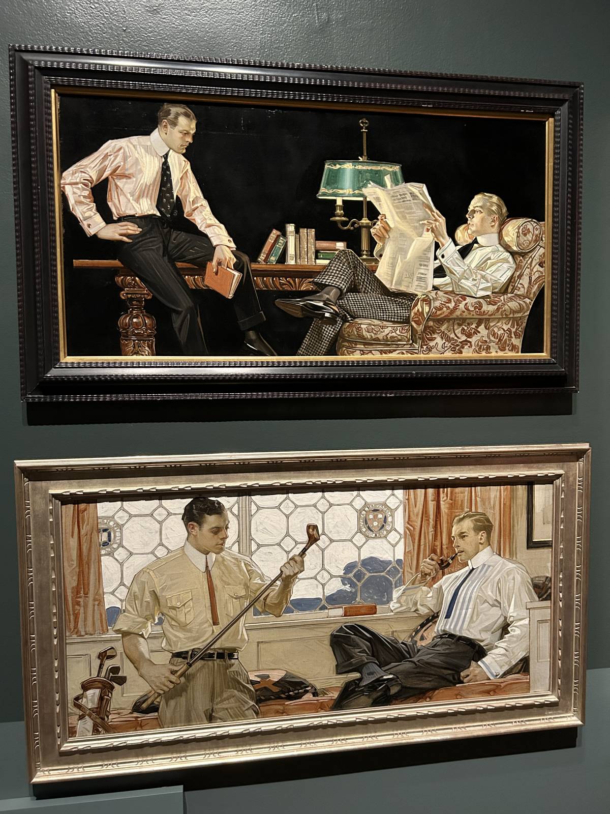

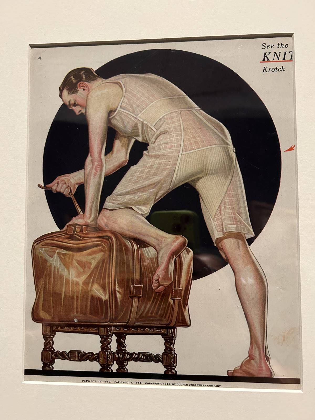
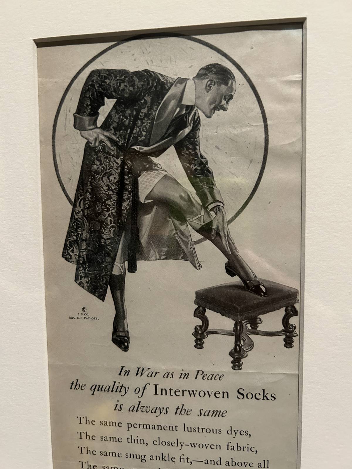
I think an advertising client would find this pretty suggestive even today
Overall it was delightful to get to see so many Leyendecker originals in person, and fascinating to see them paired up with the commercial reproductions. If you want to read more about the exhibit you can check out the exhibit page and the New York Times review.
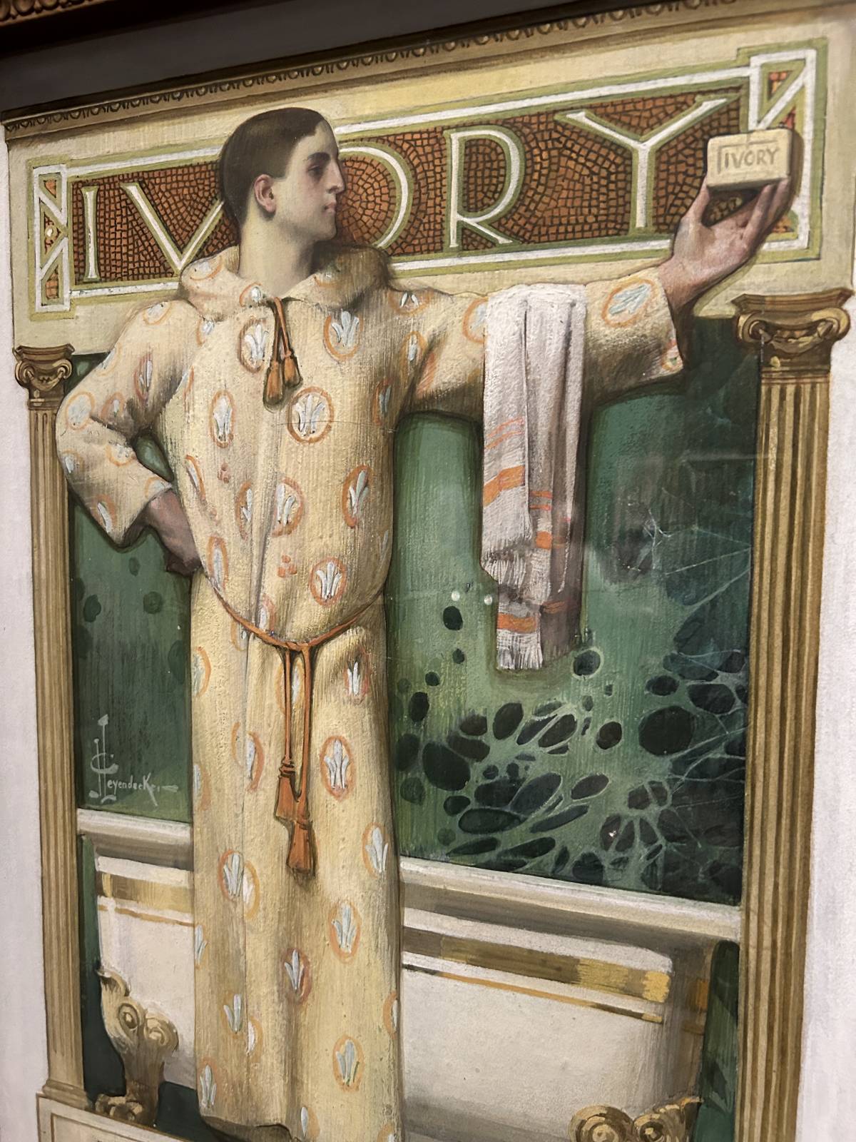
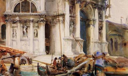
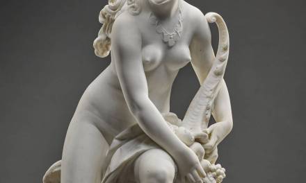
And here’s a bit of a photo dump of everything else that caught my eye:


What a fantastic selection of Leyendecker pieces here, and your observations are so insightful! I hadn’t quite consciously noticed the striking contrast between his loose brush strokes and very sharp edges. But now that you mention it, that’s one significant feature of his style that has really appealed to me all along. Someone could teach a class on how to effectively render drapery just from these images alone!
While I always appreciate a look at J.C. Leyendecker’s work, I have to say I feel this exhibit is really stretching to make a point.
If this exhibit had been of newly discovered personal “homoerotic” works that Leyendecker did, it would be one thing– and it would be wonderful to see something like that, where he was freed of anyone else’s expectations.
But based on descriptions of this exhibit, this is all commercial work– largely advertising art and magazine covers– i.e., works that were done with a specific purpose in mind, and that were almost certainly directed and vetted by other people.
Ever since it’s become common knowledge that Leyendecker was a gay man, there’s been a push to re-evaluate his work from this specific angle.
And while you obviously did not intend it as such– and were simply following the focus of the exhibit– I find the statement “It wasn’t until relatively recently that I learned that this work… was gay” to border on offensiveness.
Leyendecker was a gay MAN, but to say his WORK was also “gay” is to imply that gay artists can’t help but leave big “gay” footprints all over their work, regardless of its purpose or actual content. It’s a lot like saying, “You can always spot one.”
In actuality, Leyendecker’s work was no more “homoerotic” than that of other illustrators of the Golden Age of Illustration– and in many cases, was far LESS “homoerotic” than imagery in soap and men’s underwear ads of the time, which often had groups of men interacting while in their skivvies or glisteningly nude in group showers, with genitalia conveniently blocked. (Hard to believe now, but straight men used to be very much at ease in close contact with other men, even when naked.
And Leyendecker’s work is certainly far tamer in this regard than comic book and pulp and paperback imagery that overlapped his active years.)
Additionally, the focus of this exhibit has led you to overlook the obvious.
You write “The looks between the men in his compositions are SO CHARGED…” while posting two advertising images that show two men not even making eye contact. (In the first image, one man keeps his gaze solidly on his newspaper, while in the second, one man intently examines his golf club.)
Sometimes, two attractive men shown together in an image are just having a conversation about the news or sports– not cruising each other. These images are actually about as “gay coded” as old Sears catalogue work uniform pages, which depict groups of “manly” men interacting vaguely in the workplace.
You follow this statement with “I was hard pressed to find a single example of a man looking at a woman with anything warmer than cool disdain.”
This is– of course– due to the way this exhibit was selectively curated for a specific focus, but a quick Google Image search easily turns up Leyendecker images that depict men gazing enraptured at women, men looking at women with love shining in their eyes, and even men embracing women and kissing them passionately.
Similarly, the way this exhibit was tailored led you to state of an underwear ad, “I think an advertising client would find this pretty suggestive even today.”
This image is matted to eliminate the ad copy that would make it clear that the pose is not intended to be suggestive of sexual activity– but to demonstrate a newly designed feature, a knitted “krotch” section that makes this “union suit” more comfortable and more functional (A “union suit” is a one-piece undergarment with the top attached to the shorts, making a fly in the front and a rear flap in the back requisite for bathroom visits.)
Sorry to be so negative about this post– I love your work overall– but this exhibit has REALLY hit a nerve with me, and I needed to respond.
Thanks Hsc, I wanted to make similar remarks.