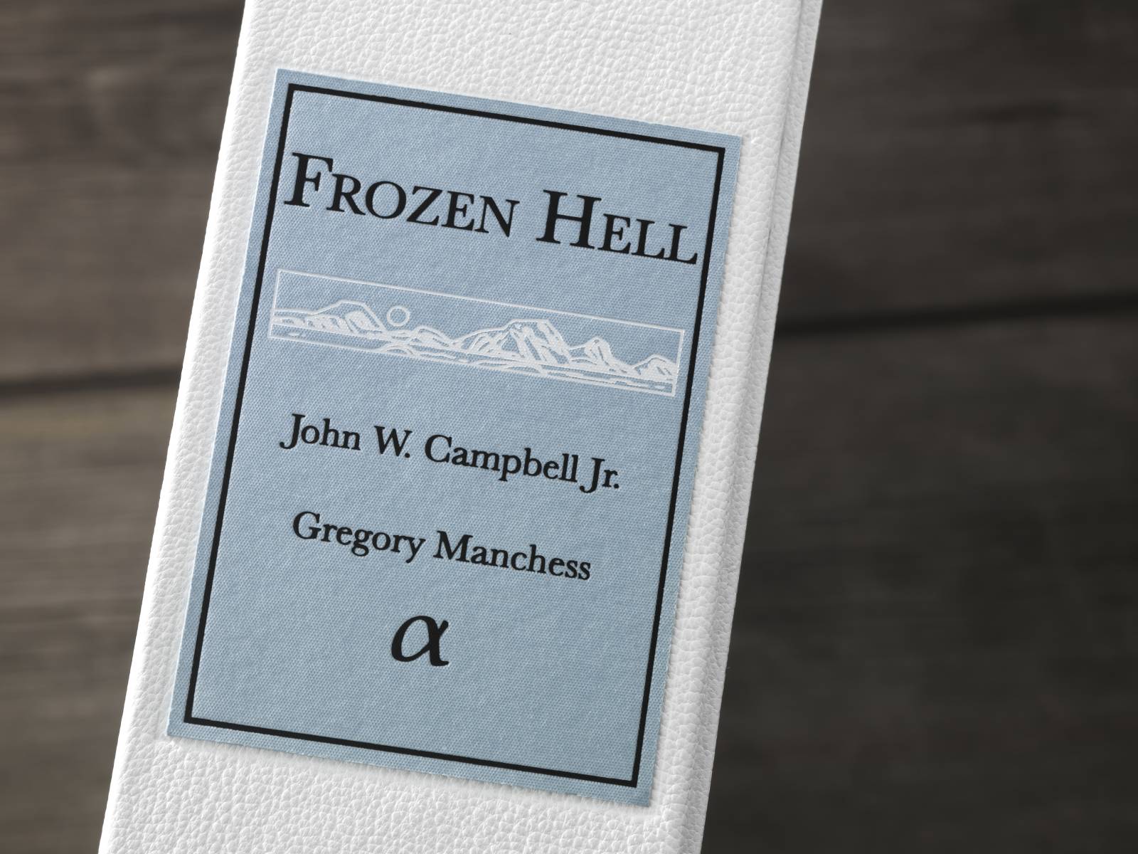
I recently finished work on multiple paintings for a ‘hot metal’ typeset Fine Press Edition of Frozen Hell, the short story originally entitled, Who Goes There? by John W. Campbell Jr. You’ll probably recognize it by its movie title, The Thing.
I got a chance to work again with Marcelo Anciano of Arete Editions, London, having worked with him many years ago on a special edition of The Conquering Sword of Conan. It’s great to work with him because we collaborate so well (as my first beta reader, he helped me build Above the Timberline). We both listen to each other and out of that we find expression for story.
Marcelo and I spent many hours on the phone discussing ideas, moments in the story, and thoughts about imagery and how he planned to build the edition. From there, I read the story a few times and started sketching.

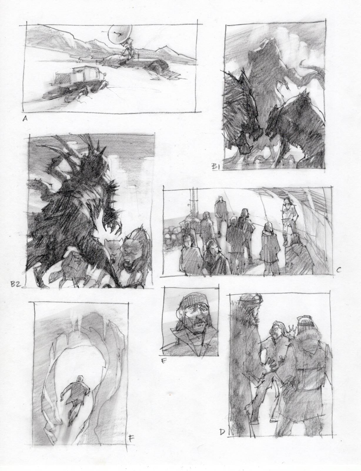
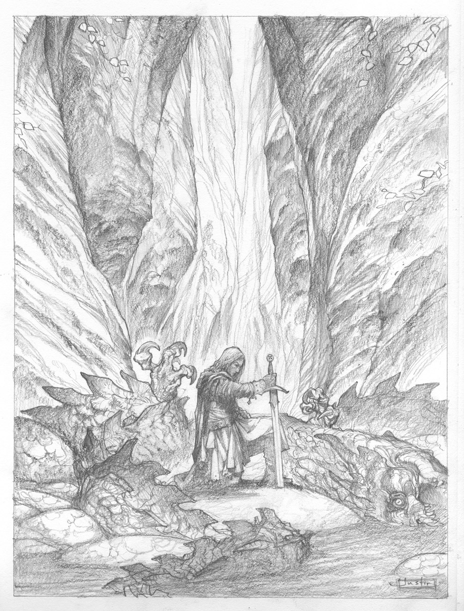
I drew pages of thumbnail sketches that I could send him for discussion. Some ideas nailed the moments depicted in the story, and other ideas gave general impressions from the story. That way, we could capture a wider range of feelings we felt the author was working to portray.
Who Goes There? was first printed in 1938. It is considered a science fiction classic and, in 1973, the story was voted by the Science Fiction Writers of America as one of the finest SF novellas ever written. The story has been adapted to film, first in 1951 as The Thing from Another World by Christian Nyby, and again in 1982 as The Thing by John Carpenter.
In 2018, it was discovered that the story was actually a shortened version of a larger novel previously written by Campbell. The expanded manuscript, including an entirely different opening titled, Frozen Hell, was found in a box of manuscripts sent by Campbell to Harvard University.
This gave us much more material to work with.
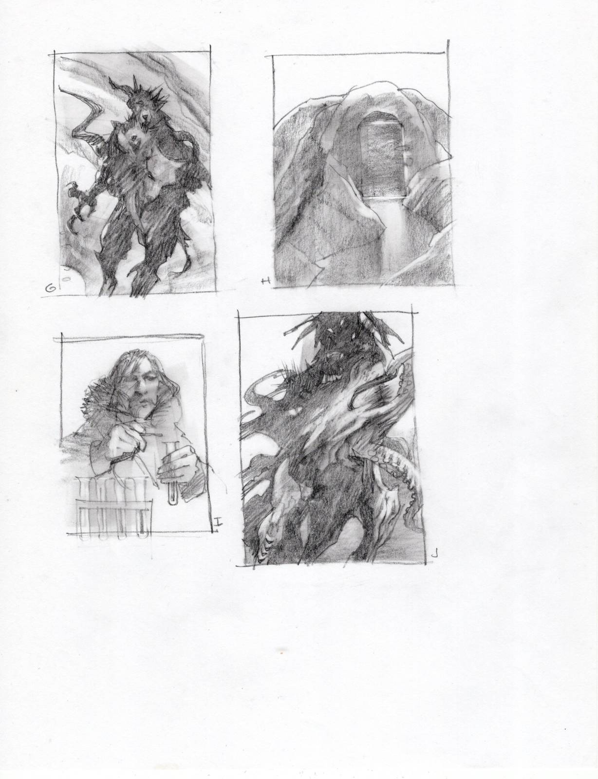
More time on the phone going over copious sketches. Once we agreed on a general list of ideas, I gathered reference and shot models to draw. The main edition will be about eighteen inches high, so I made all the sketches half-size to gain some time.
The finished sketches were projected and I redrew them onto my canvas. After a quick layer of acrylics to seal the pencil lines, I began applying oil paint.
Riding the edge between failure and success is why painting can be exhilarating.
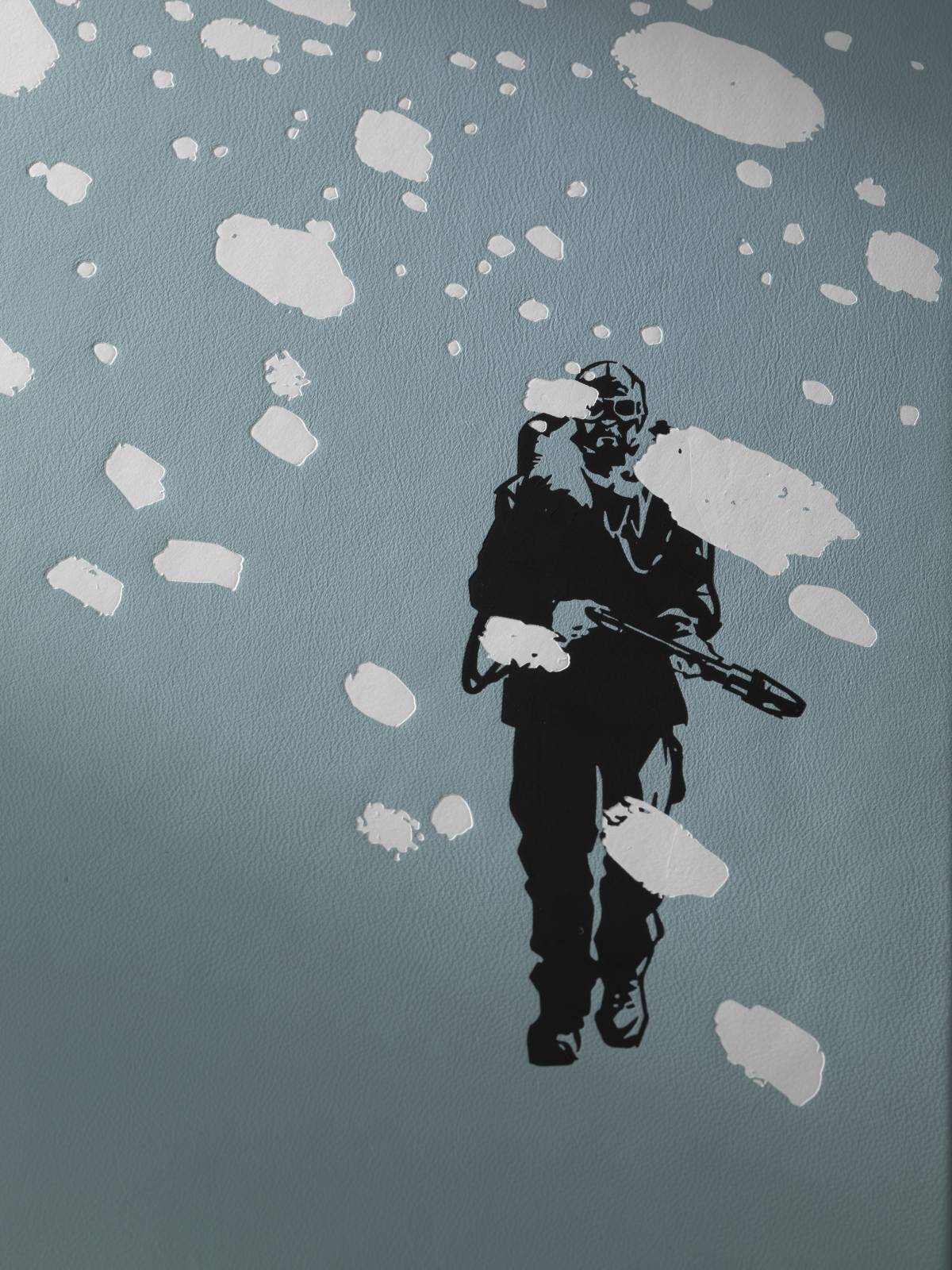
Along the way to finishing the paintings, I drew black and white images for the cover foil embossed work, and also for chapter headings. Moving between oil paint and line work helped to keep me thinking fresh. It’s important to pause and shift gears to allow your mind to rest and replenish energy. I’m not always the best at this. Getting to the paint to make a scene come alive is enticing and difficult to break from.
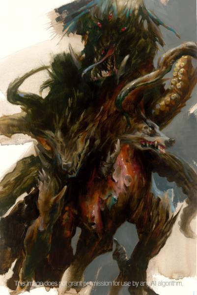
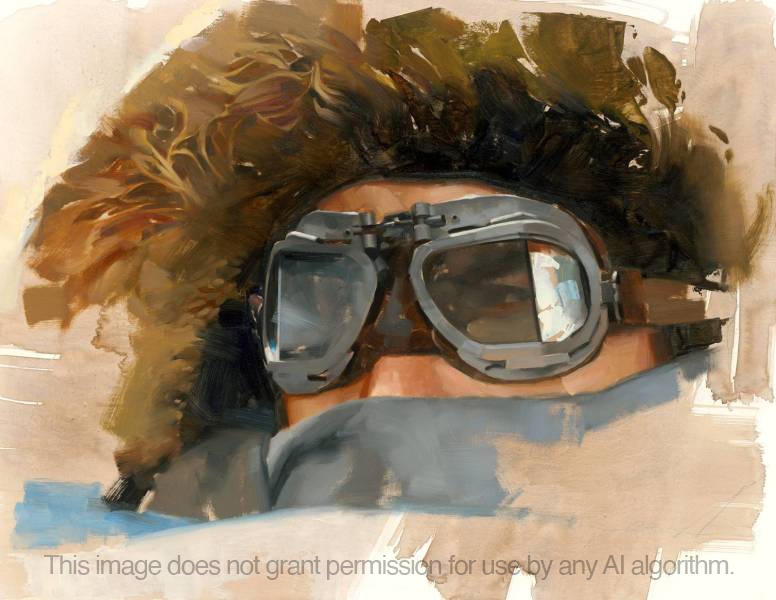
My aim overall was to make the work feel loose and quick, unlabored and yet informed. Detail vs broad, unfinished areas and color fields. I didn’t want a rigid, dropped-in feeling like one might get from an image that bleeds all around. I wanted the paint to feel like it sat on the surface of the paper, so the white areas might emulate the canvas. I focused to give it a spontaneous appeal, much like the creature’s spontaneous ability to morph into other animals, half-finished.
This approach demands being alert to every nuance, every stroke, every passage. Happily, oils are very forgiving in this way. Once a layer was dry, I could go back in and adjust and manipulate the paint to add detail or, most importantly, take detail away until I had just the shapes I wanted.

This level of work is exciting, freeing, and nerve-wracking. Because it can change on the fly, it’s important to stay alert to what’s happening to the overall piece at all times. Those changes are stimulating, but if one pays too much attention to just going with the flow, the whole affect can look underworked and sloppy. Riding the edge between failure and success is why painting can be exhilarating.
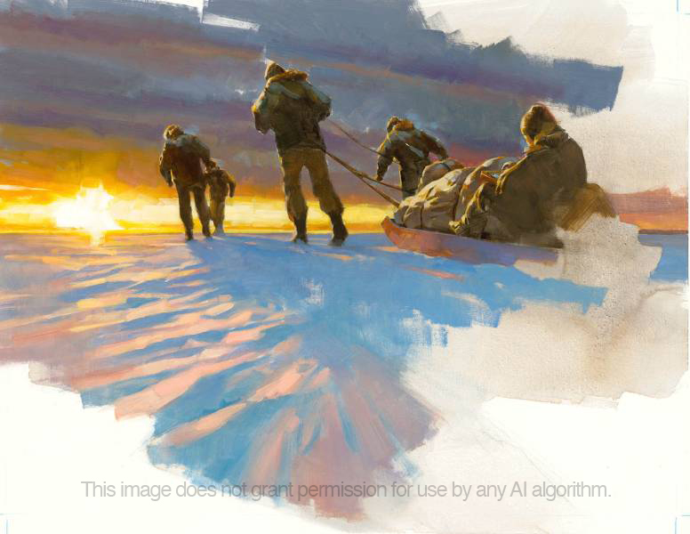
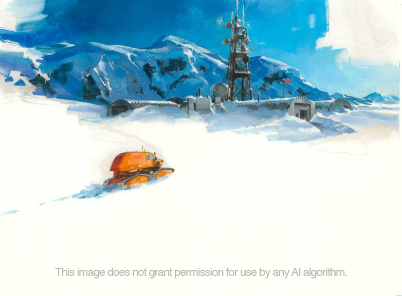
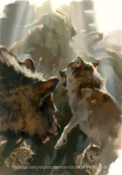
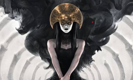
The images above and below are some of the first images for the edition which will be released soon. I’ll discuss creating the rest of the paintings in the next post.


Fantastic.. Can’t wait!
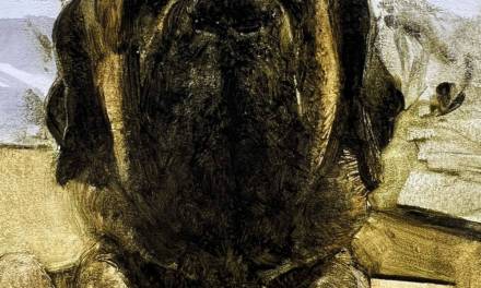
Simply stunning work as always Greg, you definitely captured the eerie isolation of the cold arctic with the humans and dogs of what they just discovered buried deep in ice. The thumbnails alone would make an awesome book! 🙂
Terrific work, as one would expect from Greg Manchess, and it is a treat to learn about the project and see some of your work for it. Following the links to the book publisher’s site, one learns that the book is limited in distribution in two ways: by quantity and price. There is one edition of just 40 copies that sells for $3752 (when the price is converted from pounds), and a different edition of 320 copies that is priced at $744. (I’m reminded of your Picture of Dorian Gray project). I’m very glad these beautiful, exclusive editions exist, but the most I’ll generally part with for even the most beautiful book is about $300, and that’s once in the proverbial blue moon. I wonder if, as with the Conan books, there are any plans to release a mass market edition at a price more accessible to your less well-heeled fans, something to tide us over, at least, while we wait for some enlightened publisher to produce The Art of Gregory Manchess?
They’re looking into it, Bob. Hopefully a trade edition that is much less expensive. Do you think artists and fans would buy it? I feel your pain. I can’t afford these special editions either. But I do love working on them!
Let it go… Let it gooo… Let it goooo.. Let it go… Let it gooo… Let it goooo.. Let it go.. Let it go… Let it gooo… Let it goooo.. Let it go.. Let it go… Let it gooo… Let it goooo.. Let it go..
Wait. Totally different Frozen Hell.
Love it!
Wow, Great!!