Every once in a while, I venture off on a creative tangent and experiment with something completely new and different. I don’t get to do this often enough, but every time I do, I discover a new method, material, or approach that I can add to my creative toolbox.
Today I’m sharing one recent experiment that I tried out on a rare-for-me traditional piece!
For this piece, I wanted to challenge myself to find a traditional process that closely follows my usual digital working process. I’ve tried several different approaches to traditional art, but nothing so far has quite clicked. One main issue is that I often want to preserve as much of my drawing as possible, while adding colour on top or underneath, but the drawn lines always get lost in the colouring process when using traditional materials, and they are never quite crisp enough.
This is where laser print transfers come in! Put simply, it’s a method of transferring a printed image using matte medium. The medium and laser printed ink bond to the working surface when dried, and the paper is removed with water, revealing the image.
![]()
With many other methods for transferring a drawing to board, the expectation is that the drawing will be covered up with paint. But this method allows the transfer to sit on top of paint layers, and more of the drawing can show through.
I can’t recall where I learned about laser transfers, but I remember using it as far back as high school, on craft projects and things like scrapbooks. I hadn’t considered it for “legitimate” art purposes until I started brainstorming how to transfer my sketch for the piece I was working on.
There are many instructional posts and videos floating around the internet that do a great job of showing how it all works. So my post here is mostly to document how I fared using the same method. It’s something I’m only just beginning to explore, and I’m definitely still refining my process as I go.
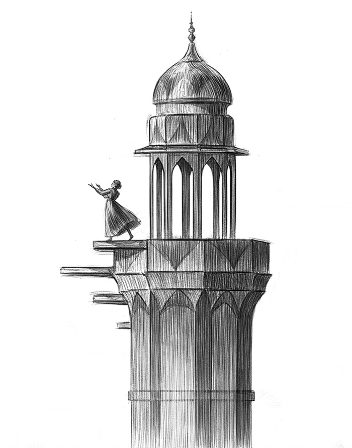
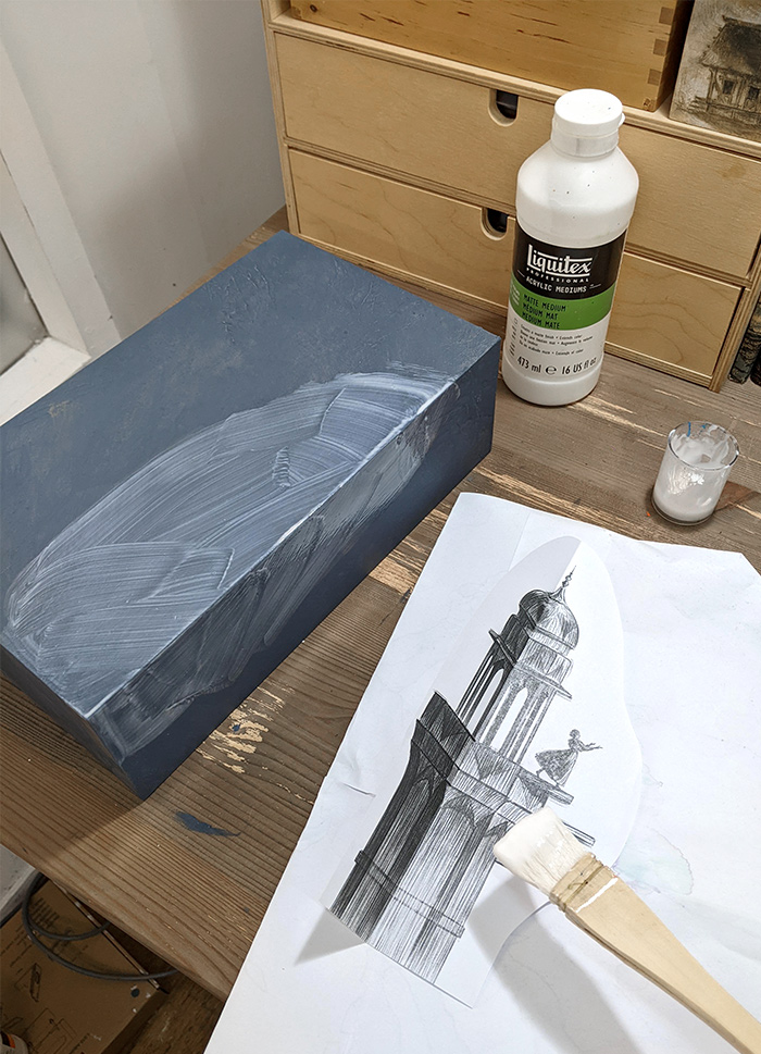
As I mentioned, I wanted to mimic my normal working process, which involves creating a finished drawing digitally before colouring. So that is exactly what I did here, with the drawing done on an iPad:
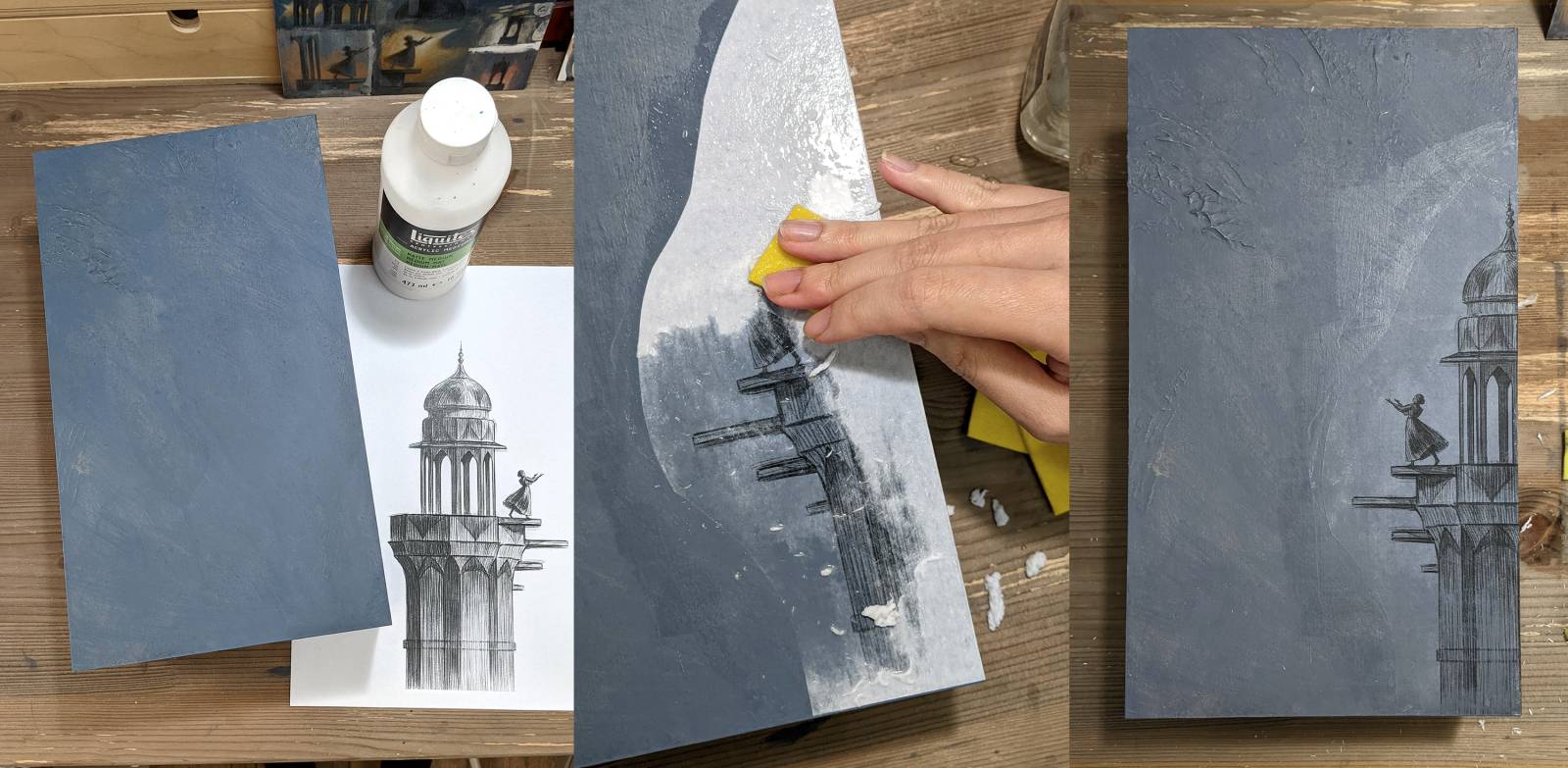
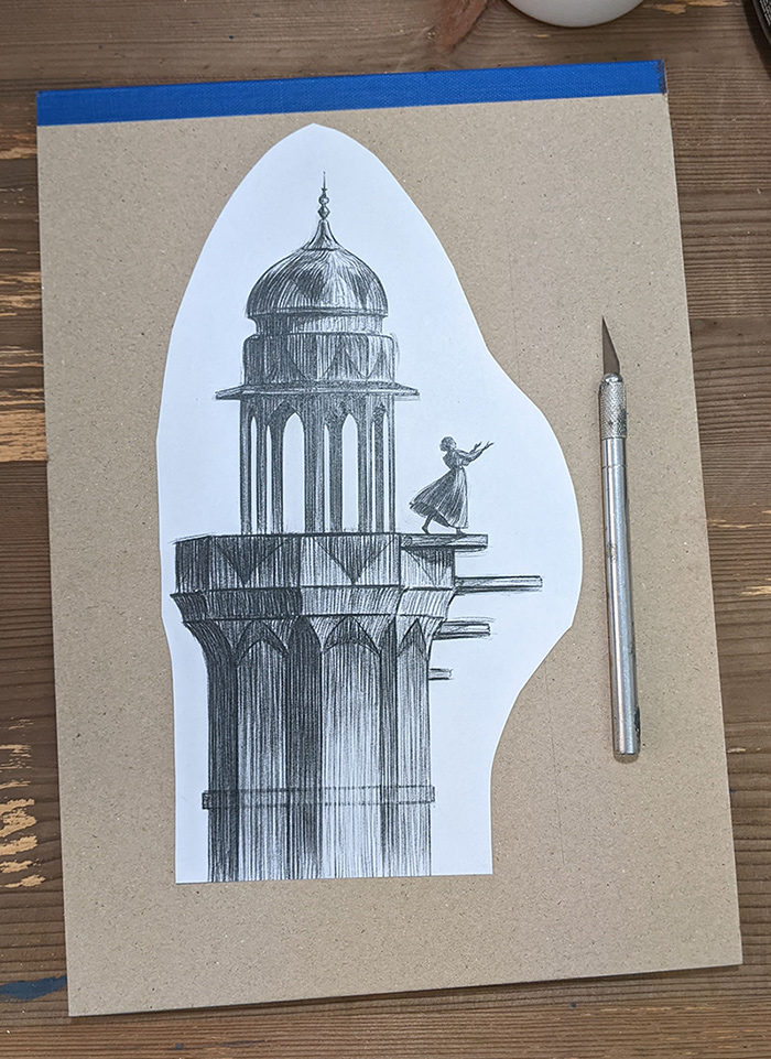
The transfer is done by placing the paper face down onto the surface, so the image needs to be flipped when printed. The image also needs to be printed on a laser printer and not inkjet for this to work.
I cut around the paper to create a more organic edge. Any white parts (i.e. the paper) will be rubbed away, but the edge of the paper does leave a bit of a raised line where the matte medium pools. So it’s best to have an organic shape that blends in more easily.
I’m working on an ultra deep cradled board for this piece, which I prepped beforehand by sealing with gloss medium (to prevent Support Induced Discoloration), and gesso. I then applied a base colour.
Ready to start the transfer, I applied matte medium to both the paper side and the board to ensure good coverage and placed the image face down on the board. Some instructions online call for using heavy gel medium, but I used regular matte medium here, and suspect really any acrylic medium will work.
I then used a card to smooth out the paper onto the surface, getting rid of any air bubbles and excess medium.

This should be left overnight to dry, but I was in a hurry, so I only waited a few hours. While the matte medium does dry fast, the bond will be stronger if you leave it overnight.
Once the matte medium is dry, the paper removal begins! I used a sponge cloth to soak the entire paper area with water.
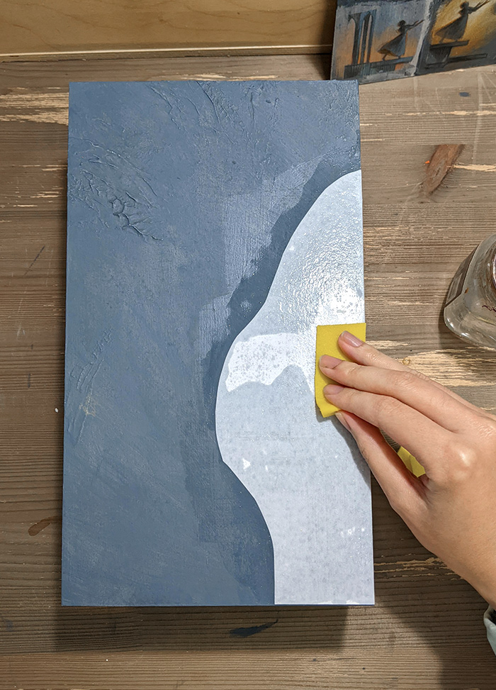
I worked slowly in small sections to remove the paper, adding more water as needed. The paper came away quite easily once saturated with water, but did so in layers, so I had to do a few passes.
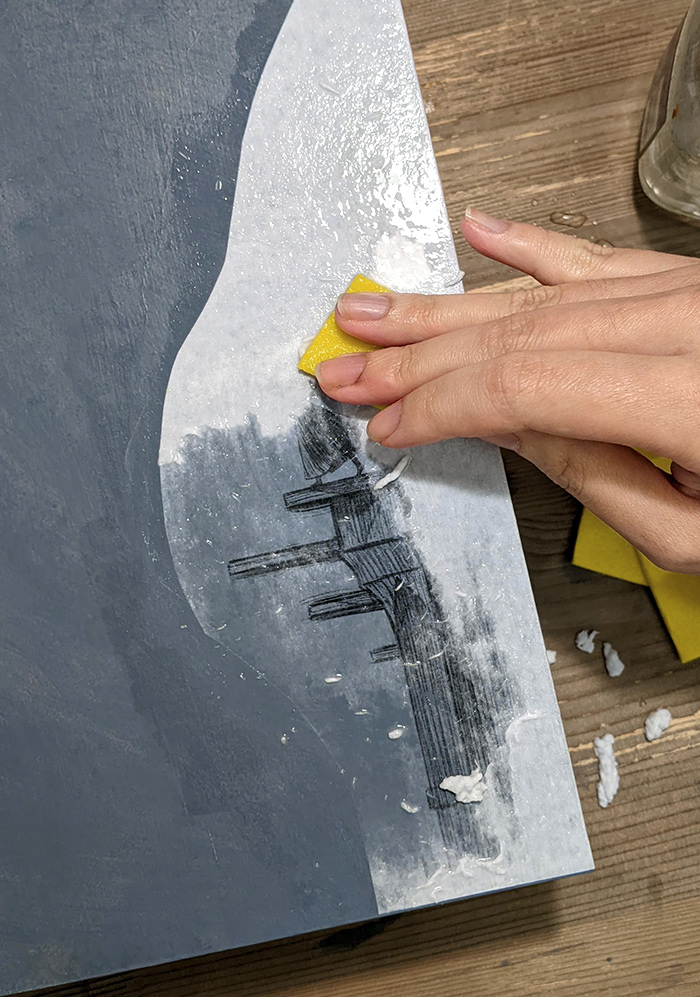
The last layer of paper was the most tricky and fragile. Especially because I did not wait overnight, the print was not very well-bonded to the surface, and prone to lifting (oops!). So I just used my fingers for the last layer, and worked extremely carefully.
There were some areas where I was too harsh with the sponge, and the image lifted. But that’s ok for this piece – a little bit of distressed texture is always nice! This probably wouldn’t happen as severely if I gave the matte medium more time to dry, but some amount of lifting is to be expected.
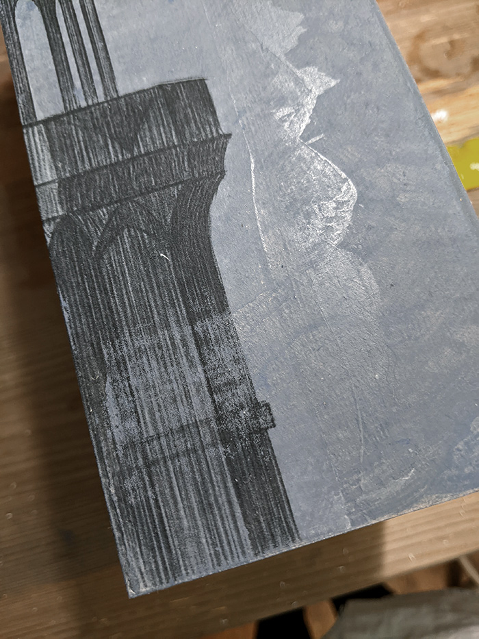
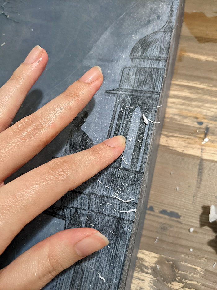
And that’s the transfer complete! The outline of the paper was still slightly visible – created by the matte medium collecting at the edge of the paper. I sanded this back with a fine-grit sandpaper to create an even surface.
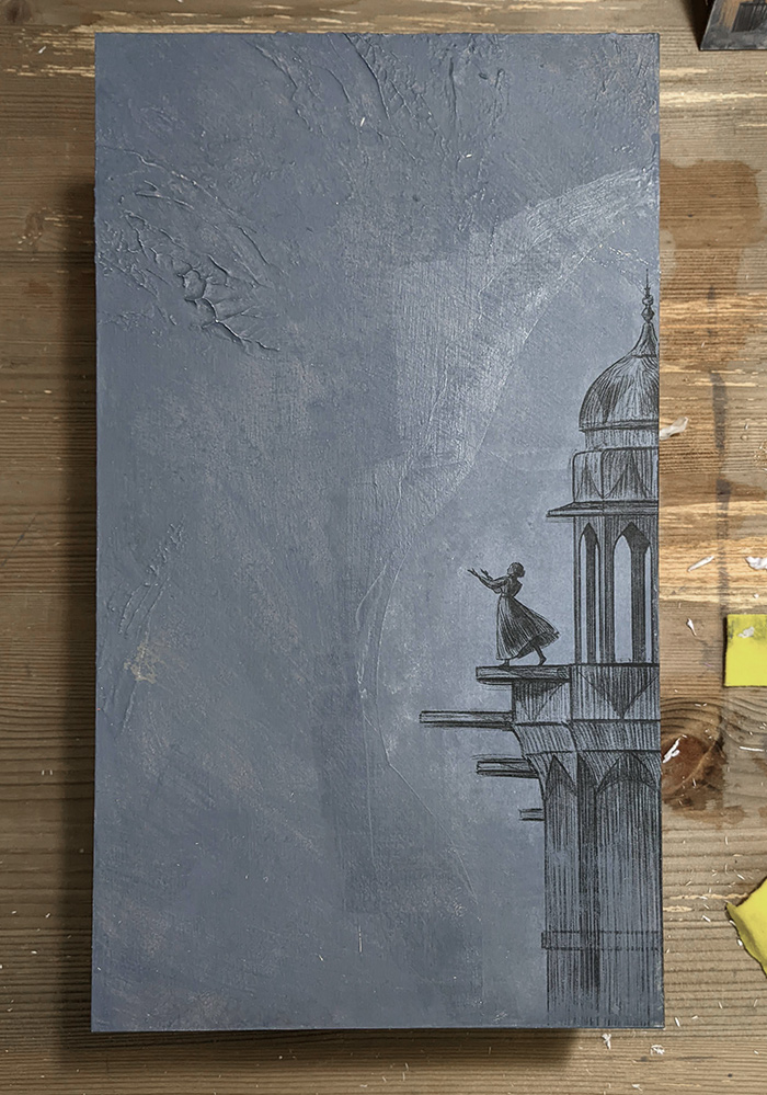
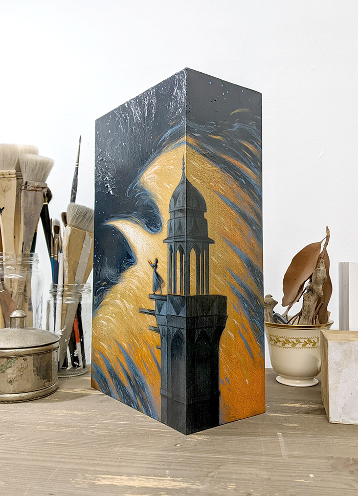
After sanding, I sealed the entire transfer with another coat of matte medium, locking it in without any further risk of lifting.
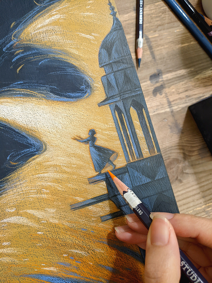
I did end up painting over parts of the transfer in translucent glazes, but I was also able to retain much of the linework from the initial digital drawing. From the process shots below, you can see how I worked on top of the transferred drawing:

With the transfer providing so much detail, it didn’t take much in the way of drawing to bring everything together. In the closeup below, you can see that I pulled out some highlights on the building, and added some glow around the figure with touches of orange. Because a lot of the shading work was already done by the transferred image, I was able to focus on creating simple but expressive marks on top.
I’m absolutely thrilled with how this turned out. I’ve always wanted to achieve this specific look of balancing value and shading with crisp lines, and this transfer method really did the trick! It has so much potential, and I’m only just beginning to explore the possibilities.
I used this piece to try out several different techniques – believe it or not, there were even more experiments beyond this transfer method! It was also not all smooth sailing; at one point I seriously thought I had ruined it and would have to drop out of the show, before some intense art material science saved it… but that is a story for another day! For now, I leave you with the finished piece, which will be in Outre Gallery’s Vanguard show, opening September 22nd.
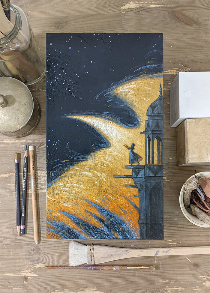
Dawn (2023)
Mixed media on cradled panel
30cm (h) x 17cm (w) x 9cm (d)

Woah. I have got to try this. Transferring is one of the few unpleasant parts of the job, and this makes it look easy to circumvent!
Oh do try it out! And let me know how you go 🙂
I saw this on Instagram but only fairly quickly so it’s nice to see a breakdown of the process. I think any process in which you can preserve the linework through traditional mediums is certainly interesting as I like to do the same. Especially with pencil work, I always want it to show through my watercolor more than it does. Ink is just better at that but sometimes you just want the quality of line that graphite gives you.
Anyway, super cool seeing this process and thanks for taking the time to share it. You’re work is very inspiring if I may say from one artist to another.
All the best!
I’ve been experimenting with this for the past couple of years and love it! It’s really fun to see what kind of texture you’re left with after removing the paper – I kind of like it when it doesn’t transfer perfectly! Thanks for sharing the process.
Very nice article, you cover all the necessary and important Topics in this article thank you for giving the best knowledge.
Great article, Thanks for sharing this article
Working with killer papers I’ve had the opportunity to engage with a diverse team of experts who have helped refine my skills and broaden my perspective. This experience has taught me the importance of seeking guidance and leveraging resources to enhance my academic performance.
MDA Powder for sale
Order crystal meth near me
Order crystal meth online
buy 3cmc 4cmc crystals
Alprazolam powder for sale
4mmc mephedrone crystals for sale
buy carfentanil powder
buy crystal meth online
buy ephedrine powder
buy mdma crystals online
buy oxycodone powder
buy fentanyl powder for sale
china white heroin for sale
cocaine powder for sale
dextroamphetamine powder for sale
buy etodesnitazene etazene online
ketamine crystals for sale
ketamine powder for sale
buy methoxetamine mxe online
buy methylamine powder
buy 2fdck 2-fluorodeschloroketamine
anesket injection non prescription
camfetamine for sale online
buy 3cmc 4 cmc crystals
4mmc mephedrone crystals for sale
Alprazolam powder for sale
anesket for sale
buy camfetamine powder
carfentanil powder for sale
china white heroin for sale
cocaine powder for sale
buy crystal meth methamphetamine
dextroamphetamine powder for sale
ephedrine Hcl powder
ketamine crystals for sale
Buy ketamine powder for sale
order mdma crystals for sale
oxycodone powder for sale
Order crystal meth near me
Order crystal meth Sydney
alprazolam powder for sale
3cmc 4cmc for sale
4mmc mephedrone crystals for sale
buy crystal meth crystals
Buy Crystal meth near me
buy ephedrine powder
buy mdma crystals online
buy oxycodone powder/
cocaine powder for sale
dextroamphetamine powder for sale
china white heroin for sale
isotonitazene-for-sale
ketamine crystals for sale
buy ketamine hcl injectable 500mg ml
Ketamine Powder for sale
methiopropamine mpa for sale
buy methoxetamine mxe online
buy methylamine powder
anesket injection non prescription
ketamine hcl liquid for sale
synthacaine crystals for sale
buy 3cmc 4 cmc crystals
buy crystal meth methamphetamine
crystal meth for sale
ketamine crystals for sale
buy ketamine powder
buy liquid ketamine crystals
order crystal meth sydney shop
ocaine powder for sale/
synthacaine crystals for sale/
buy crystal meth near me/
buy crystal meth sydney/
buy crystal meth perth/
buy crystal meth brisbane/
buy crystal meth canberra/
buy crystal meth melbourne/
buy crystal meth adelaide/
buy crystal meth darwin/
buy crystal meth hobart/
buy crystal meth victoria/
buy crystal meth crystals/
buy crystal meth crystals/
buy cocaine near me au/
buy cocaine near me canada/
buy cocaine near me germany/
buy cocaine near me online/
buy cocaine near me spain/
buy cocaine near me uk/
buy cocaine near me usa/
buy cocaine powder in australia/
buy crystal meth online cheap/
buy crystal meth online legal/
buy crystal meth online legit/
buying crystal meth online/
cocaine near me supplier near me/
crystal meth for sale australia/
Order ketamine near me
Order 4-cdc near me
Order 4cprc near me
Order 4mmc online
Order 5f-mdmb pinaca near me
Order a-pvp near me
Order alprazolam near me
Order amphetamine near me
Order 2c-b near me
Order bromadol near me
Order changa dmt near me
Order dmt vape pen near me
Order ecstasy pills near me
Order heroin near me
Order lsd liquid near me
Order lsd near me
Order mdma crystals near me
Order mescaline peyote near me
Order mushroom near me
Order spores syringes near me
Order colombian cocaine near me
Order ephedrine near me
Order etazene near me
Order isotonitazene near me
Order jwh 018 near me
Order ketamine near me
Order furanylfentanyl near me
Order Aero 3S T Rex
can am spyder f3 s se6
Order can am spyder f3 s se6
Order can am spyder f3
Order canam spyder f3 limited
Order canam spyder f3-s special
Order canam spyder rt limited
Order aero 3s t-rex-motorcycle
2023 can-am atv ds 250-for sale
maverick for sale
2023 can-am maverick x3 max ds turbo-for sale
2023 can-am outlander 570 atv’s for sale
2023 can-am outlander x-mr 1000r atv for sale
2023 can-am outlander atv xt 1000r for sale
2023 can-am ryker rally rotax 900 ace classic for sale
ryker sport rotax 900 ace for sale
2023 can-am spyder rt limited platine wheels for sale
Buy Ephedrine powder online
pseudoephedrine powder for sale
Buy Ephedrine australia
Buy Ephedrine canada
Buy Ephedrine europe
Buy Ephedrine melbourne
Buy Ephedrine near me
Buy Ephedrine sydney
Buy Ephedrine uk
Buy Ephedrine usa
Ephedrine supplier in australia
Buy pseudoephedrine powder near me
Ephedrine powder for sale
pseudoephedrine powder worldwide delivery
Pure pseudoephedrine for sale
Iberico pork meat
Atacadista wholesale
Can am supplier
Cerave wholesale shop
gree AC inverters
wholesale distributors
I need this article to complete my college assignment, and it matches the topic perfectly. Thanks for the great content!
This is such an interesting technique! I’ve always been curious about laser print transfers and how they can be applied to different materials. The step-by-step breakdown you provided makes it seem more approachable, and I love how you highlighted both the creative potential and the challenges. I can’t wait to try this out myself—thanks for sharing such an informative and inspiring post!
Discover adorable teacup Chihuahuas for sale at highland Chihuahua. Our family-owned breeding ensures each puppy is healthy and full of love. We specialize in teacup Chihuahuas, providing a nurturing indoor environment.
Looking for a tiny and loving companion? Our Chihuahua puppies are raised in a family environment and come vaccinated, Check out our selection of Chihuahua puppies for sale and bring home a delightful new friend!
I’m impressed by the details that you have on this site.You have a good point! I completely agree with what you said!!
Thanks for sharing your views…hopefully more people will check out
Nice blog. Great information. It’s really helpful. Valuable content and presentation..
Nice blog. Great information. It’s really helpful. Valuable content and presentation..
Nice blog. Great information. It’s really helpful. Valuable content and presentation..
Nice blog. Great information. It’s really helpful. Valuable content and presentation..
Nice blog. Great information. It’s really helpful. Valuable content and presentation..
Nice blog. Great information. It’s really helpful. Valuable content and presentation..
Nice blog. Great information. It’s really helpful. Valuable content and presentation..
Nice blog. Great information. It’s really helpful. Valuable content and presentation..
Nice blog. Great information. It’s really helpful. Valuable content and presentation..
Nice blog. Great information. It’s really helpful. Valuable content and presentation..
Nice blog. Great information. It’s really helpful. Valuable content and presentation..
Nice blog. Great information. It’s really helpful. Valuable content and presentation..
Nice blog. Great information. It’s really helpful. Valuable content and presentation..
Nice blog. Great information. It’s really helpful. Valuable content and presentation..
Nice blog. Great information. It’s really helpful. Valuable content and presentation..
Nice blog. Great information. It’s really helpful. Valuable content and presentation..
Nice blog. Great information. It’s really helpful. Valuable content and presentation..
Nice blog. Great information. It’s really helpful. Valuable content and presentation..
Nice blog. Great information. It’s really helpful. Valuable content and presentation..
aerocity is hub of 5 star hotels.
Your blog post is great, thanks for sharing.