Composition is the quiet workhorse of any piece of work, fine art, cover illustration, key art, etc… it is the contextual energy that guides the eye and steers it across the scope of the image. It does the lion’s share of the work on a piece but also often works best when it’s buried a little bit behind the hedge making magic in the background. You can express compositional energy with simple graphic layouts as with say splash page style action shots, or use furniture and light, or even the way characters in your image gaze at each other or elsewhere. Composition is the absolute most quiet and potent workhorse on the canvas or page.
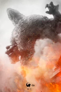
Because of my comics background I was forced to grow a limb that always thinks about how can you express the narrative visually despite the words, so for my part, I like to compose a piece based on that ethic. When its a commission and I can run wild I tend to do so, but when it’s a hired job, those powers can oftentimes get supressed for other needs of the client, for good or ill. Even if you find yourself in the latter, still push hard as you can to hold the line of an active and functional composition, if for no other reason than healthy skepticism that your client is not necessarily a visually minded person and may ask for things that don’t make sense practically on the page, or that there is a force being featured that demands its presence featured large and proud. If you were asked to do say a poster for King Kong, assume you HAVE to have a giant ape in it. You don’t necessarily have to show ALL of Kong, or even his face- you could arguably just have a hairy fist grabbing Faye Ray, or you sould have people leaning out of the Empire State building after his just climbed past them, his claw marks or foothold damage on display, maybe the Ape’s shadow cast down from above… regardless, sometimes it’s all about how to wrestle the obvious into something new and compositionally interesting. I’ve had a ton of jobs for tv and movies wherein the actor likenesses aren’t available but the film or show is hugely about characters in that story. It’s going to take some acrobat work to figure out how to do it, however weird, but you will be able to make it work if you really bust open your brain to think around the impediment of that restriction.
One of the most common challenges you’ll come across having to create an intellectual composition visually. It sounds a little in the weeds but it’s a massive difference between an intellectual or aspirational composition and a visual one. In shot… Aspirational compositions are ones derived from a desire to fulfill a client’s wishlist, and aren’t really considering what something, might LOOK like for the sake of what needs to be seen- if that makes any kind of sense.
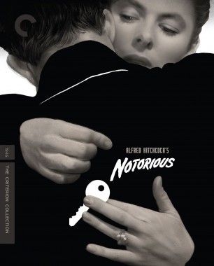
ALWAYS consider the title treatment and any needful text on the piece. Most of the time you won’t have a title treatment ready to go before you start working, so you have to operate on a few different principles and work anyway: Ignore it utterly, create the title alongside the composition of the artwork, or anticipate a standard (Comics almost always have a title at top, credits shunted to the bottom or side, publisher bullet or logo at top left.) Criterion Collection work will, for example, ALWAYS have that lil “C” at the top left. You see a lot of old Rockwell art for the Saturday Evening post leaving an excess of room at top for the ever standard title approach. Sometimes you get to play with it, overlap and interact, but even these are only done when the presence of that title bar is assumed.
What you don’t want to do is ignore completely. Yes I can claim truth that there will be projects where your art will be featured nakedly without any type whatsoever- more common for LP covers and the rare book cxover than anywhere else- but it can happen. But really this is a rare unicorn so don’t go in with that bravado intact as a basic. Assume there’s will be something and plan your composition around or with that eventual addition to come later. Chances are you will be required to work on the piece more when the title treatment comes in later. Oftentimes the designer will await your art to begin working on the title work so its integrative and responsive, and you won’t really have any control or hand in this process, but I’ve found even in those circumstances you can and want to be able to influence that decision tree as much as you can while in the early phases where you can steer the conversation more effectively.
There are some assumed aspirational compositional basics in shaping the work you’ll run into often enough to forced into ridiculous category boxes like I did below:
THE EVERYTHING ALL AT ONCE FOREVERER
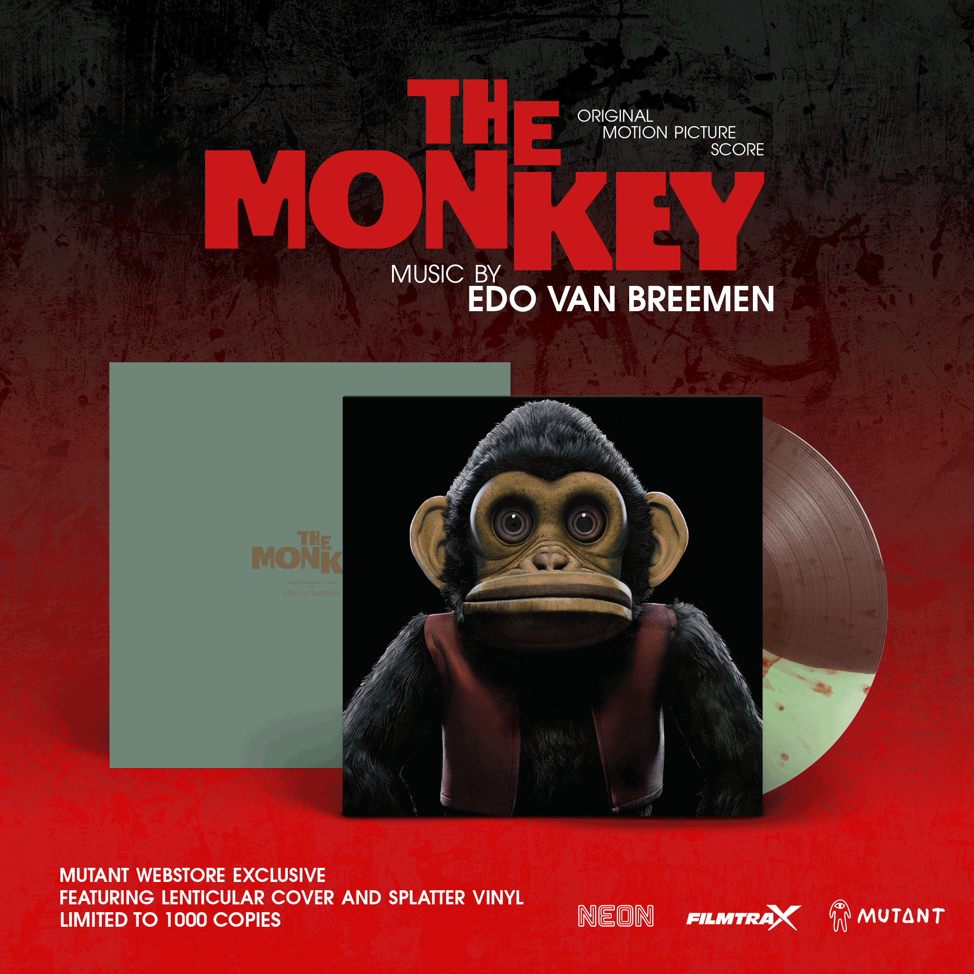
A an overly complex list of desired object- “We want to see the spaceship, the planet their from, the sun exploding int he background and the character flying upside down lasering a horde of attacking aliens, and if you can show him smiling behind his space helmet that would be great. make sure we can read the type on his helmet and the name of the ship”. Simply put a desire to see way too much and have the cover or key art carry an overburdened load for the project by showing more than it should to make for a decent composition.
Oftentimes this si coming from a client who just wants too much, and you need to figure how to navigate them down to a more succinct expression. However sometimes going absolutely bananapants on this and doing it all IS the solution and it can be made to work of you then rectify this insane storm of parts under a compositionally graphic and simplifying compositional build like with James Jean’s work on Everything Everywhere…
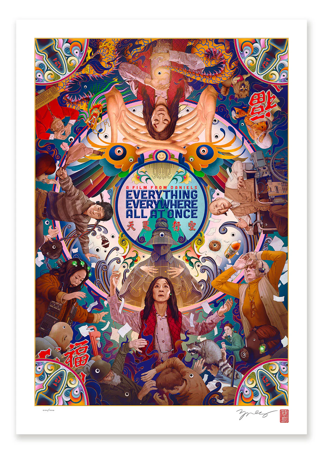
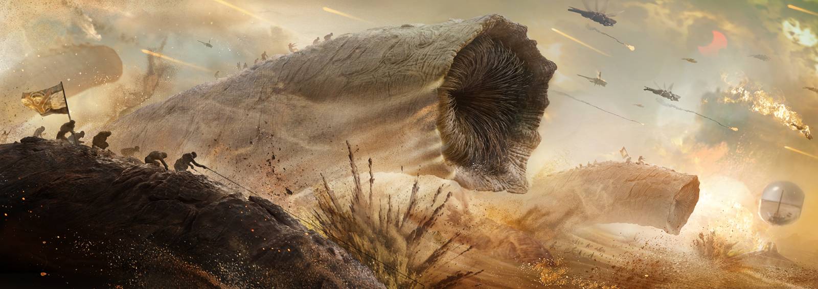
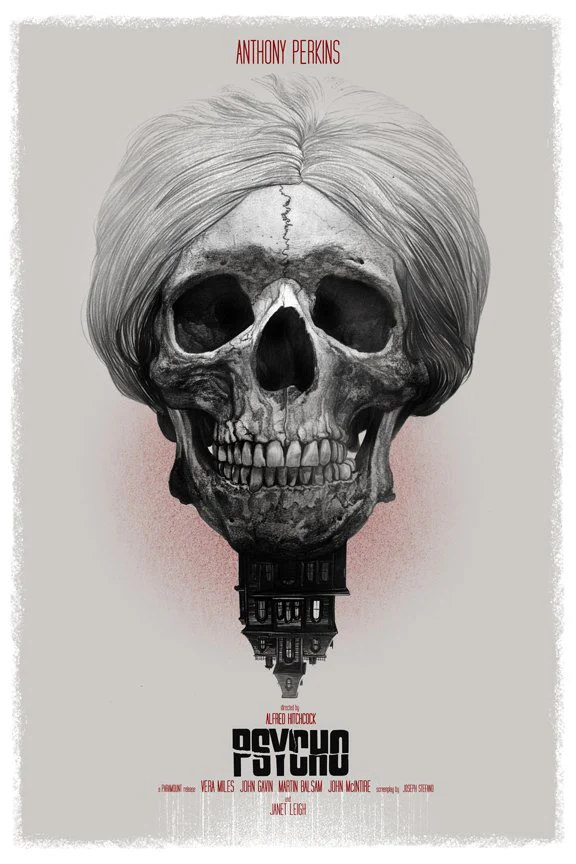
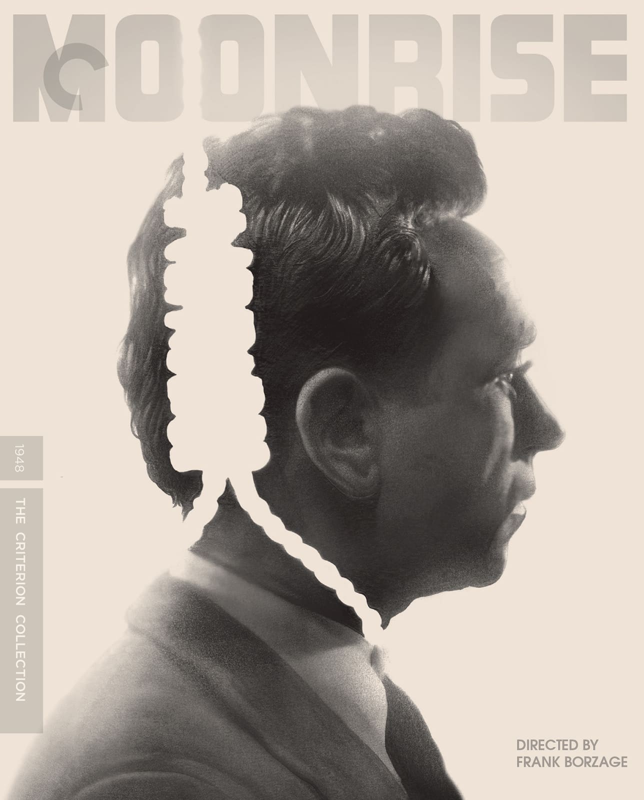
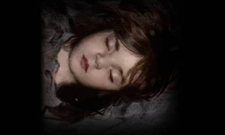
I myself prefer a simpler attack, my giant insane Dune Part 2 spread notwithstanding. If I can sell the concept in its most simplest and most elegant terms, then that’s a goal- and a rare achievement. The time spent on this cover for Criterion’s MOONRISE was so little as to this day making me question whether it’s done yet, and it is and was and even won a trophy for it. Sometimes the simple elegant solve just comes into the room and makes dinner for you, sometimes you need to go out and hunt it down. But I always try to see if there’s a simple emotional/character approach, which makes sense as I am much more the portrait guy than I am the burly brawl type of illustrator. SO make sure you have a clear picture of what you do so you can bring that instinct, or learn to suppress it given the project you’ve agreed to tackle. Busting out of preferentials is healthy and makes you a stronger more versatile artist, so I do encourage not resting on your natural position on subjects. In fact I’d encourage it over all else as a general exercise for you in the studio. If you do go big and complex, try to bring in simplifying elements graphically to help tame the wild of it. Without something like this, your composition will read as flat and sap the energy of the chaos you’re trying to express- try not to be inside the explosion, but far enough away from it to give it context. There’s power in context, there’s mess in chaos.
THE HEAD CLOUDIFIER
“We want to see all twelve of the cast members”, These are largely the result of legal requirements and likeness agreements, sometimes and often even resulting in making sure certain marquee actors are featured more prominently over others via negotiated agreements having nothing to do with how this might look, save for the stars being bigger than others. Or the inverse where everyone, regardless of where they might be in space and distance, need be made to all have the exact same size presence. Head Clouds as much as I have a particular proscription against them as a base, are a reasonable answer to this kind of request, and why we see oh SO many of them every where on most film and tv key art.
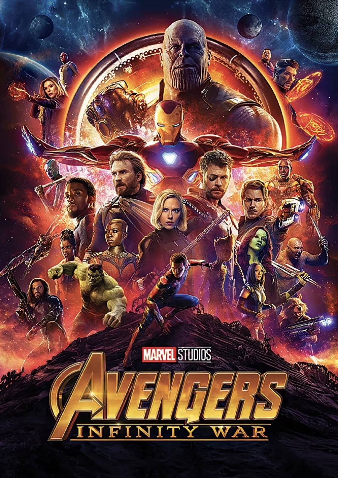
Screenshot
Sometimes you get this as a desire coming in and that’s when you need to chose to do it or not. I have passed on jobs where that is clearly the desire because I find them dull for the most part, and starting the race with a broken leg, creatively speaking. But sometimes this desire is held in check, and then creeps in via the notes and edits that all quietly steer you to it. I had a terrible job on a film once where the studio did this relentlessly despite the hard fought struggles against it even by the director and producer, resulting in the end a once dynamic piece made terrible and dull and they actually added a head or two more in via cutouts from stick footgae becuase somehow all the heads weren’t enough. So that can happen too.
THE VAGUE-INATOR
“Really important we see her inner strength expressed through her out beauty”, or “Can he look more conflicted while holding that worm baby?”, or “can you make that rope a little less ropey?” (these are all from actual notes received btw). These are desires to see any aspect of the story expressed on the image that almost no one will ever note save for the client. A lot of times especially working with film and tv, and oftentimes when an author is in the mix, you’ll have to work with and answer to people who don’t possess any real visual language sense at all. Even though more than 65% of the population learn visually, less than a third of that knows how to, often just through lack of experience with it all, manage to see what you the artist is up to, advocating for, or doing on the page. The upside of this can often be a surrendering to your skillset- not hyper-managing the plumber fixing your sink because you don’t know how plumbing works, for example.
The vagueness will often come from an emotional position they’re occupying you as the artist need to ferret out in practical terms. I think getting a sense of this dynamic and learning how to respond to it is a deeply important tool to hone when building out a piece- to be able to speak with the client or a subject, or even actor or director on a project can really aid in this. Being able to talk to Britt Lower in person and get inside how she built Helly R and Helena Eagan for Severance was an exercise in this perfectly in that through the meeting I was able to ask questions about her character in a way that helped me craft a portrait that differentiated Helly from Helena in a way that read well and immediately. But you often get that chance so you’ll find the need to develop an almost psychic ability to seance those details into the piece so you can bring it home. The most affirming moment in most of my book cover work is achieving this result from this process, and you get comments like “I feel like you drew something in my head I couldn;t describe”, or “There she is, that’s my character!”. You will likely get references to helps teer this dynamic, actors that kind of look like how they’re thinking, etc… but it’s up to you to also know that it’s never just about getting their likenesses right, but allowing their character to read, and that ALWAYS comes via how they or the piece is composed.
THE FREE BIRD
Let’s face it this is the golden ring where you are left to come up with whatever you want to make it great. It’s the client hiring you to do what you do and getting out of the way to let you do it. It comes with it’s own stumbles, leading one being that now that you’ve got the whole stage to yourself, you’d be better dance effing brilliantly because there is no safety net or cover to hide behind. You gotta dance and everyone is watching. This dynamic favors the bold so I encourage hugging the trope that absolute power corrupts as a value. Go nuts be wild while also respecting the story your expressing of course. Don’t say, make a big action splash page fight scene for a film like HER, or The Passion of Joan of Arc, etc… in short don’t be a blind fumbling idiot with your powers, but use them with the framed purpose to illustrate well, and be mighty in that act.
At the end of it all remember that your composition is the glue that binds the work together, and is so important that its more often than not, best expressed by it being behind the scenes. And just because it’s not grabbing your attention like a handsome actor or a cool ass spaceship, dragon or biplane in flight, it’s often where the piece makes it or breaks apart on the field. You can’t always rescue a project that’s too heavily built as a response to the client’s non visually rooted emotional needs of a piece, but it’s your best possible tool for getting there anyway. When in doubt do what I do- keep a nice effective library of artbooks collecting different work from different artists or even a monograph of an artist who is especially great at their compositions and get yourself inspired by it. I know it sounds old fashioned but image searching on the internet has an inherent requirement of needing to know what your looking for to prompt the search to it- you might well find a Holly Hobby kids book has a pic that unlocks the mystery for you, or some old Robert Fawcett piece leaps off the page with a solution. So letting yourself get out of your head and find a solve somewhere else can be a real life saver.
In any case don’t forget your old friend and ride-or-die partner in composition in every piece you make. If you work it enough to push it into your internal hardware as a basic function of it, you will have found a wellspring of solves and ability unmatchable anywhere else. And the beauty of it is that it’s one of those things you’ll never become perfect at- you’ll always have higher peaks to climb and summit. It’s an inexhaustible resource than can express itself in so many different ways that it’s an endless pot of gold if you know how to look for it. Good hunting.

These are all great tips, Greg. I was just on a project recently where marketing wanted the protagonist to look “Afraid, but also excited, but also sure of himself” followed by “we know that’s probably confusing.” Ah well! It’s how it goes.
Frankly the dealer’s choice option always terrifies me because it’s so open ended for what the person is looking for – I have to build limitations into it to get anywhere on it otherwise I end up spinning my wheels endlessly and end up with something very drab.
ʜᴏᴍᴇ ᴄᴀꜱʜ ᴇᴀʀɴɪɴɢ ᴊᴏʙ ᴛᴏ ᴇᴀʀɴꜱ ᴍᴏʀᴇ ᴛʜᴀɴ $500 ᴘᴇʀ ᴅᴀʏ. ɢᴇᴛᴛɪɴɢ ᴘᴀɪᴅ ᴡᴇᴇᴋʟʏ ᴍᴏʀᴇ ᴛʜᴀɴ $4.5ᴋ ᴏʀ ᴍᴏʀᴇ ꜱɪᴍᴘʟʏ ᴅᴏɪɴɢ ᴇᴀꜱʏ ᴡᴏʀᴋ ᴏɴʟɪɴᴇ. ɴᴏ ꜱᴘᴇᴄɪᴀʟ ꜱᴋɪʟʟꜱ ʀᴇQᴜɪʀᴇᴅ ꜰᴏʀ ᴛʜɪꜱ ᴊᴏʙ ᴀɴᴅ ʀᴇɢᴜʟᴀʀ ᴇᴀʀɴɪɴɢ ꜰʀᴏᴍ ᴛʜɪꜱ ᴀʀᴇ ᴊᴜꜱᴛ ᴀᴡᴇꜱᴏᴍᴇ. ᴀʟʟ ʏᴏᴜ ɴᴇᴇᴅ ɪꜱ 2 ʜʀꜱ ᴀ ᴅᴀʏ ꜰᴏʀ ᴛʜɪꜱ ᴊᴏʙ ᴀɴᴅ ᴇᴀʀɴɪɴɢ ᴀʀᴇ ᴀᴡᴇꜱᴏᴍᴇ. ᴇᴠᴇʀʏ ᴘᴇʀꜱᴏɴ ᴄᴀɴ ɢᴇᴛ ᴛʜɪꜱ ʙʏ ꜰᴏʟʟᴏᴡ ᴅᴇᴛᴀɪʟꜱ ʜᴇʀᴇ.
.
ᴍᴏʀᴇ ᴅᴇᴛᴀɪʟꜱ ꜰᴏʀ ᴜꜱ —————➤ Cash43.Com
great
ʜᴏᴍᴇ ᴄᴀꜱʜ ᴇᴀʀɴɪɴɢ ᴊᴏʙ ᴛᴏ ᴇᴀʀɴꜱ ᴍᴏʀᴇ ᴛʜᴀɴ $500 ᴘᴇʀ ᴅᴀʏ. ɢᴇᴛᴛɪɴɢ ᴘᴀɪᴅ ᴡᴇᴇᴋʟʏ ᴍᴏʀᴇ ᴛʜᴀɴ $4.5ᴋ ᴏʀ ᴍᴏʀᴇ ꜱɪᴍᴘʟʏ ᴅᴏɪɴɢ ᴇᴀꜱʏ ᴡᴏʀᴋ ᴏɴʟɪɴᴇ. ɴᴏ ꜱᴘᴇᴄɪᴀʟ ꜱᴋɪʟʟꜱ ʀᴇQᴜɪʀᴇᴅ ꜰᴏʀ ᴛʜɪꜱ ᴊᴏʙ ᴀɴᴅ ʀᴇɢᴜʟᴀʀ ᴇᴀʀɴɪɴɢ ꜰʀᴏᴍ ᴛʜɪꜱ ᴀʀᴇ ᴊᴜꜱᴛ ᴀᴡᴇꜱᴏᴍᴇ. ᴀʟʟ ʏᴏᴜ ɴᴇᴇᴅ ɪꜱ 2 ʜʀꜱ ᴀ ᴅᴀʏ ꜰᴏʀ ᴛʜɪꜱ ᴊᴏʙ ᴀɴᴅ ᴇᴀʀɴɪɴɢ ᴀʀᴇ ᴀᴡᴇꜱᴏᴍᴇ. ᴇᴠᴇʀʏ ᴘᴇʀꜱᴏɴ ᴄᴀɴ ɢᴇᴛ ᴛʜɪꜱ ʙʏ ꜰᴏʟʟᴏᴡ ᴅᴇᴛᴀɪʟꜱ ʜᴇʀᴇ.