-By Jesper Ejsing
Hey Everybody.
I have been chosen to do the next round of critique. I am glad, and frightened. First I would like to say the corrections or suggestions if you like, is only examples of what I would have done different, and not necessarily true or even better. But since I also tell why I would change these elements I hope you can gain something out of it.
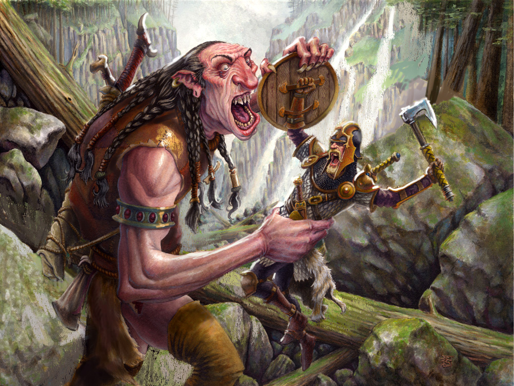
Among the many pictures sent in, I chose this one by Anthony J. Schmidt. I like the image. It portrays a situation like most paintings I do and I feel most confident in criticising analogue painting. This one was done in watercolour.
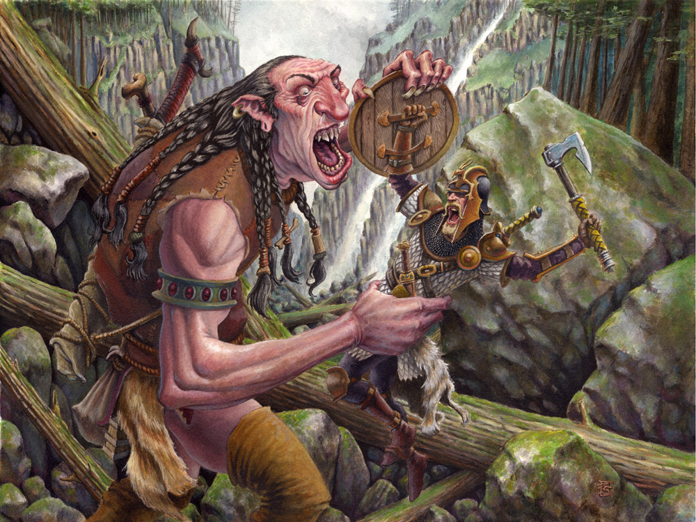
First off. To me the most important thing in an illustration is telling a story, and telling it clearly. There should be no need for explanations and you should be able to “read” it right away. What I focus on when doing a scene like this is: clearly readable silhouettes, foucs via details and color intensity, and clearness in forms. That means getting rid of tangents.
Here is what I think Anthony’s painting needs to be a bit more easy to read:
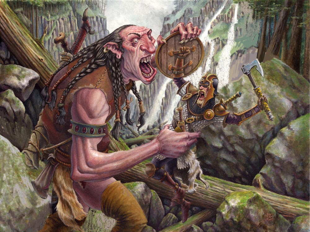
The fighter kind of disappears into the background. He has basically the same colours as the background and the shapes in the cliff behind him makes him difficult to see. The head is the most important thing. It is immediately what draws the eye, so I came up with a simple solution: to make his head a clear silhouette I added another waterfall behind it. That way, painting over a part of the cliff giving the whole area behind his head and axe a less busy texture. Also it makes the head stand out as a dark patch on white background. Doesn’t get much clearer than that.
 |
| Added waterfall behind warrior’s head. |
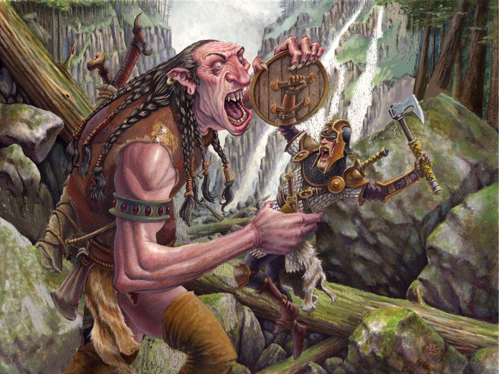
Next is the area behind the giant. It is much too busy, compared to the fact that it is one of the least interesting parts of the painting. To me the faces of the 2 figures and the interaction between the 2 facial areas is the focal point, the rest is less important the longer you get from the focal point. When doing a painting like this I force myself to go less and less detailed by using bigger and bigger brushes the father away I get from the focus. This way I do not end up detailing leaves and stones in the corners. When I go closer to the faces I use smaller and smaller brushes thus adding a focus by shear grading of details.
Well, I needed the area to be more calm so I just copied the cliff behind the fighter and made it into a large stone, creating a calm and light area with out too much contrast. This way, we read the backside of the giant better. I also lighted the triangle between his legs to make them clear.
 |
| Simplified the area behind the giant’s legs. |
In the next stage I added some light to the shoulder part of the Giant. It felt wrong that the skin tones had so much light and that the leather jacket didn’t. Light does not just stop because the material changes. But it is a mistake very easy to make when painting traditionally. Because you change colour on the brush, and you probably didn’t even do the skin tones the same day as you did the costume. But it is extremely important to be consistent with the lighting. I greyed out the area behind the giant’s braids to make his front more clear. Most important I needed the whole area of the legs of the fighter to be lighter to make his feet seem darker and thus more readable, so I painted in a lot of light brown and green to make the trunk light and simple.
 |
| Added consistent lighting to the giant’s shoulder. |
Next is the rim light. I use this trick all the time . it is a blessing and a curse. But since Anthony already had a bit of bluish rim light I felt I wasn’t stepping into unfamiliar territory. On the handles of the weapons on the giants back, the light really helps to pull the silhouette out from the background. The axe and especially the thigh and feet of the fighter benefits from the white light.
 |
| Added rim-lighting to both figures. |
Lastly, I think the colours are a bit too desaturated. I would have used stronger colours if it was me, but out of respect for the original painting I will only tweak the saturations a tad and only at the focal points. This way the eye is drawn yet again to the important place because it is also the place with the most intense colours.
| Boosted the color saturation around the focal points. |
I know that my changes are not dramatic or radical. Some of them are maybe even distasteful. But in any way they make the image a clearer image and the picture easier readable and thus the story more intense. I hope you can agree to the reasons why I changed stuff. It was all done in the name of clarity.
Also I have tried to convey the difficult choices you face in doing a scene in an illustration. Using the tricks of focus can be difficult and should only be used the important places or else the eye gets lost. I have added a piece I did a while back that had some of the same problems. But it shows how you could use focus to clear up a very busy image. The background for example have almost no trunks and no leaves at all, just messy broad strokes of blue and green. Yet you are not in doubt that it is a forest. Try imagining the same image with a full detailed forest behind where I had rendered every leave and bark structure in the trunks. Think of the eye as a camera that can only focus on one thing at a time. The simple background makes the detailed stuff seem more important. It is a matter of choosing your guns right. Same goes for the less important arms and especially the feet. I just made them flat and without much contrast. What I did instead was punching out the colours and the details on the faces and the ground right between the ape-demon and the last man standing. This area is the only part of the background that needs focus. One last thing: I used a very warm and heavy reddish colour for the Ape and a very light and cool colour for the background behind him to pull the 2 elements apart.
I hope you enjoyed this little paint over. I could talk on forever, but I need to fix a painting now that I am doing. It has lost all focus and is only a muddy patch of undefined brown. With all my own advice still clear in my head I might as well take a bold and dramatic choice.
-Jesper
A note from Dan:
I would also like to quickly chime in on this piece. I could not agree more with Jesper’s assessment of the piece. To me, above all else, legibility is most important. Though, I think that this piece can be pushed even further by controlling the value structure a bit more.
By hazing out a few of the background elements, and darkening the shadows on the figure, we can better emphasize the silhouette. Most notably, I added a bit more white behind the warrior’s back, and a few cast shadows on the giant.
 |
| Reduced contrast and lightened the background. Heightened contrast and darkened the foreground. |
All in all, this piece was already pretty great before we even got our hands on it. The changes Jesper and I are encouraging are subtle, but important. Paintings of this nature are often used for gaming art, meaning that they will likely be reproduced VERY small. Legibility takes on especially great importance at a small scale because a lot of subtlety gets lost in the reproduction. So much so, that one often needs to compensate by actually over doing it at times. Take a look at the Magic: The Gathering gallery found HERE, and look at how some pieces stand out right away. Take the time to try to discern why these paintings work better at such a small scale.
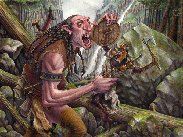
Below is an animated gif showing the three major stages of Anthony’s painting:
Thanks again to all those that submitted this round. Your interest in greatly appreciated, and as usual, the submissions were all really wonderful to look at. Stay tuned, as we’ll post info about the next Crit-Submit soon!
Amazing crit and a really awesome piece by Anthony! The gif at the end is a really nice touch, Dan. Really helps show the comparison nicely.
Great work, everyone! This was a very informative crit. Thanks for sharing. 🙂
Fantastic crit and advice Dan, thanks so much for your time and effort going over this painting.
And thanks to Anthony too for allowing his image to be used for it. Great work Anthony, love it!
Great crit! Love your subtle techniques and respect for the original work. Well done!
Really enjoying these crit posts. It's important to see how subtle adjustments can take a good picture to a great one. I'll be showing this one to my students. Thanks guys!
When I saw the original image I was thinking “ok, seriously? This painting already kicks ass, what are they going to do to it?” But it just goes to show how even subtle alterations to an image, and thinking a little more about certain things can make a really good painting that much better.
^^What they said^^
Thanks you Jesper and Dan for this awesome critique. This series has been amazingly helpful in improving my grasp of painting. Looking forward to the next installment.
Brilliantly helpful critique. All the small changes really made a difference.
This is cool, love that expression on his face. Good stuff
LOVE this post!
I always have a tough time with compositions, and these walk-throughs are extremely well done.
Thanks!
Thanks to Jesper and Dan for their very insightful suggestions! It is a huge honor to have my work tinkered with by such talented illustrators. I can't wait to use all of their imparted wisdom in my next illustration.
Thanks!
Anthony
It surprised me how helpful these crit things are. The painting was awesome to begin with, but still improved immensely after the crit. I often leave my paintings at that point, as well. This has inspired me to try to push them beyond “awesome”. I like how you chose a painting that was great technically and showed how it can always get better, as opposed to an “ok” painting where it is obvious that it could improve a bit.
I had the same thoughts, “What a great piece! I wonder what they will do to it?”
I can definitely see how the changes made it more clear.
Looking forward to the next one!
Awesome painting, Anthony! I love the crit-submit posts! thanks for doing this muddy people and submitter 🙂
Nice to read. I usually see those things on my pictures, but brining them down on paper like I want them too is what makes the art in it.
Just knowing: Oh I want to make him like this and that, doesnt automatically mean that it works when you try to do it. XD
대전출장마사지로 쉽고 간편하게 집에서 경험해볼 수 있습니다.