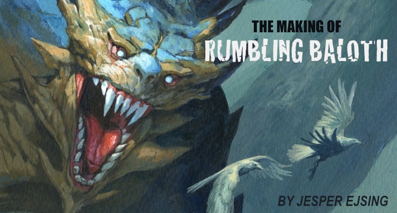
Here is yet another illustration for Magic the Gathering. The assignment was very straight forward: show us a Baloth ( A giant creature unique in magic ) in a forest setting with focus on teeth and power.
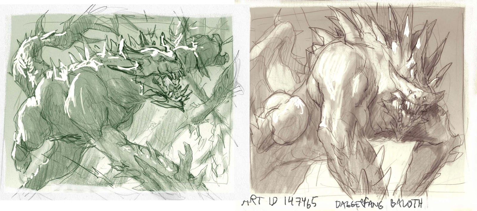
My first attempt was simply the classic way: Show the monster thrashing through the forest snarling like crazy hitting everything. Somehow it bored me a little. Perhaps because I have done a great deal many of these images before. Or because the image was the first thought that got pulled out of my cushion-anatomy. I once read in a book about writing, that you should never go with your initial thought. The idea that springs to mind right at thirst will always all the time be the most archetypical and straight forward one. ( wouldn’t base my whole artistic career on this one theory, since many of my better pieces are exactly that; the first idea ). But the words can mean something else too, at least they do to me. “You should at least evaluate that first idea and see if it is good or if it is too simple. When the thumb I did first was submitted and I looked at it again the day after, the words from the book came to me and I brought out more paper. The sketch was already pending and was properly already going through review, so I had to act fast. Sometimes I really love that I am living in Copenhagen, being 9 hours ahead of the Wizards office that I work for. I can work all day and still be delivering when the art director comes in at morning. It is like having a little time machine under the table.
Step 1.5 Revisiting step 1 ( this step is optional )
I ditched the sketch and made another one. Instead of having the Baloth thrashing I was showing him more in ease in his kingdom. I was going to show him the moment he has just heard or sensed you and he is turning his head towards you grinning. One more thing that I was going to try was to show him zoomed in so much that we would better see his face but his clawed hands would be cropped. Usually that is a “no no”, but I felt extremely adventurous (you can tell I do not get out much, when I get a kick from drawing monsters with hands outside of panel)
I submitted the sketch and called my art director right away, asking if he would consider the new sketch instead?
He more or less approved over the phone, but said one very important thing: “It looks like he is doing push-ups, Jesper. Perhaps you could turn the arms a bit?”
Looking at the sketch again I could only see it that way. A big ass monster flexing the hell out of that forest!
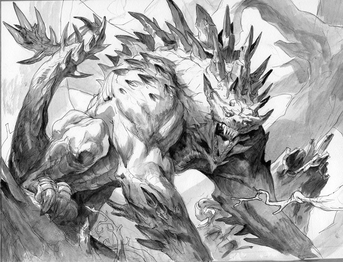
I changed the arms while transferring the thumb to the paper for painting. I like to see if I can keep the sketching as a part of the transferring process to keep the drawing fresh. If I make a very precise sketch and transfer that, I always feel like it dies a little from each step before the painting stage. So if I can manage to actually not do the detailed sketching before the board version I am somewhat happy. I ink the sketch and add grey tone. If I don’t, I will cover up everything as soon as I lay down the first layer or 2 of paint. I try to keep my hand loose and the paint thin when I start, but in reality I paint very thickly right away. Guess it is a temperamental thing. I want to see results! Not fussy-feely paint.
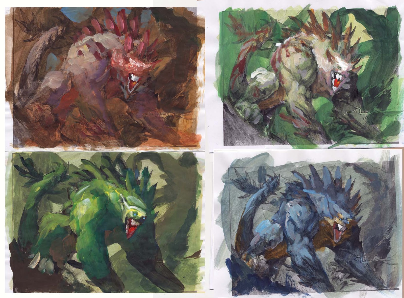
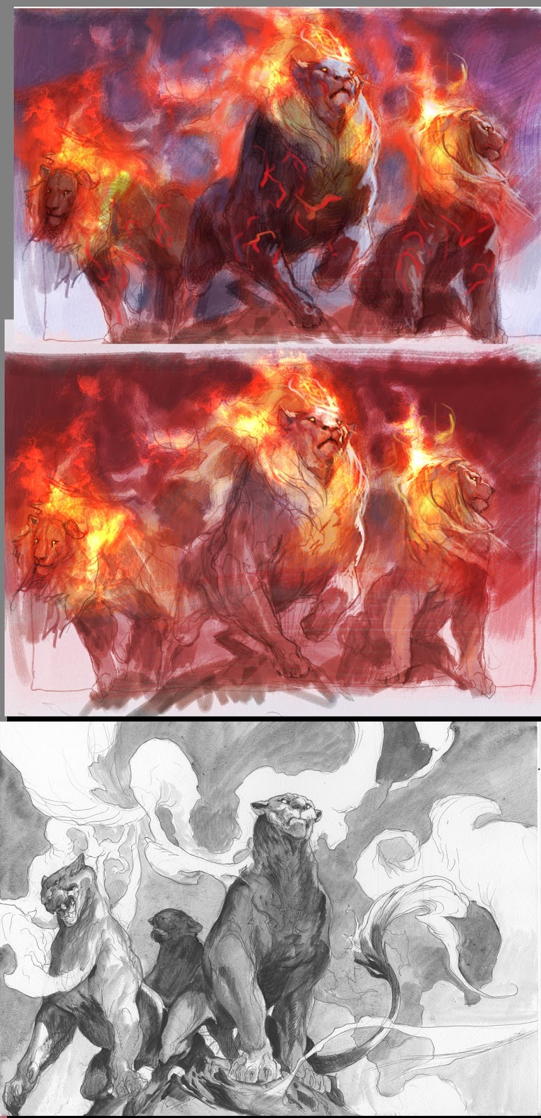
I use the grey tone version to make colour rough from. I take multiple copies and start trying different things out. The brownish one was my first try. I had in my mind an image of teh beast being light-skin, but as soon as I saw it on paper I realized that I had to make the background darker than the figure to pull that off, and I really didn’t like that. I think it works best with a clearly readable dark silhouette against light background when doing these kind of card art portraits. So I tried a bright green version. Guess it is too obvious for a green card art, green frame and then also a green creature. and I thought it somehow looked too comic book like. So I tried a third one that is a mix between the two. light creature on a green forest background. As an after thought I tried out some reddish brown stripes to make him more animalistic. I liked it but was still not too keen on the darker background. So I thought: ” lets try a muted down cold palette with a kind of spotlight on the face warming up a bit of yellowish brown. I took a run through the studio showing all the roughs to kind of cement what I already knew: It was gonna be the blue one. Apart from one douche bag – who shall not be named by name; right Emil? – they all chose the blue.
 |
| Rumbling Baloth – Magic the Gathering core set M14 |
I add colours according to colour rough.
I played around a lot with squinted eyes going in and out of focus, like trying to get a second picture forth from a Magic Eye Picture, to create the texture around the spikes. The tongue is painted from using my own as a reference. Must have looked stupid watching me at that part of the painting. when I was having the mirror in front of me, tongue out, and brush in hand. I didn’t use all the strange spots that I had in the back of the throat and farthest down on the tongue. They were not helping the painting. Got to eat more vitamins…well, stray thought, anyway.
When I was done I thought he looked too small. There was nothing in the painting to show some scale as to how big he was. I added the white ravens in front of him to help that issue.
It is always kind of nerve wrecking to draw in elements like this on a perfectly finished painting. A really professional artist might have done them separately and then added them digitally on another layer. But sometimes it is also a satisfaction that you make it work the hard way, by committing your choice without a backdoor. You are making it work by choice not by trying out things. ( that being said; I think the top bird should have been moved a centimetre up to the right to avoid the tangent from the closest bird )
“It is always kind of nerve wrecking to draw in elements like this on a perfectly finished painting…sometimes it is also a satisfaction that you make it work the hard way, by committing your choice without a backdoor” I love this phrase, this “painting without a net”. Excellent work; I learn much from your tutorials.
Amazing! You really need to be confident to do a no hands character painting, cheers for that!
That first idea-thing reminds me of Howard Pyle. I read somewhere that he would always make a lot of preliminary thumbnails – 50 or so. Even if he liked the first one and ended up using it, he still had to make the rest, just to be sure.
Yeah…I am totally like Howard Pyle. You just made my day; Christoffer
One of your best illustrations Jesper, I've been looking at it for a while now xD.
I'd love to know the colors you used for this illustration, since it's a very restricted palette.
Felipe; I cannot remember the names. I actually do not mind much: I pick the ones I like. What is mor eimportant than teh ezact color is more whatever it is warm or cold. the painting is basicly blue and a little yellow, with muddy grey inbetween. Cerulian blue is the only one I know I used.
E
The restricted palette really draws the focus to the face and head, and I marvel at the painting-without-an-exit-strategy method. I had to laugh at the “it looks like he's doing push-ups” from the AD, ah, the all-important outside perspective. Truly useful after you've spent who knows how many hours staring at your image not being able to see beyond it.
Thanks for the walk-through, Jesper!
love the colours man, whenever im painting something and i think to myself all these colour studies look exactly the same as my last painting i take a leap of faith and think to myself ” how would Jesper do it, what does he consider, stop thinking about colour and think about time of day, cool and warm, the feeling i want to convey”
you always seem to amaze me, will we ever be able to get Prints of your stunning work?
Gotta remember your advice about color temperature, thanks for the reminder.
I still want that Art Book by the way.
so coool 🙂