Some interesting thoughts on the origins of complex composition inspired by a flashback of my childhood.
First of all I would like to thank the many beyond amazing talented artists here at Muddy Colors that gave Vanessa and me a chance to share some of our stories, history, and knowledge with all of you. I will admit that when I first heard about this I thought I had everything together and would blaze through the first article with flying colors but they were soon muddied up when I began. But in all honesty, just thinking about this first article really broke me open with some glimpses from my past, a history of sorts as to why I choose some of the choices I make as a preferred way of working. I’d like to share this discovery as my first article before launching into a series of “how-to” articles. Thank you all again and I look forward to sharing what I can to help you improve your craft.
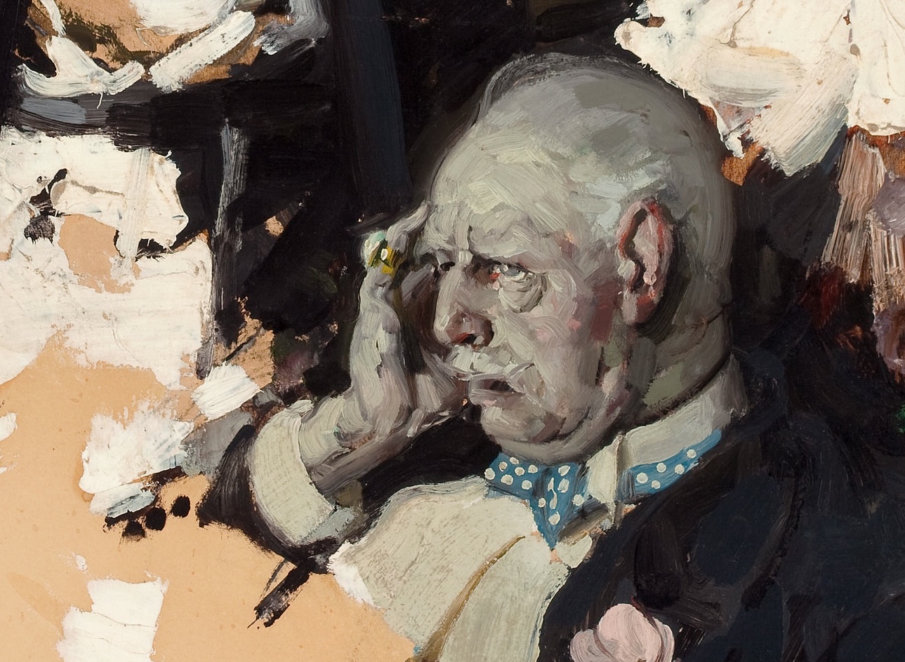
I like raised paint with lots of energy in it and brush strokes with many colors in them you cannot meticulously paint one by one. I love story and I am taken by complex design. I didn’t become aware of why I make life miserable for myself and build pictures that are too complex for short deadlines, painted in a way that is little appreciated unless standing before the actual piece, and reproduces like crap because of all the shadows that the brush strokes cast when lit from ANY direction until I wrote this article. Here is what I discovered.
This Dean Cornwell example shows thick paint throughout and the top left corner is a series of “chords”, a complex colored brush stroke.

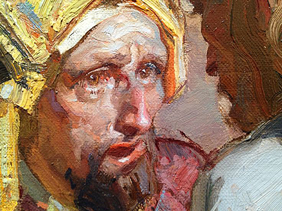
This is a close up of a Nicolai Fechin painting. Here you can see the thickness of the paint and how beautiful it looks and how meaningful the stroke is to what he painted.
I have vivid memories as a child of exploring antique stores and glass stores, and watching my parents as they mined bins and box after box of bits of colored glass called panels regardless of whether they were square or a broken shard, looking for just the right color, just the right texture, just the right noise in crazy cavernous buildings throughout the Sacramento Valley all the way out to the San Francisco Bay Area. These were adventurous places where caution was exercised, because with just the right pressure glass would shatter (barely touching or leaning against), or skin would rip and tear with ease just turning around down an aisle. BUT oh man, the colors that danced around the rooms and aisles between bins and stalls were fantastical like a kaleidoscopic portal to a child’s dreamland.
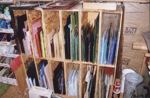
In my eyes all those bits of glass my mom and dad would sift through looked like chunks and shards from broken things, and I couldn’t quite grasp their jubilant cries of victory when that “special” piece of glass was found. These shards of glass were gold nuggets to my folks if the streaks or the misty frosted bubbles flowed in just the right direction and more so if there happened to be a unique splash of colors combined together.
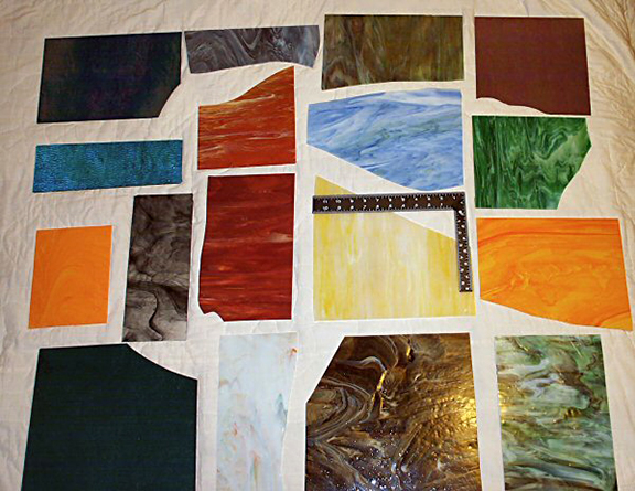
My parents worked to transform several famous Sacramento painter’s works of art into stained glass windows for private collectors. Each piece of glass represented a brush stroke and the “recording” of the stroke, or the orchestration of colors in a “chord” if any glass could be found that mimicked these complex brush strokes of many colors. Each brush stroke carefully planned to look spontaneous, and my parents had to find the perfect glass to emulate this effortless look and feel that was never effortless to begin with.
I was exposed to exquisite colors from these amazing pieces of glass. I was also exposed to texture and noise with the different colors blown together. And no matter how many photos they would shoot of the windows they made, nothing every beat the experience of looking through them live. My parents put together complex drawings and diagrams of the paintings they were replicating and mapped them out on illustration board that would then be cut out and used as the templates for each piece of glass they would cut and assemble into the final window. And with these thoughts going through my head as I was thinking about the history of painting and how it originated with stained glass windows and tapestries, and as I had a flash flood of images from my childhood, I started to see the connections to my favorite artists, my style of working, my preference of color choices, and my taste in compositions more clearly.
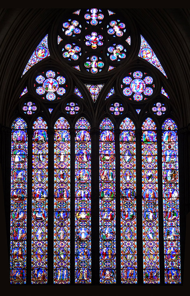
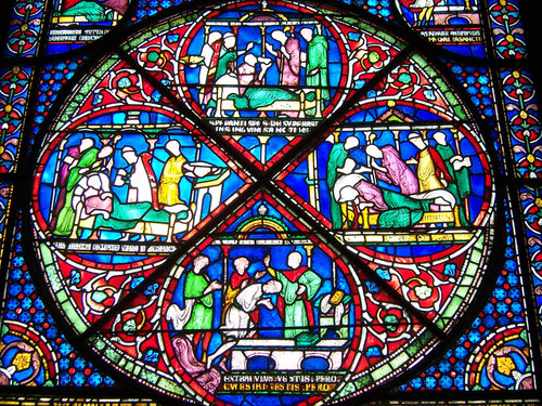
An example of the intricate detail of a stained glass window. All those shapes are calculated and worked out before any glass is cut.
I love painters like Dean Cornwell, during his first two periods or styles, P. P. Rubens, Fechin, Mucha, Brangwyn, Wyeth, Rembrandt, Rockwell, etc. I love them in print and double that, no, quadruple that when viewing their canvases live. I see the marks they made, the design they perfected, and the life and energy they found in the materials of their craft that I believe is why the canvases they made of the stories they tell are so vivid and feel more alive than they look painted. Whether I succeed or fail, and fail a lot, this is what I search to find in everything I craft.

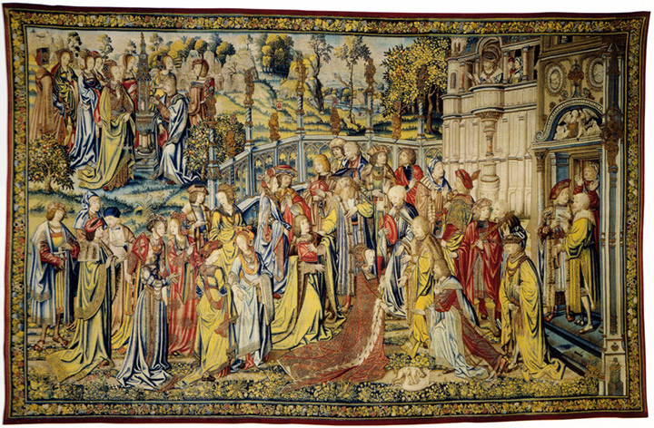
This tapestry is The Story of David. Remember that tapestries are made 1 fiber at a time, and are not painted on after they are woven. This requires intense planning and preparation for every fiber to land exactly where it is supposed to go.
Crafting a painting of this level of complexity means that the drawing which precedes the painted finish needs to be thoroughly designed. This stage of building the composition is about converging the story, all of the props and figures together, bound by an invisible complex design grid hidden in the story like a magician’s mirrors to the tricks performed. All of this so the painter can focus solely on the final performance and to finish with whatever elegance or bravura necessary in the brushwork. In many ways, the design of the piece and the final shapes designed within its matrix are what inspire the brushwork and the quality of the paint that represents the various spaces, surface facets or changes, and textures. These tiles are in many ways very much like painted shards of glass.

Here is a great example of one of Dean Cornwell’s fantastic drawings. These are purely utilitarian, no vanity drawing in his preparation drawings. Every design is worked out, the abstractions built and all the parts of the picture are connected and designed as a light, half tone or shadow tone.

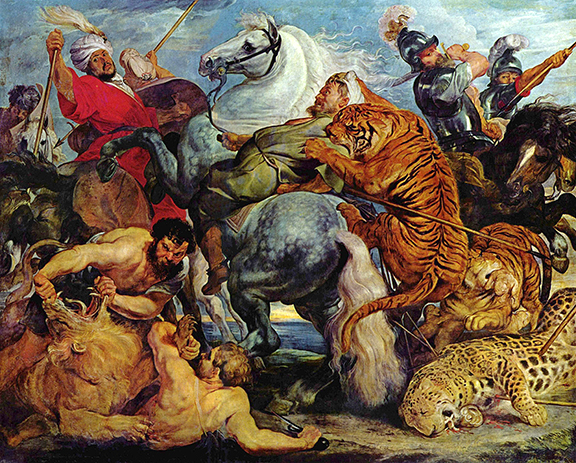
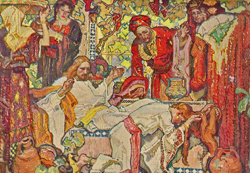
Here is a fine example of a sketch by Peter Paul Rubens (After Leonardo daVinci). The different colored washes and chalks help denote form and space, light and shadow. These drawings were done to this level of finish to work out the forms for the final painting.
The painters I have listed worked with controlled color and push the color beyond a tonalist approach. All of these painters worked with the properties of the paint, sculpting with it, layering it and playing with mediums to elevate it or suspend it to create surface effects and the illusion of textures. And in many ways, one could say that a good number of paintings by these painters look like stained glass windows or feel similar to the ancient tapestries.

This Frank Brangwyn painting also feels very much like a controlled tapestry or a stained glass window, right down to the heavy lines that seem to surround almost every color in the image.
Many of the painters I have mentioned above are also linked to one another through a lineage of teaching using certain tools that ultimately lead us to what we have today as the current methods of teaching using what are called the “construction method” and the “Reilly method” of figure drawing and figure composition. These modern tools of the trade share a direct lineage back to stained glass windows, tapestries, murals and sculptural reliefs.
An example of the Reilly abstractions that were coined by Frank Reilly, who gleaned most of this knowledge from Dean Cornwell, who got it from Frank Brangwyn who learned it from his father and the other craftsmen he worked with in his youth who learned abstractions and composition grids from their mentors that learned from theirs spanning back to the medieval period and possibly before that.
It is really interesting what grabs our attention, what we favor or enjoy and what we end up doing in our own work because of the influences we have in our lives. Until recently, I have not really stopped to pay too much attention to these things in my life. While it doesn’t help me make a better brushstroke I do feel more complete understanding how I have come to be the way I am as an artist and why. I also find it fascinating that what I do might really have been informed so early on in my life. I wonder just how much what I like to look at and do in my own work has been from discovery along the way or was it shaped early on and everything after that time is nothing more than collecting what we already have a certain bias towards much like collecting iron with a magnet in sand.
I hope that you caught on to many of the little nuggets of information that I dropped in to this article that we will certainly revisit very soon. I have several talking points I wanted to make in this first article but this diversion really helped me figure out a way to briefly touch upon them here and allows me to expand upon them with greater detail later.

A great read, very inspiring. I hadn't ever considered the place of stained glass in the development of Western art before. Can't wait for the next article.
Enjoyable article. Thanks for sharing your thoughts.
For the fun of it I'd like to drill down on one point of history you brought up; In my opinion, I don't think we can see evidence that Brangwyn used a figural abstraction model similar to Riley's. There's no evidence of the mapping of the six lines or station points or the strict dark light separation. Brangwyn was mostly self taught actually, with respect to the kind of art he eventually made, which is why his drawing style is so unique to him. (his father was an architect, not an artist, and what he would have learned in William Morris's orbit would have been physical craftmanship and decorative principles.)
There is some possibility that Cornwell's drawings evolved to something like a Riley method over time because of Cornwell's interest in executing preliminary studies with increasing speed and accuracy for both mural and illustration work (good models became increasingly expensive from the 1920 to 1940s, which is one of the reasons for photoref becoming dominant in the illustration industry.) Maybe Cornwell taught Riley some of his drawing developmnets in the mid 30s. But there is no evidence of the formal consistency of the Riley method in Corwell's drawings, so it would be a real stretch to nail down Cornwell as its originator.
My belief is currently that the Riley method may have been somewhat adapted from parts of Bridgman's teaching (who he studied the most with, and whose classes he took over) and some of Cornwell… but the actual method is to Riley's credit. Riley's was the one with the boatloads of students to teach week after week for decades. Cornwell only taught one course on anatomy once or twice a year, from what I understand. So he wouldn't have refined his method to cater to “wooden indians” but rather to his own needs.
And finally, possibly the best evidence I can point to is that the rest of Riley's system was comprised of his own reasoning and his own formulations, adapted surely from those who taught before, but very much a product of his own uniquely analytical and abstract mind and designed for teaching highly advanced concepts to very young minds. So I would argue that the likelihood is that his drawing method was mostly his own as well. I suppose the only way to actually settle the question would be if some notes turned up from Cornwell's lectures at the League which show that he was or was not teaching a similar method to Riley's.
Best wishes,
Kev Ferrara
The Reubens sketch is actually by Leonardo da Vinci
Not quite.
The original painting 'The Battle of Anghiari', was painted by Leonardo DaVinci, but has been lost. It is suspected to be hidden beneath another fresco, or on a hidden inner wall.
There is evidence of the painting's existence though, by way of other artist's studies of it, and some preliminary sketches.
This study was done by Rubens and is one of the most complete copies we have, giving us the best idea of what the original painting looked like.
DaVinci should have been credited, but the attribution to Rubens is technically correct.
More info here:
https://en.wikipedia.org/wiki/The_Battle_of_Anghiari_(painting)
Thank you Dan for answering this comment, and you are correct about the origin of this piece, and to clarify I should have stated that it was a master copy by Rubens. My apologies for the confusion.
This Rubens study was a huge influence on me when I was young. It was in a show in San Francisco and I remember very little as a child but just a few things and several of those were influential on me as an artist. It was the first drawing that actually “felt” dimensional in my eyes, and of course the dimensional feeling began with those horse's hind sections. So I could say my desire to draw only increased because of the horse butt's I saw that day.
Great read Ron, thanks! Glad to see you posting here.
These are indeed great little nuggets of information, Ron. Love hearing about your journey from childhood upward into adult realizations made from those observations as a youngster.
The parallels between the stain glass windows and formal composition are well said here, and honestly shows how artists are influenced freely and carry these realizations forward into the next generations. It makes one feel connected to the beautiful history of mankind striving to understand and express our existence in the universe, from cavern expressions to digital screens.
We've lost a lot on the way up by rinsing our endeavors of these hard-earned methods and boiling off everything until we finally came to an expression of just concept in contemporary art. But we almost had to in order to relearn what is of primary importance in painting. We are carrying forward now and I think these age-old skills will come forward again.
I hadn't expected your post to bring out such deep-seated understanding in my own struggles to express. Thanks for that. I look forward to much more.
Of course, any post with Brangwyn in it has my immediate attention!
Greg
To be exact, it is actually a copy of a copy. The painting was already gone in Reubens' time.