The control of value is one of the most basic elements in organizing a visual composition, from the simple abstract sketches through to the final rendering. Many artists, myself included, tend to only design with value in the early phases of image development, pushing around shapes, lines, and edges in pencil and chalk either on white or toned papers, happy to leave color options off the table as we seek some sense of where we want an image to go.
Not to state that color is not important, but value is one of the strongest cuing anchors in our visual understanding of the world. How we read a shape and its apparent relationship to surrounding objects is mainly determined by value (with exceptions given to high chromatic color contrasts). It is likely for this reason that most artists are comfortable and intuitively prefer to create initial designs with limited color. As many of us may feel, it is hard enough to organize and conceive an image without having to introduce color into the game!
That said, I wanted to share a few images where color is certainly a huge factor in the overall mood and feel to the work, but also call out how value is playing a deep harmonizing bass line to color’s flamboyant show within the composition. I do not believe in following rules when it comes to compositional design, but enjoy analyzing successful pieces to understand and consider the knowledge they reveal for possible manipulation and use in future works of my own.
Below we have a cityscape by Edward Cortez, with a brilliant use of orange in the sky, cafe lights, and reflections from the wet landscape. A large mass of complimentary purple holds our interest in the center.
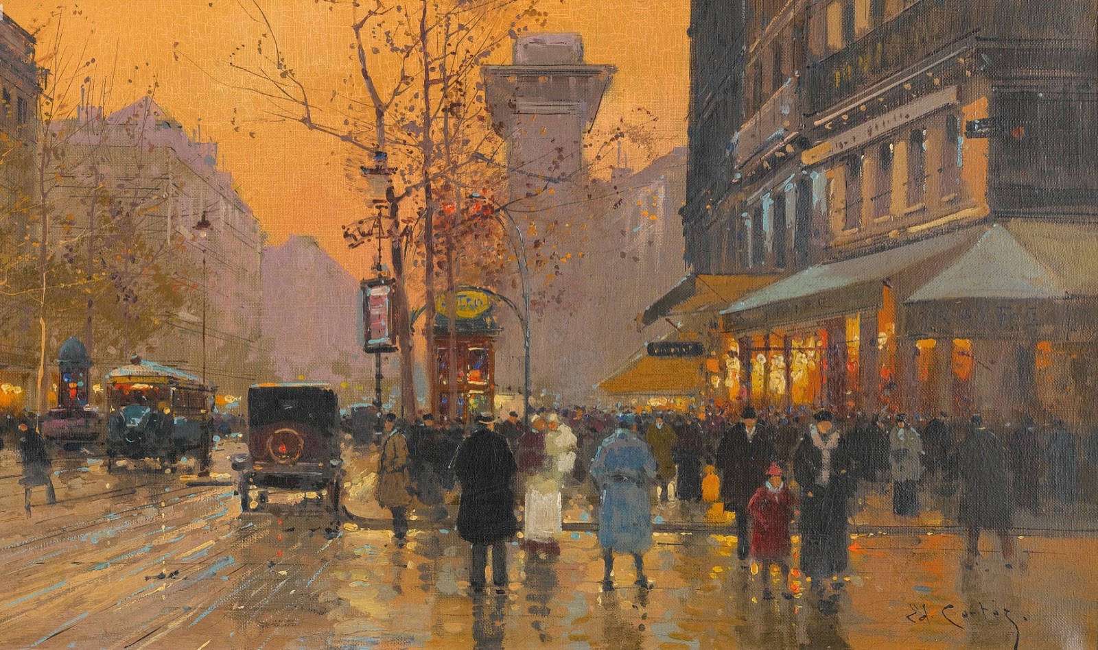 |
| Edward Cortez A Paris Street |
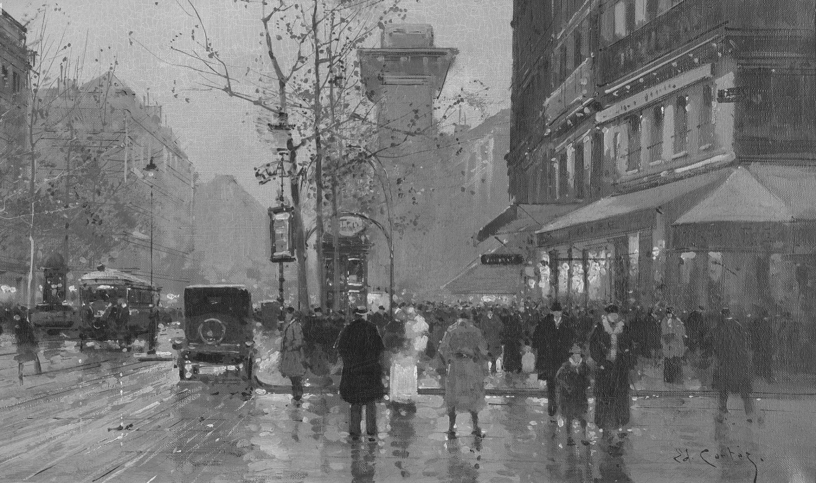
Taking the work into black and white, what I want to point out here is how Cortez withheld deep darks for only
the mid-ground figures and objects. Allowing them to float in a field
of gray values and creating a band of darkness moving horizontally
through the composition – a way to create a horizon line without having
to link it to deep objects in the distance. Also by locating a large white figure with a likewise dark one in the center, the two masses play off each other and draw our eye into them as a point of interest, further centering our focus.
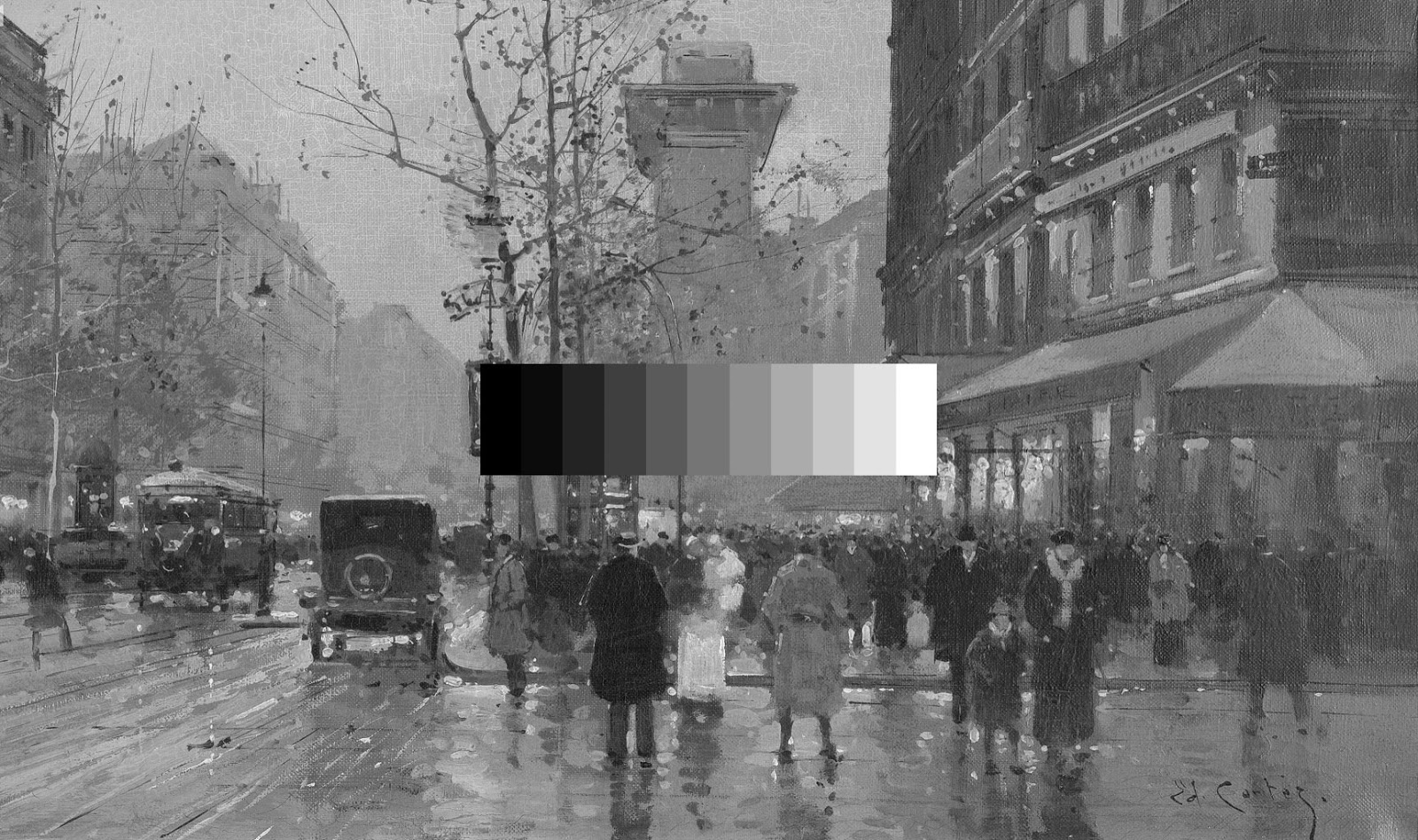
Looking at the image with a value bar inserted, we can see how Cortez also held off from using bright whites in his light sources, providing the feeling of under illumination you may perceive at dusk, and graying out his shadows rather than going too quickly to black. This graying out adds an atmosphering effect and increases the dropoff of the buildings on the right, making them appear more distant in the landscape, an effect further carried out into the deep space of the street to such an extent that the furthest point is almost the same value of the sky. Cortez then uses color here to distinguish the shapes of the buildings against the sky to great effect. A wonderful play of value and color together!
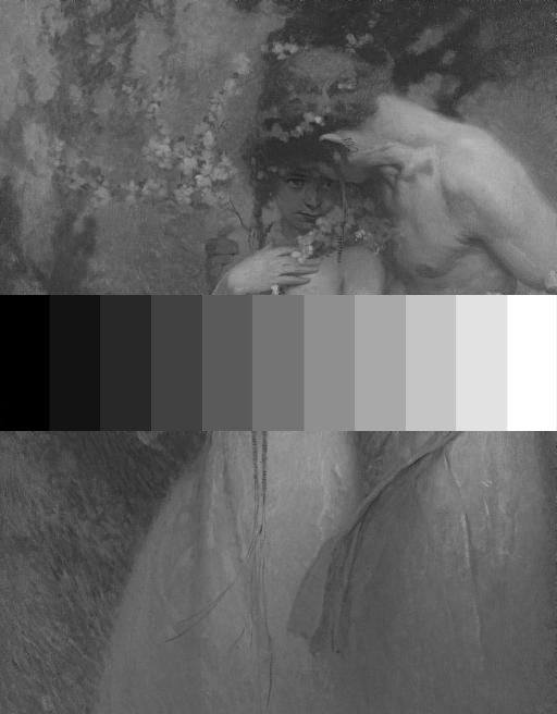
As a second example I turn to Alphonse Mucha. I have never seen the original piece, thus cannot speak to the color accuracy of this image, but the values tell us so much! A brilliant display of control over the entire surface of the work.
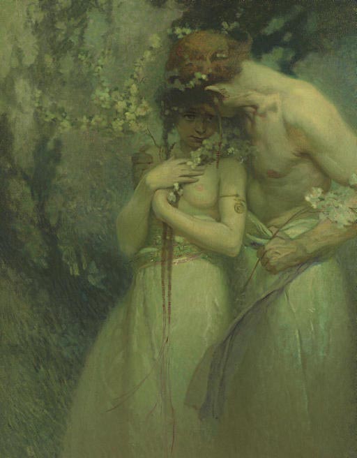 |
| Alphonse Mucha Spring Night 1910 |
Mucha used a subtle play of warmth in the this work to pull out the skin tones of the two figures from the background. His combination of those color harmonies with a narrow range of values on the figures results in the reading of this image as if under starlight or through a magical hazy fog. Look again at the lower portion of the image where the figures bodies trail off into a near unified mass of gray value!
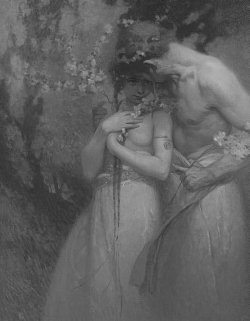
The value bar shows us just how narrow a range Mucha worked within, taking great care to manipulate the greatest sense of form and volume from as little contrast as he could manage.
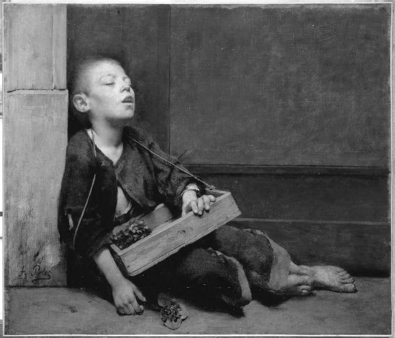
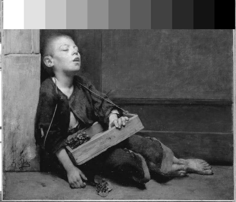
Lastly a strong graphic image by Fernand Pelez de Cordova. I’ll let you analyze the work and come to your own conclusions.
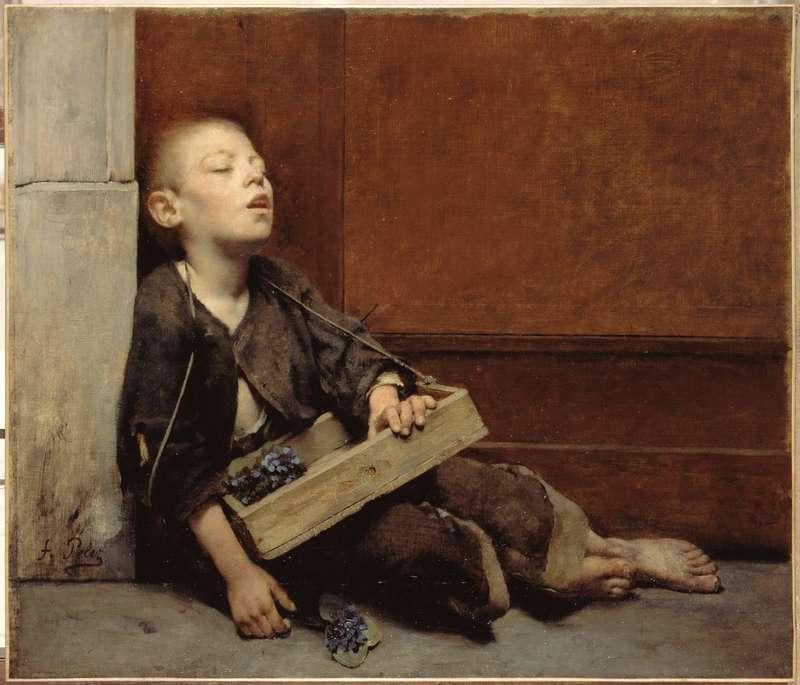 |
| Fernand Pelez de Cordova Homeless 1884 |


Hi Donato, What a wonderful article. The way you have illustrated it has helped me to understand value better and I thought the use of the black in “Homeless” in the crook of the boy's arm – with the diagonal of the box – led me to move into the boy's situation more. BTW, also loved your work in the article by Peter Richardson in Illustrators Quarterly #11
You are welcome Norman, and it is an honor to have a feature article in Illustrators magazine! I just received my copies yesterday. What a great quarterly and especially loved the article on Tomer Hanuka!
Great post Donato!
This was a great post, never seen that Mucha before.
Never tried to use such a small value range before interesting. Thanks Donato!
Great article! I have seen a few of Mucha's originals in Prague with much the same color and tonal range so i suspect the copy to be highly accurate.
Give it a shot Jacob on your next piece. It is a wonderful challenge and I am sure you will learn so much while at the same time create a dramatic new work outside your comfort zone!
Great Article, I am always struggling to understand values, I am not into color, I should be but I am not.
I looked at the last image (Homeless) and thanks to your article; I think I better understood the composition. The dark corner or interior corridor vs. the light facing wall kind of splits the world establishing the environment–light vs. dark, pretty blatant there. However the boy contrast both as a mid-tone/highlight in the sense he is the go between. His face stands out as the brightest point giving the sense of perhaps reflecting light from off canvas and while dark his clothing still is a powerful standing out against the dark background of the interior.
Sorry wordy. Still trying to grasp if that is right but again thanks for your thoughts.
You basically got it Philip! The boy holds the lights AND darks, but remember to look closely at how Pelez does that. The boys hands are fairly dark in gray, not calling undo attention to themselves, allowing our eye to shoot upwards to the face. Most artists (myself included) may have rendered up the skin tones as brightly on the hands as on the face, to a detrimental effect. By introducing even more darks around the lower body of the figure, the hands could be made to look bright against the local darker values without having to move into the lighter ranges that the face inhabits…great control!
That just cleared a lot of things up for me. Thanks for the post!
That just cleared a lot of things up for me. Thanks for the post!
That just cleared a lot of things up for me. Thanks for the post!
Great post Donato!
Very interesting article! I have never before seen such a break down of what “highly controlled values” are or how they work in successful compositions. The painting Homeless really shows how orchestrated values can drive a narrative or capture the essence of an idea!
Very interesting article! I have never before seen such a break down of what “highly controlled values” are or how they work in successful compositions. The painting Homeless really shows how orchestrated values can drive a narrative or capture the essence of an idea!
Hey there, very useful article!! Thanks for sharing, great work!!