I might be the last artist among us to discover Alex Negrea. One day, one of his Tzika paintings popped up in my facebook news feed, and I said to my self: “This guy knows what he is doing. Handles colors and light like a pro”. I started searching and looking at his artwork and discovered that all of them had amazing colors and light: His drawing style was way different than mine, but the color, mood and light effects was potent to the point of hurting my eyes. I was sure this was one of those annoying wunderkids that just got out of art school and had a miraculous talent and knack for colors and light. So I figured I might as well ask him and see if I could learn something or at least discover if this was a gift he had and yet one more thing I could tick off on the list of things I didn´t have but had to work so damn hard for. Turned out, like it almost always does: There is hard work and lots of thought behind.
Here is what Alex had to say about the subject:
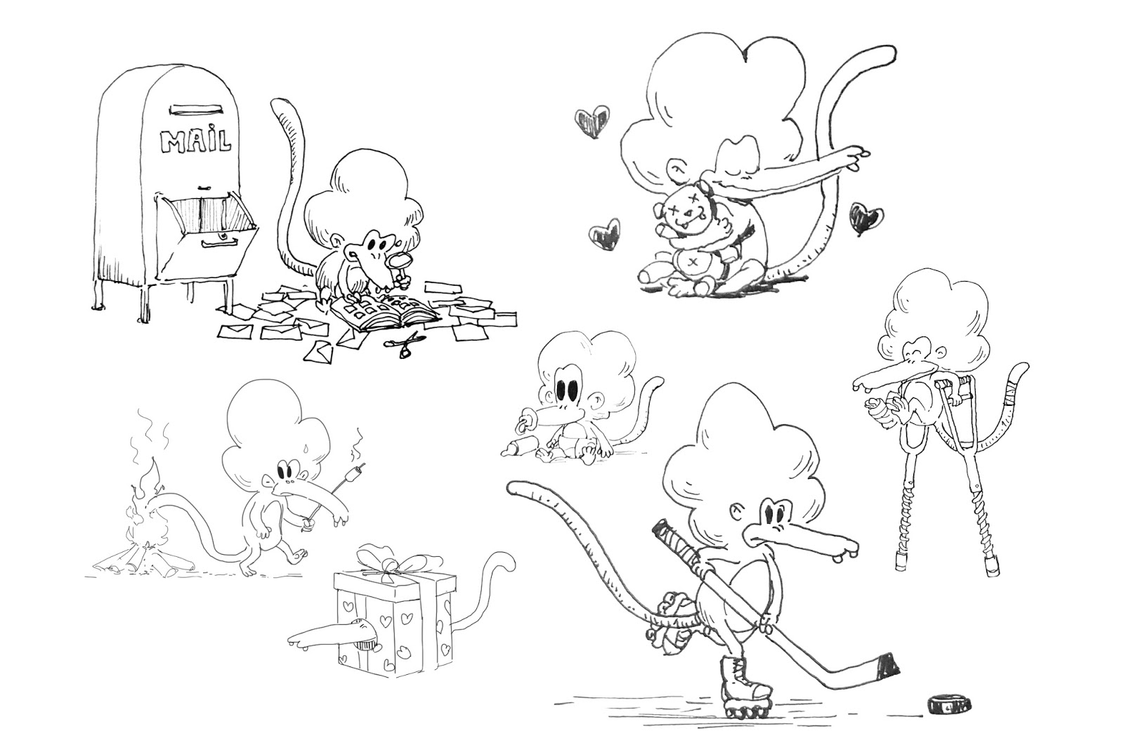
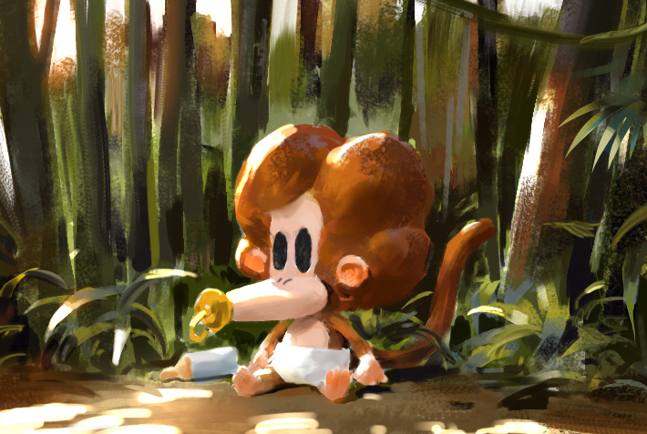
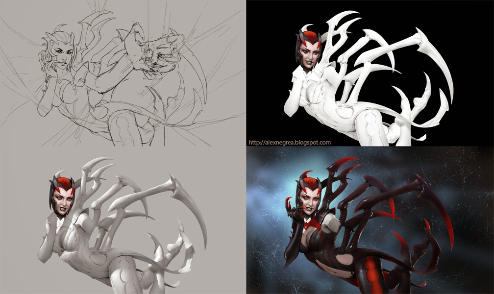
A warm greeting from a colder place, Quebec. My name is Alex Negrea and I am a concept artist and illustrator in the gaming industry currently working in-house at Volta. Not so long ago I released into the world a character named Tzika! Its a character that me and my wife created just for fun over the years. And thats the reason I am here right now. For the past months I have been releasing daily content with Tzika, at first just in lines and then in colors. I really love the character and its very close to my heart and I wanted to give her (yeah its a her – most of the times at least haha) a proper introduction in the world and my choice to release it in October wasn’t random. Its the month where everyone does the Inktober challenge. So chances are that it will gain a little extra exposure. The execution I did its not amazing and I am sure most of you would agree but my main goal was to focus on some storytelling with minimum effort. And thats the reason of super simplified lines and almost crappy drawings. I think everyone knows at this point that if the basis of your artwork doesn’t have a good foundation it will be most likely a bad artwork at the end, no matter how much render you put in it. I will talk now a bit about line-art. I believe and feel its the easiest way to express an idea. If we wouldn’t be able to talk or write I am sure the next step in intelligent communication would be drawing. That´s why so many artists prefer to use it, because it communicates efficiently and simple enough for everyone to understand. Of course you can embellish your lines and make it look ultra amazing but that´s not the point. The point is to express a raw feeling for the viewer. You either succeed or you do not. Line-art can also help you make something memorable because you see the relationship of the elements without the distraction of colors, texture, light. Its all about graphic design and placements of elements. I think if I would have started the other way around with Tzika, straight with rendering, the whole thing would have looked probably worse in the end. Lines have allowed me to filter the design pretty fast through hundreds of iterations. I kept elements that I liked and removed the ones that I didn’t and now I can sum up my design into a memorable long mouth with two protruding teeth, afro-like hairstyle and a long noodle tail. So inktober has ended and I continued to put line sketches into the world until one day I decided to show everyone how I really see Tzika in my mind. But this time I changed everything I know about digital art. I said in my mind F*** IT! Gonna paint like there is no tomorrow and gonna get this done in 2-3 hours (my free time after work). This attitude changed a few behaviors that I developed over the years (behaviors that I use for production art – which I think they are important but not essential for personal projects). I needed somehow to reach my goal faster, but how? I’m gonna take you on another parallel now that involves music.

I recently started training on recognizing intervals by ear. The key there is to picture clearly in your head the relationship of the two notes and assign them a known theme for easier recognition. So a minor second for example is the relationship between two notes that happens to be the super creepy theme from Jaws. Okay; back to painting. How do I use this information. Well I look at some reference images to make the idea clearer in my head (mood, lighting, colors), I lock in the interval in my mind, and then I use brushes without much opacity and put the direct color that i think it should be there. And since I want more vibrant colors I go even more saturated with colors. I do not color pick from my painting either except when I am closer to the end and I want to loose a bit the saturation. Colorpicking its great if you want to remove the vibrancy:)
And that´s why a lot of artists end up with ultra desaturated pictures that do not look like what they imagine in their mind. But do not imagine that I am a ninja and I always put the right color. I do mistakes constantly but I paint over them with the right color and value that I decide on after I laid down the wrong stroke. I try to make everything flat at first , almost like cell shading, and only later on I try to introduce smooth transitions between colors and values.
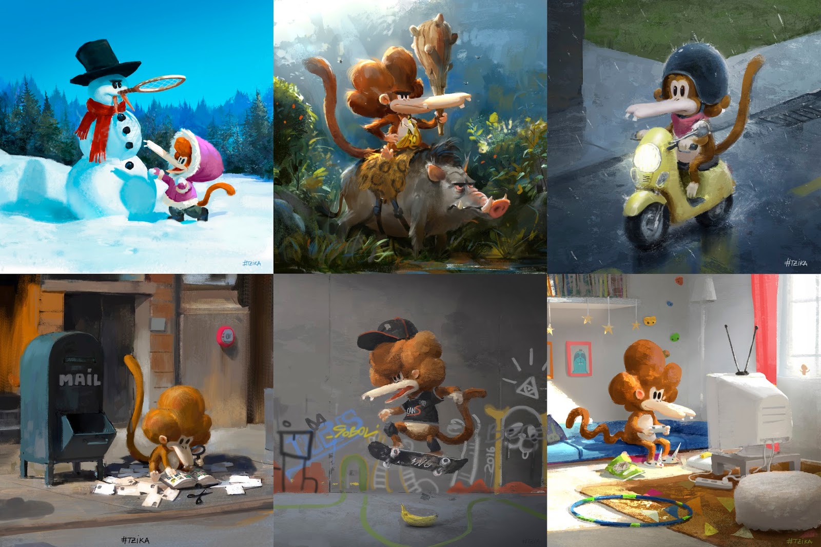
I also try to put cooler versions of the main color of the object just to suggest a different light source. Since Tzika is built from warm colors it contrasts nice. Regarding the lighting I think I grew a lot since I started using a camera and taking pictures. Exposing your camera for something in your picture frame that you want clear and nice for the viewer might mean that other elements that are part of the picture will be almost black or almost white. I am not afraid anymore of using dodge brushes because I understand what I want from it. I want the highlight to be almost white and desaturated and the edge of the highlight to be a very saturated lighter version of the base color. A very common mistake that I did over and over was to use a soft round brush to color dodge/linear dodge. That brush makes the saturated edge too wide and it just feels fake. If you use a chalk brush like brush you can get a better result. Regarding layer management for these quick paintings its almost not existent. I just paint over the line art. I leave the white of the canvas there because I like that sometimes some white speculars will still be there. I sometimes use multiply layers to lay in a super smooth gradient over a big surface. But nothing fancy.

Check out the video tutorials here:

Thanks Jesper for postering this. And thanks a lot to Alex for his insight into his workflow and his thoughts. I did not realized before that color picking leads to desaturated colors.
I knew it is not the best way to deal with color but sometimes color picking is quite comfortable. For me “color picking leads to desaturated colors” is an eye-opener. Thanks a lot.
Cheers!
thanks really inspiring
Great! thanks both of you for the inspiration!